- Dec 15, 2013
- 533
- 802
Here am I, whining again.
In all seriousness, I do think this deserves to be addressed, even if nothing can be done to change it (other than bugging Valve until they change it). I'll try to keep this short and sweet.
About a month ago I was showing a friend of mine Team Fortress 2. We were talking about games development and I explained that I had actually designed a level. When he loaded up the game I found the lighting to be odd; almost washed out in a way. I just figured that he was not running on the highest visual settings, so I took a look at it when I got home on my own machine.
It turns out that color correction and other lighting effects have been reduced/removed.
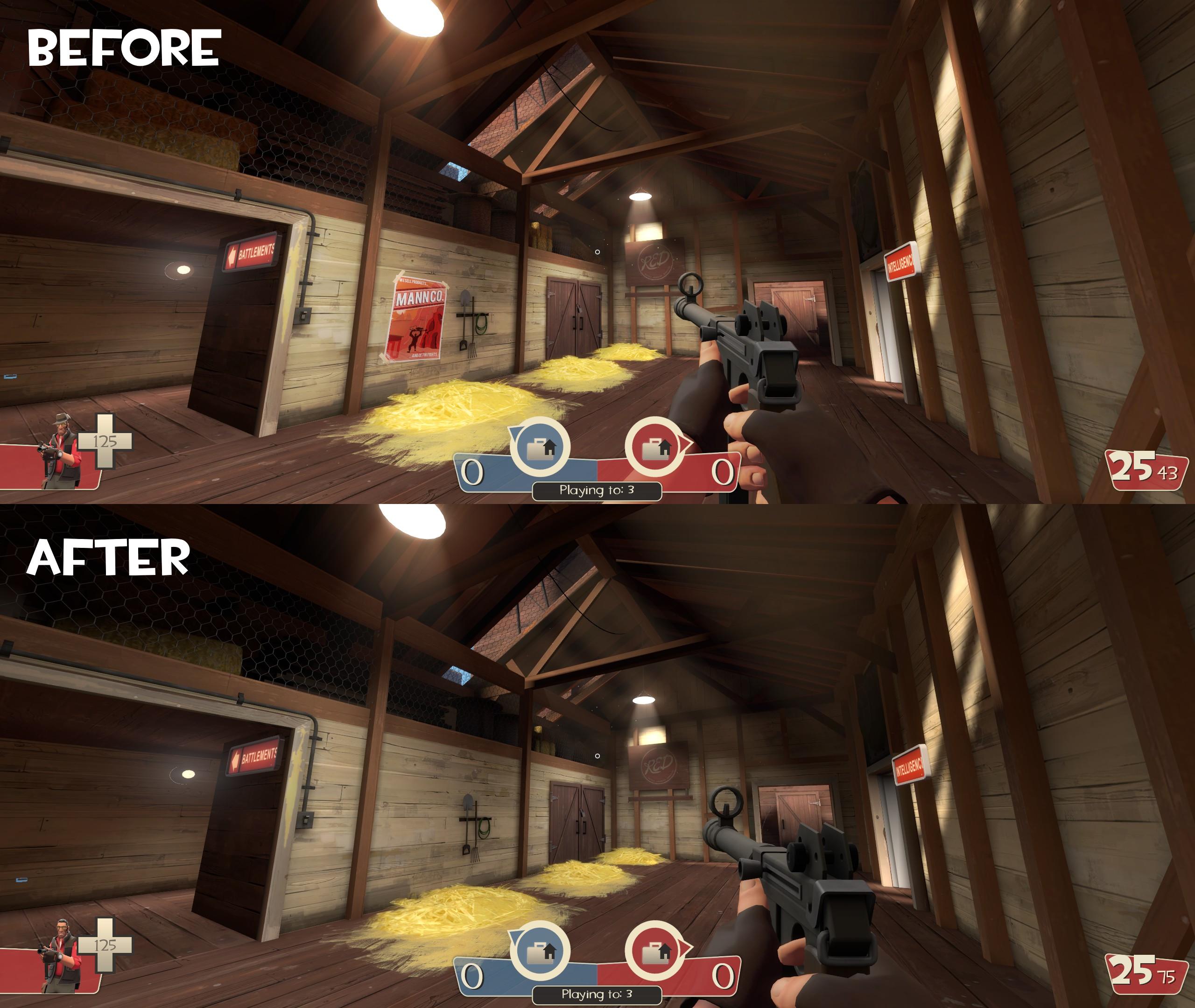
The before picture was taken in mid 2014. Notice the ceiling is darker and the wood beams are not as orange tinted as they used to be. Also notice the bloom on the lights is not as bright as it used to be.
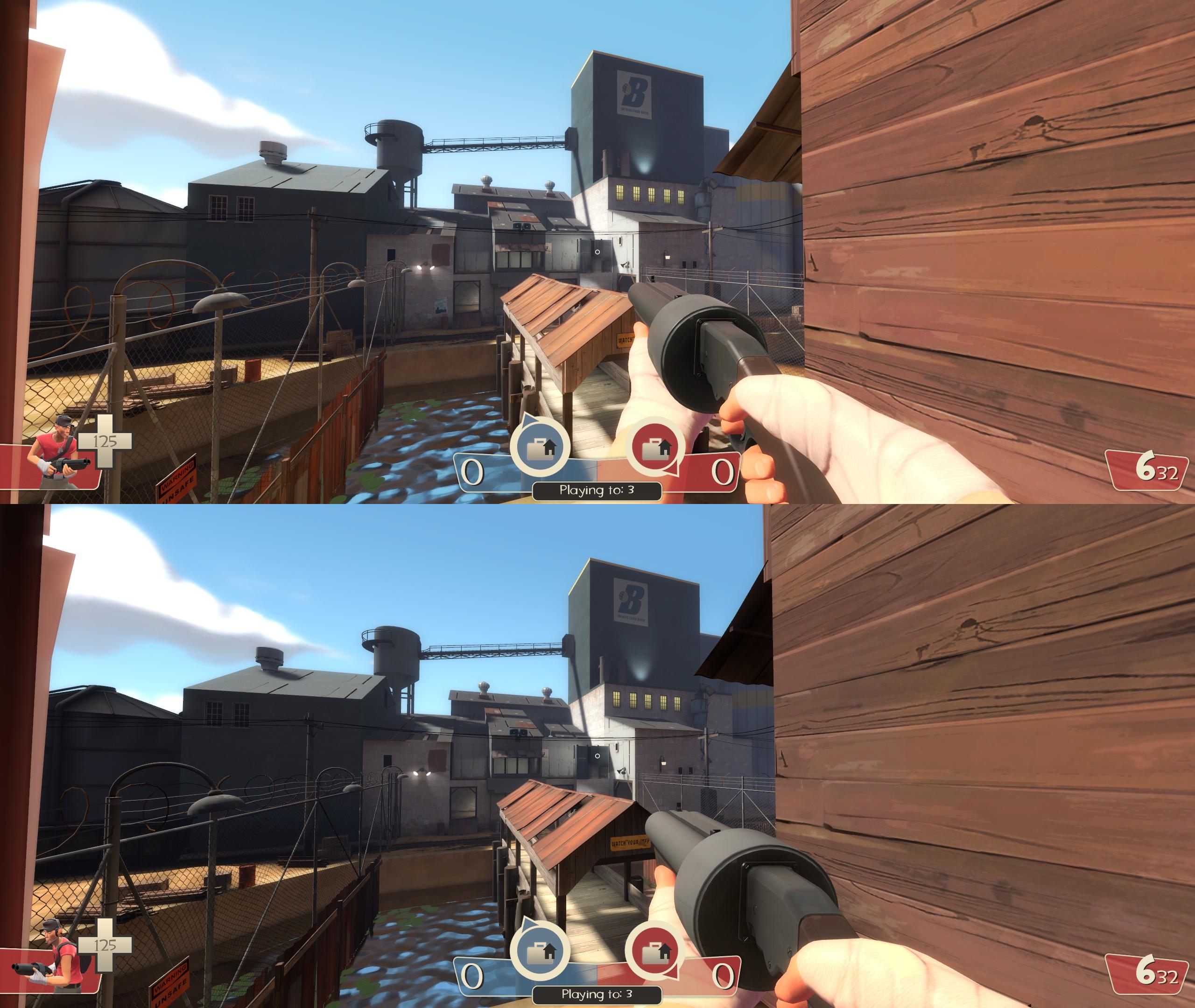
Take a look at the covered bridge. The fence and buildings on the left side of the screen are very dark as well. The lighting on the gun even seems different.
Here's where it gets a little personal. I don't want to come across as arrogant, but I was really proud of the lighting in gorge_event. It was inspired by lakeside_event and was really special to me. I spent the last 2 weeks before the event, 6+ hours a day, just working on lighting.
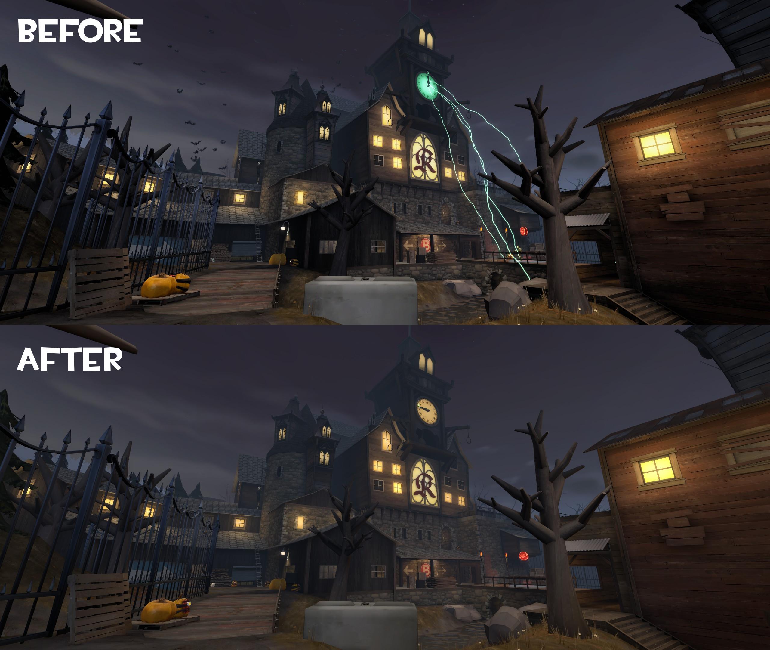
Before, there was a dark contrast to every crack and crevice. Now this is gone, and the map appears as if everything is hazy. The windows no longer have the glowing look I was going for. The fence doesn't pop as it used to.
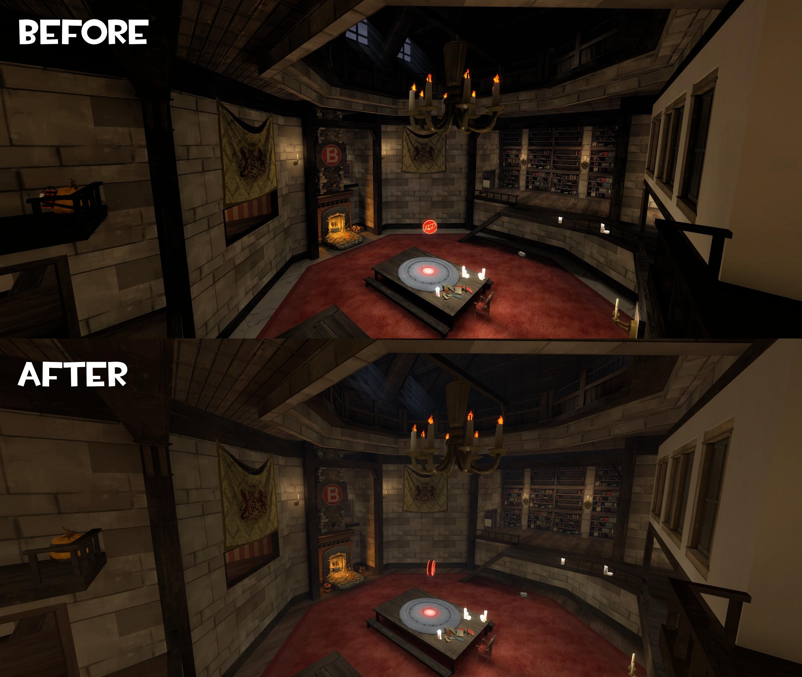
The before shot was taken while I was building the map still, so it doesn't have the wood flooring. Take a look at the wooden beams and the ceiling though. Notice how they have changed.
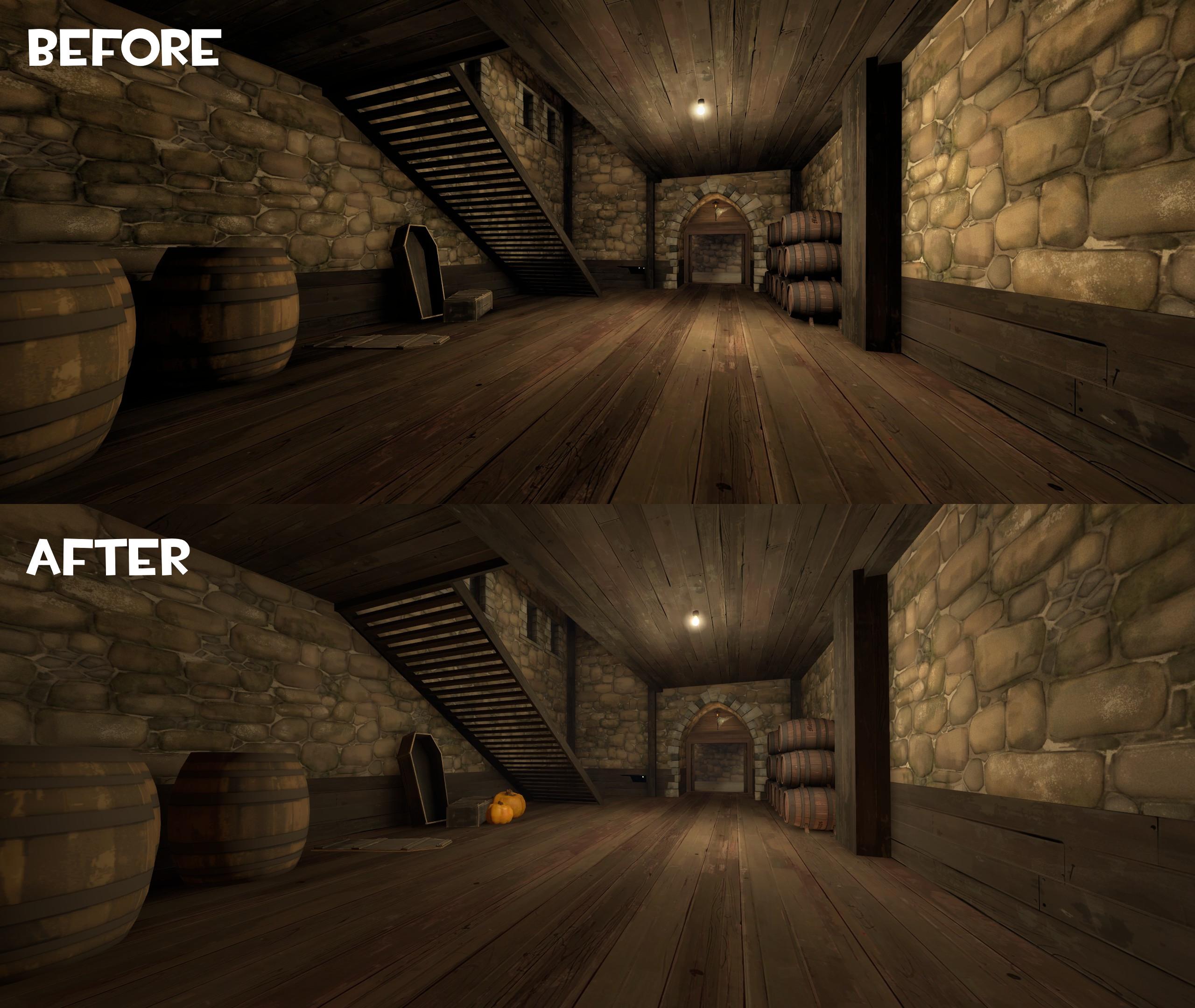
This one has the biggest change. The picture was taken before a lot of the pumpkins were added into the map. Look at the contrast on the arch and floor and compare that to the after screenshot. Also, notice the barrels on the right wall.
I have also noticed this big change on Hellstone and GhostFort.
Is this a problem that only I am having or has Valve actually changed the lighting? If so, it is very sad and only adds to the list of issues I have with the game now. Sorry if it seems like I was nitpicking, I worked very hard on that map, as I'm sure others have worked on theirs. Its sad seeing your own work corrupted as well as many maps that had an interesting look.
In all seriousness, I do think this deserves to be addressed, even if nothing can be done to change it (other than bugging Valve until they change it). I'll try to keep this short and sweet.
About a month ago I was showing a friend of mine Team Fortress 2. We were talking about games development and I explained that I had actually designed a level. When he loaded up the game I found the lighting to be odd; almost washed out in a way. I just figured that he was not running on the highest visual settings, so I took a look at it when I got home on my own machine.
It turns out that color correction and other lighting effects have been reduced/removed.

The before picture was taken in mid 2014. Notice the ceiling is darker and the wood beams are not as orange tinted as they used to be. Also notice the bloom on the lights is not as bright as it used to be.

Take a look at the covered bridge. The fence and buildings on the left side of the screen are very dark as well. The lighting on the gun even seems different.
Here's where it gets a little personal. I don't want to come across as arrogant, but I was really proud of the lighting in gorge_event. It was inspired by lakeside_event and was really special to me. I spent the last 2 weeks before the event, 6+ hours a day, just working on lighting.

Before, there was a dark contrast to every crack and crevice. Now this is gone, and the map appears as if everything is hazy. The windows no longer have the glowing look I was going for. The fence doesn't pop as it used to.

The before shot was taken while I was building the map still, so it doesn't have the wood flooring. Take a look at the wooden beams and the ceiling though. Notice how they have changed.

This one has the biggest change. The picture was taken before a lot of the pumpkins were added into the map. Look at the contrast on the arch and floor and compare that to the after screenshot. Also, notice the barrels on the right wall.
I have also noticed this big change on Hellstone and GhostFort.
Is this a problem that only I am having or has Valve actually changed the lighting? If so, it is very sad and only adds to the list of issues I have with the game now. Sorry if it seems like I was nitpicking, I worked very hard on that map, as I'm sure others have worked on theirs. Its sad seeing your own work corrupted as well as many maps that had an interesting look.


