Antiquity

CP Antiquity B18

EArkham

Necromancer
aa
Aug 14, 2009
1,625
2,773
Originally a theme started during the Artpass Contest (the one that gave us Mann Manor & Mountain Lab) in 2010. Wow. So this map is seven years old.

WORKSHOP SUBMISSION LINK

Completely revised and updated with new assets, a new look, easier routes, less crap to bump into, the works.

If you're familiar with the old layout, you will be familiar with the new as well, with some notable exceptions and changes:

* Additional connections to make team rotations easier,
* Changed the cover on last and removed half of the large obstructing structure (lot of complaints about sentry spots here)
* Mid and 2nd are both raised control points now, to address various game dynamic issues
* Additional and easier access to the top of the temple at mid
* All spawns and forward spawns now have two exits
* That annoying ditch and tunnel at second has been removed entirely
* The garden area leads more directly to and from the 2nd point
* Completely revamped artstyle! Now the place actually looks more like Ankor Wat!
* ...and a bunch of other things too numerous to mention

Get the complete asset pack here:

https://tf2maps.net/downloads/antiquity-cambodian-assets.3980/

-----
CREDITS (New version):

Vhalin - For valuable feedback on what had to change from the old version... admittedly that was 3 damn years ago, but hey.

OwlyOwl - "Dawn" skybox texture

ARCHIVED - OLD CREDITS, No longer applicable to the new version:
Boojam Snark's Ultimate Mapping Resource Pack
Acumen - Drill Models
Void's drill signs and RED corporate signs (actually I want to put these corporate signs back in for B16, I just couldn't find them at the time of compiling)

If during a playtest you spot custom content from someone I didn't credit (and I didn't make it), please let me know!

Full Changelog Here
 
Last edited:

Acumen

Annoyer
aa
Jun 11, 2009
704
628
welp, now that you decided to get full scale into this, i except some more model goodness ! MUCH more :D
I'll contintue getting on your nerves in this thread - that's for sure :)
 

Whated

L2: Junior Member
Jul 23, 2010
89
26
I wanna play this next gameplay, for sure! I love the theme. You should definitly finish this. (y)
 

EArkham

Necromancer
aa
Aug 14, 2009
1,625
2,773
Struggling a bit with the layout for points 2 & 4. Original idea was a khmer village, but it didn't mesh well with the stonework (though with a couple of custom props, the huts will make a nice out-of-bounds detail).

Still hoping to have something for download tonight, but it may be tomorrow.

Of my existing props, I'm only happy with the faces, the columns, and two of the tree root things. All of the trees have to be re-textured; I rushed them all and they have some pretty lousy seams.

And since I'm making my own deadline, I should be able to finish my tuktuk model (reference). Not sure where it'll go since I'm probably going to skip the village, but it may be cool as an out of bounds thing. It'll stay low priority though.
 
Last edited:

EArkham

Necromancer
aa
Aug 14, 2009
1,625
2,773
Okaydokey then. Playtest version A1 ready for download. Two days later than I'd planned, so I guess I map slowly. :/

Cubemaps are built, but there's only one env_cubemap (done simply to stop the purple checks on reflections). Heavy takes 15 seconds to get from any one point to the next; 30 seconds from spawn to center (comparable to Fastlane or Badlands). The map size is large for an A1 due to having a couple of small areas that use a ton of custom textures.

The center and middle points will be khmer ruins, while the end points will be unabashedly spytech. Also thinking that one of Acumen's drills will look spiffy over the last point, so that'll probably be one of the first things I do during detailing. :)

Feedback for A1:

I'm only interested in feedback about game flow, playability, and balance for this release. I don't care at all about texture or lighting problems, so don't worry about reporting those issues (there are a couple of areas fully detailed, but that was because I pulled them directly from my artpass map). Basically:

* Are any of the capture points too easy or too difficult to attack/defend? Is there too much or not enough cover around capture points?

* Do all the classes feel useful on the map?

* Are there any devastating sniper lines or sentry spots?

* Too much or too little health and ammo?

* Is it easy and intuitive to navigate the map?

Thanks for any thoughts.
 
Last edited:

Seba

DR. BIG FUCKER, PHD
aa
Jun 9, 2009
2,364
2,728
At last, attackers shouldn't have access to the upper level near the defender exits.

Overall, the map seems very confusing at first and has many paths, which leads to walking backwards for the first few times. Also, the room with the broken floor was very annoying to fight in, especially if you fell into the holes. With some improvement, this could be an awesome map.
 

EArkham

Necromancer
aa
Aug 14, 2009
1,625
2,773
At last, attackers shouldn't have access to the upper level near the defender exits.

Okay, I think I can do something different with that entrance. First impulse is to seal that path and add a ramp inside the final area, but that might make an ugly sentry area. Plus make it less intuitive for exiting spawn.

[Edit] Oh! Maybe I can make that a one way door instead (out only). Or a door that seals itself if that cap outside gets captured.

Overall, the map seems very confusing at first and has many paths, which leads to walking backwards for the first few times.

I tried to keep with the "three paths: one major, two minor" theory. Where were the spots you ended up walking backwards?

Think I heard Icarus say that all signs should point to the central CP, not any other CPs. Did the signs add to the confusion?

Also, the room with the broken floor was very annoying to fight in, especially if you fell into the holes. With some improvement, this could be an awesome map.

Yeah, that's basically a fancy ramp. Needs much better clipping than it has. I got snagged on it a couple of times, too. Think it'll be easier to navigate when it's fully clipped. I noticed some other spots around doors and pillars that could use clipping, too.

Thanks! Seems like folks liked it well enough during the playtest. :)
 
Last edited:

Pocket

Half a Lambert is better than one.
aa
Nov 14, 2009
4,694
2,579
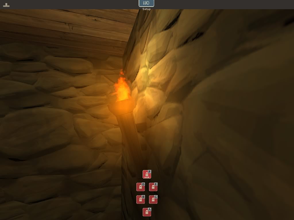
SUGGESTION! I decompiled and unpacked YM's artpass map just so I could play with some of the models, and I noticed that he uses a set of flaming_arrow particles for his fireplace fire. Out of curiosity I replaced the torch fire in my Egypt test map with one of them and fired 'er up. It's a bit smaller than I'd like, but it looks pretty good. You might want to try it in your next release and see what people think.
 

Scotland Tom

L6: Sharp Member
Jan 19, 2008
332
64
I loved the theme during artpass and I'm extremely glad to see you making a custom map with it, EArkham. Not sure I'd go with the name "antiquity" as I think something more specific to the architecture and location might be more appropriate, but the theme itself is awesome and I'm anxious to get in there and see how it plays.
 

Pocket

Half a Lambert is better than one.
aa
Nov 14, 2009
4,694
2,579
burning_torch is also a good option. it has no smoke and seems to have less particles than arrow effect. or launch tf2 with -tools, find the flamethrower effect name in particle editor, and make torches on steroids :p

Wait, there's a burning_torch effect? What was it made for?
 

EArkham

Necromancer
aa
Aug 14, 2009
1,625
2,773
Version A2 released:

* Center point capture zone size increased
* Playerclipping added to some key areas for easier navigation
* One way gate from upper area of spawn/final point
* Secondary entrance & ramp added to final point (compensating one-way gate change above)
* Couple of intermediary areas slightly changed for easier navigation
* Signs changed to be clearer, confusing signs removed

Torches not yet changed. ;)
 
Last edited:

Tyker

L5: Dapper Member
Jun 1, 2009
232
142
I really like the look of all the rubble and ruins. The individual bricks probably take a lot of time to get right, but the end results looks great!

Apart from that, the gameplay seems okay. last-second seems a bit confusing, though. And in the screenshot is a health and ammo corridor wich I think is too much out of the way and carries too much risk. When in there, any class can kill you off instantly.
 

Wilson

Boomer by Sleep
aa
May 4, 2010
1,385
1,223
The middle felt quite spammy, if someone tried to cap it demomen and soldiers spammed the hell out of point with projectiles.

Second cp was cool tough i think you should get rid of that small health next to point.

Can't say much about last, i need play this more.
 

EArkham

Necromancer
aa
Aug 14, 2009
1,625
2,773
Tyker, got some screenshots of the areas you found confusing from second to last? Is it confusing in the sense of "feels like I should turn left, but corridor goes right" or confusing as in "I don't have any idea where the next cp is"?

And yeah, the ruined bits are kind of a PITA to do, but once you make one set, it's pretty easy to cut, paste, and modify for other areas. :)

Wankhouse, yeah, I expected the mid to be a bit spammy, especially with all the scout-demo-soldier upper areas, but that's why the mid point is covered. Would you say it was more spammy than points on the valve maps?

Thanks for the feedback!
 
Last edited: