Antiquity

CP Antiquity B18

Sep 1, 2009
573
323
I really quite enjoyed the map. It is quite fun to play and airblast all that spam back at them.While playing i really found only two things i am unhappy with.

1. there is a hole in your forward spawn.
cp_antiquity_a20001.jpg


2. Could you clip the floor in this room? as as nice as running over it is i kinda get caught in the holes while fighting
cp_antiquity_a20002.jpg


Other than that it is looking beautiful and I am here wanting more :)
 

Wilson

Boomer by Sleep
aa
May 4, 2010
1,388
1,227
Would you say it was more spammy than points on the valve maps?

Well, all 5cp maps mid points have some spam, but this was way out of your ordinary spam you have at middle, once teams collide there was wave of pipes, stickies and rockets everywhere.

I think it had something to do that most of the primary routes to point make teams collide instantly, reason why maps like granary have no spam is that all primary routes to point are on side of cp instead front of point itself. Meaning teams split up, some people go up to the containers, some go to the points, some circle around the containers, on antiquity other hand, both teams clash right on the point meaning there is a lot of spam and chaos.

Hopefully i didn't make it sound too complicated.
 

Tyker

L5: Dapper Member
Jun 1, 2009
232
142
Tyker, got some screenshots of the areas you found confusing from second to last? Is it confusing in the sense of "feels like I should turn left, but corridor goes right" or confusing as in "I don't have any idea where the next cp is"?
Kep

I didn't get any screenshots, I might be able to get some later. The area I was referring to was the high ceiling open area inbetween final and second. A lot of routes converge in there, and the many 90 degree turns in the hallways connecting to that area confused me a bit.
 

EArkham

Necromancer
aa
Aug 14, 2009
1,625
2,774
Cool, thanks. Look forward to seeing the demo. :)

I haven't done an update yet for two reasons: a) obsessed with getting my stupid pyro poker weapon just so and b) not sure what to do on the last point to make it more intuitive.
 
Last edited:

EArkham

Necromancer
aa
Aug 14, 2009
1,625
2,774
Keeeerbump!

A3 Changes:

* Sealed off middle minor entrance to central point
* Removed a wall near final point to make navigation a little clearer
* Adjusted some health pack placement and type on 2nd point, path to central, & near final point
* Adjusted some playerclips, texture issues
* Began detailing the spawn rooms

We'll see if sealing off that middle entrance on the central point increases or decreases the spam to the center point. If it decreases it, I'll leave it sealed. If it increases it, then I'll add it back and try something else. Leaning towards keeping it in; the distances between entrances are almost equivalent to cp_fastlane, so spam intensity is likely due to something other than that middle entrance.

I'm very curious about sentry effectiveness on the map. There are a couple of areas specifically intended for sentries (especially on the 2nd and last points), but there don't seem to be many good sentry spots otherwise. I think engineers may have some problems keeping their buildings alive.

I've also begun planning and detailing for non-essential areas, so have a new screenshot (one of the out of bounds area near blu spawn):

cp_antiquity06.jpg
 
Last edited:

EArkham

Necromancer
aa
Aug 14, 2009
1,625
2,774
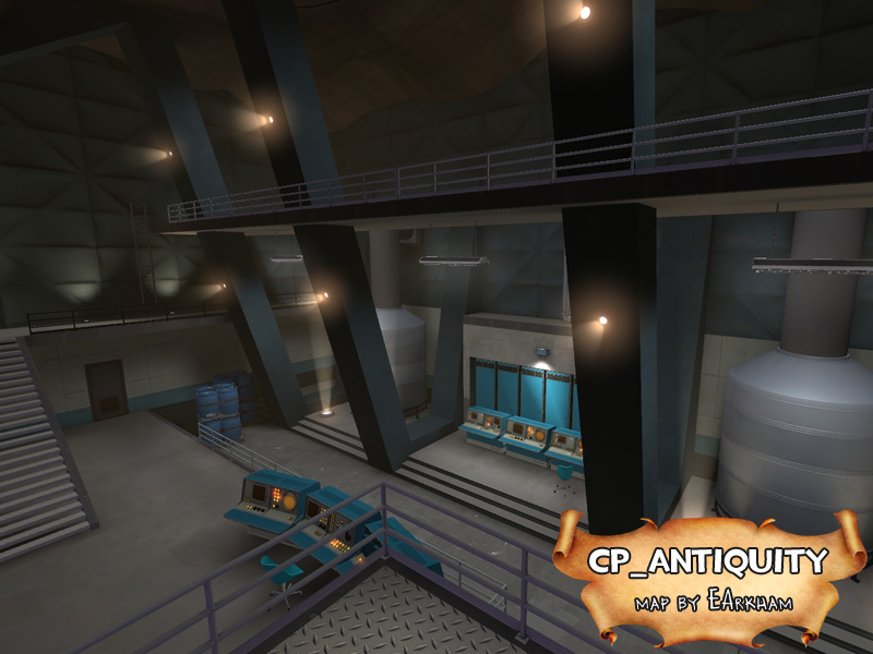
Yeah, the spawn areas and last points are going to be unabashedly spytech.

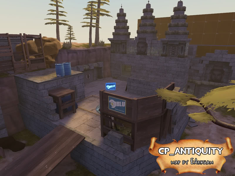
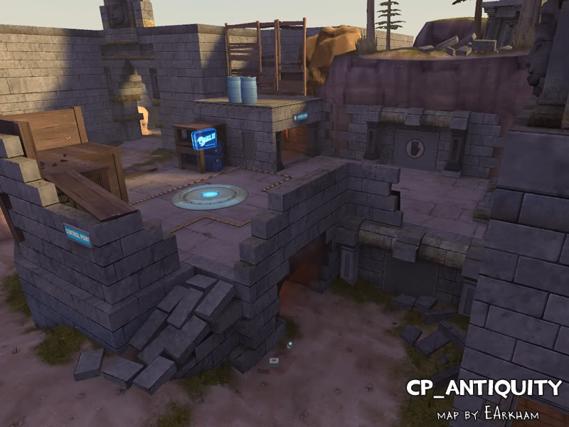
Between there and the second point, you'll see a mix. Mostly ruins, but signs of the teams moving in, knocking down walls, etc.

Center point will be wholeheartedly Khmer/Cambodian ruins.

That was one of the things that sort of annoy me about cp_egypt. It's ALL Egyptian; you don't get a sense of facades like you do in 2fort or well. And the distinction of seperate areas should hopefully help with getting around the map, too.
 
Last edited:

Acumen

Annoyer
aa
Jun 11, 2009
704
630
haha, that scene seems familar :D
At least these pillars are from a certain bond movie, am i right ?
Tried to base my cpoint entry on that but failed horribly :D
Looks very nice, but like dabeatz said, kinda straying away from the original theme, I guess.
Nothing bad, just implying that the name might not be too fitting anymore ?
 

EArkham

Necromancer
aa
Aug 14, 2009
1,625
2,774
haha, that scene seems familar :D
At least these pillars are from a certain bond movie, am i right ?
Tried to base my cpoint entry on that but failed horribly :D
Looks very nice, but like dabeatz said, kinda straying away from the original theme, I guess.
Nothing bad, just implying that the name might not be too fitting anymore ?

Dr. No. :D

[edit] I changed it up a bit... I didn't want it to be exactly like that. And avoided a watery nuclear pit cause I felt the resource hit would be unnecessary given the location is out of the way, but has windows that might let the water render when it wasn't needed.

Maybe straying, I dunno. This was the plan in my head from the start, but names are an easy change. I think in the end it'll probably be fine.
 
Last edited:

Acumen

Annoyer
aa
Jun 11, 2009
704
630
hehe, knew it - went through my james bond-reference folder to doublecheck !
I just wish your updates would be faster without the long creative pauses ;)
 

EArkham

Necromancer
aa
Aug 14, 2009
1,625
2,774
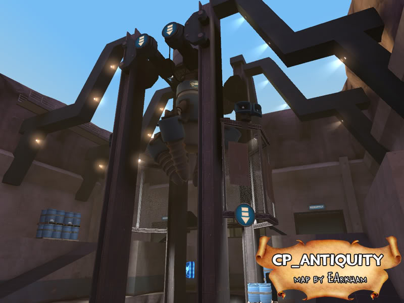
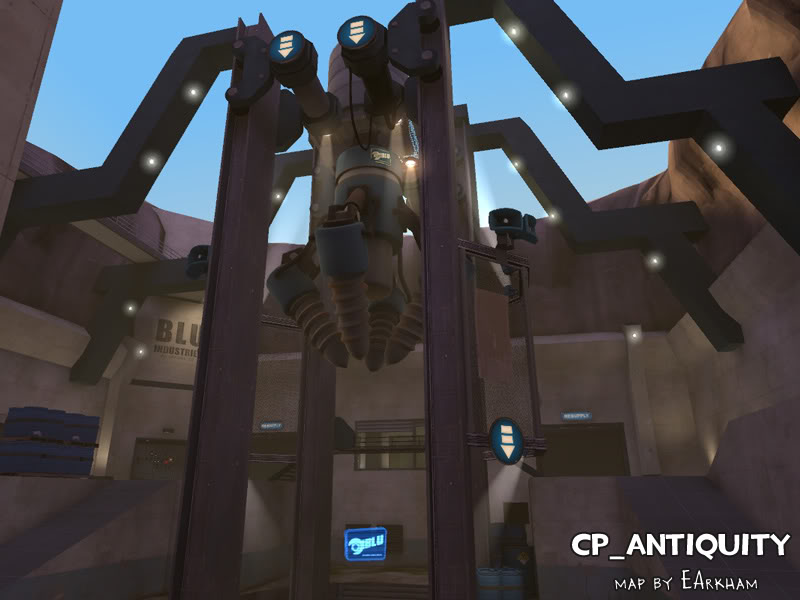
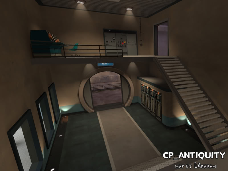
Hadn't had time to work on this until a couple of days ago. Detailing on A4 in progress (2nd point and 1st point with doomsday drilling machine, respectively).

cp_antiquity07.jpg

cp_antiquity08.jpg


Horrible, horrible lighting. Don't worry, I'm fixing it. Going to completely remove the point_spotlights on the little lights since they look awful outside.

Also, the announcer never says "Time has been added" when capturing points. Why would this be? What setting am I missing?
 
Last edited:

EArkham

Necromancer
aa
Aug 14, 2009
1,625
2,774
Honestly I keep forgetting about it.

The vines and trees still need some significant UV work/reskinning before they're release quality.
 
Last edited:

EArkham

Necromancer
aa
Aug 14, 2009
1,625
2,774
Making more progress. Nothing truly exciting yet, but will be moving to B1 after I release A4.

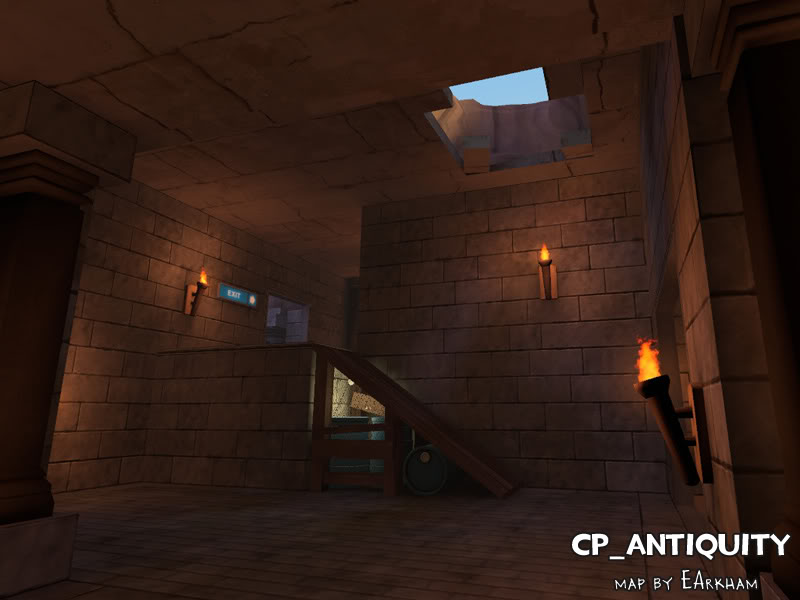
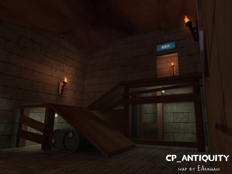
cp_antiquity08b.jpg

cp_antiquity09.jpg

cp_antiquity10.jpg

cp_antiquity11.jpg


The lightbulbs under the ramps have since been changed. And strangely, I somehow failed to take any screenshots of the stuff that actually looks khmer-esque. Heh.
 
Last edited:

EArkham

Necromancer
aa
Aug 14, 2009
1,625
2,774
Doh. Hit the brush and texinfo limits (both of them). Should be obvious why: I did a lot of brush-based stone blocks.

On the plus side, I have plenty of room for models, so I'll convert a lot of the complex and repeated brushwork... stuff like stairs, doorframes, windows, stone detailing, wooden ramps, etc. I plan to use existing textures as much as possible since custom textures eat up packed file size fast. Also on the plus side, it means I can make these slightly more detailed and less brush-like.

None of them should be complex, but I probably won't be able to start until the weekend.

Oh. And I also reduced the number of custom textures, so hopefully the download will be about the same or smaller, even with the new models.

[Edit] Also fixed the "Time has been added" voice thing (needed to use addtime, not settime).

cp_antiquity07b.jpg


Still left at this point:

  • Optimization tweaks
  • Lighting tweaks & fixes
  • Skybox
  • Soundscapes

And of course, tons more playtesting for playability... but at least it'll be pretty to look at while you do it!
 
Last edited: