WiP in WiP, post your screenshots!
- Thread starter Arhurt
- Start date
You are using an out of date browser. It may not display this or other websites correctly.
You should upgrade or use an alternative browser.
You should upgrade or use an alternative browser.


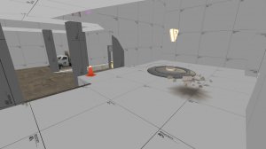
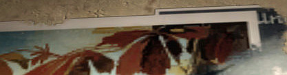
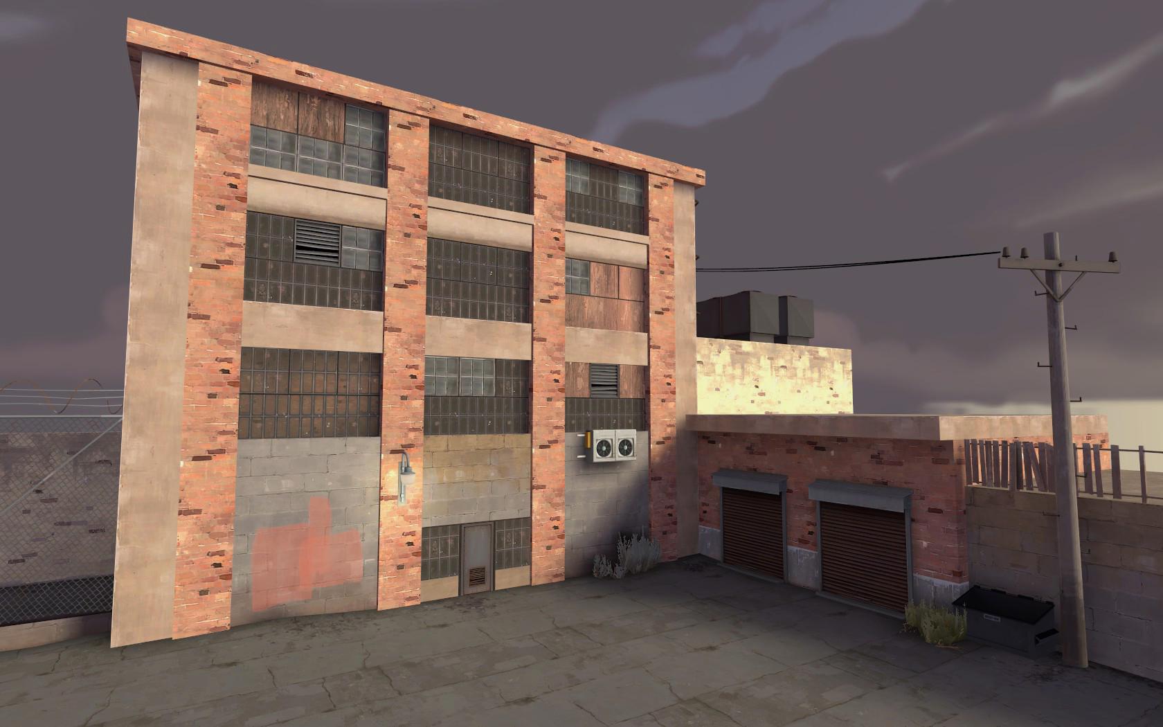
When creating a huge area behind the spawn as detail. Still needs more, but its a start.
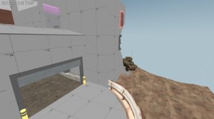
This for example needs something to indicate players they cant reach it.

Behind and below it needs some additional detail to make it appear like its more actively in use.
And this side spawn exit is somewhat done, that railing already is enough of an indication you cant jump off it. Prob will do the same to the other area.

From a place outside of the player bounds:

This for example needs something to indicate players they cant reach it.
Behind and below it needs some additional detail to make it appear like its more actively in use.
And this side spawn exit is somewhat done, that railing already is enough of an indication you cant jump off it. Prob will do the same to the other area.
From a place outside of the player bounds:
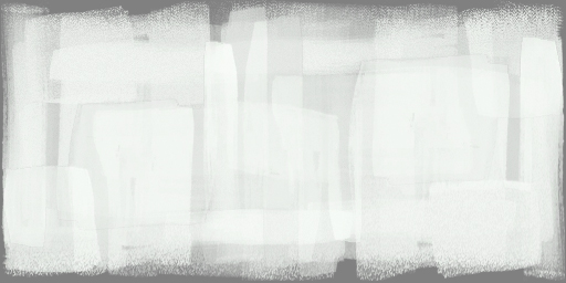
That actually looks pretty good. I think the text is a little bit too cartoony looking even for tf2, but I guess it's alright. Good job!I suck at making textures or in photoshop but I guess this is a good base?
So the idea is remaking the gameplay signs and some capture zones signs (A B C etc) like they are painted quickly over a wood board.
As I said I suck at this so if someone wants to do it for me and then release to public it will be... interesting.

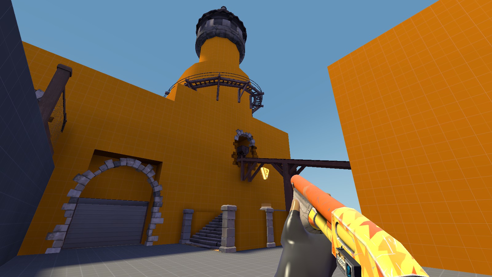
having that riveted steel around the windows looks weird, perhaps a differently colored concrete or wood insteadRemade the general layout of Thirst into an Attack/Defense Map

Playing with the Swamp theme, by which I mean, the swamp textures and skybox. Was it YM that noted that the Badlands lighting works with just about anything? Oh well, I can confirm that the Badlands lighting works with the swamp haze skybox
I'm having way too much fun sinking props into the ground
Currently leaning towards calling the map CP_Soma. You can tell I have faith in this map because I am putting some fucking effort towards the brushwork. Current concerns include the fact it is half the width of Gorge
Aiming towards having a working prototype of point A done by the next gameday, although given the reception Thirst got, a half abandoned Imp may be more appropriate. Haha! Some self deprecating humor for you


riveted steel only really looks good on floors, and even then mostly floors deep within the base or spawnroom
So its done, after a lot of work and with some help from ekscelle.dll I made this... thing.


Ingame TF2 fucked up the wood board textures, sad time.
Also I suck at texturing and its also really painful, just gonna leave the idea RIGHT HERE, and see if someone grabs it and complete the pack.
Im done with texturing.
Forever.
Hey, that came out pretty good! I'd do some smoothing around the edges of the alpha to remove the white border though.
And don't give up texturing, the more you get used to it the faster you'll be.
That's not how you remove the white. You remove the white by literally making it red instead. Making the fully transparent part of a texture a different color from the rest will ALWAYS result in color bleed.I'd do some smoothing around the edges of the alpha to remove the white border though.
Maybe put the resupply texture on an existing model? Like the wooden A sign? (or ask MaccyF if hell help you with that)So its done, after a lot of work and with some help from ekscelle.dll I made this... thing.
Ingame TF2 fucked up the wood board textures, sad time.
Also I suck at texturing and its also really painful, just gonna leave the idea RIGHT HERE, and see if someone grabs it and complete the pack.
Im done with texturing.
Forever.

So its done, after a lot of work and with some help from ekscelle.dll I made this... thing.
Ingame TF2 fucked up the wood board textures, sad time.
Also I suck at texturing and its also really painful, just gonna leave the idea RIGHT HERE, and see if someone grabs it and complete the pack.
Im done with texturing.
Forever.
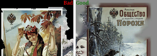
I think the main issue with the image really is that TF2's style is based more on square brushes and you've used a rounded circular brush which'll make it look odd. If you did it with a square brush I'm sure it'd look much more fitting.
Not only that, but it doesnt realy look like its painted on. Even with a circular brush you should clearly see the movement someone made. And part of this is that places where the brush starts and ends contains a bit more paint (less translucent).
To compare look at how valve did the painting on the mvm sign. I set an arrow next to most of the places that indicate its painted on.

Example things to look for are:
To compare look at how valve did the painting on the mvm sign. I set an arrow next to most of the places that indicate its painted on.
Example things to look for are:
- The brush only partialy touched the surface making it very translucent and often start thin (The EAD shows this)
- The brush is first fully set to the surface which makes the start or end thicker. (the U shows this)
- Overlapping of 2 strokes, sometimes even at some odd places (the middle of the H, top of E)
- Back and forward movement (well noticed on the R)
- Thinner and ticker areas (again that same place on the R shows it, but the Q does this alot aswel)
- Failure in doing smooth movement (The A and R at the end show this alot on the bottom right, the E shows this on the bottom by making a ~ movement)
- By rushing they already move to the start of the next char even though the previous one was incomplete (shown at the first A)
Nice work. Which texture did you go with for the top of the roof? Concrete?quick thing
Shogun
L6: Sharp Member
- Jan 31, 2014
- 260
- 220
Nice work. Which texture did you go with for the top of the roof? Concrete?
Yeah, it's just that normal concrete floor texture you see everywhere. The one in Badlands last point if you want an example.

That's pretty good. Could be better on a technical level:
Most of the texture space is wasted. Make it a 2:1 format. (256x128, 512x256)
All completely transparent parts of the image are white. This can, as I have mentioned a few posts ago, cause color bleed.
And it could be a bit bigger, but I'm guessing you made it smaller for posting purposes.
I modeled the size after the normal resupply sign found in the game. And what do you mean the transparent parts are white?
Ok, I mixed up white with black. But still:I modeled the size after the normal resupply sign found in the game. And what do you mean the transparent parts are white?

Jesus christ I said it causes color bleed when it's not the same color as the image.That's not what it looks like on my screen. And why would I want that to be red?
https://developer.valvesoftware.com/wiki/$translucent