WiP in WiP, post your screenshots!
- Thread starter Arhurt
- Start date
You are using an out of date browser. It may not display this or other websites correctly.
You should upgrade or use an alternative browser.
You should upgrade or use an alternative browser.
@Darren
@Tumbolisu
http://puu.sh/o08N1/2d613830af.vtf
I hope I got this right. GIMP is a b- with transparency.
@Tumbolisu
http://puu.sh/o08N1/2d613830af.vtf
I hope I got this right. GIMP is a b- with transparency.
Do you like brushwork crates? Well this is the map for you!
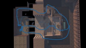
CP_Soma is technically working. No optimization, no clipping, Blue doesn't have a spawn room, but technically working. If I crammed I could probably get it presentable by the next gameday, but what with the April Fools gameday going on, I'm not completely sure there will be one, so I think I'll take my time
The point I have done I had originally intended to be Cap A, but it has turned out harder to assault than I intended so I may make it into Cap B.
Bot tests I ran showed Blue had great difficulty capping, but that probably had more to do with the fact that they spent more time tripping over geometry than they did fighting, so we'll see
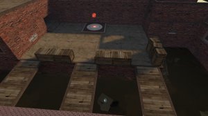
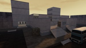
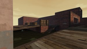
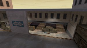
When designing the layout I tried to employ verticallity to do... something, I don't know, it's kind of a mess. The end product will probably bear only a passing resemblance to the map it is now
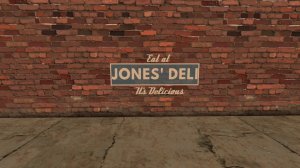
Plus, I whipped together my own Tag! Does this mean I'm in the club now?
CP_Soma is technically working. No optimization, no clipping, Blue doesn't have a spawn room, but technically working. If I crammed I could probably get it presentable by the next gameday, but what with the April Fools gameday going on, I'm not completely sure there will be one, so I think I'll take my time
The point I have done I had originally intended to be Cap A, but it has turned out harder to assault than I intended so I may make it into Cap B.
Bot tests I ran showed Blue had great difficulty capping, but that probably had more to do with the fact that they spent more time tripping over geometry than they did fighting, so we'll see


When designing the layout I tried to employ verticallity to do... something, I don't know, it's kind of a mess. The end product will probably bear only a passing resemblance to the map it is now

Plus, I whipped together my own Tag! Does this mean I'm in the club now?

Does this mean I'm in the club now?
One could go so far as to say you're in the club sandwich.
One could go so far as to say you're in the club sandwich.
Daaw, I wanted to be a Roast Beef
Popo
L1: Registered
- Jun 13, 2009
- 43
- 29
You are the roast beef! You're in the club sandwich after all.Daaw, I wanted to be a Roast Beef
Jokes aside, I believe I have fixed my leaks once and for all. But I got a new monitor so I'm not sure if it's too bright! Could anyone take a look for me?

Attachments
Spent a bunch of the day starting detail (mostly displacing) of the B point of Rebirth (cos I'm happy enough with that bit), and some other big gameplay changes on A and C. Tryna go for a whole fairytale forest vibe (big mushrooms and bright trees and junk)


I've not touched lighting at all or props much but I wanna get some of that in there. Buildings next, yay (then maybe 3D sky? not sure if I should do that if the other bits of the map are pretty alpha still)


I've not touched lighting at all or props much but I wanna get some of that in there. Buildings next, yay (then maybe 3D sky? not sure if I should do that if the other bits of the map are pretty alpha still)
My entry to the intel room contest
(my first post here I hope I didn't break any rules)
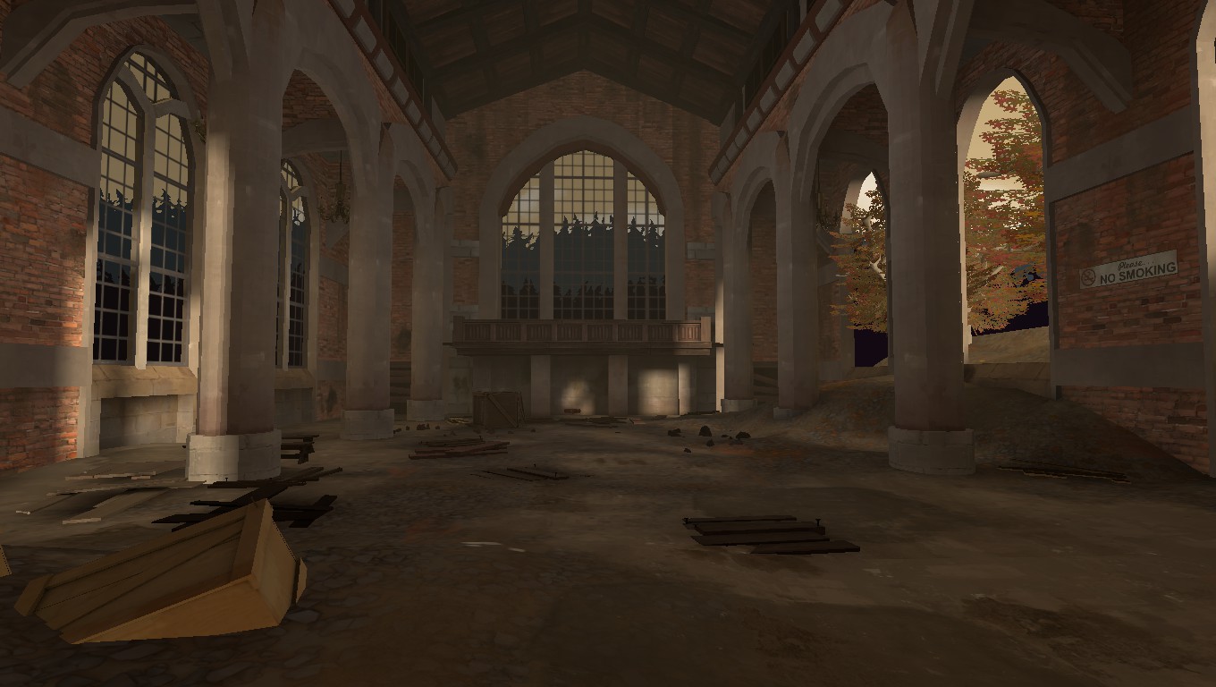
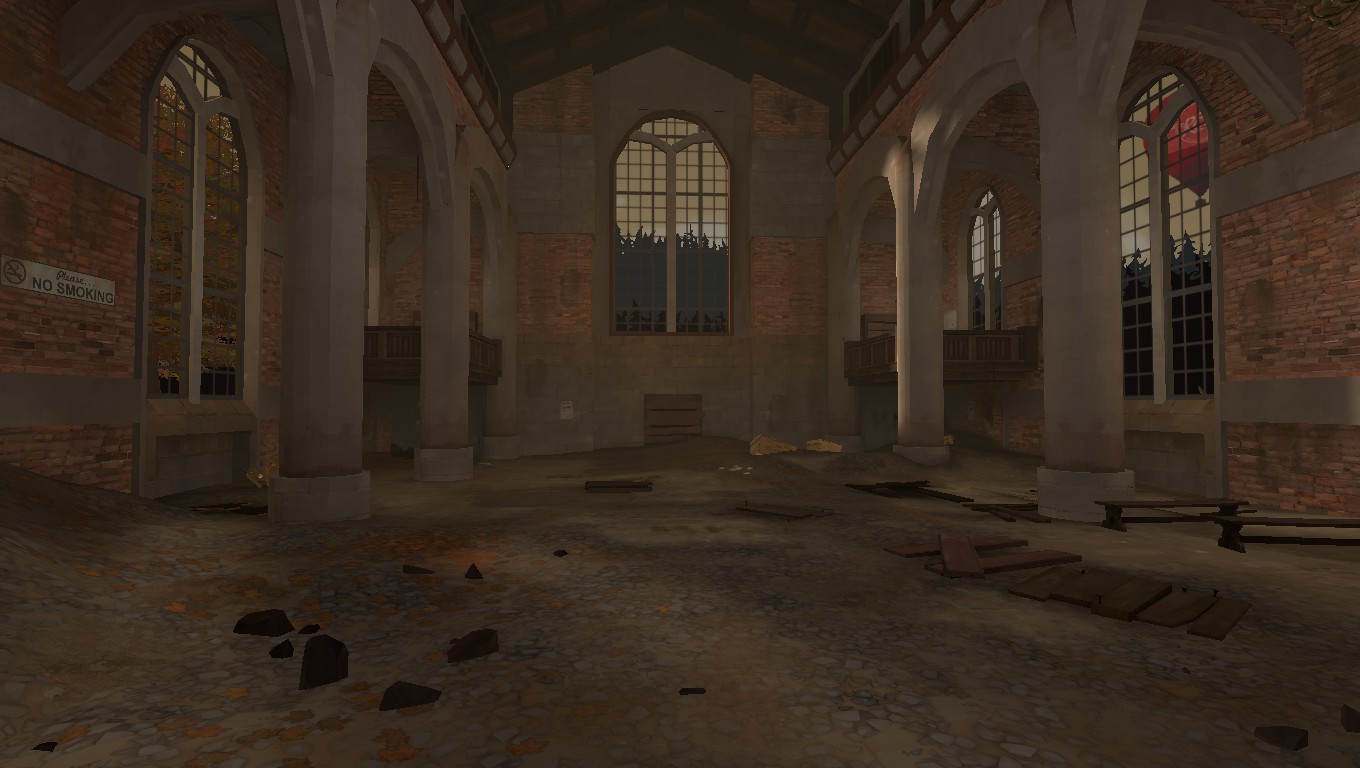
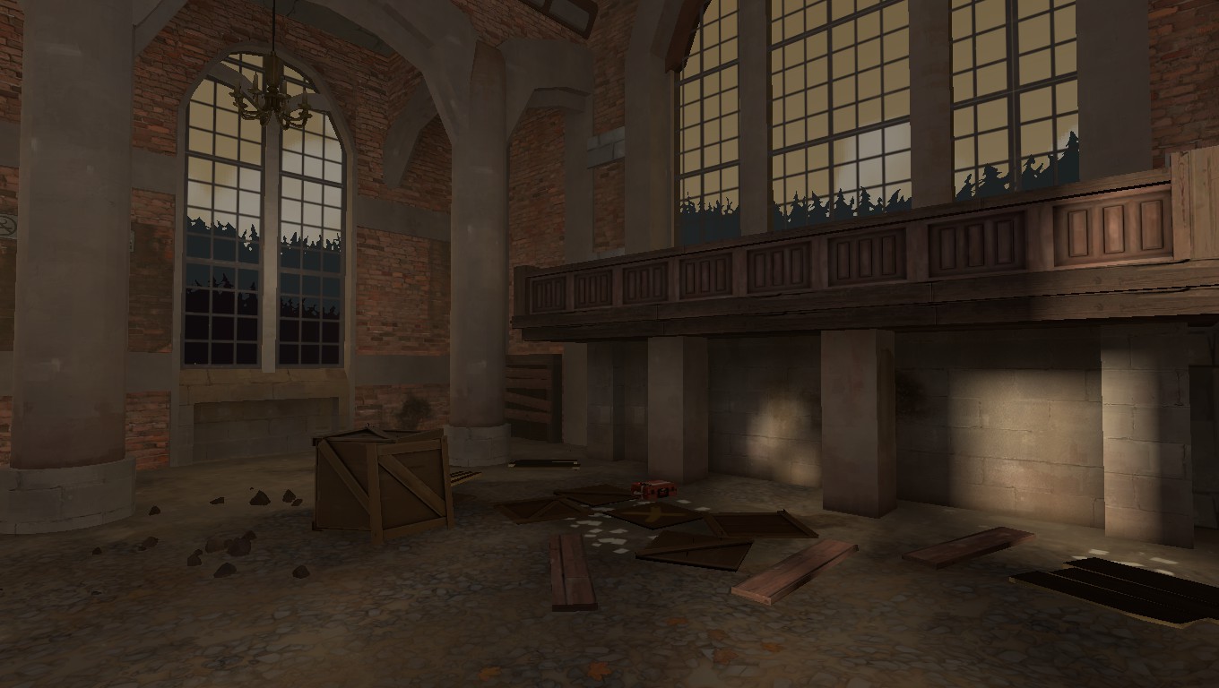
This is awesome. I think you should turn up your lightmaps in general to catch the shadows better, but what I really think you should do is set up your lighting so that one of those nicely shaped windows casts a long shadow on the floor, use brush work or blocklights and a high lightmap power so you get a really crisp shadow of the shape of the window spread onto the floor to really show off the architecture. I also think that scene would just love some god rays and dust motes too but that might be overdoing it heh
I really hope it plays as well as looksI dont know if its bad form to post pics from an existing thread but here is my baby, first version of my first Tf2 map
I think I won't even try to finish my entry after seeing other's work.
But still doing pl map
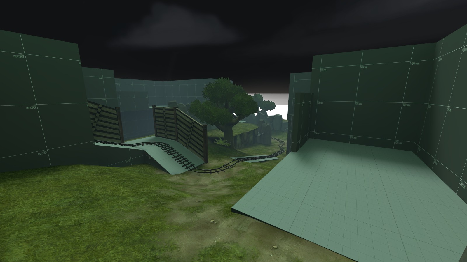
That lighting looks really green so much that it's a bit jarring. If I were you I'd perhaps turn that down a bit.


