WiP in WiP, post your screenshots!
- Thread starter Arhurt
- Start date
You are using an out of date browser. It may not display this or other websites correctly.
You should upgrade or use an alternative browser.
You should upgrade or use an alternative browser.
first post here
Jeez, what happened with all the green? It looks like someone put a filter on. It would be a lot less gassy looking and nicer without it. Everything else seems great.
Imo the yellow beams in first screenshot look weird. I really love the work with snow though.
Yeah Frozen mentioned that yesterday, I'm debating what to do because it looks super plain without anything there.
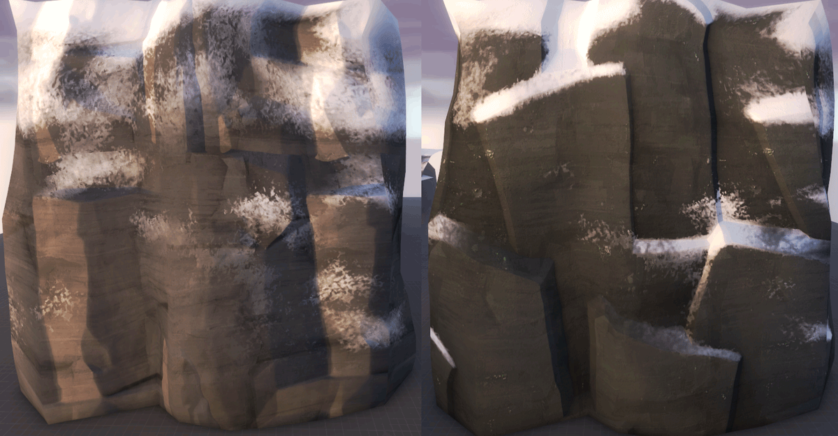
I didn't realize we even had a rock texture that could take snow that way. When did we get that?
I made it for snowplow, I hadn't planned on giving it out, but frozen went and gave everything out because I probably ok'd it when I wasn't thinking
tiling mesh:
comparison:

Aly was the one who told me to use it once it was available, even if Frozen hadn't released it I probably would have extracted it from Snowplow anyway (with your permission of course).I made it for snowplow, I hadn't planned on giving it out, but frozen went and gave everything out because I probably ok'd it when I wasn't thinking
It's a fantastic texture and I absolutely fucking adore it.
...I hadn't planned on giving it out, but frozen went and gave everything out because I probably ok'd it when I wasn't thinking...
<3
Kill_the_Bug
aa
- Oct 6, 2008
- 1,969
- 451
My alpha is getting closer to release - any help/ideas would be appreciated
Alpha as in first version of the map? What if something is wrong with the gameplay - you'll have to scrap a large chunk of the detailing you've already done - which is why a lot of people map in dev textures before going into detailing.
It looks really prop spammy, like you found some cool looking props in the model browser and tried to find an excuse to use them in a map - a big empty room map with powerful sightlines everywhere. I think the first screenshot area looks okay, but in the large open space of the next few screen shots looks not fun.
About the monitor - I would see how valve used it, they might have some special trick up their sleeve to get it to look proper.
Also what gamemode is this for?
Kill_the_Bug
aa
- Oct 6, 2008
- 1,969
- 451
Alpha as in first version of the map? What if something is wrong with the gameplay - you'll have to scrap a large chunk of the detailing you've already done - which is why a lot of people map in dev textures before going into detailing.
It looks really prop spammy, like you found some cool looking props in the model browser and tried to find an excuse to use them in a map - a big empty room map with powerful sightlines everywhere. I think the first screenshot area looks okay, but in the large open space of the next few screen shots looks not fun.
About the monitor - I would see how valve used it, they might have some special trick up their sleeve to get it to look proper.
Also what gamemode is this for?
I had the dev textures on until last night
Re: big empty room - yep have been having an issue with this - if it was outdoor setting maybe not that much of a problem but I wanted to allow jumping room for demo/soldier but it does leave me with sightline issues. I have been thinking of putting in a couple more glass walls (with roofs) on the balconies but am concerned with sentry guns being able to lock down a tunnel.
Know the name of a valve map where it's been used? I can't think of any off the top of my head.
Re: Gamemode - it's the modified payload / payload race I've been working on. Blue will push two carts at the same time - 1 to reactor core A and one to reactor core B. When the carts get to their final cap points the shield rotator will stop and fall away and then the electrics effects start up showing the overload. Both Carts will also become disabled and the third cart in behind the blue doors (which open up) will become active. Blue will then push this cart into the center cap point to end the round
Last edited:
Messing around.
-snip-
Holy shit it looks really good in the Pyroland theme.
RubbishyUser
L7: Fancy Member
- Feb 17, 2013
- 414
- 488
Those who are technologically inclined: How does Pyrovision actually work when it comes to map appearance? Is Pyrovision something we could work into custom maps?
Those who are technologically inclined: How does Pyrovision actually work when it comes to map appearance? Is Pyrovision something we could work into custom maps?
Its a shader applied to textures, you can add textures but its a very timely thing to do and is only local so you cant pack it in with the map (I think anyway as it replaces cfg files)
there is a wiki page here https://developer.valvesoftware.com/wiki/Pyro_vision


