WiP in WiP, post your screenshots!
- Thread starter Arhurt
- Start date
You are using an out of date browser. It may not display this or other websites correctly.
You should upgrade or use an alternative browser.
You should upgrade or use an alternative browser.
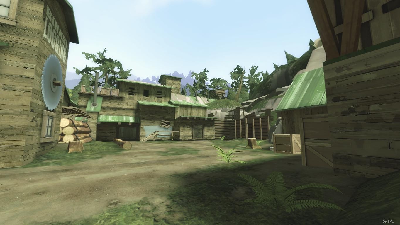
Your architecture looks really cool!
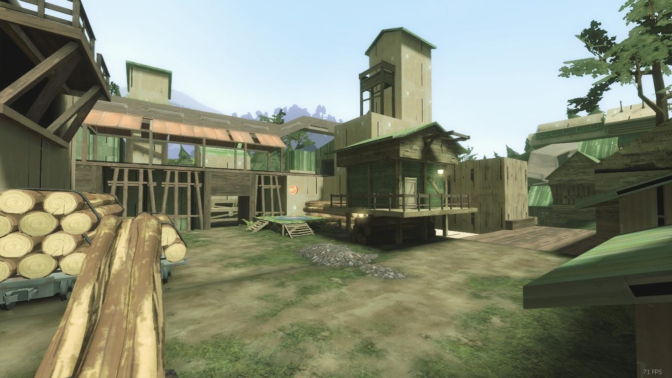
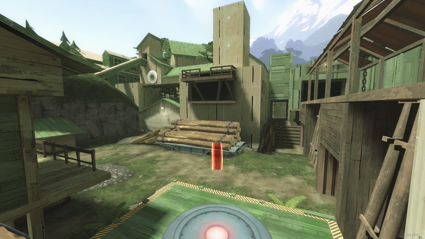
However, the 2nd and 3rd picture points look REALLY DULL. The area's flat, and the points aren't the focus. Maybe see if you can spice up those areas gameplay wise, give the points the attention!
Also, I feel like the colour pallete of the map is a little bit too green. Maybe try for some more constrasting colors. Side-recognition is very hard at the moment.
Is this an A/D map or a 5CP like thing?
Last edited:
MacRipley
L4: Comfortable Member
- Jan 15, 2015
- 156
- 293
This is A/D, and yeah i might tone down the cc it currently has. alot of the aesthetic stuff is still under development since im more focused on getting the paths and gameplay down. you can even see the respawn rooms dont have doors yet, and a lot of parts are lacking lighting too.
also there are custom sky cards
also there are custom sky cards
takabuschik
aa
- Apr 14, 2013
- 662
- 344
I like the look of thgreeeeeeeeeeeeeeeeeeeeeeeeeeeeenfirst post here
-snip-
Lampenpam
aa
- Mar 23, 2013
- 1,013
- 347
This really feels like mountainlab. The setting, the lighting, a very thin ramp and some details like the tank at the ceiling.
I like it since mountainlab is one of my favorite maps ^^
You might want to use advanced lighting settings to make the trees look better
I like it since mountainlab is one of my favorite maps ^^
You might want to use advanced lighting settings to make the trees look better
What a first post!
You've got some texture misalignment on some beams in the first image, I'm not sure about the sunken shipping container, that must be pretty squishy ground.
That retaining wall texture bottom left of screenshot #2 has some janky split going on and the beams along the mann co building have misaligned textures too.
Third SS has that brick building, it's ok, but it just looks off for some reason. Maybe add some brick beams or chamfer the edges so they're not too sharp?
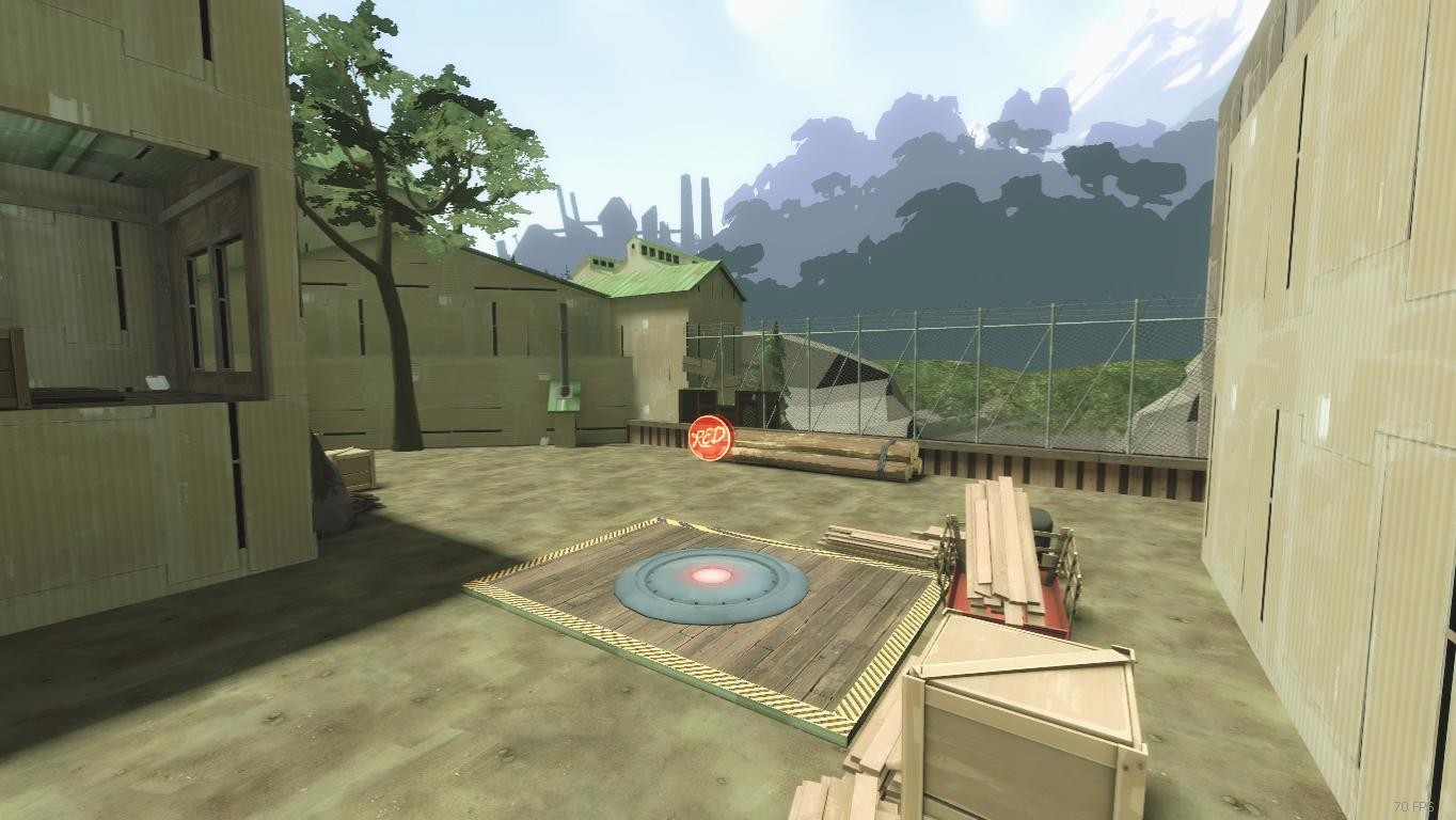
Nothing to nitpick on in the final shot, all looks great.
D
Deleted member 20029
@up thanks for feedback, i will work on it 
Shame the tank wasnt my idea. Im pretty sure i saw it on some other custom map.
Shame the tank wasnt my idea. Im pretty sure i saw it on some other custom map.
D
Deleted member 20029
Since i sometimes get stuck on detailing, i often run around maps admiring details. I didnt copy/paste it, but memorized it  I will have to change it if its part of official map though. At least to the point where it doesnt scream mountainlab when you look at it.
However, the map is influenced by mountainlab and im not trying to hide it.
However, the map is influenced by mountainlab and im not trying to hide it.
Last edited by a moderator:


