WiP in WiP, post your screenshots!
- Thread starter Arhurt
- Start date
You are using an out of date browser. It may not display this or other websites correctly.
You should upgrade or use an alternative browser.
You should upgrade or use an alternative browser.
*Pictures*
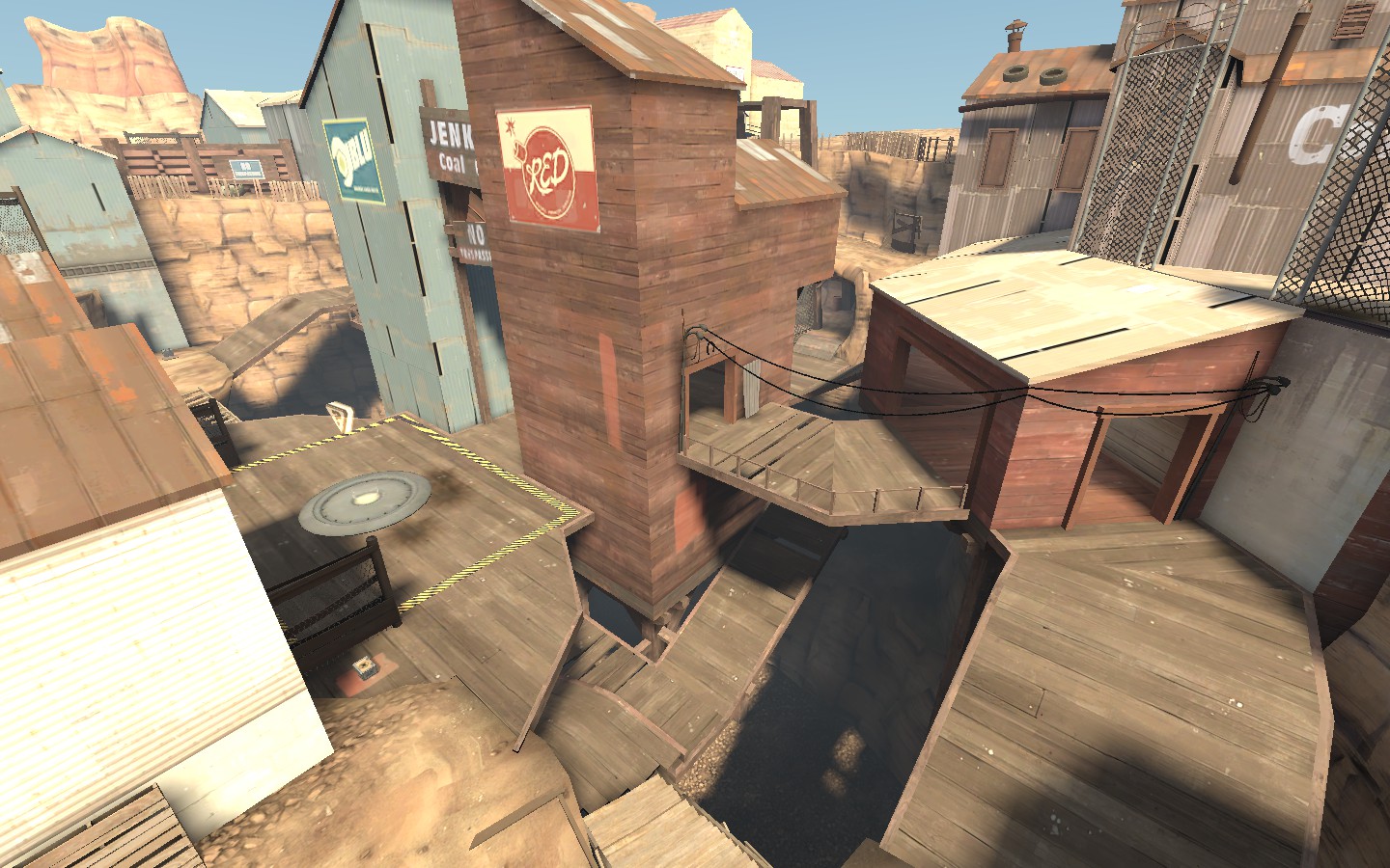
Wow, the color is great and the light compliments some of the textures you picked. Makes the space more cold in contrast but I think it looks pretty good. Nice job.
Nets Rebma
L1: Registered
- Nov 21, 2012
- 4
- 8
Sel
Banned
- Feb 18, 2009
- 1,239
- 2,570
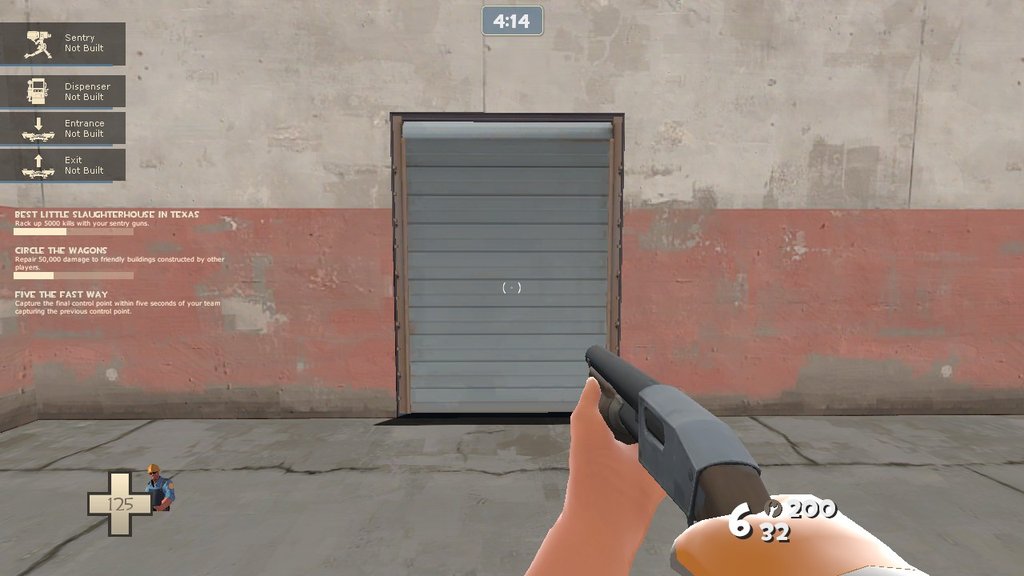
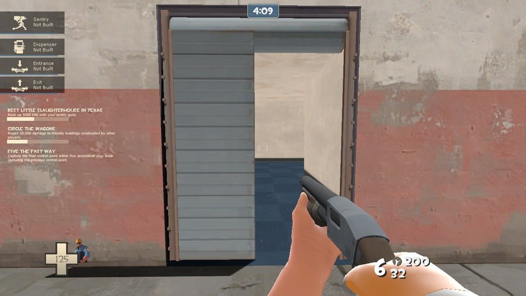
Alternately, it might be due to a mix of world brushes and func_details, which are specifically designed to never match up no matter what you do.
Ah interesting, the ones in spawn are both continuous func_details, but the ones in the main room have smoothing groups which extend back to the world. Thanks.
also yeah I'll fix those stairs when I figure out what to do with them!
So many amazing wips here *_*
I wish to be that good
practice
Last edited:
Nets Rebma
L1: Registered
- Nov 21, 2012
- 4
- 8
- Jul 31, 2011
- 872
- 1,021
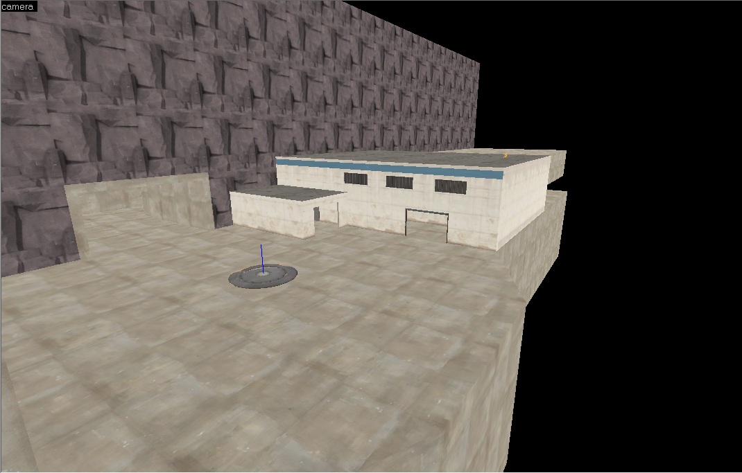
A map which I was working on. Updated it some time ago. koth_warebiltz
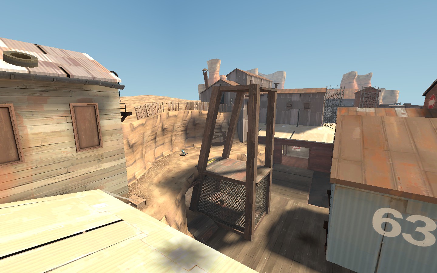
That looks insanely overscaled. Those flat areas are enormous.
WolfKit
L3: Member
- Jun 26, 2012
- 128
- 83
T
The Asylum
fully working scoreboard to help with my custom game-mode..
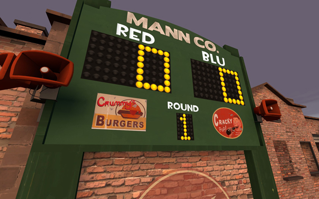
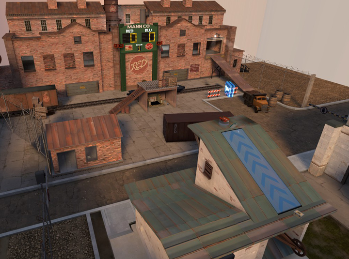
whatever this is
I FUCKING WANT IT

lol, i'll share the scoreboard textures once I get a little farther.
So...after I put that scoreboard up against the brick it reminded me of some older sports stadiums. I've basically scrapped the previous yard and making a new type of 'yard' around this theme. It's not going to have a massive open area it's kind of a mini football stadium, but the stands provide some nice ramps and it seems to be coming together better. It's already a lot more fun with bots!
So...after I put that scoreboard up against the brick it reminded me of some older sports stadiums. I've basically scrapped the previous yard and making a new type of 'yard' around this theme. It's not going to have a massive open area it's kind of a mini football stadium, but the stands provide some nice ramps and it seems to be coming together better. It's already a lot more fun with bots!
Burnout6010
L5: Dapper Member
- Oct 14, 2012
- 207
- 67
Asylum approves of it.

I smell Jettan livestream announcement video


