WiP in WiP, post your screenshots!
- Thread starter Arhurt
- Start date
You are using an out of date browser. It may not display this or other websites correctly.
You should upgrade or use an alternative browser.
You should upgrade or use an alternative browser.


Selentic that's hideous, you can do better than that :/
The bricks below the arches should not be anything like that higgledy-piggledy, especially as the shading on that middle one is dead crisp down the centre edge, but the bricks are super round and anything but straight.
The tops of the arches should have some kind of central keystone also.
The bricks on the wall generally come out far too far from the other flat ones, it looks like someone's taken them out to put something behind them.
Why is there no proper seam between the edge of the arch bricks and the standard bricks between the arches? There should be the same level of creasing as all the other brick-brick joins.
The flat bit at the top of the bricks between the arches, run out of normal map rays?
Overall I think your bricks are too bloby and lack definition as well as being too far apart (look at the gaps in back wall, yuck!)
Sel
Banned
- Feb 18, 2009
- 1,239
- 2,570
Maybe in a few months. I haven't really tried to do environments built out of modular level pieces up until relatively recently, so it shouldn't really surprise you that I'm not too great at it yet ;pSelentic that's hideous, you can do better than that :/
The bricks below the arches should not be anything like that higgledy-piggledy, especially as the shading on that middle one is dead crisp down the centre edge, but the bricks are super round and anything but straight.
The bricks on the wall generally come out far too far from the other flat ones, it looks like someone's taken them out to put something behind them.
Overall I think your bricks are too bloby and lack definition as well as being too far apart (look at the gaps in back wall, yuck!)
Totally right.
Actually the first variation had this goofy 1/4 of a brick in that space, and I thought that looked silly so I deleted those and then forgot to do anything about that gap. I should have just moved them up to fill that area lol.The flat bit at the top of the bricks between the arches, run out of normal map rays?
I can not believe that this didn't occur to me at all. I knew that something about everything else was bothering me but this never even crossed my mind even though it should have been obvious.Why is there no proper seam between the edge of the arch bricks and the standard bricks between the arches? There should be the same level of creasing as all the other brick-brick joins.
Anyway, thanks, gonna start over tomorrow :3
Last edited:
Shanghai
aa
- Jan 8, 2011
- 397
- 393
Hey Sel, the reason those arches look off is because you're not vaulting them. In a room of repeating arches, there shouldn't be a flat roof.
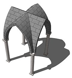
That's a groin vault, seen from the top. It's formed by extending the pointed arch, copying and rotating it 90 degrees so the two extended arches intersect, and cutting the seams at 45 degree angles to merge them. That pattern can then be tiled, as seen below.
Often, there is ribbing (those raised blocks) placed at the intersections of the arches for extra support and decoration.
Vaconcovat
L3: Member
- Jan 15, 2012
- 116
- 188


- Apr 14, 2009
- 819
- 1,217
*SMASH* *CRASH*
The cart falls through the floor just before it rolls into the furnace. That's about it.
You need to have particle effects for those Onomatopoeia


it looks like a bowling alley...
Well, that's cleared that up.
Karnage
L3: Member
- Mar 19, 2010
- 114
- 53
Hey guys, long time no post. Been slowly detailing this thing:


more here http://steamcommunity.com/id/explosivose/screenshots/
more here http://steamcommunity.com/id/explosivose/screenshots/
TheKieranator
L6: Sharp Member
- Mar 6, 2011
- 282
- 213
Vaconcovat
L3: Member
- Jan 15, 2012
- 116
- 188
You need to have particle effects for those Onomatopoeia
This. Someone tell me how to do this.
- Apr 29, 2008
- 1,068
- 709
