You are using an out of date browser. It may not display this or other websites correctly.
You should upgrade or use an alternative browser.
You should upgrade or use an alternative browser.
Hoplitejoe
cuz
- Jul 30, 2014
- 75
- 153
Minor thing that might be worth fixing to stop abuse: your red respawn signs are solid, worth dealing with just in case anyone decides to do some spawncamping.
I really enjoy this map, but I think there are still improvements to be made. What I see as the biggest issue with the map currently, is how easy it is for blu to cap B. The main cause of this is the fact that there isn't a single good spot to hold on B. Not only do you have to deal with people coming from Blu spawn, who already have an option to flank B from the far right route with the full ammo pack, people coming from D with the options of coming out from either side behind the point, and an A/B flank which lets you come to the point, get behind the point and get to the balcony behind the point, but you also have entrances into the water from the spawn side, A, and D, with exits from the water, again behind the point and on both sides.
With this, there is just no viable place to hold. Any place close to the point is flankable from so many places, you can't set up at all, and any places that feel holdable, such as the balcony over the point, is too far away from the point to stop it from being capped.
My personal recommendations on how to make the point holderable, would be to firstly remove the water. The water thing is already in D, and it just facilitates too many flanks on this point. I would give the A/B route only one exit, the one by the point. I would reduce the options coming from D, I guess to only the balcony side. Super good pictures to show this.
a10:
Modified the A-B connector so it can't come out behind B
Added a temporary-fix build uber area in blue spawn
Red respawn time when blue caps C increased
Consolodated B routes
Gave blue an opposite-height over C
Read the rest of this update entry...
Modified the A-B connector so it can't come out behind B
Added a temporary-fix build uber area in blue spawn
Red respawn time when blue caps C increased
Consolodated B routes
Gave blue an opposite-height over C
Read the rest of this update entry...
frozenpandaman
L1: Registered
- Jan 13, 2015
- 4
- 2
Love the concept – very cool. Seem to be missing some textures – most of the floor and walls just show as "reflectivity 50%" for me (screenshot). Any suggestions?
The last point being KOTH is super inventive – excited to see this map continue to evolve! Will continue to explore and see if I can offer any further comments. Love the hot water that hurts you, too (until you cap A, that is…!)
The last point being KOTH is super inventive – excited to see this map continue to evolve! Will continue to explore and see if I can offer any further comments. Love the hot water that hurts you, too (until you cap A, that is…!)
Last edited:
Seem to be missing some textures – most of the floor and walls just show as "reflectivity 50%" for me
Those reflectivity textures are called dev textures, they are usually what the mappers use as floors / walls / ceilings in their maps while they are still focusing on making the gameplay good. They are not missing textures, just Freyja has not artpassed (textured and added clutter props to) the map yet.
frozenpandaman
L1: Registered
- Jan 13, 2015
- 4
- 2
Those reflectivity textures are called dev textures, they are usually what the mappers use as floors / walls / ceilings in their maps while they are still focusing on making the gameplay good. They are not missing textures, just Freyja has not artpassed (textured and added clutter props to) the map yet.
Makes sense.
b1:
Artpass
Some stuff that I forgot because I've been detailing this for literally months
This is a beta release intended so I can start polish before the contest ends. It is not fully optimised, vis popping is very strong, and there is no HDR.
Read the rest of this update entry...
Artpass
Some stuff that I forgot because I've been detailing this for literally months
This is a beta release intended so I can start polish before the contest ends. It is not fully optimised, vis popping is very strong, and there is no HDR.
Read the rest of this update entry...
Last edited:
Uploading again because for some reason it didn't work the first time - same version of map
Read the rest of this update entry...
Read the rest of this update entry...
quick feedback
this is open all the time, allowing blu to see into red spawn, even when it's active
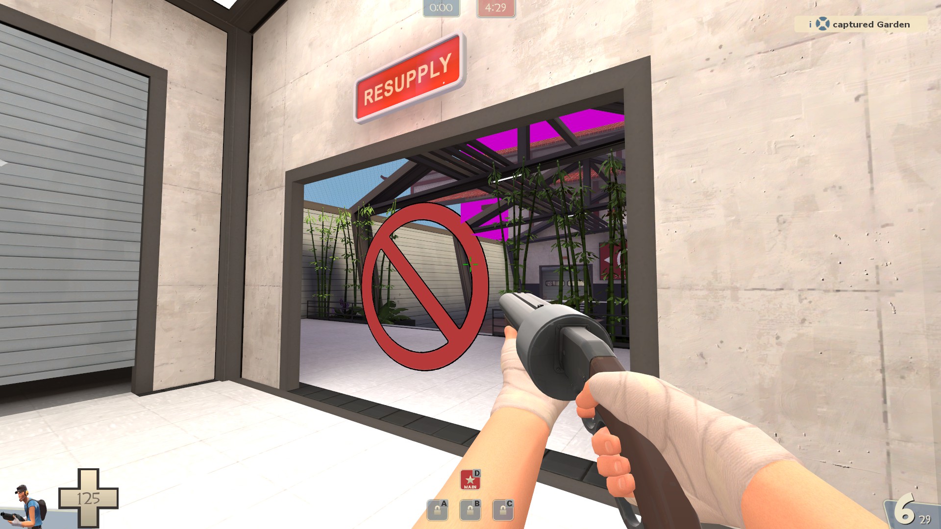
Extremely out of place bullet block on this, makes it hard to navigate and players will misjudge it
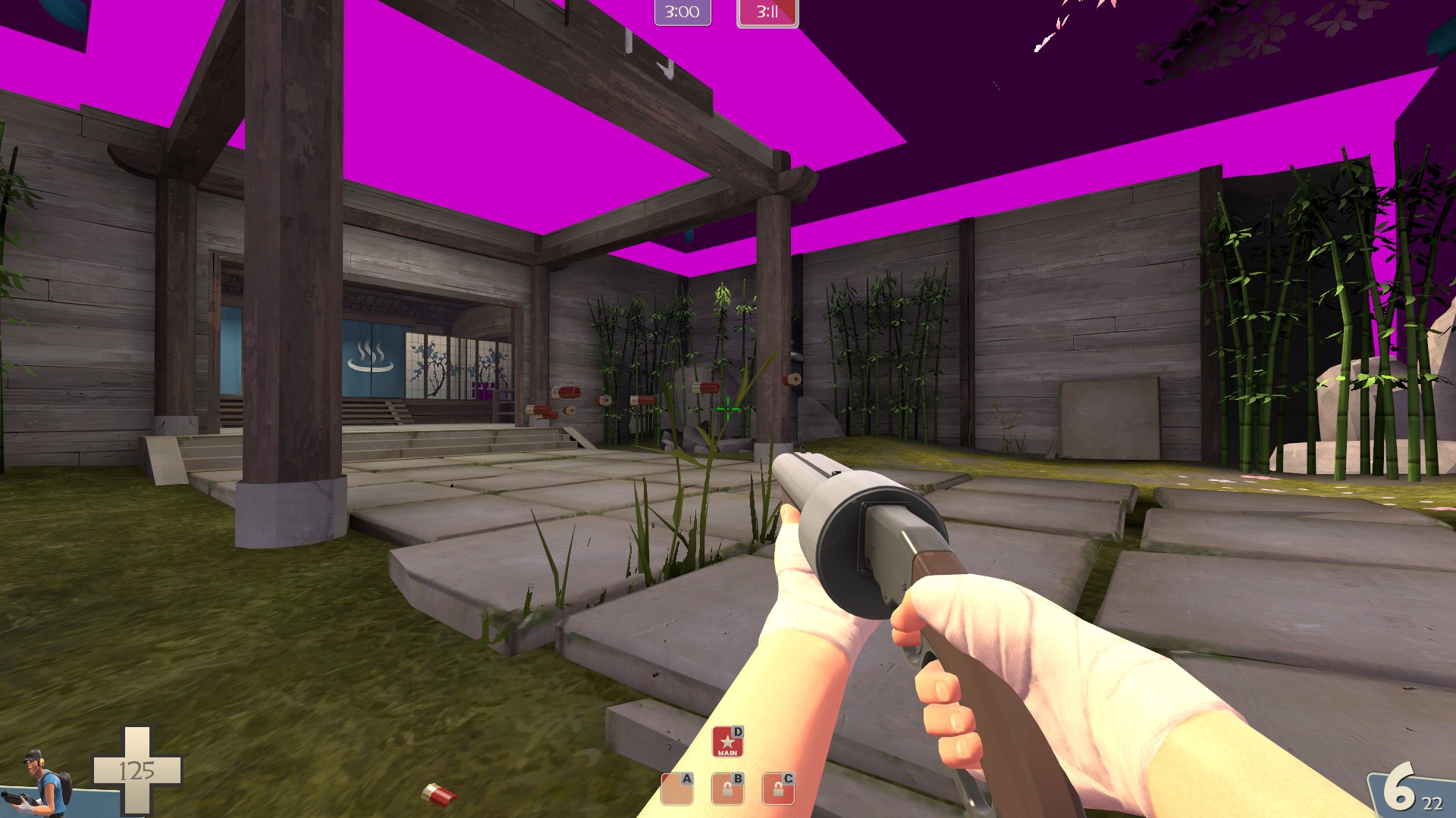
turn off the collision on these, they are cancer to walk into when trying to get into spawn
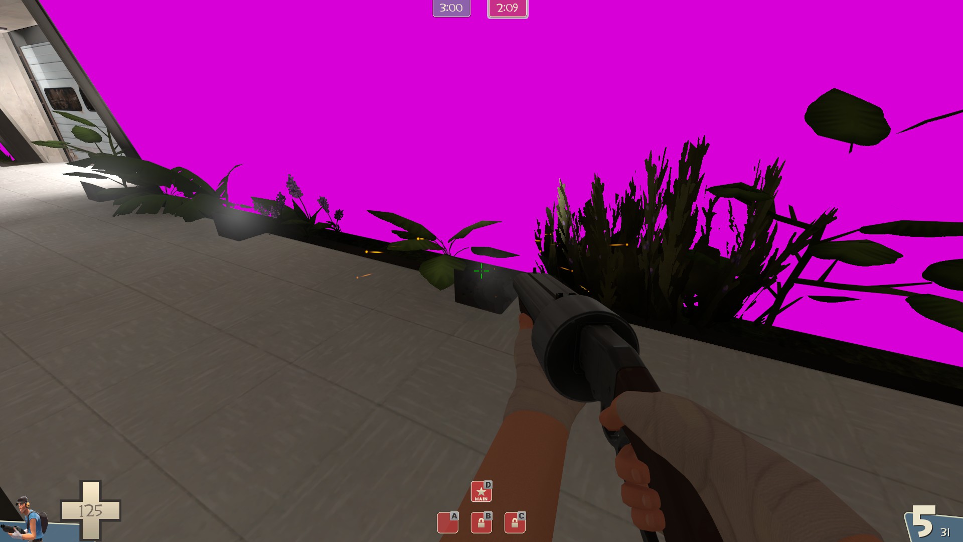
This is also cancer, right on the point
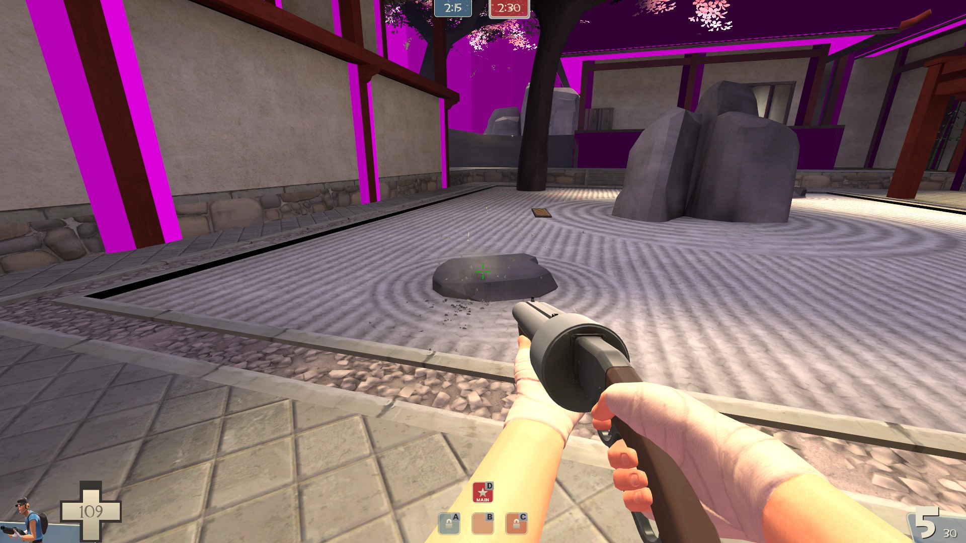
cut off building, looks terrible, easy fix
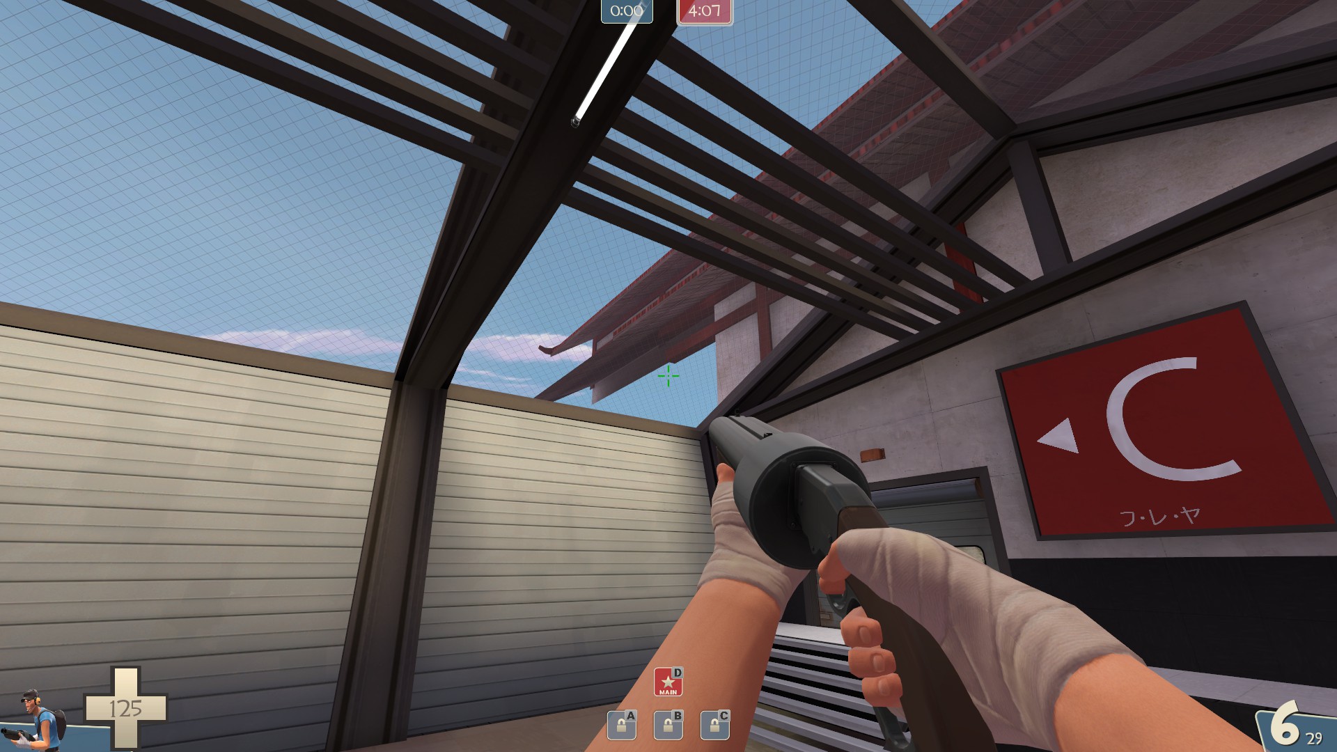
other than that.. i love it, looks fucking amazing.
this is open all the time, allowing blu to see into red spawn, even when it's active

Extremely out of place bullet block on this, makes it hard to navigate and players will misjudge it

turn off the collision on these, they are cancer to walk into when trying to get into spawn

This is also cancer, right on the point

cut off building, looks terrible, easy fix

other than that.. i love it, looks fucking amazing.
Hoplitejoe
cuz
- Jul 30, 2014
- 75
- 153
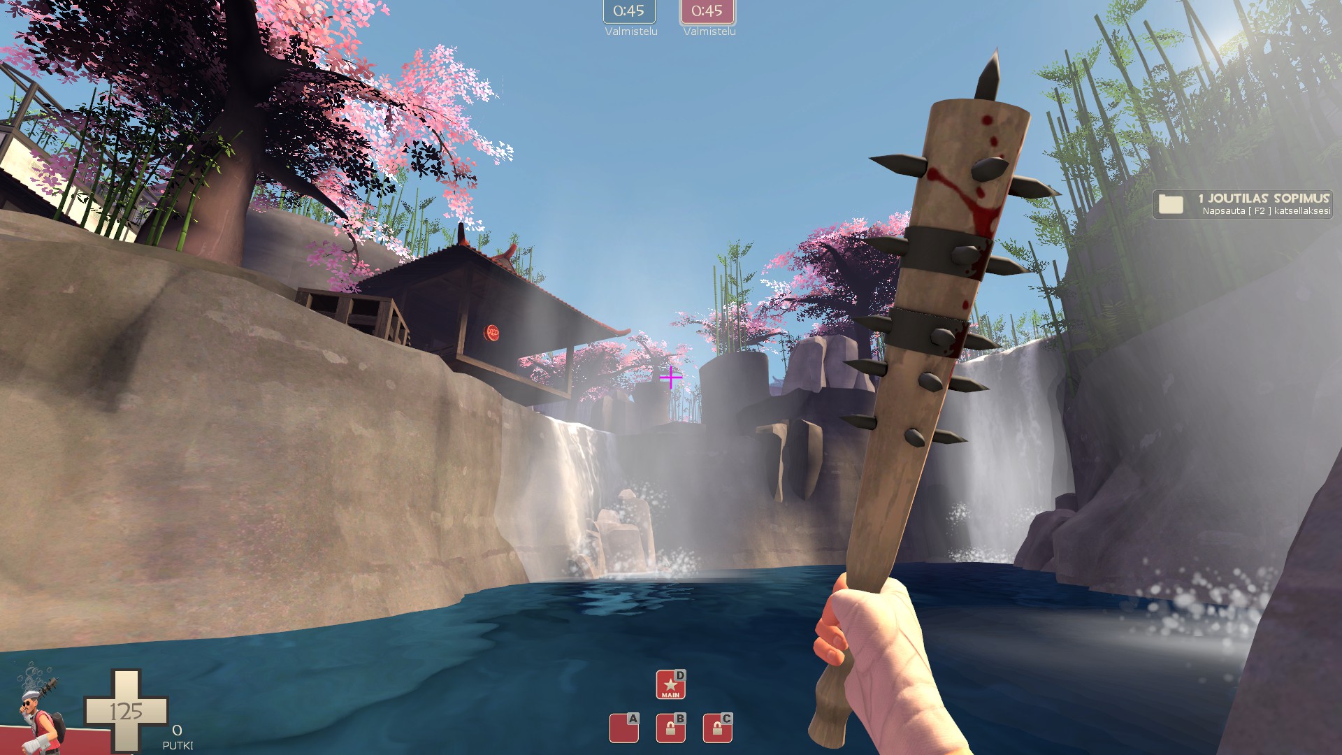
Water on B z-fights with stairs. Also there is no life on that water what makes it look weird (means that there is no growth)
E: added few
When walking up stairs here you can get stuck between steps and wall structure
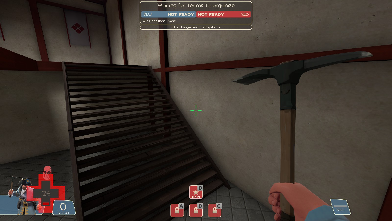
Bomboos aren't clipped
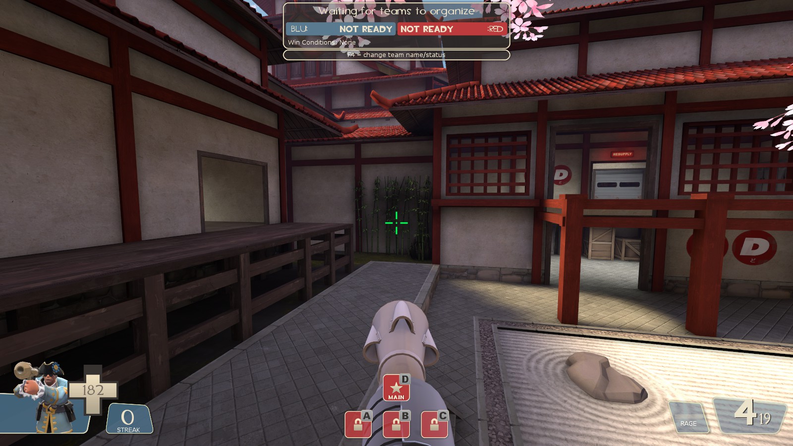
Needs clipping too
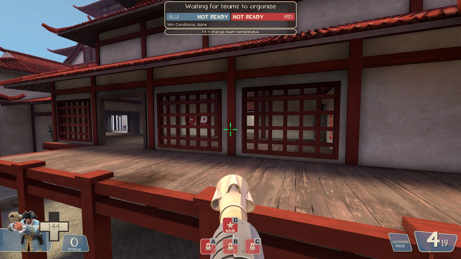
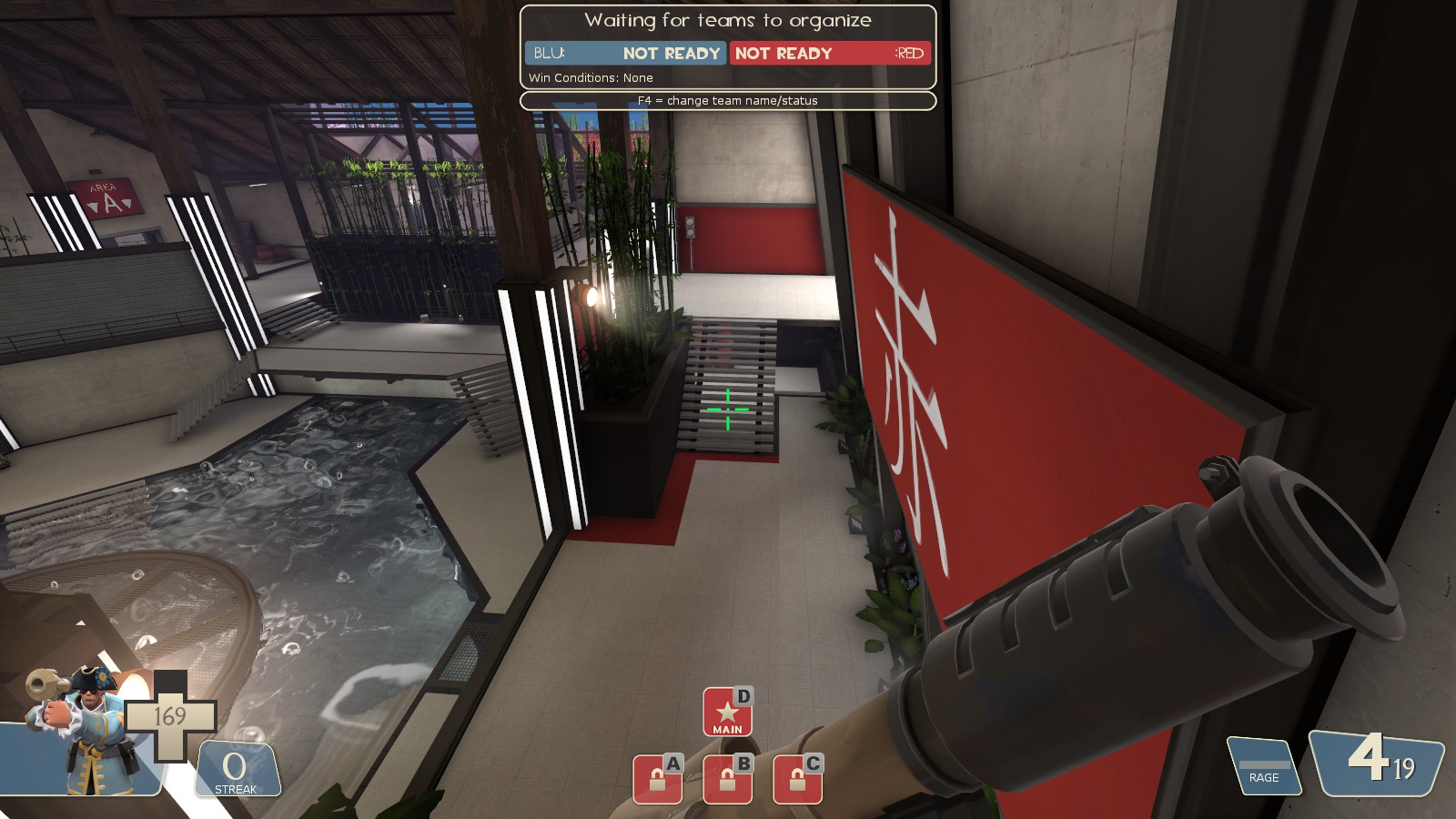
Can't walk to that rock, have to jump, clip stairs
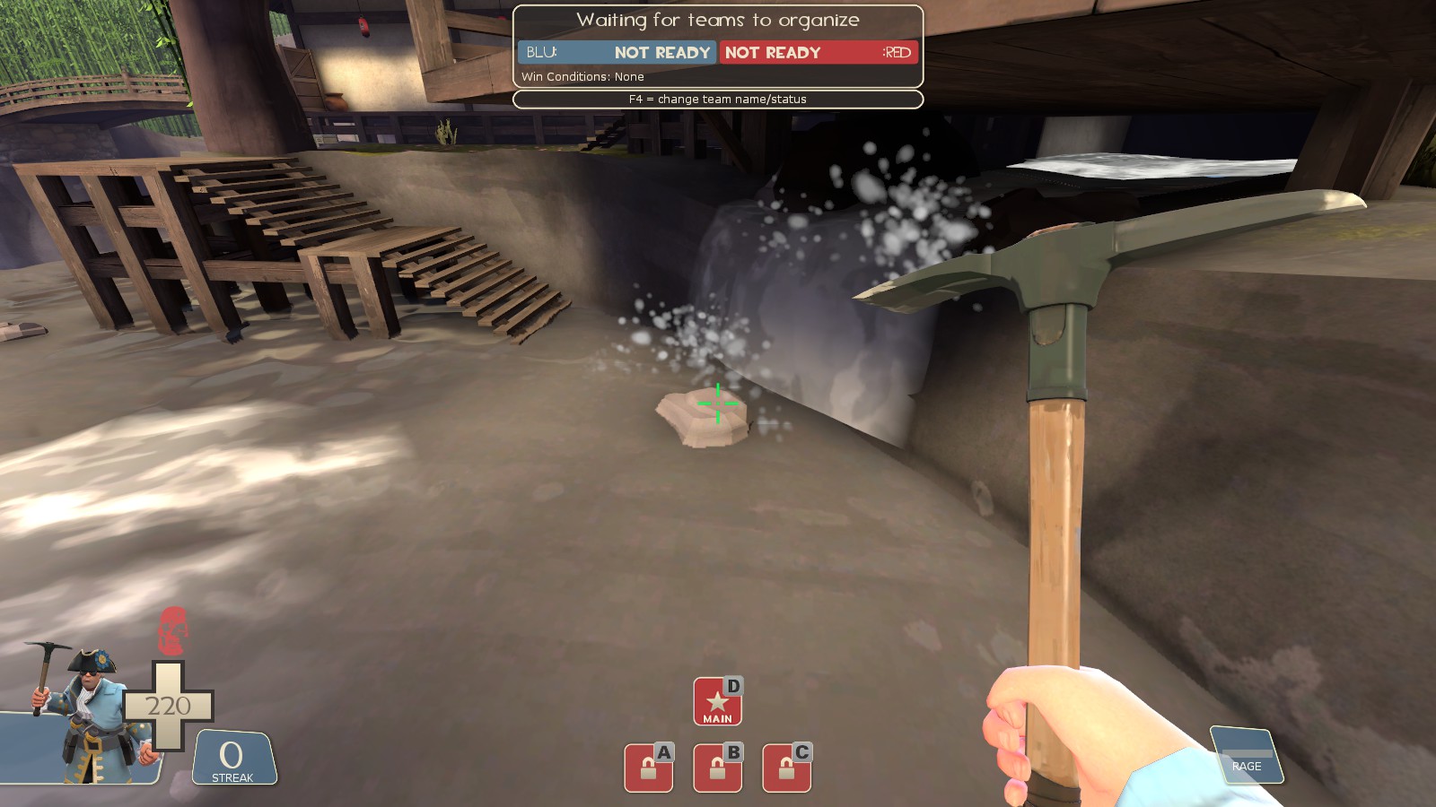 Water at two different levels, Valve devs can't handle this
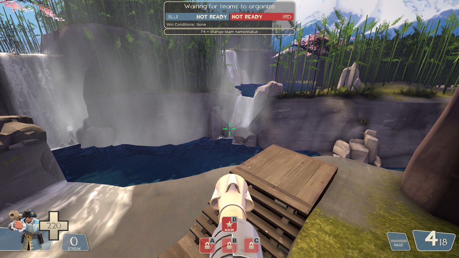 Stucked here (A, close to blu spawn on left)
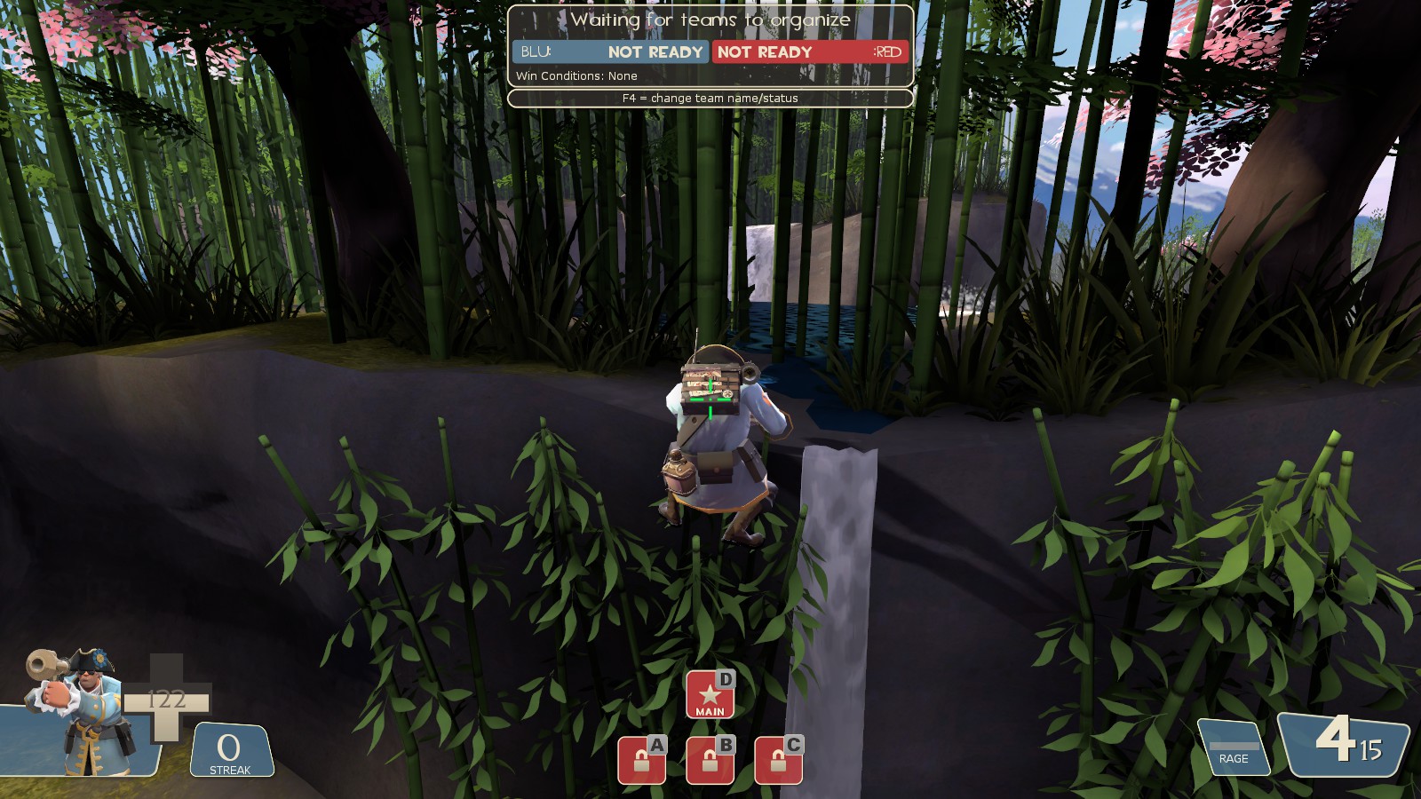 These things disappearer if I get too close (aka touch them)
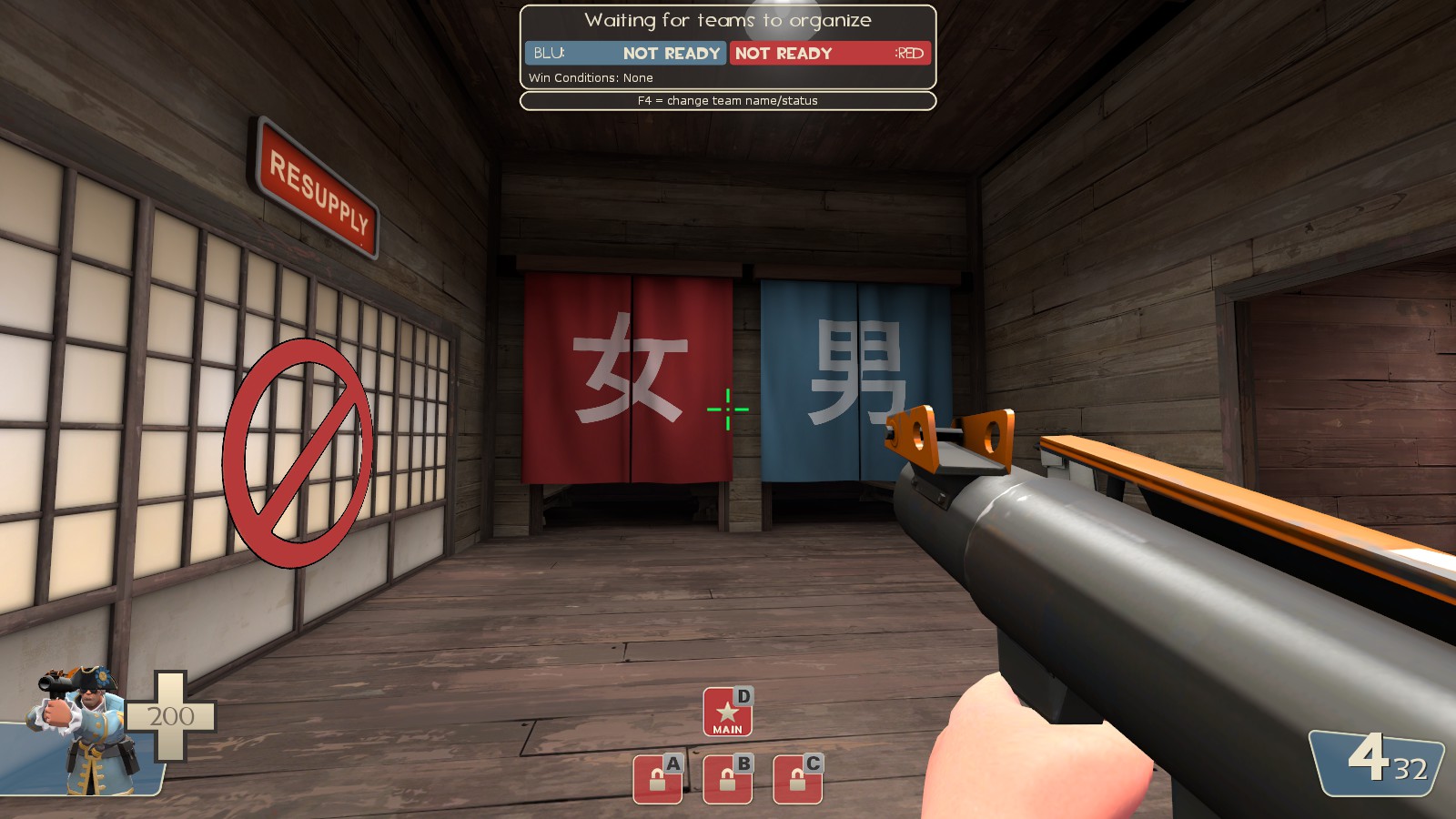
 Invisible wall
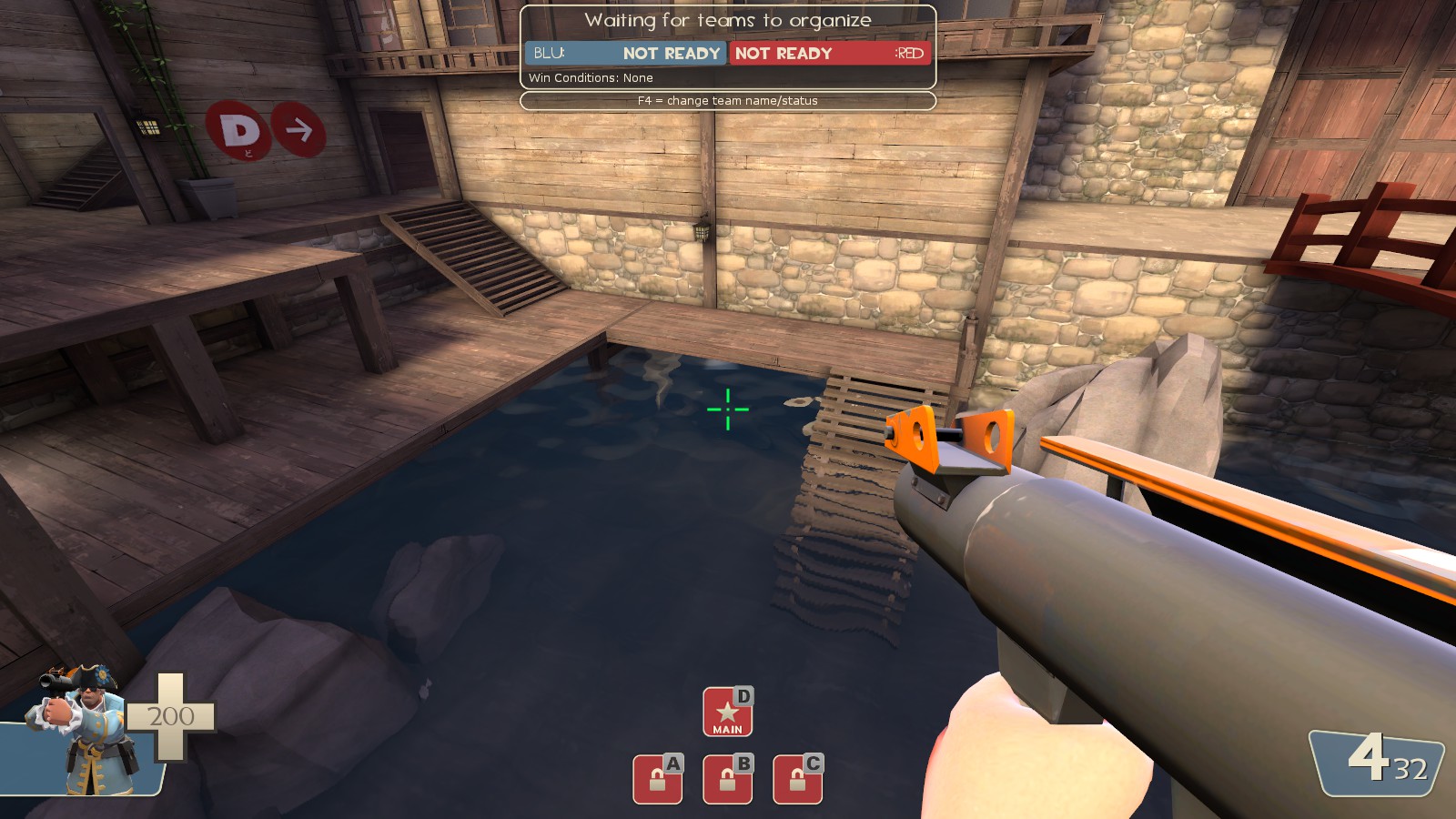
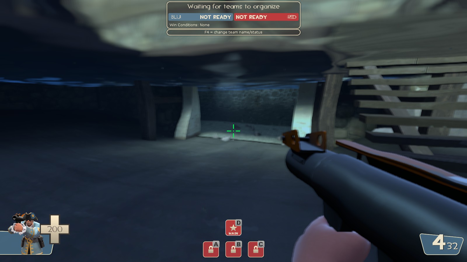

Bomboos aren't clipped

Needs clipping too


Can't walk to that rock, have to jump, clip stairs


E: added few
Last edited:
Hoplitejoe
cuz
- Jul 30, 2014
- 75
- 153
You can have water on 2 different levels with both being visible at the same time (as long as you can't swim between them) and it will work properly as long as it has cubemaps for reflections. When you start going into real-time reflections, then you have to proceed with caution.
Actually, all that blue colored water isn't even fully water. It lacks a bottom material. It's just a refractive texture scrolling along.
Furthermore, some feedback:
The waterfalls around A lack sound.
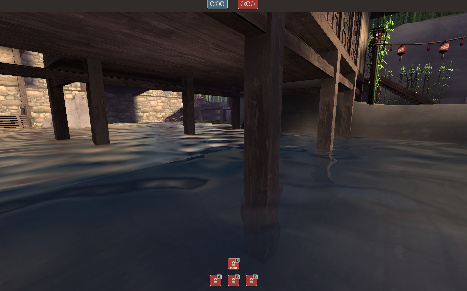
2 connecting water brushes that aren't the same size will produce nasty lines on the water.
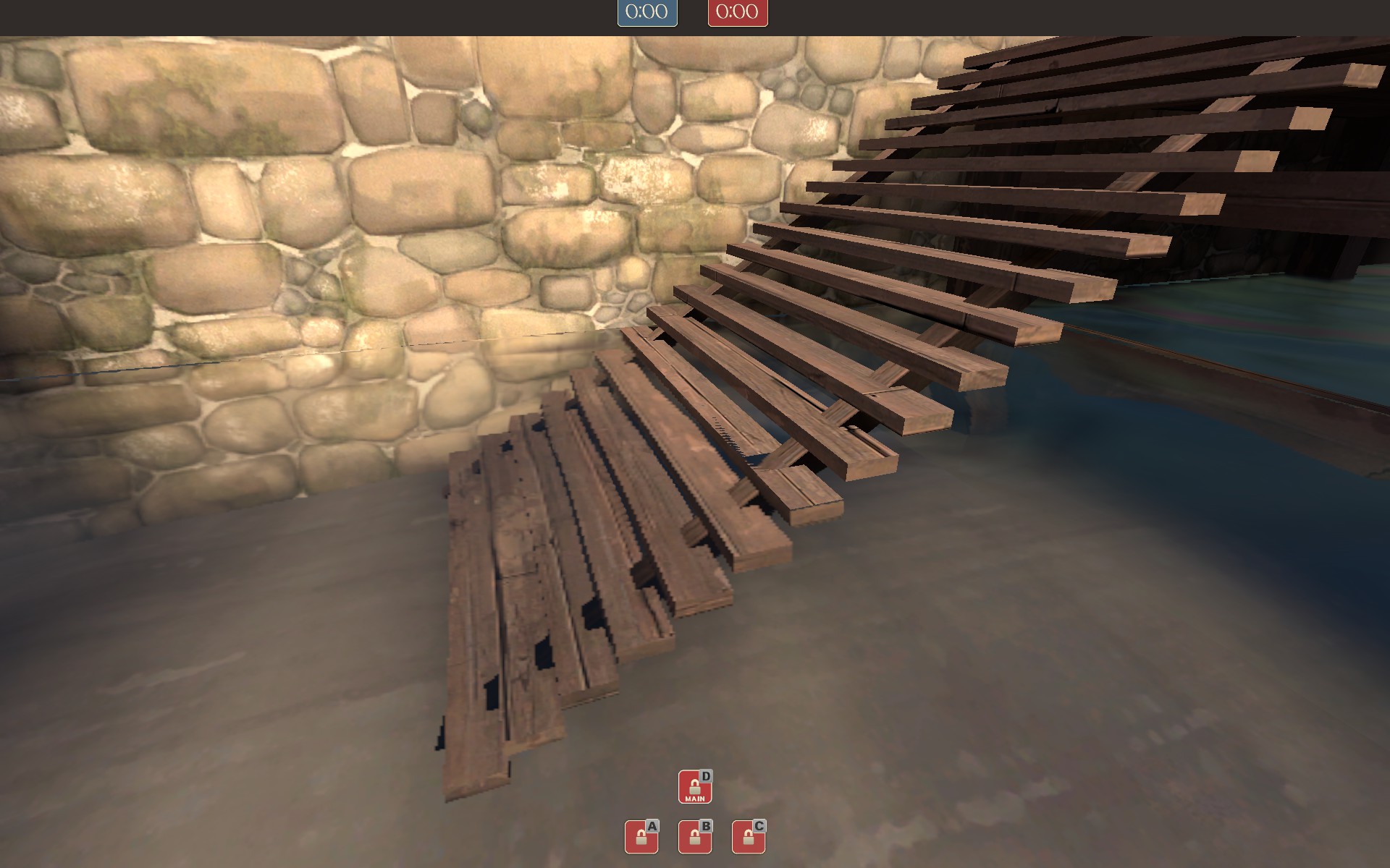
Z-fighting on the stairs and the water. Also, in the top right corner, same as before: 2 connecting water brushes that aren't the same size.
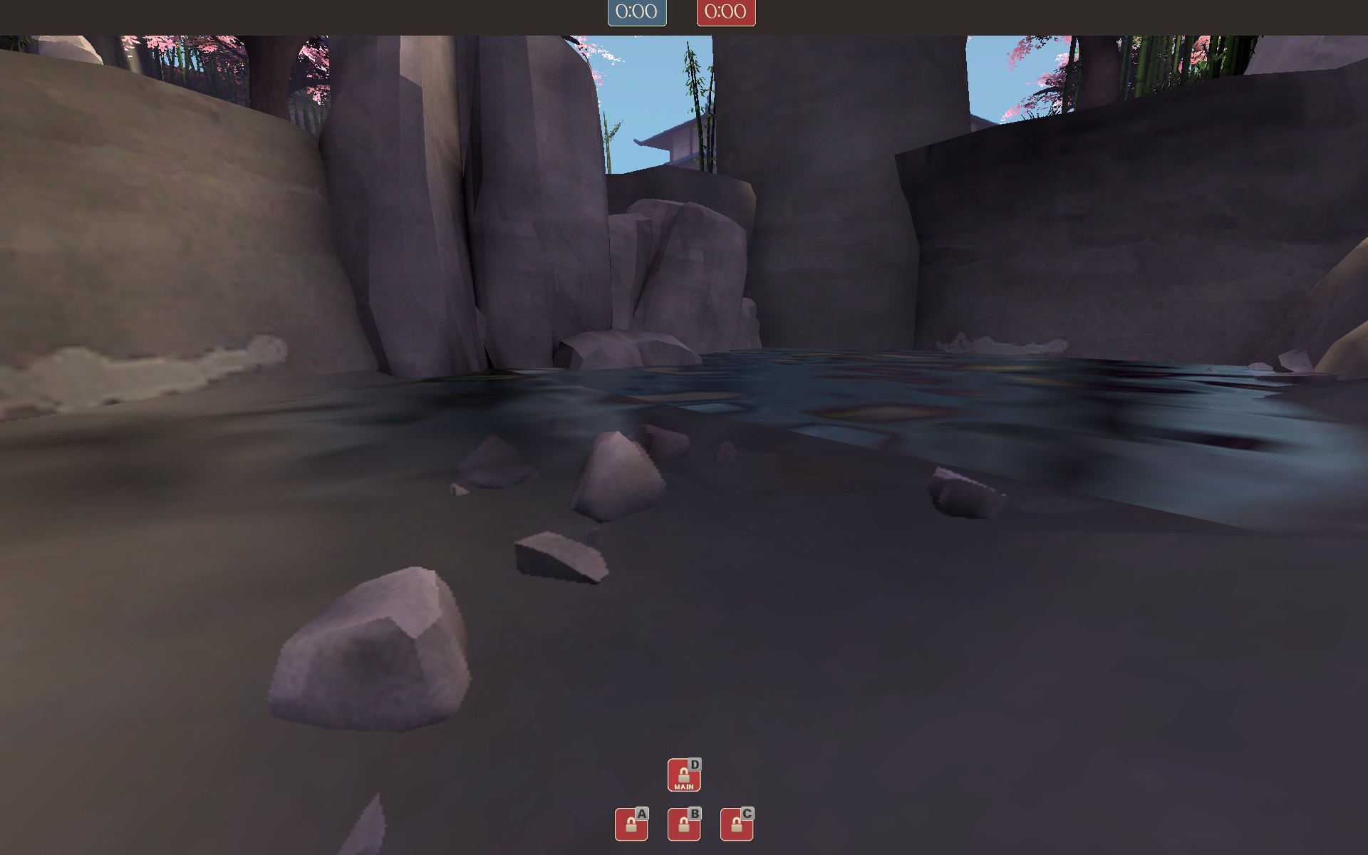
Same here.
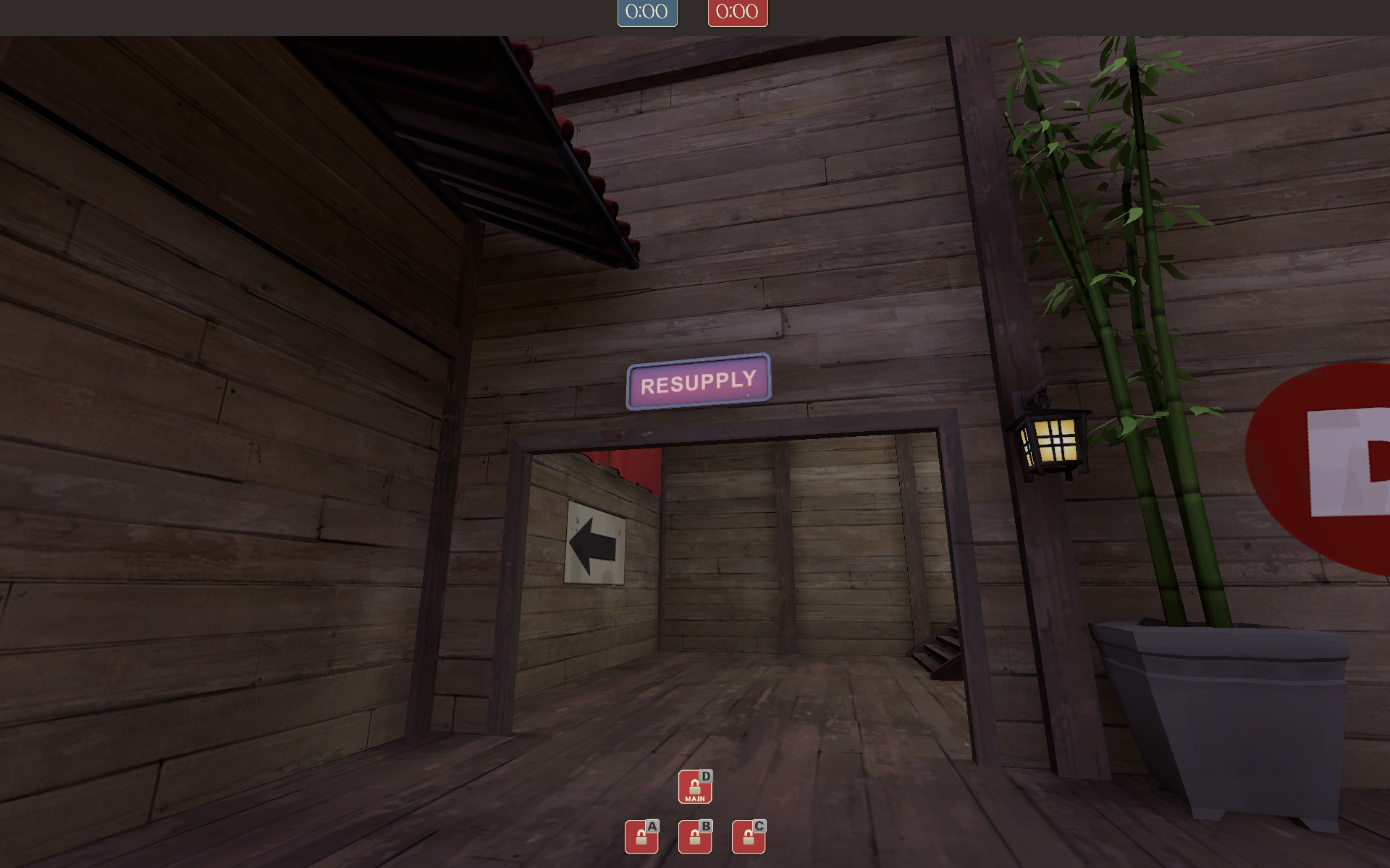
Funky reflection on resupply sign.
Actually, all that blue colored water isn't even fully water. It lacks a bottom material. It's just a refractive texture scrolling along.
Furthermore, some feedback:
The waterfalls around A lack sound.

2 connecting water brushes that aren't the same size will produce nasty lines on the water.

Z-fighting on the stairs and the water. Also, in the top right corner, same as before: 2 connecting water brushes that aren't the same size.

Same here.

Funky reflection on resupply sign.
Last edited:


