my opinion: unfiltered and brash as it is
It feels as if the primary hook of a CTF map, the middle, is the weakest on this map.
Not to be a douche, but each section of the mid doesn't complement any other section of the mid. I fear massive stalemates and generally slow gameplay that doesn't feel directly rewarding or engaging will prosper. The mid doesn't call upon a team to congregate and solve a goal, it instead asks that individuals fight their own fights on clunky terrain while the players in the one-way high ground lob spitballs from the furthest recline in their gaming chairs. How does a combo of heavy/medic/other create a bubble large enough to milk past and reach the sentries at the other side of the building when they already have to deal with hellish water combat while being antagonized by players they can't follow up on? I'm phrasing this as a question only to condescend and sound arrogant, truthfully I don't know the perfect answer but I can make suggestions:
I would suggest reformatting the middle: try to blend the combat spaces of outside to inside in a less binary way. Then add a connecting bridge or large walkway dead center to allow direct combat. (At the minimum remove the water, or make the water shallow/flat.)
Moving on:
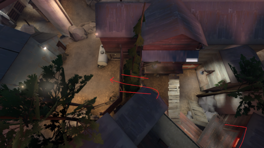
From here ill refer to [ img#1=Image top ] and [ img#2=Image bottom ] as such.
Why I would change this area.
Dead ends: when the stink is really bad. Ignoring the MSPaint scribbles in img#1: unedited there are dead ends on either side of this space, then a clunky room with a one-way door connecting each path to one another. My suggestion aims to streamline the one-way door, remove two dead ends and make a new interesting route to use for attacking and defending (Of course more changes would have to be made to surrounding geometry for accommodation, of which I don't have the time to draw).
There would be an overhead sightline blocker as shown in img#2 to allow defenders to still cross into the building without being damaged, as well as aid defense and possibly block a sniper sightline.
Moving on to nitpicks:
This hallway feels 'anti-combat', and could be made more spacious, Aswell the sewers are generally 'mazelike'
(I'd blame my inexperience as well as my lack of motivation to learn a map that blatantly aggravates me in its current state. Aggravation that bread this post presumably. 'lol'.)
The pickups and pathing make the left side of this room dead space. (Image top of this)
Possible easy fix (Image top of this): Makes combat very smooth, makes the scene feel more cohesive, less zigzag, more space, good overall IMO. Could rework the sewer entrance to complement while sewer entrance gets revamped.
Nitpicks, e blah blah, e blah...
Bottom line is that the space here is the pinnacle of the map. I feel it should be the most picked apart. so I complained about it xD111.
Seriously though, Almost there just needs to hone in on the perfection.
cringe sentry spot ft. wheres waldo
If you get anything from me writing this, please at the minimum change this.
Conclusion: Might perceive it as "too late" to make a lot of these changes, however, if anything here speaks to you I am willing to help if necessary. I'm glad I could dump my thoughts somewhere at the least. Any questions or further explanations can be found by messaging: PigPig#8052
Stating this to be transparent: I am not here to rag on your map, please contact me if it feels that way.