Mappers Vs Machines: The Results

Status
Not open for further replies.

LeSwordfish

semi-trained quasi-professional
aa
Aug 8, 2010
4,101
6,597
C0DE0137E8291945620F66562A82B3FBA24A00CF


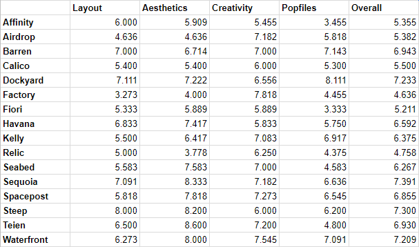
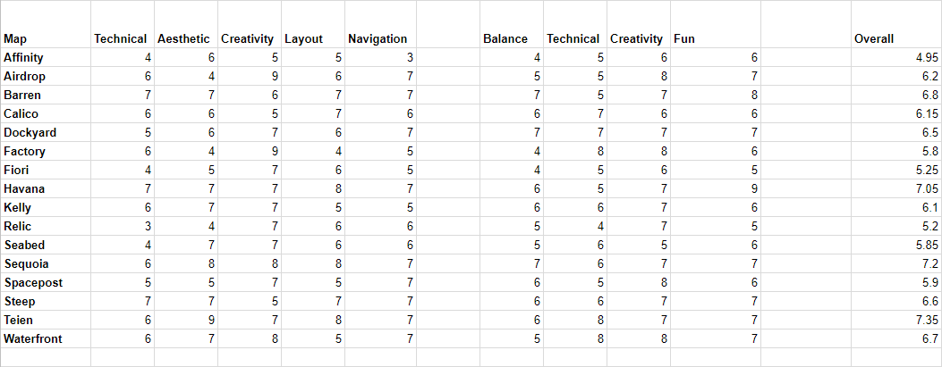
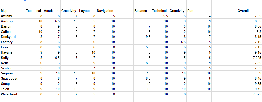
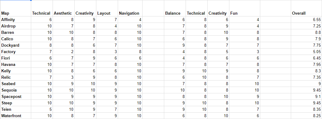
Nearly forty days of judging have gone by - but we're done! The scores are in, and here today I am privileged to announce the winners of what I believe is our biggest major contest yet!

As always, before announcing the winners, I want to thank the people who made the contest so great. I may be the one doing all the public speaking, but Hydrogen has done far more actual work in the contest so far, including running tests, setting out the judging criteria, and pretending to take my suggestions seriously. @Benoist3012, and @Egan were fantastic judges, and though she wasn't able to finish judging, @Yrr did great work in the first stages. @Gadget took care of the medals (with a little help from @Idolon), and I believe @SedimentarySocks and @Gadget produced the SFM artworks we used as our contest banners.

---​

And quickly, before the results, I want to say how high-quality the entries were. If I had been judging alone I would have found it very difficult to choose a favourite. In the end though, the numbers don't lie: time to show off which maps we finally chose.

Most Fun
A very narrow victory here: though Barren, Havana, and Steep were all within 0.5 points, in the end the category was won by Sequoia, by @Freyja!

Best Looking
This one was much less close, and I don't know that anybody is surprised by it - it's Teien, by @Freyja again.

Most Creative
We had some great contenders for this - Waterfront, Barren, and Factory all came close, but ahead by a good margin was Airdrop, by @PenolAkushari

Public Choice
Much as I hate to give any choice to you hatless proles (kidding!), the community have spoken - though Sequoia was also a strong contender, this one went to Steep by @Idolon and @phi!

and Best Overall...
Third place for best overall was Teien, and second place went to Steep, but there's only one winner. Cementing it's place as best map, and her place as (for the moment at least) the champion mapper... It's Sequoia, by Freyja!​

Congratulations to our winners, and commiserations to those who missed out. Get in touch to claim your bounteous prizes. Egan has kindly collated all the judge's feedback into one place, and I'll repost that below.

---​

It's traditional to finish these posts with a teaser of the next contest, it seems. We don't actually have another major contest planned just yet, though we have some ideas percolating for minor contests, and of course there's another Jam coming up in winter. I'd suggest everyone start practicing, because I think if Freyja wins any more contests? She'll become too powerful to stop.
 
Last edited:

LeSwordfish

semi-trained quasi-professional
aa
Aug 8, 2010
4,101
6,597
Feedback from the judges:
Layout & Balance:
The hatch:

The layout there is fine, although it's missing covering spots here (where I stand): https://steamuserimages-a.akamaihd....897/BEBF310E3601BC0783CF3BF7D4006506F2AD3CF5/ and there: https://steamuserimages-a.akamaihd....377/41DE79DF2D0136AAC8305F1D09B8A7E2C16CADDA/

The routes:
Routes are good I don't have much to say them, nice covering spots and sentry nests, however I'd make access to health kit & ammo packs easier, not really convenient to retreat for a long time from bomb route.

The front:
Front is perfect don't change anything.


Creativity:
-Jungle themed map
-Unique layout

Technical:
-Tank isn't destroyed after deploying its bomb.
-Robots don't always follow the path correctly.

Aesthetics:
-Really cool looking map, the white arrow at spawn really helps at locating the front.
-Nice skybox.
-Custom hatch.
-Nice lighting.
-Why it's raining inside the hatch?

Navigation:
-Nav isn't analyzed!
-Bots don't always follow the given bomb path.

Popfiles:
Normal:

Balance:
The normal mission seems okay, although we tested it with your broken nav.

Intermediate:
Balance:
We fixed your nav, the mission is too hard for an intermediate mission, you should remove the crit soldier on wave 3, and the chief on wave 4 they don't belong to intermediate mission.

Fun & Creativity:
The mission is boring it let you get bored, and no custom robots. Some giant banner soldiers were stuck in spawn due to quickly switching between their banner and rocket launcher, try to see how valve made this squad on rottenburg advanced.

Overall:
You need to make intermediate easier, and please use custom robots, also don't make spawn gap in your wave, it bores everyone, ruins the fun.
AFFINITY FEEDBACK:
Map Layout & Balance

Really original layout
Pickups hard to find at the start when defending / retreating from first battlements. https://youtu .be/BrBIqnf_rgs
Start area is a bit flat in the water, early combat kinda boring. Bots could have used their right, our left side route a bit more often for more varied combat. Or have more early support bots come into each popfile in that location.
Middle routes go unused often; the back of the indoor cave near the helipad -> I don't think anyone ever used that route. http://i.imgur.com/n9RTiUr.jpg
Deathpit near hatch hard to tell its a deathpit. http://i.imgur.com/uax1ppd.jpg
Battlements looking onto hatch with large ammopack went unused, it's not in a good location / path to defend with easily, and also the ammo there was difficult to spot from the player routes / perspectives. http://i.imgur.com/4EAuOQV.jpg
The shortcut leading from spawn/hatch towards the front upgrade station went underused a lot. you have a white arrow triangle sign 'pointing' to it, but that's not a typical type of gameplay sign - might have been the issue. Otherwise that route is just very dark. http://i.imgur.com/aLTw3XJ.jpg

Map Technical
some clipping issues around most of the map: lights, boundary ledges, laser on hatch, watchtower in mid, stairs near the start
no spectator cams

Map Aesthetics
nodraw visible in gameplay space
no 3d sky - can see edge of map
great creativity and original!
some areas too dark.

Map Creativity
new theme, new layout, no new gimmick ideas in the layout. I would check it out again.

Map Nav
no nav analyse ran, bots dont shoot at us, map is essentially unplayable. Benoist and I fixed the map just to test out the advanced stage difficulty afterwards.

Mission Balance
falls short at some points. difficulty a bit unordered

advanced wave 3 tank major step in difficulty, has probably 5k too much health. if you dont have 3 people focusing on it the entire wave until it arrives at the hatch you will lose - that seems a bit unfun. after we killed the tank there were just a couple demomen trickling in for a couple minutes.. http://i.imgur.com/nbHNLEH.jpg
advanced wave 4 was way easier than wave 3. wave 4 tank could have had more hp potentially. the giant huntsman snipers on wave 4 were not giants - we killed the 'bosses' as soon as they landed at the start of the map.
advanced wave 5 boss was pretty easy, not lethal enough. shoot faster? bigger clip?
advanced wave 6 went on a bit too long. i liked all the bots but kinda wish the bosses came out a bit earlier than 9 mins. 7ish would have been beetter.
advanced final boss was a bit easy and that super enjoyable. i think i got soldiered-out by the time we hit that boss. and his medic died like instantly, that probably wasnt intentional. also he got stuck in our leftside cave at the start when we had a sentry there - he eventually killed the sentry, but he didnt shoot at it for a while http://i.imgur.com/Q9NyRSf.jpg

Mission Technical
names weird/uncapitlised on a lot of bots.
popfile didnt load in correctly - normal mission should be setup automatically so that users dont have to enter a console command to start playing.

Mission Creativity
not much variety. nothing standout in bot choices / cosmetics.

Mission Fun
normal not fun, mostly from the nav analyse not being run, the bots didnt shoot at us...
advanced has some emptiness on the wave lengths
AFFINITY

TECHNICAL
  • Lots of console spam.
  • Map is at least correctly repacked.
  • Clipping not good - bumpy stairs, stuck on little wall bumps. Some areas that should be clipped and nobuilded are not - engineers building on the top of the radio tower, for instance.
  • The edges of the map seem very close - invisible walls in places I should definitely be able to jump to.
  • No fps issues, though this is probably because the map is a bit sparsely detailed.
  • It's pretty poorly optimised - in mat_wireframe I can see the entire map from everywhere.
  • Cubemaps badly placed. Inside the spawn, the back windows reflect the view out of the front.
  • No spectator cameras? No, wait, I think I've found one. It seems to be pointing outside the map.
  • The forward resupply doesn't close.

AESTHETIC
This is a very striking map, I think, and maybe has the best grasp of how to use the technicolour Mayann stuff best - the yellow fences fit really well with the gold trim against the grey background. Having such small dots of colour can make it feel a bit drab and desaturated at times, though, and i'm reminded of grey english cities like Coventry more than I am the jungles of south america. The map kiiind of makes sense, in that this is a sort of archeological spytech place? But it's hard to pick out what things are doing on a medium scale - areas seem to be mayann building, industrial building and cave practically interchangably, with the delineations between them often as simple as a doorway. This combines with the mayan buildings being not especially mayan shapes to feel, well, a bit video gamey, as though the layout was finalised before the specifics of detail was considered.

It also seems a little sparse. Given that it's barely optimised and i'm getting decent FPS, you could probably afford to add more. Are there no soundscapes?

There's a long list of little glitches and bugs here - most egregious are the dark areas (which no, aren't the worst, given that you can still navigate, but look bad and make it hard to pick out layout details like walls from a distance), small water, and dodgy cubemaps.

CREATIVITY
This isn't an incredibly creative map. Both the aesthetics - the new theme - and the layout - with it's hard crook - are interesting new ideas, but there's nothing much special about the popfiles, and no clever new ideas that change the gamemode up. Both the aesthetics and layout are imperfectly executed, but i'll discuss that in the appropriate sections instead.

LAYOUT
I like the attempt to break up the MVM standard, but the crooked layout has its issues. Some routes are much longer than others, some are much further from spawn than others - and the shortcut the defenders have across the corner of the "crook" ends up useless after the bots have gone more than a little way in. One path in particular is very hard to defend - it's not very long, far away from the player spawn raised up so the bots have the height advantage all the way through.

The map has lots of little steps up and down, meaning that navigating it often requires a bit of a scramble. This is particularly annoying at the bot spawn, which is also a small enough area that it's really difficult to navigate fluidly as scout. The visibility through the map is bad, with lots of enclosed spaces, and with the limited number of routes between the upper and lower levels I found I was losing bots a lot, and spent quite a lot of time as heavy just searching for someone to shoot. The paths split quite early so defending start can be quite difficult - in addition there doesn't feel like a good place to set up as heavy. That big rock gives cover, but is so wide that if in cover it blocks off half the spawn area, and it's easy for bots to come up the little wooden platform and behind you.


NAVIGATION
You've not run nav_analyse? Geez dude, that's really bad. It's a real shame that you didn't: i can't tell which of the other issues are related to it. Bots don't take the given path often (with a strong preference for the difficult route, it seems, and when taking the lower route they hop up a cliff, giving them a massive shortcut over the intended route. (Giants do it too, and some get stuck there.) Sentry busters also constantly get stuck in doorways, and the bots often hesitate before jumping down.

NORMAL POPFILE
Balance:
Overall, unexpectedly hard for normal. Would be good as intermediate, I think. The snipers force you to respond unusually: five of them is too much for a scout to kill before getting stabbed. Low on money.
Technical: No real issues.
Creativity: No really clever ideas.
Fun: Reasonably fun once corrected for difficulty. The snipers are actively unFun though.

  • W1 - This is kind of hard for Normal, I think - lots of bots and giants? It feels like 1100 cash is a lot to start with for Normal as well, and not balanced by the lack of money later.
  • W2 - Also kinda hard? Lots of bots active at once, awful lot of support.
  • W3 - Loads and loads of bots. so many snipers! Why are snipers spawning five at a time on Normal? It actually gets easier when the critbots come because you can dodge them and you can't dodge hitscan. I'm really noticing the lack of money now.
  • W4 - Much shorter and easier than previous.
  • W5 - Again, not too long or hard. Quite liked this one.
  • W6 - Not too bad, but I think we may just have gotten used to it being hard. The bosses hit hard, unexpectedly, and there's still way too many snipers.

INTERMEDIATE POPFILE
Balance:
At points far too hard for intermediate, forcing players into a meta regardless of playstyles. Sentry busters getting stuck makes engineer god-mode. One thing I noticed was that I was spending 300$ per wave on Crit Canteens.
Technical: Constant stream of supports for ten minutes is a glaring technical flaw. Otherwise okay but let down by dodgy nav.
Creativity: Not sure if some of the wierder ideas were attempts at creativity or just a lack of understanding of what a good popfile looks like, to be honest. In some areas it was the same as the first popfile?
Fun: severely limited by super-heavy tanks, millions of supports, and the mega-giant in a non-final Intermediate wave.

My general thoughts per wave are in the bullet points below:
  • W1 - Similar to/same as normal? It seems a pretty good start for an intermediate wave, although crikey, that's a lot of snipers.
  • W2 - Seems like one giant in middle of wave is scrap metal. The difficulty is very close to the first wave - its about right for intermediate but seems more or less the same as first.
  • W3 - Fuck, that's a tough tank. I burned four crit canteens on it as heavy and we never even got close to killing it. With the right buffs the crit soldiers don't kill, but they bounce you around like a pinball.
  • W4 - Much easier than Wave 3 somehow? The early stages are super easy, since the water turns into a bit of a killbox. Was it just me or was one tank tougher than the other? I also feel like the Giant bots weren't giant - but this wave was so trivial i think we barely saw them.
  • W5 - This wave is kind of long and painful and then Major Critz comes along to ruin your day. That bot is stupid nasty for Intermediate - not even final wave intermediate! I found that his crockets were throwing me across the entire map, making it impossible to actually shoot him from nearby. So many spies. So many FUCKING spies.
  • W6 - Fifteen fucking minutes of support waves? Not difficult, just dull.
  • W7 - So much smoke i couldnt see giants. Aside from that, trivially easy.
AFFINITY:
AESTHETIC
I like the usage of Mayann assets (which is crazy, normally I hate them), and I like the usage of the modern-looking areas, but I’m not a huge fan of how they meet, it seems kind of unnatural. If there was more disconnect it might work but currently it’s like the ruins were a façade for spytech and that makes no sense.

CREATIVITY
I didn’t notice anything hugely creative on this map honestly.

LAYOUT
Some routes are much longer than others, not sure why they exist. Lots of height variation which is good, if a little awkward to actually ascend/descend. A little hard to tell where anything goes, and the deathpit isn’t obvious.

NAVIGATION
Seems like the navigation is broken?

POPFILES
I missed most of the game so I don’t have much to say here, although the broken nav may negatively affect this portion too.
Airdrop by PenolAkushari

Layout & Balance:
The hatch:

The layout there is good and bad, we have cover spots & sentry nests, the biggest problem is the route that leads to the hatch, there are no props or building to break the LOS, crit robot heavy or snipers can be deadly on the hatch, I would suggest add some cover spots.

The routes:
The map features 2 routes, they are both good with cover spots & health kits/ammo packs, but they don't have any hold point, defending usual go like this one this map fight at front fight at the hatch but not between, you should make areas where defenders have advantages over the robots.

The front:
The front is just a wide open area with a truck at the center, not real elevated area near it for defenders and no cover spots, the front is quickly lost on that map it's hard to contain the bot here.

Overall:
Everything is flat, this makes the layout boring and super unfun to play.

Creativity:
-War themed map
-Unique layout
-Robot air raids

Technical:
-The tank IS destroyed after deploying its bomb! (good job)

Aesthetics:
-The map is not that much detailed, not enough props.
-Some areas a bit dark.

Navigation:
-Flawless

Popfiles:
Normal:

Balance:
I haven't played this mission sorry.

Advanced:
Balance:
Balance on this mission is really good, wave 4 is boring after all giants are dead, wave 5 is really well balanced nice job.
Fun & Creativity:
The work on custom robot is great, the B.A.S.E Jumper robots are super interesting, they are punishing you from the air if you don't hide, I find that really cool.

Overall:
Just tweak a bit your mission but it's really good.
AIRDROP FEEDBACK:
Map Layout & Balance

original, but not fun. roads quite flat. there are height routes in the buildings in the middle, but not every class can defend from that location - a lot of classes deal most of their damage up close - in the empty parkinglot sized streets. http://i.imgur.com/giBxeRb.jpg
front is hard to defend / awkward. the front areas are quite flat and open, so not only is it hard to find cover to survive there, but i also feel conflicted killing robots there because then i will have to dart for money in an open wasteland - but that's most of the map because its all road. http://i.imgur.com/gzcq9PB.jpg http://i.imgur.com/KDlsk6X.jpg
support routes are weird, fun, but weird. could maybe make them shorter. http://i.imgur.com/hWUQztV.jpg
I like that you can see the robots exit the carrier and walk slowly into the map because you can weigh how important focuses are on giants / medic combos. And then the support or tanks come out and flip your plan on its head - that is interesting, not many mvm maps do that apparently.
Hard to retreat from the front of the map because no routes support that without putting you in line of fire directly with robots. http://i.imgur.com/HOxNKnU.jpg
Lots of side areas we never went to like the side area on the left of the opening, and the area on the right of the hatch. They had large pickups in them, but they're on the opposite sides of the road from the combat locations, you'd either need to make the roads skinnier at places or have bridges across etc. They're just not worth going to. IDK if spys ever used them, maybe though. http://i.imgur.com/g7TS3MF.jpg http://i.imgur.com/rMf2g2m.jpg

Map Technical
some spec cams feel a bit weird but thats not super bad http://i.imgur.com/yC57DTH.jpg http://i.imgur.com/OE5COuc.jpg

Map Aesthetics
cool lighting colors, kinda wish fog was more brutal / close to be honest. original.
a lot of the detail is made up of props which looks okay in some areas (like the tanks in the roads), but seems noticeably empty in most other areas. http://i.imgur.com/wjcFOw7.jpg http://i.imgur.com/FFBOCj8.jpg
upgrade station areas at spawn and at the front are really empty and basic. http://i.imgur.com/eRhH2q2.jpg
ground texture a bit noisey.
weird that there aren't many staircases in the map - mostly just ramps.

Map Creativity
new theme, new layout ideas. interesting to play at least. Id try it out again if there were some fixes.

Map Nav
everything fine

Mission Balance
normal's mix of main and support bots were interesting
in Normal mode we never got pushed off the front of the map except for to deal with the tank for 15 seconds.
the airdrop was underwhelming in Normal mode, the battlefield was empty and then 8 robots fall from the sky and die pretty much on impact, and then the wave ends immediately afterwards. idk you got my attention and it was cool and unique but it wasnt hard at all. the last wave was a bit harder but it was still a bit underwhelming.

wave 2 advanced smg snipers all over were pretty noisey.
I wish each airdrop in advanced mode waves were alarmed, not just the first airdrop, hard to tell when they were arriving.
wave 5 advanced was long and boring, and it was weird that the robots spawned on either side of the front, ... making the entire front of the map useless to hold. i held it as a heavy and the robots just went either side of me on the very wide front and it was pointless and i felt stupid.. for holding the front... (heavy slow to retreat)
wave 5 advanced needed more non-spam classes, too many boring melee guys, not hard or threatening.
final wave could have been more epic/cinematic/difficult.

maybe could make the amount of planes in the airraid dynamic. i dont know how many robots are coming in one raid - i dont know how i should prepare. you could say thats the point but i hate the ambiguity.
even if it was just supposed to be a surprise i cant really prepare to defend against it. To be fair I could run into a building at the start, but the building doesnt supprot defense well. so i would be like "A: Defend front. B: Hide for 45 seconds." who wants to just hide in a videogame? (im saying this kinda harshly cause all my teammates were saying that being forced to hide from the airraid and do nothing for 45 seconds was stylistic and artsy. I thought it was boring).

Mission Technical
popfile didnt load in correctly - normal mission should be setup automatically so that users dont have to enter a console command to start playing.

Mission Creativity
airdrop guys are pretty original, planes are cinematic

Mission Fun
airraids could have been more balanced and interesting for gameplay experiences. wave lengths could have been more fine tuned.
I dont like that crit soldiers could 'just appear' 20ft above you in an air raid. they'd teleport in and then I'm dead because I'm a heavy defending the very open start.
AIRDROP

TECHNICAL

  • A fair bit of console spam.
  • The rooftop comes super close to the edge of the map, necessitating a very obvious invisible wall.
  • Clipping is ... generally good, but there's so little to clip. Sometimes it can be a bit overzealous but TBH i'm just glad I can finally get over those fucking piles of rubble.
  • Solid FPS but I don't know how much credit I should give given that it seems completely unoptimised.
  • Spectator cams are good, save one wierd one.
AESTHETIC
This map is... not aesthetically great. It's very close to all being the same shade of orange-grey, and very sparse, blocky, and dull. Some buildings are wierd shapes and, like Affinity, the general feeling is that of a videogame. Specifically, in this case, a COD 1 map.

The problem with city maps is that we know what cities and towns feel like. You have to do it really right or it all feels very fake. The rubble and broken walls are all unconvincing - you can't just have piles of rocks, they have to come from somewhere. And while I love the upgrade station that comes out of the ground, it makes not a lick of sense.

Images and more feedback here.

CREATIVITY
The strength of this map is how creative, I think - the core airdrop mechanic is brilliant, and very well done, and it backs that up with a lot of effort going into creative popfiles and bot names (though the layout itself is largely conventional.) I think the airdrop could be worked into the popfiles better - the further back the players are forced, the less effective it is, and so it's strongest at the start of the wave. Some of the bots are wierder than they really need to be - SMG snipers? Like what is the point - but I appreciate very much your committment to it.

LAYOUT
I'm not tremendously a fan of this layout. The main issue I have is that it's so asymmetrical - one path is considerably shorter than the other, one side of the map is higher, and from that higher side it's much easier to access the "spine" of the map. The height changes are pretty sharp and rare, making it hard to defend - you're either at a distance from the bots, or on the same level as them. Cover is very all-or-nothing, with few places you can take cover and meaningfully defend anything, which means that hitscan bots - the snipers, the heavies - can very easily kill even buffed players through sheer firepower.

There's a lot of ammo, but it's all half-boxes and I was having real trouble fighting the Tank as heavy since I had to keep retreating back to grab ammunition. The sheer size of the map makes it easy to lose the bomb or to lose money.

NAVIGATION
No issues I spotted. Bots hesitated at the start of the map a bit.

NORMAL POPFILE
Technical:
No issues I noticed
Creativity: Not as much so as the Advanced popfile, but some nice ideas and clever bot names. I think some things are more "wierd" than they are honestly "enjoyable" - the Ubersaw medics, for example - but I admire your commitment to that kind of wierd.
Balance: Seemed kind of easy for Normal, perhaps?
Fun: It was pretty fun, yeah.

ADVANCED POPFILE
Technical
- One wave is pretty badly broken.
Creativity - Very creative in the use of the airdrop but kinda less so in the popfile. Some real oddities like sniper-spam.
Balance - We never had any real trouble with it: it feels more appropriate to Intermediate than Advanced.
Fun - It wasn't too bad but the lack of cover means that massive amounts of hitscan enemies are painful to fight.

  • W1 - Constantly trying and failing to outdamage three heavies. Why aren't you using your lovely airdrop?
  • W2 - Constantly trying and failing to outdamage ten snipers. Everything is super-accurate and there's no cover, and the map is hard to navigate so the scout is missing money
  • W3 - It was all going well until it broke. Scouts maybe shouldn't have money - it's annoying to find and ends up in weird places.
  • W4 - Just heavies? Why is so little stuff airdropping in? (Use the airdrop for the Push scouts!)
  • W5 - so much spam down from above! and then a plane comes for the scout but its not them?
  • W6 - Good i guess? Three giants at once comes as a bit of a shock, but now i type that out it seems very silly compared to other "Advanced" waves.
AIRDROP:
AESTHETIC
I’m not a fan of frontline’s drab concrete aesthetic, and this map is an offender in that regard. Really monochrome, boring buildings, no visual variation, noisy ground textures.

CREATIVITY
The actual airdrops are hilarious and I love them. The usage of a real air-raid siren to warn of them is a great touch although I wish there were obvious shelters around to cover from the death from above.

LAYOUT
Everything is really open, so I don’t really know where to be as a close range class, all the hold spots are up high out of my effective range and the ground level is mostly empty and flat. Dividing us across the two “lanes” of the map was interesting, though.

NAVIGATION
Bots seem to find their way around fine for the most part, although the tight staircase to get up to the obvious high-ground hold spot leads to a lot of bots entering a tiny winding space which isn’t great. I’m not sure how to fix that issue without remaking the layout there, though, since bots need to be able to reach the players but that building is not made to accommodate it.

POPFILES
The bots were really creative in general, good scaling of difficulty, although there were some quiet periods. The air strike soldiers were a little too strong I think, but adding some more shelter from them to hide during the air raids would potentially solve that. Also some of the bot names were hilarious – Duty Calls and Revolver Shootsalot come to mind immediately.
Barren by Dayal & Hell-met

Layout & Balance:
The hatch:

The layout is well perfect, I have no complaints about it, I love the layout, perfect cover spots, and nice health kit & ammo pack location, it reminds me a bit decoy but it's perfect.

The routes:
The map features two routes, both are well made but it's missing some health kits & ammo packs, hold defending points very well made.

The front:
The front is good and bad, we have an elevated area but it's not that great, all mvm maps provide an area where the engineer can build his sentry to destroy the robots right out of spawn, I miss that, not counting that other classes don't have a real choice on when they defend they all make a group behind the fence and get all destroyed if a crit grenade/rocket is shot there, we can't split up, that's something I would prefer defenders should have more control on the front, robots are attacking Mann Co it seems natural for defenders to have an high advantage at front and less defending power on the routes.


Creativity:
-Unique layout
-Interesting map I'd play it more.

Technical:
-Tank doesn't explode after deploying its bomb.

Aesthetics:
-Cool looking map.
-Easy navigation.

Navigation:
-Flawless

Popfiles:
Normal:

Balance:
Well balanced, this is what I expect from a normal mission.

Advanced:
Balance:
The balance in that mission is odd first waves are good, but last waves are really easy, big disappointment on last wave I really expected more from a boss engie, we destroyed its sentry gun in no time and its retreat AI made it harmless to us.

Fun & Creativity:
I got TON of fun on that mission, I've never seen a mission where properties from a popfile are well used, I loved these robots with pink laser, or the cow mangler soldier with sniper AI really well thought, the tank spam support wave was really fun, I'd definitively play that mission again.

Overall:
Lot of creativity but balanced has to be reworked.
BARREN FEEDBACK:
Map Layout & Balance

felt pretty fine, pretty enjoyable.
i like that where the tank exits at the start has a bit of height over the other regular bot starts, it makes you wonder if you can hold there until the tank comes, or maybe one wave you can setup there, but then on another wave you cant. adds variety, i like that.
a bit hard to deal splash damage on the robots as they enter the map. difficulty in that sense might have felt a bit balanced until we had gotten the range upgrades for splash, but the early advanced waves felt a bit annoying that most of my rockets weren't dealing much damage. http://i.imgur.com/ANnVPS0.jpg
alleyway leading towards right side of the hatch is a bit long versus how skinny it is, leads to a lot of bodyblocking shots when standing within it, or while standing on the hoodoo at the hatch. http://i.imgur.com/Fcx092r.jpg
I kinda wish that while standing on the hatch hoodoo you could see the healthpickup located inside the danger perch on the right - this would give me the mental option of 'oh im being body blocked, let me rockejtump over to that perch' since there's health visible there. http://i.imgur.com/UwMXfAi.jpg so maybe move the health pickup in there to the opposite side of the room? I think this would work out okay because typically people looking back while retreating are looking for ammo, not health. so ammo pickup could stay where it is. http://i.imgur.com/iwDrtNA.jpg http://i.imgur.com/8r6CyV4.jpg

Hard to find ammo pickups while defending the front. maybe put a small ammopack under the spotlight on the sniper balcony, so when players grab the small they see the large pickup easier which is behind them. http://i.imgur.com/IoRRbgf.jpg

Map Technical
no problems

Map Aesthetics
pretty good. skybox looks good. hatch is original and interesting. bus in the desert road is cool.
if this was an official valve map I wouldnt really find any issues with it (except that i can't jump on the fence in spawn :'( ).
Some nodraw visible from the danger perch near hatch. http://i.imgur.com/lYYtDa3.jpg

Map Creativity
id play it again. no other sort of map gimmick though - controlpoints, gates or doors, wacky stuff, etc.

Map Nav
all fine

Mission Balance
the tank support wave every 20 seconds was kinda interesting but you would need to spawn in more things throughout the wave. it was too easy. lots of waiting / plowing through the tanks.. more bsoses would be cool. http://i.imgur.com/PhNQUYr.jpg
i do like that the tank support wave introduced the tank idea before having other bots roam in. good tutorial for that idea
last wave was really creative with the giant crit engineer boss, but he was really easy. the support scouts werent frightneing enough we only saw 3 of them, we just focuseddown the boss (who didnt injur us at all ocne we killed his sentry - he just roamed around finding a 'safe place' to rebuild - never) and kill hm slowly

Mission Technical
popfile didnt load in correctly - normal mission should be setup automatically so that users dont have to enter a console command to start playing.
the medic colored sheilds stuck around for me after the end of the wave, cant confirm if this was just me though, not a super big deal. http://i.imgur.com/pBKf2EO.jpg

Mission Creativity
pretty interesting.
a lot of creativity involved with custom bots like the tanks and the bison boss. http://i.imgur.com/1XeJEfQ.jpg

Mission Fun
long tank wave a bit slow. end boss was just okay.
BARREN

TECHNICAL
  • Overall very good, as best I can tell.
  • Well-clipped.
  • No console spam.
  • Well-optimised, good FPS.
  • Good spectator cameras.

AESTHETIC
So the main concern I have is that I've spotted at least two chunks of detailing just straight-up copied from Badlands. I don't know how to treat this, to be honest. It makes everything else suspicious since I now maybe have to assume any of it could be copied. This is a real shame because, aside from being a bit generic, it's done very well. Nothing's a stand-out, but it's very competent "basic TF2" detailing, plus some nice industrial detail too. The density of detailing works, and the skybox is nice.

I have the same issue as with a lot of maps that i don't really know what this place is, aside from "full of yellow barrels." Like legitimately. Does it fill these barrels? Does it empty them? Does it just pile a few dozen of them up? And then send them out... on dump trucks? Surely there's less staggeringly inefficient ways to do all of this. (The area behind Red's spawn is hilarious in a way. It looks like someone's very first attempt at detail.)

More images are here.

CREATIVITY
The layout isn't incredibly creative, the detailing is very much not so, and normal mode is not at all. Advanced mode is gloriously creative but feels like all the neat ideas for the map turned up at once. Normal mode refers to the difficulty - it can still be creative!

LAYOUT
The layout is a little interesting - a "canyon" instead of a spine, the S-shaped tank path, the very wide finale - but not too far from what you'd expect MVM to look like. On Normal mode, the canyon is an easy killbox (with the upper route far harder to deal with), but on Advanced, when you really need players close to the bots (spies, scouts, money, etc), it's a lot more painful, needing to get very close to sometimes very large groups. The starting area is great for playing as scout though, with lots of space to retreat to and hit and run - though the little fences got quite annoying.

The building on the left at the end of the canyon (facing bot spawn) is quite tight. If the tank's going through the doorway you have to go all the way around (easy one way, very long the other), and I found a couple of times it became a bit of a bloodbath, with twenty robots and six players trying to force their way through the same area at once. Also, why isn't there a forward upgrade station? This is 2017! We've had five years with that problem identified! Finally, defending the final point is very hard - bots tend to come from both directions at once, and the cover/height disadvantage forces you to either pick a side or hang back and only be able to target bots right before the hatch. I would suggest checking out what coaltown does, which is use Nav_avoid and prefer to force the bots to swap their pathing back and forth between sides.

NAVIGATION
I didn't see any real navigation issues - but then the only time I ever saw bots try to take any route but the "canyon" was normal mode, and they all died too fast. I'm not sure if thats what's expected.

NORMAL POPFILE

Technical - All seems good.
Creativity - Blech.
Balance - Generally well-balanced.
Fun - As much as any normal mode is.

Not much to say about this. It's a straightforward, competent, dull-as-ditchwater normal mode. It's well balanced (Wave 4 feels a little easy maybe) but has none of the cool ideas of the Advanced mode.

ADVANCED POPFILE

Technical - All works.
Creativity - Very creative. Overwhelmingly so, frankly.
Balance - Generally well-balanced, though a little hard at times.
Fun - Tremendous fun.

  • W1 - You just do one thing and its not a super-fun thing tbh.
  • W2 - Good wave. Would have been very sharply nasty at the end, except the giant heavy teleported into a small room and got stuck.
  • W3 - Engineers are once again quite annoying: whether you get the engineers or not makes a really big difference as to whether enemies spawn literally next to the point or not. One spawned behind us, stopped me getting to frontline, teleported giant laser guy on top of us. I like giant laser guy though! Shame a weedier version of him didn't make it into Normal mode - it changes up the challenge interestingly.
  • W4 - The engineers spamming buildings is faintly ridiculous, and engineers/snipers as ordinary bots strikes me as an idea that is more "interestingly wacky" than one that materially affects the players or changes the way the wave plays. It's a pretty fun wave though - maybe a TAD hard for advanced for only W4 but i'm really enjoying it.
  • W5 - Loads of creative ideas, all working really well, but almost all in this one wave for some reason? Was tremendous fun but spent the whole time figuring shit out
  • W6 - Not sure that the stickybomb demos are interestingly different? giant rocket jump soldier is ..not good.
  • W7 - Oh lord, another gimmick. I like the idea but... not sure it works? is it just a tough engineer?
BARREN:
AESTHETIC
Mostly good use of Badlands theming, some questionable details though. The bases of the buildings seem weirdly made – like you stretched some and didn’t realign the textures, and others are weirdly inset or not stretched to fit at all. Some of the rooves look weird, some of the interiors are also a little bland.

CREATIVITY
Not much to say, I didn’t notice anything particularly new.

LAYOUT
Layout seems pretty solid, although there’s no forward upgrade station, and it’s a long walk back.

NAVIGATION
I don’t remember any navigation issues off the top of my head.

POPFILES
I don’t remember anything noteworthy about the popfiles.
Calico by Tumbolizo, Izotope & Stiffy360

Layout & Balance:
The hatch:

The hatch is good, but it has some flaws, first it has problems on covering spot why this side of the map(where my sentry is) has a fence, while the other side (where my disp is) doesn't, how am I supposed to build a sentry nest here? https://steamuserimages-a.akamaihd....346/7DD53CA49B69C58D3EF0BCB518CAB59148CE313F/
The small health kit should also be replaced with a medium health kit.

The routes:
The map features 4 routes, however some are lacking cover spots or sentry nest see here:
https://steamuserimages-a.akamaihd....297/414744B398F510EB640617CAEAC5432E61639488/
https://steamuserimages-a.akamaihd....356/05AEB2EF39A20147DE216C8B8B1E7960872F8469/
I have seen ammo packs along the way, but not many health kits, one good point is that you gave a reset pit for each flank and not only one.

The front:
Even though the front layout is interesting it doesn't offer covers on the containers, I would have loved some cover props so I can put my sentry there and have an advantage over robots, it's really no convenient to setup a sentry nest at front.

Creativity:
-Unique theme, idk how I could call it, but I know no maps did it before.
-Unique layout.
-Tank vaccinator effect.

Technical:
-Tank is destroyed when deploying its bomb (good job)

Aesthetics:
-The map is detailed but that could be improved, it's still cool looking though.
-Missing skybox, we have a void around the map.

Navigation:
-Flawless

Popfiles:
Normal:

Balance:
Good, don't much to say.

Advanced:
Balance:
Wave 1 feels a bit too hard for advanced, either we played poorly or it's really hard, I would suggest making the giant medics not able to pop.
Rest of the mission is fine though, good job.

Fun & Creativity:
I loved the vaccinator tank, like holy shit this is super clever (I'll make sure to get that unofficial custom tank icon support working asap lol), the mission doesn't let you get bored it's really fun to play and I'd play it again, just need to be a lil easier.
CALICO FEEDBACK:
Map Layout & Balance

Front is a bit flat and empty, but that part was original, interesting and enjoyable!
I wish we got to use the middle buildings more in the 2nd 2/3 of the map (past the overpass/forward upgrade). Most of the bots would be sent to the side paths which were hard to defend, and more flat than Id like (relatively). Having bosses take the low mid paths more would have felt better (the heavy/med combos come to mind). Made a lot of the middle area feel like it was a waste since most robots avoided the middle (which was 2/3 of the map length)..
rolling out from spawn not particularly easy / satisfying. https://youtu .be/FQYJlyKNz0g
can get to an unclipped railing perch in the left room out of spawn/hatch, intentional? http://i.imgur.com/QB33CuY.jpg

Map Technical
one spot you can stand on at the start of the map not clipped. http://i.imgur.com/yFsJOow.jpg
forward upgrade station still useable through the round?
could have used a bit more areaportalwindows to block some distant detail rooms off when standing near hatch, nbd though.

Map Aesthetics
looks really good, but no skybox? fps in that sense good, but a simple 3d sky could be better than nothing..
interior spaces look good.
hatch area looks good, interior of spawn / curvature of it looks cool. spawn interior could have been detailed just a bit more uniquely.
standing on the yellow container at the start is kinda blinding, wish it had something on it like more stains (retexture?) or even just a no-collisions pallet prop. http://i.imgur.com/CB5JEaP.jpg
opening area is noticeably empty. http://i.imgur.com/bj6PIpz.jpg
lighting looks good in most areas.
some Z fighting but thats prob pretty obvious. http://i.imgur.com/yYoXDy9.jpg

Map Creativity
could have been a bit more creative with the layout /usage of routes in the 2nd 2/3 of the map..
no other sort of map gimmick - controlpoints, gates or doors, wacky stuff, etc.

Map Nav
nothin broken

Mission Balance
I wish you gave us 450 money at least in advanced. with 400 money you can only buy 1 useful upgrade, which smells. usually the first upgrade you buy in mvm isnt even something that will 'help you out with this wave', its usually 'ammo capacity'. being able to buy 1 more upgrade with 50 more credits at the start would go a long way to my enjoyment..

wave 1 advanced pretty hard. it forced us to buy crit canteens. we really had to prepare for that heavy med combo. i wish when the med popped it would like lock in place . or its uber lasted a lot less time. once it popped it was already near the hatch and we didnt have enough dps to kill it instantly. happened to us 3 times in a row. first wave?? http://i.imgur.com/lv5D4X8.jpg http://i.imgur.com/7yT7knp.jpg
sntr was saying maybe just not have him pop at all. which maybe you could do also..
soldiers on wave 1 were a bit spammy. like too many of them maybe. kinda enjoyable, but just a bit too much. http://i.imgur.com/IJjRFYb.jpg

5 scouts each on wave 2 i thnk. we could only kill them all just as the tank also got to the hatch, or vice versa. too hard for advanced at least.
wave 3 gives a lot of money.. was a lot easier than the 2 before. good difficulty i think though

last wave was much easier with all that money. could have made the support during delfector heavies much more brutal since they were so slow
the shielded tanks were fun though, i like that it splits up the team

Mission Technical
popfile didnt load in correctly - normal mission should be setup automatically so that users dont have to enter a console command to start playing.

Mission Creativity
the shielded tanks were interesting!
bots could have had more creative themed names / cosmetics. not really themed to the farm - straw hats and whatnot.

Mission Fun
normal mission could have been a bit more memorable.
advanced could have been balanced a lot more chronologically. wave 1 was expert level difficulty.
CALICO

TECHNICAL
  • Those lovely circular stairs aren't clipped!
  • The white building is also pretty poorly clipped.
  • Good FPS
  • Decent but not great optimisation
  • Some console spam
  • Good spectator cameras.

AESTHETIC
It's a shame so much of the map was unfinished, because what's done is lovely. All the buildings look good and make at least a reasonable amount of sense, and a good sense of place is developing. The exception to this is the roadway building which is... really wierd. It doesn't look like any raised roadway I've ever seen, more like they put a highway on top of a wierd flat building.

The spytech building at last is very nice, and though I love the curved steps they do feel a bit wierd for a farm. There's a few bits of clumsy brushwork and some odd texture choices, (and metal panels that hover in midair?) but otherwise the done bits are lovely, and I'm looking forward to seeing the rest finished.

Images here.

CREATIVITY
There's not much particularly creative about the layout, although the theme is creatively done and the Advanced popfile has some neat ideas.

LAYOUT
The layout is fairly standard MVM but with some neat changes and some things that don't work so well. Firstly, I don't like the side routes - both give the bots advantages (and very limited disadvantages) while being hard for players to access. The starting area is neat but has some problems: as scout, there's good cover and plenty of places to leave and rejoin the fight: but the staircase is small enough to make dodging through bots to get to money difficult, and it's hard to get snipers in the same place because there's a constant stream of other bots coming through. The "tank path" is strange - firstly, i'm not keen on the little jump up I have to do to get out of it, and secondly I'm not sure what the tank breaking the boards actually adds: it makes that area less of a choke but i've never really seen a defense focussed on that choke anyway.

It feels as if there's not much cover in the middle of the map - I feel like i'm always charging directly towards the bots with little scope to attack from the sides or behind without running all the way around the "spine" building. It's a good map for bot snipers.

NAVIGATION
The bots all followed the paths well, though at at least one point money dropped inside the bot spawn.

NORMAL POPFILE

Technical - No issues.
Creativity - Not very creative at all.
Balance - Decently balanced for Normal mode.
Fun - Some long waits between squads, not much to attract my attention.

  • W1 - I don't have any notes on this.
  • W2 - Nothing special.
  • W3 - The scouts aren't super interesting and there are some long waits between squads.
  • W4 - It's starting to feel a bit samey now.
  • W5 - Are the shotgun soldiers expert? I'm finding them unexpectedly tough.

ADVANCED POPFILE
Technical - Broken cosmetics the only issue i see - but technically speaking i'm very impressed by the tanks.
Creativity - The tanks work really well and are a nice creative touch - it's a shame so little else in the layout or wave works with them.
Balance - Both the difficulty as an Advanced wave and the internal difficulty curve are way off. Fun - This would be getting a really high score if it was all like the last two waves!

  • W1 - Hoo boy. I cant get any money because everything instakills me. We started off with so little cash that I can't resist more than one of the three kinds of damage coming at us. This is super fucking hard for a first wave - we have no response to the unkillable scouts but to retreat, which means we end up fighting the heavy literally on the hatch.
  • W2 - This is also really hard. We can, if we all throw ourselves into it, just about stop the scouts, but then the tank comes through and we just have no way of responding to it. It took us a while to realise what the tank shield meant - perhaps I'm just dim, but I didn't draw the connection between it and the Vaccinator shields until the next one came through. Can I suggest starting off with a different colour (it just looks "blue because it's the blue team") and possibly using it alongside a Vaccinator medic wave or something to really hammer the connection home.
  • W3 - Not bad actually! In fact, really fun! But heavy/tank/scouts is painful because you have two Massive threats to deal with and someone has to watch the bomb so only five players to do it with.
  • W4 - Actually pretty fun! Easiest wave though - hell, you could probably reverse the direction of the waves. I'd like to see the bufftanks have an alternate image so we know what buffs them - and are they as tough as always despite one player always being useless against them? In addition, the Vaccinator medic cosmetics are broken.
CALICO:
AESTHETIC
The granary-style detailing is nice where it’s finished, spawn building looks good. Kind of awkward at the bot spawn but maybe it’ll look better when its finished.

CREATIVITY
The different kinds of resists on Advanced are interesting, forcing varying team composition.

LAYOUT
Not a huge fan of how tight the first choke is or how awkward it is to chase down a scout bot that makes it through. The varied routes are good, though.

NAVIGATION
I don’t remember any navigation issues off the top of my head.

POPFILES
Difficulty on Advanced doesn’t scale well, it starts off insanely hard and then some of the later waves are easier. I think the harder ones could stand to be toned down.
Dockyard by Sntr

Layout & Balance:
The hatch:

The layout around the hatch is exactly what I expect from any good mvm maps, we have a lot of space to walk around and we have two hiding spots: the tank on the left and the truck.
I'm counting 3-4 engie spots which is pretty good, any good hatch layout shall have 2 engie spots, I've nothing else to add but the layout is great.


The routes:
The map features 2 bomb paths, I have nothing to say on them as it's like on mannhattan and we have a copy there we only see the 2 paths near the hatch so I'm going to review the map as if we had one path like on mannhattan, the route is meeting the standards, we have health kits & ammo packs along the way with hiding spots near them, we have also have the same pit/trap from mannhattan except yours is a bit too far from the main bomb path making it useless for pyros & raged heavies.
Now the gate, the gate layout is good but it feels a bit too much like mannhattan I would have loved seeing something else, that's a shame because your hatch layout is great & the main bomb path too.


The front:
The layout there is... well I don't know it's good and bad, we have flank routes for robots making waves more "dynamic", and we have that platform in center of all of this where defenders are standing and with these flank routes and the main spawn, the defenders are attacked in every directions making the front area impossible to defend properly, we have a dispenser spot near the containers even though it can be easily destroyed by robots coming from the flank routes, and we are missing an hiding spot for the sentry, the only place I could find was there and I'm sure you didn't mean that spot to be a sentry one.

Creativity:-Even though I have already made a moving tank spawn system with gates, I find that neat that someone else does it.

Technical:
-Bomb path arrow not showing on map start/wave reset
-Tank doesn't explode after deploying its bomb & doesn't deploy exactly on bomb hole.

Aesthetics:-I find the map layout really confusing it's hard to tell from the hatch where the front is, and map aesthetics doesn't help, no signs, nothing.

Navigation:-Flawless

Popfiles:
Normal:

Balance:
The normal mission is decent, but please don't use expert skills for your giant heavies they've pushed us way too back than they should have.

Advanced:
Balance:
Very good, I wish robots pushed us a bit more.

Fun & Creativity:
Same as a mannhattan mission, fun to play but nothing else to say.
DOCKYARD FEEDBACK:
Map Layout & Balance

Hatch not super enjoyable to defend. I wish hatch was pulled back a bit more to where that center ramp is going down to the main floor, and also I wish that there was some more height that players could use in the room. Maybe just let players move up by ramp to the height at the left side, or increment that height so they had a ramp to 2/3 its height, but then top was still requiring of an explosive jump/ double jump. http://i.imgur.com/bTiwI8V.jpg
Height outside hatch wasn't used at all, not super satisfying, a bit awkward to defend. The main entrance also didn't feel like a main entrance. http://i.imgur.com/hxhWVXs.jpg
Retreating from front annoying cause it gets real cramped towards the CP - especially obvious with the tank there too. Also you're always looking down at the robots when retreating from the front which makes playing demoman not very satisfying (he likes being lower than his target preferrably - for arcing weapons). http://i.imgur.com/wbCUHAU.jpg
I wish the height got a bit more interesting / extreme across areas of the map, it feels like a lot of the areas defenders are always only ever 384 units above the robots. Doesn't lend itself well to really crazy shifts in choices / varied gameplay decisions. Having areas that give you extreme height but are farther away from pickups/in range of snipers easier, let me take risks in my positioning more - front left area could have used something like this maybe.

Map Technical
Could escape bounds to the right outside of the hatch building (or could trap teammates there with a teleporter...). http://i.imgur.com/u2QAeQG.jpg
Some places you could stand that were probably unintentional. http://i.imgur.com/3SCieqo.jpg

Map Aesthetics
Looks good overall, but a bit too similarly detailed to mannhatten.. Could have done some more standout original landmarks (crane at the start is good, but im talking more color/lighting based things).
Not much of a facade going on transitioning the detail theme of the map - first 1/3 looks just like the 2/3 of the map. Hatch 3/3 isn't landmark different enough to balance.
Middle of the map is all in shadow and all the lighting cues are solid white, combined with the very gray texturing of the buildings/ground makes me a bit sleepy. http://i.imgur.com/t6l7KeF.jpg

Map Creativity
Pit is okay that it exists but it's in a place that we never used it, hard to knock someone over there.
something fun at the start could be interesting, like a phsycis thing on the container crane, or something noisemakery. front just a bit boring to prepare for defense. could be layout related as mentioned above.
Im glad there was at least a contolpoint to move the pace along some waves, but not super fun defending hatch/spawn area from the new robot spawn (not interesting enough).

Map Nav
bots sometimes dont jump down from the controlpoint spawn balcony, otherwise fine. http://i.imgur.com/5hqDrhY.jpg

Mission Balance
those snipers on wave 1 advanced were pretty annoying. i wonder if they could do less damage but higher knockback so i dont die as often, or make them do higher damage less knockback. both are just kinda frustrating imho.

kinda wish more excitement in wave 2 advanced. like a bigger boss trio. like if the blackbox soldiers were the stars of the wave to shout out when they arrive on the field. it seems a bit samey that one.

last wave advanced tanks a bit easy for the time we face them, we have all our upgrades. fun though. maybe 1.25x health, idk
sentry busters on last wave could have had more health too. we could kill them just as they dropped in

Mission Technical
popfile didnt load in correctly - normal mission should be setup automatically so that users dont have to enter a console command to start playing.

Mission Creativity
kinda wish the pyros on last wave(?) advanced did more damage or lasted longer, idk. they werent that active. pyros in general. always shooting pyro could have made an entrance.
though it was kinda the theme not to have pyros some sort of fire guys maybe could have worked. like igniting heavys with that hulongheater. or fire something else idk.

Mission Fun
wave 5 advanced was fun good job. nice balance of classes going all over. could have been a bit harder. the small medics could have been a bit more bountiful maybe.
DOCKYARD

TECHNICAL
  • Not much console spam.
  • The FPS is not great, especially in locations where both sides of the point building - It doesn't seem well optimised by much except the basic layout (though, props for building a good basic layout).
  • Decent clipping, but watch the collisions on the various props.
  • The spectator cameras are good.
  • The upgrade station didn't reenable after failing wave.
  • Holograms sometimes dont appear.
  • I can get outside the map, and can stand on some of the rooves.

AESTHETIC
You've got a lot of promise here, and I think you've really used the urban environment well. However, the map has a lot of oddities that let it down. There's a lot of blocky or strange brushwork in the map, and you have some very strange texture choices - I've highlighted them in the image below, but you make the detailing newbie mistake of using lots of different textures or props in the same building. It's more realistic, and looks better, to limit yourself to a coherent set of props and textures (check out how comparatively few different textures each building in mannworks will use, and think about how and why people use particular building materials - you're unlikely to get a massive metal room held up by wood, for example.)

You also use the concrete/coal texture very wierdly - concrete can definitely be formed into slopes but I don't think you'd find undulating curves like those. I would suggest you check out Grazr's Immersion and this Density Of Detail tutorial - the second is about using the density of the detailing in your map to guide players eyes to the right places, which the map really doesn't do now - a lot of detailing is out of bounds and i find myself focussing on the wrong places.

More images here. I also want to note that I love your use of TF2 humor - the door-onto-crusher gag took me a moment to "get" but I enjoyed it once I did. You could probably flag that up more clearly as a joke - maybe put a banana peel between it and the crusher.

CREATIVITY
The layout and popfiles do some creative things, but not a massive amount of them. The gate and tanks are neat, but there doesn't seem to be much else.

LAYOUT
The scale of the map seems a bit off. It's very wide before the point - so easy for bots to get past - and then the point itself is quite a sharp choke with no way around it. The second half of the map feels a little underscaled: as Scout I felt that I was constantly stuck in the fight right there with the bots, and sometimes even unable to dodge around tanks. The basic layout felt very solid to me though, with lots of progression for the bots, coming together for chokes and spreading out for flanks, etc etc. One thing I noticed was that in several places I needed to run quite a long way to outflank the bots.

NAVIGATION
I didn't notice any issues with the bot navigation.

NORMAL POPFILE
Technical
- No issue I saw.
Creativity - Some neat creative touches but not a super amount.
Balance - A little hard for normal. Two tanks that add new bombs? You give a lot of money, which makes me think you balanced around "easy for good players" - which isn't the same thing as "balanced for bad players". Newbies don't know how to spend lots of money, see, and even "two tanks in the same wave" can ruin them.
Fun - Sure, it was fun enough.

ADVANCED POPFILE
Technical
- No issues I saw.
Creativity - Nothing stands out? But the tank-cap is a nice idea.
Balance - Gets a little fuzzy near the end, but actually pretty close to perfect.
Fun - One of the more enjoyable Advanced waves I played.

  • W1 - A good wave, I like it!
  • W2 - Also a good wave. I'm not really a fan of tanks opening the gates, though - this is a far more significant buff than Rottenburg's fence breaking, and I've never really successfully seen us prevent it.
  • W3 - Same as before. This wave ends up kinda easy because we have a lot of money now.
  • W4 - I'm noticing nothing especially creative in this wave, and again it's a little easier.
  • W5 - Infinite QF medics are really painful to fight, but its a neat idea. This wave seems maybe a bit hard for Advanced.
  • W6 - Easier than wave 5. Kind of easier than wave 4. Frustratingly, I was getting bounced around way too much.
DOCKYARD:
AESTHETIC
Detailing is serviceable, mvm-appropriate if bland in places. Some awkward details around and the huge crane model is not supposed to be so close to playspace (its low-res textures make this especially obvious).

CREATIVITY
Using tanks and gates together is new to me at least. Idk if other maps do it.

LAYOUT
A couple weird tight spots, but mostly good use of space. Could do with more ground level variation.

Tight turns tank can squish you in.

NAVIGATION
I don’t remember any navigation issues off the top of my head.

POPFILES
I don’t remember anything noteworthy about the popfiles.
Factory by Sage J. Fox, Sweater Pups & Schaden

Layout & Balance:
The hatch:

The hatch is bit far from spawn, and it's really open & empty we don't have any cover spots defending this area is really hard.

The routes:
The map features 2 routes, although the map is symmetrical so it's literally the same thing on both side I don't see why we have 2 different routes it feels useless, it's also very open and again empty I don't know where to defend on this map, it's missing cover spots, health kits and ammo packs.

The front:
The front is so small that I don't know how we are supposed to defend it, the elevated are (building) at center feels useless because it's all exposed to robots making it dangerous to stand here, the front is missing covering spots, sentry nests and health kits + ammo packs, this area must be reworked.

Creativity:
-Conveyer linked to a cp, slowing down or speeding up the bomb escort.
-Factory themed map.

Technical:
-Tank doesn't explode after deploying its bomb, and doesn't make the hatch explode & trigger game win.

Aesthetics:
-The map isn't that well detailed.
-Flat map.

Navigation:
-Flawless?

Popfiles:
Normal:

Balance:
Seems okay for a normal mission.

Advanced:
Balance:
Everything on that mission is too easy, we don't have giants on 1st wave, everything must be buffed and add new robots.

Fun & Creativity:
Custom giant medic & crow robots are nice but that's the only creative thing, the mission itself is borring.

Overall:
I would recommend making your advanced mission on coaltown advanced mission.
FACTORY FEEDBACK:
Map Layout & Balance

Really big and open. Feels like you made the room bounds first and then tried filling in the rest - this is not good for design. Try to design interesting routes / gameplay ideas / spaces first, then connect them together. http://i.imgur.com/Q0UgBEo.jpg http://i.imgur.com/vu9eNAL.jpg
Hatch area defense points are like nonexistant (conveniently we never got pushed back to the hatch). http://i.imgur.com/v3XMwkx.jpg
Defending the controlpoint while standing on it is kinda flat / unexciting.
Weird that there's so little/no ammo at the start. http://i.imgur.com/iRL0Wzs.jpg
Falling back to the controlpoint isn't fun, you retreat on the same paths the robots take - makes me feel weird and inferior to the robots. You can take the far away side path but its equally open to the robots so there's not much of a tactical advantage.
The upper routes generally went underused because they were too far away / routes upwards were too far away from main path.
The back top paths 'for snipers' I don't think anyone used.. http://i.imgur.com/5E08DZf.jpg
Most of the map is way too flat. The robots do not go up or down at all throughout the entire length of the map assuming you don't push them into the pit at the end - which we never really got to do.

Map Technical
Weird that you can get up so high, none of the places are clipped, doesn't feel intentional. http://i.imgur.com/uOE2H4J.jpg http://i.imgur.com/Yov3e3U.jpg
Why do we have to capture the controlpoint every round at the start? seems needless.

Map Aesthetics
Hard to find the controlpoint room.
Hard to tell the conveyor belt direction, could have some arrows subtly on the texture (or more contrasting texture somehow).
Hard to tell when bots are shootable, no lip except a texture change subtly on the ground - but they don't even stop getting invulnerability after they pass that. Could have step lips that the bots fall off on the side paths, and maybe keep the middle path no lip for the tank? http://i.imgur.com/bmpXnKg.jpg
Hard to tell where the upgrade station trigger is located on the ground, combined with how slow the van door opens it makes it weirdly unsatisfying to go for upgrades.. https://youtu .be/BwK3byV3s70
Map being so symmetrically detailed / layed out is kinda boring.

Map Creativity
Creative use of the conveyor belts, but I kinda wish one of the earlier rounds utilised the map gimmick so it was more interesting early on.
Not super exciting when the tank is so stationary after it hits the conveyor belt, you can completely stop focusing on it, not enough pressure. I wish the tanks moved a bit faster but then had less health to compensate.

Map Nav
fine as far as I can tell other than the invulernability thing at the bot entrance.

Mission Balance
Generally you gave us too much money for the advanced difficulty throughout the rounds, was never penny pinching / really making decisions on what I was buying. Ideally also raise difficulty of advanced waves.
the 2nd wave of normal mission of just scouts really accentuates how flat the space is at the start.
Last wave of advance being just tanks allowed us to all go phlog with no repercussions. Should require some additional anti-pyro guys, like heavies or something. http://i.imgur.com/99kQNkr.jpg

Mission Technical
popfile didnt load in correctly - normal mission should be setup automatically so that users dont have to enter a console command to start playing.

Mission Creativity
Some of the icons didn't make sense to me - why are the bleed-shot medics a bird icon?
Could have had a lot more support bots or other misc bots use the height around the sides of the map, 95% of bots just were on the flat ground.

Mission Fun
Wasn't too interesting across the rounds, nothing standout, especially in the normal difficulty mission. Fun or lack thereof mostly based off the layout.
Bleeding medics were a bit fun to deal with.
I wish you gave us 450 money at least in advanced. with 400 money you can only buy 1 useful upgrade, which smells. usually the first upgrade you buy in mvm isnt even something that will 'help you out with this wave', its usually 'ammo capacity'. being able to buy 1 more upgrade with 50 more credits at the start would go a long way to my enjoyment..
FACTORY

TECHNICAL
  • Decent FPS - seems to be optimised surprisingly well!
  • Well-clipped. Going down the stairs is wierd though - they’re so steep your sideways momentum causes you to fall several steps at once.
  • Only two spectator cameras? Hard to see most areas of the map through them.
  • Something is clearly wrong with the map’s base logic, since some things don’t change when we lose a wave. Sometimes there are no holograms, sometimes there are, sometimes the point stays capped and working, sometimes the conveyors stay working.
  • Dying in the cap zone feels a bit cheap.
  • The spawn brushes are super big, which means robots are invulnerable outside spawn.
  • You can’t use Jarate/Milk on the conveyors.

AESTHETICS
For someone new-ish to detailing, this map shows a lot of skill and consideration. My main issue is how square and blocky everything is - you’ve done some work to disguise it, but everything in the entire map is a cube or rectangle, with nothing so much as a displacement to break it up. Some of them don’t make much sense - a crate is one thing, but there’s at least one cube of bare brick in the map. You also use limited numbers of textures - a good 60% of the map is the same red-brick textures, which causes what is presumably ordinary lights to cast a rather sickly glow.

The gantries you use look… honestly pretty ugly, with two noisy textures used a lot. I also think you need to think more carefully about how the rooms in your map are used and what for - it seems unlikely that the same room would be a loading dock for lorries and the break room? Read Grazr’s article on Immersion in detailing, and use that to consider what the spaces in your map are and why they’ve been made the way they are.

Images here: http://imgur.com/a/H07sP


CREATIVITY
The conveyor belt and point are neat, but i’m not entirely sure how i’m meant to use them? Practically speaking the only real change seems to be that there’s an extra point to worry about: this is cool but the bots never seemed to effectively threaten the point. I guess that’s more of a popfile thing but it’s important: we never had to split our forces very significantly, and the conveyors were basically a free bonus. To be great, I think it needs to provide an additional choice, as well as a task - and there was nothing to stop us throwing a sentry on the point and forgetting it. What if it was further back? (Possibly even behind the hatch?) Thus forcing the decision to move to/from it to be a bigger one.

I think they make the tanks way less powerful, since holding the point slows tanks to a crawl - it looks as if you’ve amped up tank health, but even if a half-speed-double-health tank is mechanically as difficult, its a dull slog to fight through.

NAVIGATION
The only issue I saw with the navigation was the bots sometimes not following the diagonal paths. In addition, it would be nice to make use of the gantries some times.

LAYOUT
The main issue I have with the map is that it’s very big and open and flat. This makes the bot snipers very powerful. There are gantries and height changes, but they’re hard to reach and very open so there’s no real reason to head up. The big wide entrance and limited money makes zipping around as scout collecting money difficult, especially with no cover - and retreating is tricky since the conveyors are against you. There’s not much ammo around, and a bunch of it is in weird places i need to specialjump to.

NORMAL POPFILE
Technical
- Aside from the crows exploding into human-size corpses, it works well.
Creativity - I didnt realise medics were toxic symbol. Crows are weird, especially when they drop full-sized bodies. All cool new ideas though.
Balance - Feels generally kinda hard for normal, except W3 and W4 are quite hard.
Fun - Not bad.

ADVANCED POPFILE
Technical
- The tank ends up really super slow. I wish you didn’t use the pain train to mean “bulletproof”.
Creativity - Like before, a couple of neat ideas.
Balance - Super easy for Advanced.
Fun - I guess fun? The conveyors and bulletproof bots actually don’t improve it much.

  • W1 - Grargrgagrh, soldiers bouncing me around. How come nobody else can see how infuriating this is? Easy otherwise.
  • W2 - Really easy because pyros come so slowly. Scouts don’t take the bomb so it’s kinda pointless. They do cap the point really fast, though.
  • W3 - Conveyors barely slow scouts but DO stop us milking them. More like advanced but still kind of easy.
  • W4 - The conveyor maybe slows the tank too much? I also found that as scout i was best placed to run back and kill cappers which was really hard if they were bulletproof
  • W5 - Neat ideas but need to be harder and more worthwhile. Super easy. Bots going for point kind of boring and easy.
FACTORY:
DIDN'T PLAY
Fiori by Zahndah & Dasnvi

Layout & Balance:
The hatch:

The hatch layout seems solid, we have some kind of elevated area, cover spots, but it feels a bit too open, I'd love to see cover spots closer to the hatch, the routes from the hatch aren't really visible too we are tempted to go either on the rigth or left instead of forward.


The routes:
The map features 3 routes? It's hard to tell the town feels a bit like a maze and some places are really too small, however heal kits & ammo packs are well placed and we have cover spots along the routes.


The front:
The front layout is odd it could use some rework it's a bit too small, we also have no advantages over the robots, no elevated area, we have to fight on the same ground as them.

Creativity:-Town themed map

Technical:
-Tank doesn't explode after deploying the bomb.

Aesthetics:-The map looks pretty, however we can see some nodraw texture, it also doesn't help at the hatch as I said in the layout we don't know where to go, we are tempted to go on right or left instead of going forward, and your road and lack of signs doesn't help.

Navigation:-Robots are getting a bit stuck in spawn I suggest reviewing your drop down connectors.

Popfiles:
Normal:

Balance:
Normal is good, not much to say.

Advanced:
Balance:
The mission is really too easy, no enough robots in the 1st wave, wave 2 is just a tank with one super scout super easy to take down, and the demomen are just canon fodder they could be removed the wave wouldn't be different. Wave 3 is too easy, however it COULD work as a first wave, sorry for what I'm going to say but wave 4 is wtf, one tank and same robots that one wave 2, it's probably the easiest wave no difficulty. Wave 5 is the disappointment harmless boss can't even kill one merc and has low health, really not hard at all.

Fun & Creativity:
I didn't enjoy that mission, and nothing that's creative.

Overall:
What I liked in your mission is the robot names, but that's really minor.
FIORI FEEDBACK:
Map Layout & Balance

Didn't get to enjoy much of the map due to the weird popfile difficulties.
Middle seemed a bit confusing, but we didn't really play that so it's hard to judge.
Front seemed interesting, good pickup locations, interesting retreat/fallback pathing and defense positions.
I like that the ammo/health on the left is directly in harms way, so you can kinda stick around maybe if something else is distracting the robots, but if a boss comes out you're pretty much screwed - that's interesting. Having decision-based choices of where the players stand is cool - see barren with it's path that a tank used.
Hatch seems ok? A robot never made it to 1/3 into the map so I have no idea... is why the meh rating.
General map thoughts for extra curiosity: https://youtu .be/xHY5vPvC-qo

Map Technical
clipping bugs. http://i.imgur.com/1fNT8Pz.jpg
one of your spec cams sucks.
Sometimes the bot arrows were on the wrong sides.
The lampposts at the hatch can block bots when they want to capture the bomb, happened to the super scouts in advanced. Are you using an old nav file?

Map Aesthetics
Good attempt at that 3d skybox, those things take a while to make.
Some areas aren't very TF2y feeling, probably just need some reminders.
Last looks really basic and underdetailed, and there's some nodraw visible.

Map Creativity
New theme idea, new layout ideas. If this map had working popfiles I'd love to check it out again in full force!

Map Nav
bots get caught exiting on the right side

Mission Balance
Normal mission felt great until the last one which was too easy. one of the last waves had a deflector heavy which was super dangerous and interesting but then the last wave was ezpz over in 60 seconds!

Waves on advanced were way too easy. last two waves each took less than 25 seconds. could consider making this 'intermediate' instead..
wave 2 advanced's tank isnt backed up with difficult bots enough. its a good distraction but it needs harder side killers.

3rd advanced wave bosses not hard enough. the heavies shouldnt just be regular heavies, they should be giant heavies at least. maybe backed up with medics, maybe several medics
the giant scout bots on 3rd wave comes out at the same time as a bunch of filler small bots who pick up the bomb before it does, and it just dies to a sentry p much instantly.

wave 4 advanced's only-a-tank isnt hard enough for advanced. you need more than just a tank because people can just switch to phlog in the setup with the respec and destroy it instantly. maybe pair it up with a defletor heavy or some snipers at least. the tank on this wave also has like 1/8 as much health as it should have. it literally took like 15 seconds to kill it. http://i.imgur.com/1BdKgty.jpg

venetian medic bot at the end of advanced mission has too little health, got stuck in a corner in the nav on exiting its spawn, and also doesnt have enough support. the support dies way too quickly, isnt lethal enough. http://i.imgur.com/mUDZyud.jpg

Mission Technical
popfile didnt load in correctly - normal mission should be setup automatically so that users dont have to enter a console command to start playing.

Mission Creativity
Not super interesting robots. Not anything super different from other maps.

Mission Fun
Normal mode was decent, I might play that again.
Advanced was broke.
FIORI

TECHNICAL

  • The clipping’s pretty bad, I keep getting stuck on walls and boats. Lots of invisible walls.
  • Oh my god dozens of physprop breads?
  • FPS is noticeably low.
  • Optimisation isn’t too bad but could definitely be better considering how small all the spaces are.
  • No spectator cameras?
AESTHETIC
The map is very pretty in general, but overall a little blocky and simplistic. You need to put more effort into brushwork things that SHOULD be brushwork, and get the suite of props you need for things that shouldnt - railings, fences, benches. It’s got a great sense of place and I love the use of colour.

Images of feedback here: http://imgur.com/a/rqzR4

NAVIGATION
There do seem to be some issues with the popfile here. Unless specifically told otherwise the bots come through one narrow path into a killbox, and they do seem to get stuck a lot - under arches, on boxes, etc. In addition, something that would approve the nav would be removing those sections of it on the tops of railings and such - looks a bit weird when bots run around on top.

CREATIVITY
The setting for the map is lovely and creative, and if nothing else the amount of stuff you've made out of brushwork speaks to howfar you are from standard detailing - even if the brushwork itself doesn't look very good. I also like the bot names - though some of them could be more descriptive of what the bot actually does.

LAYOUT
I'm not sure how the size compares to other maps, but this feels like a very wide map indeed. The start is definitely wide, and would feel quite hard to defend if it weren't for the fact that all the bots come from more or less the same place, ending up in a neat little killbox. Beyond that as best I can tell the map turns into a bit of a maze - very rarely did bots get far enough into it to get to most places, and whenever they did it was along the leftmost flank. I'm not sure if it would be easy or hard to dodge and flank in this map, but the most important thing would be learning the map - and though the map flows well enough that I never had trouble finding my way from spawn to start, whenever I moved far from that route I had trouble finding the bomb again. It took me ages to find the forward resupply. Some of the routes seem quite narrow. Beyond that, there's not much I can say: the bots never pushed us more than halfway back.

NORMAL POPFILE
Technical
- No issues.
Creativity - Not much that's particularly creative. Why not send the Neon Annihilator pyros through the water?
Balance - A shade easy?
Fun - was kind of easier than would have been really enjoyable.

ADVANCED POPFILE
Technical
- bots seemed to be getting stuck a lot, including one in spawn that forced us to forceskip the wave.
Creativity- really only the final bot was a properly creative idea.
Balance - so easy. Start is a perfect killbox if bots don't come from anywhere else, and the later waves are, for advanced, kind of pathetic.
Fun - easy enough to not be much fun.
FIORI:
AESTHETIC
Detailing doesn’t seem finished, but what’s there is neat.

CREATIVITY
The use of water throughout the map is interesting.

LAYOUT
Layout seems interesting, good height variation and different routes. Bot spawn is neat, varied directions are good. Forward upgrade station was kinda hard to find

NAVIGATION
Bots get stuck weird places, wont jump down from far right spawn.

POPFILES
I only played advanced but the waves weren’t great. Really short and not all that challenging.
Havana by Nicky & Muddy

Layout & Balance:
The hatch:

The layout seems solid, nice cover spots & sentry nests, maybe make the hedges higher and a cover spot there: https://steamuserimages-a.akamaihd....263/BB25F5DA832B7D5A936BF21DE3F3827478EE86D7/

The routes:
The map features 4 routes, they are all well made with cover spots with health kits and ammo packs, my only concern is with one of the flank route, it offers defenders the ability to send back the bomb carrier very easly, while the other flank route that has almost the same distance does not offer said ability, I really find that unbalanced making missions harder depending on the route and thus luck based.

The front:
The layout there is perfect, lots of ground changes, the elevated areas are really nice, the big rock offers a nice dispenser spot, and it has a lot of cover spots, don't change that area it's perfect.

Creativity:
-Night town map.
-Unique layout.

Technical:
-Tank isn't destroyed after deploying its bomb.

Aesthetics:
-Cool looking map with a nice play on lighting.
-Nice skybox

Navigation:
-Flawless

Popfiles:
Normal:

Balance:
Very good.

Advanced:
Balance:
Wave 1 is good, wave 2 & 3 are too easy, you should also remove these 30 soldiers on wave 3 they are useless and slow down the wave, wave 4 is more like an advanced wave.
Wave 5 is great.

Fun & Creativity:
Even though the mission mostly use stock robots, I like how they are spawned in it doesn't let us get bored and that's very good, I also find the 3 custom bosses at the end super hilarious Muddy will rule the earth someday.

Overall:
The only problem is the balance on advanced mission, the rest is good.
HAVANA FEEDBACK:
Map Layout & Balance

Defending hatch felt pretty good.
I liked that it was rather easy for robots to swarm the holding positions if the players let their guard down any bit. http://i.imgur.com/q1yhBGc.jpg
Players didn't seem to use that rightside area - the dropdown thing. Probably okay, but a bit weird. Maybe it just wasn't clear enough that it was a dropdown, could use more lighting cues / arrow or something on the wall / wall down below. http://i.imgur.com/ktIB8GM.jpg
Players never really defended the back road much, the road on the left of the spawn. http://i.imgur.com/BpUHOq8.jpg
Kinda sad I couldn't jump on top of the awning above the exit of the forward upgrade station. http://i.imgur.com/LFRi2NA.jpg
Wish it was smother to explosivejump back to spawn, I hit my head on the overhang, and its hard to land on the hedge after. http://i.imgur.com/ryoJtvy.jpg

Map Technical
Some clipping spots where players could get up on. http://i.imgur.com/kyok07B.jpg

Map Aesthetics
Generally pretty good.
Not enough of a facade between the lighting near the beach / near the hatch. Doesn't really transition at all, just all bright yellow. http://i.imgur.com/mQaQBbE.jpg
Back alley seemed really similar to front alley. Maybe back it more bluey/greeny/different somehow.
Maybe make hatch more red somehow. Doesn't seem like 'red mannco' even with that gray darkened mannco sign.
Dock probably looks interesting in hammer but players can never view it, it has a ton of detail players are too low to see. Seems like a weird use of space. Also because players can't view it they otherwise just look at some rocks and stuff, they don't really have things to look at around there. Maybe vary up the hights of those rocks so players can see robots coming / the carrier ships sometimes? http://i.imgur.com/sbYJFtQ.jpg http://i.imgur.com/Ox5Srdo.jpg

Map Creativity
Theme, layout, soundscapes are all cool.
Stairwell from hatch to front road is real original and neat.
A lot of the interior spaces felt similar - could have some more vibrantly unique rooms across the town. Like a golden/shiney room, a red steamy room, some blueish room, etc.
no other sort of map gimmick - controlpoints, gates or doors, wacky stuff, etc.

Map Nav
All fine.

Mission Balance
Normal mission like 5 minutes too short. Normal waves 3, 5 and 6 especially felt too short.
Having engibots teleport in with full sentries behind us was really annoying. Should have them be the 'walk in' guys.

Difficulty on normal wave 3 should have been a bit longer at least. spys too probably by then, just a bit.
wave 4 normal was good difficulty
wave 5 normal was kinda easy, could have been a bit longer random classes there, i mean like more of the same a bit more. 3 was harder..
wave 6 normal was really easy
[Victory] Time spent on Wave 1: 1 min 35 sec
[Victory] Time spent on Wave 2: 1 min 32 sec
[Victory] Time spent on Wave 3: 48 sec
[Victory] Time spent on Wave 4: 1 min 43 sec
[Victory] Time spent on Wave 5: 2 min 2 sec
[Victory] Time spent on Wave 6: 1 min 27 sec
[Victory] Time spent on Wave 7: 2 min 47 sec
last was ok i guess

2nd wave of advanced was a bit easy. could probably have had higher health shotgun heavies or had 2 tanks, idk
engibots on 3rd wave advanced were annoying that they instantly teleported in behind us when we were defeding the front still. i think only use that for later in the round if we're pushed back, like on a tank or something
3rd wave advanced was really easy. they just trickled in and we killed them all instantly, not pushed back at all
5th wave could have used a tank or more of the medic/heavy comboes. something to push the defenders back. the engi bots helped i guess. idk what to do for that
maybe more scouts that run after defenders fast like swarming
last wave was pretty good diffciulty of advanced

Mission Technical
popfile didnt load in correctly - normal mission should be setup automatically so that users dont have to enter a console command to start playing.

Mission Creativity
4th wave advanced big defelctor i wish looked a bit more special due to how he has 3 meds backing him up.
Even though engi bots were annoying at least you had a variety of bots to fight.
I don't remember what the 'muddy' bot did/was. If you're gonna keep that maybe put some icon behind it, or incorporate some icon into it.

Mission Fun
Last wave of advanced was a good fun difficulty!
HAVANA

TECHNICAL
  • Great clipping.
  • Plenty of good spectator cameras.
  • Good FPS.
  • Well-optimised.

AESTHETICS
As a city, it’s generally convincing, and I love your use of lighting to darken the areas around the buildings and make it larger. As a war zone, it’s far less convincing, but fine, okay, its just taken… precisely one shell hit ever, fine. The buildings seem… a bit off. Often they use multiple building materials in strange ways, or different shapes that dont seem to go well together (like arched doorways and flat rooves?). Above eye level, they all seem very weird, often like buildings I’ve never really seen. The overall effect sometimes feels more like clashing architectural styles than a Whole New Thing, but I admire the determination to do something new.

Two other things: the whole map is uncomfortably yellow, and i mean uncomfortably: at the start, with the strong yellow sand, its almost nauseating. Secondly, the sense of place is really badly hurt by all the signs being in english.

NAVIGATION
Giants got very stuck at times, but no other issues.

CREATIVITY
The setting is very creative - a stab at something completely unique - and the layout is reasonably new. Some cool bots as well, but nothing much else.

LAYOUT
My first instinct was that the map was quite complicated, but I actually learned it quickly. It does sprawl a bit - it seemed quite hard to find the money, given that the fighting is often spread over a large area. It’s well scaled, and mostly made of good fighting areas - though the snipers are quite annoying, thanks to long flat routes and lots of windows. One route is noticably longer than the other - the archway path (which was so narrow I couldnt get past the tank) seems to cut off about half the distance of the alternative. Sure, it goes past the reset point, but thats out-of-the-way and hard to use, and there’s a deathpit on the other side - apparently. I didn’t notice it for ages.

NORMAL POPFILE
Technical
- Some broken things - smg snipers had the wrong icon, the giant medic wasn’t on the HUD?
Creativity - Some creative ideas though nothing that really stands out.
Balance - Maybe a touch hard for normal at later end?
Fun - I really enjoyed this wave!


ADVANCED POPFILE
Technical
- No issues except bots getting stuck some times.
Creativity - Some neat ideas, though few truly unique things. I note that the same support bots are coming up over and over again - i’m not sure how much I like that.
Balance - Seemed well-balanced generally, though some waves were noticably easier or harder than they should have been.
Fun - One of my favourites!

  • W1 - Good! Unexpectedly tough. Fan scouts are good, though they apply the same debuffs as snipers
  • W2 - Again good. Not sure how much I like limited selection of bots, but i’m having fun.
  • W3 - Actually way easy. Didn’t even notice the giants
  • W4 - Giants got super stuck. Wow, lots of snipers.
  • W5 - I liked this wave too. Running out of things to spend money on at the end though, and i missed a ton of money
HAVANA:
AESTHETIC
Good city feel, simple geo is nice but too many textures per building make it a little messy in places.

Skybox is good but transition both between level and skybox, and skybox and edge, could be cleaner. City skycard doesn’t need to be there, the land silhouette was enough but the city one takes me out of it.

Just a note, don’t put fade distances on things like the streetlamps in the bot spawn that cast obvious silhouettes and have the big glowing light cones underneath cause they look weird from further back

CREATIVITY
Not much to say, I didn’t notice anything particularly new.

LAYOUT
Layout is good, nice varied routes and gameplay spaces, reset point doubling as a shortcut to the front is nice.

NAVIGATION
I don’t remember any navigation issues off the top of my head.

POPFILES
Bots take a while to get to gameplay space sometimes

Only played normal but the waves were really short.
Kelly by Mikroscopic

Layout & Balance:
The hatch:

The layout is not that great, we have cover spots, however making sentry nests is kinda hard here, if we try to build on the cover spots near the hatch well if we are too close to the hatch we can't build, I would love some props on the right side it feels empty and having cover spots for that right bomb route would be good. The low ground in front of hatch is never used and could use a rework, because it's low ground we get a disadvantage on bots and we should have an advantage over them because the hatch is the last defending point, it's really not convenient, and because of that the full health kit & ammo pack there are never grabbed cause it's not worth the risk.

The routes:
The map features 4 routes, they could use a bit more cover spots & sentry nests, more health kits & ammo packs too, the two main routes (not flank routes), feel a bit too open you need to rework your use of space here.

The front:
The front layout isn't bad though, but it could use a cover spot on house roof and another cover spot on the elevated area.

Creativity:
-Night barn map
-Custom map tank spawn

Technical:
-Tank isn't destroyed after deploying its bomb
-Missing forward upgrade station, I would love to have one on this map.

Aesthetics:
The map looks nice, but doesn't really on navigating the layout is already good enough.

Navigation:
Flawless

Popfiles:
Normal:

Balance:
Normal mission is good but I'd buff it a bit.

Expert:
Balance:
The balance is just terrible, it's not expert at all, everything is really too easy, only last wave works as an expert wave.

Fun & Creativity:
It's mostly boring, it's nice to see robots are kind of aliens but that's it.

Overall:
I recommend you looking how valve made their expert mission, it's not that well balanced, also put your creativity into the waves, it's not fun to play missions that are similar to official ones.
KELLY FEEDBACK:
Map Layout & Balance

Map pretty wide, to get from one side to the other it's quite a long way of flat holding W. Weird that the best routes are at the sides of the map. http://i.imgur.com/adxIdSv.jpg
Generally the map geometry felt a bit simple.
Defending hatch is kinda flat and uninteresting. How the bots attack the area isn't too interesting either. http://i.imgur.com/Ir6bRyh.jpg
It's weird that the easier place to defend on the map is the hatch actually, because of how open the rest of the map is. http://i.imgur.com/icT49RC.jpg
Interesting that there's a full healthpack on the truck at the front, seems like someone 'could' stay there for a while. Otherwise though there is a lack of cover on the front right area of the map, especailly noticeable when the bosses come out, super dangeorus and weird feeling. http://i.imgur.com/yq0Z5mw.jpg
Roof on the left at the start is pretty fun. Good mix with the pickups in the house behind it. http://i.imgur.com/jWPqMbb.jpg

Map Technical
weird that there's only 1 spec cam.

Map Aesthetics
Lighting is generally okay, it is dramatic and dark in a lot of the right places, but overall the map felt very 'white' - all the lights across the whole map were white, and a lot of the textures are just gray. http://i.imgur.com/jNy5Jx7.jpg

Map Creativity
Having an mvm map set in a cornfield with aliens at night is really cool. I think that's what a lot of people wanted from invasion!
I think having the map so wide is pretty original, and certainly in combat on the ground that is generally okay, but across the whole map it starts to feel weird.

Map Nav
All fine.

Mission Balance
Balance was generally good, a bit hard at times, but enjoyable mostly too.
Idk if i found those tiny scouts fun in advanced. They were hard to see.. is that fun? difficult to see.. easy to miss. We eventually got past that wave but it seemed like faux-difficutly a bit. like missing a scout who got to the hatch, ecept lots of scouts.. just food for thought.
Wave 5 expert seemed pretty short, could have gone almost twice as long probably.
Last expert wave was fun, we had to use like 15 crit canteens. I think spys on that would have made me shit my pants - at your discretion. I do think though a bit that the final boss on the last wave could have arrived 15-25 seconds earlier.

Mission Technical
Mission loads automatically!!! I don't have to enter a command!! you're in the good minority.

Mission Creativity
UFO was really cool. Alien invaders cool.
Could have done a bit more interesting loadouts on the boss guys.
'Alien parasite' spy name was really cool for the kill feed. http://i.imgur.com/iAj0AGR.jpg

Mission Fun
I wish you gave us 450 money at least in advanced. with 400 money you can only buy 1 useful upgrade, which smells. usually the first upgrade you buy in mvm isnt even something that will 'help you out with this wave', its usually 'ammo capacity'. being able to buy 1 more upgrade with 50 more credits at the start would go a long way to my enjoyment..
I do kinda wish there was some more themed excitement going on in the map from the alien invaders. Or somehow alien themed.
KELLY

TECHNICAL
  • One place clipped, everywhere else not - I’m getting stuck on walls etc.
    Good FPS.
  • Only one spectator camera.
  • Not great optimisation - can see everything from everywhere.
  • Bomb once got stuck on ledge away from bots.

AESTHETICS
I like your use of lighting and your displacements: this is a very well-put-together map. Unfortunately right at the moment it’s a bit sparse and drab, with nothing that really stands out or draws the eyes - it’ll be lovely once it’s done, I’m sure. The use of lighting to denote the play area is good but I think you need to watch out for the few gaps - such as one of the rooves near start. I didn’t even realise it was a playable space because its so dark.

Images: http://imgur.com/a/s3Usr

LAYOUT
The layout at first appears to be bog-standard classic MVM but I think is actually not that great. The "spine" in the centre is hard to use and more limited, and the map outside of that is very flat and wide. The start is the same as coaltown but bigger and wider and more unwieldy. There's no reset point of any kind, limited cover, and very limited ammo - feels like we dont really have opportunities to play cleverly, just pound damage into the bots until they all die.

NAVIGATION
The Bots jump through windows which is wierd. In addition, bots seem perfectly happy to take multiple routes once the bomb is close, which is very annoying, since we end up essentially fighting on two fronts at all times.

CREATIVITY
The creative touches in this map are limited and mostly cosmetic, but I like them - I like the alien themes, and the UFO deploying the tank.

NORMAL POPFILE
Technical
- No issues aside from navigation or technical things above.
Creativity - Bots are neat changes but still tend to be very basic ideas.
Balance - Maybe a bit on the easy side.
Fun - Sure.


EXPERT POPFILE
Technical
- Aside from the navigation issues, all okay. Misleading icons.
Creativity - Several neat ideas but I'm not sure any of them actually made the wave more fun.
Balance - Seems about right for expert to me.
Fun - Often not very much fun.

  • W1 - Wrong icons. This is important for laser guns because they’re not blast weapons, so I keep wasting my money on resistances. Wow, thats a lot of spies. I think good but 'm not an expert on expert.
  • W2 - Feeling maybe closer to Advanced? Maybe? Having no money and no idea of what bots REALLY are is frstrating
  • W3 - Swarmers more annoying than anything - oh but they crit? It doesnt say that. Beam robots seem to be basically automatically killing me. Spies not adding much, just artificial difficulty. Seems to just be similar bots all the time
  • W4 - Not much money. Oh, these soldiers ARE explosives so I DO need resistance?
  • W5 - Easier than the last.
  • W6 - The noscopers kind of suck.
KELLY:
AESTHETIC
Nice invasion detailing, little bland/nonsensical in some places though.

CREATIVITY
Unique invasion style intro (Reminds me of Rapture so I like it)

LAYOUT
Kinda generally wide and empty, hatch area especially. Theres varied routes and good height variation but its let down by there not being much going on.

NAVIGATION
Melee robots can’t get me on the truck, but otherwise didn’t notice issues.

POPFILES
Alien themed bots were neat if ruined a little by someone in my game having Romevision on. The Cow Mangler soldiers were a little irritating, I’m not sure if it was your intention but I believe Cow Mangler rockets can’t be deflected.
Relic by Faux Rhinoceros, Svode & Medscootsman

Layout & Balance:
The hatch:

The hatch layout is solid, I like the 2 different elevated area, health kit & ammo pack locations are good, nice work.

The routes:
The map features 4 routes, however all of them lack cover spots & ammo packs, I'd love to see that fixed, the center route has literally no health kits or ammo packs along the way.

The front:
The front layout is great, I have some concerns with the left side (the one with the pillars there are no real place for a sentry nest or good cover spot you should rework that area.

Creativity:
-Jungle themed map
-Unique layout

Technical:
-The tank doesn't explode after deploying its bomb and goes through the hatch.

Aesthetics:
-Lots of dev texture.
-Nice skybox

Navigation:
-Flawless

Popfiles:
Normal:

Balance:
Perfect, don't change the mission it's good.

Expert:
Balance:
Wave 1 is nice but remove 10 soldiers we have to wait for them after we kill the giant heavy.
Wave 2 & 3 are too easy, buff them please.
Last wave feels a bit too easy I would add more support robots, a boss health bar for the small boss robot.

Fun & Creativity:
Nice use of B.A.S.E Jumper and nice new robots, I really like the custom nuke model for the giants on the last wave on expert mission. Medic shield + super scout is really clever it spices up difficulty.

Overall:
You have great ideas your only issue is balancing, but you should first get your layout done, then rework the balance on your expert wave.
RELIC FEEDBACK:
Map Layout & Balance

Layout is generally really cool. Neat that there are four routes that the arrows at can switch to. Really does add variety.
Some routes I never went to around the waterfall / up near the top of the map. Even as a sniper. Doesn't really give you good places to attack enemies / places to counter a slow boss coming through the area. https://i.imgur.com/SP6kkWn.jpg
Front is very original, I like the variability of height to stand around on. I love the catapult robots that get pulled down the temple front! https://i.imgur.com/aprv80R.jpg
Hard to play as a demoman around the rope bridges on the right of the hatch - which is where bosses can come from, hard to get lower than the robots there. https://youtu .be/xYc76w8kFbc
Area in the caves / top of the map is a bit confusing, probably related to it all just being dev textures though. https://youtu .be/B8UAYX9TxIU
Area around the waterfall is a bit confusing, but it's original.

Map Technical
Some clipping issues near waterfalls and stuff. https://i.imgur.com/zpPRVJr.jpg
Can stand in the trees at the start, near the hatch, intentional? https://i.imgur.com/qcSK8s9.jpg https://i.imgur.com/NqvfchG.jpg
Some money got caught on the start catapult launch area. https://i.imgur.com/soMudFM.jpg

Map Aesthetics
Dev textures.. https://i.imgur.com/xQ0z4g2.jpg
No 3d sky..
Caves are dark, can't see what weapon robots are holding in there.

Map Creativity
I like the pillars at the start, how it's a bit of a skill jump to stand on for some usefulness for some classes. Also tends to 'give something for the players to do' while waiting during set up - that's cool! https://i.imgur.com/29qj00L.jpg
I like your medic guy who makes voice sounds at the forward upgrade station and the ability to stand in behind the spawn upgrade station. https://i.imgur.com/bJjxtuq.jpg

Map Nav
all fine.

Mission Balance
Your 'expert' mission wasn't too hard, more resembling of advanced difficulty.
Parachute soldiers on wave 1 expert die way slower than the boss does. We killed the boss and then just delt with soldiers annoyingly jumping around for 5 minutes.
2nd wave expert a lot easier than the first was, could probably do with more not-boss guys, like bison or something. on a second try at the expert mission with a new team we had less dps and were less successful, requiring a couple of us to switch to the dps metas (which some people would find annoying), is that intentional?

3rd wave expert was easy peasy. also the bots seem to clump together
on 3rd wave you could probably use spys to really reck the defense. we just would kill the scouts so quickly. maybe actually dont do spys but give scouts more speed / more health. it was just easy to pump them down. also the heavy boss things in that wave were really easy

wave 4 expert support bots too easy, we kill them instantly. them coming from the catapult on middle lane was really cool though!!! pyro bosses also too weak i think. wed kill them before they even got close to us cause that middle lane was open enough for us to build / stand all together ezpz. tank on the wave could probably also have had more hp.

final wave expert boss was funny
but it was weird that you gave us so much money until the final wave. i had nearly full restistances as a heavy, as well as all the necessary things on the minigun. could probbaly have 400-700 less money by the end nbd

Mission Technical
Forward upgrade station breaks in normal popfile past wave 3.
Parses correctly!! I don't have to enter a console command to start playing!!

Mission Creativity
I like that all the bots are themed like the scouts wearing jaguar cosmetics.
Kinda wish there was a bit more variety in robots at times, maybe more medic bots.
Kinda wish the final expert boss was a bit more interesting / scary, instead of it just being a joke medic melee guy..

Mission Fun
Some waves got slow and it was a bit hard to take down the robots on the sides of the map - a bit confusing to trail them. Otherwise okay.
Thank you for 450 money in advanced at the start!
I'd play the map again if it had a higher difficulty / more balanced missions!
RELIC

TECHNICAL
  • Forward upgrade station not opening - in fact loads of things broken at a couple of specific waves near end of Normal.
  • Stuck in a hole. Clipping on the rocks etc is pretty bad.
  • FPS is pretty good but not great for how few props there are.
  • Looks as if everywhere is rendered from everywhere.

AESTHETICS
Hardly done. What is done is very bare. It sketches out interesting spaces but soley in dev textures.

LAYOUT
The basic layout is more straightforward than before, but every individual part of the layout feels quite basic and often separated from other sections. Some routes are far more complex or easily-defended than others - I've no idea how we're meant to defend the lowest route. The very start area above the tank entrance is quite small and spammy, making playing scout really challenging. Also, there's no ammo - playing as a heavy on Expert I was using a ton of cash on refilling my ammo.

CREATIVITY
The big leap is an interesting idea... I'm not sure that it's used correctly (or that it COULD be used correctly), but I very much admire the concept.

NAVIGATION
As best I can tell, all functional.

NORMAL POPFILE
Technical
- A couple of waves don’t seem to fire the round-end trigger, meaning the forward spawn doesn’t work.
Creativity - Doesn’t use the jump route much, doesn’t have much creativity in bots.
Balance - The early waves seem quite hard for Normal but the late waves are quite easy.
Fun - Reasonably fun but not stellar.

EXPERT POPFILE
Technical
- I didn't see any problems this time, though apparently ALL the sniper weapons had knockback, including their melee weapons, including the bleed from their melee weapons
Creativity - A few cool bots, but most were annoying more than interesting.
Balance - In the later stages, felt quite easy for expert.
Fun - Lots and lots of frustrating bots.

  • W1 - A pretty bad wave. Torturously slow once the heavies are dead. The knockback snipers are infuriating
  • W2 - Soldiers have weapons that ignore shields and resistances. Why so many scouts and spies?
  • W3 - Not so bad.
  • W4 - good wave but kinda just heavyspam, not really Expert hard
  • W5 - so many overlapping annoyances. What is the point of the final bot other to troll
RELIC:
AESTHETIC
Largely undetailed with some questionable decisions in the areas that do have detail. (A sakura tree in a jungle??)

CREATIVITY
Not much to say, I didn’t notice anything particularly new.

LAYOUT
Ok mostly? There’s a spot you can get stuck.

NAVIGATION
I don’t remember any navigation issues off the top of my head.

POPFILES
I don’t remember anything noteworthy about the popfiles.
Seabed by Blade x64, XB33 & Psychopath

Layout & Balance:
The hatch:

The layout there is "meh", it's not bad to defend but feels open I would prefer cover spots closer to hatch.

The routes:
The map features two routes however it's super confusing both are active in same time, it feels like spaghetti you are not really sure where one, where robots are going first it's not that great.
It's also missing lot of covering spots & health kits/ammo packs, I don't know where are the hold points it's all confusing.

The front:
The front isn't bad but confusing too, robots have 3 spawns for 2 different routes both active, I have no idea where is the right spot to defend and I have no real cover spots it feels like robots are coming from everywhere, the front is always lost by defenders because of that, the first gate is also very close to robot spawn.

Creativity:
-Underwater map, it's awesome.
-Unique layout (even though it's super confusing)

Technical:
-No issues

Aesthetics:
-The map looks pretty but god these colors make everything super confusing, your eyes are cached by the different colors but then you forget to learn the map and you get even lost.
-Awesome skybox

Navigation:
-Giants getting stuck in spawn on gate B under the ramp.

Popfiles:
Normal:

Balance:
4 waves, balance is good, but it's too short.

Advanced:
Balance:
2 waves, balance is nice but again it's too short (11 minutes).

Fun & Creativity:
Nothing special.

Overall:
I would remake the popfiles entirely.
SEABED FEEDBACK:
Map Layout & Balance

Really interesting design!

The three levels of height at the start is really interesting since if robots are going to the lower route you have to physically abandon your foothold / defense positions to go deal with the robots - unless you don't mind letting them walk a ton of distance up to where you /can/ shoot them from your defense position. Makes you think about your decisions instead of it just giving you targets to shoot at.
The ramps that intertwine between the front defense location and the controlpoint are still, after playing the map several times, confusing. https://youtu .be/VIGRF6IcUps

Some of the layout in middle is confusing..
The upper platform from hatch looking over middle makes the map feel a lot more complex than it is. https://i.imgur.com/squHNkh.jpg I think maybe just block off that whole upper platform with glass? https://i.imgur.com/k3fvWtl.jpg No one was up there to defend the middle from, and if its only use is to be used as a 'route' to quickly go back to hatch or vice versa - you might as well take the safer route going down low in the same spot. https://i.imgur.com/3NXx1iz.jpg I think it would help cut down in the confusion people were generally having.

Second cap felt kinda flat, do you want to mix up some geometry around it a bit more? I don't know if a ramp would fit in, but maybe just some curved geometry at the end to absorb some splash? https://i.imgur.com/v1gjZl1.jpg
I haven't played too many rounds where the players actually defended the second cap - either because we just never got pushed back that far, or because we were defending against the first cap spawn exit as opposed to keeping a focus on the robots heading towards the 2nd cap.. Maybe it's a bit too easy to defend against the first cap spawn exits? Maybe if first cap is taken have more super scouts in later stages to push players back / keep them on their toes? https://i.imgur.com/OwJC6Cx.jpg

Really enjoyed the hatch area! I like that you don't want to 'let the robots walk' too far under the hatch, so you have to find ways to counter them. Cool stuff. Some notes on the design anyway: https://youtu .be/W0Mb_RMtf6M

Map Technical
Some clips are a bit confusing, like above the sloped blue detail near the front. I kinda wish you clipped that location off with npcclip so that bots couldnt get up there - if that was the problem - but that players could still get up there just to be less annoyed. You can keep it a slippy >45 degree surface so you can't actually stand up there, that's fine. https://i.imgur.com/Olf3Gax.jpg
Support bots don't seem to spawn in when the 2nd gate is capped. No spawn points for them?

Map Aesthetics
Really interesing / good aesthetic.
Maybe you could have more of the 'green transition detail' around the middle 2nd controlpoint location? Might help with the stark contrast between the lava and the water front. https://i.imgur.com/59CMJGp.jpg
Kinda sad I can't jump at least a bit up into the hatch top pipe.. https://i.imgur.com/wIv0L06.jpg

Map Creativity
I do really like that your map has two controlpoints, really helps push the player focus along through the stages. Really interesting cause you 'could' get bored a bit of defending around the first opening section - although not likely just cause it's so original / interesting - but then if the robots take the controlpoint it shifts focus to a new area a bit further on.. I feel like that's 'obvious' but not every mvm map has cps, so.
A lot of the layout is really original, and the theme is of course original / interesting!

Map Nav
all fine.

Mission Balance
Kinda unfortunate that your missions aren't very long (especially advanced..) - I think the rest of the map design is pretty good otherwise.
Superscouts could be fun if used more maybe.

Mission Technical
popfile didnt load in correctly - normal mission should be setup automatically so that users dont have to enter a console command to start playing.

Mission Creativity
Definitely interesting. Kinda wish there was more something 'in here' than I've seen in any other map. Loadouts / unusuals / bosses / otherwise. Maybe incorporate map theme a bit more into robots somehow?

Mission Fun
Really enjoyable in cooperation with the layout / looks / controlpoints.
For future reference I think some spy support attacking the hatch would be really enjoyable!
SEABED

TECHNICAL
  • Clipping’s not very good.
  • Gates all work properly.
  • FPS often noticably low.
  • Layout must make it hard to optimise but I can see like 2/3rds of the map from everywhere.
  • No spectator cameras?


AESTHETIC
To a lesser extent than Waterfront, seabed looks gorgeous but doesn’t make any sense. I’m happy to accept it being wierd as part of the sci-fi environment, but many things are just… clumsily strange, like it could be tied together into a more coherent whole but isn’t. The green goo in particular is very strange to me - i’m not sure it adds anything to the (gorgeous) colour scheme of the map, while adding whole new questions about what this place is and what it does. (Also, make it flow down the pipes, not sideways across them!) The coloring is lovely, but the map doesn’t do much to help me navigate it’s complicated layout, and the detailing is in places very sparse. There’s also quite a few dodgy or misaligned textures.

Images and feedback here: http://imgur.com/a/hAGpr

CREATIVITY
The setting is very creative (yes, I know, Hadal did it too), and credit where it’s due, the unusual layout really changes up the game. The gates also work pretty well, I think - but none of that’s entirely NEW, per se.

NAVIGATION
Not seen any navigation issues, except for bots getting stuck at the ramp at the end.


LAYOUT
It’s taking me a really long time to figure out the layout of this map. It doesn’t flow very well and all looks the same: I can’t figure out a route from any A to B without pausing and planning it out. The bot path is slow and convoluted, and some of the shortcuts are awkward. There’s no forward spawn, so I need to go aaaall the way back to spawn at the end of each wave. I like how the map starts with three sets of bots from three directions to two targets - that balances out the advantages that the players have at the start. If they don’t do that, though - like in Normal mode - it’s really easy to kill them early on.

When you get used to the spaghetti junction of the layout, there’s flanks and heights and all of that - it just all takes a moment of sitting and thinking to use. One thing I don’t like is that the two routes to last come from opposite directions, with nowhere except the hatch to monitor both routes at once.

NORMAL
Technical
- Again, all worked well.
Creativity - Nothing, really.
Balance - Ended up quite fast and easy.
Fun - Too easy, I think because the bots don’t use their three routes.

ADVANCED
Technical
- All seemed to work well.
Creativity - I have to say, if there were any new ideas in here, I’m not sure I saw them.
Balance - Not too bad for Advanced but the waves were so short and there were so few of them. Felt like the first two waves of a bigger popfile.
Fun - Scorch Shot spam was annoying, but otherwise yeah, reasonably fun.
SEABED:
AESTHETIC
Abyss aesthetic again, seems like you had less time tho, it’s a little less polished. Find it a little difficult to navigate which makes me unsure on how effective the visual progression is.

CREATIVITY
Being wrapped around itself does lead to some interesting geometry although we never got to see how it played out as combat only really happened in the first area.

LAYOUT
Kinda mazelike, no forward upgrade station but long way back to upgrade.

NAVIGATION
Bots seemed to wait a bit before getting on the cap zone but that might just be MVM itself.

POPFILES
Missions are absurdly short
Sequoia by Freyja

Layout & Balance:
The hatch:

The layout is great I don't have much to say, nice cover spot, we can clearly see the sequoia tree is super important ;D, nice health kits & ammo packs location.

The routes:
The map features 1 route that is shortened if robots take the watergate, lots of covering spots nice health kits & ammo packs locations.

The front:
The layout is great there too, good use of space, nice elevated area giving advantage to defenders.

Creativity:
-Forest map, with Sequoias!
-Unique layout.

Technical:
-Tank isn't destroyed after deploying its bomb.

Aesthetics:
-Awesome skybox.
-Amazing lighting & use of fog.
-Custom hatch.

Navigation:
-Flawless

Popfiles:
Normal:

Balance:
Perfect

Advanced:
Balance:
Perfect, but last wave, I found the boss too easy but it depends on their AI mostly.

Fun & Creativity:
The spam on these waves is well controlled and don't let us get bored, really well made, the play with vaccinator medics is really neat, and I love the "BotName Boy" really fun.

Overall:
Don't change anything, maybe buff the advanced boss? or add support for it.
SEQUOIA FEEDBACK:
Map Layout & Balance

Hatch design is excellent!!
Some areas of the map feel a bit wide, like the route that goes past the controlpoint along the outside, or the lower part of the water area on the inside of the watergate section.

Defending the front is interesting - I feel close to my team often, but I sometimes feel like its useless to defend the wooden structure there because you can so easily get cut off from the single escape route out of the area. Thoughts on that: https://youtu .be/ZgVK5smEmOg

Defending the controlpoint area is a bit frustrating: as a soldier I often found my shots were mostly hitting my teammates in the cramped stairway area (or just on nearby bots) https://i.imgur.com/SaUoICv.jpg , shooting sideways over the drink I kept missing shots, and it didn't always seem like the robots 'owned' the area when they captured the controlpoint - just one or two sneaky guys sneaking in.. Some extended thoughts: https://youtu .be/DnbzTBMNBEs

Jumping out of the water near the front bridge should be really ezpz. A couple times I'd fallen in and it would take me 2-3 jumps after slipping back from the angled displacement before I actually 'jumped out' - which, during the frantic controlpoint defense attemps, made me angry.. I think you should do those playerclip 16 unit height step ladder things all along the sides so players can essentially just 'walk out', or at least jump out reliably in one jump. I had this issue a bit on pd_watergate too - that I never ever ever had a problem jumping across the boat / water jumps in the middle, but it seems others did? just, when it happens it sucks..

I think the ammo locations behind the watgerate after the CP is capped are interesting. Sometimes I notice I run out of ammo, but it might be intentional to lure players away from the bridge location? Maybe make ammo pickups easier to spot? More thoughts: https://youtu .be/hO6YSkaSm_A

I really like that the lower route of the hatch where the tank deposits the bomb is also kinda a shitty place to be, you kill the tank and then frantically run back up to the top to defend the top - but you can see it the whole time, etc. Combined with the theme of that whole area, I really think it's my favorite hatch in mvm I've seen..

Map Technical
Some spots you can stand on top of weirdly clipped. https://i.imgur.com/v4b6XEf.jpg
Some nodraw visible, no biggie. https://i.imgur.com/mBLkOSX.jpg

Map Aesthetics
Looks really cool!
I do kinda wish the spawn had a bit more spytech than just the single gray console. I know most mvm maps don't tend to have a ton of spytech, but I guess the room feels a bit simplistic. https://i.imgur.com/4h3uFM6.jpg

Map Creativity
Really original theme, layout styles!

Map Nav
no issues that I saw.

Mission Balance
the scouts all over the first couple advanced waves are enjoyably frustrating and annoying. good job .. ?

i like the pyros all the time, and the big socuts , and the boss medics
and the amount of bosses on wave 6 advanced. cool stuff
2nd last wave advanced was very good difficulty. i had like all the resistances / speed / jump height / full primary, and it was still pretty challenging. good stuff..
last boss advanced could have fired more frequently. we pinned him against a wall ezpz https://i.imgur.com/9pRMOnP.jpg

Mission Technical
popfile didnt load in correctly - normal mission should be setup automatically so that users dont have to enter a console command to start playing.

Mission Creativity
I like that you used a lot of loadouts on the bosses combined with unique names. Made the missions really feel unique to this map!

Mission Fun
I had a lot of fun, good mix of bots of all types, good teamwork sections, enjoyably complex mission structures. Really frantic to destroy tanks sometimes, but in an enjoyable manner..!
Also the 2nd wave of advanced was interesting by itself. How many mvm maps can you say that about
SEQUOIA

TECHNICAL
  • Stairs are clipped but a lot of the wood isn’t. Some holes you can fall into, some routes that look navigable but arent.
  • Good Spectator cameras.
  • FPS Decent but not great.
  • Lots of surfaces that could be nodraw that arent
  • Other than that generally good work optimising - though trees basically always visible which must hurt.
  • Water is at the awkward height where you “bounce” when crouching.
AESTHETICS
It’s a very pretty map. I don’t have much else to say. I think that to its detriment, some areas are quite bare, and the various wood textures do kind of end up feeling like a brown mass at times - I would have liked to have seen some stronger splashes of colour on them, as well as just brown/green/grey/sand. Generally it’s great, of course, but needs more work before its matching your best work. My other main issue is that the finale makes no sense whatsoever - it kind of feels just like a couple of boxes of dynamite. In a hole. With an elaborate wooden scaffolding overhead.

I have some nitpicky comments in the images here: http://imgur.com/a/lx8Nu

CREATIVITY
The point is a neat, straightforward idea that's both new and clear. I think the layout only partially supports it - given how much of a spampit the water is, it's not that much easier for the bots. In addition, I don't like Tanks capping the point - we got pushed back quite far, defended the point very well, and then a tank came through, we had only a few meters to shoot it, and it sailed through with both middle fingers raised. It felt like a waste of energy to defend the point at all. At one point when we were defending the front an ubermedic sneaked through and capped, and... Nothing much happened because we were still defending the front.

LAYOUT
I like the start and end, but I'm not entirely convinced on the middle. The water pit is so deep that it's hard to defend with hitscan from the top, forcing me down into the middle to get screwed over by robots, and once you're in there it's hard to get back up. The map seems maybe a little longer than it needs to be, but otherwise is enjoyable.


NORMAL
Technical
- All working.
Creativity - Some cool ideas and combinations, though I think nothing entirely new.
Balance - Trended a little hard perhaps?
Fun - I was enjoying it, yeah.

ADVANCED
Technical
- Vaccinator cosmetics are broken again. I have a feeling there was something else I forgot to note down, but I shan't mark you down for it.
Creativity - Similarly to normal, there are some nice ideas here. The shield medics are quite good but I suspect just a BIT too janky to send against players - bots halfway through them look revealed but don't take any damage.
Balance - Reasonably well-balanced. I think over time it doesn't keep up with the level of power the players reach.
Fun - I think the only thing impairing my enjoyment was the Uber bots, which frequently were able to entirely avoid our defences.
SEQUOIA:
AESTHETIC
Prettiest alpine map I’ve ever played, really feels like I’m in the middle of nowhere with nothing but forest for miles. There are some minor graphical bugs of course, but overall the map is perfect. Love the rock wall usage especially. The big concrete wall is a little bland but its minor.

CREATIVITY
The way the gate is used is pretty unique, adds an interesting dynamic to the map.

LAYOUT
Good use of varied height and alternate routes, easy to find my way around.

NAVIGATION
I don’t remember any navigation issues off the top of my head.

POPFILES
Only played normal, but I don’t remember anything noteworthy about the popfiles.
Spacepost by BigFootBeto, Flipy, StarBrigth

Layout & Balance:
The hatch:

The elevated area around the hatch is really something neat, and give a clear advantage over the robots in a closed area, the barrier around the hatch are perfect covering spot or sentry nest, I have nothing else to say.


The routes:
The map features 3 bomb routes, health kits & ammo packs along the way, some elevated area, and lots of cover spots, I don't have much to say it's good.


The front:
The front layout is really strange, we have an open area then robots go where the tank goes in small area where we don't have much fighting power, in fact once robots got in that corridor defending front is impossible, whereas most mvm maps give an open front.

Creativity:-Spaaaaaaaaaaaaaaaace
-Custom bomb hatch

Technical:
-Tank doesn't explode after deploying the bomb.
-Hatch not destroyed after bomb deployed.

Aesthetics:-The map is really pretty, lots of red arrow telling us where to go, but we have some confusing areas, like that one I'm coming from the hatch and I have no idea where to go to join the front, I know there's a battlement sign but look my hud is hiding it some arrows wouldn't hurt here.

Navigation:-Flawless

Popfiles:
Normal:

Balance:
Nothing to say it's good.

Advanced:
Balance:
Good missions but last waves are too easy they should be harder, I also expected an harder boss on last wave and with a knockback resistance we literally played ping-pong with the boss making it harmless.

Fun & Creativity:
The waves had to fun we could get from advanced mission, and the wormhole boss spawner was something really neat and it's a nice way to end the mission.
SPACEPOST FEEDBACK:
Map Layout & Balance

The front area was really enjoyable. I like that the top of the center building was a cool fun place to stand on and feel powerful but it was also countered to a ton of the robots coming from the left. So it was fun to stand there occasionally but you were forced off of it often. There were pros and cons to standing at places constantly through the opening fights - made it non-trivial, was cool!
A couple of the routes in the interior of the space base I never actually used. https://i.imgur.com/Vu00rKk.jpg https://i.imgur.com/nuCWuDU.jpg
Seemed I often ran out of ammo at both the start and the hatch. https://youtu .be/blmzo1CRqBo Hatch area otherwise was designed pretty well, and is fun!

Map Technical
Can stand on some supports high above the start. https://i.imgur.com/Rhs9PcQ.jpg

Map Aesthetics
Really unique theme comparably, never seen a spacey mvm map before!
Really cool detail rooms off the sides of the interiors. I like the fakeish bioroom with the waterfall and trees but steel supports jarringly in the middle. https://i.imgur.com/SJ02oqV.jpg
Some of the rooms throughout the interior felt too similar to each other, and it's hard to picture the layout in my mind still because a lot of it all has the exact same color scheme. Maybe you could make the middle areas really golden or red or dramatic, something. Could probably incorporate a more obvious detail facade transition in the interior space.

Map Creativity
A lot of unique layout structures that I haven't seen in other maps, I think the style of the moon base really helps with that. Makes it feel really unique just moving around the environment!
no other sort of map gimmick - controlpoints, gates or doors, wacky stuff, etc.

Map Nav
no problems.

Mission Balance
Normal mode difficulty felt good all around, wave 6 was a bit easy though.
last wave was just a bit underwhelming that there werent more bots. but it was pretty enjoyable.

Advanced mode made me pretty irritated that I kept dying so often to spys. It seemed 3/4 of my deaths were to spys.. https://i.imgur.com/atb2yXF.jpg

the opening waves were a weird difficulty because it was hard, and i had to think about where my money went, but all my money went straight into resistances, needed resistances cause everything was critting. the scout laser pistols were brutally annoying. they were not fun to play against, just annoying.
and then the remaining waves got significantly easier since we had bullet resist to 2 tier already.

the last boss of the advanced mission felt too easy, we just kept knocking him back, he didn't even leave the first area.. maybe add some knockback resistance + other bots to the wave?

Mission Technical
popfile didnt load in correctly - normal mission should be setup automatically so that users dont have to enter a console command to start playing.
tanks can crush players when it turns near the deathpit in the lower route

Mission Creativity
i really like that it has the laser weapons on some but not all the robots. feels special.
Last boss cinematics were kinda neat.

Mission Fun
Normal mode was really good. Advanced was a bit frustrating at times.
I do kinda wish the tanks felt just a bit more special/enjoyable when they were released. The mission felt very balanced when they were in the area, and it was enjoyable having to communicate with the team to make sure somebody was on the tank for a bit to actually kill it, but it often felt, especially in advanced, that every wave /somebody/ had to dedicate a good chunk of their time exclusively to dealing with the tank which became a bit mind numbing. I wonder if in the more advanced waves you could have speedier tanks with lower amounts of health so you had to react quicker to it, and it would push you far into the map, but you'd also be done with it quicker too. Could be interesting maybe.
SPACEPOST

TECHNICAL

  • Non-spiral stairs often clipped but vertical doorways etc often not.
  • Only a few spectator cameras.
  • Good FPS
  • Well-optimised but, with that layout, damn well should be.
  • The tank crushed a guy to death.

AESTHETIC
I like this map’s aesthetic, but very often it feels unfinished. In many places it’s quite bare or blocky, and often it doesn’t make any sense at all. There’s lots of neat ideas and good use of colour, but nothing much to coherently tie the whole place together - what are they doing, here on the moon? Electrocuting scouts? I find myself liking it, though.

The map doesn’t use density of detail or lighting to help players flow through it well: i’ll discuss that more in the “layout” section below.

Images here: http://imgur.com/a/vWeha

NAVIGATION
A lot of bots went wierd directions and ended up attacking us from wierd angles. I’m honestly not sure if this is intended and good navigation, or unintended and bad? The giants tended to stick to the route given so I guess it was deliberate? It was often not all that much fun, though.

CREATIVITY
The layout and setting are both reasonably creative, but neither is executed fantastically well.

LAYOUT
I don’t much like the start. The two entrances are quite wide apart, meaning I have to run a long way to collect the money. Bots have to walk all the way around our defensive spot, but we have no cover, meaning we’re both very vulnerable.

A lot of the interior is quite small - enough so that as a scout I always felt forced right down into the thick of things. This is particularly bad at the final pit. There are several spaces that are individually quite fun to fight in, but overall the map is a bit sprawly and mazelike - I was finding I had to concentrate to find my way around the map. I could find it, but there was no flow.

NORMAL POPFILE
Technical
- The icons are all wrong! You need to show us what the bots are.
Balance - Pretty well-balanced.
Creativity - Everything was slightly wierder than normal, but often in ways that didnt necessarily support the gameplay.
Fun - Overall I enjoyed it.

ADVANCED POPFILE
Technical
- Some broken cosmetics, but otherwise fine.
Balance - Way too hard in very many places.
Creativity - I will give it to you, there are lots of cool ideas here.
Fun - Honestly not tremendously fun. Everything crits and is often ubered as well, and Iron Bomber demomen bounce me around like a pinball.
  • W1 - I like the wave but it’s quite hard for a first wave and we have like no money.
  • W2 - Why does everything crit, what does that add, Jesus. The same three bots over and over again forever, honestly kinda boring. Also really hard.
  • W3 - Easier than wave 2. Broken cosmetics all over the place and a lot of spam.
  • W4 - Really hard again. Why does everything crit so much. I hate the iron bomber - just throws me around.
  • W5 - Less horrible than the others but please stop critting me, i’m maxed out on resistances and dying in one shot to everything.
  • W6/7 - Last two waves were pretty horrible and unfun. More accurate diffuclty for expert but still wouldn’t be enjoyable.
SPACEPOST:
AESTHETIC
Good use of what space assets exist, with mvm-appropriate detail density. Some areas are kind of bland though, especially some behind-the-scenes areas through the windows.

Visual progression could be a little better, I get lost inside the building because it all looks kinda the same, and can’t tell if I’m heading further in or out of it.

Forcefields need a better material type so that shooting them generates sparks or something instead of dirt debris.

If you’re gonna use the scream in the elevator shaft you gotta go the whole hog and make it as deep as it sounds.

LAYOUT
Good height variation, alternate routes, and use of space.

NAVIGATION
I don’t remember any navigation issues off the top of my head.

POPFILES
Only played normal, but I don’t remember anything noteworthy about the popfiles.
Steep by Idolon & Phi

Layout & Balance:
The hatch:

The layout there is solid, we have 3 elevated areas which really compensate for a closed area, I really like that layout it's something I haven't seen before and it's very well made, but maybe that defending power is too strong for robots, they have to actually go to the hatch then take the stairs to reach the defenders, while one most mvm maps robots don't have to actually to go at hatch to reach the defenders on elevated area.

The routes:
The map features 2 routes, all along the way we have elevated areas, cover spots with health kits and ammo packs, hold points are easy to find they are in corners which is perfect for defenders, the area around the routes is really well made and allow defenders to walk from a point to another very quickly, my only concern and it's minor I'd like some door in that wall so I can access the elevated area inside that building quickly: https://steamuserimages-a.akamaihd....172/12B3537A400712A88EF709D14AC065675969854B/
If I'm an engie or a sniper I can stand there build my sentry there, and if robots get inside the building I could take that door and build my sentry on the elevated area, because for now I have to go down take robots route, go inside the building and then take the stairs to elevated area, and there are high chances I die while doing this.

The front:
The front is really well made, cover spots are good especially the fence with the health kit and ammo pack behind it, the train works really great as elevated area, this is good I don't have much to say but it's good

Creativity:
-Mountain map.
-Unique layout.
-Nice lighting work.

Technical:
-Tank isn't destroyed after deploying its bomb.

Aesthetics:
The map is really pretty, the fact it's a mountain edge explains why everything is linear.
The arrows for defenders help to navigate in the map.
The skybox is really awesome.

Navigation:
-Flawless

Popfiles:
Normal:

Balance:
Very well balanced, nice job.

Advanced:
Balance:
Perfect balance 0 complaints great job.

Fun & Creativity:
The mission is really fun to play, we don't have to wait for robots we always have something to look for we don't get bored this great, the last wave is very fun the tank support is fun but also clever to distract us from the real objective good job.

Overall:
Don't change anything I rarely see perfect popfile this one is perfect ;)
STEEP FEEDBACK:
Map Layout & Balance

Layout is really clean, but also offers a lot of interesting perch points. I always end up somewhere above the bots when I enter a new area from a connector and that made me feel good.
Standing on top of the rocks at the front (as a solider guy) was the best tactic, and I would have to do it every mission start if I wanted to feel useful. https://i.imgur.com/ob5ammY.jpg There were a couple snipers in the advanced mission that spawned in, but I'd always be able to see them coming and just knock them down with splash super quickly. I kinda wish the snipers were buffed more to help push the players back from these high positions, or maybe nerf the position a bit. - Maybe 'buff' the spot by adding cover - but cover which blocks the sightline from behind the rock?

Defending the hatch felt narrow / samey kinda quickly. I know you were trying to get something unique and original, and it does feel that way, but being so 'beside' the robots on the right made it difficult to shoot at them with a lot of arcing/projectile/tracking weapons. Breaks the meta I guess at least! but it felt a bit frustrating when DPS was required. Maybe if the back area had a bit more cover / access from the ground it could be more useful? https://i.imgur.com/TV1fqsN.jpg https://i.imgur.com/OLlQMX1.jpg

Map Technical
Getting some of the cheap/expensive water breaking stuff near the deathpit view. https://i.imgur.com/Ycy8g9h.jpg
Can stand on some of the roofs. https://i.imgur.com/4WjAzae.jpg https://i.imgur.com/gMC527M.jpg

Map Aesthetics
Detailing is great, really original and feels very TF2y.
Some areas did look a bit similar in gray/brown and i got confused, especially turning around back towards spawn from the center of the map. I would kinda prefer if the center-map building areas had a different colorscheme, or at least maybe a different feeling / glowyness to the lightings to make it stand out a bit easier in my head.

The two lanes are a bit identical looking. you can learn them apart but it still tricks me up sometimes. i guess i wish the 2nd lane was a bit different. or like the first lane had something distinguished in it cause you see the first lane more. like a landmark you can see from the first lane above cave? https://i.imgur.com/Q3y3WrH.jpg

I really couldn't tell that deathpit was a deathpit - wasn't outlined/cued easily visually.. https://i.imgur.com/UANJtkX.jpg

I kinda wish that right here https://i.imgur.com/bkG4mUZ.jpg there was a grate so I could see that I was distinctly above the spawn exit. I rocketjumped back up there and couldn't quickly find the door back inwards. Wasn't sure where to look - was hidden from view. Also when you're down there it's hard to tell where the potentia 'vantage point' locations are just to wrap your head around it - 'where I could stand to defend'.

Map Creativity
Really interesting geometry through most of the map, seems you were goin for a lot of unique gameplay areas!

Map Nav
all fine.

Mission Balance
Normal mode seemed a bit easy / short. Last wave difficulty felt fine with the double tanks as we actually at least got pushed off the front of the area, which was good. I think waves 4 and 5 could probably have pushed as a bit farther back. I guess balance assuming that the HWG / medic combo are dealing super up close damage on the bosses instantly.

Difficulty was great i think for the last advanced wave. really fun cleaning the tanks up. felt really clean.

Mission Technical
Good that your missions actually load in correctly! You're in the small minority of maps that actually seemed to do that!

Mission Creativity
Last wave's tanks were memorable, but not many other bosses / loadouts / bot concepts were too memorable. Could play with some gimmicks a bit I think.

Mission Fun
good starting cash on advanced wave, kinda wish normal started with 450, not 400. Can't really buy anything 'for the wave' with 400 since you most likely go for one 'basic' useful upgrade and can't afford anything else.
I didn't get to play the hatch much because I guess we were just too good.. Would play an expert mission on the map.
STEEP

TECHNICAL
  • The Vaccinator medics have the broken cosmetics bug.
  • Bot spawns all seem to be working.
  • Clipping good, with one exception (pictured in the images linked in the aesthetics section)
  • Good fps and optimisation.
  • Good spectator cameras.
  • Some console spam but not much.

AESTHETICS
I mean... it's pretty enough but kind of sparse and bare. There's only so much to say because only so much detail. It usually guides players pretty well, though there are some wierd dark spots inside the buildings, which makes some routes hard to see. The buildings are all credible, but with so few props or details i'm having difficulty interpreting what they actually are? Mining and shipping, it says on the sign? So i guess it must be that.

CREATIVITY
The layout's long thin shape deserves some credit, I think, as does the unusual bots and tankspam in the Advanced mode. There's no big gimmicks or anything, though.

LAYOUT
It feels like quite a narrow map, with fairly limited ways to break away from the path that the bots take. This is weakest at the end: the sharp corner is an interesting and unique design but does kind of end up as a narrow funnel for bots with only one real defensive spot above them: I suspect basically all final-point defenses will feel the same. The start is most reminiscent of Bigrock, but bigrock's low cover and width makes it easy to dive in and retreat, whereas here non-jump classes have to retreat on foot quite some way, all the way back around the fences.

The centre is also reminiscent of Bigrock, splitting into two separate paths with a lot of distance between them, but where bigrock's Spine is about as simple as is possible, this has quite a complicated set of stairs, and gantries - some of it seemingly designed to Flow when moving along from the bots direction, not from player spawn. Some of it feels like it could be much simpler (bots don't ever go through, do they?)

NAVIGATION
No issues that I spotted with the navigation.

NORMAL POPFILE
Technical
- No issues I spotted.
Creativity - Nothing that stood out.
Balance - Like... 15% too hard? But that's not too bad.
Fun - Pretty fun!
  • W1 - A little long for normal but okay i guess.
  • W2 - Struck me as hard but we were halfassing it. Heavies arent fun to deal with as scout but thats just the matchup.
  • W3 - The standard.
  • W4 - I enjoyed it, but its really stretching our ability to not tryhard.
  • W5 - Was good. No comments.
  • W6 - A bit easier than wave 5, maybe?

ADVANCED POPFILE
Technical
- Vaccinator medics have bugged cosmetics, though i didn't notice anything else.
Creativity - A more creative wave than normal, with ideas that are at least rare if not unique like the tankspam.
Balance - Way hard at times. Swap Wave 3 and 4 and it would have a more natiral difficulty curve - though might still work better as Expert. Wave 3 in particular needs two different types of damage for the medics and tanks? The level of "tactics" and "meta" needed felt more appropriate to Expert to me, as opposed to Advanced, where I feel you should be able to make it through just by playing sensibly and decently.
Fun - Some of the bots are very frustrating to fight (with frustration as distinguished from Difficulty, of course), and the tankspam didn't seem especially fun - just pouring on damage until you win or lose.

  • W1 - No issues.
  • W2 - No real issues - though the burst demomen and crit demoman come out of nowhere and fuck you all the way up as scout. I also felt that at this point I was quite low on money.
  • W3 - Giant heavy just mows people down, and multiple times won the round single-handedly. The giant demo so soon after makes it really hard to get nearby to use Clever Tricks. Once the medic was taken out - which was really hard - they were fairly straightforward though.
  • W4 - I cant say i liked the fan-scouts-with-medics - bouncing me all over the place- but they were less horrible than the heavy-medic-demo combo. Way easier wave
  • W5 - Man, fighting tanks isnt much fun? We had a good spy that was basically soloing the giants and i suspect it would have been far harder without that? But just pouring damage into the tank is... its just kind of dull.
STEEP:
AESTHETIC
Beautiful!!!!!!!!!!!!!

Great usage of the Yukon-y mountains theme, as well as the mining buildings, really feels like a real place. One of the small buildings is a little bland on the inside but the rest of the map more than makes up for it.

CREATIVITY
The alternate routes being so distinctly separated is a little interesting, but otherwise not much new.

LAYOUT
Lots of height variation, alternate routes for both players and bots, and easy to find your way around.

Lots of enemies at once can be a little awkward in the space they spawn since they all open into the same area, but once they disperse its fine again.

NAVIGATION
I don’t remember any navigation issues off the top of my head.

POPFILES
Only played normal, but I don’t remember anything noteworthy about the popfiles.
Teien by Freyja

Layout & Balance:
The hatch:

The hatch itself on a elevated area is really well thought it solves the problem to defend the hatch instantly, we just have to stand near the edge near the rocks to defend the hatch, we have a lot of cover spots health kits and ammo packs are well placed, my only concern is that we are forced to spawn on "one side" only, https://steamuserimages-a.akamaihd....370/88E65A62171B7DC0511804E41494FDC416F8E0A2/
the spawn on the two sides would be neat of course that would mean to add some extra cover spots but I find that odd to have the spawn on one side only.

The routes:
The map features 2 main routes that will then turn into 3 routes near the hatch, they have health kits and ammo packs along the way with covers spots, and the hold point are right before the "temple" entrances, and one near the wooden bridge, however these hold points are far from the front, we don't have hold points on the road, because it's pretty much linear we are pushed from front to temple entrance without a real way to fight back, the train hazard does help but it's so random that we can't rely on it.

The front:
The front isn't bad at all, cover spots and sentry nests are good, I wouldn't change a thing, however I'm heavily bothered that robots can go in this area(red): https://steamuserimages-a.akamaihd....908/88388963D9A5EF284F5139343B7D8EA9B5080214/
An engie could have a great sentry spot on that ammo pack, but because robots can go there behind the engineer it makes the spot useless and dangerous, I would prefer if robots where going where the green arrow goes.

Creativity:
-Japan themed map
-Unique layout
-Unique map hazard
-Custom hatch with custom explosion animation!

Technical:
-The tank isn't destroyed after deploying its bomb.

Aesthetics:
-The map is really cool looking, the road tell us where to go it really helps to navigate in the map.
-The skybox really gives a rural feel to this map.
-The light work is really well made.

Navigation:
-Flawless

Popfiles:
Normal:

Balance:
Perfect balance no complaint.

Expert (not fully played):
Balance:
Wave 1 is a real perfect wave, I can't talk about wave 2 I lost over and over on that one lol, but I would call it impossible but each map has the right to make its own expert difficulty.
Fun & Creativity:
The sentry tank is really super fun, I really love that idea great job, your mission also doesn't let us get bored we always have something to do, and great work with vaccinator medic it really forces teamwork in a good way.

Overall:
I can't say much on the mission I would have to beat to say more, but by the look of it, it's great.
TEIEN FEEDBACK:
Map Layout & Balance

You've pulled off some really unique gameplay areas while making each area feel grounded in the detail of the region too, good job! The hatch is really enjoyable, and the winding road, which is kinda weird, does give off gameplay that doesn't exist anywhere else in the game, which is pretty neato.

My biggest issue with the layout is that most of the alleys on the right side of the map (from the red team perspective) went very underused, and these equate to at least a quarter of the map size. Because players were focusing nearly solely on the winding road path (which is where a majority of the bomb carriers go down), and combined with there not being much cover in the alleyway, made it difficult for players to traverse over and take down the engis who set up nests on the far alley road areas. The engi nests helped lock off any continued use of the areas there. https://i.imgur.com/UXI4Prd.jpg
I think either balancing out how many bots take that alley road (maybe more than half, since it seems longer), or adding more cover to that road might make the inner winding path become less of 'the only focus', and naturally place players in better positions to take down the engi bots who set up on in the alley. It did seem that the bomb only ever entered the final 1/3 of the map through the gated entrance as opposed to the temple route.
Comparatively, dealing with engis who set up near the hatch is noticeably less of a burden since the position the engis set up their nests in on the curved cliff route are more often within view of the players and the carrier.
More thoughts: https://youtu .be/21tUPjlVVS8

Defending / retreating / attacking forwards on the long winding road is kinda annoying with my full team there because their bodies eat a lot of the splash / rockets I shoot out since the road is rather skinny, and it seems hard to quickly find vantage points where I can get some height as I'm walking backwards. https://i.imgur.com/DWCFeGh.jpg
I do wish there was some easier location that was definitively 'the hold point' along the long road near the gate, since there isn't really one. Maybe repurpose / redesign a bit this building: https://i.imgur.com/Raohflz.jpg ? If the balcony was a bit wider with the building push back towards the cliff a bit it could become the holding position.

Alternatively at least move this healthpack / combine it with the other one nearby outside to form a large so that retreating players notice it more. https://i.imgur.com/OOwkx8t.jpg It seemed you went to this building for defense / pickups as you were retreating / shooting at bots down the long windy road but just wouldn't see it.

Defending from the ground just behind the gate / large temple , just before the bridge, was kinda annoying because it was rather flat and a lot of rockets / shots were colliding with teammates there. https://i.imgur.com/qOL0zGN.jpg There is height on the left of the area, but sometimes it feels too far away from the contextualised combat, kinda wish there was something down low I could stand on at the end of the bridge. https://i.imgur.com/hzNN96V.jpg The length of the area is especially noticeable with arcing weapons as demoman.

Map Technical
Very bad fps across the map, but especially while at the hatch looking out. Seems ~80% of the map is rendered when I'm sitting in spawn. I guess it's especially noticeable at the hatch because when we hit the hatch in gameplay there tends to be a lot of commotion / robots / effects in view (and even more so on harder waves). (Also if you turn on vcollide_wireframe while looking out from the spawn your game will crash because there's too many things trying to render at once...).

- I think what you could do is use 2fort's 'multiple fog controllers' concept - with separate varieties of farz values, and dynamically set that on players as necessary for best fps. It really seems uncessary that the player renders so much length of the map since they can't likely see it from those distances away. Farz settings should be relatively easy to implement also. (BTW you can set the 'interpolation time' on the fog controllers to do fades between). (If you set the farz on the hatch area to be 5000 you get double the regular fps with almost zero visual difference).

It was a bit difficult tell when robots were shootable as they exited the left waterfall exit. I kinda wish there was a better indicator that the one particular step was the 'exit' step for them, like some wood planks before it, or a lantern on the left, or something. https://i.imgur.com/criyMXP.jpg https://i.imgur.com/HMFh6i8.jpg

For some reason walking backwards (only backwards, forwards its not really an issue..) into this tree - ie retreating from robots while shooting at them - you can easily get caught on it, which is annoying during a firefight: https://i.imgur.com/0Z39eI1.jpg Just needs a smoother clip I guess.

Again while walking backwards (and only backwards) you can get caught on the side mirror of the yellow truck just past the front. https://i.imgur.com/bH0zI4V.jpg Walking forwards into it you don't get stuck..

Again again while walking backwards you just happen to bump into the truck near the outside of the gate, I know it fits well in detail but you should put something in front of it and then clip it slanted so you get pushed sideways when walking backwards. Getting stopped in your tracks while stressed from the front sucks.

This roof on the long road near the gate is unclipped, is that intentional? https://i.imgur.com/5AJcLQn.jpg If it is intentional, and it's intended as a 'hold spot' for explosive jumping classes then it is extremely difficult to tell that you can jump ontop of it. Every single other similar roof is clipped off, and there's nothing special about this one: no special wood flooring, lanterns, props, signs of use of it as a platform..

Map Aesthetics
The town design is great, really captures the spirit of the japanese village on a hill.
Those curbs along all the roads must have been a real pain in the ass to make!
Good lighting all around, with good use of env fx stuff like particles and lightglows.

For some reason I never noticed the forward upgrade spinning sign as I was approaching the front for a long time of playing the map https://i.imgur.com/5xAhfer.jpg maybe move it to the left side of the doorway? I think also you should have another upgrade station sign on the other side of the building maybe. https://i.imgur.com/A2dsF0V.jpg Maybe you could set its animation to stop spinning when the wave starts.

Map Creativity
The layout and geometry - and especially the theme - are very unique, and not just for an mvm map! It really is cool exploring the town. Town design is super cool.
If the map ran better in the fps department, like double what it currently is when behind the gate / large temple, defending around the long bridge to the hatch, then I feel like I'd enjoy it a lot more. If you could find some way to incentivize players going to the far alleyways more without just using teleporting engis that might be cool too. Maybe have the bomb carrier forced to take the long way around sometimes - since that seems to be what leads players the most towards the inner road / gate areas.

Map Nav
no issues I saw.

Mission Balance
difficulty of normal mission feels great
last wave of normal was a bit short though, difficulty was fine, the healthy pyro was fun, but maybe two would have pressured us more. i think it was just that the 2nd last wave was harder x2.5 than the last one was. just for how far the bots got into the map.

we couldnt beat expert wave 2. problem we faced was the amount of engis coming in. we would focus on the first couple bosses fine and dandy, but then get totally separated. each taking our own goals fine with medic going in between each, and that felt okay. but as soon as one person died due to any random thing like spys, the brass beasts, the pyros, the engi sentry guns, etc, then it was pretty much game over cause we wouldnt have enough DPS to kill the tanks + the giants in time. I think a really good team can beat it (and apparently one has? night shift or something?) but we tried for 40 minutes on just that one wave and couldnt beat it so..
https://i.imgur.com/oZziJk6.jpg https://i.imgur.com/U7FO2Bp.jpg https://i.imgur.com/NnPQkM2.jpg https://i.imgur.com/a9yaCbQ.jpg https://i.imgur.com/eVjm3Tn.jpg https://i.imgur.com/cmU4r0x.jpg https://i.imgur.com/keB8xmT.jpg

Mission Technical
popfile actually loaded correctly! surprising because majority of maps didn't have their missions load correctly - including sequoia?

Mission Creativity
Bosses / bot types / loadouts / bot names all seemed really unique and themed to the map.

Mission Fun
Normal mode mission was quite enjoyable.

On expert I REALLLY dont like the abundance of the teleporting engis. They'd teleport in behind us with a full teleporter wave of robots, and we'd suddenly be surrounded through no fault of our own.. Happened a lot after bosses would spawn in near the back alleyway, we'd be tackling the boss, half dead, and then 10 ft to the side you'd see an engi poof into existence and build all his builds instantly and then we'd be dead 5 seconds later. Felt pretty ridiculous.

On the three attempts I had at the expert mission we had to use the panic button to get past most of the waves, and I guess that means that we suck and this expert mission is for the true experts - high end of the expert spectrum, but I wasn't having fun. I guess it's more of a relabelling thing, you could probably just label it Nightmare difficulty and it would be fine.
TEIEN

TECHNICAL
  • Stairs are clipped but not much else is.
  • FPS is pretty low compared to others. To some people, unplayably low.
  • Good big load of spectator cameras. (So many I couldn't use them unless i randomly spawned on the right one - perhaps you could disable/enable them based on where the bomb is?)
  • Could probably be better optimised - at least half the map is being rendered from everywhere.

AESTHETICS
Yes, yes, it’s all very gorgeous, of course, now onto the negative stuff. Well, not entirely: i want to particularly call out the gentle sunset glow, which compares so nicely to the rather overbearing orange/gold of Airdrop or Havana. The buildings all also strike me as normal, feasible shapes, which means a lot compared to some. The main issue I have is that for most of the time, the sun is shining in our eyes, turning a lot of these lovely buildings into silhouettes or blobs. Also, I’m not a fan of the bamboo skycards. Not only does their omnipresence feel a little like we’re lost in an endless cornfield, but they’re visibly different to the props in front of them, and a frankly lurid green.

Images here: http://imgur.com/a/6Rnwr

LAYOUT
I mentioned the darkness in the aesthetic section but some bits are so dark it seriously hinders my ability to move through it, and there are some gaps (the yellow van and the tree) that look big enough to move through but aren't. The start is good but lhas lots of crouch-jumps, which are hard to do backwards. It's also so dark I can barely see bots in the water. One route is way longer than the other, and sometimes I have to sweep really wide in order to flank bots.

CREATIVITY
The layout is reasonably creative but really only the size stops it from playing like most other maps I think. Similarly for the theme - the combination of city and japan is new and interesting but neither feels especially new. The train is a cool idea but I'm not certain it actually plays that well - it's 100% random if it hits the tank, and like 80% if it hits a bot, and when it does it's funny but doesn't feel earned.

NAVIGATION

I didn't see or have any issues with the navigation.

NORMAL POPFILE
Technical
- All seemed to be working.
Creativity - Good use of NA pyros and milk, not much truly new but more creative than most normal modes
Balanced - Yes, pretty balanced.
Fun - Yeah, pretty fun.


EXPERT POPFILE
Technical
- The usual broken vaccinators but otherwise seemed fine. The tank sentries are very impressive.
Creativity - A few very creative touches. Props for bot names that are both characterful and informative.
Balance - So is there such a thing as too hard for expert? I’d tentatively suggest yes - this is definitely and deliberately designed for a higher skill level than most Expert waves - but there isn’t a difficulty for that so...
Fun - hnng. I feel like what we’re getting into here is “what is fun in videogames” which is kinda intense. I had 2/10 fun the whole time, 3/10 once i stopped giving a shit about spamming the panic button, but then i’m well outside the target audience. I was getting the general feeling that you don’t want me here and I don’t want to be here. In the end, I think even if I was the kind of great player that would love this, I’d have a few issues with it - I’ve listed some of them below.

  • W1 - Pyros are way tougher than they instinctively look like they should be. There was so little money I was basically running around naked, which means when ubercrit pyros roll through, I just straight-up die. (I was playing scout, so staying out of range just wasnt possible.)
  • W2 - Still almost no money. I’m sure it’s the right thing for balance, but earning no money kind of “feels” bad, like we’re getting no reward for what we’re doing?
  • W3 - Two types of stun in one wave. Joy
  • W4 - 50% health on attacks that one-hit-kill me.
  • W5 - Less horrible now I don’t constantly die in one shot to everything. Ubermedics ubering ninjascouts is really annoying.
  • W6 - Finally i get to spend money on something other than Not Dying. (i’ve been using cheats to give us the full money for each round). Apparently some of the tanks have sentries on? Thats neat but i never actually saw it since i was spamming the panic button just to survive the scouts. I do like the panic and paradigm shift that the engineers bring but there’s so much stuff its really hard to push through to take one out.
  • W7 - “Boss Fight” waves are 100% of the time either silly easy or bullshit annoying. Lets see which this one is. We actually won this one without cheating (but with an uberspy which is apparently a super cheesy tactic) so I guess the first?
TEIEN:
AESTHETIC
Beautiful map, possibly the best detailing of any TF2 map ever. That isn’t Hyperbole.

Visual progression is great, despite the complex layout the visuals guide me in the right direction. Not a single weak element.

Bot spawn area looks like something you’d see in a carving or painting.

CREATIVITY
The train adds a fun layer to the map.

LAYOUT
Completely offgrid geometry makes for a really natural feeling layout. Great use of height variation and alternate routes. The usage of water in the bot spawn area is interesting. Pickups are always where I look.

Takes a really long time to walk to the front when you die.

NAVIGATION
I don’t remember any navigation issues off the top of my head.

POPFILES
Nice interesting bot ideas. Only played normal so I can’t comment on difficulty of advanced waves.
Waterfront by signalmax, Pluto & Lamiiku

Layout & Balance:
The hatch:

The layout is pretty solid, we have 2 elevated areas where both engineers & other classes can build their sentries & hide, the barrels near the hatch are perfect they offer a great cover/hiding spot allowing players to stay closer of the hatch which is more than recommended on higher difficulty missions, I like the concrete block & the barrels near the 2 hatch area entrances they are great, they can allow defenders to push pack robots before they get any closer to the hatch.

The routes:
Like on decoy that is a small map, this map features 2 bomb paths although one is shorter and not really open making it difficult to defend, on a small map like yours this is not really recommended because it will make the missions having difficulty jump and based on luck to win.
Another issue with the layout you've made for that short path is that robots can attack defenders from behind such things shall be avoided at all cost, you can click here to see what I'm talking about, the dark blue arrow is where all the robots shall come from and the light blue arrow is where some robots come from behind and that shouldn't be allowed, I believe you made that area for defenders so they can come from the front without going through the robots bomb path which is great.
As for the first path outside, I like it and find it pretty solid, we have a lot of hiding spots and an elevated area like on Decoy.

The front:
I love the front layout on this map, the sentry spot & dispenser spot are obvious we don't have to spend some minutes studying the map, we see the metal barriers and we know where we have to build our sentry & dispenser, I like the 2 routes for defenders, one to go down to the flooded area and the other to the elevated area inside the facility, making life easier for defenders.

Creativity:-A water treatment plant is something we have never seen in mvm yet, it's really cool looking.
-Custom robots map intro, I haven't seen any maps doing that before really interesting.
-Boss door

Technical:
- Sentry buster getting stuck in spawn if we have an intro for caustics robots. (it's something you couldn't think of It won't count towards the final score just saying)
- Robots taking the defender route to the "water area" https://steamuserimages-a.akamaihd....397/F91D27E6E8AE2278EC44851A5C1D8CBBF246A848/ ligth blue arrows.
- Tank doesn't explode after deploying its bomb.

Aesthetics:-The map is really cool looking the large facility entrance make it pretty clear on where to go.
-The skybox is cool looking.

Navigation:-Overall the bot navigation around the map is pretty good, no real issues.
-Bots get stuck here in spawn:

Popfiles:
Normal:

Balance:
The normal mission is great, almost flawless, all waves are good but the first one feels a bit difficult. The mission length is 15 minutes for 7 waves, it's perfect.

Advanced:
Balance:
That's an interesting mission, 3 waves and each of them last ~10-15 minutes, the first & second wave are fine for an advanced mission, however the 3rd wave is way too easy if we compare it to wave 2 & 3, my biggest disappointment is the final bosses it didn't take us long to destroy them, I would have expected something harder.

Fun:
Now the 3 waves choice may sounds nice but it's actually not that good, spending 10 minutes in a wave and loosing at last seconds and do all over again doesn't give me any fun, I get the point you want to make an unforgiving mission, but by doing that you also make players unforgivable towards your mission, and I mean if new players try your mission and lose at last seconds on wave 1 I doubt they will ever play your mission again. That almost happened to me I've tried the mission with some players from TF2Maps.net we lost over and over on wave 1 if it wasn't for the contest I wouldn't have tried again the day after.
That's not the worst advanced mission I saw, it's still something good to play, but it's not the best advanced mission.

Overall:
What I probably loved most about your mission are the caustics robots, I find that very clever to use the "isotope" unusual effect on weapons to create a new kind of robots it's something I have never seen before and I find that very creative.
The boss door is a neat addition to the map, but I really expected strong bosses out of that door I got a little disappointed but that's not too important.
A little bug that I will report here, I was playing as Engie on your advanced mission and a sentry buster spawned, rigth after the caustics robots spawned (they were still in spawn), the sentry buster triggered the message and got stuck and because it was stuck the sentry buster exploded, you should add a bot tag filter on your condition trigger.
WATERFRONT FEEDBACK:
Map Layout & Balance

The layout feels pretty good. I like that going up high has views into the lower route that tanks use. it allows you to quickly check if anyone is slipping past, but is high enough that you might/might not consider dropping down if need be to inflict more damage. neat stuff. https://i.imgur.com/zquOj6T.jpg

The hatch is a neat area too. some good areas to consider defending from.

Robots seem to have to walk a bit too much distance before they fall into the map at the top front. https://i.imgur.com/3FJpSdi.jpg When they come from this direction it can get just a bit slow it seems. Either shorten or introduce bots from the other exists earlier.

I wish the shutter door on the second level (in the middle) robot spawn was used a bit more often. https://i.imgur.com/0MXITd5.jpg - just to vary up the robot drop positions.
Maybe also if you could find a way to have robots drop more randomly either to the left / middle / right of the large dropdown above the boss door. They seemed to pool up a lot often for easy kills..

I kinda wish that the front area balcony heights , the small heights, were less tedious to jump up. cause you need to crouch jump up to get up them , but during a fight that kinda sucks. https://i.imgur.com/g4piLay.jpg

I actually don't think I consciously knew that this staircase was here https://i.imgur.com/GTOGg6U.jpg - it really isn't easy to tell it exists from the defender locations https://i.imgur.com/vd4BZIi.jpg Maybe make it more obvious?

Map Technical
Water in pit room doesn't break your fall? Intentional? https://i.imgur.com/dTEL3Nj.jpg

Map Aesthetics
Outdoor concrete is very bright - kinda hurts my eyes tbh. https://i.imgur.com/9ZqFh06.jpg I guess I generally don't like how bright it is in the outside areas cause I can easily lose the bomb target. Im not sure the best way to fix that cause it has some good style to it. Maybe just lowering the direct intensity of the light env like 40-60 ish . idk

I really like a lot of the detail rooms around the map, and the general use of props are really well done!

Small point but I didn't notice the forward upgrade station spinning sign on the left of that doorway for a while - maybe move to the right of the doorway? https://i.imgur.com/sMYrXE5.jpg

I do like how tall the bomb room is, feels good just being in there. It is noticeably line-y in the room though. https://i.imgur.com/RqSn7cS.jpg Maybe you could mix up the detail a bit more / be more strict on line usages for wall details.

Map Creativity
The theme is pretty unique considering it uses a lot of gorge assets, but is distinctly different from gorge, good job!
The layout, while relatively small, still had a good amount of enjoyement / strategy / fairness in routes and things. I like that there were a couple places like the grate platform above the water room that you wanted to explore around on top of. Was cool.
no other sort of map gimmick - controlpoints, gates or doors, wacky stuff, etc.

Map Nav
no issues I saw.

Mission Balance
The waves at the top of the screen were humongous so it made it difficult to tell what was coming out first - what to 'prepare for' first with upgrades.
It seems like there weren't many gun shooting robots - no bullet resistance necessary?

You also incorporated those 'break periods' which is a neat idea - I can see it working in 'some way'. But here, the first time we had a 'break! to upgrade quick!!' it was 15 minutes into the round. And then afterwards it wasn't even that hard .. the bots never got past the beginning of the map..! Why not just make the 'break' the actual end of the wave and then increase the difficulty?
Breaks could work somewhere else though im sure.

Mission Technical
popfile didnt load in correctly - normal mission should be setup automatically so that users dont have to enter a console command to start playing.

Mission Creativity
I like that caustic bots make you bleed cause your screen starts flashing red, which is a pretty unique thing to experience in mvm. The water washing off caustic i wish had a sound effect /particle or something, cause that didnt seem to make a ton of sense / notification / feedback to the player during gameplay. it just kinda happened. neat idea though.

The caustic bots were hard to pinpoint because the map was bright and i couldnt see any green at all except for on the sniper rifles (longer). I do also wish the icons for the bots somehow illuminated that they were caustic..

last wave normal was cool with the doors that open up at the front.

Mission Fun
Normal was good.
Although generally advanced was kinda tedious / easy due to the wave lengths and the 'not wanting to screw over' the player much in difficulty because of that length..
WATERFRONT

TECHNICAL
Decent clipping but watch the clipping on props - lots of pallets etc.
Has loading pictures, which is nice!
Lots of spectator cameras, but they do feel angled for cool dramatic views rather than where I need to see.
In places my FPS is dipping.
Partially optimised, but in some places I can see the whole map. Would be way better optimised with less massive windows.


AESTHETIC
I’m going to say a lot of negative things here so to start: this map is gorgeous. Every screenshot is a picture, every angle is well-composed. The use of colour is great. However. It fails at several things it needs to do well to be a TF2 map, and makes no fucking sense whatsoever. Keep repeating “it’s beautiful but-” before every sentence in the rest of this paragraph, because that’s how I feel.

The main issue I have is that I have no sense of what this place is or does, and the map gives me no hints. I eventually found a sign suggesting it was a hydraulic power station - except that doesn’t make any sense. There’s pipes all over the place (often visibly going from nowhere to nowhere) but a hydraulic power station needs a flow of water to use - you can’t pump water up (as you would have to do to get it to those third-floor turbines) and then generate power from it flowing down. What are the water barrels doing everywhere? (There’s nowhere to fill or empty them.) The whole map is an odd combination of the spytech and industrial themes, with props that occasionally appear chosen at random: it’s like walking through a combination loading dock/industrial bathroom, with the occasional random concrete block. Some design elements of the map are strange - the very narrow corridor that a full-blown dump-truck has driven down - and some are simply insane. What the hell is that massive room of water? What the hell is going on? Why do they keep computers in there! And vents that must flood because they’re below the waterline! I’m so confused. You really need to think more clearly about what each room in the map is, what it’s purpose is, how people use it, and how it would need to be connected to the others. It’s gorgeous, but the strangeness is constantly pulling me away from that.

In addition, the density of detailing is all off. There’s tons of detail above or outside the playable area which draws the players eyes to the wrong place. In addition, this means that very many props are being rendered that neednt be - there’s fully detailed offices around that the player can barely see into from a distance.

Images here: http://imgur.com/a/JgkNE

LAYOUT
The main issue I have with the layout is how completely seperate the two paths are. Firstly, this makes it a pain to move from one to another (which way is the tank going? Guess right, or its halfway through before you get there!)(If a bot sneaks past you, it’s got an easy backcap. In the long narrow paths, outflanking is difficult or impossible, and though the height advantages are powerful, there are strictly limited ways to get up there - this means that while holding front is generally easy, once we’ve been knocked down we really struggle to counterpush. The underground route is painful: too small to even get past the tank, no chances to gain any advantage other than a spam-corridor. The start of the map is also quite cramped - I suspect it’s tricky to collect cash without being spammed to death.

I had real trouble with ammo on the map, especially when someone else was searching in the same place. The water around the hatch makes it a pain to reach from spawn, and there’s loads of small height changes that one needs to jump or even crouchjump up.

CREATIVITY
I will grant that the layout is interestingly creative, and does seem to work well with the idea of the Caustic bots. The caustic bots could be more clearly identified, I think, both on the scoreboard and during the game.


NAVIGATION
I didn’t see any navigation issues, although never at any point did the bots try to do anythng but the basic boring two routes.

NORMAL
Technical
- Some bots stuck at the jump.
Creativity - Caustic bots don’t seem to be used very much. (Why wait until wave three?) They’re a cool idea, though.
Balance - Could probably have been a little harder in the later stages.
Fun - As much as normal mode ever is. The Caustic mechanic is actually quite enjoyable.

  • W1, 2 - All standard, kind of normal and boring.
  • W3 - Good introduction to the caustic bots. They’re kind of easy though, I never got hit, should use them more and sooner.
  • W4 - No more caustic bots? Mark them on the HUD.
  • W5 - Again nothing caustic? We missed the sniper too.
  • W6 - Could be harder maybe, could definitely be more interesting.
  • W7 - Oh there are some caustic bots maybe?

ADVANCED
Technical
- All works very well, and the breaks show unusual technical accomplishment.
Creativity - The “endurance wave” mode is nice, but I think you need to do different things with it, as I’ll mention below. Caustic bots and washing off the damage are neat, but need to be more clearly telegraphed.
Balance - The balance is a bit dodgy for Advanced, I think - it works out okay over time but individually seems to drop between “too easy” and “too hard”.
Fun - Some bits weren’t terribly fun - again, can move quite fast from “too easy” to “too hard”, neither of which is very entertaining.

  • W1 - The first half of the wave is… I was finding it not much harder than Normal mode. The bots never managed a proper push. The rest is decently good and hard - the ubers nearly got us.
  • W2 - When its cool, its cool. When it’s not, its… not actually super interesting?
  • W3 - I don’t like the long-range pyros. It’s really hard to read their range, and they’re surrounded by other enemies - it’s really hard to even get close to them without dying.
WATERFRONT:
AESTHETIC
Very visually striking, lots of nice details. Suffers a little from overdetailing in some respects. All the blue stripes everywhere are distracting and I think the map would look a lot better if those were left plain. Almost feels “vilestyle” in that regard.

Skybox is nice, world feels like a real place. Submerged pickups could stand to be more obvious.

CREATIVITY
Usage of water is neat, and the special bots are a cool idea.

LAYOUT
The tunnel route sucks because there’s only a short, awkward space to fight the bots in between the spawn and the tunnel, it’s the least fun route in the whole map but it’s the first you fight in. If you’re going to use the tunnel, spawn them from the tank entrance so there’s space to fight them in.

Otherwise, nice hold spots, not much height usage and kind of small, but still fairly enjoyable.

NAVIGATION
Some nav problems, bots struggling to leave spawn properly, getting stuck places.

POPFILES
On normal the only real difficulty comes when bots are sent the tunnel route, and that’s only because they’re awkward to chase after or intercept. I didn’t play advanced though, so I can’t comment on that.
 
Last edited by a moderator:

Izotope

Sourcerer
aa
May 13, 2013
698
764
Why did one author win in 3 out of 5 categories? I thought you could only win in 1 at most to leave other categories open for other entries.
I'm not trying to come across as ungrateful and disrespectful and I'm sorry if I do, which is not my intention, but I'm just a little bit disappointed that 2 other very amazing entries couldn't win because of this.
 

LeSwordfish

semi-trained quasi-professional
aa
Aug 8, 2010
4,101
6,597
Why did one author win in 3 out of 5 categories? I thought you could only win in 1 at most to leave other categories open for other entries.
I'm not trying to come across as ungrateful and disrespectful and I'm sorry if I do, which is not my intention, but I'm just a little bit disappointed that 2 other very amazing entries couldn't win because of this.

The rules were that no one map (not mapper) could win more than one of the four basic prizes, as well as the best overall prize. I definitely see your point: in future I think i'm going to tweak the rules so this won't happen again, but it would be pretty shitty to do that mid-contest so that one person didn't win Too Much.
 

signalmanx

L1: Registered
Apr 6, 2014
23
72
Damn, I have to say that I'm really dissapointed after all the work we put in... it's a little disheartening to know that not even your best was good. Congrats to those who won.
 
Last edited:

Benoist3012

L3: Member
Dec 25, 2015
148
207
Just noticed part of my judgement got eaten by posting format, I'll make a separate post.
Waterfront by signalmax, Pluto & Lamiiku

Layout & Balance:
The hatch:
The layout is pretty solid, we have 2 elevated areas where both engineers & other classes can build their sentries & hide, the barrels near the hatch are perfect they offer a great cover/hiding spot allowing players to stay closer of the hatch which is more than recommended on higher difficulty missions, I like the concrete block & the barrels near the 2 hatch area entrances they are great, they can allow defenders to push pack robots before they get any closer to the hatch.

The routes:
Like on decoy that is a small map, this map features 2 bomb paths although one is shorter and not really open making it difficult to defend, on a small map like yours this is not really recommended because it will make the missions having difficulty jump and based on luck to win.
Another issue with the layout you've made for that short path is that robots can attack defenders from behind such things shall be avoided at all cost, you can click here to see what I'm talking about, the dark blue arrow is where all the robots shall come from and the light blue arrow is where some robots come from behind and that shouldn't be allowed, I believe you made that area for defenders so they can come from the front without going through the robots bomb path which is great.
As for the first path outside, I like it and find it pretty solid, we have a lot of hiding spots and an elevated area like on Decoy.

The front:
I love the front layout on this map, the sentry spot & dispenser spot are obvious we don't have to spend some minutes studying the map, we see the metal barriers and we know where we have to build our sentry & dispenser, I like the 2 routes for defenders, one to go down to the flooded area and the other to the elevated area inside the facility, making life easier for defenders.

Creativity:
-A water treatment plant is something we have never seen in mvm yet, it's really cool looking.
-Custom robots map intro, I haven't seen any maps doing that before really interesting.
-Boss door

Technical:
- Sentry buster getting stuck in spawn if we have an intro for caustics robots. (it's something you couldn't think of It won't count towards the final score just saying)
- Robots taking the defender route to the "water area" https://steamuserimages-a.akamaihd....397/F91D27E6E8AE2278EC44851A5C1D8CBBF246A848/ ligth blue arrows.
- Tank doesn't explode after deploying its bomb.

Aesthetics:
-The map is really cool looking the large facility entrance make it pretty clear on where to go.
-The skybox is cool looking.

Navigation:
-Overall the bot navigation around the map is pretty good, no real issues.
-Bots get stuck here in spawn:

Popfiles:
Normal:
Balance:
The normal mission is great, almost flawless, all waves are good but the first one feels a bit difficult. The mission length is 15 minutes for 7 waves, it's perfect.

Advanced:
Balance:
That's an interesting mission, 3 waves and each of them last ~10-15 minutes, the first & second wave are fine for an advanced mission, however the 3rd wave is way too easy if we compare it to wave 2 & 3, my biggest disappointment is the final bosses it didn't take us long to destroy them, I would have expected something harder.

Fun:
Now the 3 waves choice may sounds nice but it's actually not that good, spending 10 minutes in a wave and loosing at last seconds and do all over again doesn't give me any fun, I get the point you want to make an unforgiving mission, but by doing that you also make players unforgivable towards your mission, and I mean if new players try your mission and lose at last seconds on wave 1 I doubt they will ever play your mission again. That almost happened to me I've tried the mission with some players from TF2Maps.net we lost over and over on wave 1 if it wasn't for the contest I wouldn't have tried again the day after.
That's not the worst advanced mission I saw, it's still something good to play, but it's not the best advanced mission.

Overall:
What I probably loved most about your mission are the caustics robots, I find that very clever to use the "isotope" unusual effect on weapons to create a new kind of robots it's something I have never seen before and I find that very creative.
The boss door is a neat addition to the map, but I really expected strong bosses out of that door I got a little disappointed but that's not too important.
A little bug that I will report here, I was playing as Engie on your advanced mission and a sentry buster spawned, rigth after the caustics robots spawned (they were still in spawn), the sentry buster triggered the message and got stuck and because it was stuck the sentry buster exploded, you should add a bot tag filter on your condition trigger.

Dockyard by Sntr

Layout & Balance:
The hatch:
The layout around the hatch is exactly what I expect from any good mvm maps, we have a lot of space to walk around and we have two hiding spots: the tank on the left and the truck.
I'm counting 3-4 engie spots which is pretty good, any good hatch layout shall have 2 engie spots, I've nothing else to add but the layout is great.


The routes:
The map features 2 bomb paths, I have nothing to say on them as it's like on mannhattan and we have a copy there we only see the 2 paths near the hatch so I'm going to review the map as if we had one path like on mannhattan, the route is meeting the standards, we have health kits & ammo packs along the way with hiding spots near them, we have also have the same pit/trap from mannhattan except yours is a bit too far from the main bomb path making it useless for pyros & raged heavies.
Now the gate, the gate layout is good but it feels a bit too much like mannhattan I would have loved seeing something else, that's a shame because your hatch layout is great & the main bomb path too.


The front:
The layout there is... well I don't know it's good and bad, we have flank routes for robots making waves more "dynamic", and we have that platform in center of all of this where defenders are standing and with these flank routes and the main spawn, the defenders are attacked in every directions making the front area impossible to defend properly, we have a dispenser spot near the containers even though it can be easily destroyed by robots coming from the flank routes, and we are missing an hiding spot for the sentry, the only place I could find was there and I'm sure you didn't mean that spot to be a sentry one.

Creativity:
-Even though I have already made a moving tank spawn system with gates, I find that neat that someone else does it.

Technical:
-Bomb path arrow not showing on map start/wave reset
-Tank doesn't explode after deploying its bomb & doesn't deploy exactly on bomb hole.

Aesthetics:
-I find the map layout really confusing it's hard to tell from the hatch where the front is, and map aesthetics doesn't help, no signs, nothing.

Navigation:
-Flawless

Popfiles:
Normal:
Balance:
The normal mission is decent, but please don't use expert skills for your giant heavies they've pushed us way too back than they should have.

Advanced:
Balance:
Very good, I wish robots pushed us a bit more.

Fun & Creativity:
Same as a mannhattan mission, fun to play but nothing else to say.

Spacepost by BigFootBeto, Flipy, StarBrigth

Layout & Balance:
The hatch:
The elevated area around the hatch is really something neat, and give a clear advantage over the robots in a closed area, the barrier around the hatch are perfect covering spot or sentry nest, I have nothing else to say.


The routes:
The map features 3 bomb routes, health kits & ammo packs along the way, some elevated area, and lots of cover spots, I don't have much to say it's good.


The front:
The front layout is really strange, we have an open area then robots go where the tank goes in small area where we don't have much fighting power, in fact once robots got in that corridor defending front is impossible, whereas most mvm maps give an open front.

Creativity:

Technical:
-Tank doesn't explode after deploying the bomb.
-Hatch not destroyed after bomb deployed.

Aesthetics:
-The map is really pretty, lots of red arrow telling us where to go, but we have some confusing areas, like that one I'm coming from the hatch and I have no idea where to go to join the front, I know there's a battlement sign but look my hud is hiding it some arrows wouldn't hurt here.

Navigation:
-Flawless

Popfiles:
Normal:
Balance:
Nothing to say it's good.

Advanced:
Balance:
Good missions but last waves are too easy they should be harder, I also expected an harder boss on last wave and with a knockback resistance we literally played ping-pong with the boss making it harmless.

Fun & Creativity:
The waves had to fun we could get from advanced mission, and the wormhole boss spawner was something really neat and it's a nice way to end the mission.

Fiori by Zahndah & Dasnvi

Layout & Balance:
The hatch:
The hatch layout seems solid, we have some kind of elevated area, cover spots, but it feels a bit too open, I'd love to see cover spots closer to the hatch, the routes from the hatch aren't really visible too we are tempted to go either on the rigth or left instead of forward.


The routes:
The map features 3 routes? It's hard to tell the town feels a bit like a maze and some places are really too small, however heal kits & ammo packs are well placed and we have cover spots along the routes.


The front:
The front layout is odd it could use some rework it's a bit too small, we also have no advantages over the robots, no elevated area, we have to fight on the same ground as them.

Creativity:
-Town themed map

Technical:
-Tank doesn't explode after deploying the bomb.

Aesthetics:
-The map looks pretty, however we can see some nodraw texture, it also doesn't help at the hatch as I said in the layout we don't know where to go, we are tempted to go on right or left instead of going forward, and your road and lack of signs doesn't help.

Navigation:
-Robots are getting a bit stuck in spawn I suggest reviewing your drop down connectors.

Popfiles:
Normal:
Balance:
Normal is good, not much to say.

Advanced:
Balance:
The mission is really too easy, no enough robots in the 1st wave, wave 2 is just a tank with one super scout super easy to take down, and the demomen are just canon fodder they could be removed the wave wouldn't be different. Wave 3 is too easy, however it COULD work as a first wave, sorry for what I'm going to say but wave 4 is wtf, one tank and same robots that one wave 2, it's probably the easiest wave no difficulty. Wave 5 is the disappointment harmless boss can't even kill one merc and has low health, really not hard at all.

Fun & Creativity:
I didn't enjoy that mission, and nothing that's creative.

Overall:
What I liked in your mission is the robot names, but that's really minor.

Barren by Dayal & Hell-met

Layout & Balance:
The hatch:
The layout is well perfect, I have no complaints about it, I love the layout, perfect cover spots, and nice health kit & ammo pack location, it reminds me a bit decoy but it's perfect.

The routes:
The map features two routes, both are well made but it's missing some health kits & ammo packs, hold defending points very well made.

The front:
The front is good and bad, we have an elevated area but it's not that great, all mvm maps provide an area where the engineer can build his sentry to destroy the robots right out of spawn, I miss that, not counting that other classes don't have a real choice on when they defend they all make a group behind the fence and get all destroyed if a crit grenade/rocket is shot there, we can't split up, that's something I would prefer defenders should have more control on the front, robots are attacking Mann Co it seems natural for defenders to have an high advantage at front and less defending power on the routes.

Creativity:
-Unique layout
-Interesting map I'd play it more.

Technical:
-Tank doesn't explode after deploying its bomb.

Aesthetics:
-Cool looking map.
-Easy navigation.

Navigation:
-Flawless

Popfiles:
Normal:
Balance:
Well balanced, this is what I expect from a normal mission.

Advanced:
Balance:
The balance in that mission is odd first waves are good, but last waves are really easy, big disappointment on last wave I really expected more from a boss engie, we destroyed its sentry gun in no time and its retreat AI made it harmless to us.

Fun & Creativity:
I got TON of fun on that mission, I've never seen a mission where properties from a popfile are well used, I loved these robots with pink laser, or the cow mangler soldier with sniper AI really well thought, the tank spam support wave was really fun, I'd definitively play that mission again.

Overall:
Lot of creativity but balanced has to be reworked.

Kelly by Mikroscopic

Layout & Balance:
The hatch:
The layout is not that great, we have cover spots, however making sentry nests is kinda hard here, if we try to build on the cover spots near the hatch well if we are too close to the hatch we can't build, I would love some props on the right side it feels empty and having cover spots for that right bomb route would be good. The low ground in front of hatch is never used and could use a rework, because it's low ground we get a disadvantage on bots and we should have an advantage over them because the hatch is the last defending point, it's really not convenient, and because of that the full health kit & ammo pack there are never grabbed cause it's not worth the risk.

The routes:
The map features 4 routes, they could use a bit more cover spots & sentry nests, more health kits & ammo packs too, the two main routes (not flank routes), feel a bit too open you need to rework your use of space here.

The front:
The front layout isn't bad though, but it could use a cover spot on house roof and another cover spot on the elevated area.

Creativity:
-Night barn map
-Custom map tank spawn

Technical:
-Tank isn't destroyed after deploying its bomb
-Missing forward upgrade station, I would love to have one on this map.

Aesthetics:
The map looks nice, but doesn't really on navigating the layout is already good enough.

Navigation:

Popfiles:
Normal:
Balance:
Normal mission is good but I'd buff it a bit.

Expert:
Balance:
The balance is just terrible, it's not expert at all, everything is really too easy, only last wave works as an expert wave.

Fun & Creativity:
It's mostly boring, it's nice to see robots are kind of aliens but that's it.

Overall:
I recommend you looking how valve made their expert mission, it's not that well balanced, also put your creativity into the waves, it's not fun to play missions that are similar to official ones.

Seabed by Blade x64, XB33 & Psychopath

Layout & Balance:
The hatch:
The layout there is "meh", it's not bad to defend but feels open I would prefer cover spots closer to hatch.

The routes:
The map features two routes however it's super confusing both are active in same time, it feels like spaghetti you are not really sure where one, where robots are going first it's not that great.
It's also missing lot of covering spots & health kits/ammo packs, I don't know where are the hold points it's all confusing.

The front:
The front isn't bad but confusing too, robots have 3 spawns for 2 different routes both active, I have no idea where is the right spot to defend and I have no real cover spots it feels like robots are coming from everywhere, the front is always lost by defenders because of that, the first gate is also very close to robot spawn.

Creativity:
-Underwater map, it's awesome.
-Unique layout (even though it's super confusing)

Technical:
-No issues

Aesthetics:
-The map looks pretty but god these colors make everything super confusing, your eyes are cached by the different colors but then you forget to learn the map and you get even lost.
-Awesome skybox

Navigation:
-Giants getting stuck in spawn on gate B under the ramp.

Popfiles:
Normal:
Balance:
4 waves, balance is good, but it's too short.

Advanced:
Balance:
2 waves, balance is nice but again it's too short (11 minutes).

Fun & Creativity:
Nothing special.

Overall:
I would remake the popfiles entirely.

Relic by Faux Rhinoceros, Svode & Medscootsman

Layout & Balance:
The hatch:
The hatch layout is solid, I like the 2 different elevated area, health kit & ammo pack locations are good, nice work.

The routes:
The map features 4 routes, however all of them lack cover spots & ammo packs, I'd love to see that fixed, the center route has literally no health kits or ammo packs along the way.

The front:
The front layout is great, I have some concerns with the left side (the one with the pillars there are no real place for a sentry nest or good cover spot you should rework that area.

Creativity:
-Jungle themed map
-Unique layout

Technical:
-The tank doesn't explode after deploying its bomb and goes through the hatch.

Aesthetics:
-Lots of dev texture.
-Nice skybox

Navigation:
-Flawless

Popfiles:
Normal:
Balance:
Perfect, don't change the mission it's good.

Expert:
Balance:
Wave 1 is nice but remove 10 soldiers we have to wait for them after we kill the giant heavy.
Wave 2 & 3 are too easy, buff them please.
Last wave feels a bit too easy I would add more support robots, a boss health bar for the small boss robot.

Fun & Creativity:
Nice use of B.A.S.E Jumper and nice new robots, I really like the custom nuke model for the giants on the last wave on expert mission. Medic shield + super scout is really clever it spices up difficulty.

Overall:
You have great ideas your only issue is balancing, but you should first get your layout done, then rework the balance on your expert wave.

Sequoia by Freyja

Layout & Balance:
The hatch:
The layout is great I don't have much to say, nice cover spot, we can clearly see the sequoia tree is super important ;D, nice health kits & ammo packs location.

The routes:
The map features 1 route that is shortened if robots take the watergate, lots of covering spots nice health kits & ammo packs locations.

The front:
The layout is great there too, good use of space, nice elevated area giving advantage to defenders.

Creativity:
-Forest map, with Sequoias!
-Unique layout.

Technical:
-Tank isn't destroyed after deploying its bomb.

Aesthetics:
-Awesome skybox.
-Amazing lighting & use of fog.
-Custom hatch.

Navigation:
-Flawless

Popfiles:
Normal:
Balance:
Perfect

Advanced:
Balance:
Perfect, but last wave, I found the boss too easy but it depends on their AI mostly.

Fun & Creativity:
The spam on these waves is well controlled and don't let us get bored, really well made, the play with vaccinator medics is really neat, and I love the "BotName Boy" really fun.

Overall:
Don't change anything, maybe buff the advanced boss? or add support for it.

Factory by Sage J. Fox, Sweater Pups & Schaden

Layout & Balance:
The hatch:
The hatch is bit far from spawn, and it's really open & empty we don't have any cover spots defending this area is really hard.

The routes:
The map features 2 routes, although the map is symmetrical so it's literally the same thing on both side I don't see why we have 2 different routes it feels useless, it's also very open and again empty I don't know where to defend on this map, it's missing cover spots, health kits and ammo packs.

The front:
The front is so small that I don't know how we are supposed to defend it, the elevated are (building) at center feels useless because it's all exposed to robots making it dangerous to stand here, the front is missing covering spots, sentry nests and health kits + ammo packs, this area must be reworked.

Creativity:
-Conveyer linked to a cp, slowing down or speeding up the bomb escort.
-Factory themed map.

Technical:
-Tank doesn't explode after deploying its bomb, and doesn't make the hatch explode & trigger game win.

Aesthetics:
-The map isn't that well detailed.
-Flat map.

Navigation:
-Flawless?

Popfiles:
Normal:
Balance:
Seems okay for a normal mission.

Advanced:
Balance:
Everything on that mission is too easy, we don't have giants on 1st wave, everything must be buffed and add new robots.

Fun & Creativity:
Custom giant medic & crow robots are nice but that's the only creative thing, the mission itself is borring.

Overall:
I would recommend making your advanced mission on coaltown advanced mission.

Havana by Nicky & Muddy

Layout & Balance:
The hatch:
The layout seems solid, nice cover spots & sentry nests, maybe make the hedges higher and a cover spot there: https://steamuserimages-a.akamaihd....263/BB25F5DA832B7D5A936BF21DE3F3827478EE86D7/

The routes:
The map features 4 routes, they are all well made with cover spots with health kits and ammo packs, my only concern is with one of the flank route, it offers defenders the ability to send back the bomb carrier very easly, while the other flank route that has almost the same distance does not offer said ability, I really find that unbalanced making missions harder depending on the route and thus luck based.

The front:
The layout there is perfect, lots of ground changes, the elevated areas are really nice, the big rock offers a nice dispenser spot, and it has a lot of cover spots, don't change that area it's perfect.

Creativity:
-Night town map.
-Unique layout.

Technical:
-Tank isn't destroyed after deploying its bomb.

Aesthetics:
-Cool looking map with a nice play on lighting.
-Nice skybox

Navigation:
-Flawless

Popfiles:
Normal:
Balance:
Very good.

Advanced:
Balance:
Wave 1 is good, wave 2 & 3 are too easy, you should also remove these 30 soldiers on wave 3 they are useless and slow down the wave, wave 4 is more like an advanced wave.
Wave 5 is great.

Fun & Creativity:
Even though the mission mostly use stock robots, I like how they are spawned in it doesn't let us get bored and that's very good, I also find the 3 custom bosses at the end super hilarious Muddy will rule the earth someday.

Overall:
The only problem is the balance on advanced mission, the rest is good.

Affinity by Necro

Layout & Balance:
The hatch:
The layout there is fine, although it's missing covering spots here (where I stand): https://steamuserimages-a.akamaihd....897/BEBF310E3601BC0783CF3BF7D4006506F2AD3CF5/ and there: https://steamuserimages-a.akamaihd....377/41DE79DF2D0136AAC8305F1D09B8A7E2C16CADDA/

The routes:
Routes are good I don't have much to say them, nice covering spots and sentry nests, however I'd make access to health kit & ammo packs easier, not really convenient to retreat for a long time from bomb route.

The front:
Front is perfect don't change anything.

Creativity:
-Jungle themed map
-Unique layout

Technical:
-Tank isn't destroyed after deploying its bomb.
-Robots don't always follow the path correctly.

Aesthetics:
-Really cool looking map, the white arrow at spawn really helps at locating the front.
-Nice skybox.
-Custom hatch.
-Nice lighting.
-Why it's raining inside the hatch?

Navigation:
-Nav isn't analyzed!
-Bots don't always follow the given bomb path.

Popfiles:
Normal:
Balance:
The normal mission seems okay, although we tested it with your broken nav.

Intermediate:
Balance:
We fixed your nav, the mission is too hard for an intermediate mission, you should remove the crit soldier on wave 3, and the chief on wave 4 they don't belong to intermediate mission.

Fun & Creativity:
The mission is boring it let you get bored, and no custom robots. Some giant banner soldiers were stuck in spawn due to quickly switching between their banner and rocket launcher, try to see how valve made this squad on rottenburg advanced.

Overall:
You need to make intermediate easier, and please use custom robots, also don't make spawn gap in your wave, it bores everyone, ruins the fun.

Airdrop by PenolAkushari

Layout & Balance:
The hatch:
The layout there is good and bad, we have cover spots & sentry nests, the biggest problem is the route that leads to the hatch, there are no props or building to break the LOS, crit robot heavy or snipers can be deadly on the hatch, I would suggest add some cover spots.

The routes:
The map features 2 routes, they are both good with cover spots & health kits/ammo packs, but they don't have any hold point, defending usual go like this one this map fight at front fight at the hatch but not between, you should make areas where defenders have advantages over the robots.

The front:
The front is just a wide open area with a truck at the center, not real elevated area near it for defenders and no cover spots, the front is quickly lost on that map it's hard to contain the bot here.

Overall:
Everything is flat, this makes the layout boring and super unfun to play.

Creativity:
-War themed map
-Unique layout
-Robot air raids

Technical:
-The tank IS destroyed after deploying its bomb! (good job)

Aesthetics:
-The map is not that much detailed, not enough props.
-Some areas a bit dark.

Navigation:
-Flawless

Popfiles:
Normal:
Balance:
I haven't played this mission sorry.

Advanced:
Balance:
Balance on this mission is really good, wave 4 is boring after all giants are dead, wave 5 is really well balanced nice job.
Fun & Creativity:
The work on custom robot is great, the B.A.S.E Jumper robots are super interesting, they are punishing you from the air if you don't hide, I find that really cool.

Overall:
Just tweak a bit your mission but it's really good.

Calico by Tumbolizo, Izotope & Stiffy360

Layout & Balance:
The hatch:
The hatch is good, but it has some flaws, first it has problems on covering spot why this side of the map(where my sentry is) has a fence, while the other side (where my disp is) doesn't, how am I supposed to build a sentry nest here? https://steamuserimages-a.akamaihd....346/7DD53CA49B69C58D3EF0BCB518CAB59148CE313F/
The small health kit should also be replaced with a medium health kit.

The routes:
The map features 4 routes, however some are lacking cover spots or sentry nest see here:
https://steamuserimages-a.akamaihd....297/414744B398F510EB640617CAEAC5432E61639488/
https://steamuserimages-a.akamaihd....356/05AEB2EF39A20147DE216C8B8B1E7960872F8469/
I have seen ammo packs along the way, but not many health kits, one good point is that you gave a reset pit for each flank and not only one.

The front:
Even though the front layout is interesting it doesn't offer covers on the containers, I would have loved some cover props so I can put my sentry there and have an advantage over robots, it's really no convenient to setup a sentry nest at front.

Creativity:
-Unique theme, idk how I could call it, but I know no maps did it before.
-Unique layout.
-Tank vaccinator effect.

Technical:
-Tank is destroyed when deploying its bomb (good job)

Aesthetics:
-The map is detailed but that could be improved, it's still cool looking though.
-Missing skybox, we have a void around the map.

Navigation:
-Flawless

Popfiles:
Normal:
Balance:
Good, don't much to say.

Advanced:
Balance:
Wave 1 feels a bit too hard for advanced, either we played poorly or it's really hard, I would suggest making the giant medics not able to pop.
Rest of the mission is fine though, good job.

Fun & Creativity:
I loved the vaccinator tank, like holy shit this is super clever (I'll make sure to get that unofficial custom tank icon support working asap lol), the mission doesn't let you get bored it's really fun to play and I'd play it again, just need to be a lil easier.

Steep by Idolon & Phi

Layout & Balance:
The hatch:
The layout there is solid, we have 3 elevated areas which really compensate for a closed area, I really like that layout it's something I haven't seen before and it's very well made, but maybe that defending power is too strong for robots, they have to actually go to the hatch then take the stairs to reach the defenders, while one most mvm maps robots don't have to actually to go at hatch to reach the defenders on elevated area.

The routes:
The map features 2 routes, all along the way we have elevated areas, cover spots with health kits and ammo packs, hold points are easy to find they are in corners which is perfect for defenders, the area around the routes is really well made and allow defenders to walk from a point to another very quickly, my only concern and it's minor I'd like some door in that wall so I can access the elevated area inside that building quickly: https://steamuserimages-a.akamaihd....172/12B3537A400712A88EF709D14AC065675969854B/
If I'm an engie or a sniper I can stand there build my sentry there, and if robots get inside the building I could take that door and build my sentry on the elevated area, because for now I have to go down take robots route, go inside the building and then take the stairs to elevated area, and there are high chances I die while doing this.

The front:
The front is really well made, cover spots are good especially the fence with the health kit and ammo pack behind it, the train works really great as elevated area, this is good I don't have much to say but it's good

Creativity:
-Mountain map.
-Unique layout.
-Nice lighting work.

Technical:
-Tank isn't destroyed after deploying its bomb.

Aesthetics:
The map is really pretty, the fact it's a mountain edge explains why everything is linear.
The arrows for defenders help to navigate in the map.
The skybox is really awesome.

Navigation:
-Flawless

Popfiles:
Normal:
Balance:
Very well balanced, nice job.

Advanced:
Balance:
Perfect balance 0 complaints great job.

Fun & Creativity:
The mission is really fun to play, we don't have to wait for robots we always have something to look for we don't get bored this great, the last wave is very fun the tank support is fun but also clever to distract us from the real objective good job.

Overall:
Don't change anything I rarely see perfect popfile this one is perfect ;)

Teien by Freyja

Layout & Balance:
The hatch:
The hatch itself on a elevated area is really well thought it solves the problem to defend the hatch instantly, we just have to stand near the edge near the rocks to defend the hatch, we have a lot of cover spots health kits and ammo packs are well placed, my only concern is that we are forced to spawn on "one side" only, https://steamuserimages-a.akamaihd....370/88E65A62171B7DC0511804E41494FDC416F8E0A2/
the spawn on the two sides would be neat of course that would mean to add some extra cover spots but I find that odd to have the spawn on one side only.

The routes:
The map features 2 main routes that will then turn into 3 routes near the hatch, they have health kits and ammo packs along the way with covers spots, and the hold point are right before the "temple" entrances, and one near the wooden bridge, however these hold points are far from the front, we don't have hold points on the road, because it's pretty much linear we are pushed from front to temple entrance without a real way to fight back, the train hazard does help but it's so random that we can't rely on it.

The front:
The front isn't bad at all, cover spots and sentry nests are good, I wouldn't change a thing, however I'm heavily bothered that robots can go in this area(red): https://steamuserimages-a.akamaihd....908/88388963D9A5EF284F5139343B7D8EA9B5080214/
An engie could have a great sentry spot on that ammo pack, but because robots can go there behind the engineer it makes the spot useless and dangerous, I would prefer if robots where going where the green arrow goes.

Creativity:
-Japan themed map
-Unique layout
-Unique map hazard
-Custom hatch with custom explosion animation!

Technical:
-The tank isn't destroyed after deploying its bomb.

Aesthetics:
-The map is really cool looking, the road tell us where to go it really helps to navigate in the map.
-The skybox really gives a rural feel to this map.
-The light work is really well made.

Navigation:
-Flawless

Popfiles:
Normal:
Balance:
Perfect balance no complaint.

Expert (not fully played):
Balance:
Wave 1 is a real perfect wave, I can't talk about wave 2 I lost over and over on that one lol, but I would call it impossible but each map has the right to make its own expert difficulty.
Fun & Creativity:
The sentry tank is really super fun, I really love that idea great job, your mission also doesn't let us get bored we always have something to do, and great work with vaccinator medic it really forces teamwork in a good way.

Overall:
I can't say much on the mission I would have to beat to say more, but by the look of it, it's great.
 
S

saph

Congratulations to everyone, even if you didn't win. I'd like to say a huge thank you to the TF2M staff and judges as well as Hydrogen and Potato's MVM Servers for this wonderful learning experience, and as usual, amazing stuff was produced. I can't wait to see where some of these projects go!
 

Sage J. Fox

L1: Registered
Feb 10, 2017
9
5
Now I'm really worried because a lot of the technical issues pointed out never occurred while I was testing so I don't know if I even uploaded things right.
 

Tumby

aa
May 12, 2013
1,087
1,196
Just noticed part of my judgement got eaten by posting format, I'll make a separate post.
I don't know why it's just me, but the quoted text within the spoiler just cuts off at some point and I can't scroll to see it all. Quoting your entire post to see it doesn't work either because I can't quote a quote.
 

Flipy

I like foxes
aa
Jul 20, 2016
170
1,019
Congratulations to all of you winners! :O

I cant imagine judging being easy for this contest, there were too many good entries up there and its a shame that not all of them could win. Theres no denying the quality behind those that topped the rest though, gg!
 

Fruity Snacks

Creator of blackholes & memes. Destroyer of forums
aa
Sep 5, 2010
6,394
5,573
Damn, I have to say that I'm really dissapointed after all the work we put in... it's a little disheartening to know that not even your best was good. Congrats to those who won.

That right there! Thats a bad attitude!

You put out your best, be proud of that. Take what you learned, and the feedback others have given you and improve yourself.
 

Egan

aa
Feb 14, 2010
1,378
1,724
Just noticed part of my judgement got eaten by posting format, I'll make a separate post.

Yeah it seems the quote blocks sometimes just stop working in spoiler tags. I can edit out the quotes there in a bit from the original post if that works smoother. It does seem though that if you refresh the page and go directly to the weirded-out block then it will work! (interesting stuff).

Ok I edited them all out!
 
Last edited:

Infomaniac

L6: Sharp Member
Nov 29, 2015
374
207
Good jobs, guys
 

Crash

func_nerd
aa
Mar 1, 2010
3,348
5,522
Congrats to everyone who completed a map for this! It was a really cool contest to watch from the sidelines, and I was honestly surprised by the number of entries in the end. Wish I would've had the time to make something myself for it!
 

LadyRaee

CHEERFULLY SUICIDAL
Sep 1, 2012
197
217
Is it just me who's not surprised Freyja claimed prizes for both entries.

Like damn, you're good. But it's kinda boring just knowing who'll win straight away. Personally I'd prefer the most badass mappers to "just" stay as judges, cause y'all just crush everyone by sheer amount of experience.
 

~curlysnail

L69: Deviant Member
Nov 17, 2014
69
54
Is it just me who's not surprised Freyja claimed prizes for both entries.

Like damn, you're good. But it's kinda boring just knowing who'll win straight away. Personally I'd prefer the most badass mappers to "just" stay as judges, cause y'all just crush everyone by sheer amount of experience.

I don't think it's fair to bar people from a competition because they're too good.
 
Status
Not open for further replies.