Hello! Hope you have a fun time making TF2 maps! We're a bit more active on our Discord server but there are a few of us that post on these forums.
Here are some tips for you.
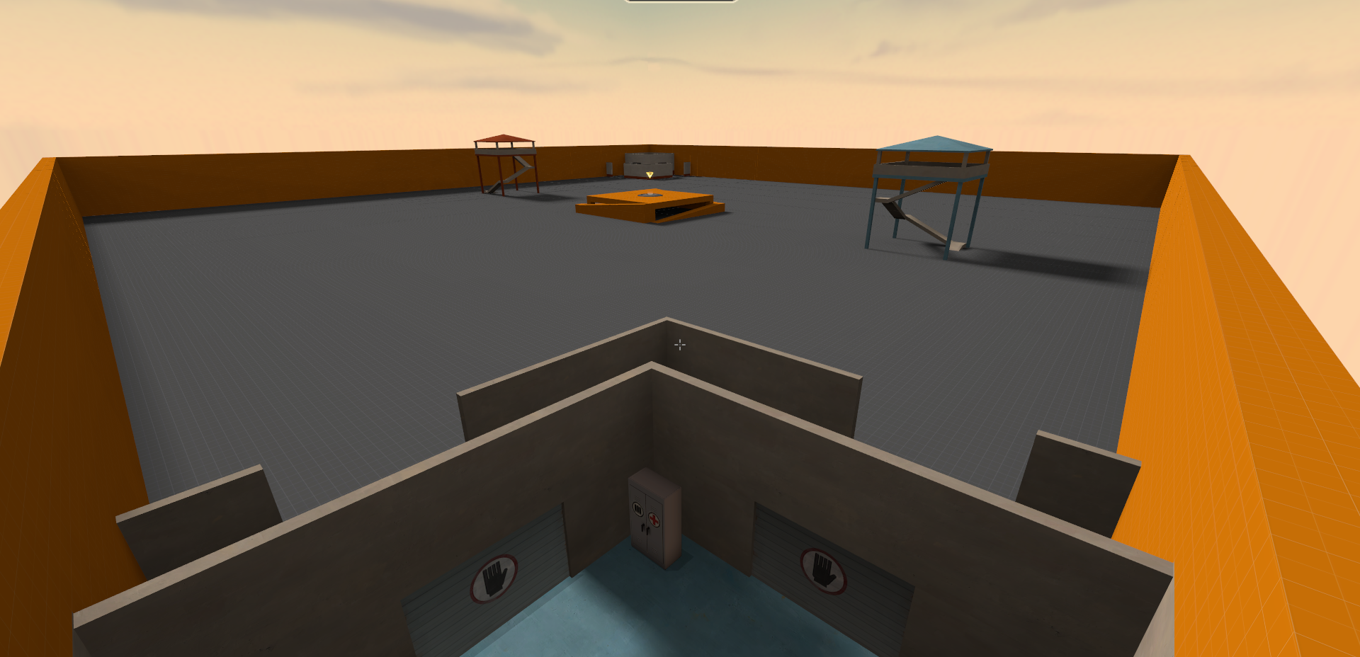
Try designing the point area a few pieces at a time. Crash is right, don't have a giant brush as a floor to build things on.
Try to make interesting height differences that classes can play around. Players love being on the high ground so they will naturally play around it. It also makes combat more interesting. Even a height difference of 32 units can make a huge difference! That much being said, height differences over 512 can be a bit overwhelming. Tying this into the first point, try making smaller ground planes with height differences between them.
Try to think about how combat will play out when you design points and other combat spaces. Keep asking yourself questions about how classes will play around what you've built. Is this too long of a walk/big for heavy players? Does sniper have a place to shine without being too oppressive? Do scouts have opportunities to jump around on things? Do medics have places to duck into cover when falling back or staging a push? Do engineers have a place to set up a nest? Are there ammo packs in enough good places for spies infiltrating?
When designing spawns it's a good idea to make each exit meaningful in that they don't exit into the same sight line. This is less necessary in koth, but just keep the exits far enough apart from each other so they're not easily spammed simultaneously.
Since you're making a KotH map, make sure that routes leading to mid do not bypass the mid. Players should have to push into mid to contest the point and through/beyond the point to forward hold. Routes shouldn't give that opportunity to players for free, as this leads to players dying to flankers without realizing they're there.
Right now you basically have one single massive route into the point area. You should have a few routes into mid and they should serve different purposes. Think about how there are the two main push routes onto the Mid on Viaduct as well as the flank route leading to concrete and the path leading to the high ground on the cliff. It might also be worth having some routes to filter from the spawn lobby to the area approaching mid (think about the narrow building with three exits you have to walk through on Viaduct).
Right now your map looks very overscaled. Try putting down some player models (search for "hwm" in the model viewer) as prop_statics all over your map to get a sense of scale when you are making it. These player models won't show up when you compile your map so you can leave them in. As far as raw numbers go, try to keep sightlines under 2048 units. Damage falloff starts at 512 units and most combat occurs within 1024 units, so make sure that you design your fight spaces around those rough measurements. If you need to, take a look at some of the
decompiled stock maps to get an idea of how large their individual areas are.
This one is very important: don't expect to get it right the first time! Your first map isn't likely to be good (all of ours certainly weren't!) so don't worry if your first play test doesn't go well. You'll be in good company. Even when veteran mappers make new maps their a1s aren't guaranteed to be good. Map making is an iterative process! Most maps go through dozens of versions before they hit release candidate, some even more! Keep perservering and don't be afraid to ask other people for help, opinions, and guidance!
Best luck!


