CP Firewatch [Deleted]
- Thread starter BsP
- Start date
You are using an out of date browser. It may not display this or other websites correctly.
You should upgrade or use an alternative browser.
You should upgrade or use an alternative browser.
- Status
- Not open for further replies.
Ok so first: that 110MB BSP, is that before or after repacking (compressing the map, not packing custom assets)? And two: did this get tested for gameplay before it was given the beautiful scenery? Because you generally test for gameplay first before detailing to save you from having to delete detail areas when the layout changes. And 3rd: Jesus H Christ thats a lot of screenshots. Can you narrow that down to like 6 or so instead of 55?
Thanks Vel0city for the feedback!
First of all, yeah, we COMPLETELY forgot about compressing the map, so many thanks for reminding us! (Since we were running out of time).
Second, we tested early versions with some friends and bots, but not in the TF2Maps net server, gameplay worked quite fine. Then we started detailing!
Third, we wanted to provide a better overwiew of the map in the screenshots, is it completely necessary to remove most of them?
Read the rest of this update entry...
Third, we wanted to provide a better overwiew of the map in the screenshots, is it completely necessary to remove most of them
It's good practice to take just a few screenshots that show as much as possible. A picture of a wall with windows/doors on it doesn't really say much about the map at a glance. This screenshot, for example, doesn't really tell me anything. This screenshot of Sunshine, on the other hand, shows a ton of the map at once, giving you an idea of what that space is like.
You can totally include a ton of screenshots if you want, but I'd recommend placing the more informative ones at the top of the list.
Oh, I see your point.
Thanks!
Not only that, I think I spotted some straight-up duplicates in there. Anyway...
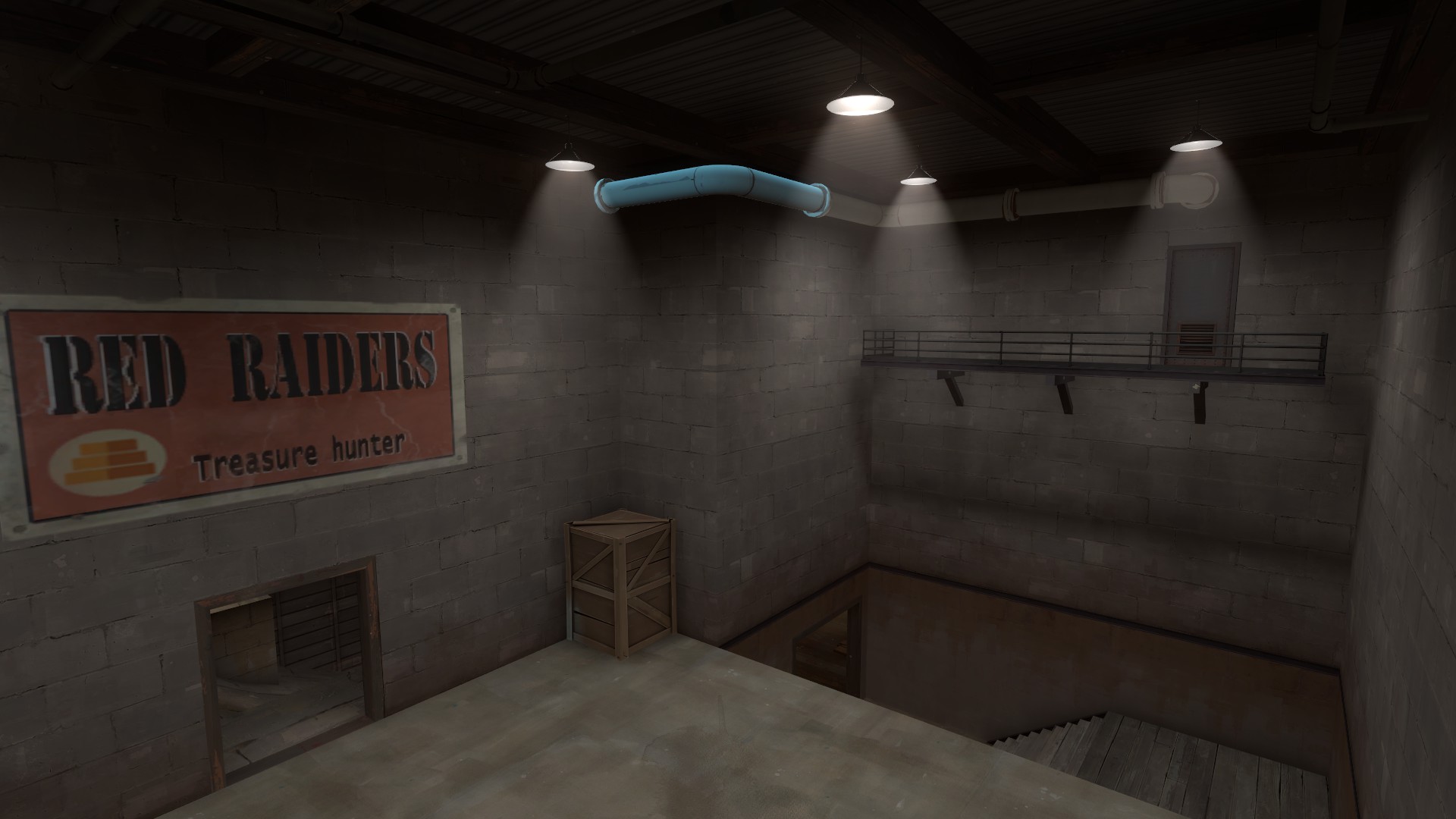
Use an info_lighting to fix this glowing pipe (which appears to be getting its lighting origin from outside the building).
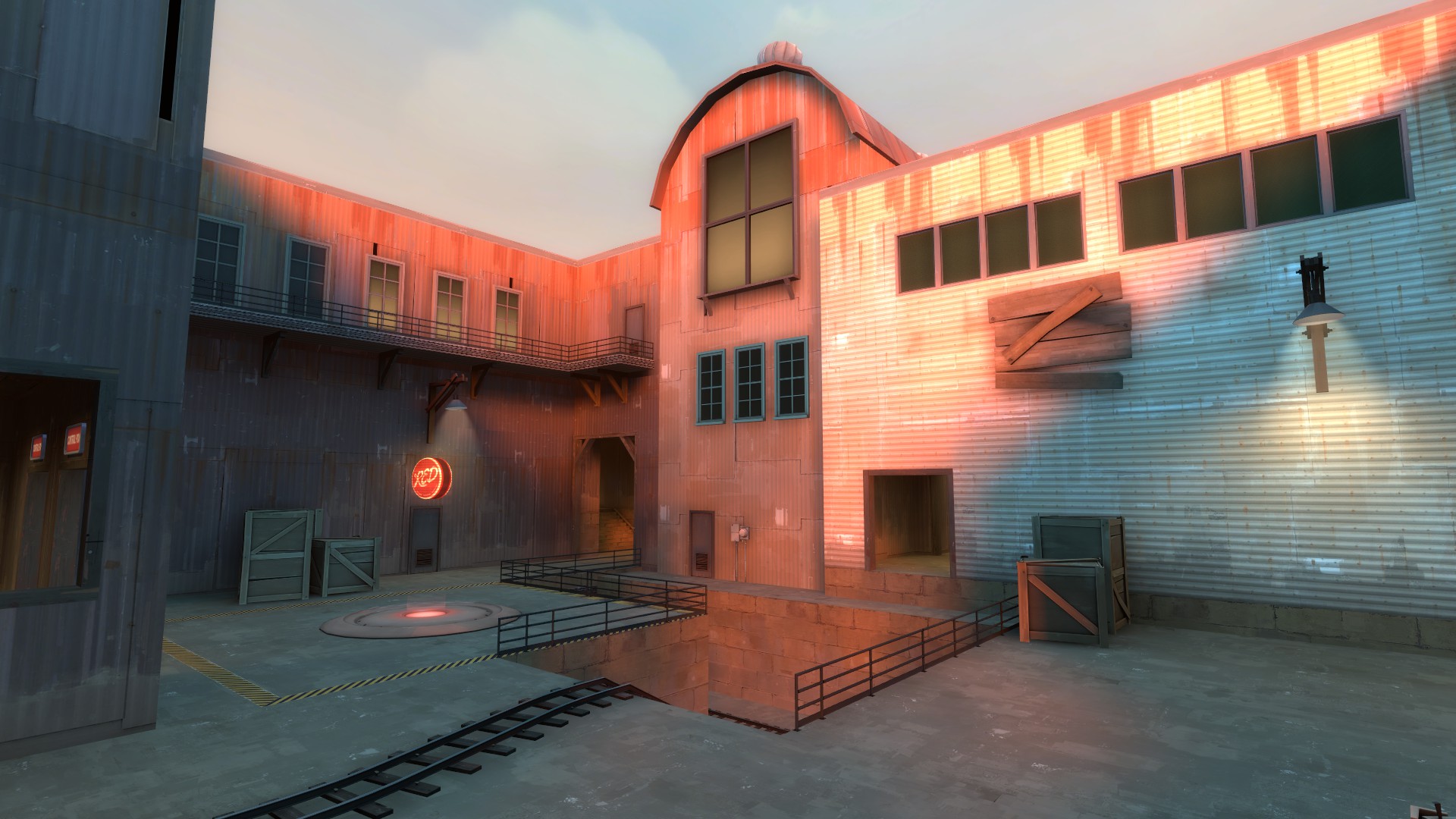
Similar situation with those three windows.
Overall, this map looks gorgeous on account of the extremely saturated colors of the light_environment... and that worries me. It worries me that people will have a hard time telling who's on what team when everyone is bathed in pure red or pure blue light. I already can't tell whether I'm looking at red or blue textures in most of these pictures.
Use an info_lighting to fix this glowing pipe (which appears to be getting its lighting origin from outside the building).
Similar situation with those three windows.
Overall, this map looks gorgeous on account of the extremely saturated colors of the light_environment... and that worries me. It worries me that people will have a hard time telling who's on what team when everyone is bathed in pure red or pure blue light. I already can't tell whether I'm looking at red or blue textures in most of these pictures.
Really cool detail wise, but you have broken doors for blu spawn in stage 3 (in addition to the doors you can leave during setup in stage 2 that n8 mentioned). Blu can't leave spawn at all.
I like the gravel pit A+B split (if that was intended) for stage 2, but you've left your last point unlocked for stage 3 when you reverted to the linear point system.
I like the gravel pit A+B split (if that was intended) for stage 2, but you've left your last point unlocked for stage 3 when you reverted to the linear point system.
You could treat the environment lighting as being a "night time" environment. Basically that means adding more lights to the playable area to make visuals there neutral, while retaining the really nice atmosphere in all the out of bounds areas. Broad, wide angle diffuse lights; you probably don't even have to make them particularly strong since there's plenty of light, it's just not currently neutral.
Co-Author / Maker / Contributor of the map here ; just wanted to say something out loud because some people are getting midly confused about it : 2nd Stage of the map is made so that BOTH POINTS are cap-able at the same time, in opposite to stage 1 and stage 3 wich are in a 'last is locked until 1rst is capped' kinda fashion (much like cp_gorge).
Hope this clears up the confusion some of you might be having, my good sirs.
Hope this clears up the confusion some of you might be having, my good sirs.
Murky
L1: Registered
- Dec 31, 2016
- 1
- 1
Hi! Just wanted to ask, as I found it odd when I ran through the map. Is this meant to be a 2 way door? It seems a little non-sensical to just have a roller door there for seemingly no reason:
https://gfycat.com/AbandonedReliableAngelwingmussel
If it is, could you explain why? And why there are similar ones?
Also, the capture zone seems a little short. If you jump, you can actually jump above it.
https://gfycat.com/AbandonedReliableAngelwingmussel
If it is, could you explain why? And why there are similar ones?
Also, the capture zone seems a little short. If you jump, you can actually jump above it.
I like the idea of this map but the lighting is too blue and saturated to look all that good in TF2 in my opinion. I honestly find it hard to look at after a short time as it starts to hurt my eyes.
-Fixed a one-way door opening from both sides in Stage 1!
-Fixed third door from BLU's spawn not opening in Stage 3!
-Fixed BLU's spawn doors in second stage being enabled even during setup time!
-Shots and projectiles now dont pass through the fence in stage 2 in BLU's spawn!
-Fixed some clipping issues!
-Fixed being able to capture the last point in stage 3 without capturing the first one!
-Raised capture time of 3 to 5!
Read the rest of this update entry...
I think I really need to point this out
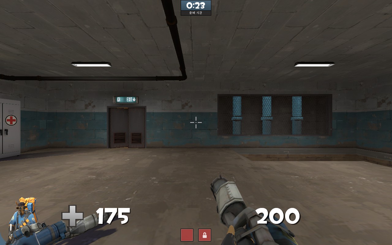
This is how I spawn at stage 1. At first glance, that door with the exit sign looks like a real exit but it's not. The real exit is behind me and this is really not intuitive and uncomfortable for blue. I can guess why you did this: to emphasize that there is a staircase. But if that is your reason, you might as well try to move the staircase so it aligns with other exits. If you really want blue to spawn like this then at least put an arrow pointing sideways and remove that exit sign because it clearly isn't an exit.
Edit:
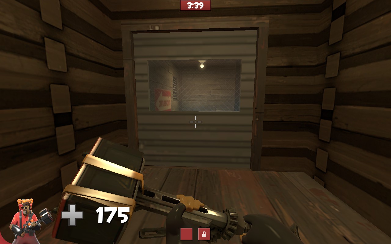
this door does not open until I politely knock on it. It is good for teaching manners but it isn't for gameplay because it cuts the flow of this route.
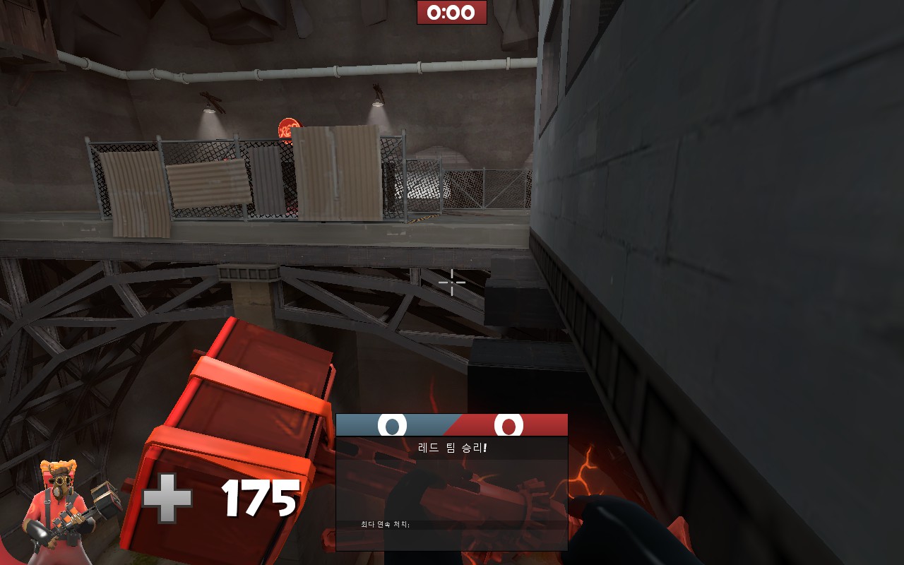
I am pretty sure this was not intended.
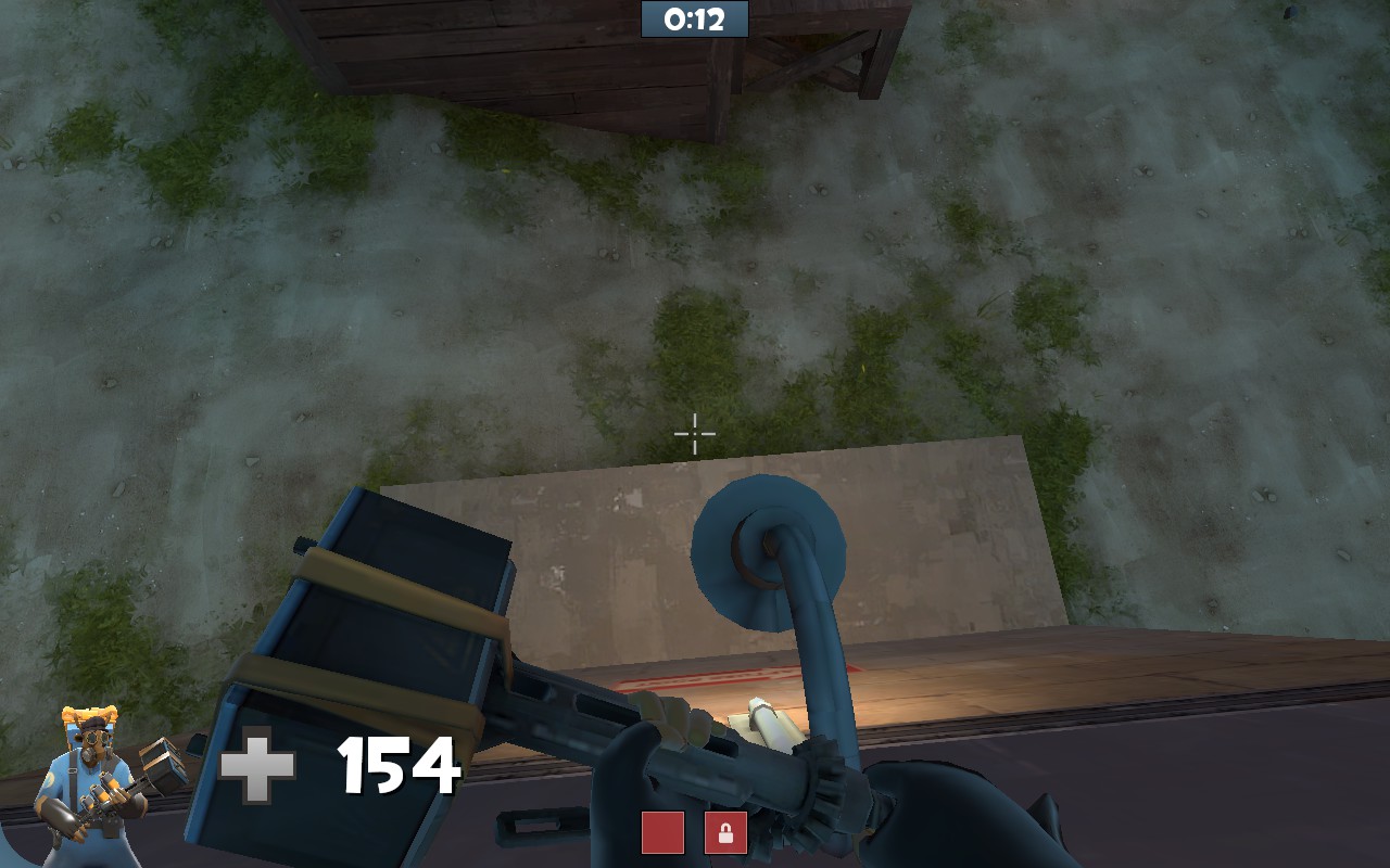
An exploitable lamp
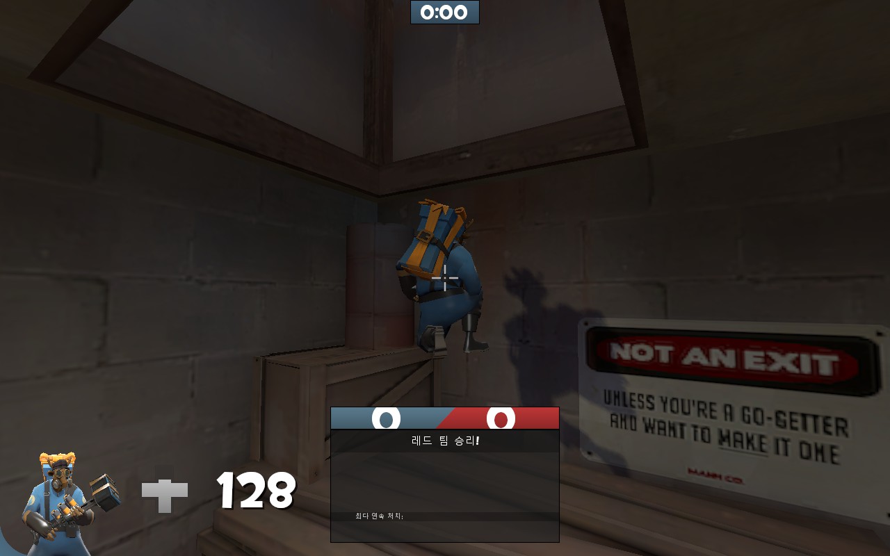
I am stuck here like literally. My screen trembles and I can not move.
EDIT 2: nvm looks like this happened because I was inside it when the round ended.
I am not going to mention any gameplay because there are people better than me when it comes to gameplay theory.
This is how I spawn at stage 1. At first glance, that door with the exit sign looks like a real exit but it's not. The real exit is behind me and this is really not intuitive and uncomfortable for blue. I can guess why you did this: to emphasize that there is a staircase. But if that is your reason, you might as well try to move the staircase so it aligns with other exits. If you really want blue to spawn like this then at least put an arrow pointing sideways and remove that exit sign because it clearly isn't an exit.
Edit:
this door does not open until I politely knock on it. It is good for teaching manners but it isn't for gameplay because it cuts the flow of this route.
I am pretty sure this was not intended.
An exploitable lamp
EDIT 2: nvm looks like this happened because I was inside it when the round ended.
I am not going to mention any gameplay because there are people better than me when it comes to gameplay theory.
Attachments
Last edited:
- Status
- Not open for further replies.


