You are using an out of date browser. It may not display this or other websites correctly.
You should upgrade or use an alternative browser.
You should upgrade or use an alternative browser.
- Jul 22, 2009
- 1,874
- 1,258
You should be more imaginative for your 'C' point, it's just gravelpit in a nutshell :/
now that this map has competitive attention, phi is better off not fixing what is not broken imo
B1D Released: http://dl.dropbox.com/u/84556731/cp_edifice/cp_edifice_b1d.bsp.bz2
Changelog:
- Fixed small clipping errors
- Made metal sheets solid
- Added small 3d skybox
- Minor technical upgrades
Please use this instead of B1A for any tests you might have. Thanks.
Changelog:
- Fixed small clipping errors
- Made metal sheets solid
- Added small 3d skybox
- Minor technical upgrades
Please use this instead of B1A for any tests you might have. Thanks.
Melvin D Engineere
L4: Comfortable Member
- Feb 25, 2012
- 173
- 192
this map is super sexy; the only issue i have with the detailing is how much grass you have on the walls. It looks completely wrong and bad and wrong and you should totally change it to be un-bad.
i will proceed with the un-badding procedure
If everyone could un-bad all of the bad we'd have the perfect maps.
And we would also solve all the problems in the world. And Hitler would be a painter, not a mass-killer. And both capitalism and socialism would work.
Good luck with that, Idolon.
Melvin D Engineere
L4: Comfortable Member
- Feb 25, 2012
- 173
- 192
nightwatch
aa
- Sep 7, 2012
- 638
- 501
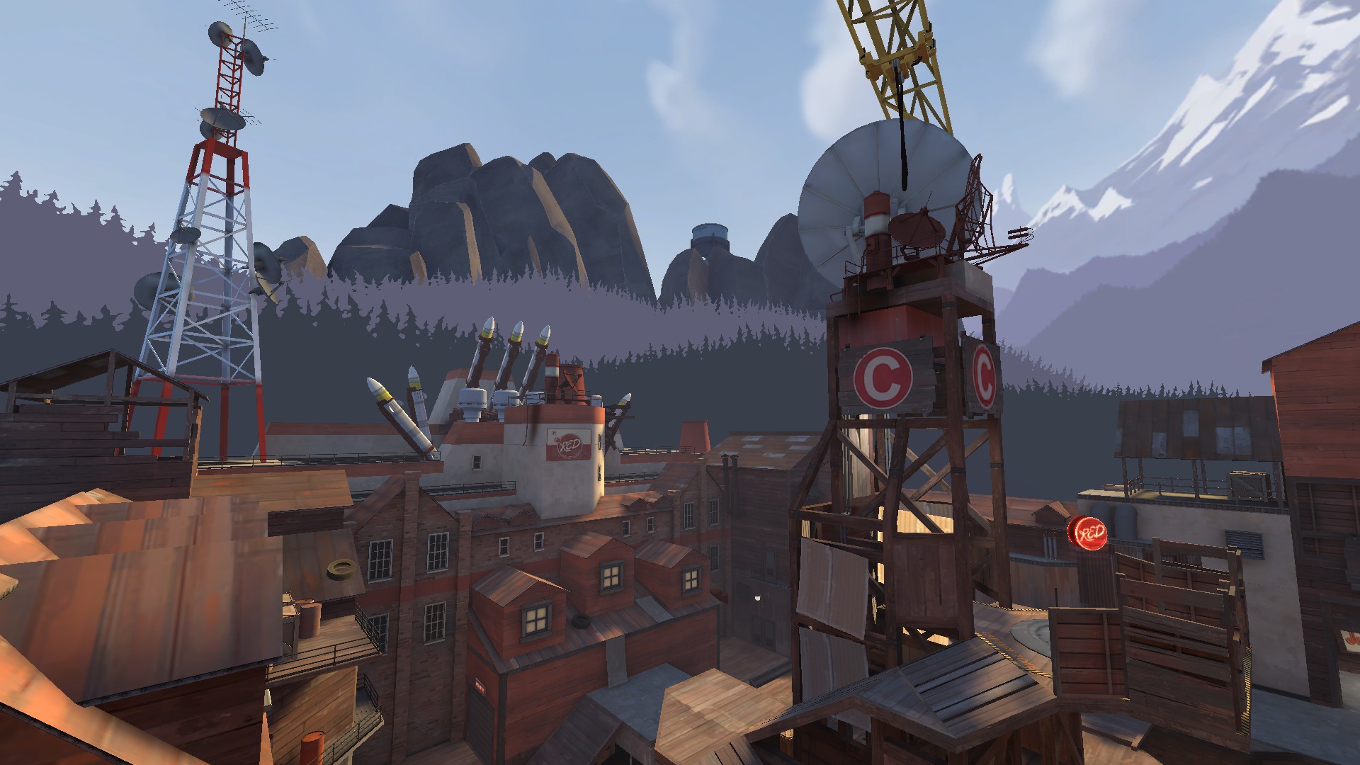
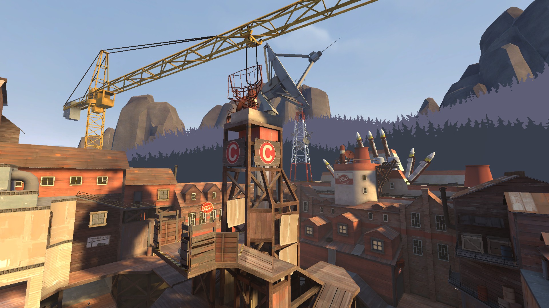
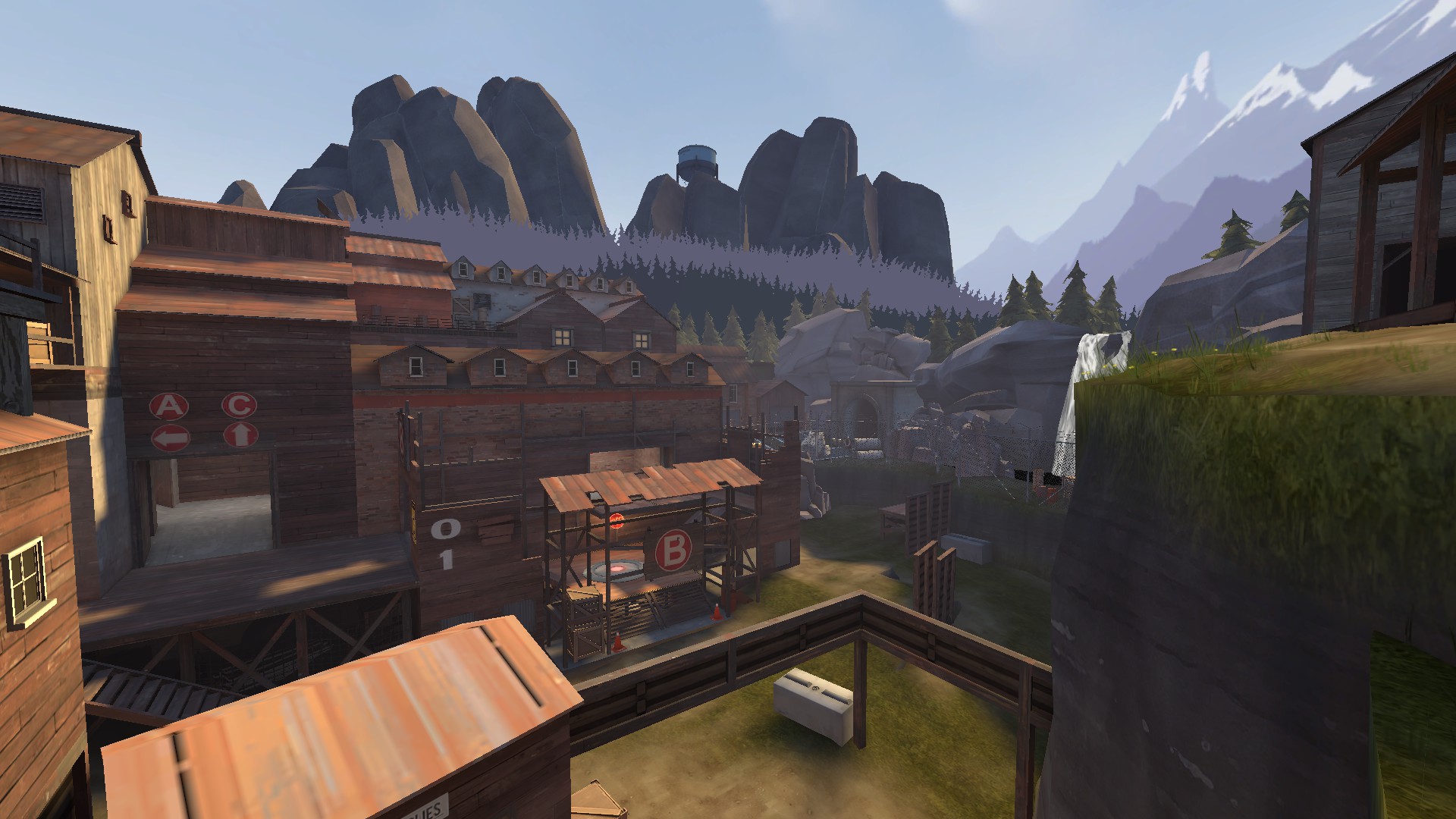
The forest cut-outs clash horribly with the mountain/rocks behind them, and the water tower in the distance seems uncertain of what scale it is.
In addition, your placement of the rockets is farcical and only adds to the overall business of the detailing.
That said, I think there's a lot of potential here.... I just don't know where. Slow it down somehow, make it more drab and boring, duller.... I don't know.
In addition, your placement of the rockets is farcical and only adds to the overall business of the detailing.
That said, I think there's a lot of potential here.... I just don't know where. Slow it down somehow, make it more drab and boring, duller.... I don't know.
The forest cut-outs clash horribly with the mountain/rocks behind them, and the water tower in the distance seems uncertain of what scale it is.
In addition, your placement of the rockets is farcical and only adds to the overall business of the detailing.
That said, I think there's a lot of potential here.... I just don't know where. Slow it down somehow, make it more drab and boring, duller.... I don't know.
The rockets were mainly something I did for fun, just to see how it would look. I'm most likely going to remove them and place them inside, or have just one or two barely showing outside.
The trees, yeah I'll work on that. I'll either fiddle with the fog settings to see if I can get a lighter and more soft façade of trees and rocks, or just remove the rocks altogether if that doesn't work. With the current technical standpoint of my skybox, putting the rocks in front of the trees wouldn't work (or fit with regards to space), so that is kinda ruled out.
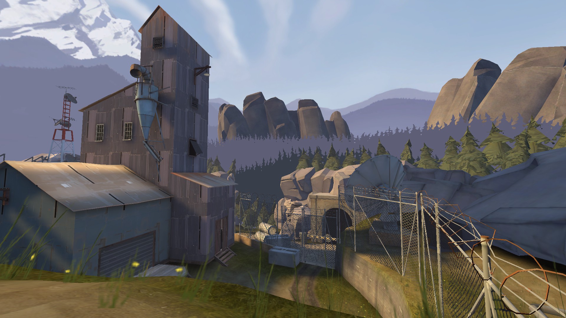
Something I noticed after playing this was that the texture work feels... unfocused. Especially around point C. Like, you've got brick, wood, concrete, and sheet metal exteriors all mashed together. The only other map I can think of that does that is maybe Mountain Lab, and it's not exactly held up as an example of good detailing. Furthermore, you have a cinderblock structure on top of one made of corrugated metal.
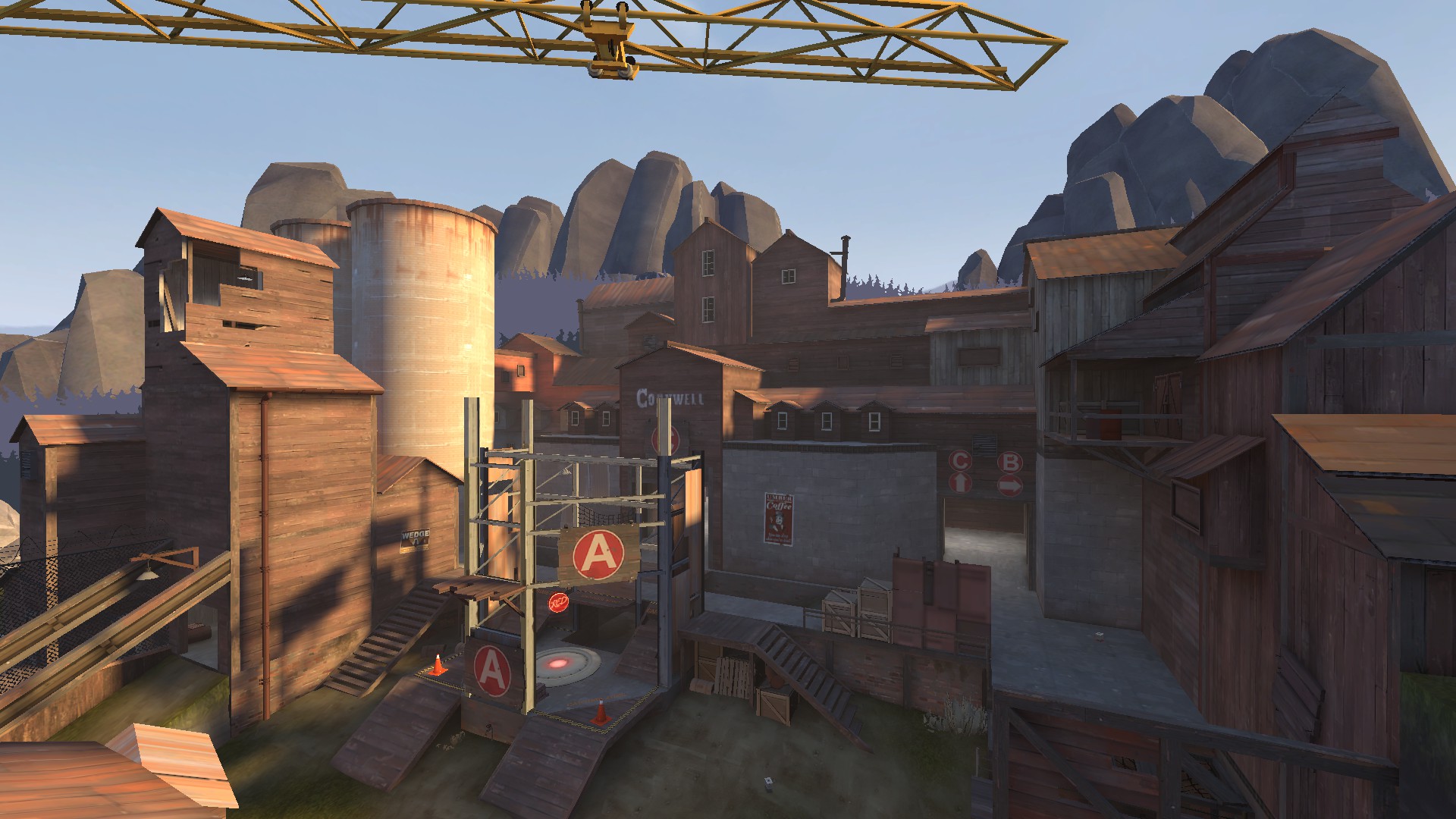
Also, I thought this was meant to be Construction Pack themed. Other than the crane, and the capture zone structures at A and B, I don't see anything that looks construction-y.
Also, I thought this was meant to be Construction Pack themed. Other than the crane, and the capture zone structures at A and B, I don't see anything that looks construction-y.
Something I noticed after playing this was that the texture work feels... unfocused. Especially around point C. Like, you've got brick, wood, concrete, and sheet metal exteriors all mashed together. The only other map I can think of that does that is maybe Mountain Lab, and it's not exactly held up as an example of good detailing. Furthermore, you have a cinderblock structure on top of one made of corrugated metal.
Also, I thought this was meant to be Construction Pack themed. Other than the crane, and the capture zone structures at A and B, I don't see anything that looks construction-y.
I'll have to admit, I didn't entirely go the route towards complete construction-theme. As I progressed through the map I started to favor solid buildings rather than the half-constructed ones I've seen in other maps detailed alike.
Again, I'll admit that C is probably the weakest link in terms of detailing. It's the only point without an out of bounds detail area present and is the one I detailed in a jiffy well before any of the other points. At some time I'll probably head back and re-detail most of the area around it so it is less clustered and dense and represents a more "facility-in-a-valley" feeling than it does now.
- Jul 31, 2011
- 872
- 1,021
The area around C is super visually noisy. You've got way too many big, complicated props all vying for attention; a satellite dish, a crane, a radar thing, and a fuckload of rockets.
Would look better if it was simplified so there aren't more than 2 giant things imo
Would look better if it was simplified so there aren't more than 2 giant things imo
The only other map I can think of that does that is maybe Mountain Lab, and it's not exactly held up as an example of good detailing.
Am I the only one that finds Mountain Lab insanely well detailed and actually has a great atmosphere and the keeps the feel of "I'm breaking through a secret base" that really few maps have?


