Edifice

CP Edifice RC1

phi

aa
Nov 6, 2011
832
1,815
I'm not *too* worried yet but I still have to keep an eye on filesize. I haven't started detailing the buildings or the OoB areas and the packed size is 12MB. Not too worried about it but if if ever manages to head over 35MB packed for whatever reason I'll have to keep an eye on it.
A8 coming in the following week, most likely.
 

MisterChippy

L1: Registered
Jan 25, 2013
2
0
If you're making this map for comp you really should avoid putting in too much custom cosmetic content. Comp players dislike maps that have too much stuff for a few reasons, mainly FPS and visual clutter.

Comp players hate visually cluttered maps. Many players use configs to remove as much cosmetic content from maps as they can. Here are some examples of what a config that is extremely popular among comp players does to maps:

Badlands before:
http://fakkelbrigade.eu/chris/configs/screenshots/maxquality_badlands.jpg
Badlands after:
http://fakkelbrigade.eu/chris/configs/screenshots/highframes_badlands.jpg

Coldfront before:
http://fakkelbrigade.eu/chris/configs/screenshots/maxquality_coldfront.jpg
Coldfront after:
http://fakkelbrigade.eu/chris/configs/screenshots/highframes_coldfront.jpg

So if you're making this map with competitive play in mind, you might want to keep the level of detail in this map to a minimum.
 
Sep 7, 2012
638
500
I'm not sure whether this is entirely relevant or not since I run chris's max frames config, but I could see either the skybox texture or an extremely out of place shiny floor underneath the world map room in the A tunnel when I jumped. There were also a couple of spots on the ground near walls where the skybox texture was seen through gaps. One thing to keep in mind is that few competitive players keep 3d skyboxes on, so if you're trying to visually seal an area with the 3d skybox then you're out of luck. At the same time, you might have left these gaps there simply because you didn't know about them. Just remember that your 3D skybox won't appear to 90% of comp players and so they may or may not know why there are funky holes here and there.
 

phi

aa
Nov 6, 2011
832
1,815
There is no 3d skybox yet, nightwatch, and yes I am aware that most players (including me) keep r_3dsky to 0 for 'better' play. Most likely these visual errors were caused by either intersecting skybox brushes onto world geometry or a misplaced nodraw brush. That one floor is like that either because it's the wrong texture or because I forgot to put an env_cubemap anywhere near it. It'll be fixed in a8.
 

JeanPaul

L6: Sharp Member
Aug 5, 2010
284
279
Vertical scale at C is fine

If anything, blu has too easy of a time capturing it.
 

phi

aa
Nov 6, 2011
832
1,815
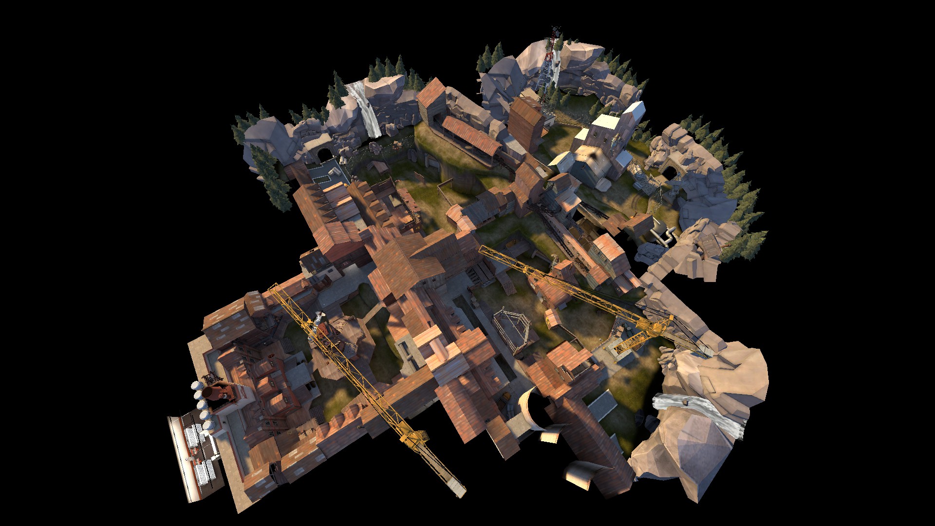
WHOA, I did something! A8 released!
http://dl.dropbox.com/u/84556731/cp_edifice/cp_edifice_a8.bsp.bz2

Changelog:
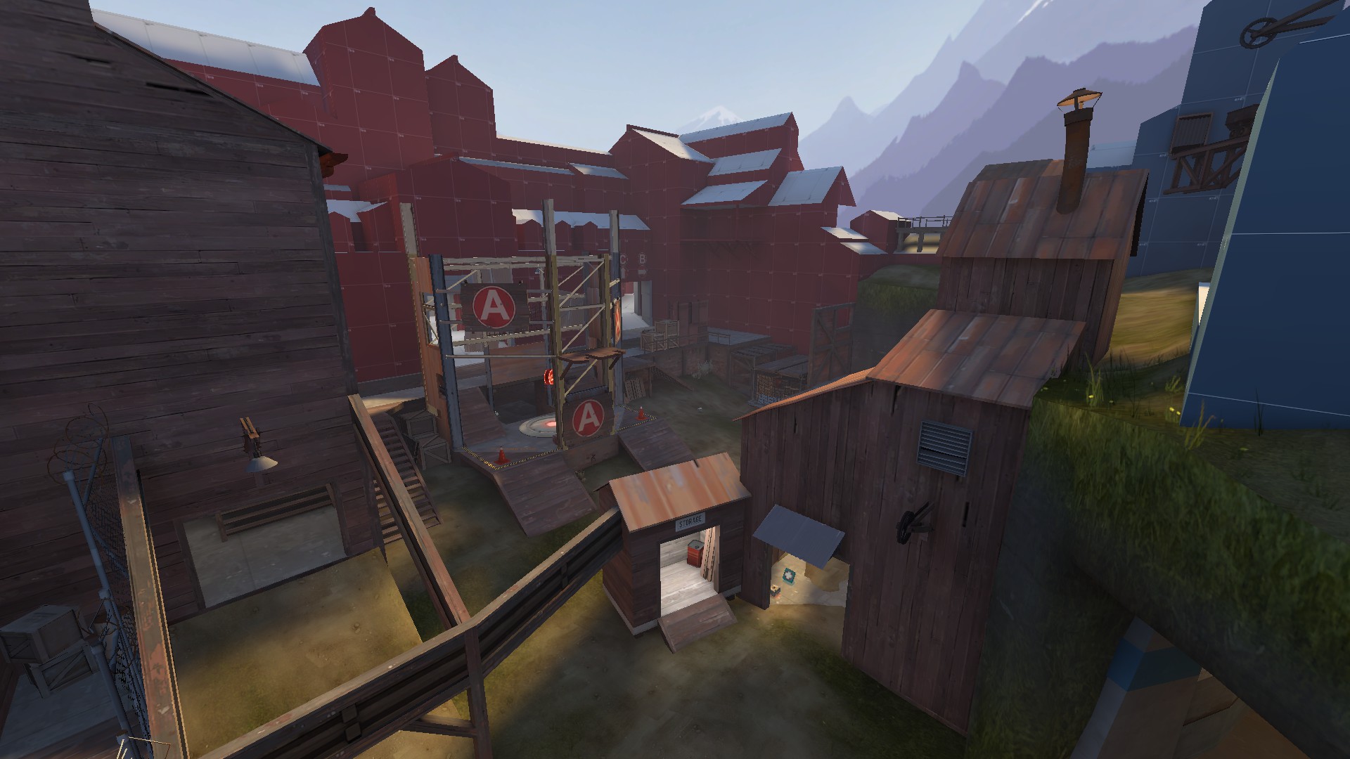
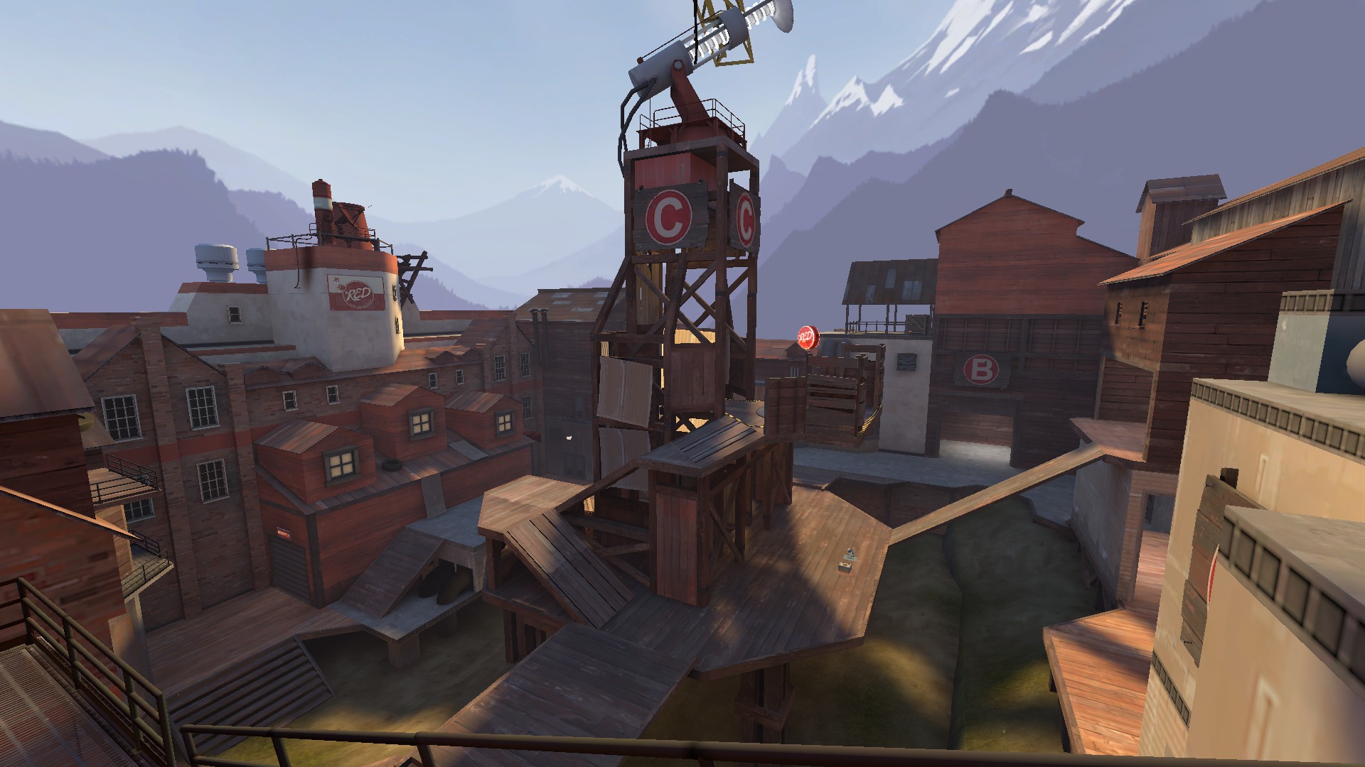
- Added dropdown from the A+B>C connector high ground to low ground
- Removed wall from upper connector
- Added jumproute to C from ground
- Removed easy demospam spot up to C and made it a bit harder to do so
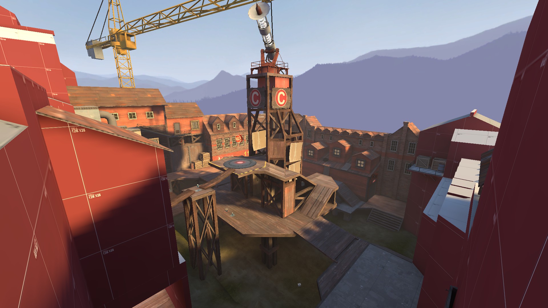
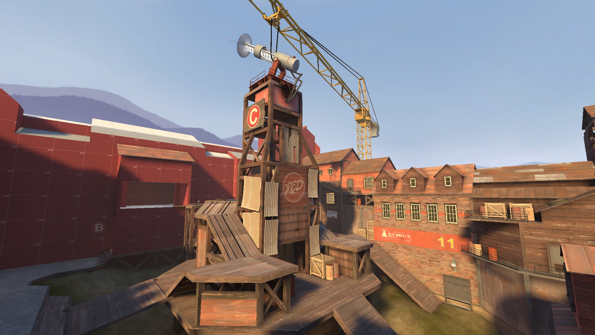
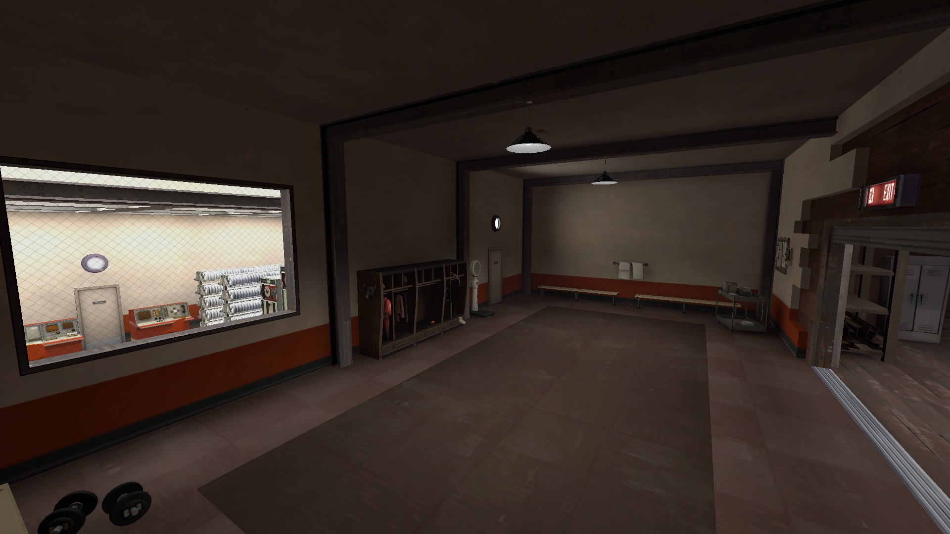
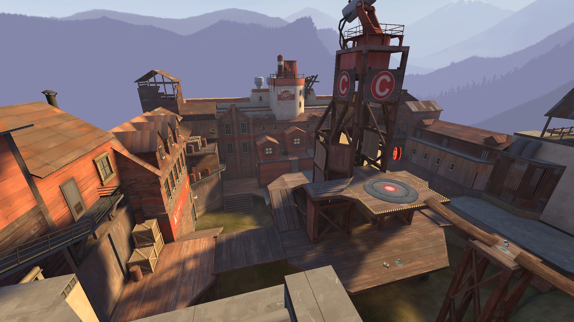
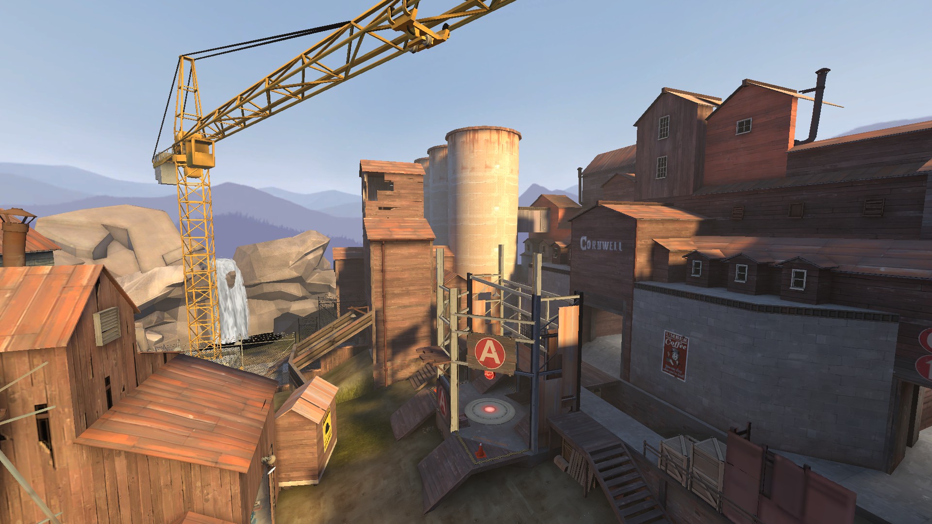
- Detailed a bit around C
- Fixed some clipping errors
- Properly built cubemaps
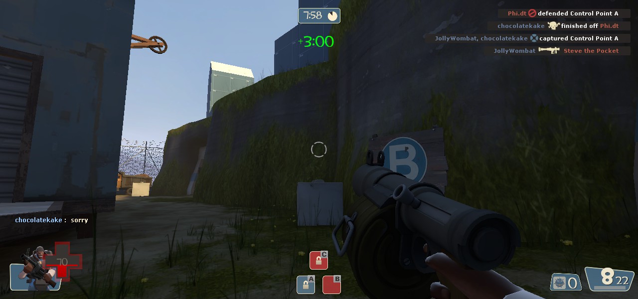
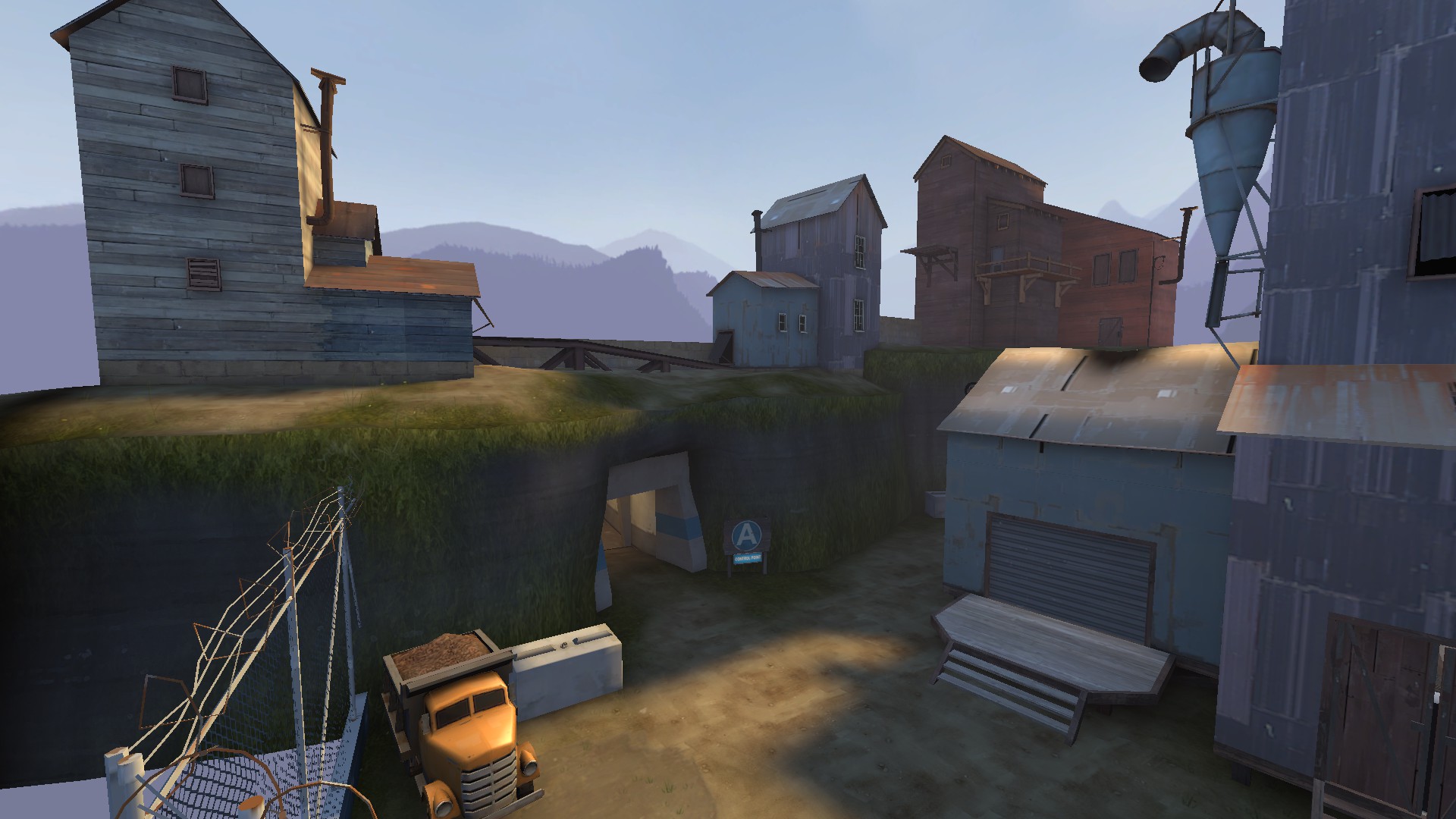
- Added cover to A
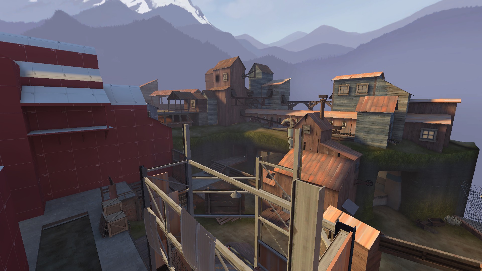
- Widened area behind A to facilitate movement
- Added more metal on the ibeams around A
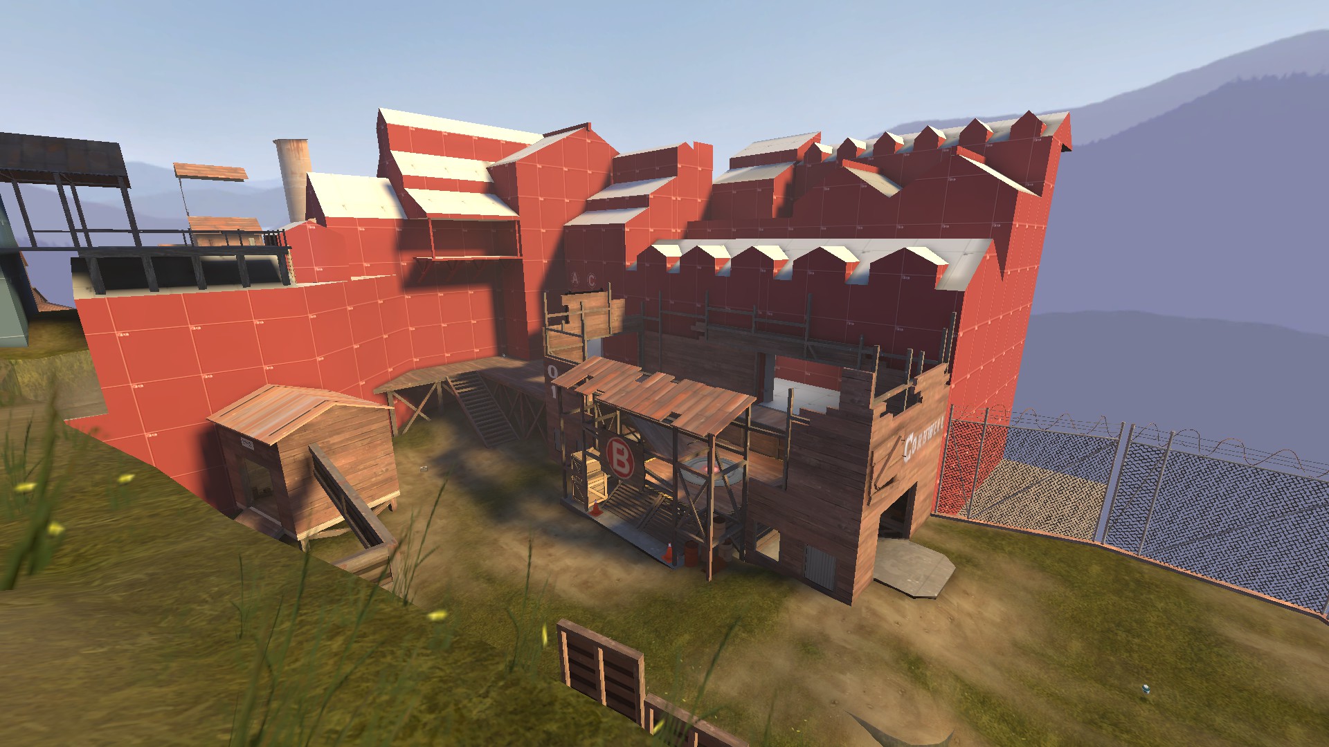
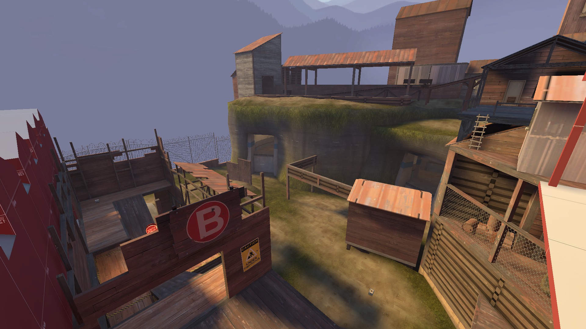
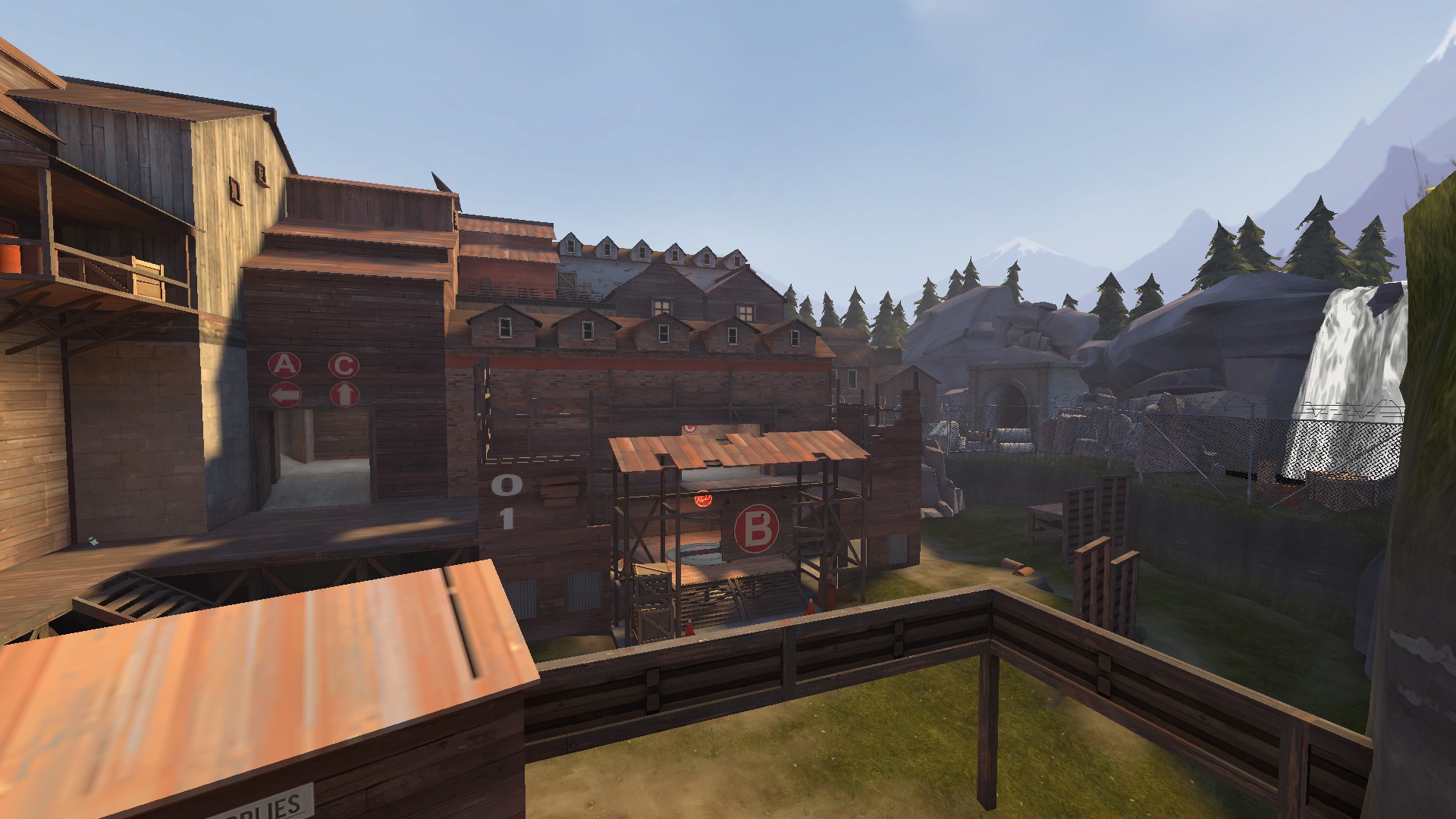
- Clipped B a little
- Added props in places that are inaccessible to make it look like they actually aren’t accessible
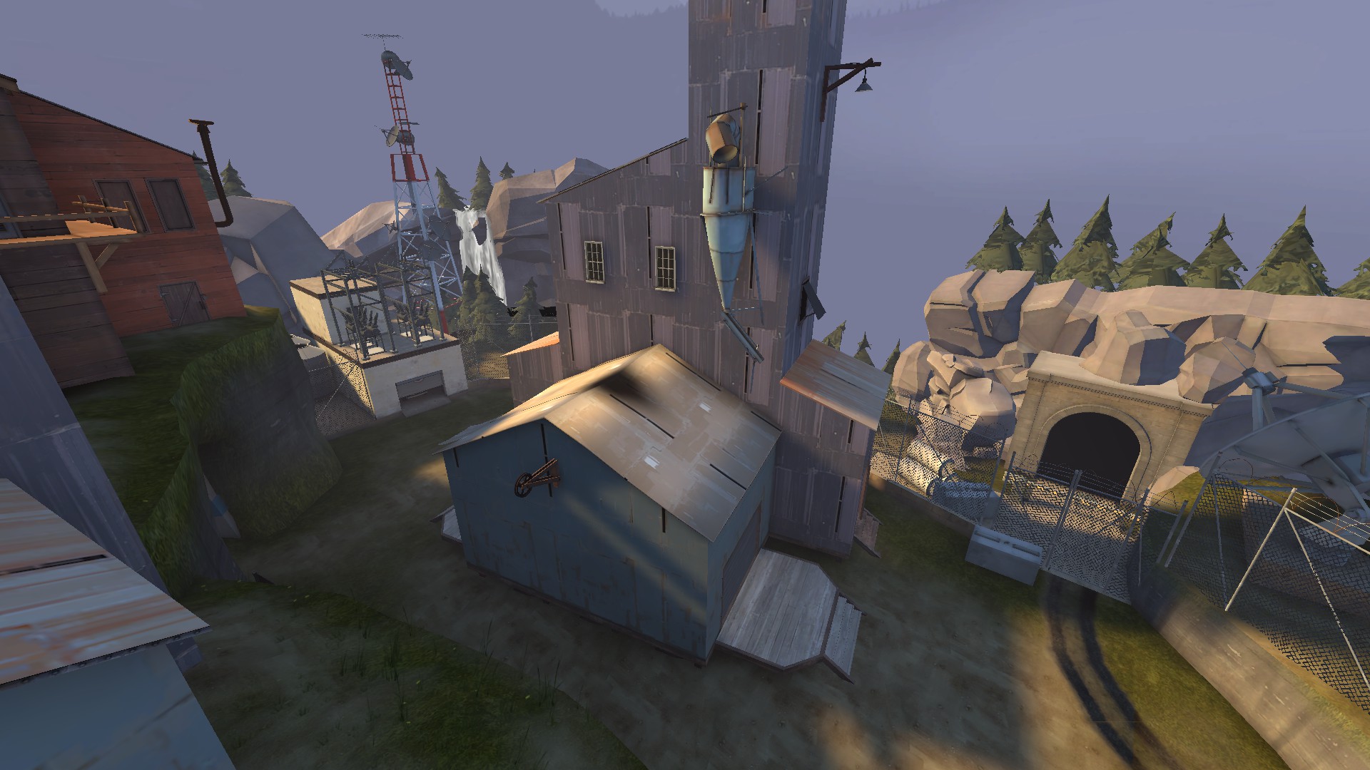
- Dev pass on all buildings, preparing for major detail pass in coming versions
- Removed many beams in connectors

2013-03-02_00011.jpg

2013-03-02_00010.jpg

2013-03-02_00009.jpg

2013-03-02_00013.jpg
 

phi

aa
Nov 6, 2011
832
1,815
also fair warning: there's a few errors in a8 that I'm going to be addressing soon. Minor exploits but exploits nonetheless. The map works well otherwise, feel free to test.
 

Verno

L2: Junior Member
Jul 17, 2010
80
34
I think there are way to many dormers (those tiny rooms with widows on top of buildings).

Edit:
Most of your buildings are too pointy really.
 
Mar 23, 2010
1,872
1,696
anyone else kinda bothered by the crane being still hooked onto the laser?
 

GPuzzle

L9: Fashionable Member
Feb 27, 2012
638
414
I love this map. Really. I do have some pics about things that I thought that were worth taking note.
First:
2013-03-03_00006.jpg

This is a bit too dark, I think.

Second:
2013-03-03_00005.jpg

Wonky lighting in RED spawn.

And last, but not least:
2013-03-03_00004.jpg

Uh, this is the connector between BLU spawn and CP A. This suffer from a problem from Doomsday. You enter through left, and then you split between left and right. In fact, while Doomsday has an arrow that allows you to see that you can go left, you can't see the right way in Edifice, it doesn't have any way to point to right. This is quite wierd, as most people come from left, making it much easier to hold, as you can attack someone through right and they won't notice. Change this so you can see the way to the right when you enter and not only left.

Anyway, this map is awesome. And also: Pistol 2stronk.
 

Pocket

Half a Lambert is better than one.
aa
Nov 14, 2009
4,694
2,579
Or put a pair of arrow signs roughly where the window currently is.
 

GPuzzle

L9: Fashionable Member
Feb 27, 2012
638
414
Or put a pair of arrow signs roughly where the window currently is.

Doomsday does that and nobody takes left. Still, could be a solution.
EDIT: I think (my opinion) that the main reason why I think it's quite hard to rocket jump from RED spawn to C is because the map itself is quite cramped. Mainly A, but C also is quite cramped. Anyway, that's about it from my gameday information.
 
Last edited:

phi

aa
Nov 6, 2011
832
1,815
QUICK Release of Edifice A9!
Bigger, better, smexier - http://dl.dropbox.com/u/84556731/cp_edifice/cp_edifice_a9.bsp.bz2

Screenshots:
2013-03-08_00001.jpg

2013-03-08_00002.jpg

2013-03-08_00004.jpg

2013-03-08_00005.jpg
2013-03-08_00006.jpg


Changelog:
- Removed lip on dropdown
- Slight overall technical editing
- Unnoticable brush editing to prepare for a possible flank route to be created on B
- Major detail pass around C and the OoB areas around BLU Spawn
- Lots of little tiny things to make the map better overall

Get it here or in the OP!
 

Pocket

Half a Lambert is better than one.
aa
Nov 14, 2009
4,694
2,579

Some advice for that unfinished wall on the right: Replace the textures with bare cinderblock or something. Nobody paints an unfinished wall, and they definitely don't wrap the paint around to the edges like that. And the I-beams meeting each other at an angle like that doesn't seem particuarly likely either; consider just having either the vertical ones go all the way to the ceiling or the horizontal ones go all the way to the side, and having the others run into them.

Also I'm not fond of the blue wood in the other shots. It looks incredibly unnatural, as if it weren't so much painted as harvested from a tree on an alien planet.
 
Last edited:

phi

aa
Nov 6, 2011
832
1,815
I wasn't originally planning for this, it just kinda happened, but...
B1(a) RELEASED! DOWNLOAD - http://dl.dropbox.com/u/84556731/cp_edifice/cp_edifice_b1a.bsp.bz2

Changelog:
- Humongous detail pass everywhere, fully detailed the map and all OoB areas
- Adjusted skybox locations a lot
- Optimized a bit
- Fixed minor technical errors
- Changed the A-B lobby around quite a bit
- Added cover to C
- Removed bridge straight to C in favor of a board leading to the base of C
- Added a bit of cover to B and some stuff in the unused portion
- Fixed a few exploitations
- Clipped a lot
- Changed a bit of func_details to func_lods to lower my waterindices count (86.3%!)
- Minor changes all around the map

SCREENSHOTS:

2013-03-12_00006.jpg

2013-03-12_00005.jpg

2013-03-12_00008.jpg

2013-03-12_00003.jpg

2013-03-12_00004.jpg
 
Last edited:

GPuzzle

L9: Fashionable Member
Feb 27, 2012
638
414
Why do all your maps look freakin' sweet? Montane is one of the few eye-candy (Scenery Porn for TVTropes) maps with Badlands style, Maelstorm feels cool and don't even get me started on Edifice.