Dusk

CP Dusk rc

RaVaGe

aa
Jun 23, 2010
733
1,210
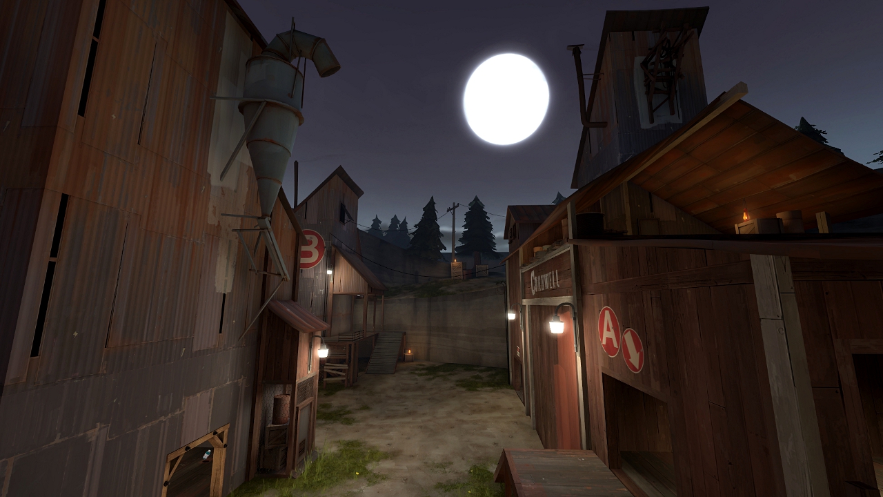
This map is so sexy. But I have some aesthetics reviews on the map for you :D


Where is the door :confused:


I think you should smooth the displacement here by adding a few spots of rust btw.


The area seems too wide, cut it please.


not long enough :D


This wall is very odd, you should make it perpendicular to the others, either in the respawn or here.


Btw this piece is too small and can be a bitch with the spam, get rid of the door on the right for extend it.


I don't like when two same things are differently textured. In this case here, this is the stairs.


This big rock is totally out of place, you may add a barn at the place of this rock who's totaly more in the style of the map.


Please add some signs here, especially on the right because it's a unique way.


Add a door here to keep a certain sense with the unique path you have in this zone.


The white wood texture is inappropriate, please stay in the metal tones here.


Same here.


The frame is misaligned and too thick.


The texture change bother me here.


This sign is useless and a bit ugly.


HOLE, HOLE !

:thumbup:
 
Last edited:

osiem

L2: Junior Member
Jan 25, 2011
89
137


Edit: DON'T DOWNLOAD THIS.
I've accidentally compiled with tool brushes off.

Changelog:
- paint patches and lightwarp texture packed in
- added menu photos
- fixed not sewn displacement
- moved D spectator camera
- little changes in 3d skybox


Yeah, Frozen's right, I've just predicted that since there's only one light entity in that room, the light's gonna look like that so I've changed the lightmap scale on those textures to 4.

Ravage - thanks A LOT for such great feedback! I think you're mostly right, but unfortunately I haven't read your post before compiling b1a and I've only noticed that not sewn displacement myself. It's gonna be useful in a next version though! :)
 
Last edited:

osiem

L2: Junior Member
Jan 25, 2011
89
137
I've just noticed that I've accidentally compiled with tool brushes off, so I'm compiling b1b at the moment, also some of Ravage's suggestions included.
I am so professional. -,-
 

osiem

L2: Junior Member
Jan 25, 2011
89
137


Okay, now everything is (should be) fine.
Some changes that Ravage suggested included.

Changelog:
- fixed tool brushes not included in the compile
- minor visual improvements and bug fixes
 
Last edited:

osiem

L2: Junior Member
Jan 25, 2011
89
137
Cp_dusk_b2. Coming sooner rather than later.
dusk_b2_a.jpg
 

osiem

L2: Junior Member
Jan 25, 2011
89
137
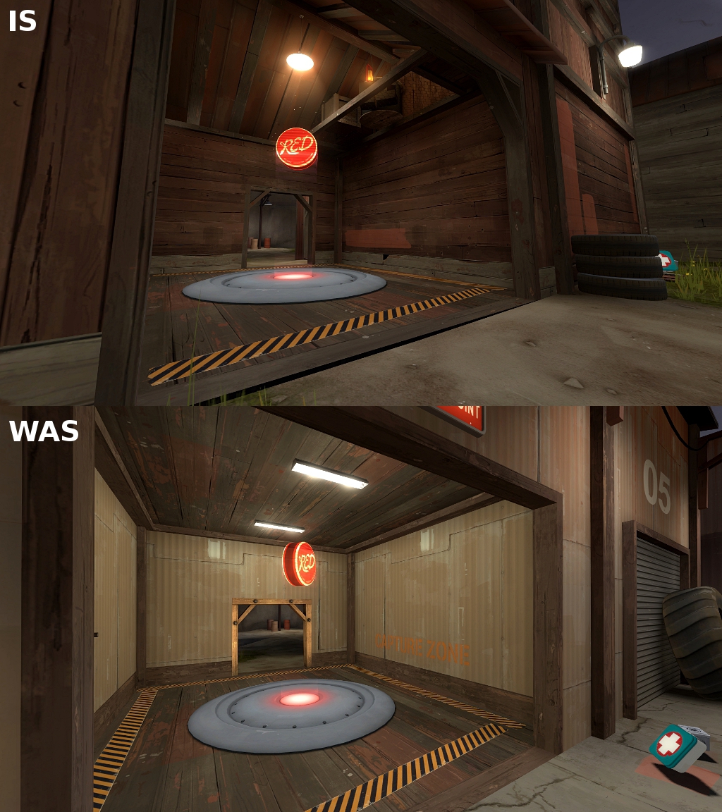
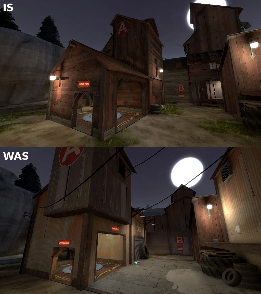
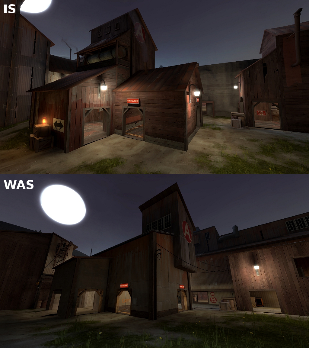
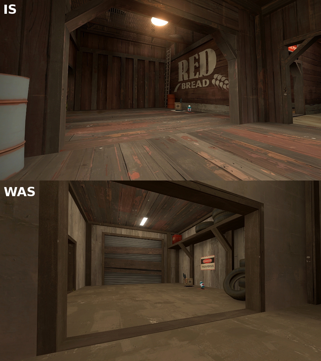
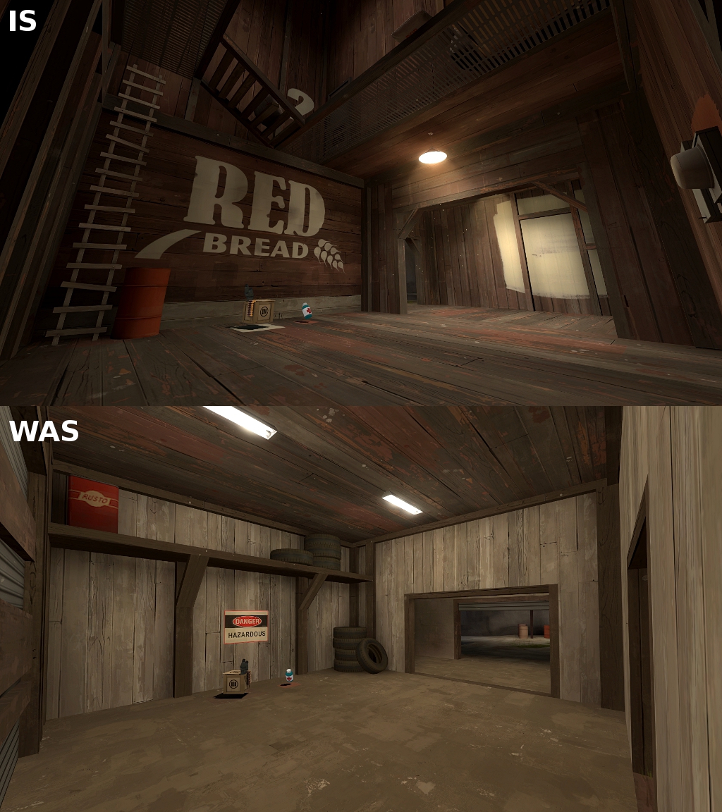
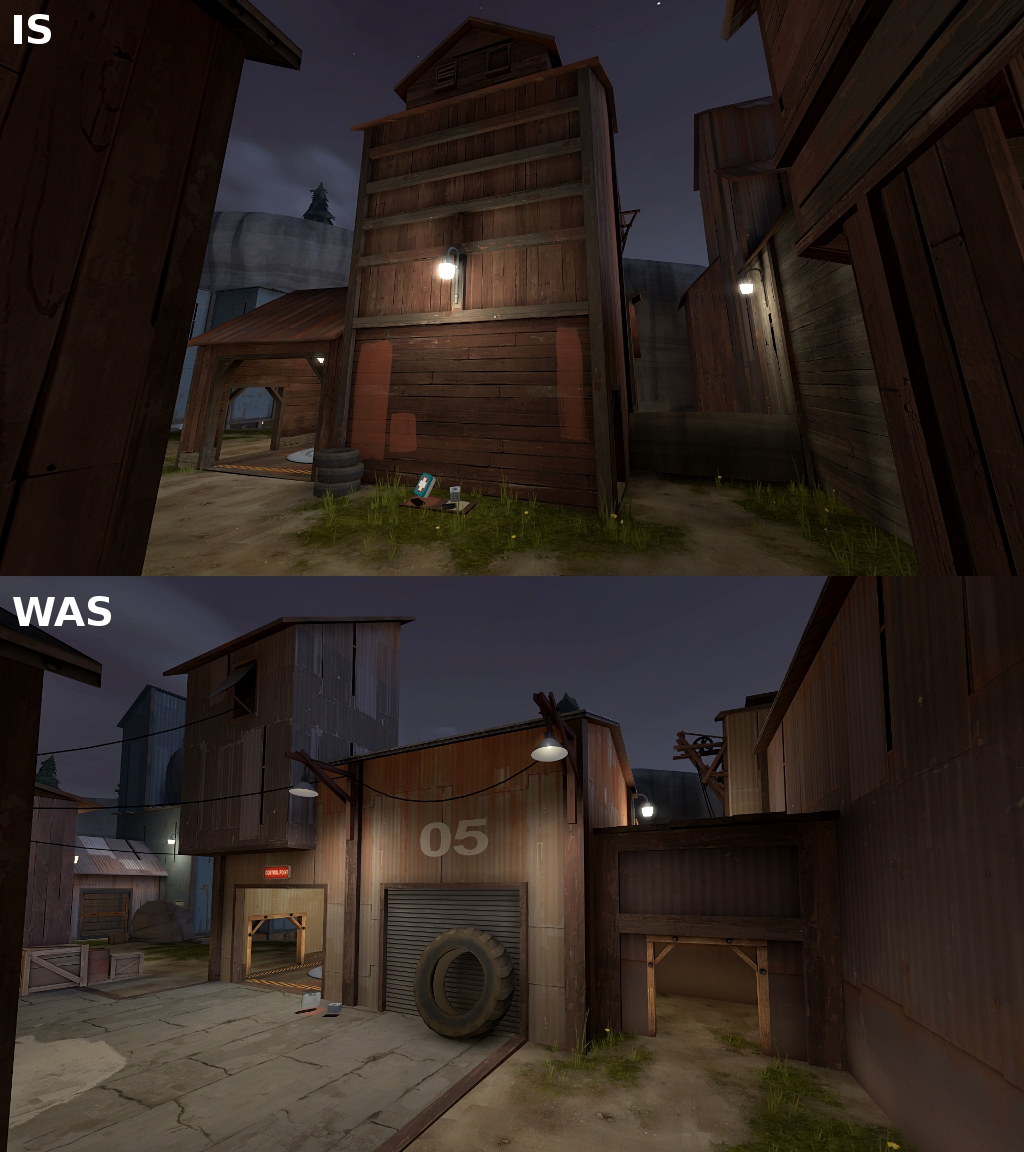
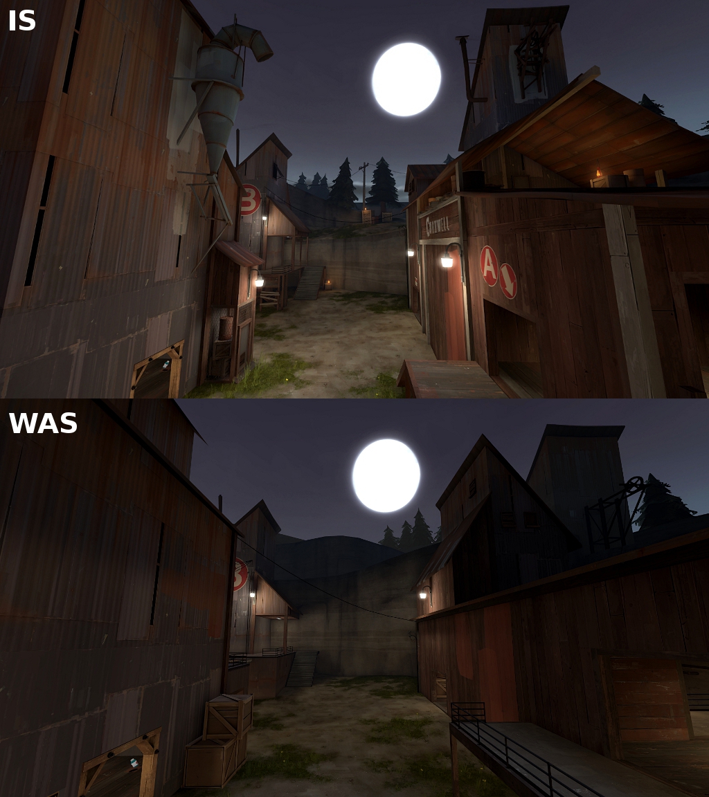
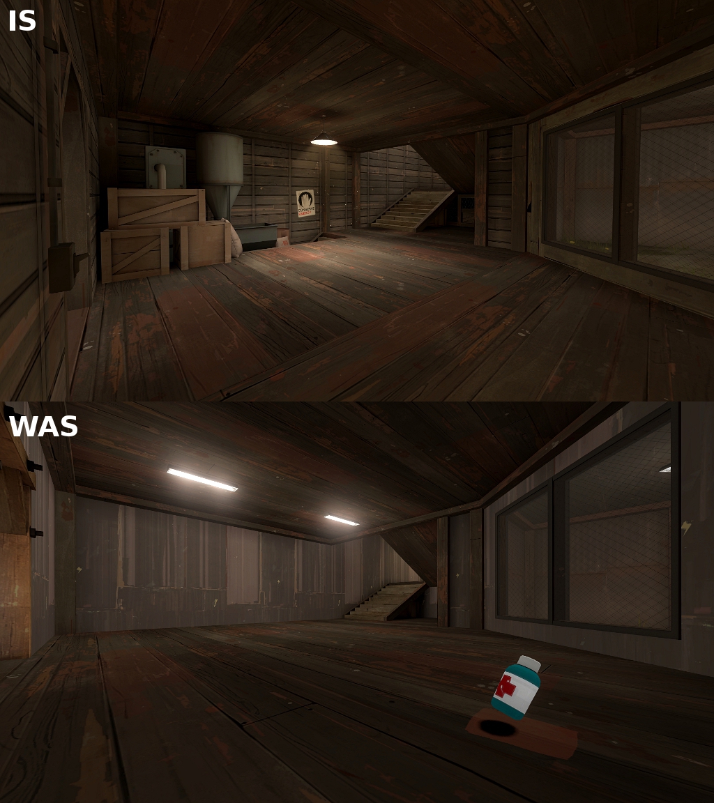
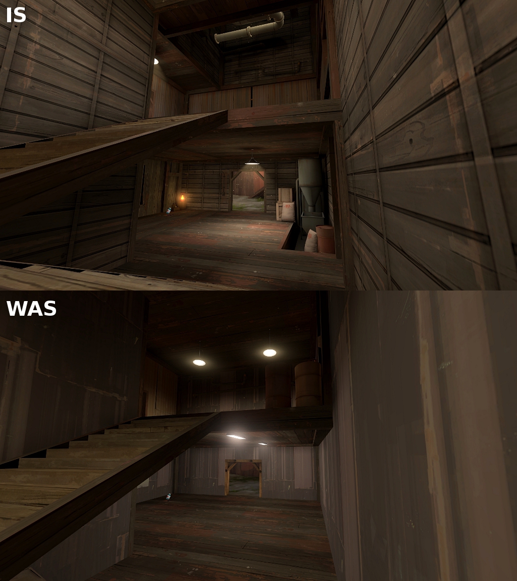
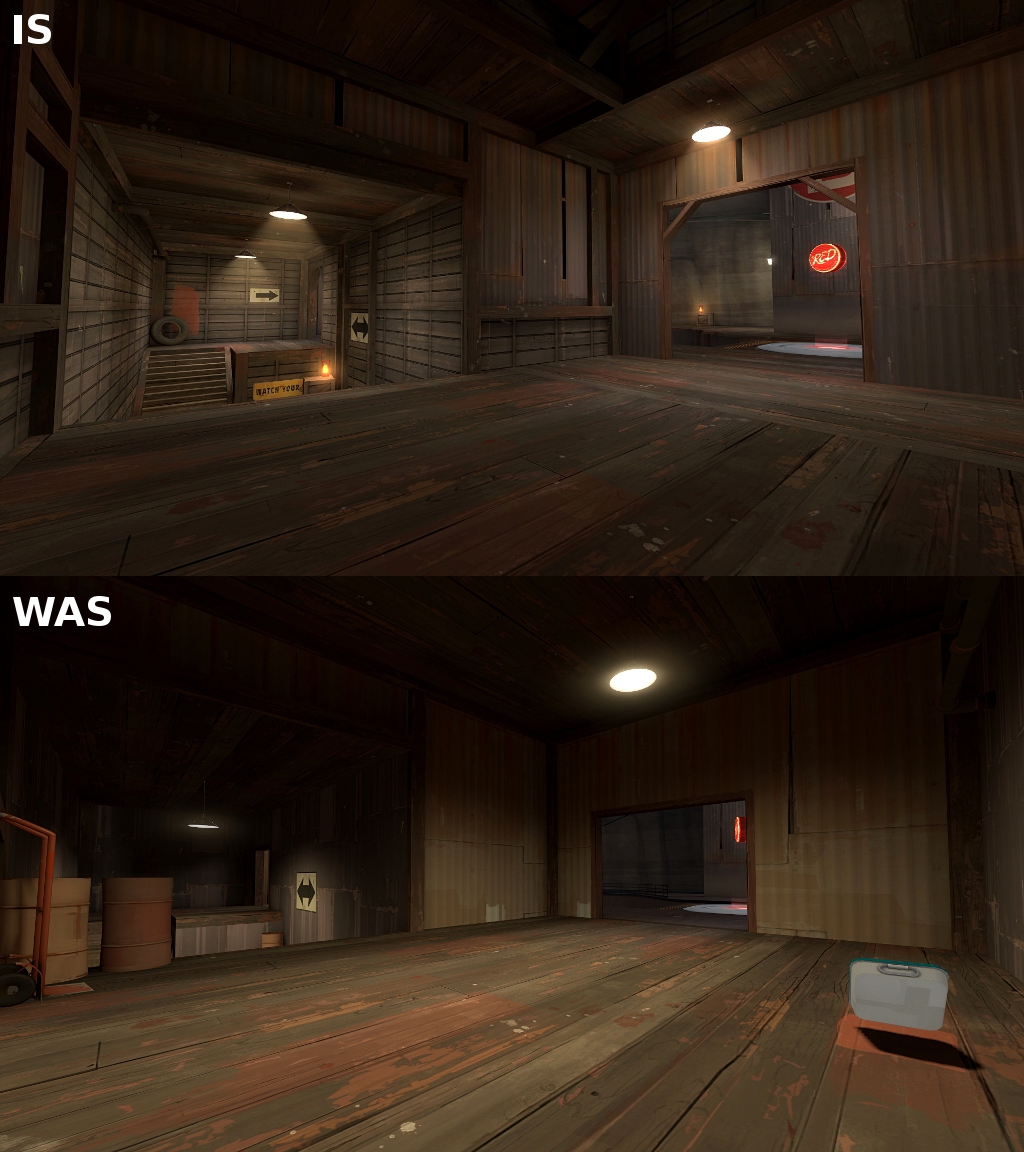
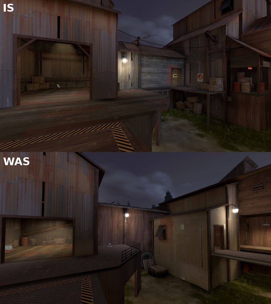
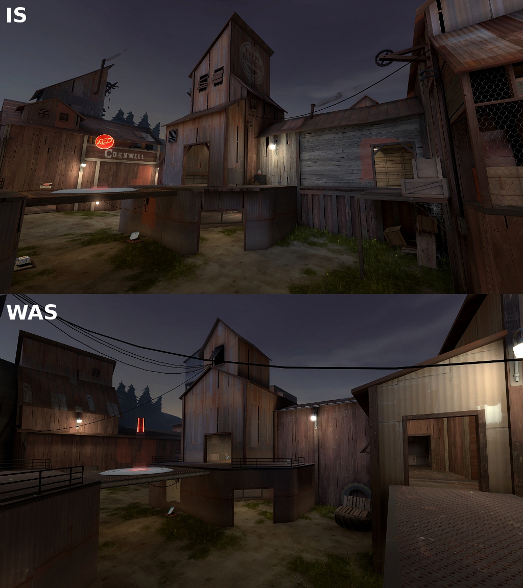
I've spent last two weeks redoing and improving the detailing of the first stage. I'm not done yet, but I've done a pretty compile to see how it looks like and decided to throw some comparison pictures to show how aesthetics of the map improve.

So here's the screenshot spam:
dusk_b2_p1.jpg

dusk_b2_p2.jpg

dusk_b2_p3.jpg

dusk_b2_p4.jpg

dusk_b2_p5.jpg

dusk_b2_p6.jpg

dusk_b2_p7.jpg

dusk_b2_p8.jpg

dusk_b2_p9.jpg

dusk_b2_p10.jpg

dusk_b2_p11.jpg

dusk_b2_p12.jpg


Visual feedback hiiiiiiiiiiiiiiiighly appreciated! :)
 

grazr

Old Man Mutant Ninja Turtle
aa
Mar 4, 2008
5,441
3,814
Yes, tons better. Although i can't help but wonder whether you swapped out your spot lights for regular lights.

The only thing i don't like are the wooden trusses you put in the corners of doorways. They are too wide (don't make them the same width as your walls unless your walls are 16 units thick or less; and not thick enough (they look too thin to support anything). You should also remove them from the smaller doorways as they look even weirder there.

Also: http://dl.dropbox.com/u/19629692/dusk screenshots/b2/dusk_b2_p7.jpg

That rooftop which is visible from outside could do with some support beams.
 
Last edited:

osiem

L2: Junior Member
Jan 25, 2011
89
137
Thanks guys!

Grazr, all the inside hanging lamps have spot lights, sometimes with a regular light with little brightness (like 20-30) under it to make the ceiling not so dark. I'll try out your suggestions, you're probably right.
 

osiem

L2: Junior Member
Jan 25, 2011
89
137
Okay! First off, thanks to everyone who voted for my map to be featured! I came back from holidays a few days ago and I was like 'OMG THAT IS SO COOL'.

B2 will be released in few days. It has taken so long because I didn't want to rush and also went on holiday.
I only need to improve optimisation and clipping, so expect b2 in 2-3 days.

So far, detailing is 99% done for this version, so here's the super twelve-in-one screenshot!
dusk_b2_long.jpg
 
Last edited:

osiem

L2: Junior Member
Jan 25, 2011
89
137


A little late, but here it is.
New screenshots in the OP.

Changelog:
- a lot of visual changes, first stage almost completely redone
- now about 3/4 of props have fade distances
- added soundscapes
- reworked A building, now it's possible to go around it, also there's a blu drop
- changed medium healthkit near A to big, also added medium ammo near blu's left spawn exit
- reworked area between A and B, now it's harder to push blu team back
- reworked left flank at B, now it's shorter
- changed small ammo behind B to medium
- deleted big rock in C area
- added some crates near the deathpit, now there is no dead end
- added new entrance to building to the left of red spawn on 2nd stage
- moved medium healthkit from the D's sentryspot back to the building
- round time tweaks: A is a bit shorter, B is a bit longer, C is a bit shorter, D is a bit longer
- respawnwavetime tweaks: on C red now waits for respawn 2 sec shorter, on D blu waits 2 sec shorter, red 1 sec longer
- improved clipping
- other minor tweaks
 
Last edited:

bob+M|M+

L6: Sharp Member
Mar 31, 2008
346
394
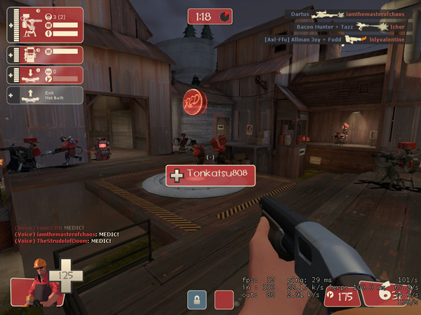
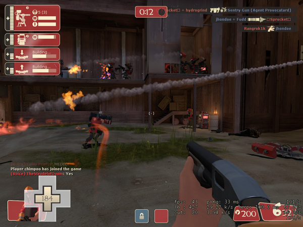
Played this map for the first time today. It's very good but the 2nd point on both round 1 and round 2 is too difficult, especially the first one. It's the first stage so it should be easier to cap.

cp_dusk_b20006.jpg


cp_dusk_b20016.jpg


was very fun on defense though :p
 

Jeremy

L11: Posh Member
Oct 24, 2010
829
299
On the far right of the first screenie I see something orange which I think is an Engie glove. Does that make five engineers? Unless that thing is part of the sentry gun.
 
Last edited:

Mr. Wimples

L6: Sharp Member
Jan 27, 2010
276
226
Just count the sentries, there are 5. Regardless though, the point was still relatively hard to cap when I played, and the defenders used no engies. All in all the point pictured above should be easier, considering we took the final point pretty easily.
 

osiem

L2: Junior Member
Jan 25, 2011
89
137
Bob, thanks for your feedback, but I'm afraid the map wasn't designed for 32 slot servers with no class limit and 5 engies. I played this version about 30 times and most of the time it was pretty hard to defend on 24 slot servers with the limit of 2 or 3 engies.

I think B is kind of strange. It's pretty easy to cap it when defence is not set up yet or when RED defends only the point and the upper area, but if they decide to defend the whole lower area near the point it gets pretty hard for BLU. I guess I'll try to make it a bit harder to push BLU back on B.

And I'm pretty satisfied with D. I'll maybe make the main path a bit wider and less spammy. Remember that it's the last point and from what I've seen it's most often enough to push with two ubers and there are more options than on the last point of dustbowl or goldrush.