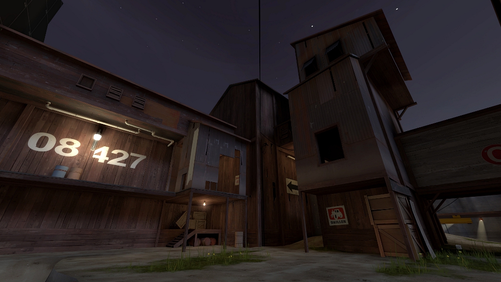
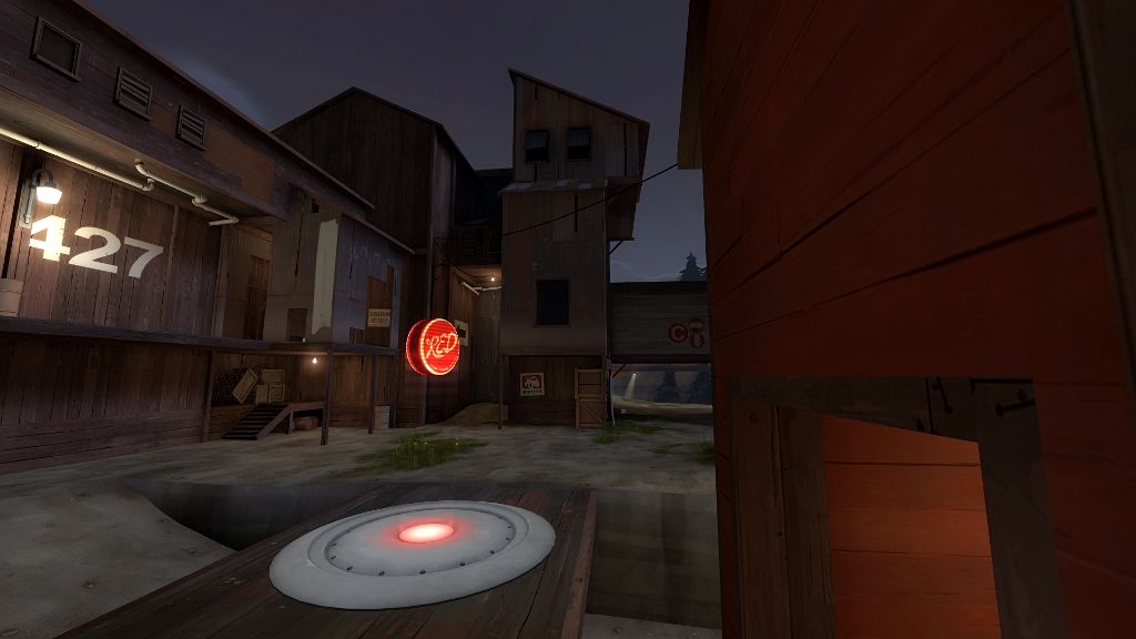
Dusk

CP Dusk rc

Wilson

Boomer by Sleep
aa
May 4, 2010
1,388
1,227
cp_nightfever!
cp_full_moon
cp_midnight

Also i got to say you know what you are doing with detailing, good work and hopefully you stay here making more of these maps, we would like it.

EDIT:

One thing bugs the hell out of me:
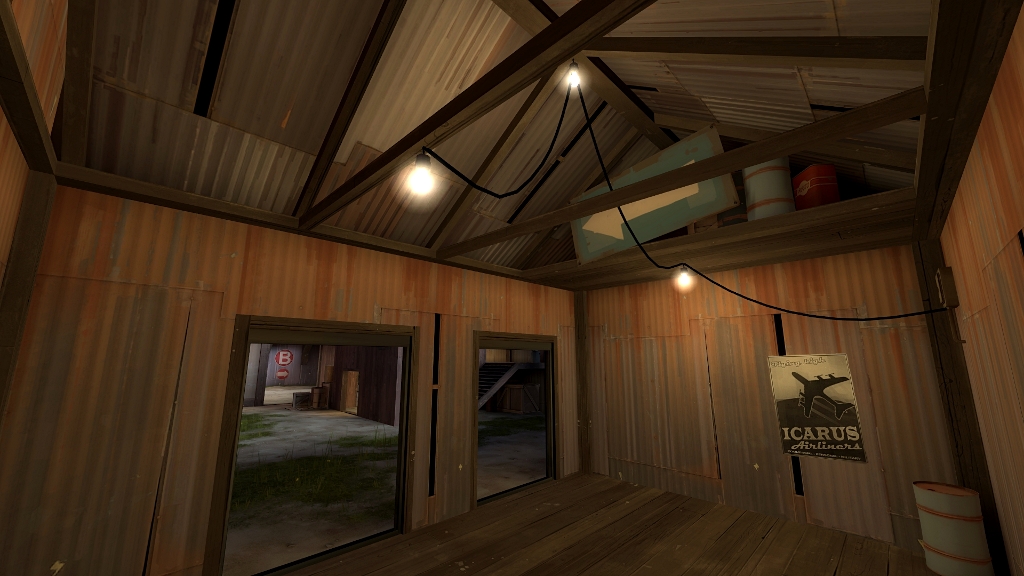
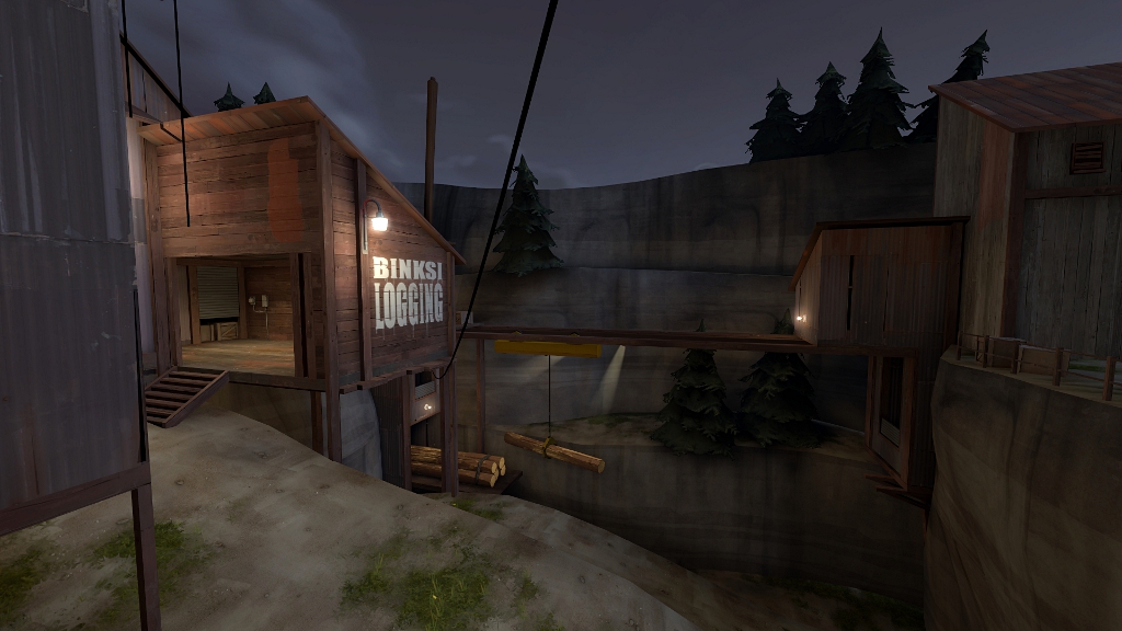
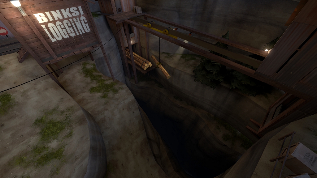
cp_osiem_a7_stage1_08.jpg


How did the sing get there and how it is staying on it's place? Right now it looks bit silly.
 

osiem

L2: Junior Member
Jan 25, 2011
89
137
Thanks guys. :)

I like dusk and nightfever most, but nightfever seems to be taken.
Dusk is also taken, but it seems like that guy has left his map in alpha and is not gonna release it, so I think there's nothing wrong if I'll take that name, huh?

Wilson - Thanks a lot. :> I thought it would be attached to that wooden support beams by 3 of it's corners, but now as I look at it I also think it looks unnatural, so I'll remove it.
 

tyler

aa
Sep 11, 2013
5,100
4,621
I think my only comments are that you have too much slack between the two leftmost lights in that image with the sign, in my opinion, and the junction box on top of the conduit looks really odd. Otherwise it's looking great.
 

osiem

L2: Junior Member
Jan 25, 2011
89
137
yyler - I didn't notice that, gonna fix it. :)

Leswordfish - yes, I'll try to, but it's only one month left and i still need to detail and optimize 2nd and 3rd stage, and 3rd also still needs at least a few tests since I'm completely rebuilding it.
But anyway, as soon as I'll release next version, I'll ask someone to rename the thread and move it to contest area. :)
 
Last edited:

Wilson

Boomer by Sleep
aa
May 4, 2010
1,388
1,227
He can't enter tough, as it started sometime before contest and been in development outside contest quite a while. Also there is no tf2 map called nightfever yet, i did search on tf2stats and only thing i could find was someone running CSS map called nightfever on his private tf2 server.

If you still decide to go for Dusk, try to poke Radaka and ask about it, he still occasionally pops up to update his maps, so you never know.
 

osiem

L2: Junior Member
Jan 25, 2011
89
137
Hey, I've started the map somewhere in the end of january and the contest was announced on 26-12-2010, a month before I've started the thread. Also, the rules say that a thread is not even required to participate, so I think it'll be alright, but I'll ask Ravidge anyway. :)

I still need to think which name I like better, if it'll be Dusk, I'll ask Radaka.
 

osiem

L2: Junior Member
Jan 25, 2011
89
137


I'm updating the map to a7_stage1.
I will upload a version with 3 stages as soon as get this one tested and I finish changing 3rd stage's layout.

Changelog:
- fully detailed 1st stage
- some layout changes on 1st stage

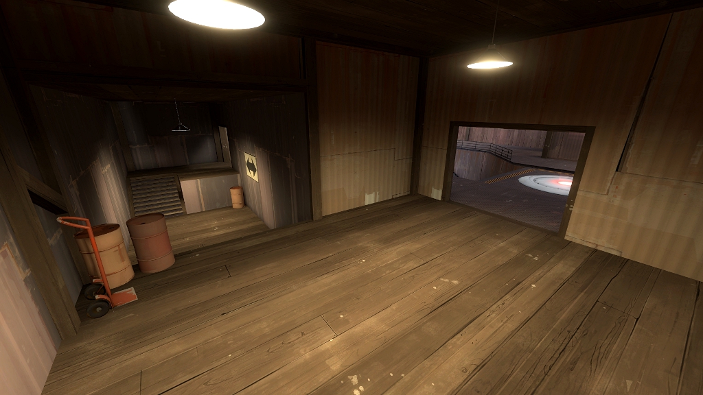
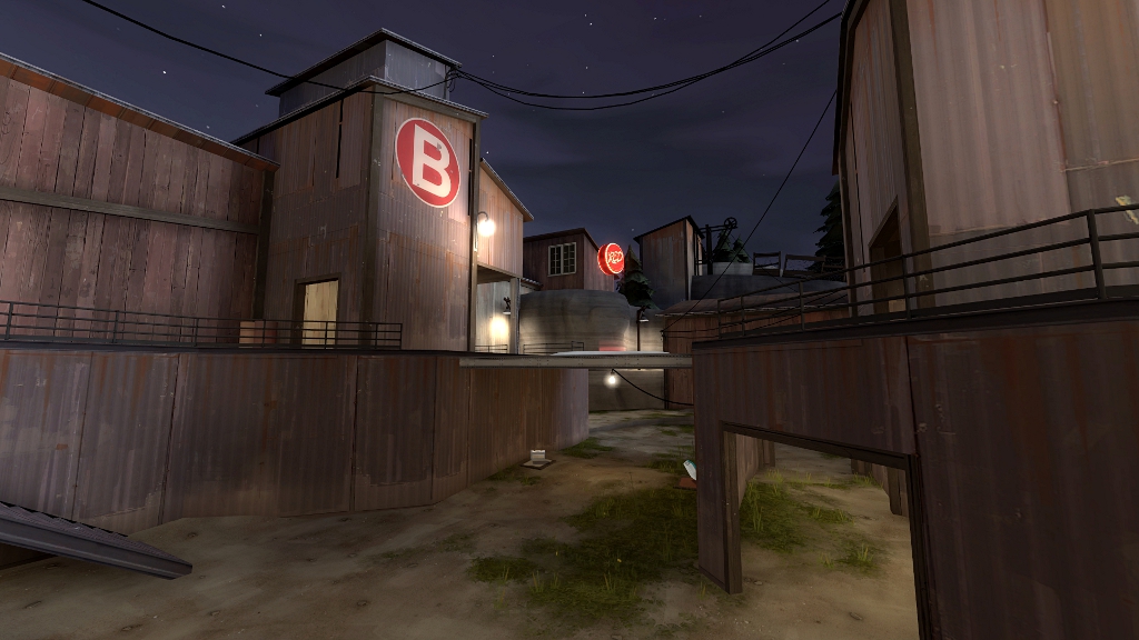
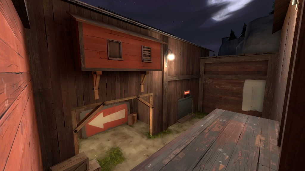
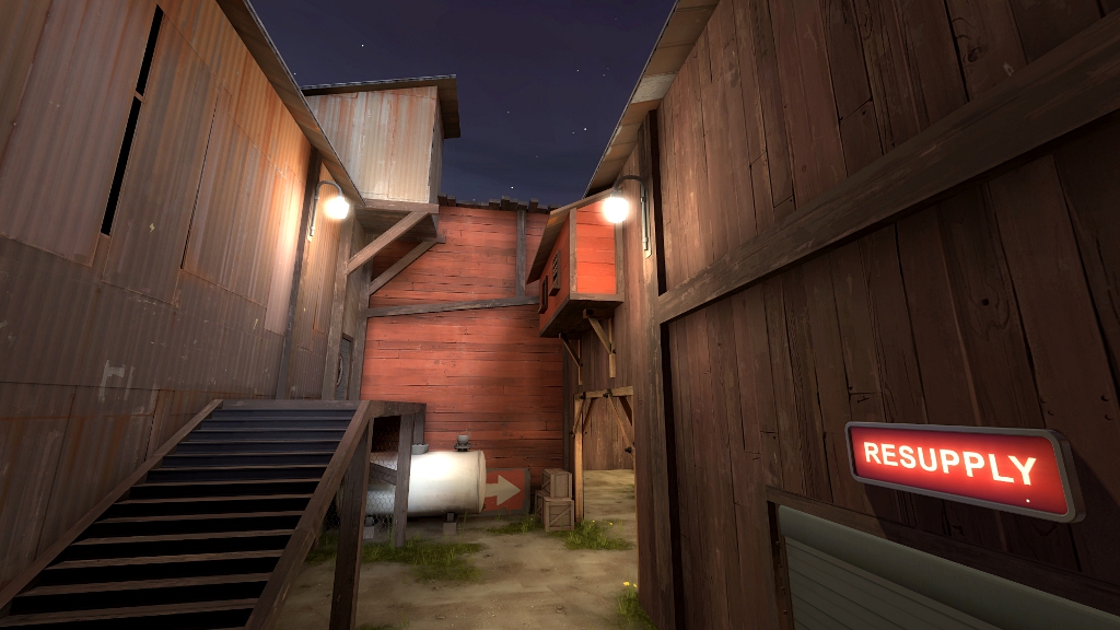
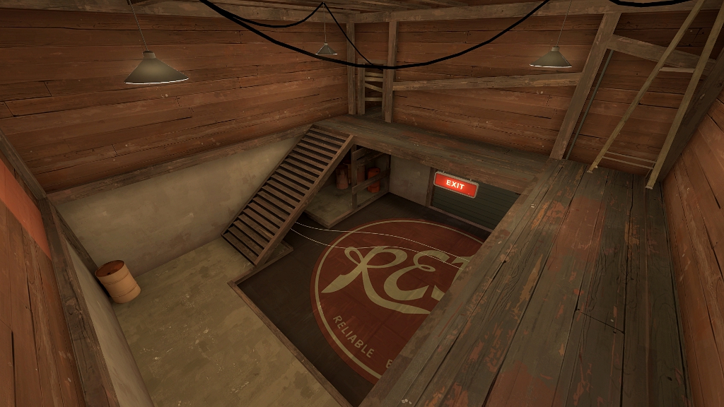
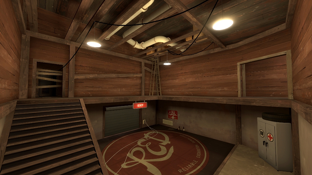
Here are some screenshots of red spawn and area near B:
a7_stage%201%2011.jpg

a7_stage%201%2012.jpg

a7_stage%201%2013.jpg

a7_stage%201%2014.jpg

a7_stage%201%2015.jpg

a7_stage%201%2016.jpg

a7_stage%201%2017.jpg

a7_stage%201%2018.jpg
 
Last edited:

Wilson

Boomer by Sleep
aa
May 4, 2010
1,388
1,227
a7_stage%201%2015.jpg


That big wall there would do just fine without any additional rooms (They make area look really small when it is not) and with few overlays, if any.
 

osiem

L2: Junior Member
Jan 25, 2011
89
137
You mean deleting that little red room up there? Okay, I'll see how it looks without it.
 
Sep 1, 2009
573
323
Here is what I think
-attackers have some diffculty accessing the first point .
-attacker never were able to capture the second point, I think this was due to the height difference and also due to limited flanking avaliblity
-I like the displacements :3
-Some textures don't fit well together.
 

osiem

L2: Junior Member
Jan 25, 2011
89
137
Thanks!
I'm gonna try to make it easier for blu.
Also, if you could tell me which textures, it'd be great. :)
 

osiem

L2: Junior Member
Jan 25, 2011
89
137
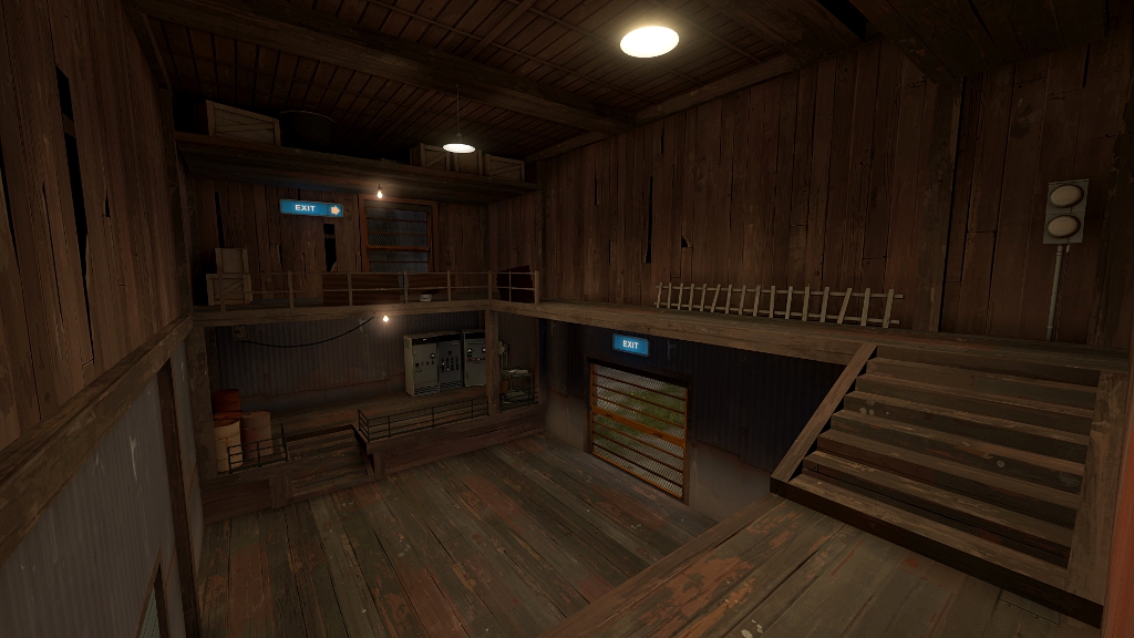
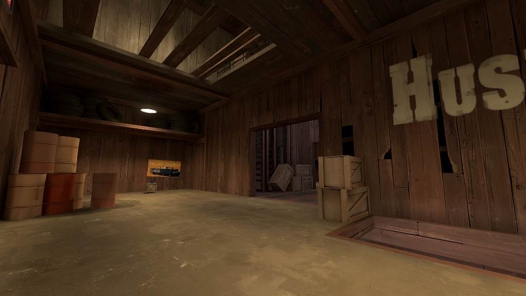
Okay, so thanks to Ravidge the thread has been moved and renamed and I'm posting three wip screenshots of 2nd stage. I've decided to go for sth a bit more like hightower with architecture.

Also, I'm going to enter only two stages into the contest, cause I can't detail 3rd one that fast.

a7_stage%202%2001.jpg

a7_stage%202%2002.jpg

a7_stage%202%2003.jpg
 

osiem

L2: Junior Member
Jan 25, 2011
89
137
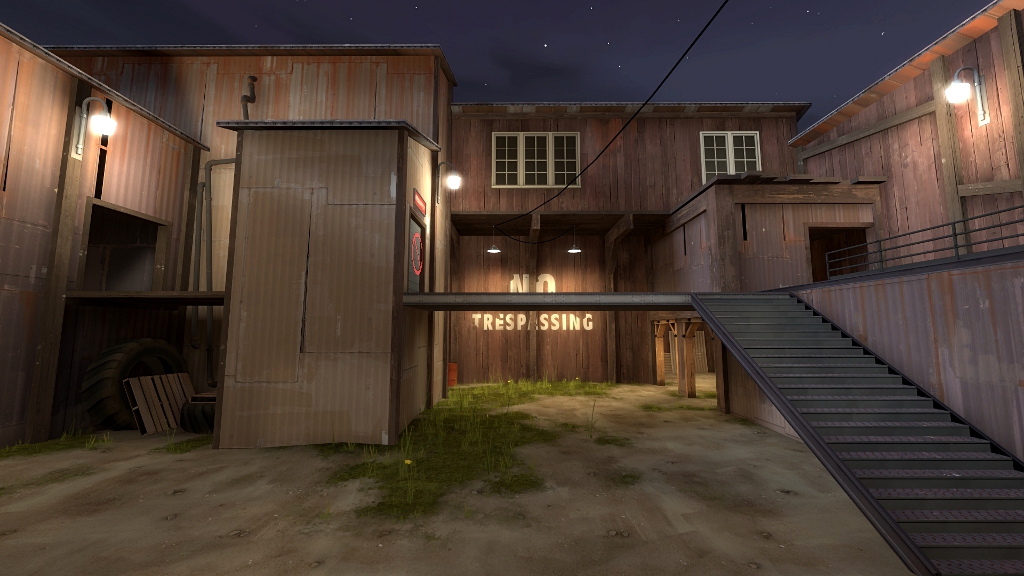
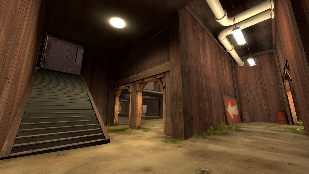
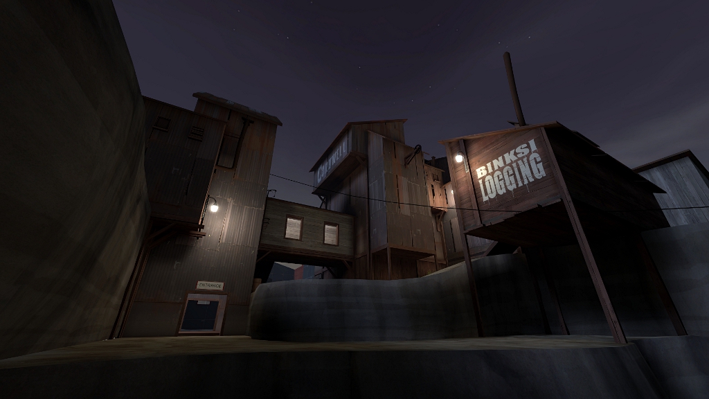
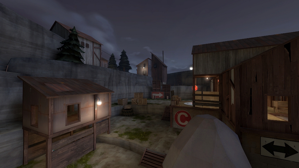
Here come the screens of 90% detailed stage 2!
Gonna have to map hardly for those 4 days, there's still quite a lot of work to be done.

Also note that there's no 3d skybox.
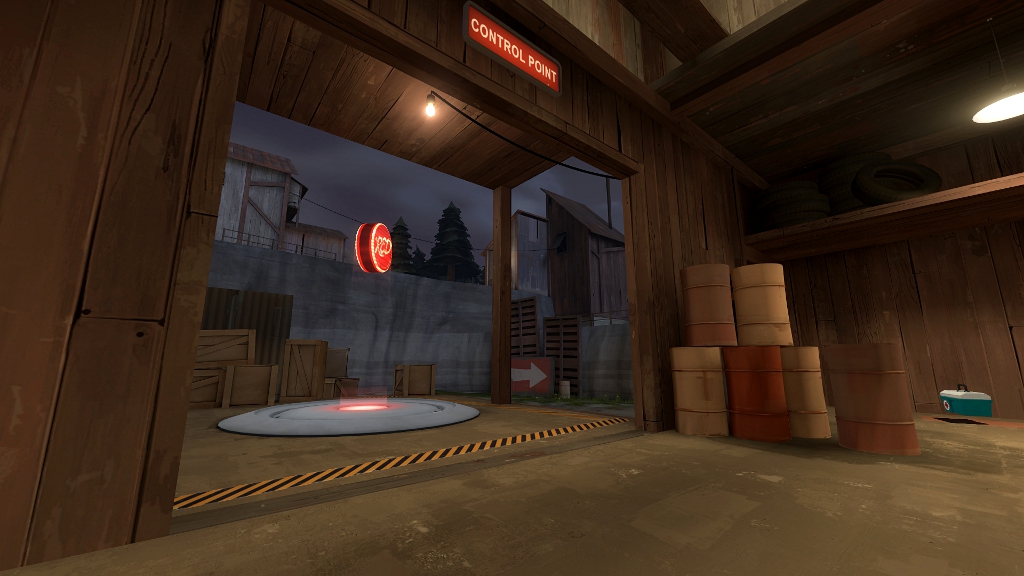
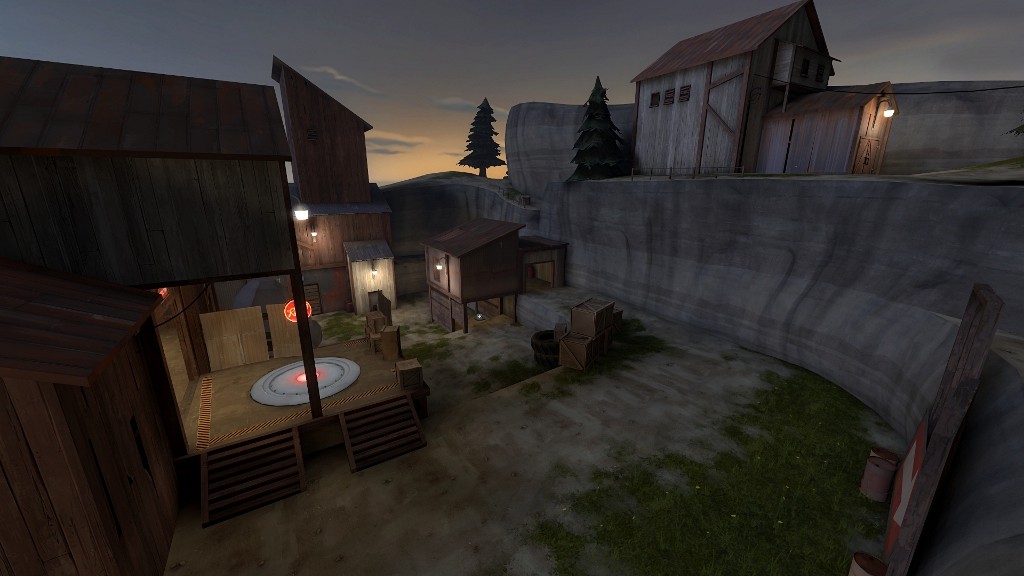
dusk_b1_01.jpg

dusk_b1_02.jpg

dusk_b1_03.jpg

dusk_b1_04.jpg

dusk_b1_05.jpg

dusk_b1_06.jpg

dusk_b1_07.jpg


Feedback highly appreciated :)
 

Boylee

pew pew pew
aa
Apr 29, 2008
1,068
709
Purely aesthetic feedback from the screens as I've not played it at all:

http://dl.dropbox.com/u/19629692/a7_stage 2 02.jpg

Don't use the wood texture with holes in it in game play areas, it just looks weird close up, especially when you put an overlay on it. If I recall correctly there's overlays called "woodhole" or some such similar designed for putting little cracks on clean wood textures. Go look at arena_lumberyard above blue spawn.

http://dl.dropbox.com/u/19629692/dusk screenshots/dusk_b1_06.jpg

The "4" overlay isn't assigned to the brush to the left of it.

Oh and one other thing your ground displacements look very flat, they could do with a bit of vertical noise.

All in all it looks nice though, in particular your density of detailing looks great, uncluttered yet still with character. I look forward to checking it out. :)
 

tyler

aa
Sep 11, 2013
5,100
4,621
Don't just add noise, though, make a huge radius sphere and click once or twice every now and then.
 

osiem

L2: Junior Member
Jan 25, 2011
89
137
BoyLee - thanks a lot, I'm gonna add some noise to the ground, but I'm gonna keep that wood texture with holes, I was going for sth like hightower, take a look, there's quite a lot of that texture both in outside and inside areas. Maybe I'll just replace it in a few places.

yyler - thanks, never thought of doing it that way, it's much faster and better.