You are using an out of date browser. It may not display this or other websites correctly.
You should upgrade or use an alternative browser.
You should upgrade or use an alternative browser.
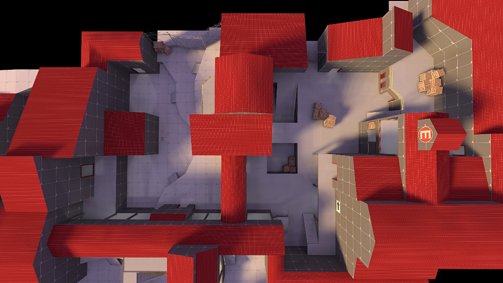
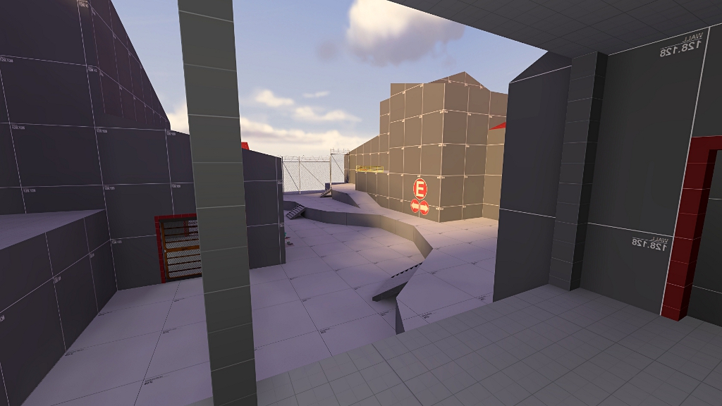
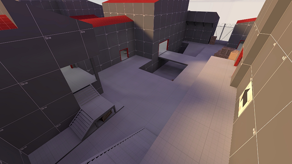
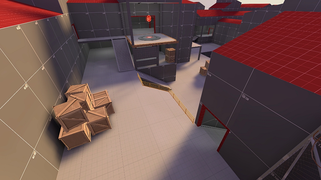
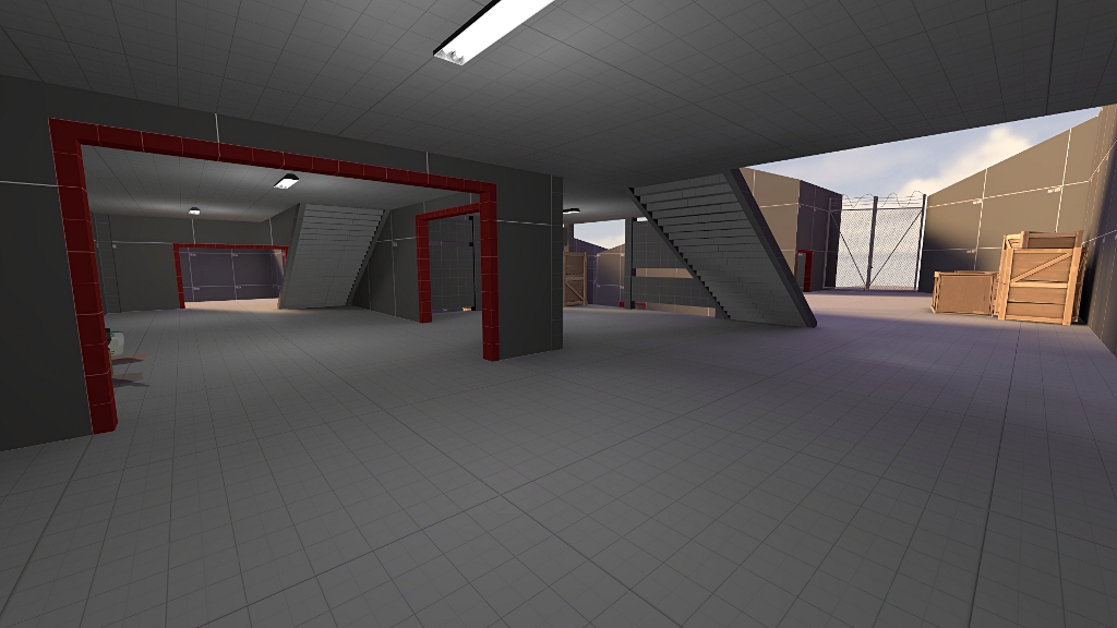
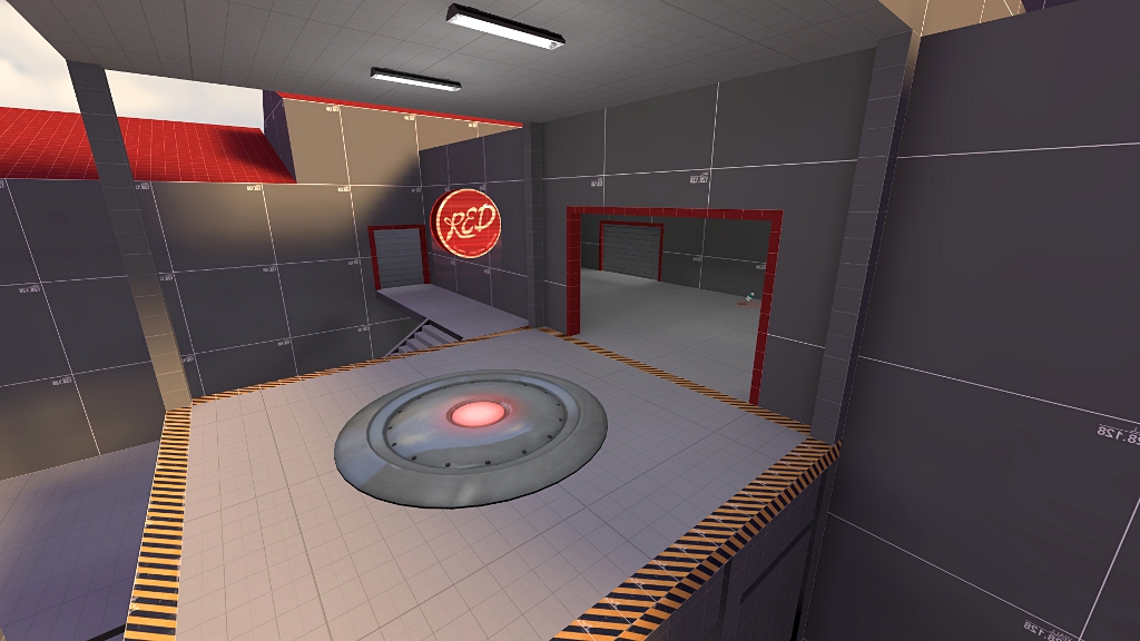
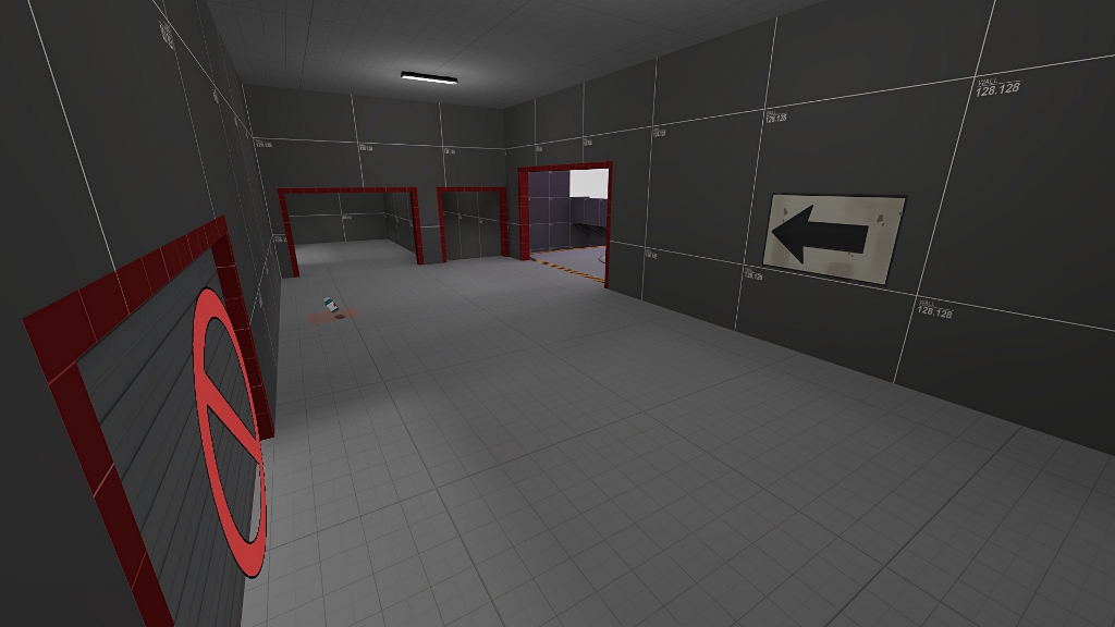
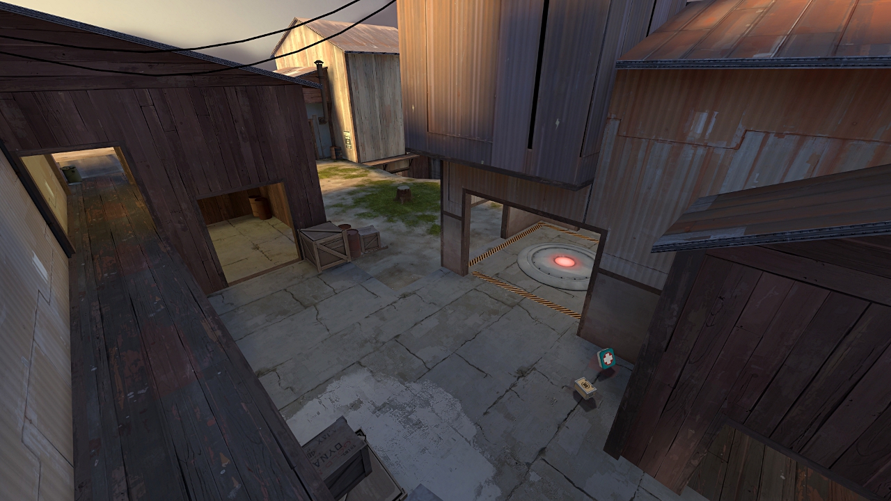
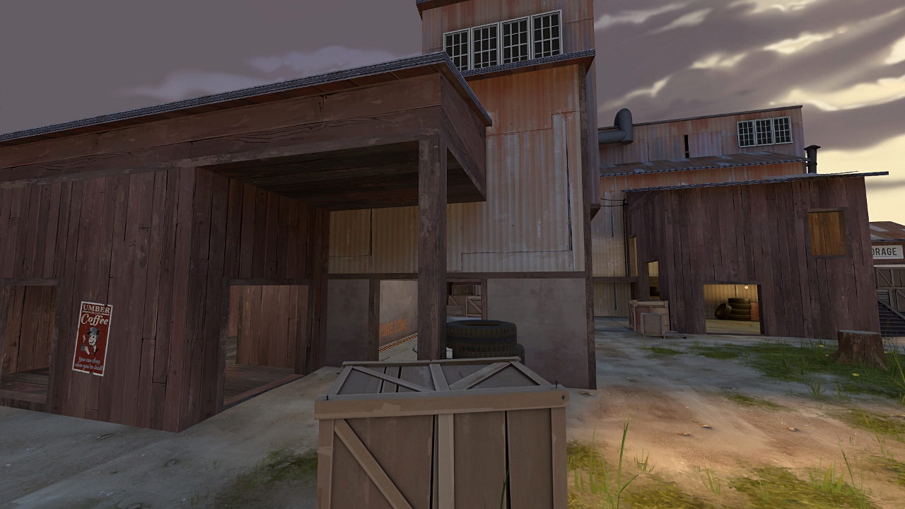
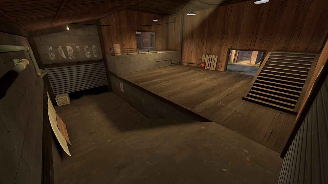
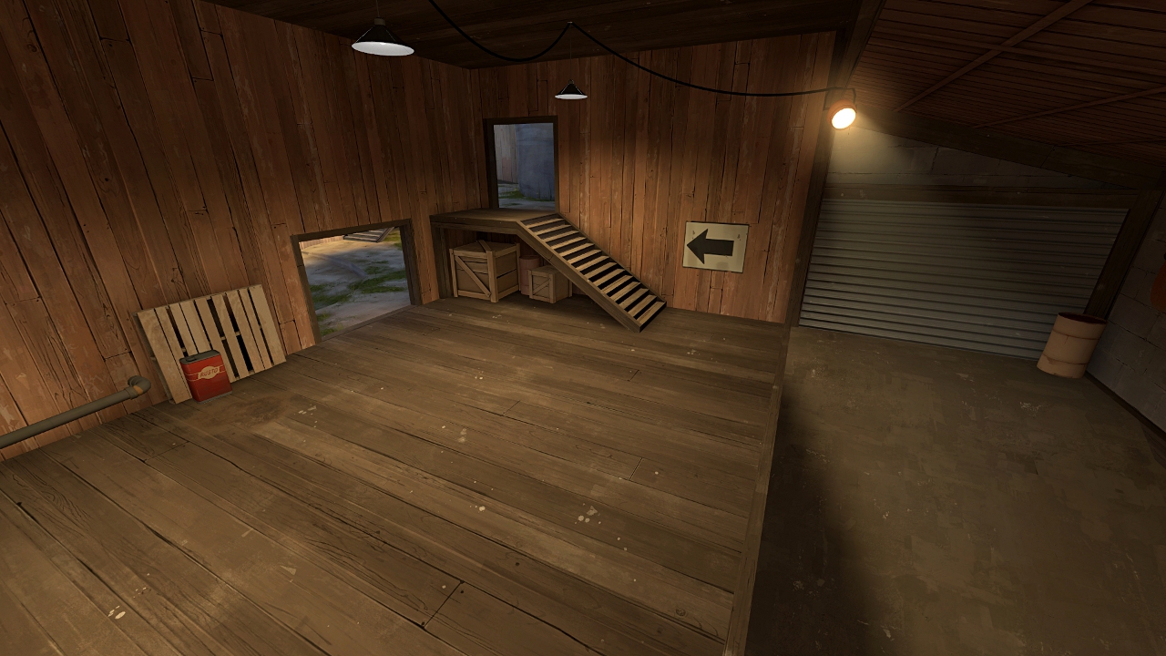
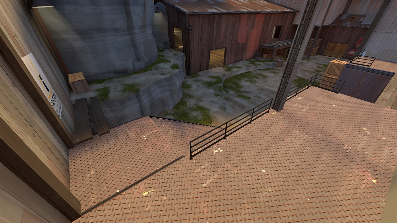
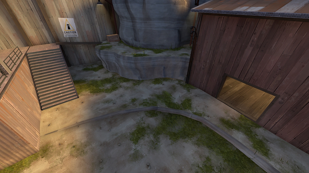
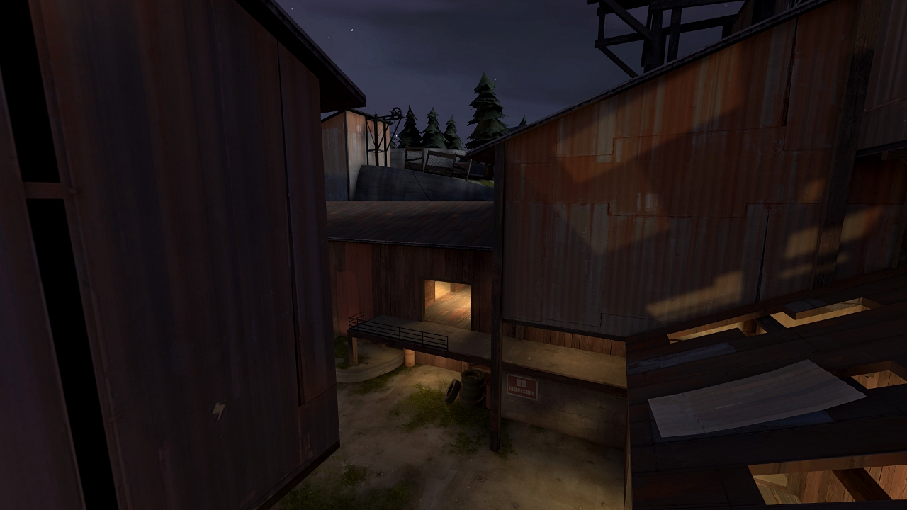
Not uploading a playable version of the map, but I've started detailing and wanted to upload some screenshots to show you the environment and style I've chosen. I'd love to know, what do you think about it. 
Sorry for some ugly shadows, but it was a quick compile just to show the general feeling of map's style.

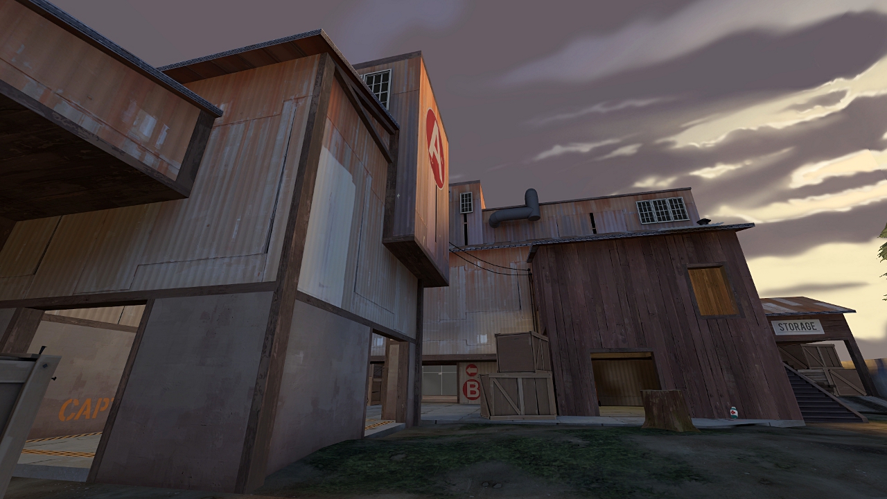
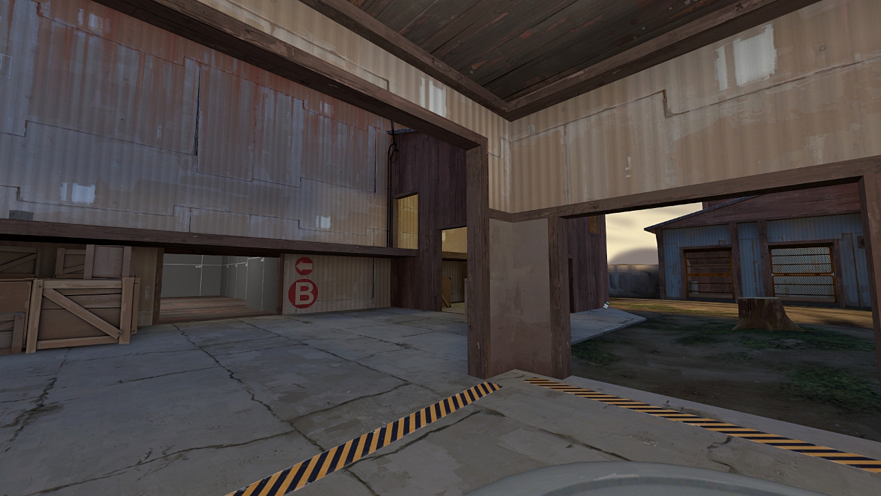
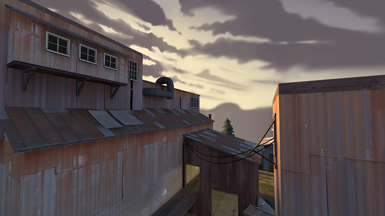
Sorry for some ugly shadows, but it was a quick compile just to show the general feeling of map's style.


Languid
L5: Dapper Member
- Oct 9, 2009
- 240
- 256
Thanks, guys! 
Sergis - Okay, I'll try to make it more obvious where it is walkable and where not
Languid - I started this map in the end of january, so I think I can participate. I just wasn't sure if I'll find enough time to finish it, but now it seems I will, so as soon as I'll choose a name, I'll create a new thread in contest area or I'll ask some mod to change thread's name and move it.
I am not sure, but from looks of it the skybox is big box around the map and that is probably reason for some massive fps drops around the map i left feedback on.
Also, please add some no entry sings and lock some other ways from other stages when you move on the new stage, hitting your face on door that turns out to be locked or climbing stairwell up to find out the path is blocked off is really, REALLY annoying sometimes.
Also, please add some no entry sings and lock some other ways from other stages when you move on the new stage, hitting your face on door that turns out to be locked or climbing stairwell up to find out the path is blocked off is really, REALLY annoying sometimes.
Wilson - no, the skybox isn't a big box around the map, but I have no hints and areaportals in my map, I also need to cover not visible brushsides with nodraw. I didn't get any comment about low FPS when the map had 2 stages, but now as I've added 3rd, some people seem to have FPS drops, so I'm gonna work on optimisation for the next version.
I didn't think of no entry signs, gonna add them, also I'll remove that staircase in blu spawn for 2nd round.
I didn't think of no entry signs, gonna add them, also I'll remove that staircase in blu spawn for 2nd round.
That last point is kind of horrible. There are two, narrow spammable routes up to it, and red can put a sentry outside their spawn and defend.
My sggestion would be to move red's spawn to ground level, and add an extra route up, and widen the current one. If red are fighting uphill too, blu get the advantage that, once theyre on the point, theyre harder to push off, which should be more interesting gameplay than turtling and fruitless wave attacks.
My sggestion would be to move red's spawn to ground level, and add an extra route up, and widen the current one. If red are fighting uphill too, blu get the advantage that, once theyre on the point, theyre harder to push off, which should be more interesting gameplay than turtling and fruitless wave attacks.
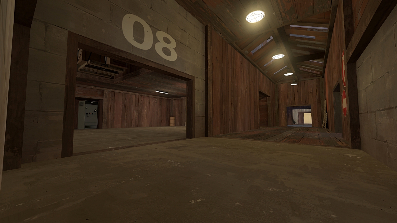
I was pretty busy recently, so I didn't have much time for mapping and I'm still not updating a playable version, but I'm posting some new screenshots as detailing of 1st stage is nearly finished.
I have to work on optimization a little bit more, do some changes to 3rd stage and then I'll upload new version.
Screens:
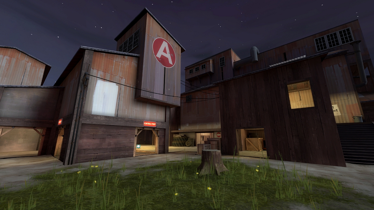
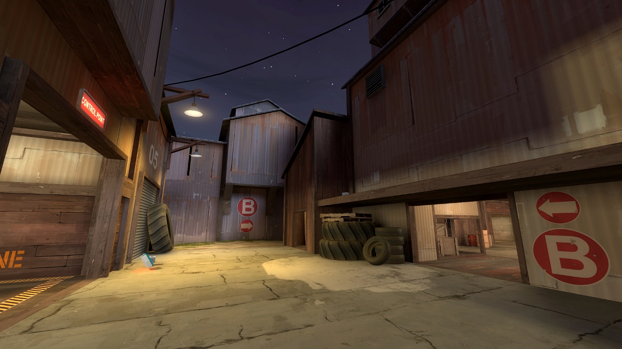
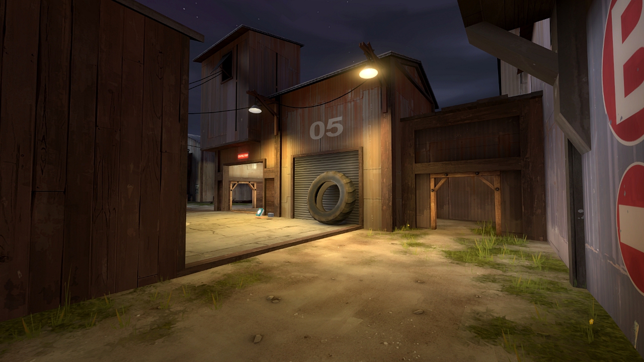
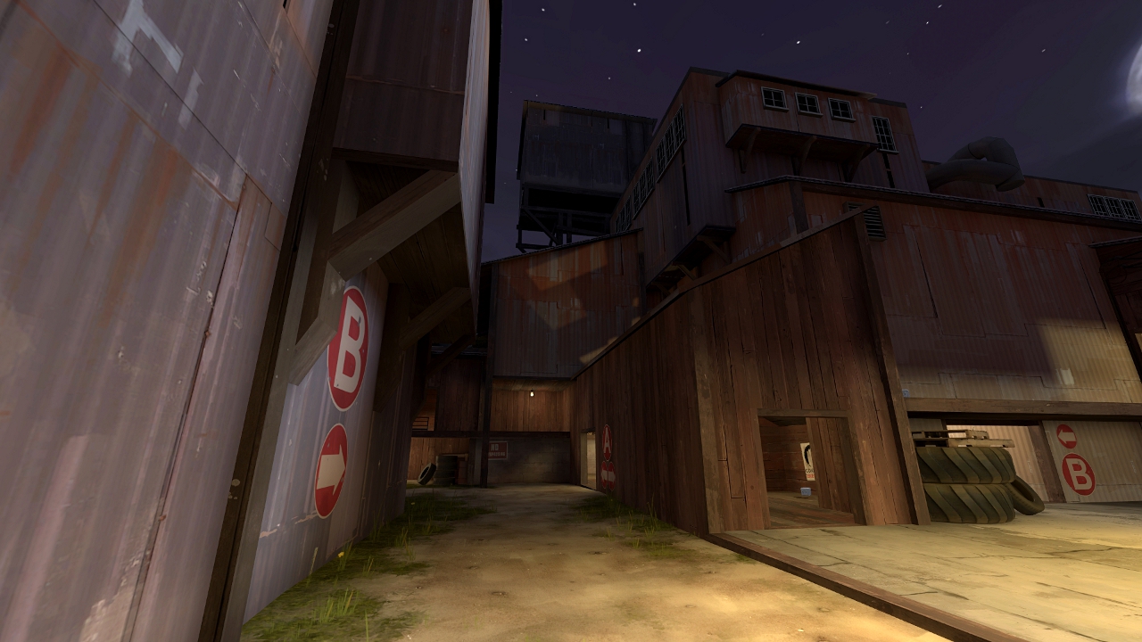
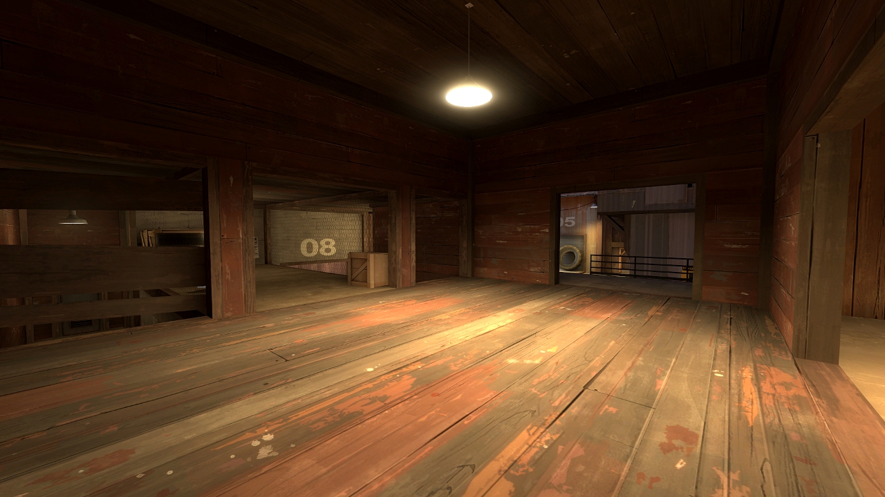
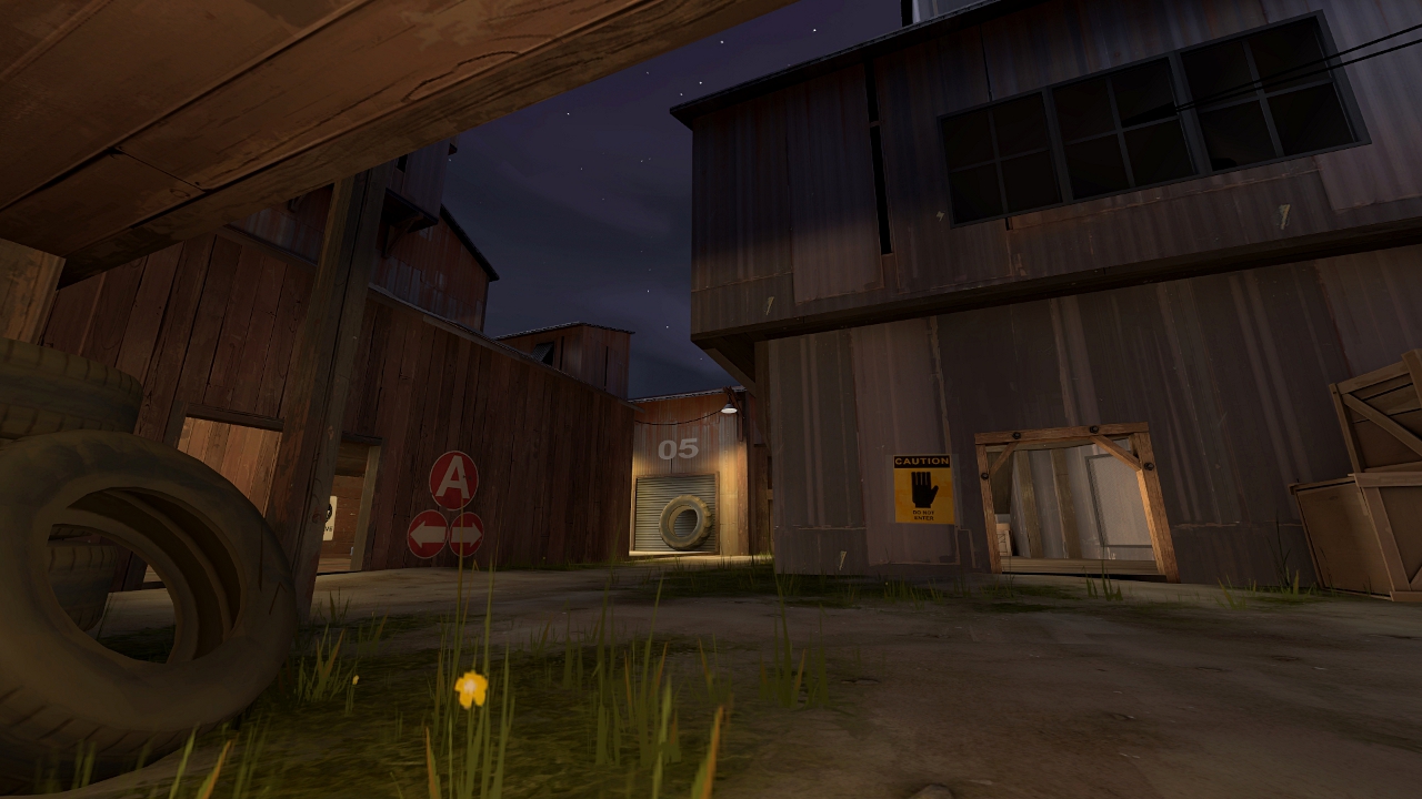
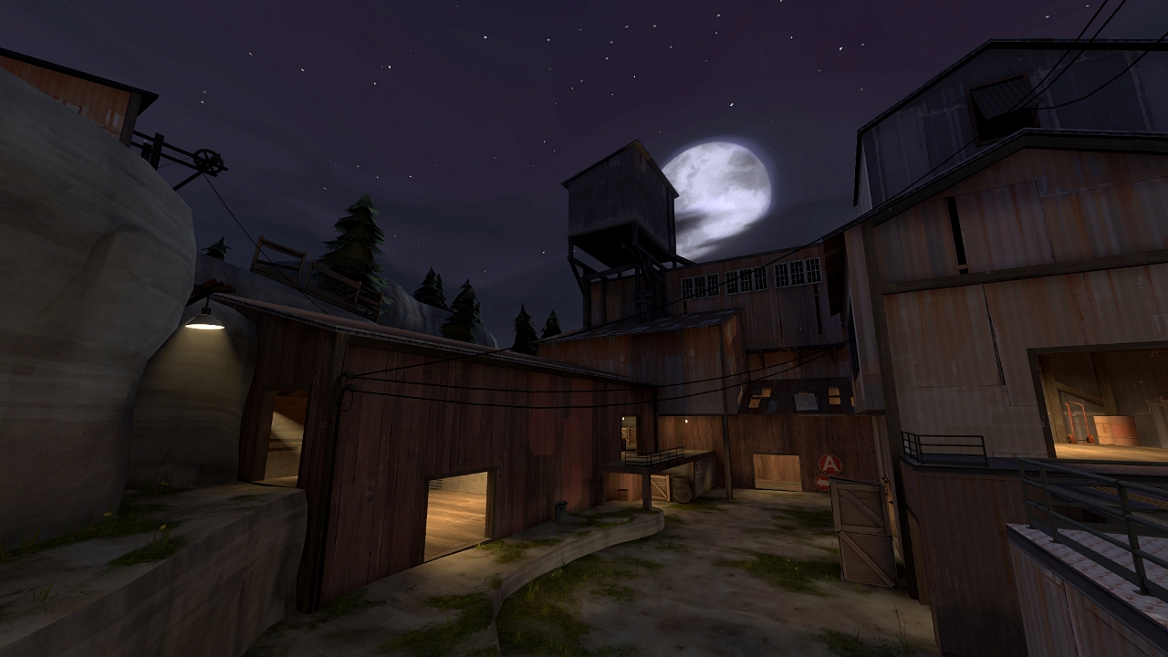
I have to work on optimization a little bit more, do some changes to 3rd stage and then I'll upload new version.
Screens:


Looks good! Use blocklight on the roof in this shot, though http://dl.dropbox.com/u/19629692/cp_osiem_a7hdr 6.jpg or else fix it some other way. Unless you like that. I think it looks odd.
Thanks guys! 
I think I'll keep that light shining through the roof, I like it and it seems that most of you like it too.
LeSwordfish - Most of the doorways are 128 and some are 160 or 192 units high, so I think it's just you.
Also, I'm still thinking of map's name, so if you have any ideas, please let me know, I'll be grateful.
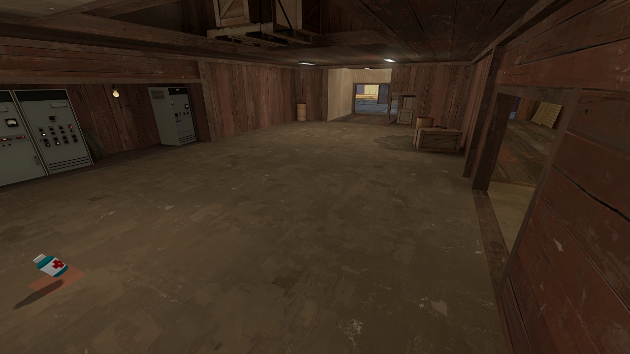
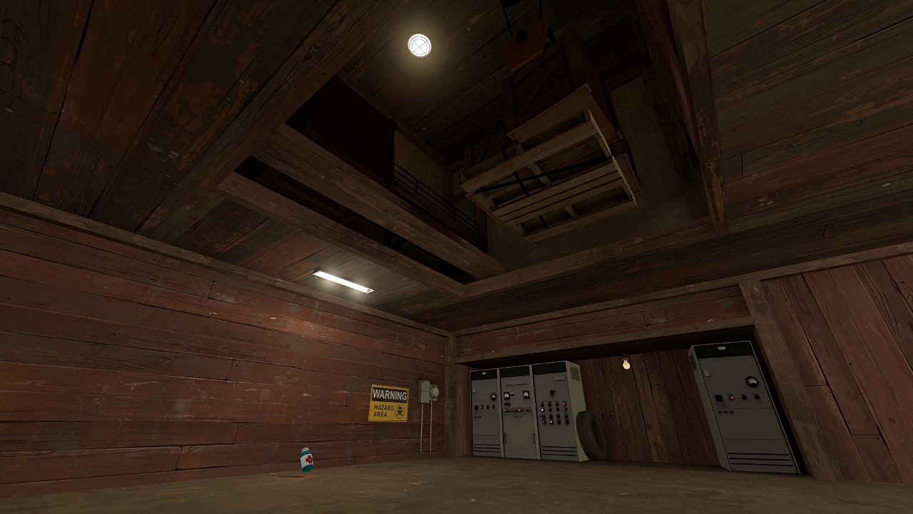
Some screenshots of blu spawn.
I've tried not to make it just another spytech room, hope you like it.
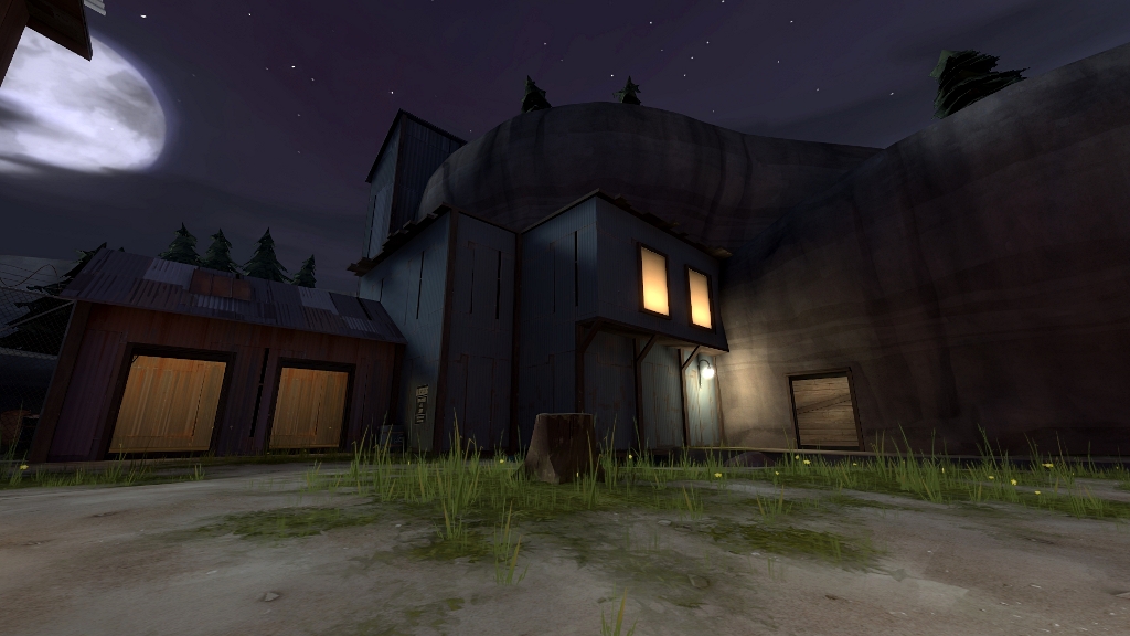
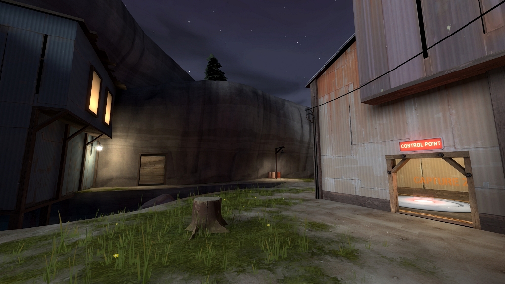
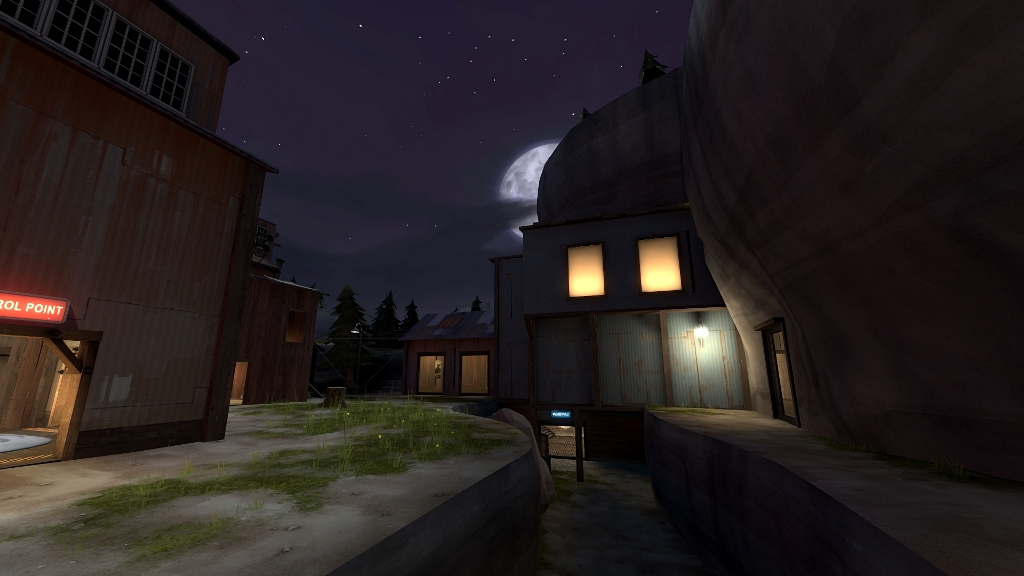
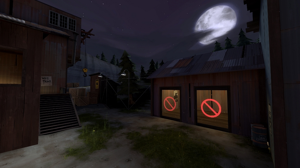
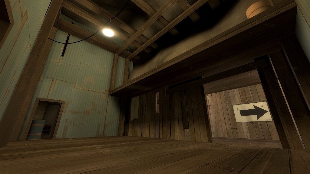
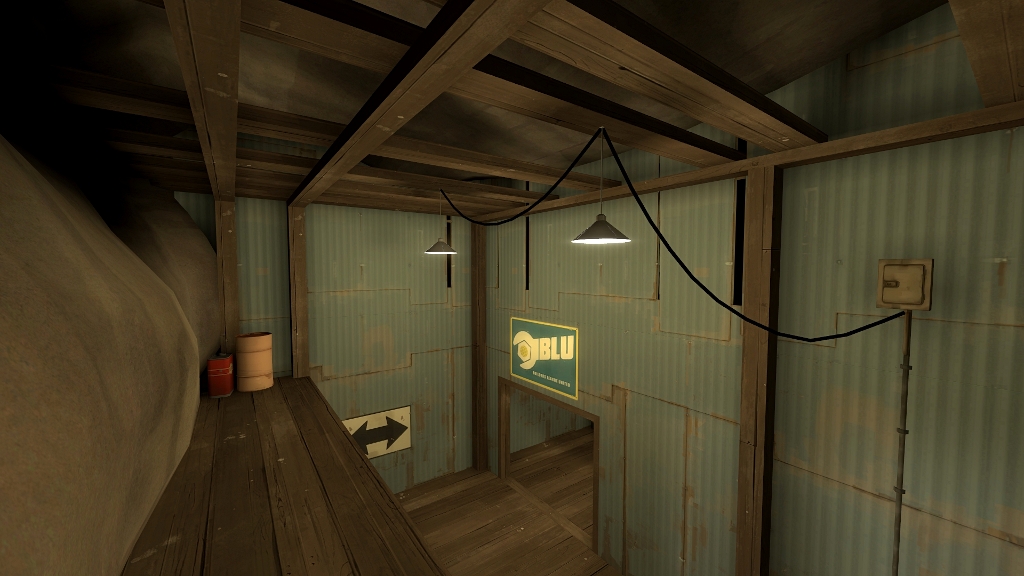
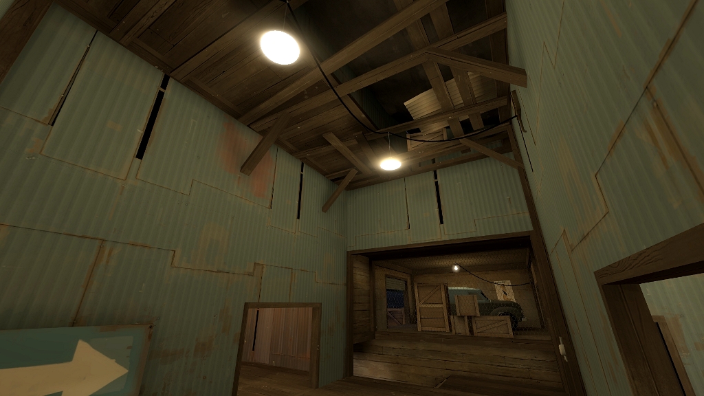
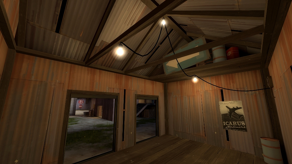
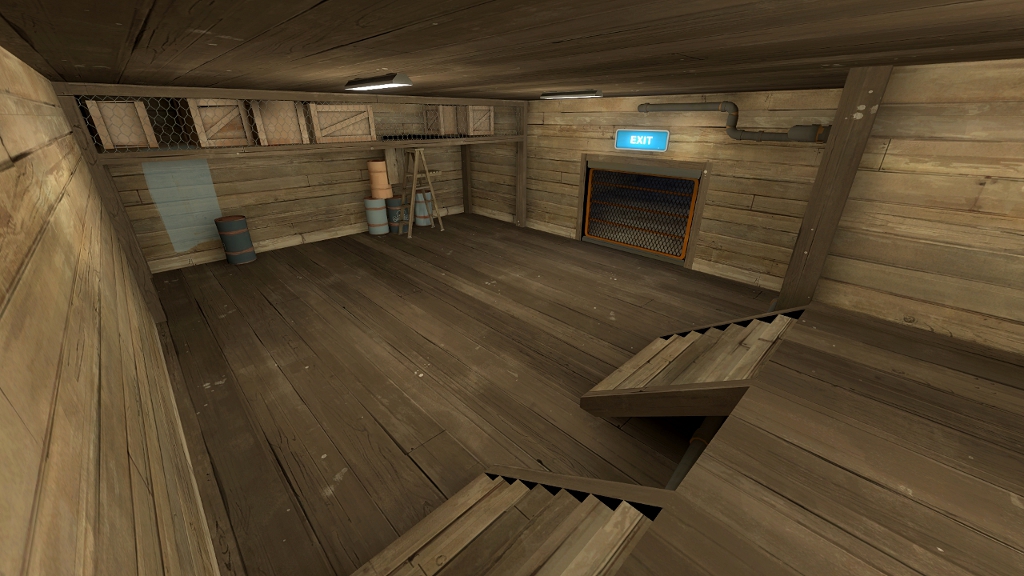
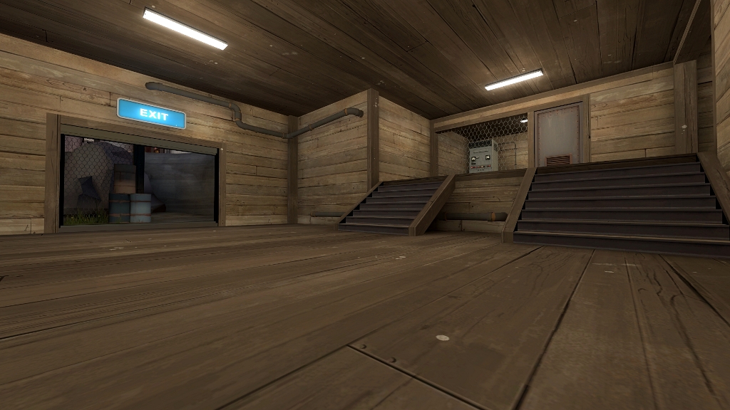
I'm almost done with 1st stage's detailing, just need to clip it and add hints, so I hope to release new version in a few days.
Also, still thinking of map's name. Any ideas appreciated.
I've tried not to make it just another spytech room, hope you like it.


I'm almost done with 1st stage's detailing, just need to clip it and add hints, so I hope to release new version in a few days.
Also, still thinking of map's name. Any ideas appreciated.


