You are using an out of date browser. It may not display this or other websites correctly.
You should upgrade or use an alternative browser.
You should upgrade or use an alternative browser.
-Fixed respawn room visualizers for blue spawn (Only one of the three was working, oops!)
-Packed ground texture
Read the rest of this update entry...
-Packed ground texture
Read the rest of this update entry...
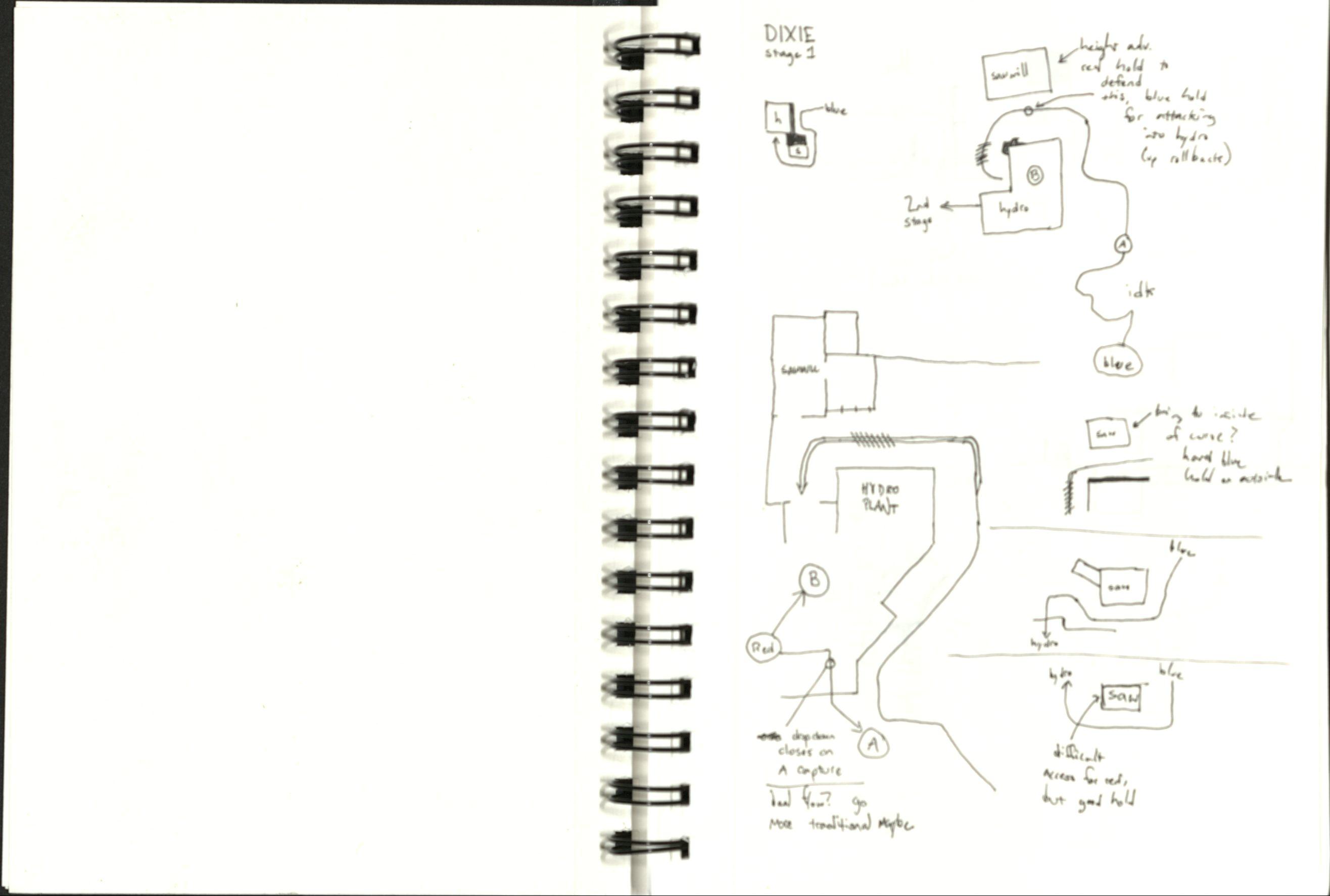
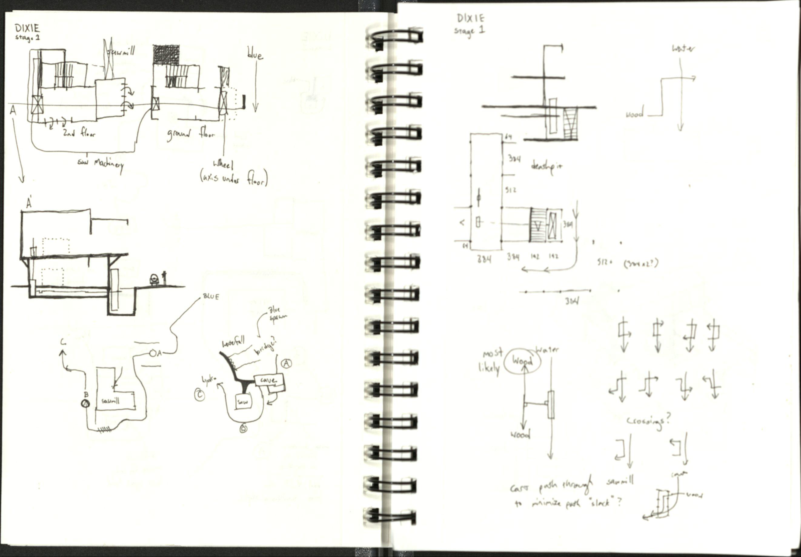
I like documenting things. I'm going to try and document my development process as thoroughly as possible, because why not? Some changes based on things I observed from testing a1a:
The side area next to the A ramp used to only open up once A had been capped. In the interest of making A a bit more interesting to fight around, this area is now open at all times. There is also another route into this area, which is quickly accessible from Blue's flank spawn. This route is also a drop down, which should make it (hopefully) harder for Red to use to camp. We'll see.
The sentry nest for A is less accessible to Blue. Hopefully this will make the corner act a bit more like a choke. Also, the ramp before A is a rollback zone.
The entirety of the indoor section after A has been flipped and stuck directly after A. The cart no longer enters the small depression before entering the base. This also means some different connections between parts of the map. This door now exits into this room (through the door on the left). I may add a door that blocks blue from using this route until A is captured, but I'm going to leave it open to see how much of an issue it becomes.
The big fighting arena before A is a bit expanded (128-256 units ish?? I haven't decided yet).
Red spawn is going to be moved to the other side of B, which should hopefully help prevent spawncamping issues (and also make defense a bit more focused). Some of the areas around B need a redesign, but I haven't figured out what that's going to be yet
EDIT: More possible changes
I started working on this again! Changes to expect for the next version of stage 2:
The two major indoor routes leading into the first fighting area have been redesigned. They join up together and spit players out a bit behind the sentry nest.
The area adjacent A's rollback zone has been redesigned to be more open. The flank leading to this area splits into two paths, allowing attackers to take the upper or lower route. This should make the flanking area a bit more attractive to use.
Spawn is going to get a redesign.
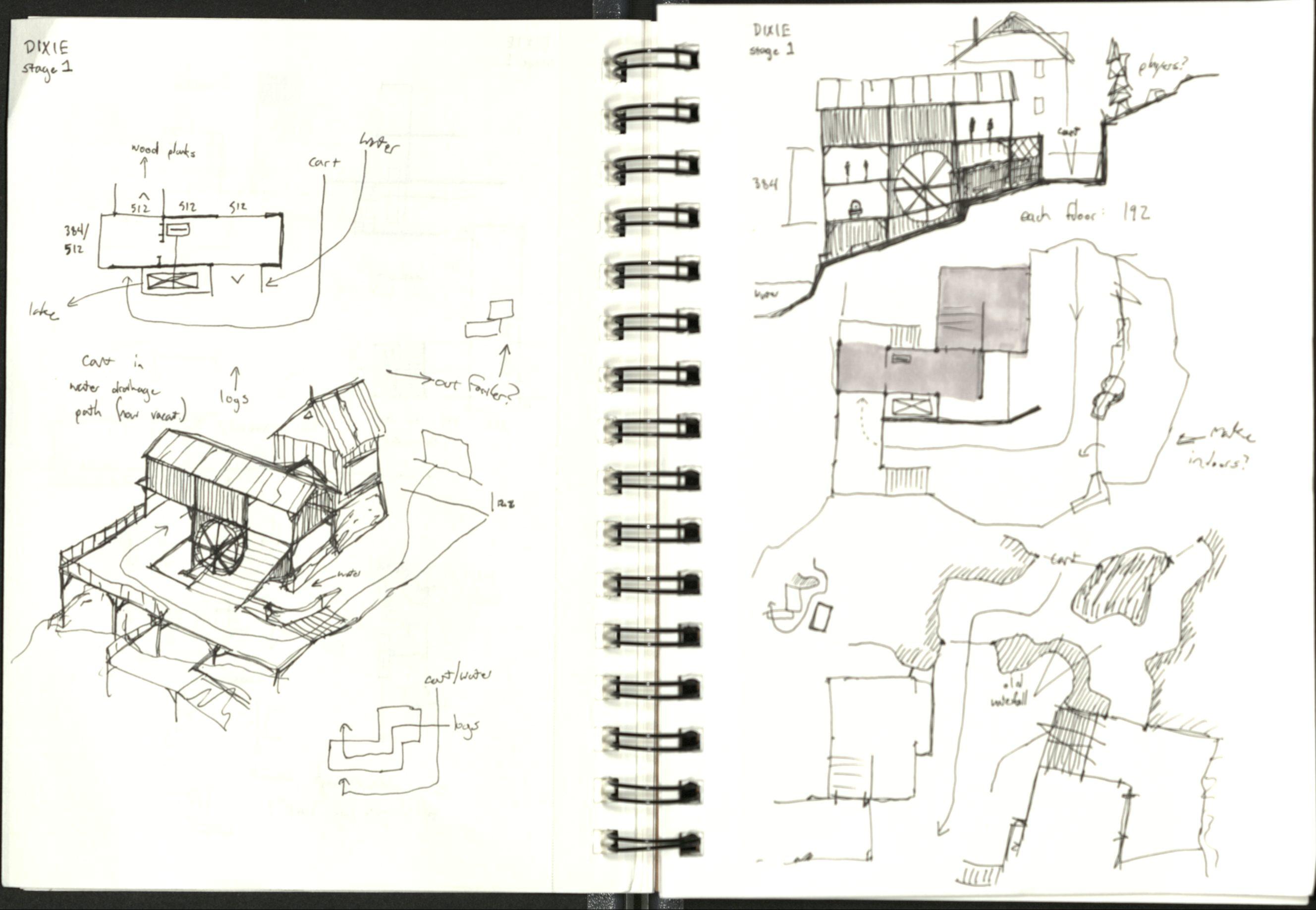
Stage 1 has also begun development! Screenshots:
The first main path, wrapping around the forest's visitors' center. On the left is the building that houses A, the first main choke of the map.
Visitors' center interior. Behind the camera is a perch that overlooks the first screenshot's path. In the back of the center is a route that leads to behind the waterfall. Underneath the ramp closest to the camera is a route to the basement, which leads underneath the A house.
The building that houses A. I haven't actually stuck the CP in yet. On the left is a ramp that leads underneath the house, which connects to the visitors' center basement. Players can use the roof as a route to a perch that overlooks the cart's entrance to the building.
Overview. There are no spawns, and most of B is yet undesigned, so things look incomplete at the moment.
-scrapped everything after A and started over
-reworked some existing connectors to fit new post-A design
-changed some pickups around pre-A
-rescaled some areas
-reworked blue spawn to not feel gigantic and hopefully provide a better way out of the flank exit
Read the rest of this update entry...
-reworked some existing connectors to fit new post-A design
-changed some pickups around pre-A
-rescaled some areas
-reworked blue spawn to not feel gigantic and hopefully provide a better way out of the flank exit
Read the rest of this update entry...
quick update for any potential testing later today. more substantial changes are planned (last needs some big changes), but they'll take at least a day or two to actually make.
PICKUP ADJUSTMENTS
-removed medium health near tracks because it was in a weird spot
-moved full ammo by A sentry nest further away, changed health to a medium so that its more useful to everyone (also to make up for missing health pack mentioned on previous bullet point)
-changed medium health by A short flank to a small
-changed medium ammo by A short flank (blue side) to a small, moved it to be next to health in same area
-moved small ammo on A short flank bridge to red side, changed to medium ammo
-changed medium ammo on A long flank to a small
-moved medium ammo on B long flank to a spot that isn't hidden from red team
-moved small health/ammo combo near B main blue side slightly further away from wall, which is very significant
LAYOUT CHANGES
-removed barrels on B long flank's blue side entry, added a barrel outside of same doorway to somewhat block the same sightline
-adjusted A short flank roof to look less accessible, made short A flank a bit wider in the process
-adjusted stairs in short A flank because I wanted to put a handrail on them i guess?? also very significant
-clipped B main roofs (they were supposed to be this way in the first place)
-brought far wall of cart entry area back inwards to make things a bit more snug, which should make it a tiny bit harder to hold blue in spawn
no screenshots because im lazy (changes are minor anyways)
Read the rest of this update entry...
B SHORT FLANK
-route to warehouse now comes from basement, is wider, and longer, which should make it less ambush-friendly
-route to pool room is further away from pool
-added route from upper room to rotate into warehouse
-removed full health
-moved medium ammo inside
-added medium health by ammo
-made upper roof exit wider
-reworked stairwell
B LONG FLANK
-removed blue side doorway into building inside of warehouse
-moved medium ammo into building
-added staircase up to platform from track area
-opened area underneath stairs
-added medium health/ammo under stairs
-route to pool room is further away from pool and has less of a height advantage
-moved small health/ammo inside
OTHER
-added more stairs up to A long flank red side
-moved full ammo by A choke to the roofed area
-made pool room longer to provide a larger fighting space around the track
-made warehouse longer
-reworked upper warehouse room red side stairs to be 2:3 slope instead of 1:1
-adjusted red spawn to hopefully be less campable??
-adjusted ramp in blue spawn so you can't get caught on it
-added small ammo near DIXIE sign
-added small health to basement room near loading dock
-added small health to upper warehouse room
Read the rest of this update entry...
YARD (PRE-A)
-added some more height differences to make holding positions more obvious (and to add difficulty)
-adjusted far rock cover to account for new height difference and accidentally created a scout route up in the process
-fixed colors on pickup indicators because i forgot that you can't put overlays on func_brush
-lowered concrete block so you can crouch jump onto it without using the barrels
-textured some things because hey why not
A SHORT FLANK
-removed upper doorway/bridge by loading dock for two reasons: a) so that its a less powerful route to push in with for blue and functions more as a sneaky flank b) so that people coming in from blue are more likely to continue using the route to push into B instead of filtering off into the warehouse
A
-changed cap name
B LONG FLANK
-changed small health to medium
B SHORT FLANK
-added route to upper room that should hopefully let red use the rooftop more easily
-rerouted warehouse connector to fit in new route
WAREHOUSE
-changed upper room windows to be consistent with the other room's windows
-added a desk to lower room
POOL ROOM
-made it bigger, again
-shifted over one warehouse bay so that there are two main entrances into the pool room rather than one main route and two kinda shitty flanks. also this should make B short flank a better route to attack with because its nearby entrance to the pool room is a bit stronger (hopefully)
-reworked spawn exits to make the pool room hopefully better?? i'm still figuring out what to do with this area
-changed cap name to something sensible
Read the rest of this update entry...
Last edited:


