Desertion

CP Desertion rc

  • This map is featured! Our best maps, all together in one place for your viewing pleasure.

grazr

Old Man Mutant Ninja Turtle
aa
Mar 4, 2008
5,441
3,814
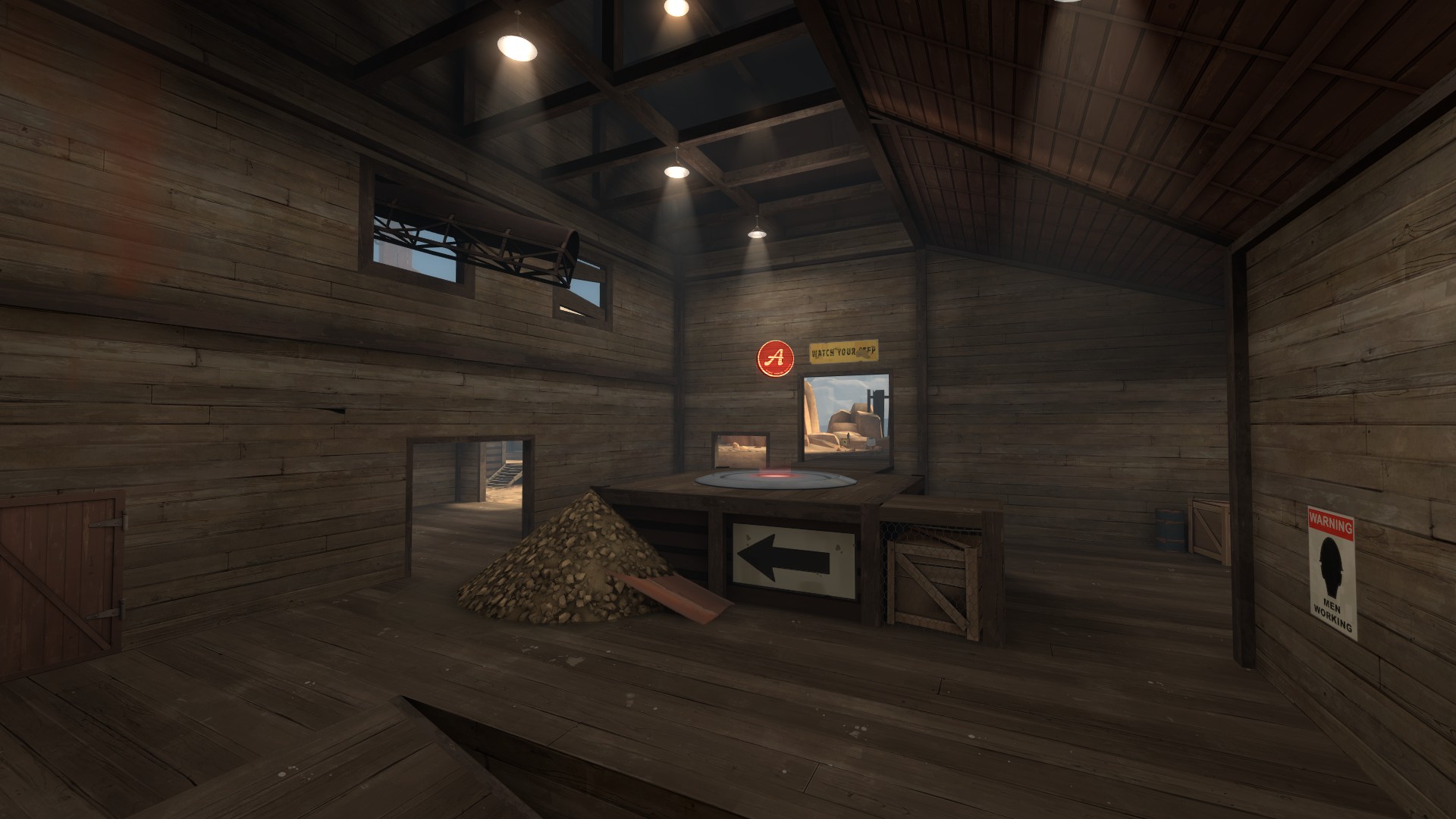
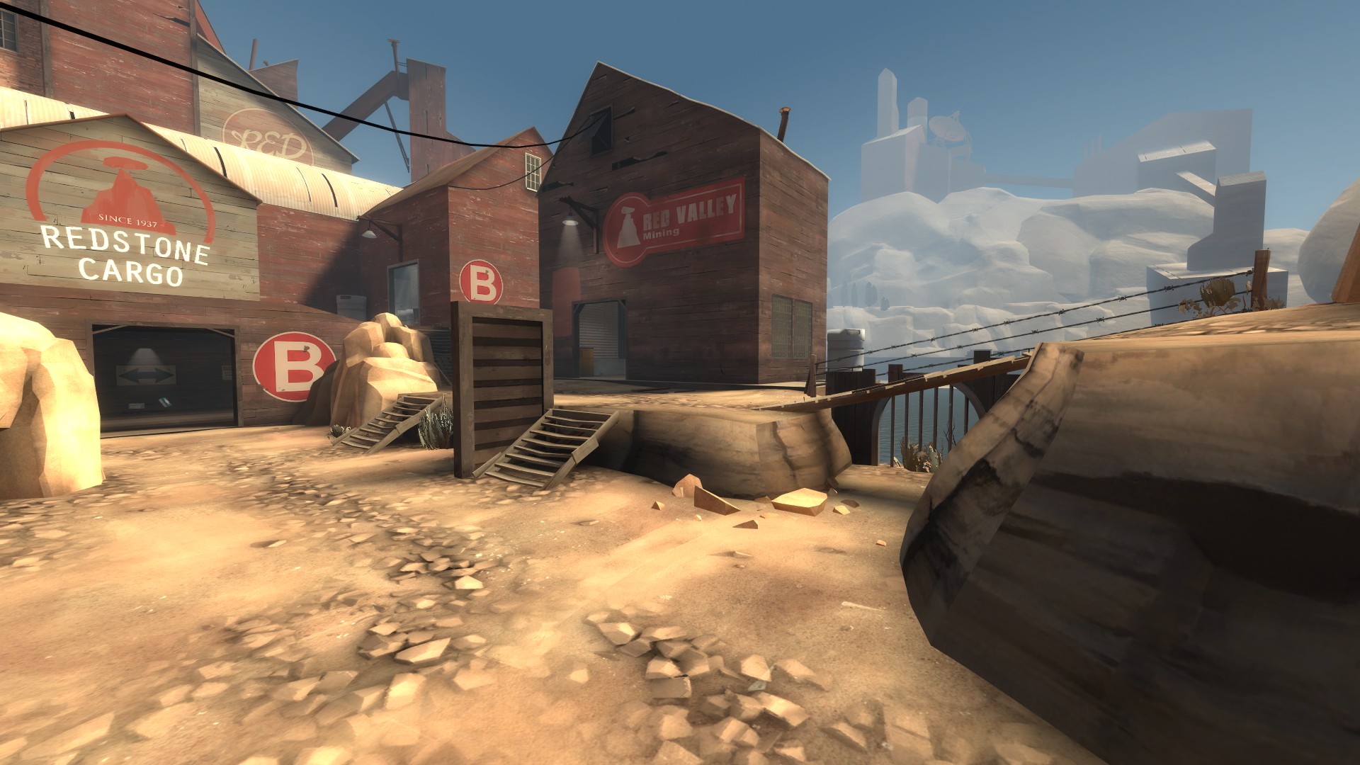
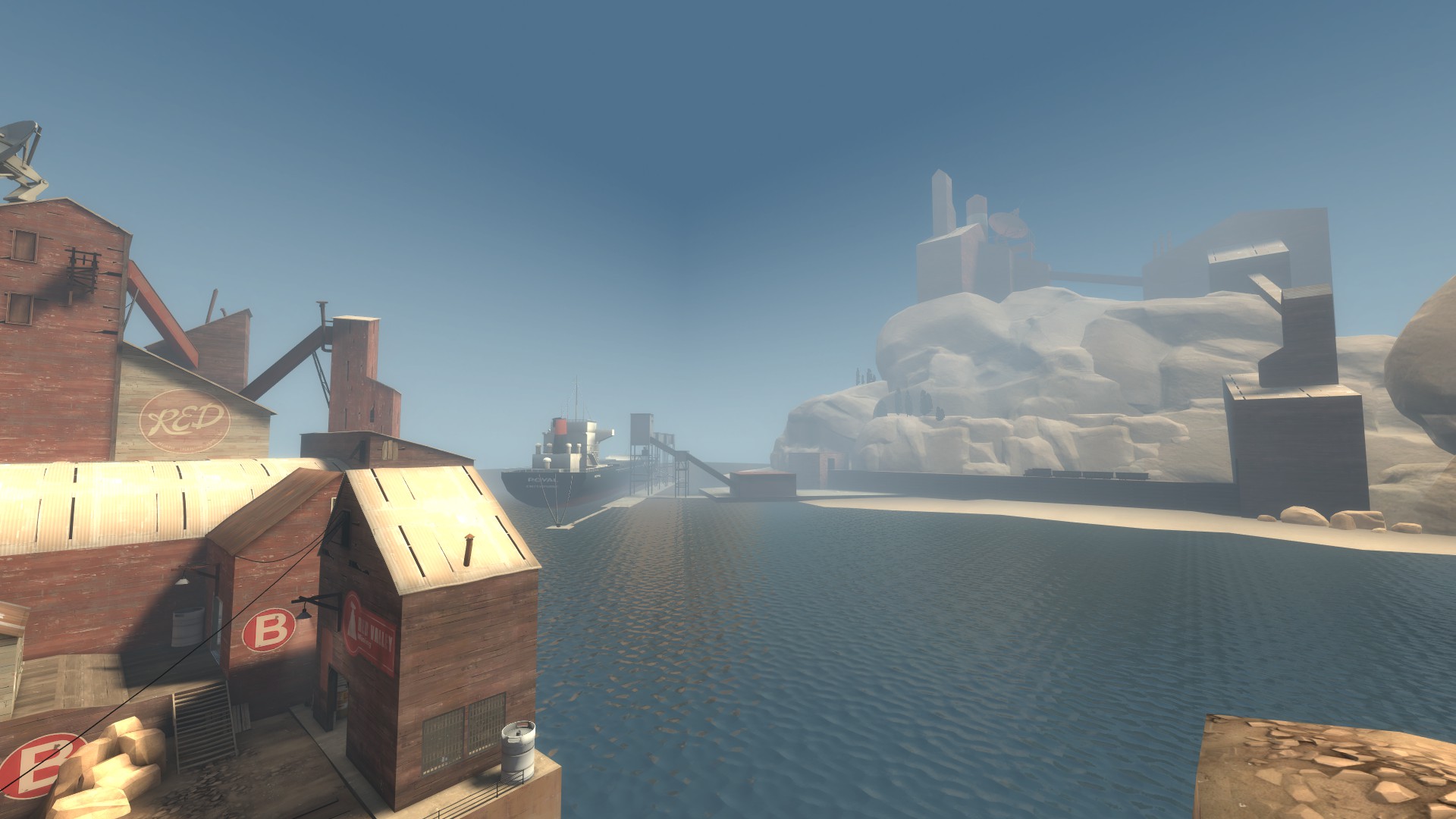
The dirt pile at A was problematic in alpha and early beta, i'm surprised it's still there in late beta. It's a bitch to defend by most classes, bar HW guy, because of the acute steepness (for both defenders and capturing attackers). The elevation and difficulty of accessing the platform (navigating the steep dirt) also made pyro's+airblast a god damn nuisance.

it's also in the way of the doorway making assaults through it into the sentry nest behind and on the left problematic with all the spam throwing you against the platform/dirt behind you making you prone to getting pinned/generally stuck.
 

EArkham

Necromancer
aa
Aug 14, 2009
1,625
2,774
The first point is a total bitch to stop a capture if you have to use the lower level doorway. BLU has a height advantage AND they can fire as soon as they see your feet.

I'd suggest either lowering the height of the point slightly (not a lot, keep it still elevated), turn the dirt pile into detailing (eg, not needed to climb up) and give the point a proper ramp on the side with the arrow (in this screen).

Or maybe raise that doorway to be level with the point, with a platform and stairs on the other side so that the area with the health remains as it is.

If that doesn't make sense, I can do a paintover or something.

Kep
 

tyler

aa
Sep 11, 2013
5,102
4,621
I'm not going to drastically change the A area. I will be releasing b5a today, which changes the junk pile into a proper ramp and does a few other very very minor things. Although I admit A (and for that matter the entire map) has issues here and there, at this point I feel I just have to take what I've learned and apply it to my future projects.
 

evanonline

L420: High Member
Mar 15, 2009
485
273
That's a door. How were you in there before that extended outward? It extends the moment A is capped, and that's when that spawn is activated. Only people noclipping should see that.

Oh. Hahahah I am dumb then, I passed through checking for errors and didn't really think too hard about WHY that'd be there. That's on me, you're right.
 

IrishTaxIDriver

L6: Sharp Member
Sep 27, 2008
271
149
Hello, its been a while since I looked at it so I'll take another look.

First thing I noticed, lotta areas in shade without lights.


Some lights here above the doorways would be nice to instantly draw the player in.


Facade of the buildings in shade! Throw some artificial sunlight on it with some light_spots or something. Some floodlights would be cool too.


A light above the packs in the back aiming towards where the screenshot was taken from would be good. It'd draw the players into the health/ammo and light the area.


Some floodlights would be nice here. Probably centered.

Here are some pictures of dark ceilings.


A huge thing I noticed is that you're only using light_spots with your lights. I'd recommend the generic light entity as well for the global lighting. It'd get rid of all your dark ceilings.


I'd just make this a wood bridge. It makes the doorway look wierd and superfluous using a plank bridge.


For a warehouse its kinda dark. I'd add another row of lights in between, or pump up the light coming through the skylight.


I'd put these rows side by side either on the top or on the bottom. Having them above each other is really strange to me.

As for your A conundrum:

I'd expand out the lower area and merge the ramp up with a staircase up to A.

Like so:


I'd say remove that white/black sign as well. I don't understand why its there!
 

Pocket

Half a Lambert is better than one.
aa
Nov 14, 2009
4,696
2,580
In that first screenshot just above, does that rock not cast a shadow, or is it just a quirk of the camera angle? Because that probably needs fixed too.
 

Languid

L5: Dapper Member
Oct 9, 2009
240
256
v2ErX.jpg


bYj4u.jpg


YGH9K.jpg


methinks this be done soon
 

Languid

L5: Dapper Member
Oct 9, 2009
240
256
Odd, the buildings feel pretty detailed to me atm. I'm just replacing yylers terrible 3dsky
 

tyler

aa
Sep 11, 2013
5,102
4,621
I'm really terrified of making the gameplay buildings too busy. I actually counted props and overlays and shit in Upward, and any time I went over the number a same size building in Upward had, I freaked out a little.

I'm serious.
 

Pocket

Half a Lambert is better than one.
aa
Nov 14, 2009
4,696
2,580
One thing that just occurred to me: You're using the fog values from Upward, right? The fog distances in that map are way below average because it's used to hide the edges of the water. This map doesn't have that problem, so it might be a good idea to change them to something more natural looking.
 

Languid

L5: Dapper Member
Oct 9, 2009
240
256
Thats the plan, steve. Rav also pointed me towards a handy keyvalue that may allow it to look upwardsy without getting fogged out
 

tyler

aa
Sep 11, 2013
5,102
4,621
If I did this, does anyone think CP2 would be any worse?

I know it's been a while for most (all) of you.

(There used to be a wall/crates/etc here.)

ubAoZ.jpg
 

Hanz

Ravin' Rabbid
aa
Jan 18, 2009
844
479
I'd leave a few crates there, but not the whole wall of crates. This way that route won't be too overpowered but you still give BLU a little bit cover, otherwise I don't see a lot of BLU being able to reach the other side of the area with that route.
 

tyler

aa
Sep 11, 2013
5,102
4,621
cp_desertion_rc1

rc1:
  • languid made me a really good 3d skybox
  • languid also did a lot of regular detailing, cementing his place as the best guy
  • i did a couple detail things
  • and a couple optimization things
  • and made a couple adjustments to cap timers or spawn timers, you decide

cp_desertion_rc10000.jpg

cp_desertion_rc10001.jpg

cp_desertion_rc10002.jpg

cp_desertion_rc10003.jpg

cp_desertion_rc10004.jpg

cp_desertion_rc10005.jpg

cp_desertion_rc10006.jpg

cp_desertion_rc10007.jpg

cp_desertion_rc10008.jpg


download
 
Mar 23, 2010
1,872
1,696
looks a lot better. u da man languid.