Hello. I left you a few notes, and I do like the map, but yeah there are a few things I'd suggest for improvement.


One of the things I saw quite a bit of were awkward areas, like where supports met the ground and crevices in rocks and stuff. I know why you did it too (I do it too), you have a set of rules for how stuff works in the map and it had to be there. Really, don't worry about that. Worry about how it plays first and then fit the detailing around that.
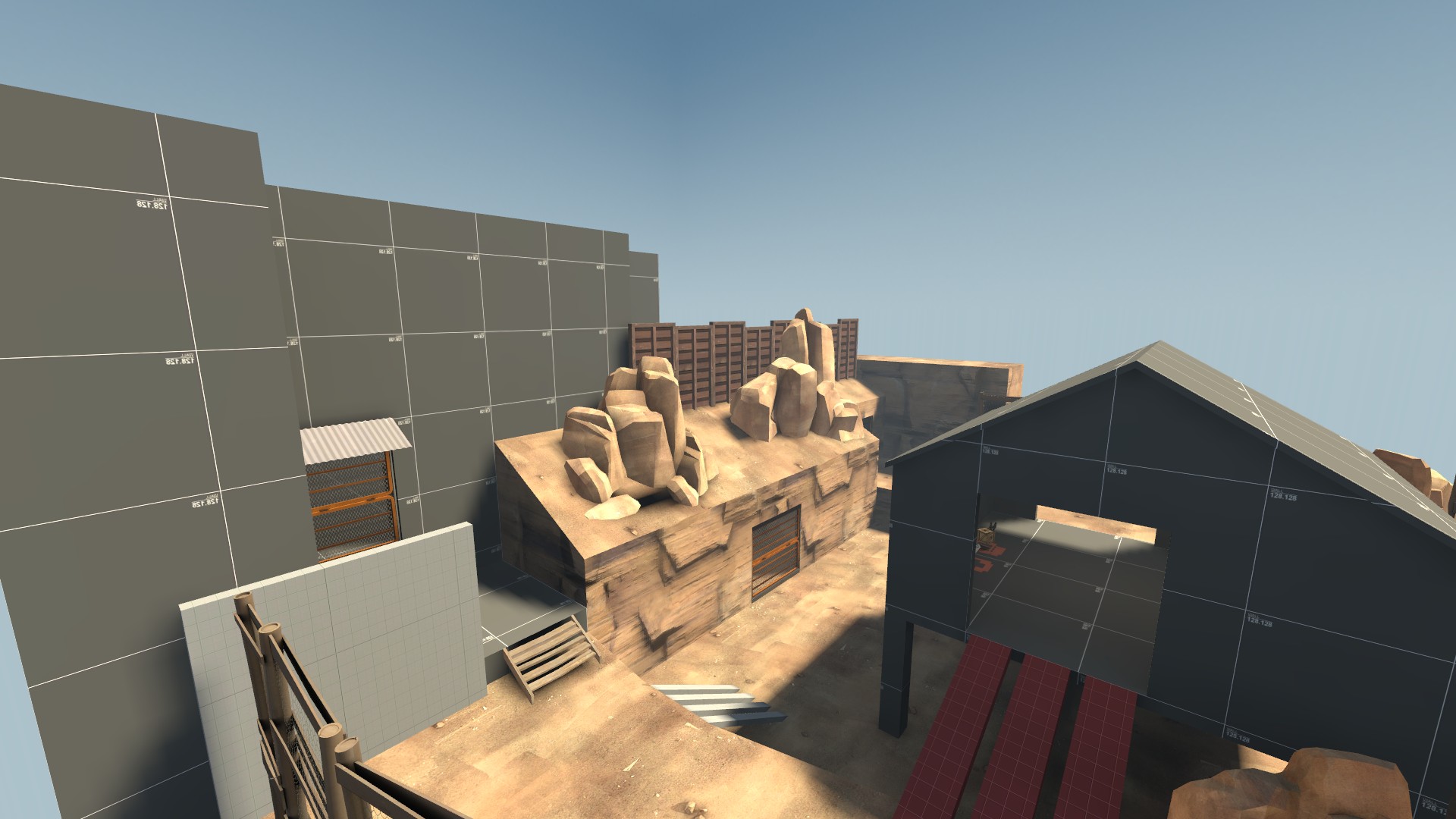
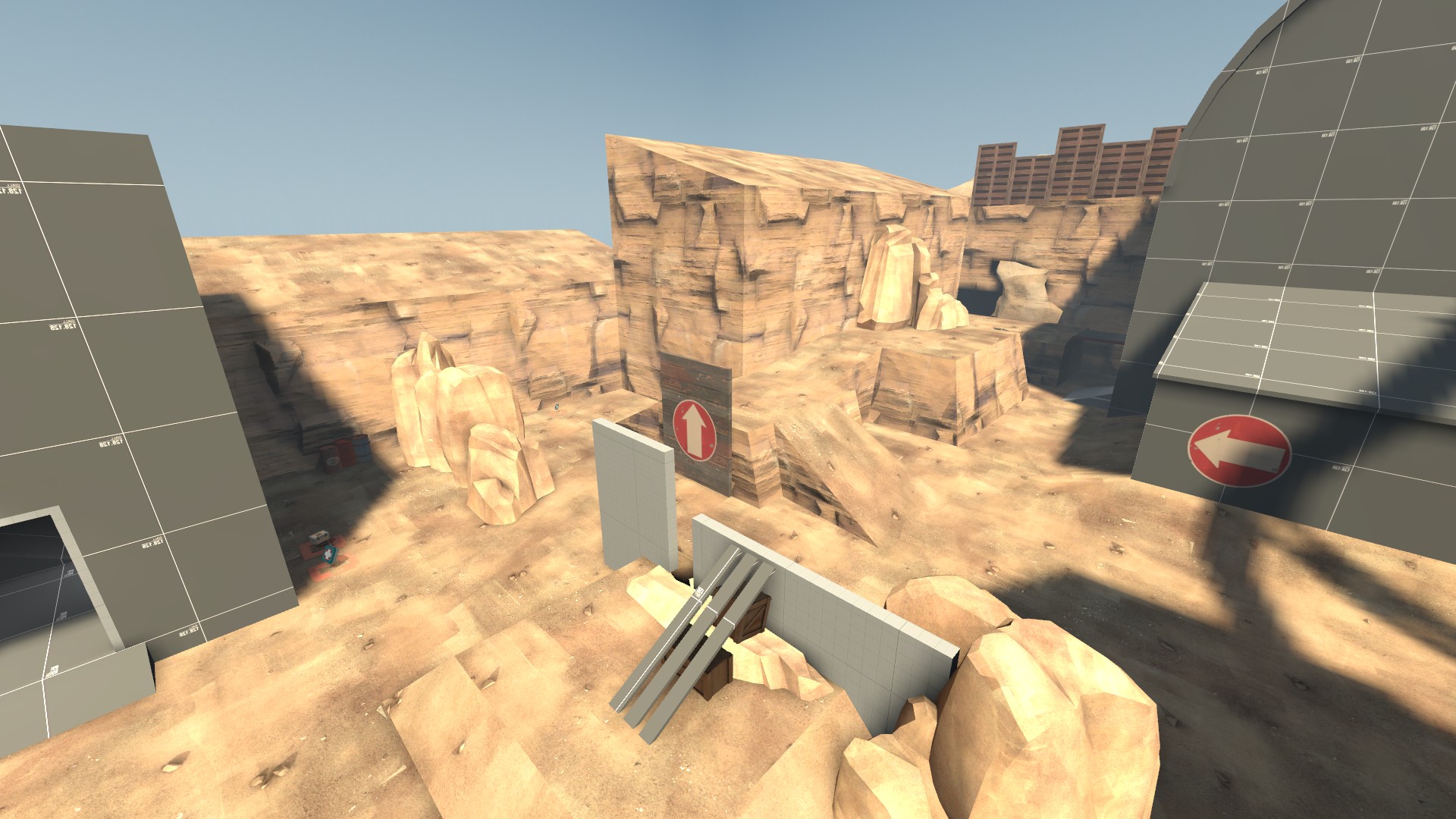
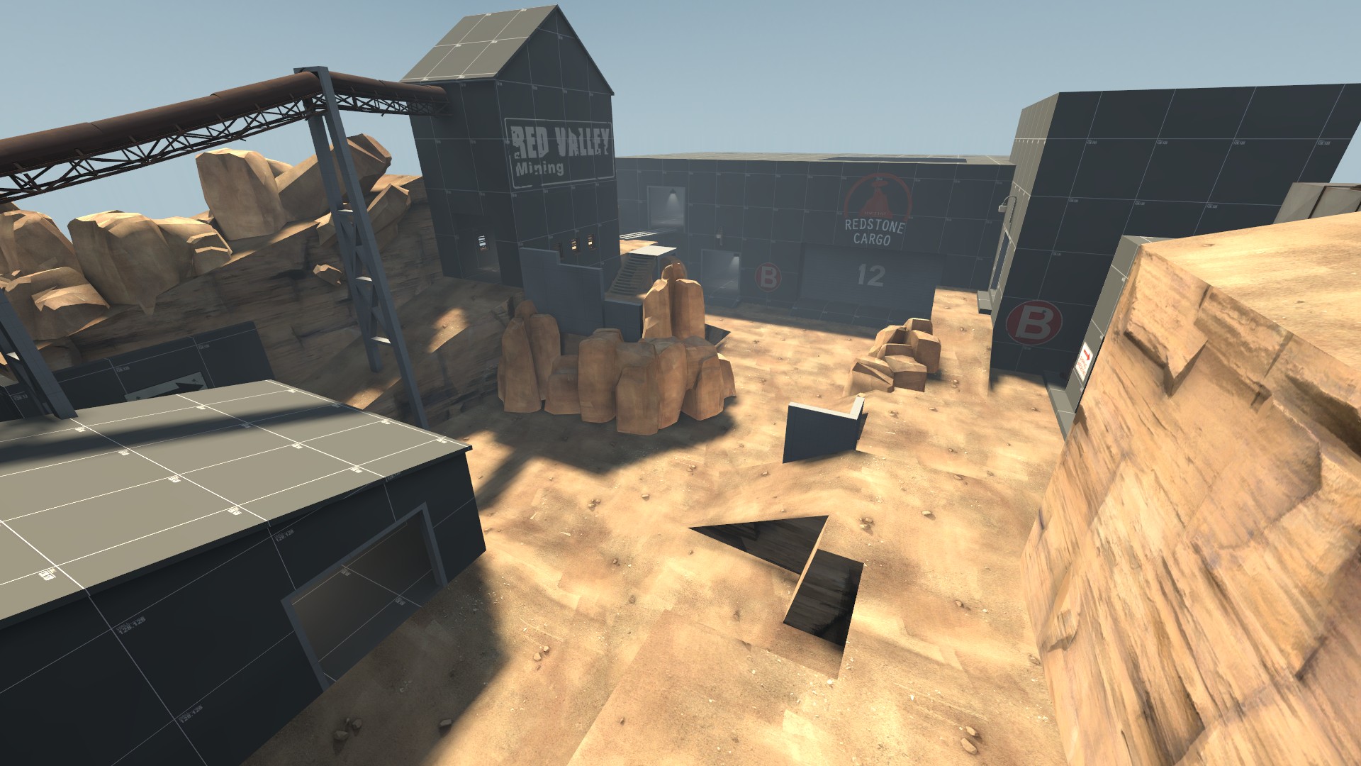
I'm not a big fan of dead ends in maps either. Its more of a quake mapping thing but it just bugs the hell out of me. I missed a shot of the area to the right of the rock crevice with the items, simplify that down!
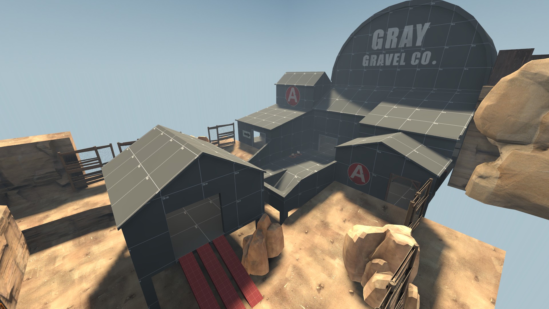
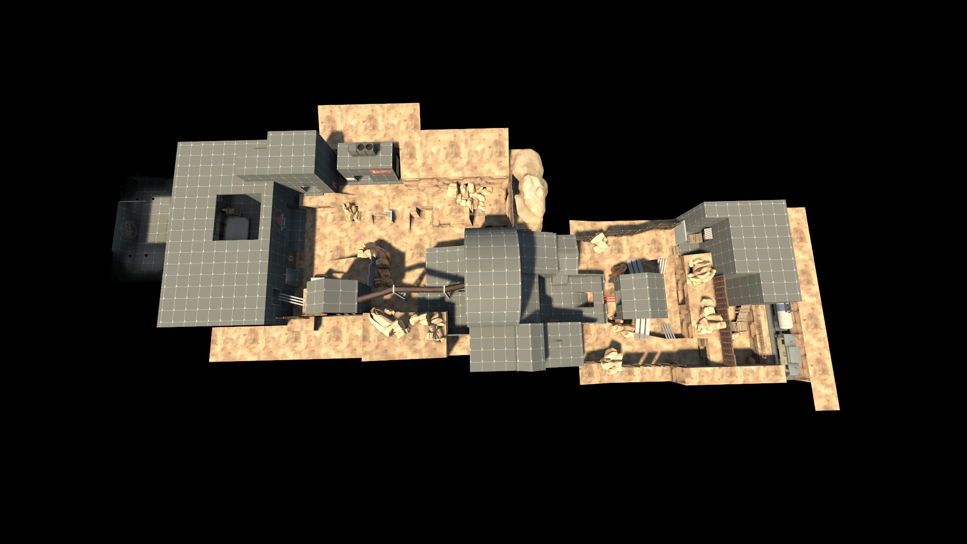
I'd also say over-emphasis the main route to the cap points. Some lights, those dirt tracks for the trucks, stuff like that. Players are goldfish and will go to whatever looks the most appealing.
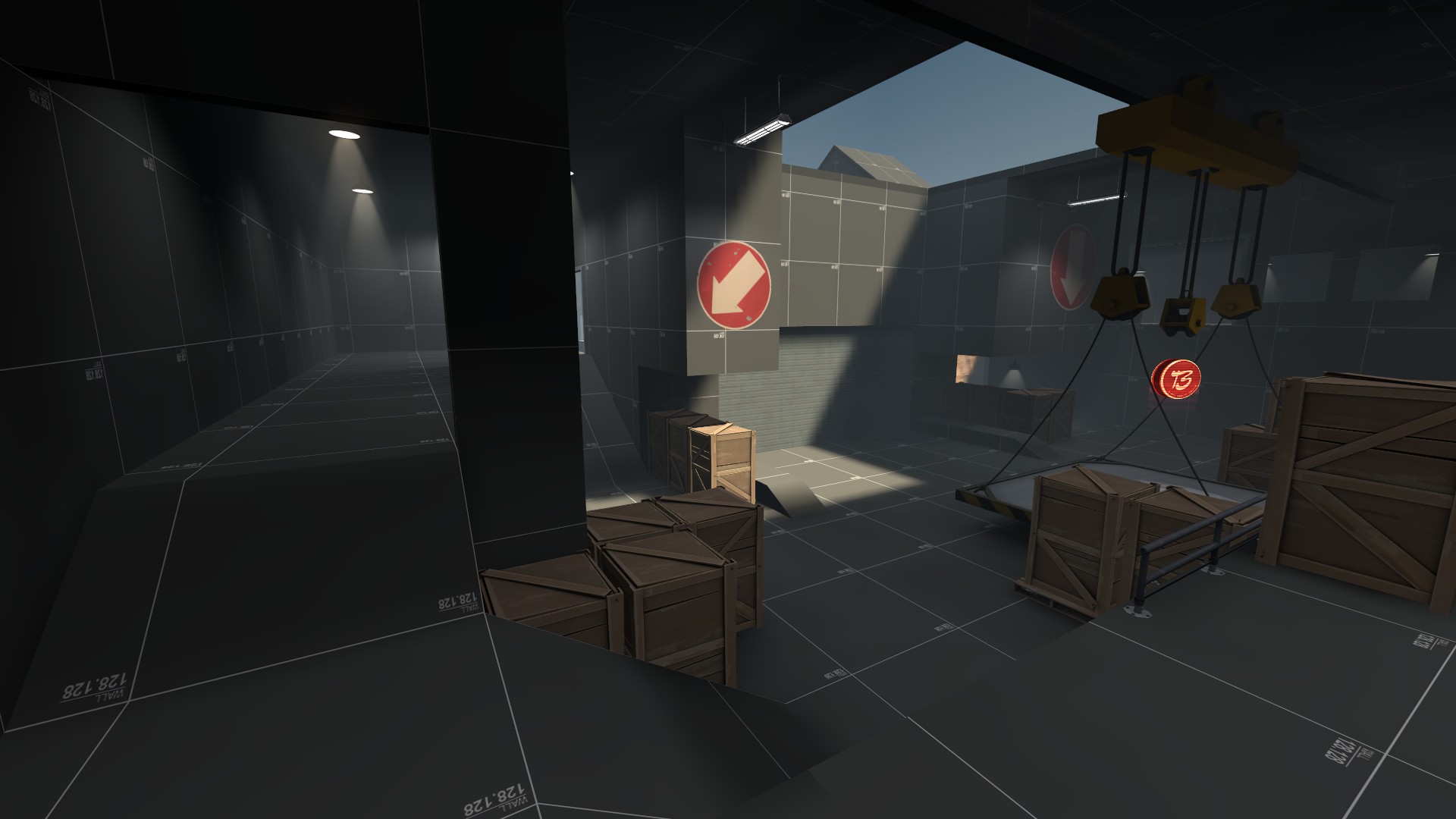
Speaking of the cap, That improvised ramp in front should really be a walkable thing. The only way up right now is that path in the back, and while its fine, it needs more access points. I also think its a wee bit small.
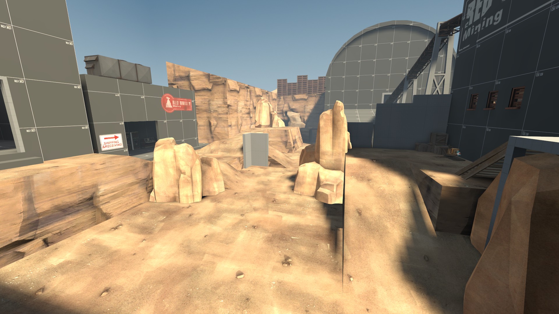
Also that area to the left in the shot, its a little cluttered. Simplify it up. Turn that giant ramp at mid-left to a 96 or 128 staircase hugging the wall and extend that ledge all the way over.
Another thing, I don't think the forward spawn is needed at all. Blue was able to roll the last cap really easily, and while they should have the advantage, it was too much of an advantage. You could probably get away with shortening (or not touching at all) their spawn timers.


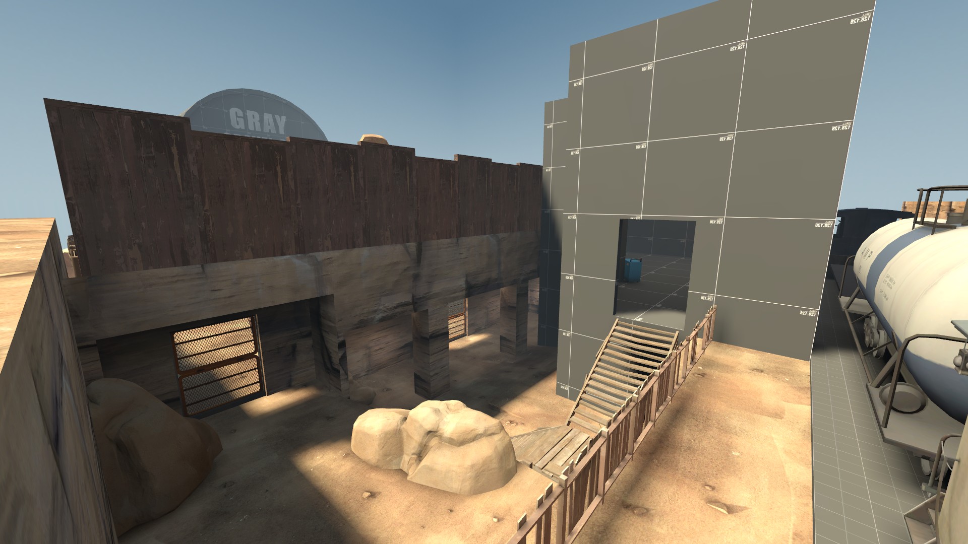
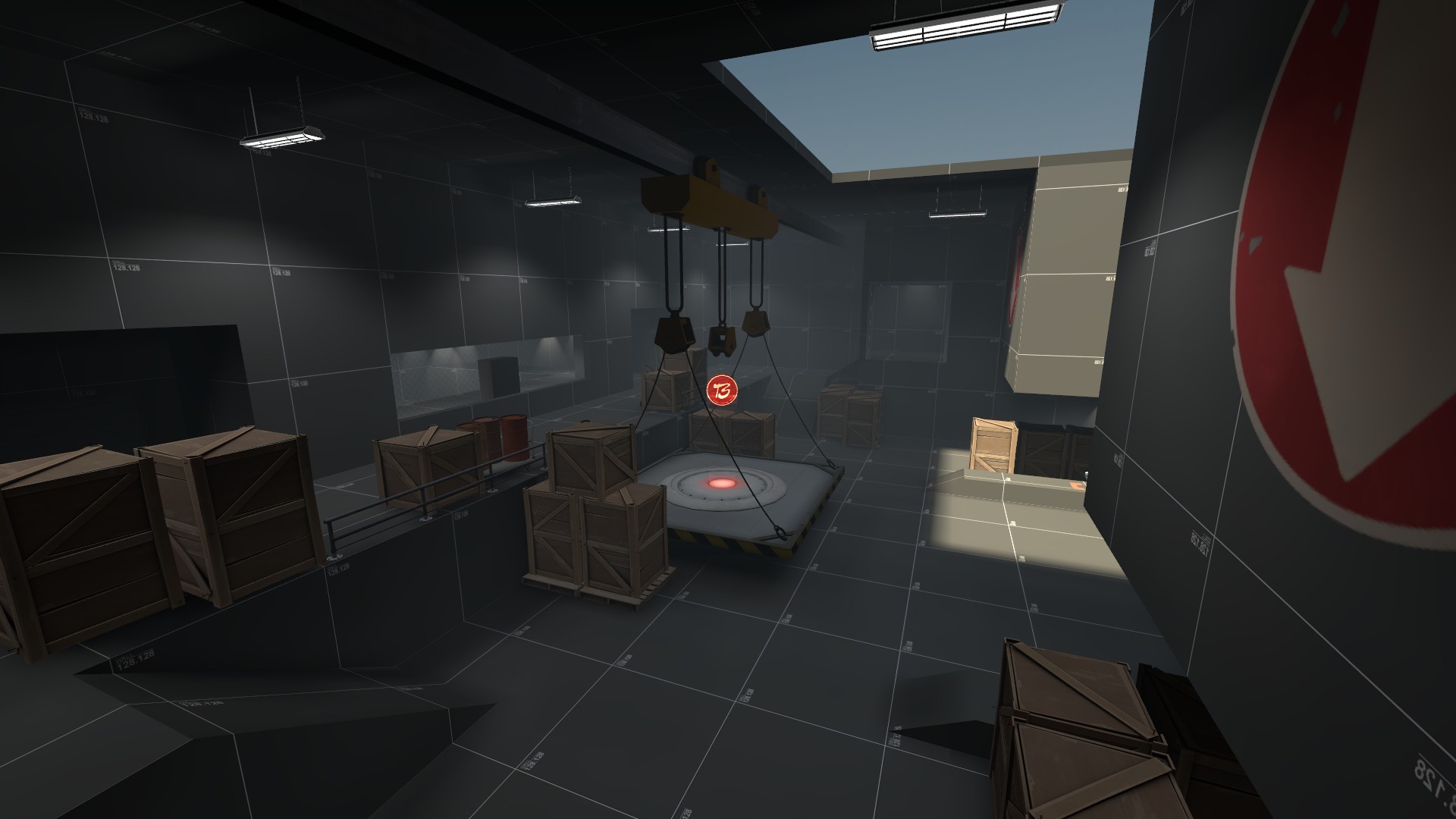
Remove this building. I think it just over complicates the area and whatever that building had you could put into the little battlements area. I'd also say move the ramp out to where the red planks are, but I would also suggest some kind of something in the middle to break out that large flat lower area.

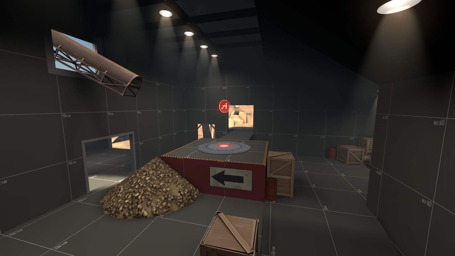
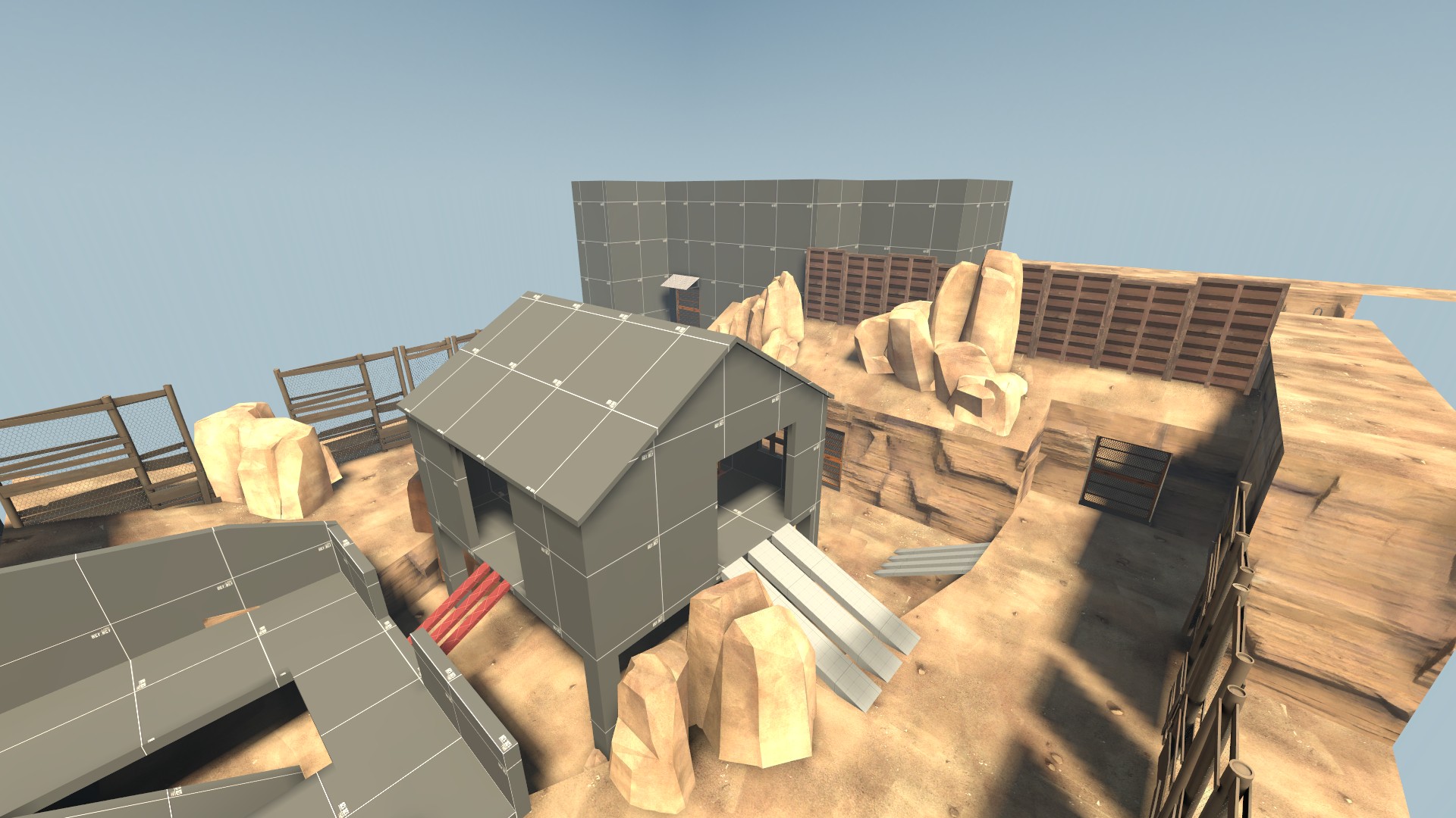
I think this should be closer to the ground or have some improvised ramps up to it. I know its not hurting anyone by having it a little off the ground.
Otherwise, I think you're off to a great start. You have some good sizing going on and the flow was decent.