CTF_Rock2
- Thread starter Buddikaman
- Start date
You are using an out of date browser. It may not display this or other websites correctly.
You should upgrade or use an alternative browser.
You should upgrade or use an alternative browser.
- Nov 12, 2007
- 1,128
- 746
I know this is a nitpick, but the rock intersecting those windows is bothering me from a logic perspective. Seems if there was a room up there that they were building adjacent to a rock, even with hewing the backside of the rock out for space, there'd be some brick and mortar between the rock and the window frame.
- Dec 31, 2007
- 107
- 11
I know this is a nitpick, but the rock intersecting those windows is bothering me from a logic perspective. Seems if there was a room up there that they were building adjacent to a rock, even with hewing the backside of the rock out for space, there'd be some brick and mortar between the rock and the window frame
Your right it does look tacky, ill probably have to remove that rock altogether.
-Buddikaman-
- Dec 31, 2007
- 107
- 11
Hey Buddikaman, any updates in the mean time?
This map is being completely redone as a collaboration between Shmitz and I. Shmitz will be taking over all mapping dutys, while i focus on generating custom props and envrionment art for the map. I will probably hold off on posting new screens untill we have something substantial to show, but so far we have some great ideas and shmitz has brought alot to this project. Our working together will most likely continue after this map, and the idea is to bring a new level of excellence to TF2 custom maps. Stay tuned!
-Buddikaman-
Scotland Tom
L6: Sharp Member
- Jan 19, 2008
- 332
- 64
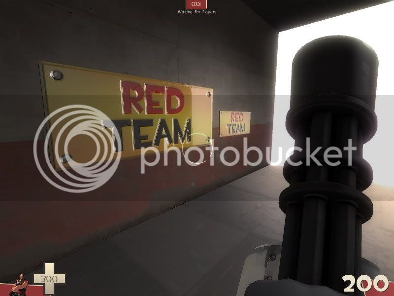
I absolutely adore the reflectivity in those signs. On the other hand I'm not sure the font is correct for the "engraved sign" look. Yeah, TF2 has its characteristic fonts, but those are used in the UI and menu screens for the most part. When you take a look at some of the overlay signs they use fonts appropriate for the types of signs they are. Go ahead and use a nice clean font with sariffs. Copperplate Gothic or something along those lines would do nicely I think.
Also, the one sign is too big in my opinion. Usually these types of metal engraved signs are used as placards, not large directional or informative signs. Keep them smaller and make a variety of them! I'd like to see some that could be used as cornerstone markers, "EST. 1957" and the like.
Also, the one sign is too big in my opinion. Usually these types of metal engraved signs are used as placards, not large directional or informative signs. Keep them smaller and make a variety of them! I'd like to see some that could be used as cornerstone markers, "EST. 1957" and the like.
- Nov 12, 2007
- 1,128
- 746
also, my additional critique is that I dont think Valve refers to Red or Blue as teams in any of the maps, it is the RED and BLUE companies or something like that.
Red Penitentiary, Blue Maximum Security =)
- Dec 31, 2007
- 107
- 11
re
This map is as of now being scrapped for bigger and better things(ie more ambitious ). Im currently working with Shmitz and Scoobings on a entirely new "themed" map concept, which being the only artist is alot of work. I guess i can show a few props for rock2 that ended up being scrapped ;/
Toilet


-Buddikaman-
This map is as of now being scrapped for bigger and better things(ie more ambitious
). Im currently working with Shmitz and Scoobings on a entirely new "themed" map concept, which being the only artist is alot of work. I guess i can show a few props for rock2 that ended up being scrapped ;/Toilet
-Buddikaman-
Last edited:
I absolutely adore the reflectivity in those signs. On the other hand I'm not sure the font is correct for the "engraved sign" look. Yeah, TF2 has its characteristic fonts, but those are used in the UI and menu screens for the most part. When you take a look at some of the overlay signs they use fonts appropriate for the types of signs they are. Go ahead and use a nice clean font with sariffs. Copperplate Gothic or something along those lines would do nicely I think.
Also, the one sign is too big in my opinion. Usually these types of metal engraved signs are used as placards, not large directional or informative signs. Keep them smaller and make a variety of them! I'd like to see some that could be used as cornerstone markers, "EST. 1957" and the like.
Doh! I posted these in the wrong Rock2 thread!
I mean them as a replacement for the signs Sacrificist used.


Scotland Tom
L6: Sharp Member
- Jan 19, 2008
- 332
- 64