sitebender
L3: Member
- Aug 15, 2012
- 102
- 33
In the blue safe room.... I like the control room. Corners and left exit seem to be dark. Corners need clutter. I want to look out into the ocean and see beauty  And a lighthouse or island or shipping freighter in the distance. There's a Wade's Canoes sign that people get stuck under.
The left door of blue spawn room you can EASILY spawn kill with rockets or demos straight into where the players spawn. This is a huge problem People will die just as they spawn instead of at least running out the door to die. It is also really easy to blindly demo spam either side, but I guess that's okay since its blind demo spam.
Yep you're right point B to C is really dark Time for a skylight somewhere or just indoor lights?
I see why point C is easy to get through. There are a lot of paths to the top. Yet somehow we failed to catch point C. Anyway I noticed somehow some way the cart at point C flipped itself upside down. Perhaps red need some snipe points near C point with holes in the white wall that would be to the right of blue side when they're coming. It is possible to defend it. I think the catch to defending it is preventing them from getting around the bend.
I find a lot of the bots jump over the railing to their doom for whatever reason.
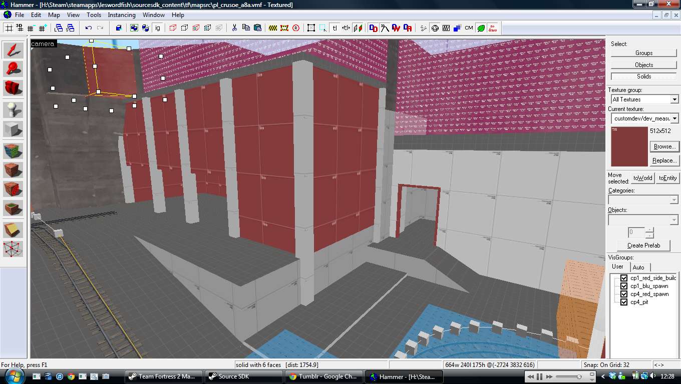
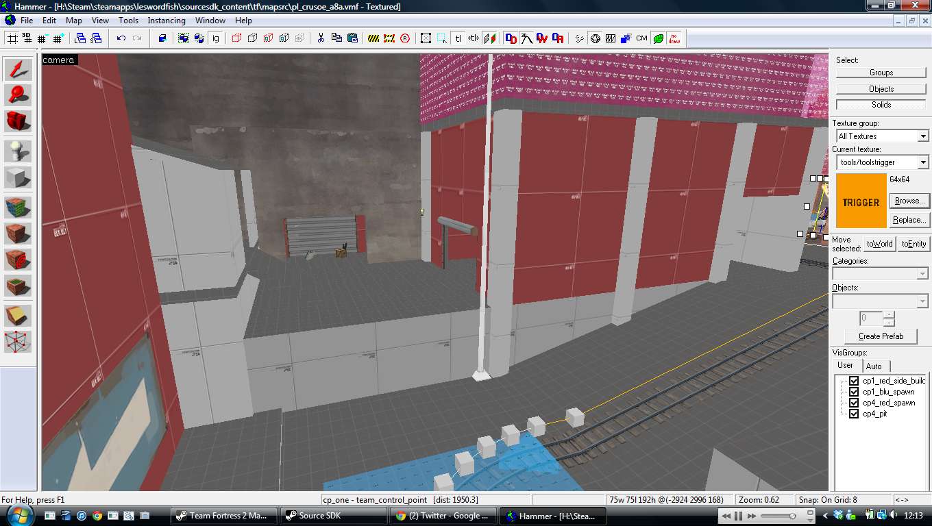
The path to point A feels like there's a lot of good action. The top exit path is good to prevent spawn killing, but red team can get up to that exit path. The 2 ramps for the cart... you have another steep ramp that runs parallel with the second mine cart ramp. I kind of feel you should just have 1 long ramp for the cart instead of 2 steep ramps.
There always seems to be a good counter path to everything which prevents a group from totally blocking an area. In other words spies will have an easy time backstabbing people. A quick time too. Backburners and spies could do a lot of damage. Scouts could do a lot of annoying
The cart does wild flips on the ramp at point D.
In all I do have to say this has the making of a good / great map.
The left door of blue spawn room you can EASILY spawn kill with rockets or demos straight into where the players spawn. This is a huge problem People will die just as they spawn instead of at least running out the door to die. It is also really easy to blindly demo spam either side, but I guess that's okay since its blind demo spam.
Yep you're right point B to C is really dark
I see why point C is easy to get through. There are a lot of paths to the top. Yet somehow we failed to catch point C. Anyway I noticed somehow some way the cart at point C flipped itself upside down. Perhaps red need some snipe points near C point with holes in the white wall that would be to the right of blue side when they're coming. It is possible to defend it. I think the catch to defending it is preventing them from getting around the bend.
I find a lot of the bots jump over the railing to their doom for whatever reason.
The path to point A feels like there's a lot of good action. The top exit path is good to prevent spawn killing, but red team can get up to that exit path. The 2 ramps for the cart... you have another steep ramp that runs parallel with the second mine cart ramp. I kind of feel you should just have 1 long ramp for the cart instead of 2 steep ramps.
There always seems to be a good counter path to everything which prevents a group from totally blocking an area. In other words spies will have an easy time backstabbing people. A quick time too. Backburners and spies could do a lot of damage. Scouts could do a lot of annoying
The cart does wild flips on the ramp at point D.
In all I do have to say this has the making of a good / great map.


