Crusoe

PL Crusoe a17b

LeSwordfish

semi-trained quasi-professional
aa
Aug 8, 2010
4,101
6,597
what, you thought this was dead?

this link says that that realistic estimate was in fact erroneous

so more fool you

ADD9818B8AB4B2EE139FFFC988E50D37868A86C9

EAB08AE5B63FB0A9C949AFACE1A6D90EDE18E773
 

LeSwordfish

semi-trained quasi-professional
aa
Aug 8, 2010
4,101
6,597
A13 out

Download here

-added cover at A-B and B-C - including kind of breaking the C sightline
-unlocked Blu's forward spawn sooner
-reduced red respawn time at the finale
-upped the brightness of interior lighting
-general detail and lighting tweaks
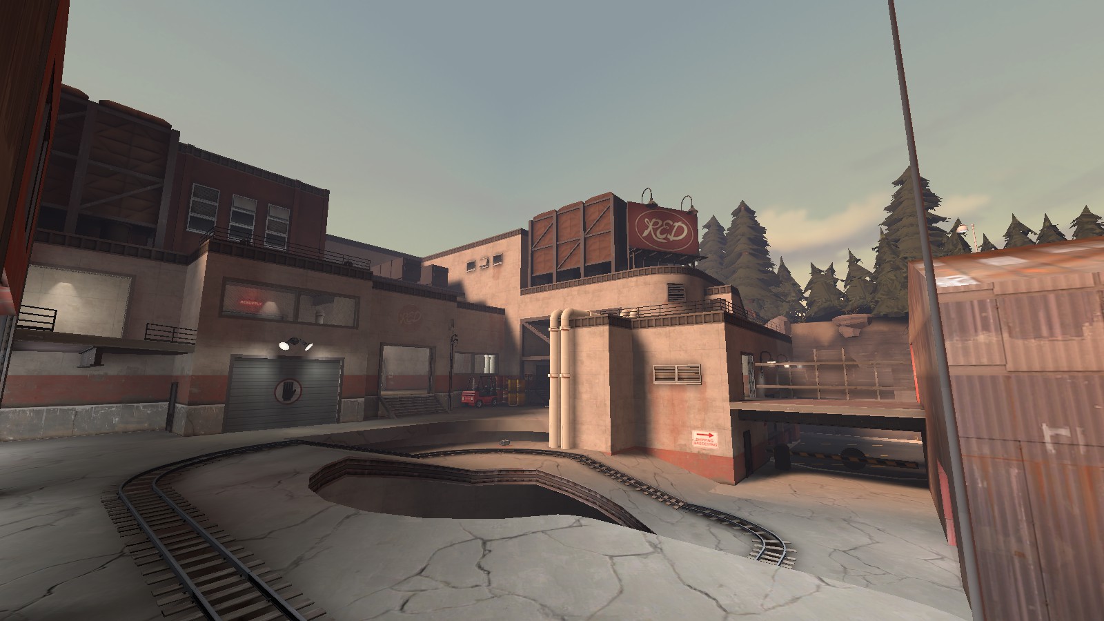
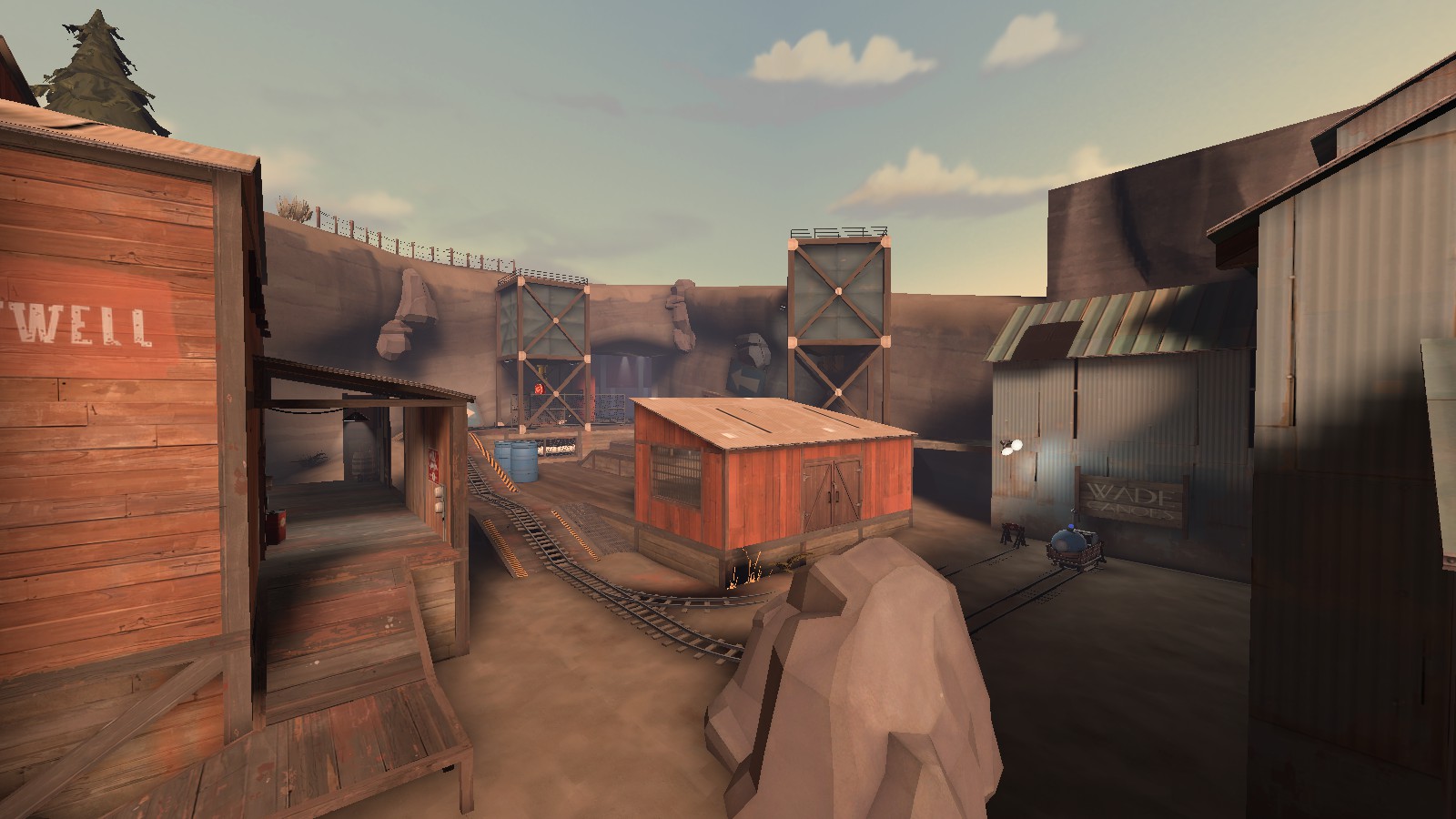
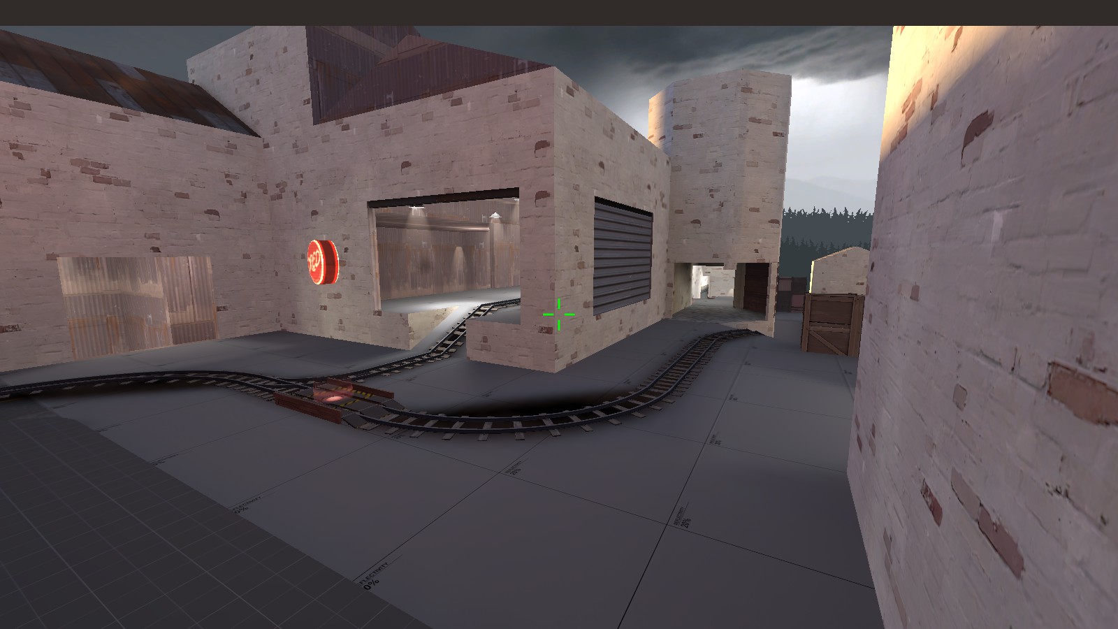
-retheme to thundermountain environmental style

I say "kind of breaking" since i like that area as one that ranged classes can control - it's deliberately a good place for snipers, wranglers, etc. The new cover forces snipers to move forward a little to cover the choke, and prevents them from also covering the flank route across the bridge. Ideally this point should play almost like a CP - Blue have to flank, destroy/kill the long-range defenders, and then hold the top of the ramp for long enough to push the cart up. I mean, maybe not in practice, but that's the theory.

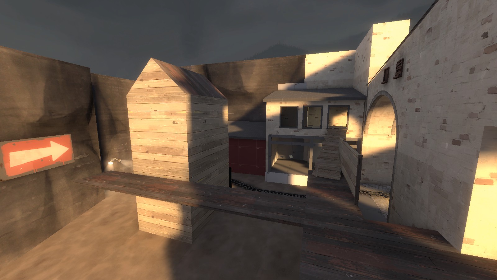
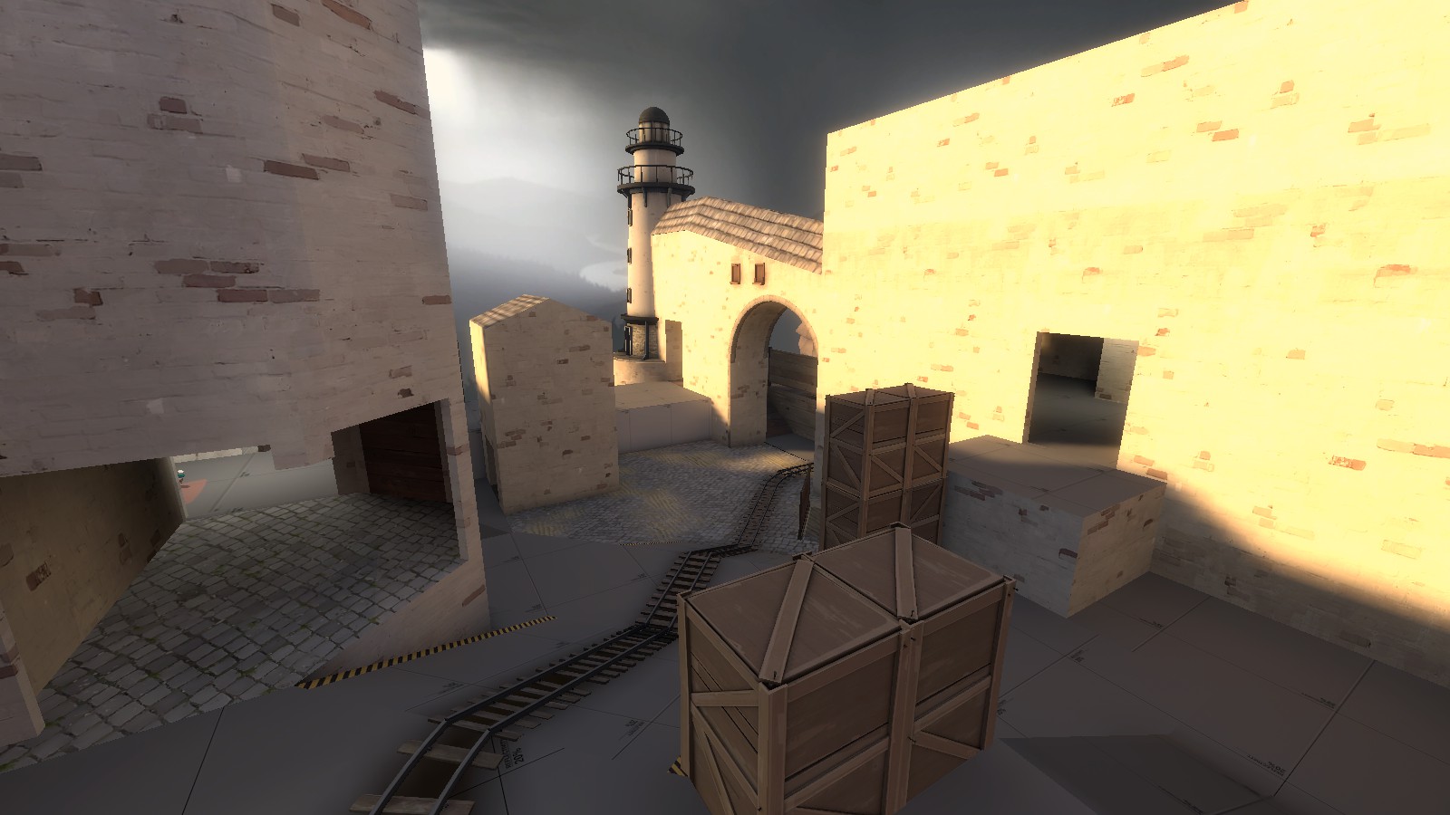
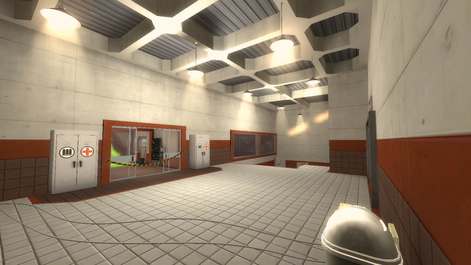
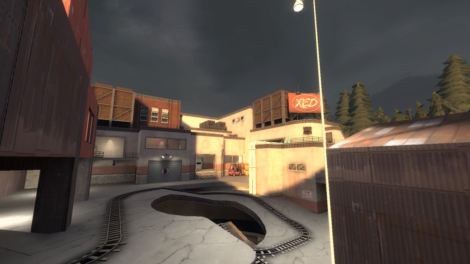
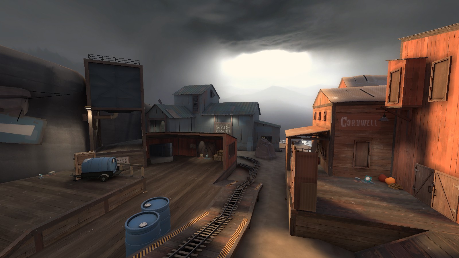
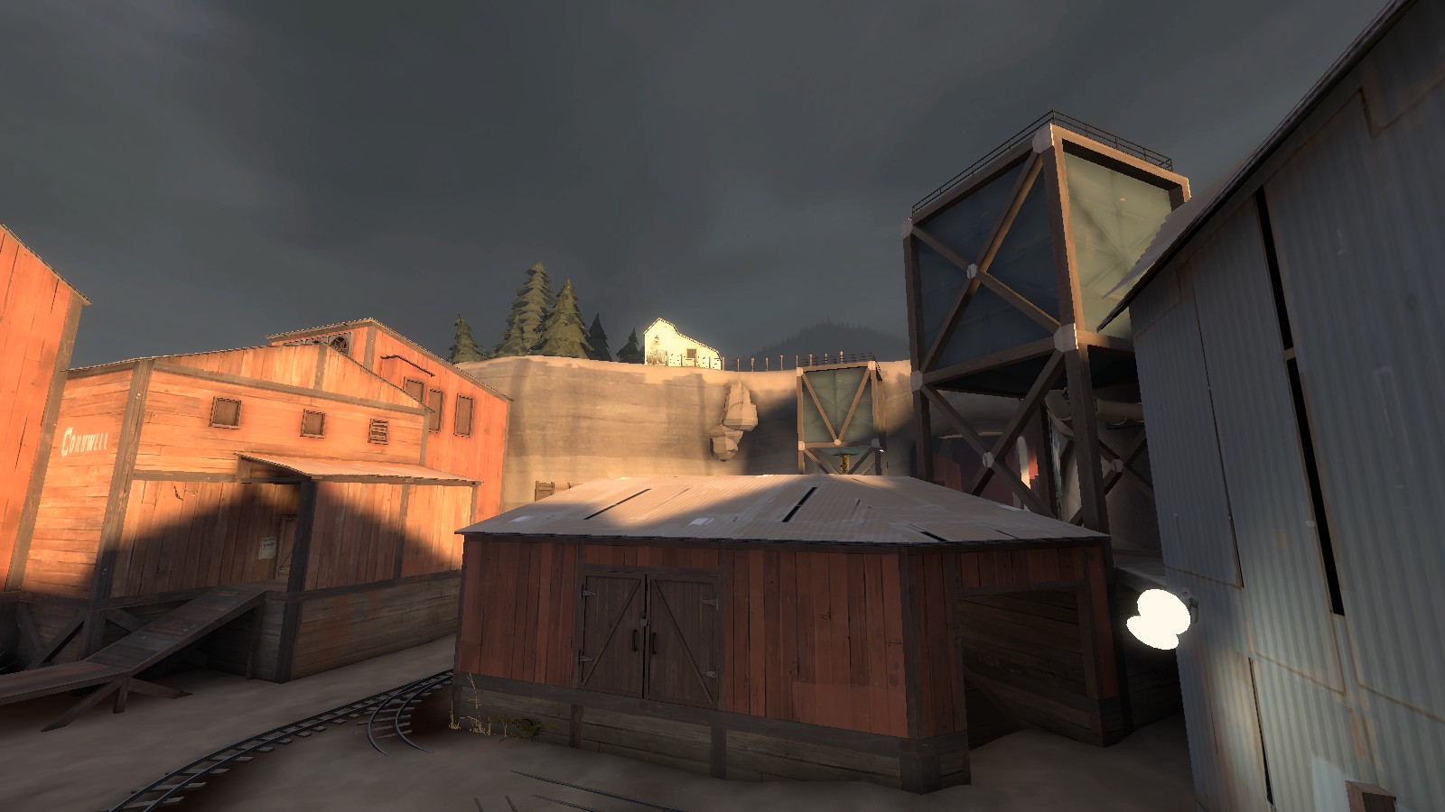
A lot of the feedback I got was on dark areas, but the retheme of the map to thundermountain's style - complete with entirely different light_environment settings, different sun angle, and generally increased brightness - means that some of the advice is no longer relevant. I've upped the interior brightness, but some outside areas may still be a bit dark - any feedback on this is welcome.

Below are pictures of it on full final compile mode - note that the released version is more basic since this turned out to have an areaportal glitch.
855F9BA1C0D521DDE1B9C41A49BD57725F3BF567

F1F4C799975C3FD5E931E2D5C7A1017C4D82B54C

B0E95E96E2C287CE4F14BBA5233CB54F6186080E

C22FB9D65F6DE4EE202FF1CB1E6E5B9F23D9787B

1C48C6E6F95D8A733E3FFC99790F9B56046FDDCD

778D8C87BBBB465388E666E4985AA742ECF4E2FD
 

LeSwordfish

semi-trained quasi-professional
aa
Aug 8, 2010
4,101
6,597
A14

Download Here


This should now be uploaded to the tf2maps servers - I'm very keen to get it tested so feel free to throw it in any imps around. I think it's now good enough that I can start trying to get competitive testing on it as well - or should I wait until it's fully detailed? Since i'm detailing areas as I pin them down as "good" that could be a while. Similarly, I don't really want to start promoting it outside tf2m until it hits beta.
 

LeSwordfish

semi-trained quasi-professional
aa
Aug 8, 2010
4,101
6,597
a14a has been released and tested - it fixes a bugged door. I should have a15 soon - before the end of the weekend, perhaps, but for now I wanted to check the timings to see if the map is really as long as all that.

Time (Spawntime)
| Crusoe | Badwater | Upward
Red>A | 13 (4) |15 (8) |15 (9)
Red>B | 8 (8) |7 (8) |5 (10)
Red>C | 8 (6) |9 (8) |9 (10)
Red>D | 2 (5*) |4 (10) |5 (9)
Blue>A | 5 (3) |8 (4) |8 (4)
Blue>B | 12 (3) |12 (4) |16 (2)
Blue>C | 11 (3) |18 (4) |12 (2)
Blue>D | 17 (1) |14 (4) |11 (2)

*already changed from a14(a)

These are as scout, which was probably a bad idea: players will be far slower as other classes, skewing the numbers.
 

LeSwordfish

semi-trained quasi-professional
aa
Aug 8, 2010
4,101
6,597
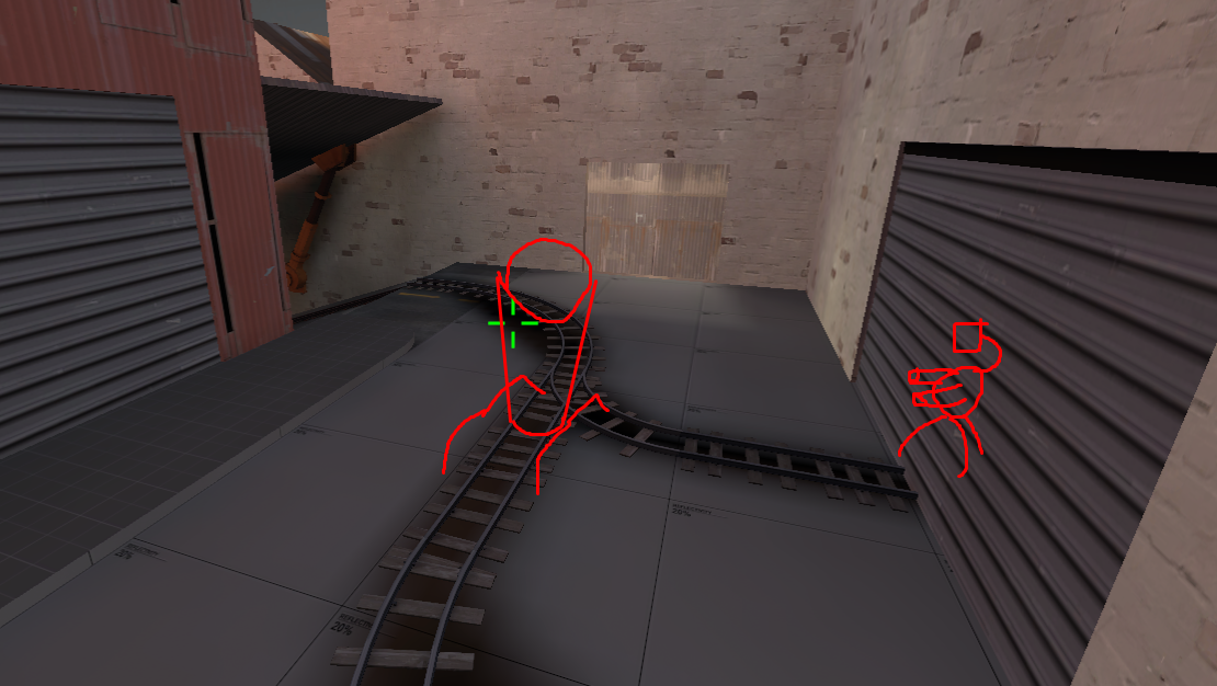
So I have some ideas on what to do with this, since most points need some or other kind of layout change - hopefully these are legible.

A)

A pretty much works, I think! I want to make the glass window of the little building in front of spawn lower so you can see in from outside, but otherwise: probably done.

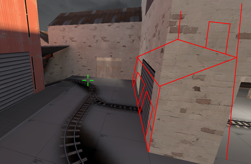
B)

Tyler was suggesting adjusting the flank so as to give an additional path into the warehouse area - I like that, and will be trying this:
575h23w.png


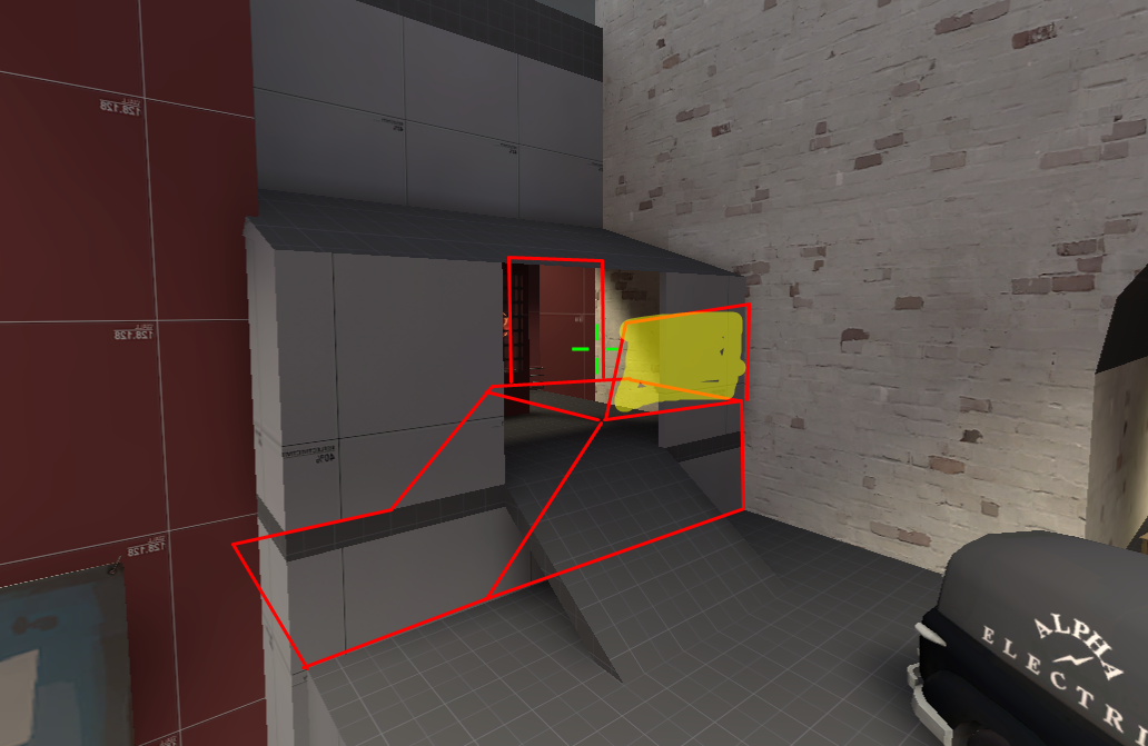
Instead of the current doorway, open up the raised area into a fuller balcony, and put a door on that, plus some cover. This will then lead to the current flank past the spawn, but it's a bit easier for attackers to access, and gives them a bigger advantage in the current area.

The one-way route to the point itself could be easier to use - I might simplify it to something like:

MrHMJgU.png


A single (or crooked) ramp or staircase, with some cover. (Cover will probably be more substantial than this.)

This leads to:

wr5zcmy.png


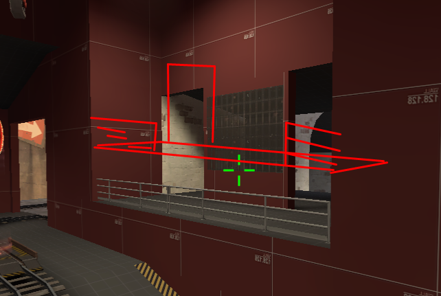
This platform is way too high - it should be about the height of the top of the railings, so you can't jump up but its easier to jump down.

Opposite this will be:

EoArTBL.png


A slightly less wierd version of the old area, raised so as to be better for sentries: it should also be easier to see when coming from blu spawn.

C)

I need to think more about C, but the basic idea I have at the moment is:

bQVnefe.png


Move the point back and put a sentry spot here: firstly for red to defend with, and then for blu to use to stop counter-pushes. Variant on this:

SeYrEuN.png


Put a roof for sentries - which would probably need something to stop it being used to defend the ramp up to here from B. I worry that this would make it too easy to defend though - big height advantage, with a very nasty sentry spot at the top? Especially with D so hard.

D)

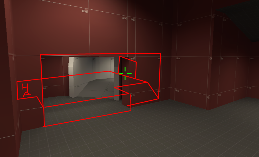
I think D is proving to be not so bad now the timers are tweaked and the health reduced. I probably wont implement this change in the next version - i want more testing first, so will stick to the changes to B for a15 - but something like this:

xpPSMfd.jpg


This one isn't clear because its internal, but i'm thinking of an extra route from the top on the right through to above the doorway on the left, with closed windows for seeing the defenses and open windows for shooting sentries from.
 
S

saph

This is a great map, it's very beautiful for alpha. Some areas (mostly the two long/steep upward ramps) make the cart stop for a few minutes, but an Uber and a defensive offense (holding the area they currently control) is key to overcoming them. Final is pretty open, I would add a small barrier at the end before the sharp left turn to the spiral. The one jump is tricky to get to the side rooms. Maybe add a small ramp there? A steamroll can happen if BLU rushes A, but it's stopped around final usually. The map is great though, small tweaks are needed, but nothing major. Also, pack the caution tape texture into the BSP. I was missing the resource.
 

LeSwordfish

semi-trained quasi-professional
aa
Aug 8, 2010
4,101
6,597
a15 includes the following changes:
  • Clipping and bugfixes from a14c.
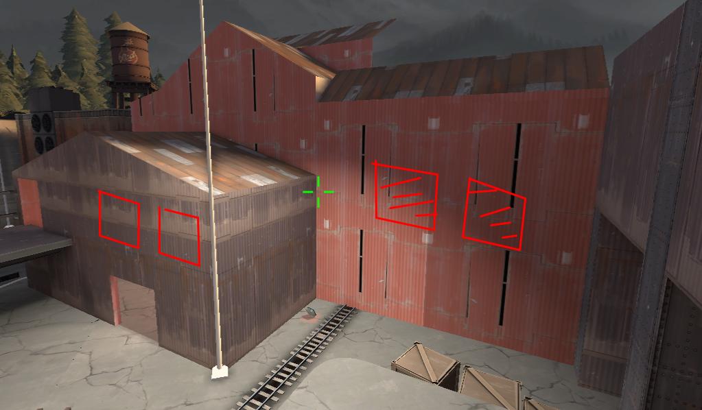
  • Reduced the time to cap A from 4:30 to 3:30 : A was always pretty easily capped, save for a few cases, and I want to make it just a bit more challenging. If this doesn't work, i'll revert it.
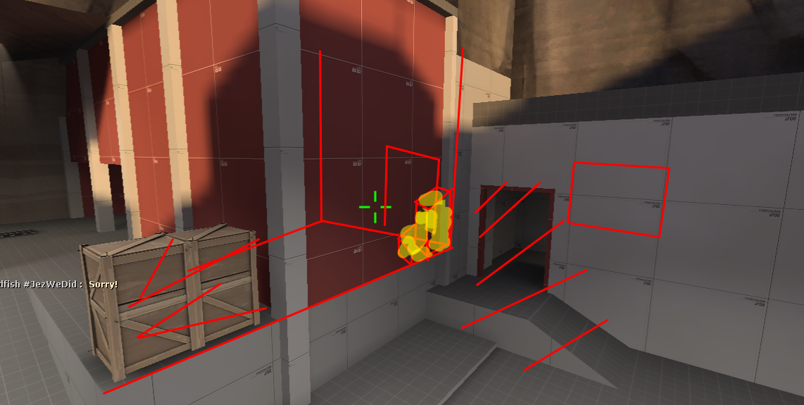
  • Increased the size of a window at A so blue can see the defense better. (X)
  • Adjusted the flank routes past B for slight advantage to attacker (X, X, X)
  • Adjusted sentry spot at B and route to C for defender advantage and clearer rollout. (X, X) (Not shown: now has a large ammo pack)

Read the rest of this update entry...
 

LeSwordfish

semi-trained quasi-professional
aa
Aug 8, 2010
4,101
6,597
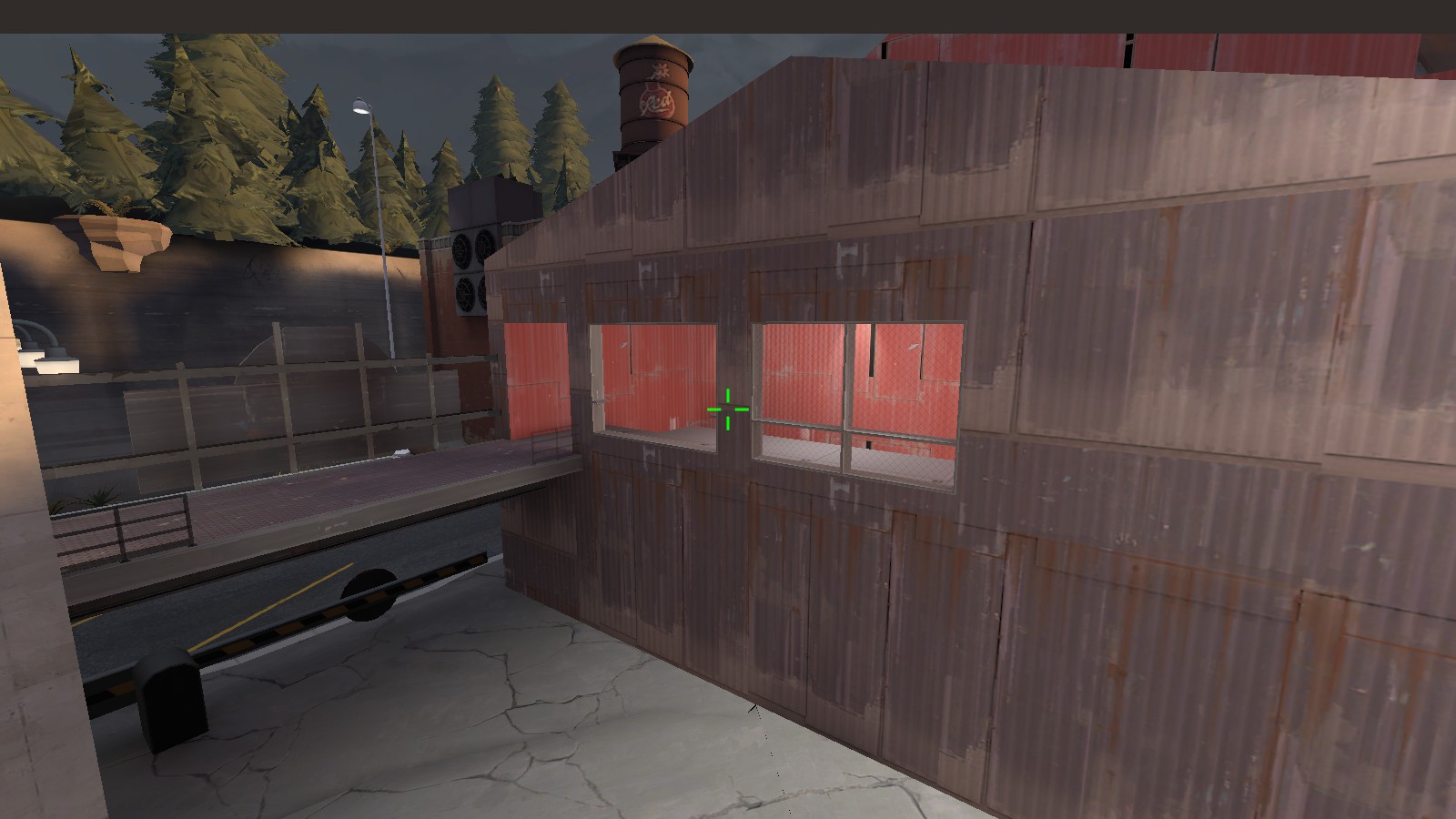
Super quick four-month change.

0523FBD132AE983F61DFEBC11802D166C062C6F7

Added a window at last instead of a door: should be a little easier for blue to use this area to snipe sentries. The open window is shuffled fairly far across so there's a lot of cover for the spawn exit: you can only cover half one door.

930F9DCFAAFCF0FB7A6C93CD1E481DB7B1142C21


Moved C back and added a defensive position for Red. Should be fairly tricky - we'll see.

Read the rest of this update entry...
 

theatreTECHIE

Yet another Techie for the net...
aa
Jun 19, 2015
455
458
Had an idea while watching the demo of a17 and doing research on what I could put in a payload map.
If you wanted to keep the curve in front of red's spawn in the final point, you could make it a rollback zone in front of red's spawn so that blu doesn't have to spawn camp to be able to push the cart. They just have to make a push to get the cart to the rollback zone, then another push to cap the cart.
 

Kaibz

L1: Registered
Jul 10, 2015
6
6
This map really does play well and looks amazing, it's a shame most players don't like dev textures where i admin, otherwise we would play it every evening.
Please tell me you are still working on it...