corridor

CTF corridor d10

ficool2

L4: Comfortable Member
Oct 28, 2017
161
232
That image is pure beauty that shows how far we have come in mapping
 

G.bo

L4: Comfortable Member
Sep 24, 2017
180
195
I didn't really think about this before, but Turbine has a very unique art style.

Unique in the fact that no other map has it, not in that it is mind blowingly beautiful. That being said, this map now makes me want to try and build a Turbine themed map, just for the fact that I want to see how well it could actually go.

P.S. Could we get more screenshots of the map?
 
Last edited:

Zoomspilo

L2: Junior Member
Aug 8, 2017
89
18
idk about you but this map looks a t a d familiar... probs just my imagination ;)
 

G.bo

L4: Comfortable Member
Sep 24, 2017
180
195
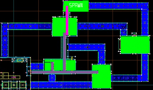
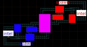
Now that I have a real overview to look at, I can give some feedback.

To start, the hallways are extremely long and straight, giving snipers a huge advantage over other classes. The best example of this is the two hallways parallel with the turbines: not only are they two of the more direct routes to intel (from what I can understand), but they also have no cover whatsoever for players attempting to push them. A normal sniper sightline is about 2000-2500 HU long, so do with that as you will.

Second, the layout itself may be a bit confusing due to the various branching paths and huge distances players have to cross to reach a room. I recommend adding signs to point players in the right direction (if you already have those, than great: I'm just going off what I can see in the map overview rn.)

Those issues aside, I do want to say I'm pleasantly surprised at how good the map looks and how accurate to turbine it really feels. Keep up the good work!
 

type _keter

L1: Registered
Apr 25, 2018
12
3

Attachments

  • mapcamp.png
    mapcamp.png
    100.4 KB · Views: 234

Call_Me_Meme

L1: Registered
Apr 21, 2018
41
7
I think that the corridors are a bit too long and the layout is honestly confusing.
New players could easily end up running in circles due to the layout

Make the coridors shorter and maybe add signs to make the layout less confusing.

At first I found it weird with the Turbine inspired design but it does make the map unique. Keep up the work!
 
Last edited:

Muenster Monster

L1: Registered
Apr 22, 2018
34
6
Overall the map is pretty bright. I'd suggest toning down some lights and lowering the radius on some spotlights.

In the intel rooms, you don't really need a small ammo and health kit so close to a full ammo pack and medium health kit. I'd suggest at least decreasing the size of the full ammo pack (so it's a bit like 2fort in which you need to wait a little to get all your buildings up as engineer) or removing the small packs entirely. The secret spawn vents also take really long to get to places that you could get to much faster by just taking the normal route there, which I personally don't enjoy that much.