Really like the theme you've got going here and the creative ways you've solved design problems. That trailer is a cool touch, I don't think I've seen that in a map yet. Ditto for the road tunnel, though it feels overbuilt for the set dressing around it. Those are some cool and unique set pieces that'll really elevate maps. I think the second area could use more cool and clever touches like that. The road feels like a good setpiece to continue more, I'd suggest making it that far left path and wind it closer to the rio grande coal building. That truck cab feels comically small!
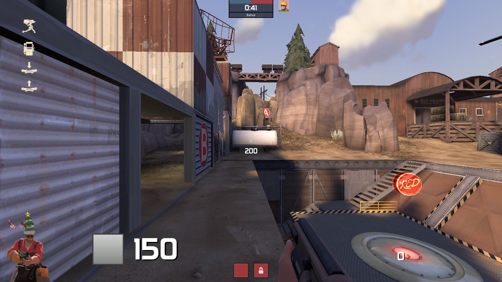
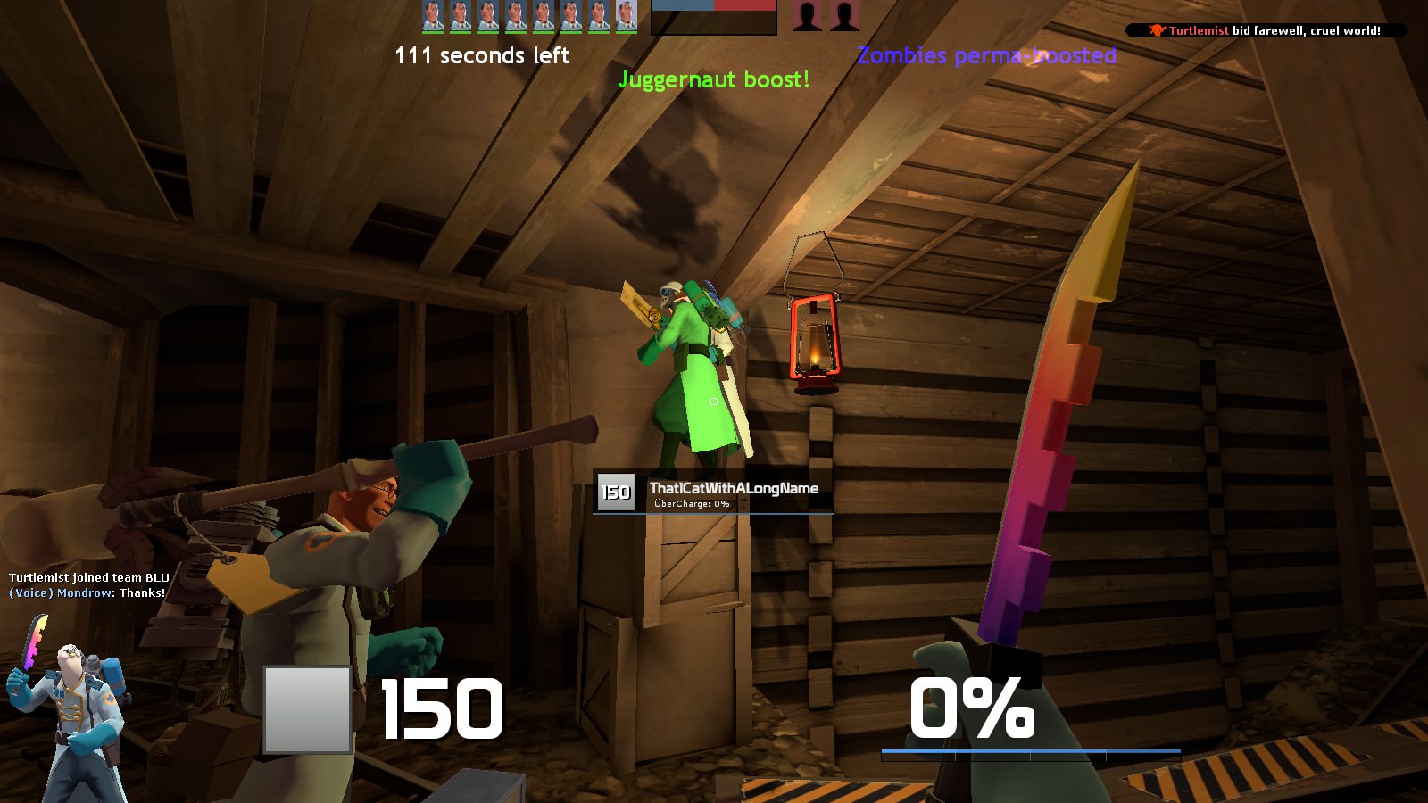
I think you need a more defined main path through your capture points and you need to unhide your points. Dustbowls probably not the best example these days because the games evolved so much, but look at the reads on the points there. Your paths get messy quickly and I think you've overdesigned the building and the mine infront of the first cap point. The view out of the construction trailer is difficult and obstructed as well. I'd also suggest knocking down some heights of buildings and cliffs across the map to the minimum amount required to keep the design functioning the way you want. The Salt Rock building on defense side at cap 1 feels superfluous or overbuilt.
Your displacement gets a little fussy near the road by cap 1 where you've got three different displacements intersecting. It feels messy, I think you should simplify it.
Personally I'm not a fan of that netted scaffolding and the view to the BLU spawn through the fence on the road at the first point, and the various other spots on the map where you've used this element. Being able to see people without being able to shoot them is always frustrating in my book.
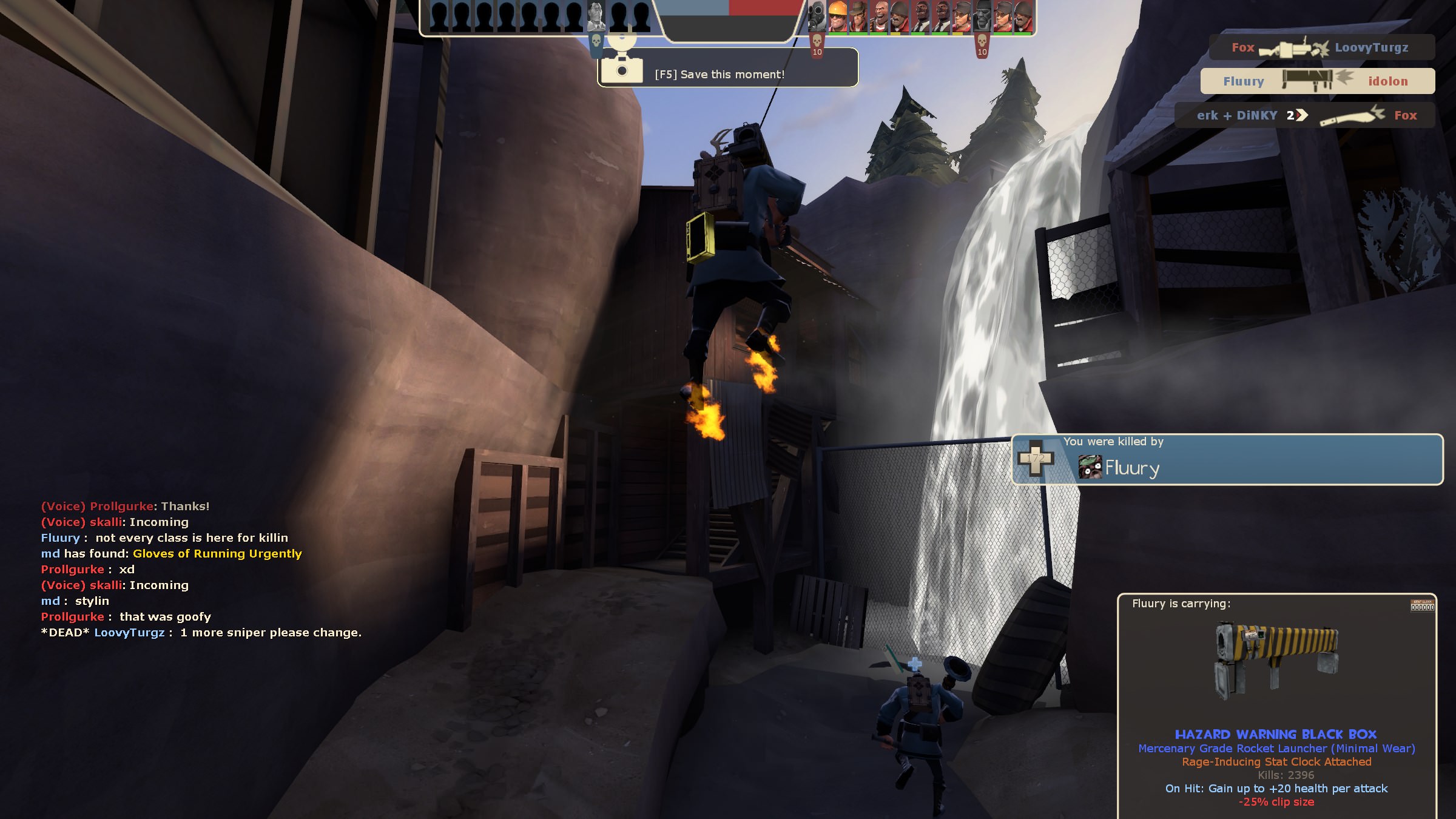
The Jenkin Coal building at the waterfall needs a re-design. The path widths there don't match, you've got two large doors leading towards a small single person width stairwell, and one of the doors is perpendicular to the path. I ran in there and went through the tunnel because that felt like the path to me, but it just took me back to cap 2.
Cap 2 looks like it plays perpendicularly to how it should go. It looks like you're fighting lengthwise across the point and BLU appears to have a real easy opportunity surrounding three sides of the point. Consider Goldrush last, where its a more head on slugfest to get the final point, or Dustbowl last under the rocket. Set dressing wise, the pit feels too clean especially if the giant trap door above it is sliding around with all that dirt on it. Some hints of dirt on the dressing down there would be a cool little detail.
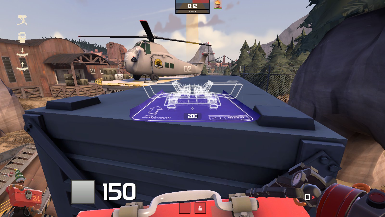
The helicopter pad at cap 2 feels accessible, and the scout has a perfect jump to get up there. Would it really be so bad if people could get there? A staircase on the other side could get RED up there. I think theres an opportunity there for the path underneath to also echo the shape of the structure, rather than being orthagonal.
The underground path at RED spawn to cap 2 feels REALLY abbreviated. Those stairs need some more room to breathe.
A good effort. Keep it up!


