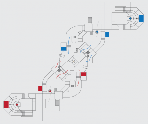
-
This map is featured! Our best maps, all together in one place for your viewing pleasure.
You are using an out of date browser. It may not display this or other websites correctly.
You should upgrade or use an alternative browser.
You should upgrade or use an alternative browser.
Please re-upload this, you dont need to do anything to the file, but in the version string, just add _reupload to it. (on the site dont change the file name)
a2
-changed name to "kalinka"
-added a few ramps that were missing in a1
-cleaned geometry a bit
-widened the ramp on the defending side to 2nd point
-added hazard stripes to the points
-cut down the sides of the little buildings at mid and replaced those with platforms
-changed lighting and skybox (frontline autumn + soviet theme)
-added small ammo under the point
-minor alpha detailing and props
Read the rest of this update entry...
I took a run around. All of my feedback is basically just guessing, so take it with as many grains of salt as you'd like.
These handrails are typically non-solid with playerclip so that player can shoot through them reliably.
clip
This whole situation with the shed feels more complex than it needs to be? I feel like the most valuable thing here is that the defending team has a slight height advantage, which could be accomplished by getting rid of the shed and extending the platform on the left over (and raising the platform a bit). You might also want to consider changing the ledge to stairs to make rotating while attacking last less of a hassle.
I find it pretty difficult to navigate through this area - getting through the shack window, for example, requires pretty precise aim when walking (and at the moment, there isn't clipping at the bottom, so you have to jump or crouch to get in), and it's not really a great place to be as a player. I recommend making the shacks bigger, or removing the window, or even removing the interior entirely. I would also recommend making them a bit shorter - it's possible to get on the roof as scout from mid, but it's a weird maneuver.
Some areas feel a bit underscaled, especially lobby. "Correct" scaling depends a lot on how much fighting actually happens in the area, so without actually seeing people play the map, it's hard to make judgment calls like that.
Nothing good can come of this door. Shutters are usually a high-risk situation for anyone to be in, and putting a small one next to a point is a red flag imo.
a3
-moved shutter near 2nd and made it a larger slide door
-clipped ac units on mid shacks for easier movement
-made mid sheds less tall so scouts can get up top easier
-replaced sheds near 2nd with platforms
-uncollided and clipped all handrails
-added few lights
-minor alpha detailing
Read the rest of this update entry...
a4
Ton of changes:
MID:
-removed interior from sheds and made them larger
-made central tank hollow and added some platforms up there
-remade right side choke into highground
-made the mid lobby area larger
-added ramps to get on top of the sheds
2ND:
-opened up the walls a bit around the point
-relocated some of the enterances
-made right side larger
-removed shutter from the left flank
-added some cover
LAST:
-polished up the left side for less clunkyness
-redid main enterance
-made right side flank area larger
-removed third exit that led to the highground
-removed the weird lowground behind point
-moved spawn exits a tad higher
OTHER:
-redid pickups
-added some more frontline assets
-minor detailing and displacement adjustments
Read the rest of this update entry...
Last edited:
a4-a7
MID:
-redesigned mid point (twice) into a broken building.
-highground now accessable from both left and right
-stairs leading from the lowground under the point to the point
-polished lobby and connectors to 2nd point
-extended the lobby building towards 2nd on the flank route side
-added small ammo pickups behind the tanks on mid
2ND:
-reworked right side shutter enterance to 2nd and removed the little building in front of the shutter
-left side enterance to last connected to lobby to make escaping 2nd into lobby easier
-moved first forward spawn a bit forward in front of the 2nd point
-sightline blocking across the point
-opened up the area behind the point more
-highground for the defending team on the left flank route
LAST:
-redesigned last point a lot
-removed highground from directly behind the point and added some cover instead
- reworked and polished the rightside chocke/holding area
-added a pilar to the left side to break the gameplay space a bit
OTHER:
-more frontline
-some detailing
-stuff that I forgot to mention
Read the rest of this update entry...
a8
MID:
-made the left side enterance to mid smaller and buffed the rightside enterance
-removed the concrete barrier wall wich players could jump over
-made 2nd forward spawn face mid to cause less confusion
-changed props inside the mid building
-added jumpable awning on top of the lower enterance to mid
-reworked the left flank from mid to 2nd to feel a bit more chokey
-moved pickups around on house and added an additional small ammo
2ND:
-added an alternative door to the rightside alternative shutter route
-reworked main enterance a bit
-added some highground for the defending team closer to main enterance
-made some brushes behind 2nd into displacements instead
-moved medium health closer to the point
-replaced small ammo with a medium and moved it next to the med health
-added an additional small ammo to the new highground
-a few new props and lights
-detailing
LAST:
-moved highround a bit higher behind the last point
-made right side ramp up to the highground wider
-made the flank/secret on the right side smaller to make it easier to clear last
-added a prop jump from lower right to top right
-removed the left railing on lobby and added some props to get up easier
OTHER:
-spec cams!
Read the rest of this update entry...
Last edited:
a8a
-removed the extra small ammopack from red last
how did I miss that :v
Read the rest of this update entry...
-removed the extra small ammopack from red last
how did I miss that :v
Read the rest of this update entry...
a9
MID:
-blocked the sides a bit more with a broken window
-detail and lighting changes
-minor clipping
2ND:
-opened the roof behind 2nd to allow jumps into and out of the point
-added a new small highground overlooking 2nd, accessible from lobby with a small ramp
-changed one of the left side doors into windows (which can still be used as a enterance to lobby)
-some detailing
-lighting pass
LAST:
-replaced the silly staircase on the right side with a dropdown/secret accessible from the rightside of lobby
-some detailing
-lighting pass
Read the rest of this update entry...
Last edited:
a10
MID:
-cut down the rightside highground a tiny bit
2ND:
-minor detailing
LAST:
-added a small highground behind the point on top of the glass panel
-added highground made out of pipes connecting left and right side
-included wip models of teslacoil parts
-new capturepoint platform model
prolly forgot a lot
Read the rest of this update entry...
Malachite Man
L6: Sharp Member
- Oct 16, 2015
- 378
- 225
I have feedback of this map:
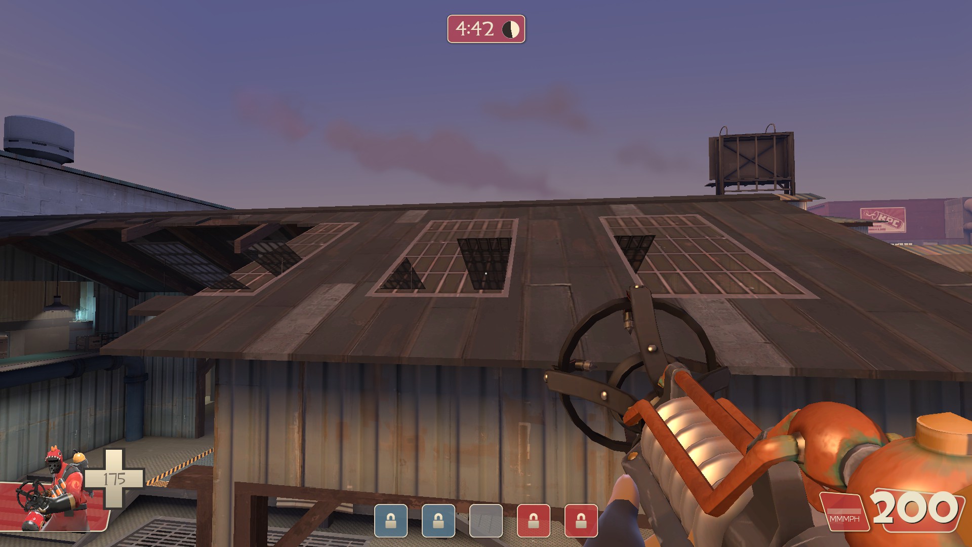
Whoa what is going on here?
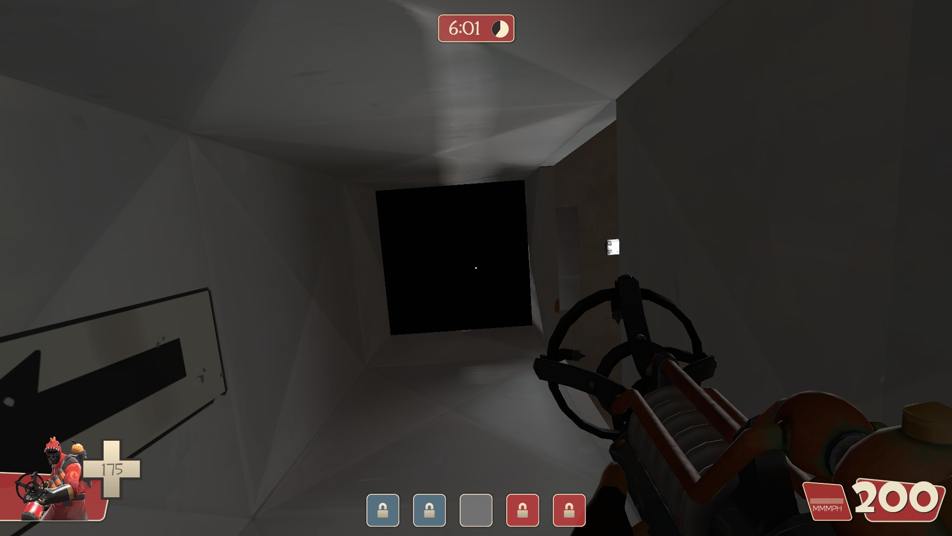
This black abyss is a little weird looking.
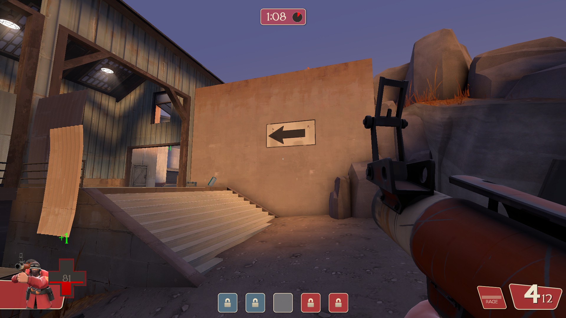
This wall looks very bland and boring.
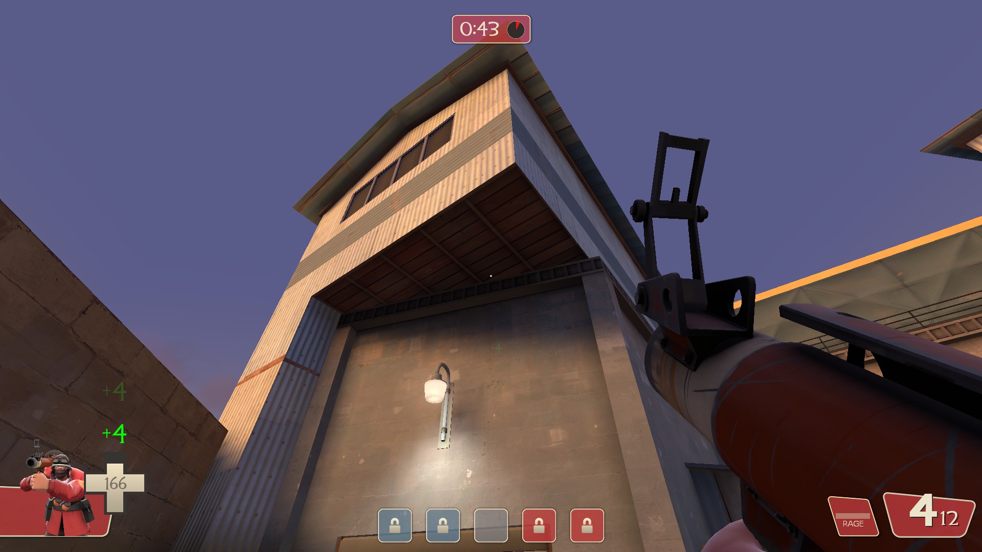
There is metal on the side but wood on the bottom?
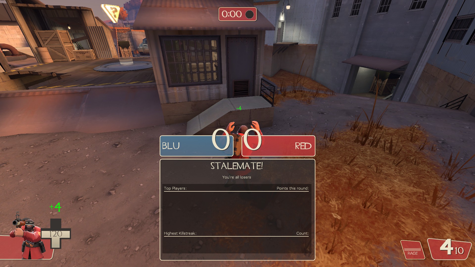
Clean concrete on top but old concrete on the side?
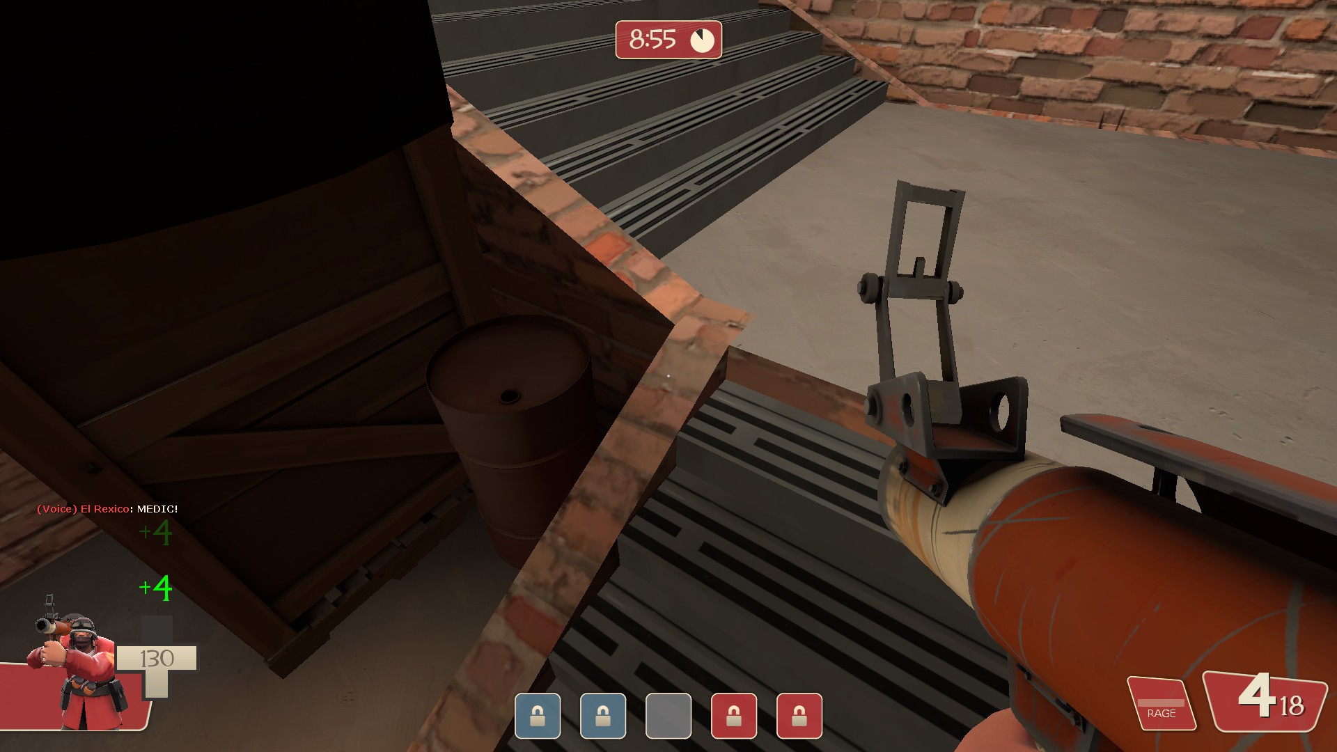
The brick here looks very weird.
all around i really like this map and this is turning out very well i can't wait to see what is has to offer in the future.
Whoa what is going on here?
This black abyss is a little weird looking.
This wall looks very bland and boring.
There is metal on the side but wood on the bottom?
Clean concrete on top but old concrete on the side?
The brick here looks very weird.
all around i really like this map and this is turning out very well i can't wait to see what is has to offer in the future.


