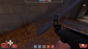
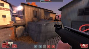
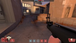
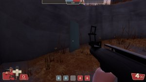
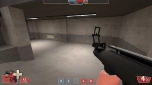
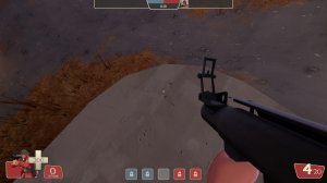
Always liked this map, haven't played it in a while so here's some feedback

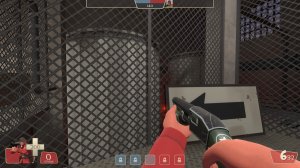
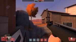
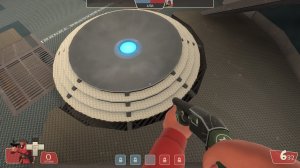
-these cylinders could use more angles

-smooth out the clipping, it's easy to get caught up on these

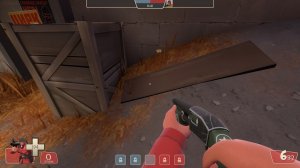
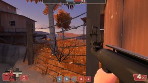
-grass sticking through wood

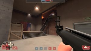
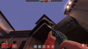
-I get that red light in the upper area is supposed to help make it more noticeable, but there's gotta be a better way to do it. Right now it just looks weird to be so much brighter than everything around it.


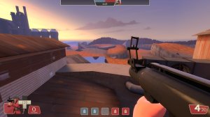
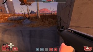
-The Far off detail, which may be the 3D skybox, could REALLY use some work. Right now it's very basic and just doesn't look right

-I can see outside the map here by rocket jumping

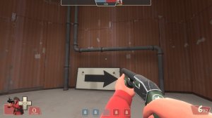
-I can go through this large pipe and the roof above it. It's super noticeable.

-I think these indoor windows should be lit up so it doesn't look like it's pitch black night outside.

-This out of bounds area is very close to the in bounds area and it's hard to tell where the bounds actually are

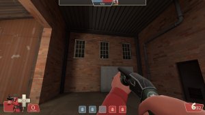
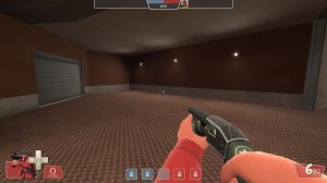
-This area is SUPER empty

-Metal's a bit thick

-grass going through the metal

-This area is similar in height to the areas around it which makes me think I can rocket-jump there, but I can't

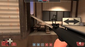
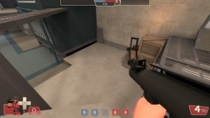
-What's the point of the area with the crates? It just seems to be like that cause it can be and seems a bit overly complex than it needs to be

-Clipping around this metal sheet is odd

-the darkest grey metal could use more angles

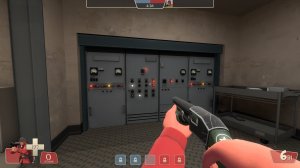
-These nooks with computers should be clipped flat with the wall I feel

-This area feels like dead space

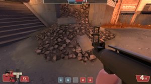
-I'd recommend making a blend texture between the gravel and the ground and have it fade out to ground instead of the hard stop that's there now

-It's just so empty and bland


-more angles please
