CP artpass grazr
- Thread starter grazr
- Start date
You are using an out of date browser. It may not display this or other websites correctly.
You should upgrade or use an alternative browser.
You should upgrade or use an alternative browser.


"something else" like what?
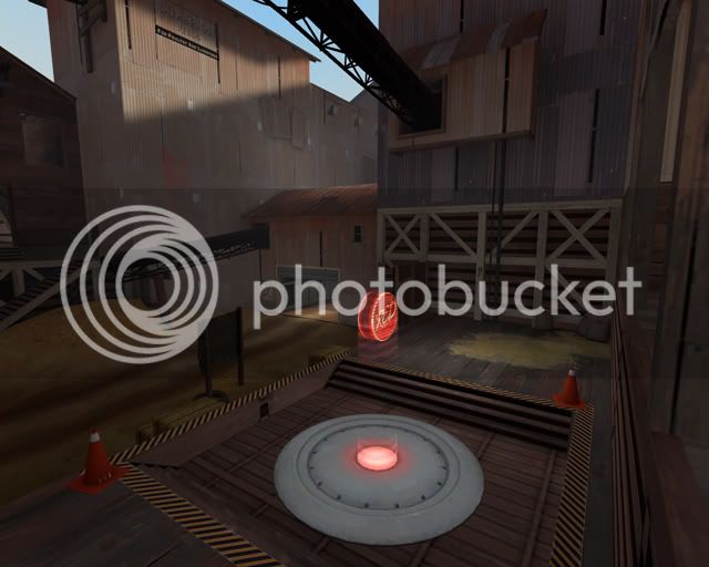
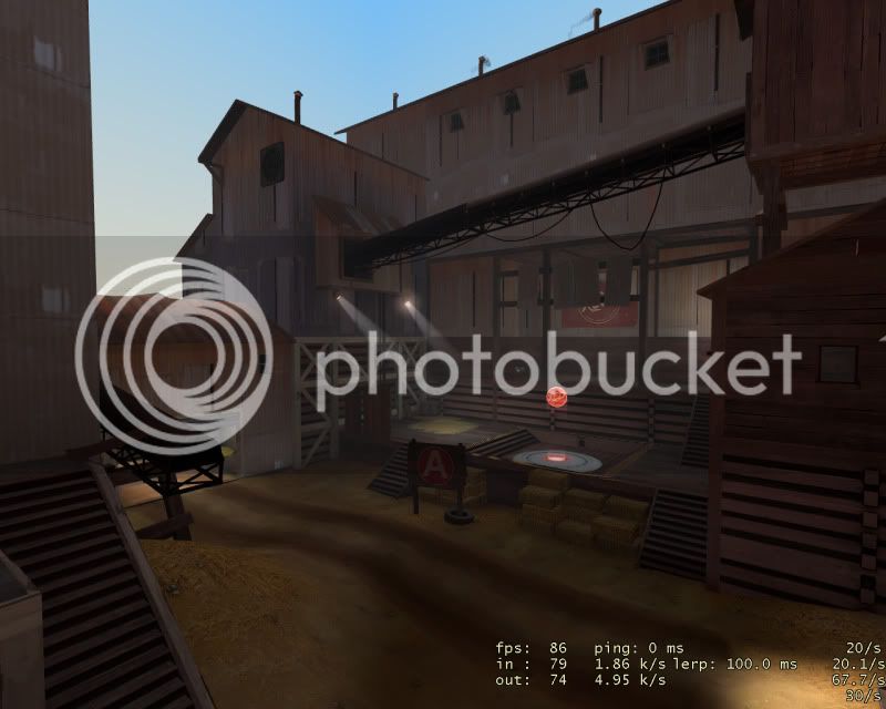
It's supposed to be a test chamber. There will be crocodile clips and conductors poked into it and on capture the pumpkin explodes like it took a jolt of electricity or the lack of regulation made it unstable during an experiment. That is the concept at least.
Update:

Starting to get a bit annoyed with the low reflectivity of these red tiles :/ walls are still really dark.
It's supposed to be a test chamber. There will be crocodile clips and conductors poked into it and on capture the pumpkin explodes like it took a jolt of electricity or the lack of regulation made it unstable during an experiment. That is the concept at least.
Update:
Starting to get a bit annoyed with the low reflectivity of these red tiles :/ walls are still really dark.
pumpkin is too silly imo
I thought so too, but if i went with a GM food theme i could justify something that odd. Plus i wasn't happy with putting up with a standard ending... that rocket gets used to much. It's in like half the entries too so...
Gee, it's kinda dark. And by that I mean very. Maybe rotate the whole map 90/180/270 degrees for a better light angle
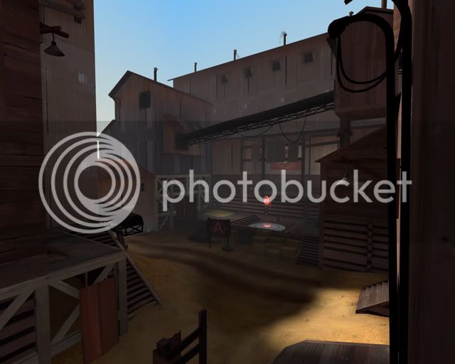
There is no better light angle... There's really no other way to get better env' lighting because of the height and layout of the buildings; increasing the sun angle stops it being morning and totally throws off the theme (then it's just another generic noon setting adn i lose all my originality). The env light angle is already 10 degrees higher then the suns orientation to increase light getting into the play area. At least at it's current orientation only A is dark. It's the price i pay for a low sun angle and frankly i'm lucky that as much of the map is lit is lit; only A is really all that dark whilst the beginning, B and the base entrance are reasonably well lit.
Changing the sun angle by less than 90 stops it from rising perpendicular to the map orientation, which is really important for mood and setting. I'm not willing to change this because not enough people have complained (and even though complaints in the thread outweigh support, there has been plentiful support in the steamchat). People seem to just want a noon setting because they know light = good without really thinking about it. It's just something they've seen complained about in 100 different dark maps along with the phrase "team recognition" and paste the same comments "here and there" with more to say.
I'm not trying to defend the lighting, i'm well aware it's not amazing, but i don't believe (other than perhaps A) it's bad either.
*
Is there any other complaints besides the sun angle? I have to say the only thing i've been able to respond to is Tinker's observation of the details being too neat. I'm well aware C needs "more work" because it's not finished, and that the sky has no clouds (on purpose). But i've not got a lot of comments here to work with besides "looks great" or "X is meh".
Which either means i'm doing most things fine or people just arn't really caring for this map. Which has me feeling anxious.
I intend to throw a couple flood lights around A so it's less "meh" and a little brighter... but other than continuing to work on C none of the comments have been particularly enlightening.
I feel like people are holding back because the map looks "nice" rather than amazing or bad and don't want to hurt my feelings or something. Which doesn't help me.
Last edited:
J4CK8
L11: Posh Member
- Mar 4, 2009
- 820
- 243
I think lighting wise outside, it looks OK, obviously it's not ideal, but as long as you can differentiate between the two teams. I love the pumpkin (for added GMness, make it 'bubble' and 'pulse'  ) can't wait to see the final scene, but it might need something there to justify death if you fall down there. As far as detailing around cap 1 and 2, I think it's pretty much fine. Not overcluttered with prop spam but not too bare either.
) can't wait to see the final scene, but it might need something there to justify death if you fall down there. As far as detailing around cap 1 and 2, I think it's pretty much fine. Not overcluttered with prop spam but not too bare either.I think C is looking bland and empty, maybe it will look better once you've added the wires and stuff to the pumpkin but the death pit still doesn't make much sense.
I think maybe having the pumpkin above the point being held up with the wires or something, you could make the pit filled with GM chemicals which would warrant the death pit being there at least, with the idea being the pumpkin being lowered into the pit. Or maybe some terminals around the outside would help it look like its a experiment room and the room behind the point being of observatory. Hope this gives you some ideas maybe.
All the rest of this is just nitpicking stuff:
http://img.photobucket.com/albums/v213/grazr/artpass_valvebaseb110030aaa.jpg
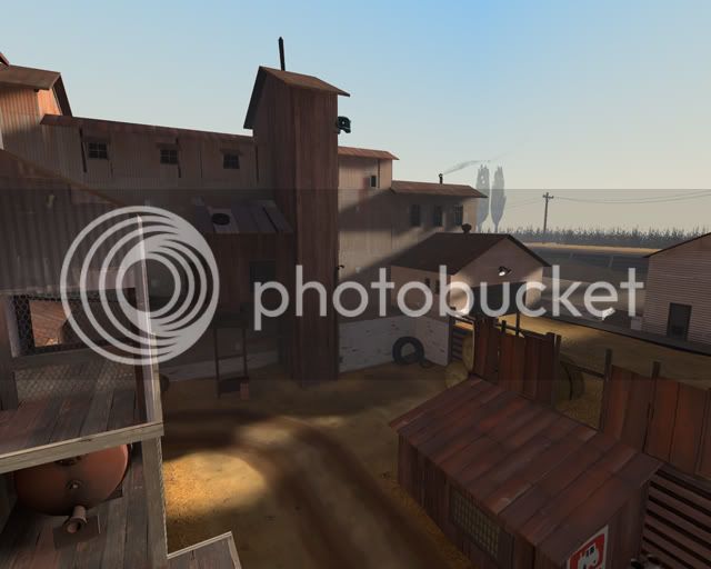
The lighter coloured wood beams near the bag of grain, shouldn't they be darker like the rest of the wood?
http://img.photobucket.com/albums/v213/grazr/artpass_valvebaseb110029aaa.jpg
The large RED sign being covered by the metal sheets, kinda counter productive in terms of readability. The steam vents (?) on the top, maybe should lose a couple.
http://img.photobucket.com/albums/v213/grazr/artpass_valvebaseb100013aaa.jpg
The ladder on the roof going nowhere?
http://img.photobucket.com/albums/v213/grazr/artpass_valvebaseb90008b.jpg
The square on the top of the fence, is this meant the have a arrow on it? like this one:http://img.photobucket.com/albums/v213/grazr/artpass_valvebaseb40031.jpg
I dont think you need to really need to do anything more to the outter bounds other than that crane,it looks great, any updates on a model for it?
Hope any of this helps
I think maybe having the pumpkin above the point being held up with the wires or something, you could make the pit filled with GM chemicals which would warrant the death pit being there at least, with the idea being the pumpkin being lowered into the pit. Or maybe some terminals around the outside would help it look like its a experiment room and the room behind the point being of observatory. Hope this gives you some ideas maybe.
All the rest of this is just nitpicking stuff:
http://img.photobucket.com/albums/v213/grazr/artpass_valvebaseb110030aaa.jpg
The lighter coloured wood beams near the bag of grain, shouldn't they be darker like the rest of the wood?
http://img.photobucket.com/albums/v213/grazr/artpass_valvebaseb110029aaa.jpg
The large RED sign being covered by the metal sheets, kinda counter productive in terms of readability. The steam vents (?) on the top, maybe should lose a couple.
http://img.photobucket.com/albums/v213/grazr/artpass_valvebaseb100013aaa.jpg
The ladder on the roof going nowhere?
http://img.photobucket.com/albums/v213/grazr/artpass_valvebaseb90008b.jpg
The square on the top of the fence, is this meant the have a arrow on it? like this one:http://img.photobucket.com/albums/v213/grazr/artpass_valvebaseb40031.jpg
That crane type thing looks really meh. I mean are you planning to make it something else other then a block?
Yes. I'm not really touching skybox/outter bounds details until i've got the playable area looking nice.
I dont think you need to really need to do anything more to the outter bounds other than that crane,it looks great, any updates on a model for it?
Hope any of this helps
...(for added GMness, make it 'bubble' and 'pulse'
I actually really wanted to do this but when Acumen had agreed to undertake this project it wasn't in the original agreement and he doesn't have much experience in animation. Which was fine at the time as i'm making the explosion mechanics in hammer.
It doesn't seem very dark to me at all... maybe I have a high tolerance of low light levels, though. Or maybe I have my screen brightness higher than others?
It always worries me that i might simply have higher brightness/gamma settings than other people... this variable always means someone finds a lighting condition different.
your map needs some phantom lights to help prevent some of these deep shadows.
I have a couple that resolve shadow contrast issues... i'll have to do a pass through the map and note specific areas of darkness so i can properly patch dark lighting conditions in one methodical go.
@Harribo
The sign is already fixed but as for the rest i'm not really sure what you mean/find the importance in making those modifications. The chimneys had been bothering me though, even if they are rotated to reduce the appearence of copy pasta. I'll swap one or two around/make them less uniform.
update coming soon with explosions. I guess at some point i'll have to figure out how to convert .dem to .avi.
Last edited:
Do you have any alternative scene A suggestions? The pit was to break up the large monotonous flat platform, considering the bright red hologram is obvious enough from all lower areas i didn't believe it would hinder player orientation so negatively. Hm...
As for spam... grenades don't actually bounce around all that much, i can't imagine it "collecting" spam any more than a flat surface, it's not exactly a bowl. I will however be releasing this map for testing over the weekend. If that is allowed in the contest rules? If so then we can find out.
As for spam... grenades don't actually bounce around all that much, i can't imagine it "collecting" spam any more than a flat surface, it's not exactly a bowl. I will however be releasing this map for testing over the weekend. If that is allowed in the contest rules? If so then we can find out.
Last edited:
update coming soon with explosions. I guess at some point i'll have to figure out how to convert .dem to .avi.
FRAPS.
As long as you keep it under about 3-5 minutes you can upload it to youtube (over that and it'll probably be above the file size limit, as its raw video).
Ah, well one thing i noticed while running through the map was that the fog was reducing the contrast of the light against walls... since the fog starts so close to the player. This probably explains a lot of the below average light aesthetics. Everything is washed out with a light grey at mid range.
StuartPB
L1: Registered
- Nov 20, 2009
- 21
- 10
Do you have any alternative scene A suggestions? The pit was to break up the large monotonous flat platform, considering the bright red hologram is obvious enough from all lower areas i didn't believe it would hinder player orientation so negatively. Hm...
Put some of that catwalk perforated steel under the cap, like Lumberyard.
As for spam... grenades don't actually bounce around all that much, i can't imagine it "collecting" spam any more than a flat surface, it's not exactly a bowl.
They do, however, roll around a shitton.
I will however be releasing this map for testing over the weekend. If that is allowed in the contest rules? If so then we can find out.
To the Official Server? Looking forward to it.
- Apr 19, 2009
- 4,460
- 1,724
- Dec 21, 2008
- 288
- 638
Looking good grazr!
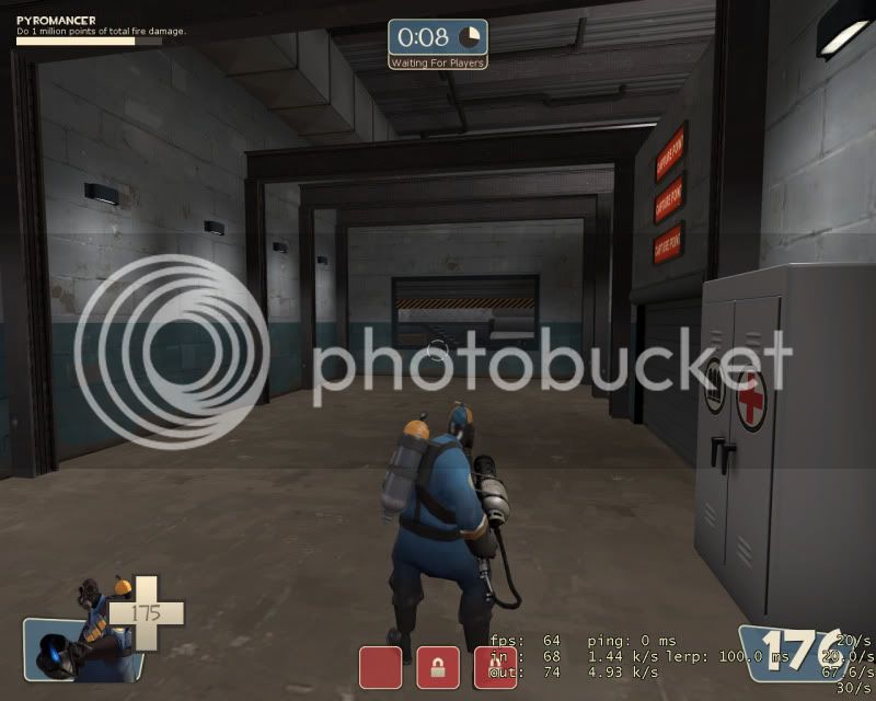
I don't really like the red signs in blu spawn though. They seem kind of unnecessary.
+1
I know they probably change with the color of the point but the HUD is here for that