Amazing

KotH Amazing v5borge

Another Bad Pun

In the shadows, he saw four eyes lit by fire
aa
Jan 15, 2011
801
1,844
It's called koth_amazing because its amazing in every conceivable way possible

with that in mind, lets hope i need not rename it koth_terribad after one test.

1:06 PM - Idolon: looks like shit i hope you get aids


E5A4E819B44C3CB73B4486B813DC969672B1C80E
 
Last edited:

YM

LVL100 YM
aa
Dec 5, 2007
7,135
6,056
Koth amazing? You're right, that is another bad pun.


(except it isn't a pun, so this joke is lame)
 

Another Bad Pun

In the shadows, he saw four eyes lit by fire
aa
Jan 15, 2011
801
1,844
Isn't it really big for a koth map ?

The only area that might be a tad big would be the space near spawn... I might cut that down a little, but i want to get it tested first since the map felt okay running through all the classes with it. (some of the paths are strategic and stuff) Then again, testing may make me get rid of it entirely so i dunno

Koth amazing? You're right, that is another bad pun.


(except it isn't a pun, so this joke is lame)

:3
 

Another Bad Pun

In the shadows, he saw four eyes lit by fire
aa
Jan 15, 2011
801
1,844
alright, so from todays test ive concluded that i should prob cut down spawn just a little, as well as some other things. nobody really uses the battlements or the right route because left gives a better vantage point and theres already a building to the right, so what im thinking for a2 is:

-put random stuff on battlements so people actually use it
-make right flank and right building more connected (im just going to put a door there)
-make the left route building nearest to spawn exit only???
-move op healthpacks at mid to right flank using new doorway
-rotate map 45 degrees on y axis
-submerge entire map in water

-more propspam to block sightlines
-kill rage inducing health near spawn


Yep, That sounds 'bout right.
 
Last edited:

PoignardAzur

L2: Junior Member
Mar 21, 2013
92
9
The only area that might be a tad big would be the space near spawn... I might cut that down a little, but i want to get it tested first since the map felt okay running through all the classes with it. (some of the paths are strategic and stuff) Then again, testing may make me get rid of it entirely so i dunno
No, what I meant is that the whole map seems pretty big. Like, the players would have a long time walking before reaching the point. It's not always bad in other gametypes, but koth maps are usually small enough to allow people to retake the point easily.

Anyway, I played the map a bit, and that's what I thought about it :
- The layout is really big. As a pyro, I took quite a long time to arrive at the point.
- The orange death pits don't look like death pits. You should make them either deeper or paint the bottom black. Or both.
- When you die in a pit, it says you've been crushed by a train. Edit the trigger_hurt and set the damage type to FALL.
- They are some parts of the layout that seem pretty useless : getting to them takes time and grants no real advantage. It looks like you spotted them and tried to make them more "attractive" by putting some items (health/ammo) on it. The problem is that now there's too much items, so theses spots have no interest anyway. I think you should delete some of them.
- The one that really bugged me was the platform with the ladder, close to the orange death pit. You have no interest climbing it, it 'conflicts' (I've no other word to describe it) with the death pit supplies, and you're more exposed after climbing it. So it's more confusing than anything else.
- You use a lot of spawn doors and spawn door frames, while you actually need only two doors per team. All the other one are just confusing (especially the one that leads to nowhere). The type of doors you use should separate spawn rooms from the fighting area, and nothing more.
- The 'no entry' sign on enemy doors looks odd. Just sayin'
- I spawned facing the lateral door. People should spawn facing the main exit, otherwise it's confusing.
- Because of that "facing the wrong direction" thing, I was a bit lost at the start. You should put signs that show where to go.

Okay, that was the list of objective problems I noticed. It's a bit long, but you can easily fix most of them. Now for the subjective part :
- The layout around the point is really open. As a pyro, you probably can't do much to capture that point or keep it.
- Okay, that's really subjective, but I definitely think that the whole map is way too complicated. You might want to make it simpler, with fewer choices of "where to go, how to go there". But I may be wrong.
- I think the map lack strong points of interest. There's no place that makes you think "hey, I should stay here, that way I can frag lots of enemies and be efficient at defending the point", like the area around the death pit in the merasmus map, or the point itself in mosth koth maps. But again, hey, subjective.

So that was all I found. I hope it will help you :)


EDIT : btw, if you forget the poorly oriented spawnpoints and the "too much doors" thing, the spawn room itself is really nice :D
 
Last edited:
Sep 7, 2012
638
500
We played this today and it was fun, except for the sightlines everywhere and it took a little while to get to the point. The point was rather non-descript and didn't seem important, and all the buildings seemed a little cluttered and purposeless.
 

phi

aa
Nov 6, 2011
832
1,815
¸,ø¤º°`°º¤ø,¸¸,ø¤º° MYSTERY MAP °º¤ø,¸¸,ø¤º°`°º¤ø,¸

I liked the map. Probably because it has some really good sightlines and I was playing sniper. You may or may not want to fix that.
2013-08-18_00007.jpg


Scouts seemed powerful due to the abundance of side routes and the distance between spawn and the point - at no point were there ever less than 2 scouts on either team. There should be something done to kind of nerf scouts on the map. Also I'm not sure what you plan optimization-wise but right as I come out of the front spawn door, practically the entire map renders. That's not a good thing and you should do something about it, probably create some buildings in different places to try and cut visleaves.
2013-08-18_00005.jpg


I'd recommend shortening the distance between spawn and the point. There's a building right outside spawn kind of in the right-center placement that doesn't serve a purpose, really.
2013-08-18_00006.jpg

^ That building, to be specific.

I found myself never getting near the platform over the deathpit. I heard rumors there was a train down there but I can never be sure.

2013-08-18_00009.jpg

This just looks weird and redundant

2013-08-18_00008.jpg

This platform I felt was rarely used

ALSO HERE ARE SOME THINGS OPTIMIZATION-WISE
2013-08-18_00010.jpg

Looking through this window and when standing pretty much anywhere around it, nearly everything will render up until near red spawn

2013-08-18_00011.jpg

I'm on BLU's side. You may not see it due to fog but that's RED spawn under my crosshair. Fog does not stop this and the rest of the map from rendering, though.

But I did think it played pretty well. Job well done.
 

Another Bad Pun

In the shadows, he saw four eyes lit by fire
aa
Jan 15, 2011
801
1,844
Koth_amazing_a2a is now a thing!
Includes redundant changes such as:
moved spawns forward 5 feet, made a door open, made map a little smaller, added a random fence for comp players to complain about, moved around some health
I'm going to change the positions of the spawns much more in the next version, but i would like to see how some small changes I made are going to work out. The cliff section of the map might or might not get more game-play. I also created a visual glitch near spawn doors I don't feel like fixing, so feel free to complain about that too.

Next up: add theme inappropriate snowfall particles for comp fans

edit: doesn't this cake just look delicious and moist
hl2%202014-01-22%2019-13-48-13.png
 
Last edited:

Another Bad Pun

In the shadows, he saw four eyes lit by fire
aa
Jan 15, 2011
801
1,844
After a test on the AU server last night, I was able to recover a wip vmf from a few months ago. I used it to create _a3, which has some new things such as:

Created a building at mid
added cover to mid and other places
added a window jump that all classes can utilize
put columns in spawn
im pretty sure i shortened walktimes to point by 5 secs or so
did some areaportal optimization
occluder
minor ammo changes
made some doorways larger

EDIT:
Layl: yep
Layl: fun times
Freyja: Just straigten it after you wash it >_>
the ghostly presence of abp: spared by the train god
Freyja: but ok
Layl: well yea I'll try that
Layl: but I mean that oil stuff is bad
Layl: outsmarted the train god
hl2%202014-07-13%2020-45-50-39.png
 
Last edited:

Pocket

Half a Lambert is better than one.
aa
Nov 14, 2009
4,694
2,579
7C88483754168763F4D5C2CFC30D7BC630FF8BE4


In addition to having uneven sides and angles, the curves on this wall could stand to be made smoother. I'm guessing you func_detailed them? Don't do that. It doesn't really help optimization, and in the meantime it looks ugly because it splits up the lightmaps between the "real" walls and your curved inset.

pVirj9Y.png
 

Another Bad Pun

In the shadows, he saw four eyes lit by fire
aa
Jan 15, 2011
801
1,844
Thanks pocket. The curves were func_detailed in that version, since I did them really quickly, but I made them actual walls for this next one. They are still uneven and the lightmaps only look a little better, but I will work with it later.
Other than curves, koth_amazing_a4 has some new notable changes. Such as:

-Added cover to cut sightlines
-clipped off some areas
-made engi parties easier
-I'm pretty sure the point is interesting now
-Spec cams
-Added mystery and intrigue to the map?
-Secret 3D skybox??????
-A bunch of other stuff I don't remember??

A free download
 

ibex

aa
Sep 1, 2013
308
528
koth_amazing has potential. The potential to be amazing. I mean I honestly like this map, it's lots of fun. So I'm going to nitpick, and give some sort of opinion on changes I'd make if you handed me this map.

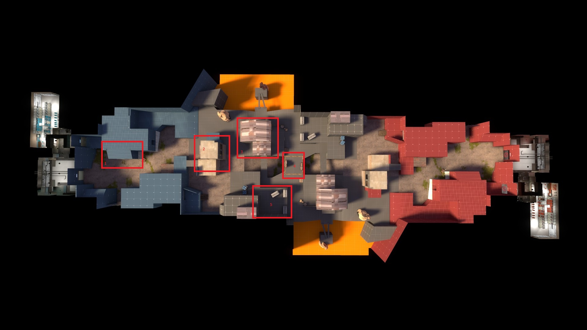
Here's the overview of the areas I'll be talking about. (done in 5 sec on paint)
EggoAAZ.jpg
(also just imagine this is a4)
2&3: if you can see the little numbers from paint, are the areas that I think are important to improving your map.
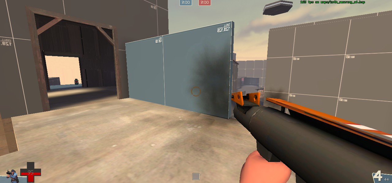
I think someone said it on one of the gamedays/imps: "swiss cheese". And you're map is reminiscent of swiss cheese because these two buildings. Both of them have 5 openings through which you can either enter/exit or see players. While there is health and ammo in each, players will not want to be in these locations for long because there is no safety.
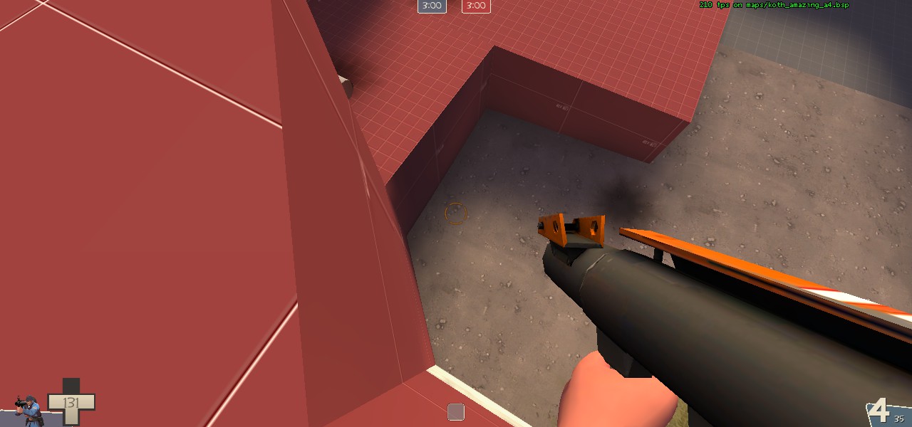
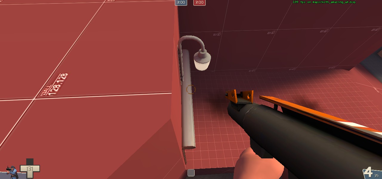
wvvB63e.jpg

KXfqcGm.jpg

For 
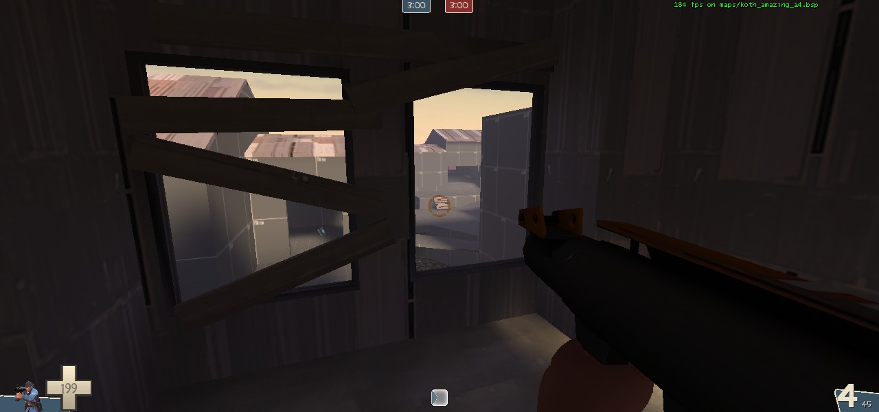
building #3 I'd recommend either closing these windows and door pictured, or close the opposite large entrance. This will create a space where defenders can hold if you do the latter, or attackers can hold if you do the former. If you choose to implement either of these you should reduce the size of the ammo and health available or limit it to only one.
vOWlVu9.jpg

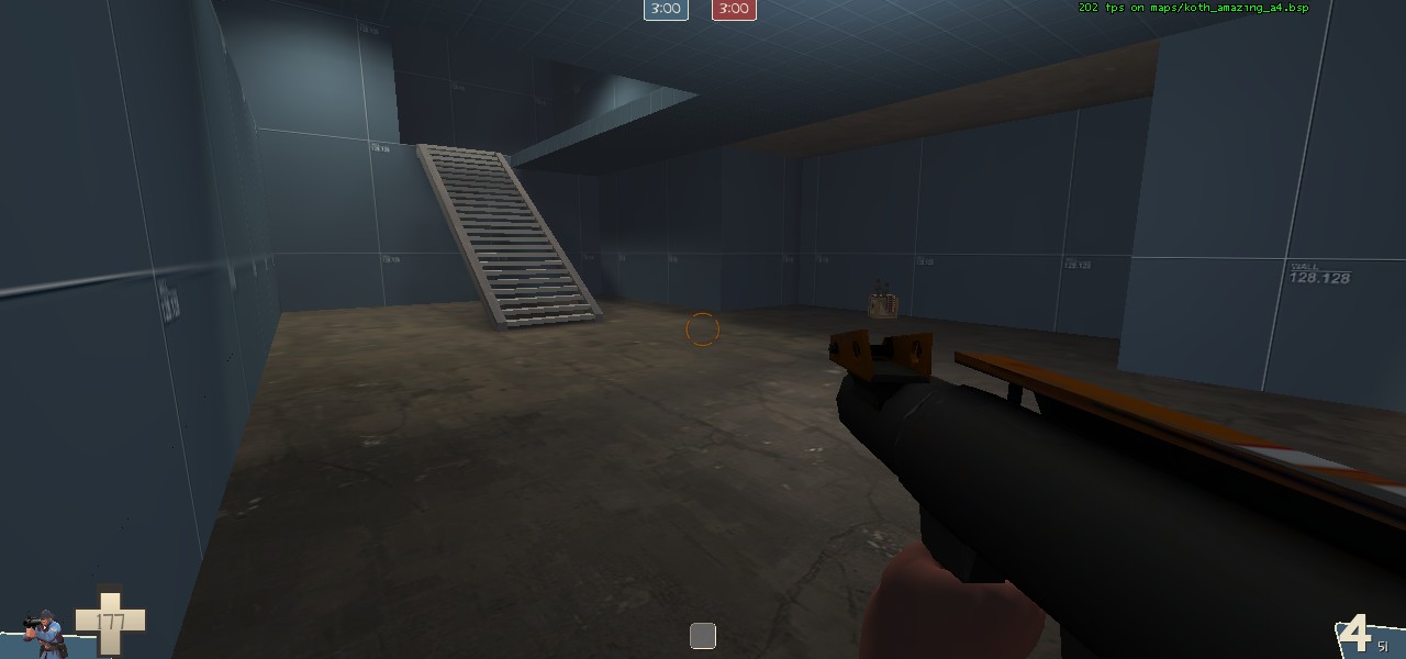
For this new board right here it would be better if it was constructed similar to viaducts sniper boardwalk area, consisting of 2x4's and sheet metal to give better vision to whoever stands on the platform while still restricting it from being too advantageous.
KOPyLdJ.jpg

There is also some sort of clipping rub with the model here.
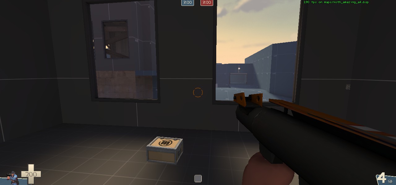
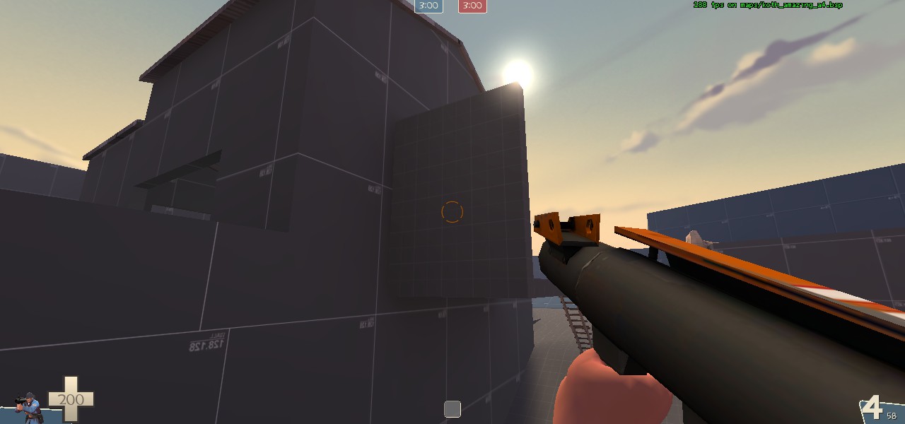
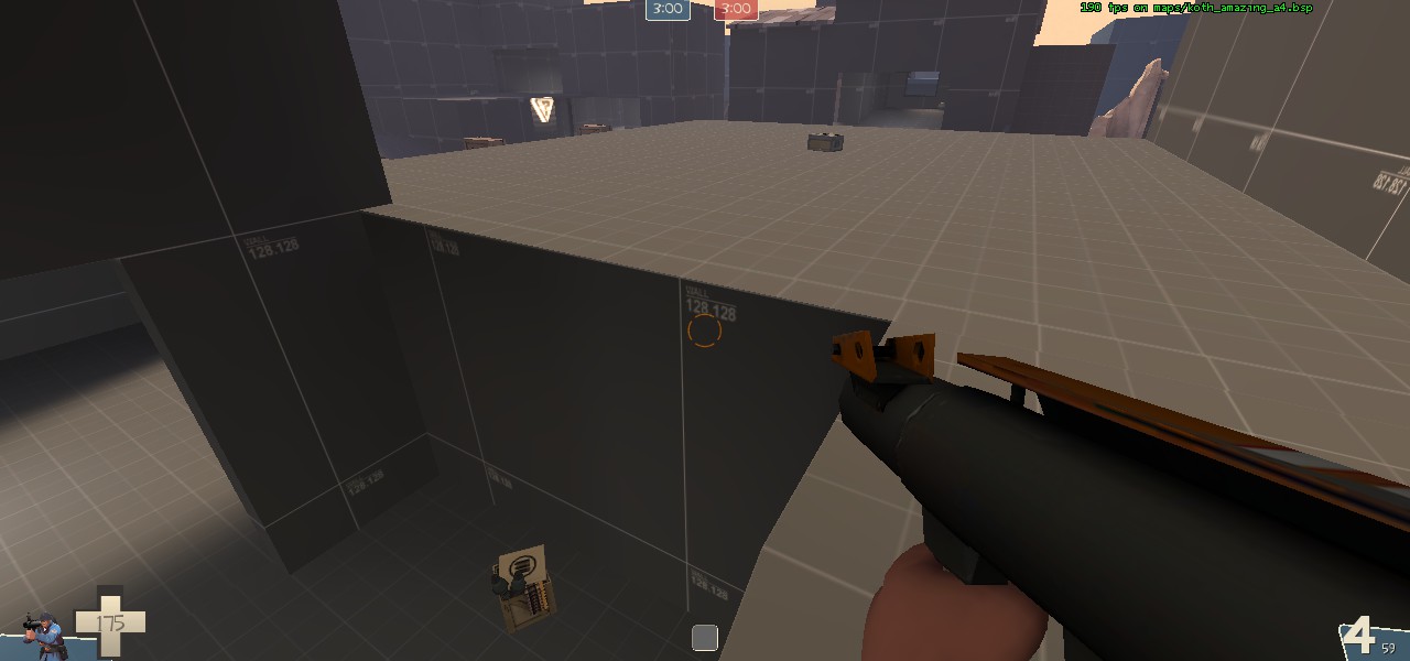
2q6aMVm.jpg

kplkN90.jpg

For 
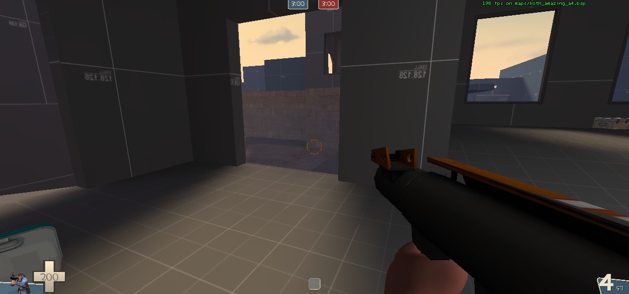
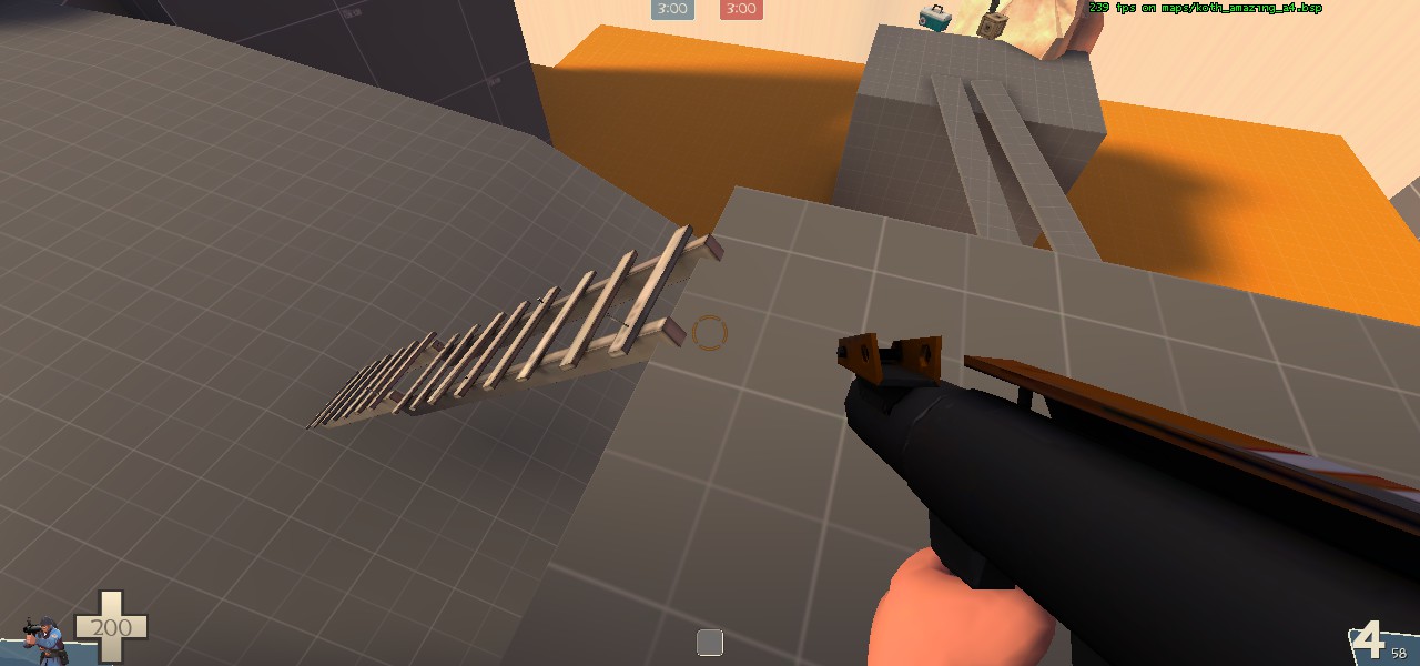
building #2 closing the window that my crosshair is over in the first picture would greatly reduce snipers' views right onto point. Whether you keep the boards over the second window is up to you, they both limit the vision of the sniper while also providing cover for the sniper, but the main point is that that window has a different view angle that isn't directly onto point. The main issue with that other open window is that you've given snipers direct view to the point and excellent cover along with a medium health pack and ammo(?).
I think that the placement of that board in the second image is perfect, however there is a sliver of a sightline that testing will show whether or not it is an issue.
m7Hlqq6.jpg

I like building #5 and think it would be a great fighting area. However, this large and medium ammo placement is much too close together, and doesn't particularly make sense unless you are hoping an engi is gonna set up right there in that easily spammable garage. Also, the upper area is in need of some cover, whether it be small or not, it feels too empty.
g1Fb8I6.jpg

Building #1 is basically part of the spawn, and I think it makes a nice area for defenders to get an advantage on spawn campers. To improve on this effect, I think you should get rid of the lower part completely and add a health kit of some size upstairs. This will improve flow for new players and create better high ground. And I don't honestly think that lower area serves any purpose or adds anything to your design.
#4 The point. The main issue with the point is that it is just too small. The cover you've provided actually makes it much easier to spam out with explosives. The point needs to somehow be larger (maybe with a small roof a la 2fort bridge, though that's probably a bad idea).

Currently you've got some really nice buildings and brushwork, but people are really unsure of where to place themselves because the forward holds don't feel safe and the point is a death-sentence. You've really improved on the sightline issues though, that one board at building #2 is close to perfect. I could see this map being great for both competitive and pub play. Also I like the little details that you've added here and there like the barrels/shrubs out a little past spawn, and the boards over the windows at building #2.

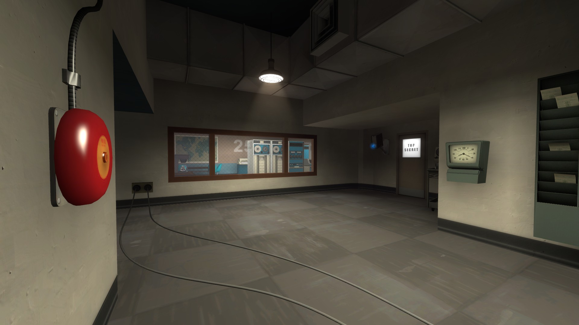
Here's a few little side bugs that I noticed while rocket jumping around.
Can stand here:
wZr1G0Z.jpg

N50txQ2.jpg

Might be a clip issue.

Another thing I just remembered, the spawns should really face toward the point, current they face you like 90 degrees left, which is just odd.

Sorry this is so long, but it really does have the potential to be amazing.

Edit: going to leave the album here so the link is available---http://imgur.com/a/KG9IU
 
Last edited:

Idolon

they/them
aa
Feb 7, 2008
2,105
6,103
To get the lightmaps to look right, you'll need to align all of the textures end to end with alt-clicking.
 

Another Bad Pun

In the shadows, he saw four eyes lit by fire
aa
Jan 15, 2011
801
1,844
koth_amazing_a5a is now here, and was played in today's EU gameday. (DL will updated later) It includes some changes brought about by other people's suggestions, such as:

-Removed basement in building right of spawn
-Flipped wood planks in midhouse horizontally
-Got rid of catwalk route in mid
-Changed entrance to left-side mid building
-Added health and cover at the highest points on mid
-added directional lights
-removed occluder
-mystery bananas are now mysteriously hidden around the map
-changed some medpack positioning
-somehow changed lighting in blu spawn by accident, its now brighter and im not sure why
-other adjustments made in the heat of the moment with extreme passion

If any of you have some feedback from the gameday today, please tell, as I only got 6 feedbacks from it and only two were gameplay related. If this first world problem continues, I will have no idea what to change in the map and will have to resort to adding additional mystery bananas. Please save me
 
Last edited:

Another Bad Pun

In the shadows, he saw four eyes lit by fire
aa
Jan 15, 2011
801
1,844
Koth_amazing_a7 is out, and has some things such as:

-closed four windows
-changed water area under point
-added ramps up onto point
-got rid of point crates
-made med health at mid small
-changed health position in a house
-in this version spawn room textures decided blu spawn was bright
-additional secret