WiP in WiP, post your screenshots!
- Thread starter Arhurt
- Start date
You are using an out of date browser. It may not display this or other websites correctly.
You should upgrade or use an alternative browser.
You should upgrade or use an alternative browser.

Empyre
L6: Sharp Member
- Feb 8, 2011
- 309
- 187
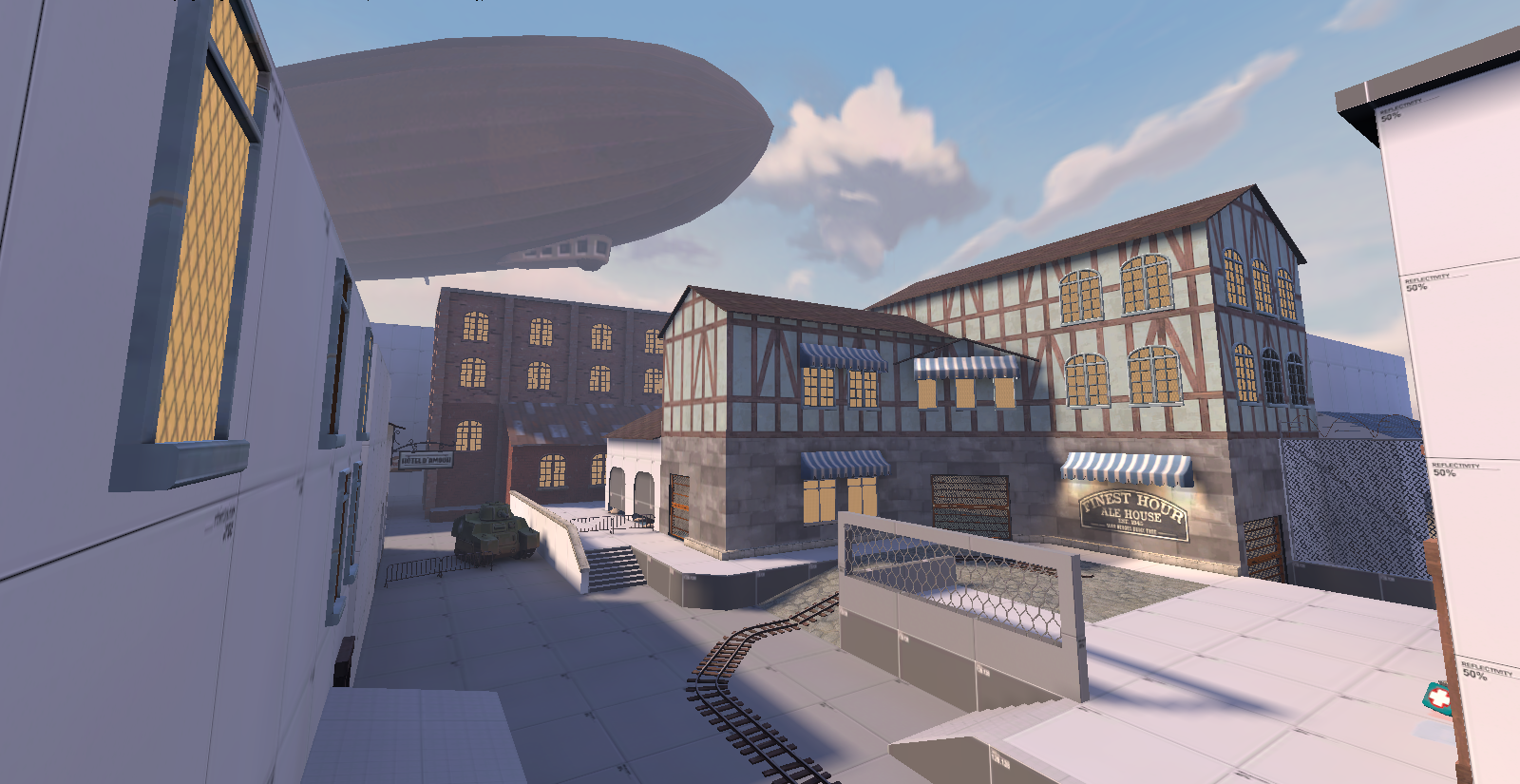
This looks great, except the windows look weird, especially the ones above the Finest Hour sign. It looks like the wooden beams are a wallpaper with windows stuck on top. To make it look more realistic, you should move, stretch, and/or squeeze the texture so that the beams are going around and/or between the windows, not behind them. You want it to look like it is a real place, but having those beams go behind the windows can break immersion."no dude I'm not over-detailing, it's just fine"
I am not attacking you. I am trying to help.
will work on it, and don't worry I'm not taking this as negative at all, you cool.This looks great, except the windows look weird, especially the ones above the Finest Hour sign. It looks like the wooden beams are a wallpaper with windows stuck on top. To make it look more realistic, you should move, stretch, and/or squeeze the texture so that the beams are going around and/or between the windows, not behind them. You want it to look like it is a real place, but having those beams go behind the windows can break immersion.
I am not attacking you. I am trying to help.
Why are all those lights on if its daytime... It looks really odd, should probably only have very few of the windows have lights turned on behind them."no dude I'm not over-detailing, it's just fine"


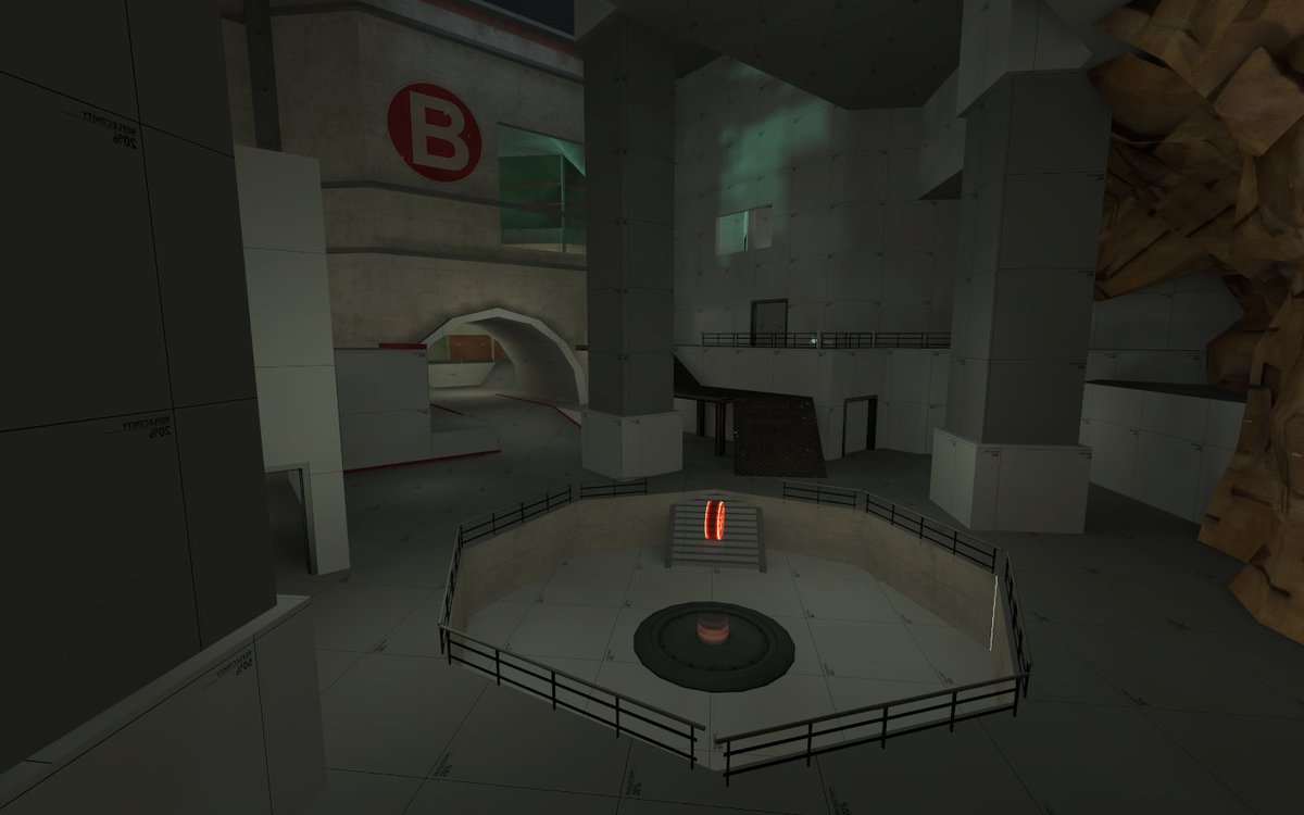
Been doing a map on the side (doing my payload map was kinda limiting, 'cause it has to fit with the theme)
it's a CP map... it's called cp_ascension (working title)


EDIT: I really like how those lights turned out.... Maybe I'll bump the lightmaps scale a notch
Just a heads up, I made a map a while ago called Ascension already. You're welcome to keep the name because that map went nowhere, but I personally wouldn't if it's just a working title to avoid any confusion.
")
.png")

- Mar 23, 2017
- 1,338
- 996
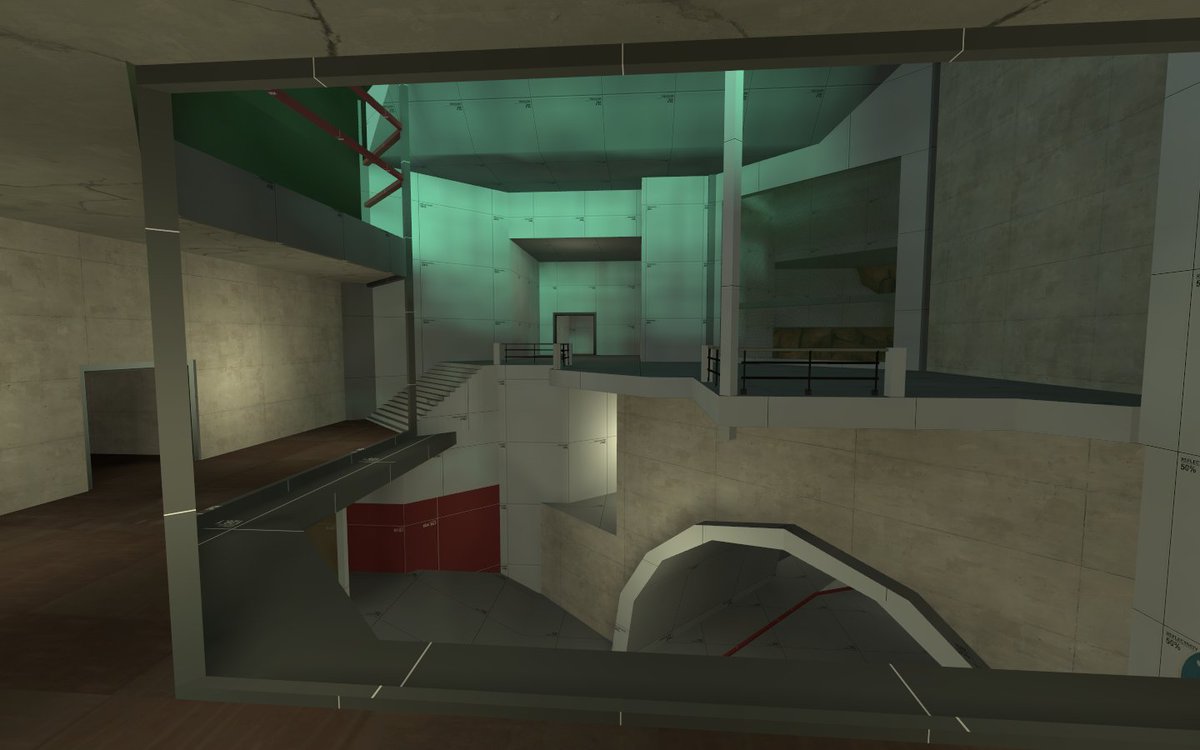
Is there a reason someone gave this a disagree?nice lighting
hey Skittelz pie, what do you think of the lighting?
I presume they mean less that it's "bad lighting" (though it definitely needs to be brighter, especially in your darker areas), and more that it's not "good" (i.e. beta lighting that's taken extra hours of effort on top of the alpha lighting to make look really good).
I'd definitely try increasing all your lights in screen 1/2 around 100-200 (depending how many lights you're using) and seeing what it's like from there. Remember indoor/underground/night maps should be just as light as outdoor daytime maps, but also have excuses/reasons to be that light.
Soilbleed
L2: Junior Member
- May 7, 2015
- 64
- 246
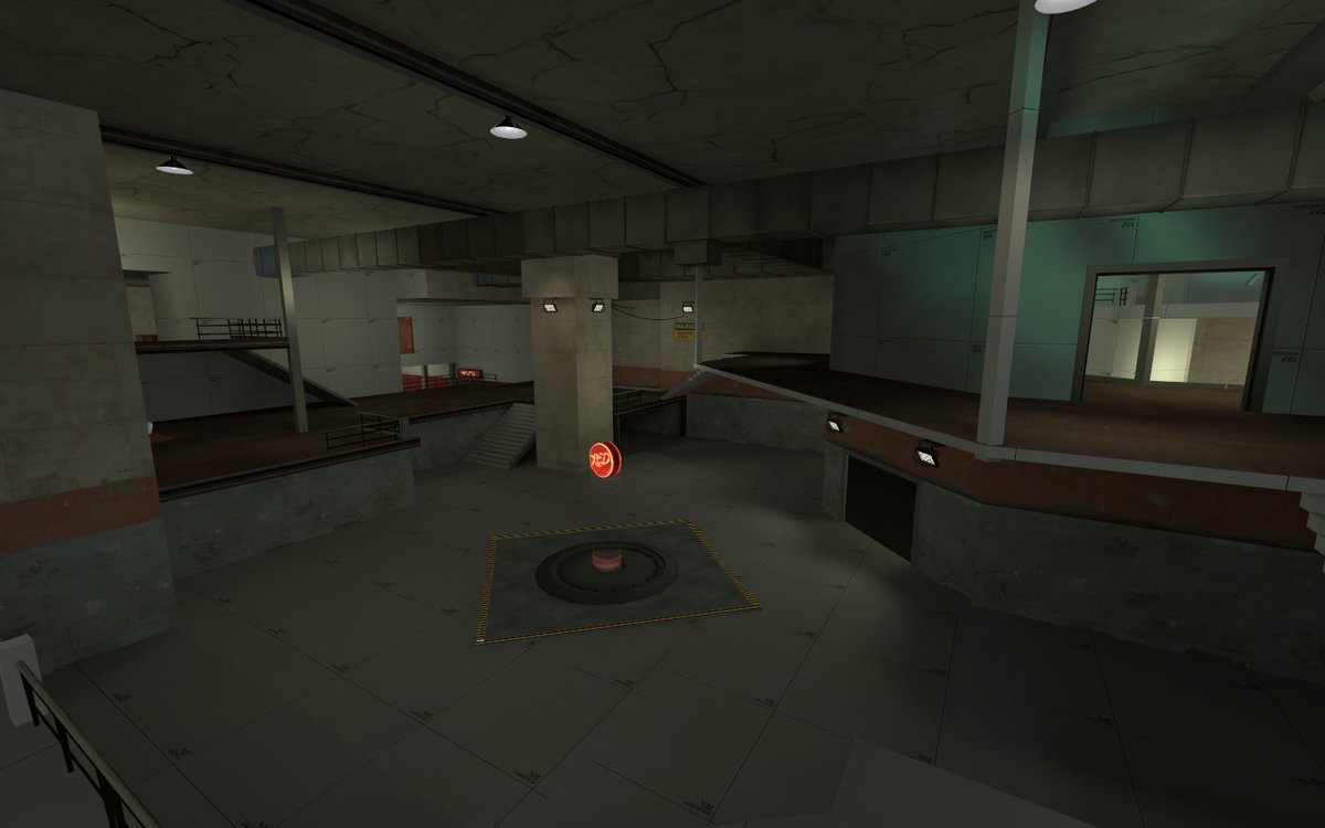
I presume they mean less that it's "bad lighting" (though it definitely needs to be brighter, especially in your darker areas), and more that it's not "good" (i.e. beta lighting that's taken extra hours of effort on top of the alpha lighting to make look really good).
A fair chunk of it is still dev lighting. I'm wanting to make the skybox a "seabox" since it's underwater, so i'm still experimenting with that. Will probably put a bit more effort into it in the a6.
I'd definitely try increasing all your lights in screen 1/2 around 100-200 (depending how many lights you're using) and seeing what it's like from there. Remember indoor/underground/night maps should be just as light as outdoor daytime maps, but also have excuses/reasons to be that light.
Thanks! I'll increase the general ambient lighting on the map before uploading for playtesting
I guess by little you mean that small texture scale on water.a little something for a22 of hinden
that looks amazing!a little something for a22 of hinden
Harritron
L4: Comfortable Member
- Feb 26, 2017
- 167
- 83
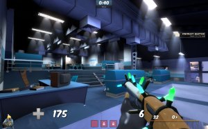
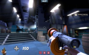
Nice Little Spawnroom for my contest entry (lighting still needs a hell of a lot of work) Also my apologies for the viewmodel and hud getting in there too.
That looks a bit like a prop spam for me.
Harritron
L4: Comfortable Member
- Feb 26, 2017
- 167
- 83
Consoles in the front there are gone, probably shoudn't have put those there to begin with...That looks a bit like a prop spam for me.