WiP in WiP, post your screenshots!
- Thread starter Arhurt
- Start date
You are using an out of date browser. It may not display this or other websites correctly.
You should upgrade or use an alternative browser.
You should upgrade or use an alternative browser.
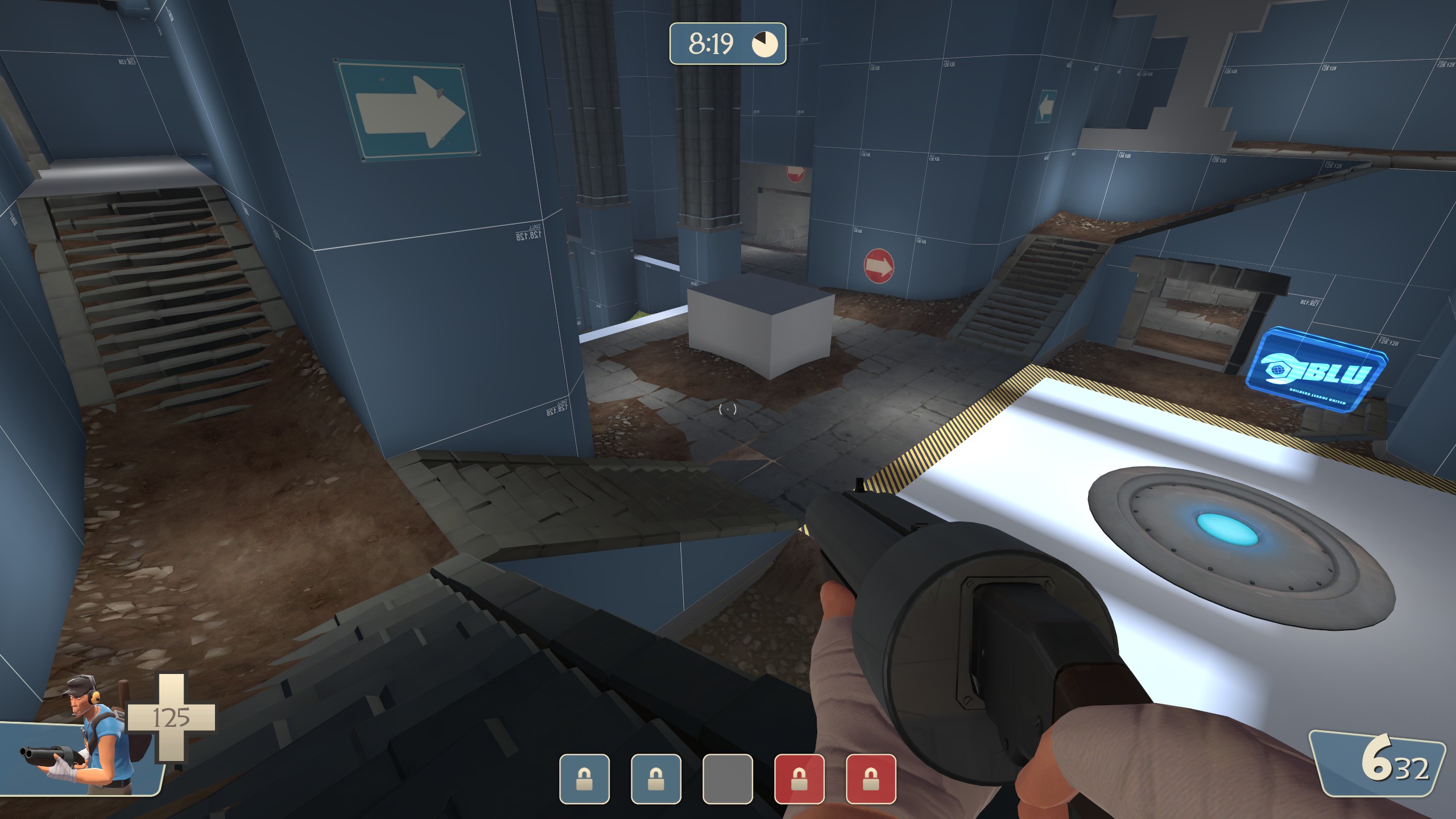
started adding some dirt textured and trying out some new stairs
Are those edited medieval stairs?
Are those edited medieval stairs?
I'm pretty sure that they're Mayann, or Mayann-inspired
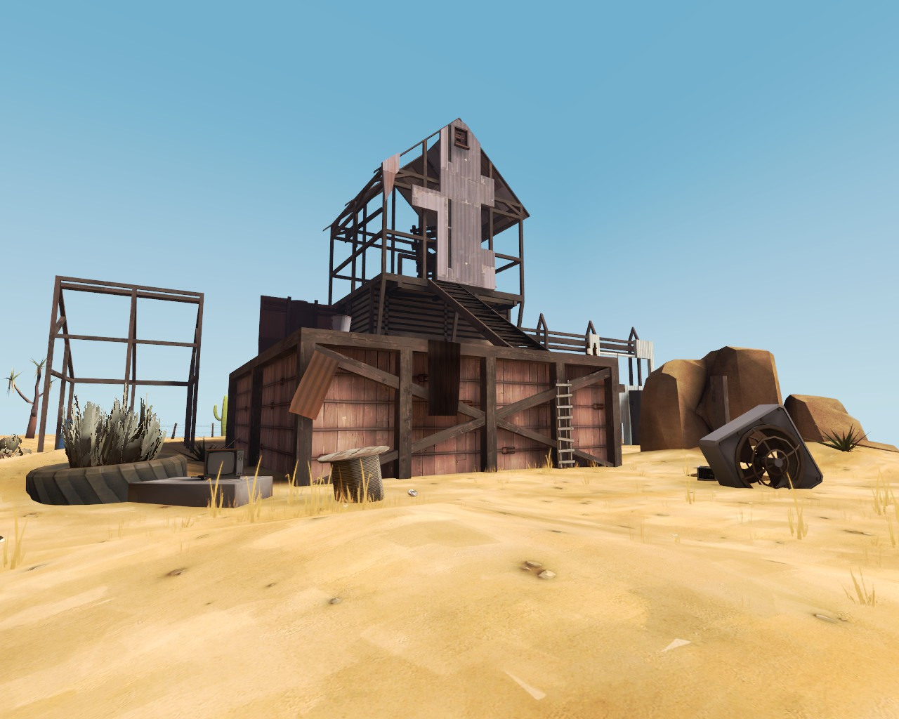
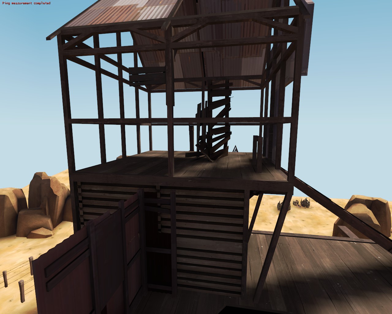
Not really a WIP anymore, since I got bored with it, but I made this thing in like January because I was bored. Felt like it might go here.
You could probably make a good KOTH map with this as the center. or a sniper tower.
Should i be add screenshots of my maps here?
Yes, yes you can.


Not really a WIP anymore, since I got bored with it, but I made this thing in like January because I was bored. Felt like it might go here.
Reference was supposed to be this: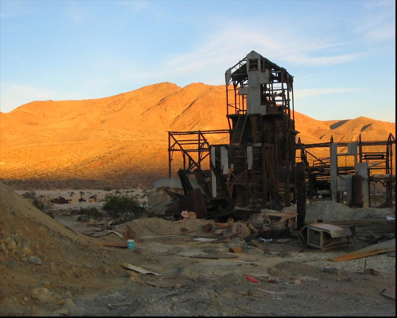
Beautifully done, Erk! The farm theme needs more love.
suber36g
L3: Member
- Jan 20, 2017
- 134
- 37
SHOULD I?
Ultimately, your choice dude.
But I would. It gets some early thoughts from other community members before testing and even after testing.
It seems that you spammed the ceiling beam prop, which can be very bad, and very distracting to players... Also, I feel like you just took the screenshot that you had on your uploaded map, meaning that this isn't really wip, as you already put this version up for people to play... so... Correct me if I'm wrong though...
TL;DR: Please don't spam the ceiling beam prop...
TL;DR: Please don't spam the ceiling beam prop...
nitewalker
L2: Junior Member
- Aug 5, 2014
- 64
- 142
The displacements on the right aren't aligned with the bridge so it looks kinda off.
Harritron
L4: Comfortable Member
- Feb 26, 2017
- 167
- 83
It seems that you spammed the ceiling beam prop, which can be very bad, and very distracting to players... Also, I feel like you just took the screenshot that you had on your uploaded map, meaning that this isn't really wip, as you already put this version up for people to play... so... Correct me if I'm wrong though...
That was the first beta, as I already removed those.
TL;DR: Please don't spam the ceiling beam prop...
Yes, I did use the same screenshot of the "completed" area, but below you will now see an uncompleted area
You know, you could have just put the second screenshot in the first post...That was the first beta, as I already removed those.
Yes, I did use the same screenshot of the "completed" area, but below you will now see an uncompleted area
Harritron
L4: Comfortable Member
- Feb 26, 2017
- 167
- 83
Well crap, I forgot about edits... Oh well, just deleted my 1st screenshotYou know, you could have just put the second screenshot in the first post...


