WiP in WiP, post your screenshots!
- Thread starter Arhurt
- Start date
You are using an out of date browser. It may not display this or other websites correctly.
You should upgrade or use an alternative browser.
You should upgrade or use an alternative browser.
the door is out of frameWood grain goes in the wrong direction on this column
I'm not sure if having more than one of this poster makes sense and also it doesn't look great. I do like that its placed at the end of a long uninterrupted floor space, that's a smart move
Looks awkward how close this window comes to the ground. You won't find that in most homes because someone could fall out pretty easily (buildings with glass that goes to the ground probably have much stronger glass)
The counters don't look wide enough to really place anything on. The finish on top of them also looks kinda weird and i'd try to find another wood texture. Also think about changing the floor in this area to tile - floor finishes are an often overlooked way of making a place seem more real. Your home probably switches floor finishes between the kitchen and living room cause they have different needs
Could use a truss in here to support the roof. Also the decking likely runs in the other direction (turn it 90 degrees)
Where's the door?
Whoever was here went through the effort to place the bottles somewhere nice but placed a lot of crushed cans on the ground. Also, unless all those cans/the chair were left there by the last person to use this room, they'd likely be moved out of the way (cause they're where people would be walking)
Sprite doesn't quite line up with the center of the bulb
Columns don't just suddenly end like this. The wood wall doesn't hold itself up, it's just attached to the framing inside, so if a column like this is gone then the whole building falls over
Did they have a problem where their calendars were regularly getting destroyed, so they had to stockpile them? Were the occupants lonely enough that having multiple pin-up girls on the wall made a difference from having just one? Did they really just like the month of June?
These might make sense depending on the context of the building in its environment, but without that information, they feel out of place
as for the construction errors i like to think the guy who made it was blind, the back story in my head while making it was that, it was an old relay station in the woods that was then purchase by red, and then captured by blu (the origin of the posters) then during the merc war the administrator hired an intern to run the station (a diffident one, male, mid 20's called smith runner) he then spent 4 years up there and when the events of MVM rolled around Miss Pauling was sent to get him back to HQ to assist in monitoring the war.
P.s. 4 years, no other humans, you can bet the guy got as meny pin-ups as he could!
Last edited:
- Aug 7, 2014
- 1,241
- 1,025
Why the hell would you want 4 copies of the same pinup calendar though?P.s. 4 years, no other humans, you can bet the guy got as meny pin-ups as he could!
the door is out of frame
as for the construction errors i like to think the guy who made it was blind, the back story in my head while making it was that, it was an old relay station in the woods that was then purchase by red, and then captured by blu (the origin of the posters) then during the merc war the administrator hired an intern to run the station (a diffident one, male, mid 20's called smith runner) he then spent 4 years up there and when the events of MVM rolled around Miss Pauling was sent to get him back to HQ to assist in monitoring the war.
P.s. 4 years, no other humans, you can bet the guy got as meny pin-ups as he could!
Well that's one way to say "artistic liberty." Neat story though
He most likely lost it at year 2, I can only imagine how exciting he was to see miss Pauling.Why the hell would you want 4 copies of the same pinup calendar though?
If I ever finish a map I want you to go over my artpassWood grain goes in the wrong direction on this column
I'm not sure if having more than one of this poster makes sense and also it doesn't look great. I do like that its placed at the end of a long uninterrupted floor space, that's a smart move
Looks awkward how close this window comes to the ground. You won't find that in most homes because someone could fall out pretty easily (buildings with glass that goes to the ground probably have much stronger glass)
The counters don't look wide enough to really place anything on. The finish on top of them also looks kinda weird and i'd try to find another wood texture. Also think about changing the floor in this area to tile - floor finishes are an often overlooked way of making a place seem more real. Your home probably switches floor finishes between the kitchen and living room cause they have different needs
Could use a truss in here to support the roof. Also the decking likely runs in the other direction (turn it 90 degrees)
Where's the door?
Whoever was here went through the effort to place the bottles somewhere nice but placed a lot of crushed cans on the ground. Also, unless all those cans/the chair were left there by the last person to use this room, they'd likely be moved out of the way (cause they're where people would be walking)
Sprite doesn't quite line up with the center of the bulb
Columns don't just suddenly end like this. The wood wall doesn't hold itself up, it's just attached to the framing inside, so if a column like this is gone then the whole building falls over
Did they have a problem where their calendars were regularly getting destroyed, so they had to stockpile them? Were the occupants lonely enough that having multiple pin-up girls on the wall made a difference from having just one? Did they really just like the month of June?
These might make sense depending on the context of the building in its environment, but without that information, they feel out of place
He probably will even if you say nothingIf I ever finish a map I want you to go over my artpass
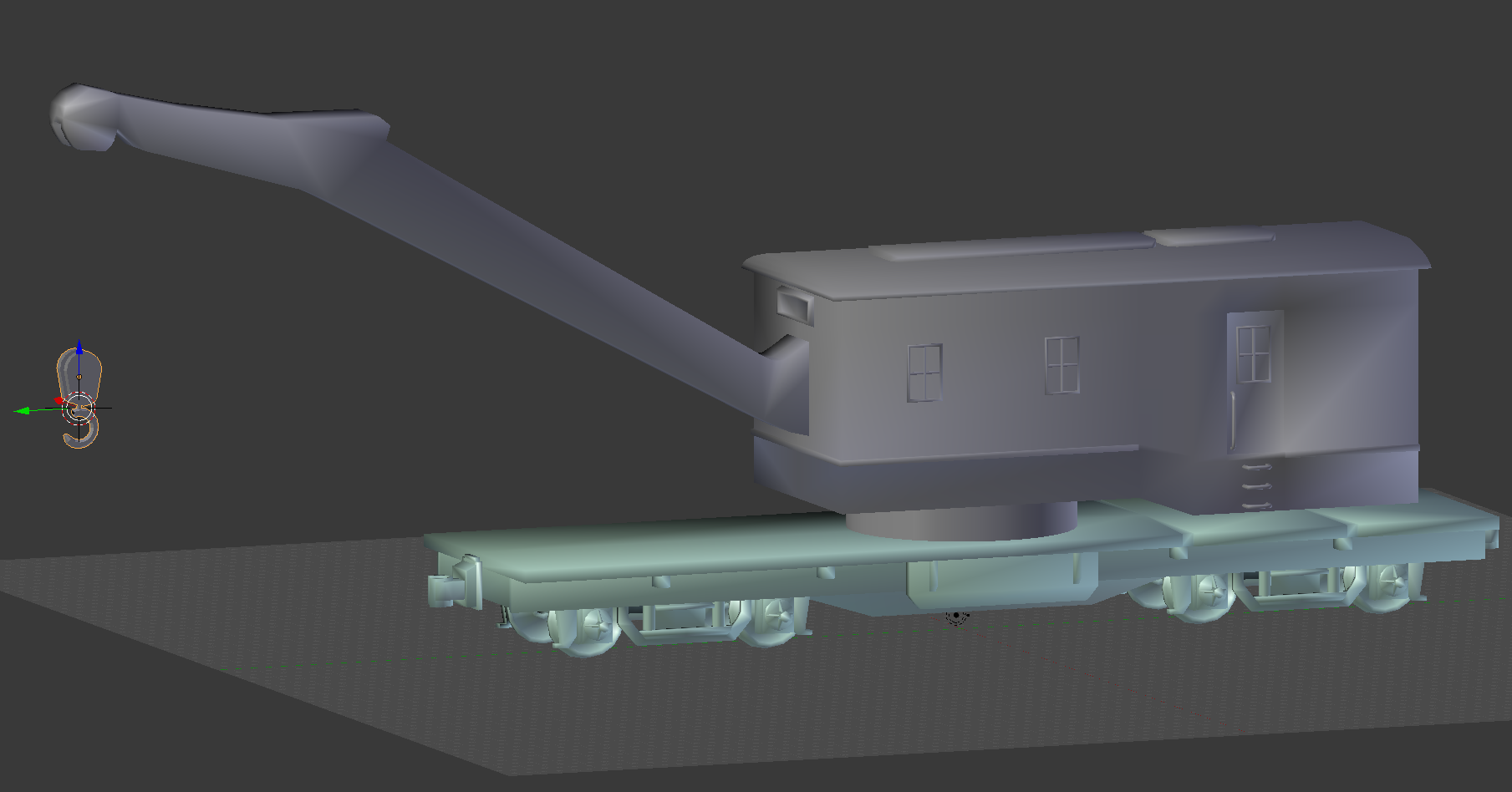
it would be cool if you could make a game mode out of that...Crane Control! you have to hold the point for a long enough time so the crane can drop a bomb in the other teams cargo pit! but if the other team takes the point, the bomb will drop in your pit!
Something interesting for you guys to see
Last edited:
So, koth with more visual representation?it would be cool if you could make a game mode out of that...Crane Control! you have to hold the point for a long enough time so the crane can drop a bomb in the other teams cargo pit! but if the other team takes the point, the bomb will drop in your pit!
a little bit more to it than koth, but at its basics, yes.So, koth with more visual representation?
What "more"? Gameplay wise?a little bit more to it than koth, but at its basics, yes.
different time mechanics, smaller map, maybe even a premature detonation option for defending.What "more"? Gameplay wise?
it's just an idea.
B!scuit
L5: Dapper Member
- Aug 12, 2016
- 206
- 267
tug-of-war payload meets special delivery?it would be cool if you could make a game mode out of that...Crane Control! you have to hold the point for a long enough time so the crane can drop a bomb in the other teams cargo pit! but if the other team takes the point, the bomb will drop in your pit!


