WiP in WiP, post your screenshots!
- Thread starter Arhurt
- Start date
You are using an out of date browser. It may not display this or other websites correctly.
You should upgrade or use an alternative browser.
You should upgrade or use an alternative browser.
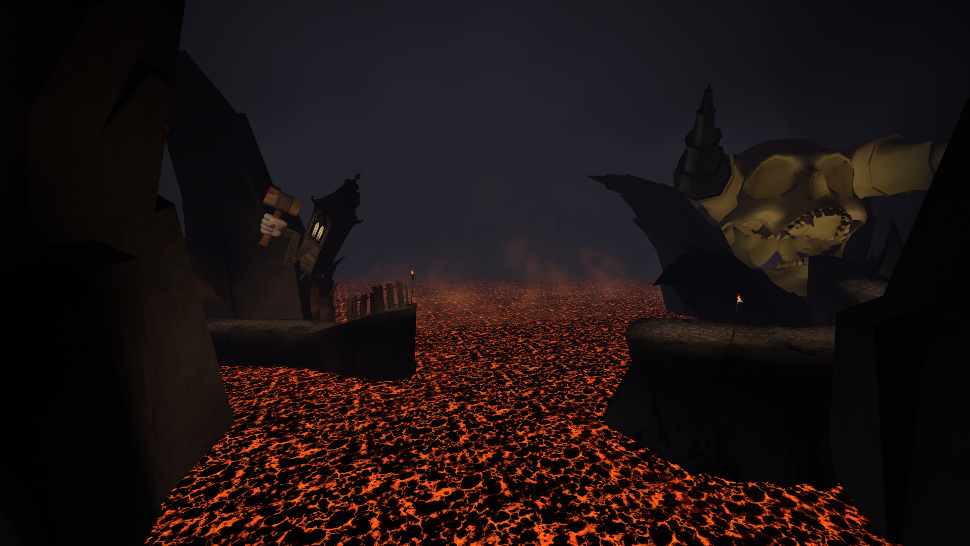
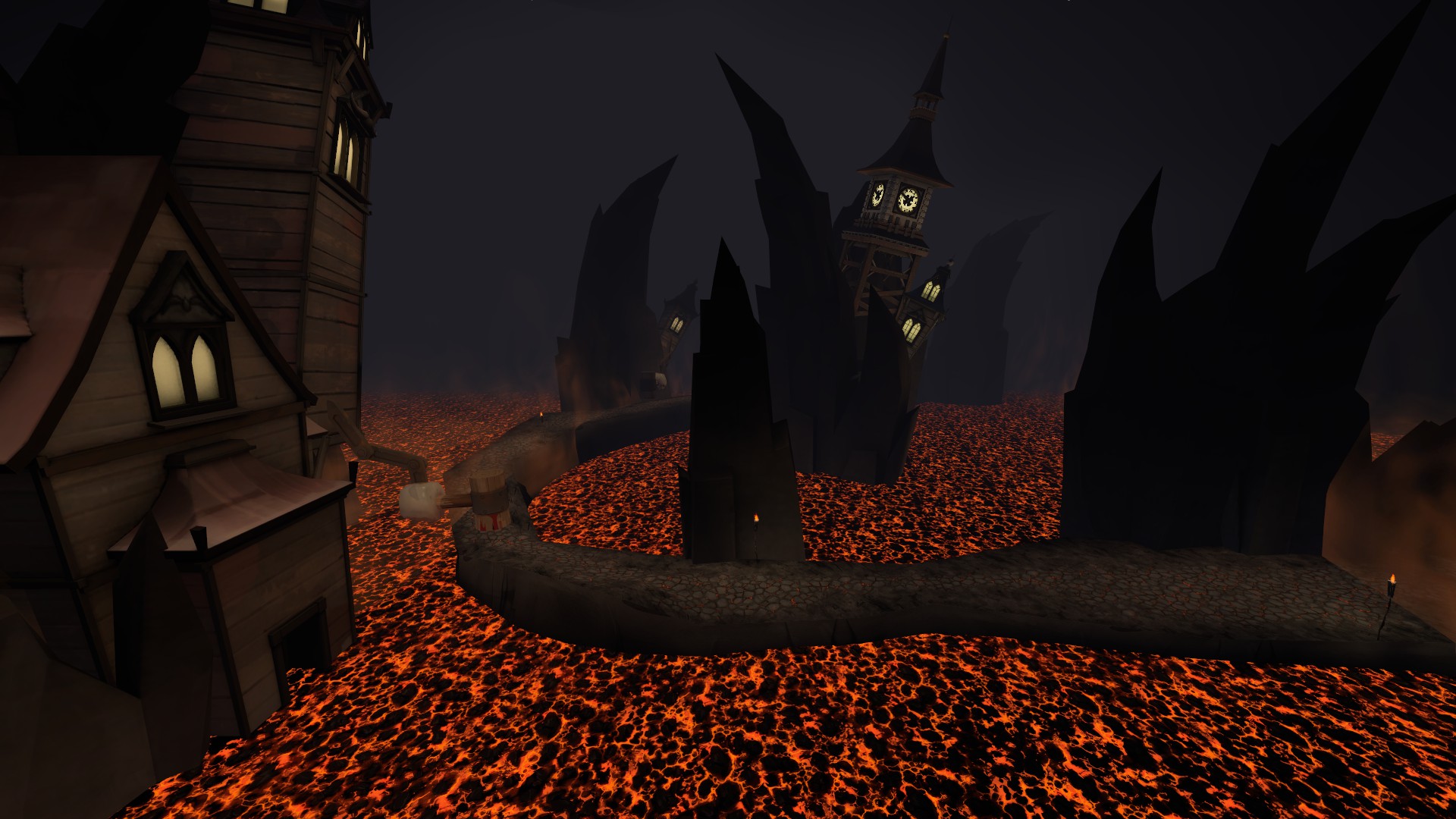
The lava looks a little plain. In case you are not planing into making it a model (which would solve the listed things), here are some things you might want to consider:
Scale it up. It repeats a bit too much imo.
Use the TF keyworded one. There is another variant that is almost identical but uses vertexlitgeneric, therefore having visual glitches.
Displace it. Just give it distortions in all kinds of directions. Mainly anything but up or down.
Scale it up. It repeats a bit too much imo.
Use the TF keyworded one. There is another variant that is almost identical but uses vertexlitgeneric, therefore having visual glitches.
Displace it. Just give it distortions in all kinds of directions. Mainly anything but up or down.
The lava looks a little plain. In case you are not planing into making it a model (which would solve the listed things), here are some things you might want to consider:
Scale it up. It repeats a bit too much imo.
Use the TF keyworded one. There is another variant that is almost identical but uses vertexlitgeneric, therefore having visual glitches.
Displace it. Just give it distortions in all kinds of directions. Mainly anything but up or down.
Yea, thats the plan. I realized later how repetative it was.
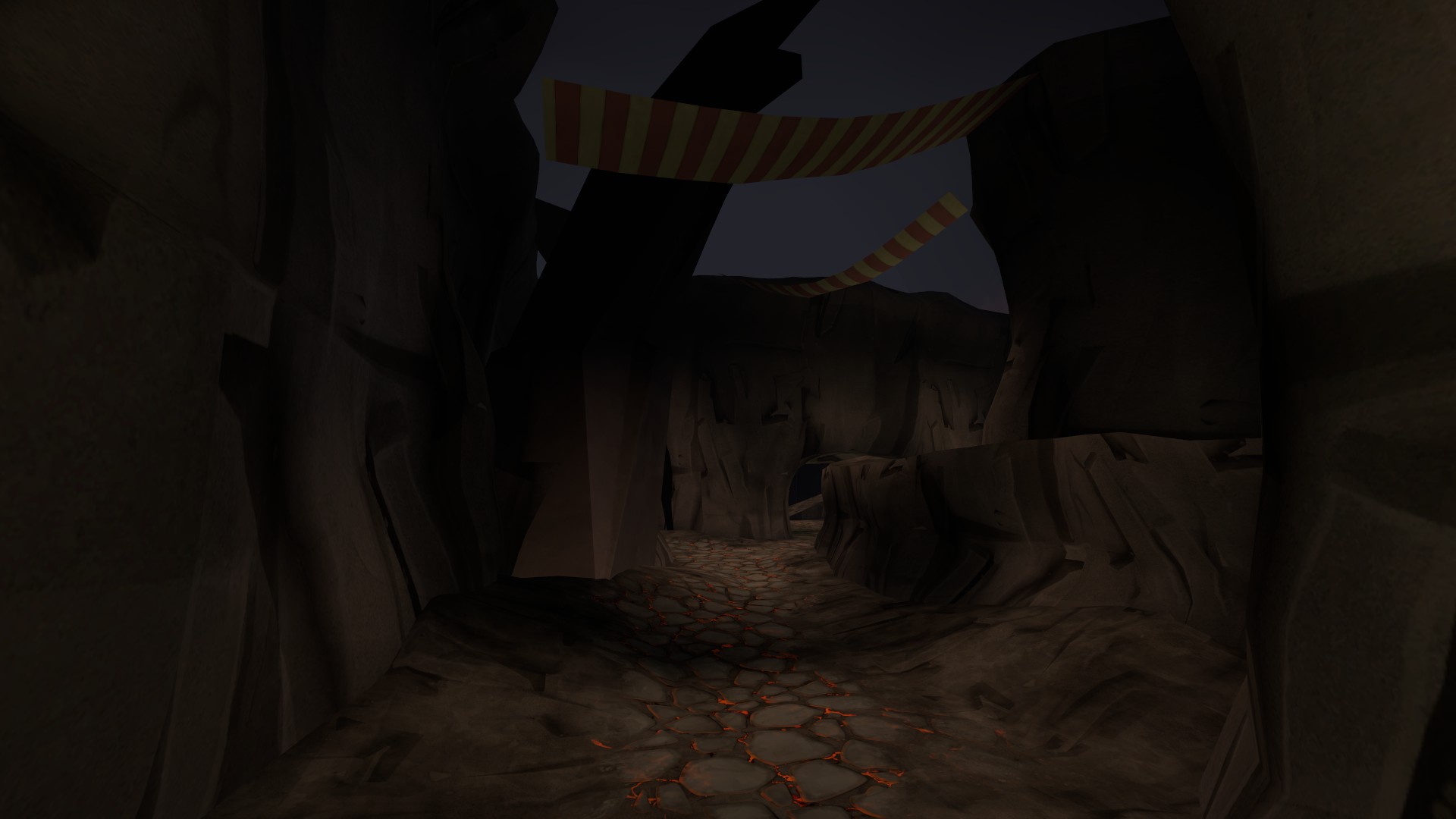
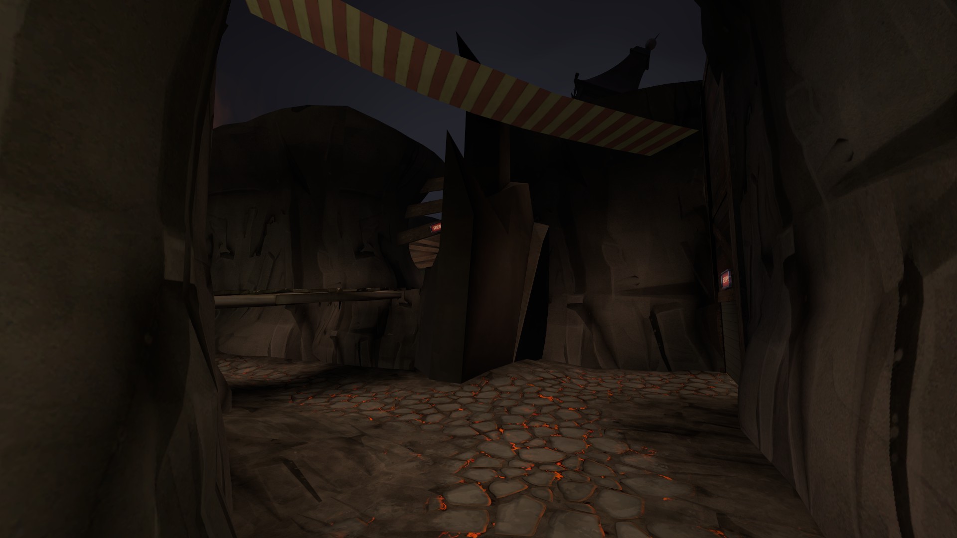
I remember when the carts came out and for a short time everyone wanted make a race course.I'm calling... cart racer?
Halloween is coming...
-snip-
Gotcha covered, Frozone.


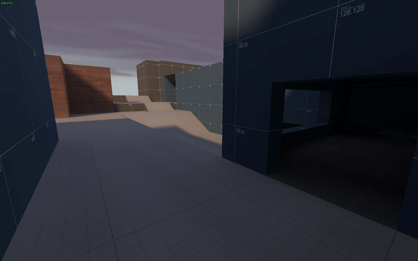
Question- Does this look overscaled? FYI it's about 2500 units across.
Yes.You should have the door open slowly and dramatically and have it be pitch black inside, and then all the lights come on at once and reveal that it's a tiny room with a small health kit in it.
Noizeblaze
L1: Registered
- Jan 16, 2014
- 15
- 38
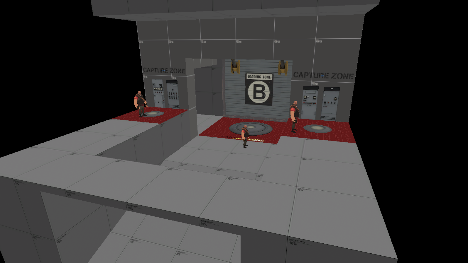
Rather than making the door a passage for player. Make it a the doors to a more important control room (or whatever stuff is important in the map). This way you can keep it out of the playing area while still giving it a little bit of sense. The door in that case can be just a detail while at the same time making the system easier to understand.Yeah, that's kind of the same problem I had with this iteration of the split cap idea too.
Yeah, I mean beside the door I'll probably have windows showing a control room or something else important once it's finally detailed.Rather than making the door a passage for player. Make it a the doors to a more important control room (or whatever stuff is important in the map). This way you can keep it out of the playing area while still giving it a little bit of sense. The door in that case can be just a detail while at the same time making the system easier to understand.
I might go with this for the time being just so I can get a new version out.


