WiP in WiP, post your screenshots!
- Thread starter Arhurt
- Start date
You are using an out of date browser. It may not display this or other websites correctly.
You should upgrade or use an alternative browser.
You should upgrade or use an alternative browser.
- Oct 11, 2013
- 273
- 413
ErickShock
L1: Registered
- Aug 23, 2015
- 20
- 10
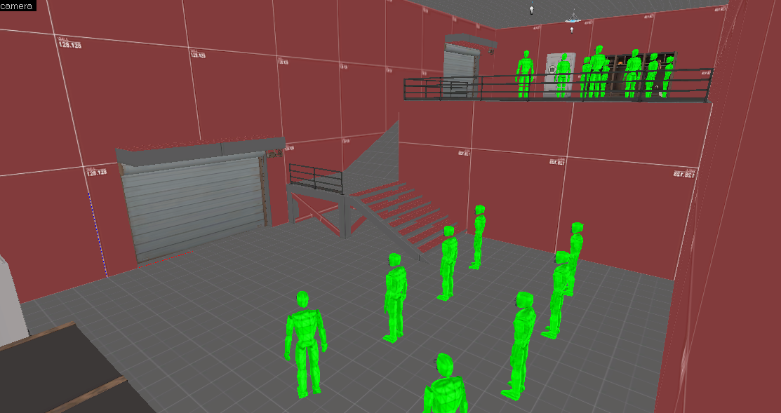
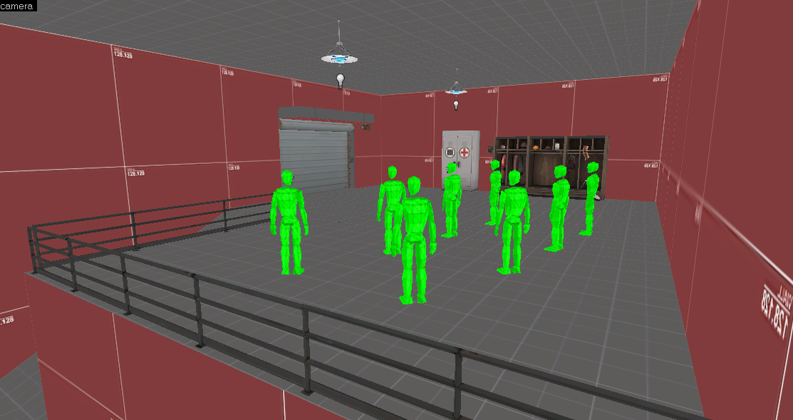
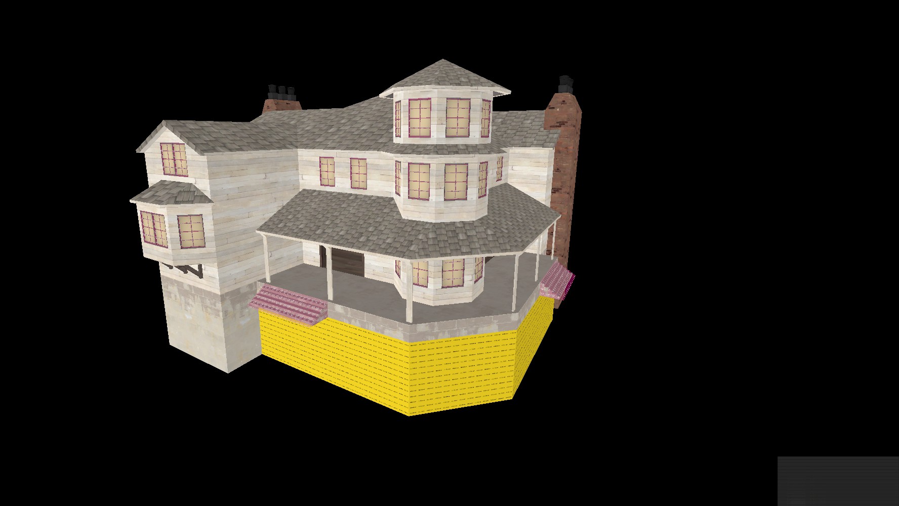
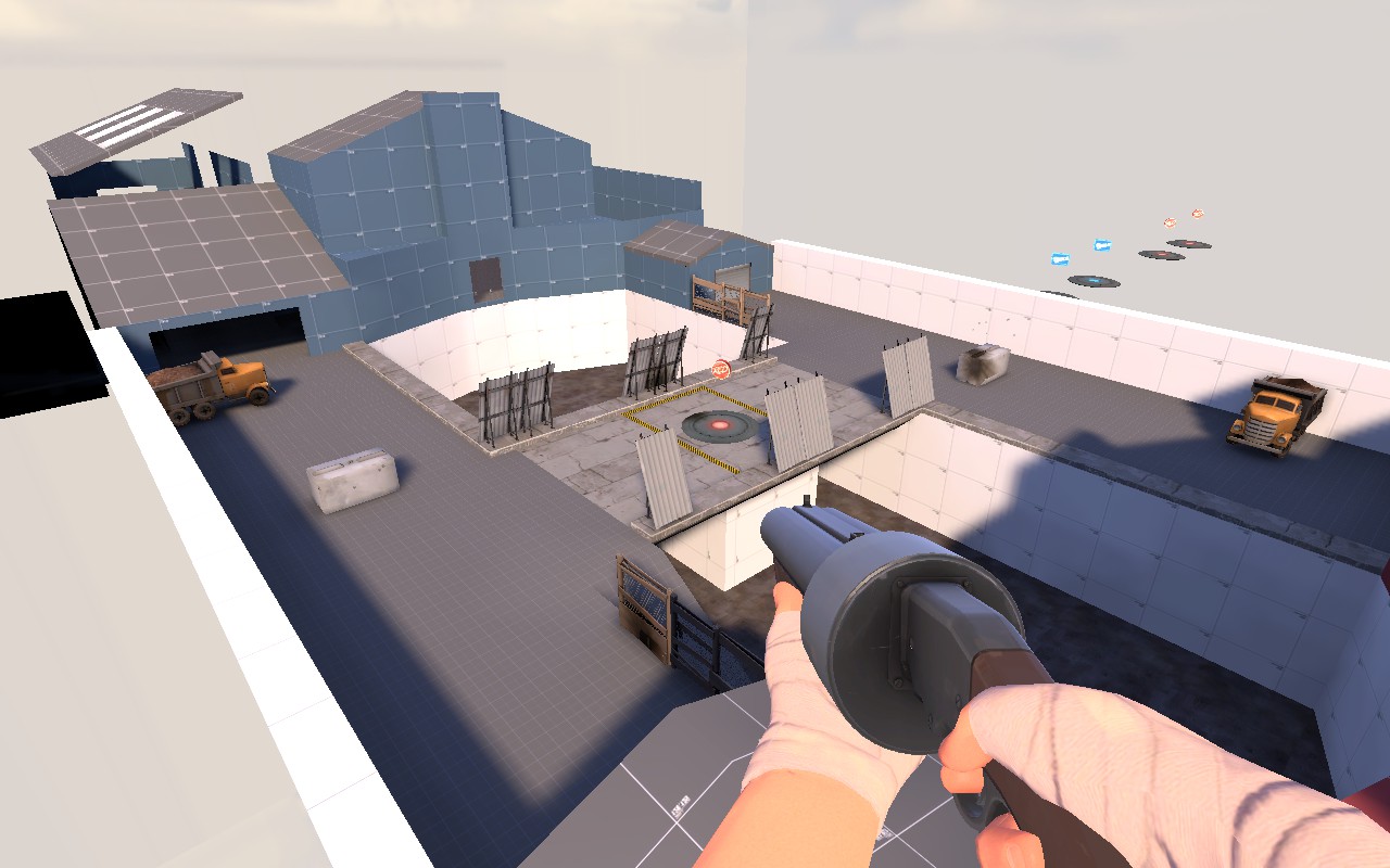
In Hammer's options, there's a setting for adjusting the render distance of models in the 3D viewport so you don't see a bunch of boxes. Fyi.
Yeah, thanks. I left the standard values for the sake of laziness =P
Wrong architectural style for that. This looks like a seaside New England homeAll it needs is a cotton farm surrounding it
Sure. It's something you can literally learn from Google images, it's that simple:
Most Southern houses are square, often like big cubes with triangles on top, and for some reason they fuckin' love Corinthian pillars. I don't know why.



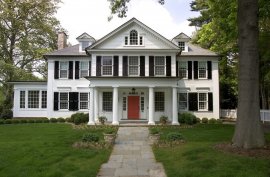
Click 'em to expand 'em. These veer from the crazily stupid to the completely typical Southern mansion, which is really the level of home we're talking about. More boring versions of these houses litter the East coast, including New England.
Specifically coastal New England homes, though, are different.
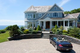


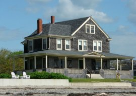
These are much less just cubes and even go so far as to use non-square areas, such as rectangular or circular rooms on the side. These circular windows that extend out from the facade, bay windows, are a key element of basically any house on the coast anywhere in America. They sometimes have a covered porch, but unlike the Southern homes, rarely is there living space above the porch (and no fucking pillars). The attics are also more integrated into the living space in many cases. Very similar to the Southern homes, but a bit more interesting, I think.
Also, both New England and Southern houses were built with cupolas all over if the owner was rich enough. Cupolas are dope.
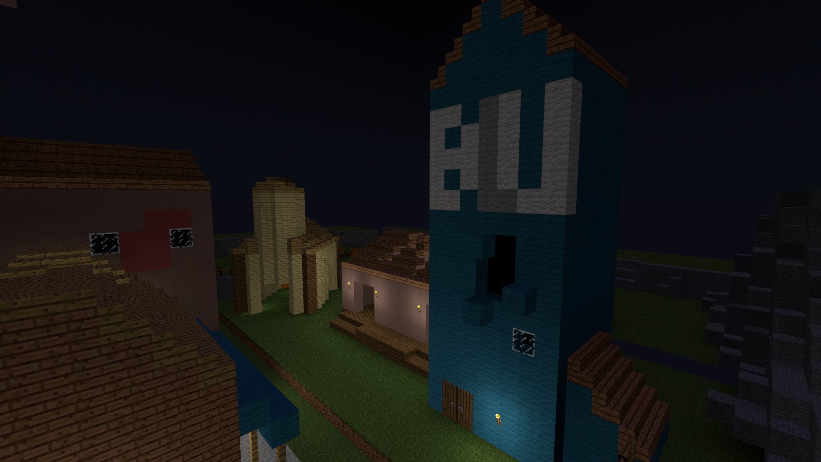
Auwi's house looks like a snowy New England home, so it makes sense.
Hope this helps!
Most Southern houses are square, often like big cubes with triangles on top, and for some reason they fuckin' love Corinthian pillars. I don't know why.


Click 'em to expand 'em. These veer from the crazily stupid to the completely typical Southern mansion, which is really the level of home we're talking about. More boring versions of these houses litter the East coast, including New England.
Specifically coastal New England homes, though, are different.


These are much less just cubes and even go so far as to use non-square areas, such as rectangular or circular rooms on the side. These circular windows that extend out from the facade, bay windows, are a key element of basically any house on the coast anywhere in America. They sometimes have a covered porch, but unlike the Southern homes, rarely is there living space above the porch (and no fucking pillars). The attics are also more integrated into the living space in many cases. Very similar to the Southern homes, but a bit more interesting, I think.
Also, both New England and Southern houses were built with cupolas all over if the owner was rich enough. Cupolas are dope.
Auwi's house looks like a snowy New England home, so it makes sense.
Hope this helps!
Last edited:
- Sep 5, 2009
- 912
- 684
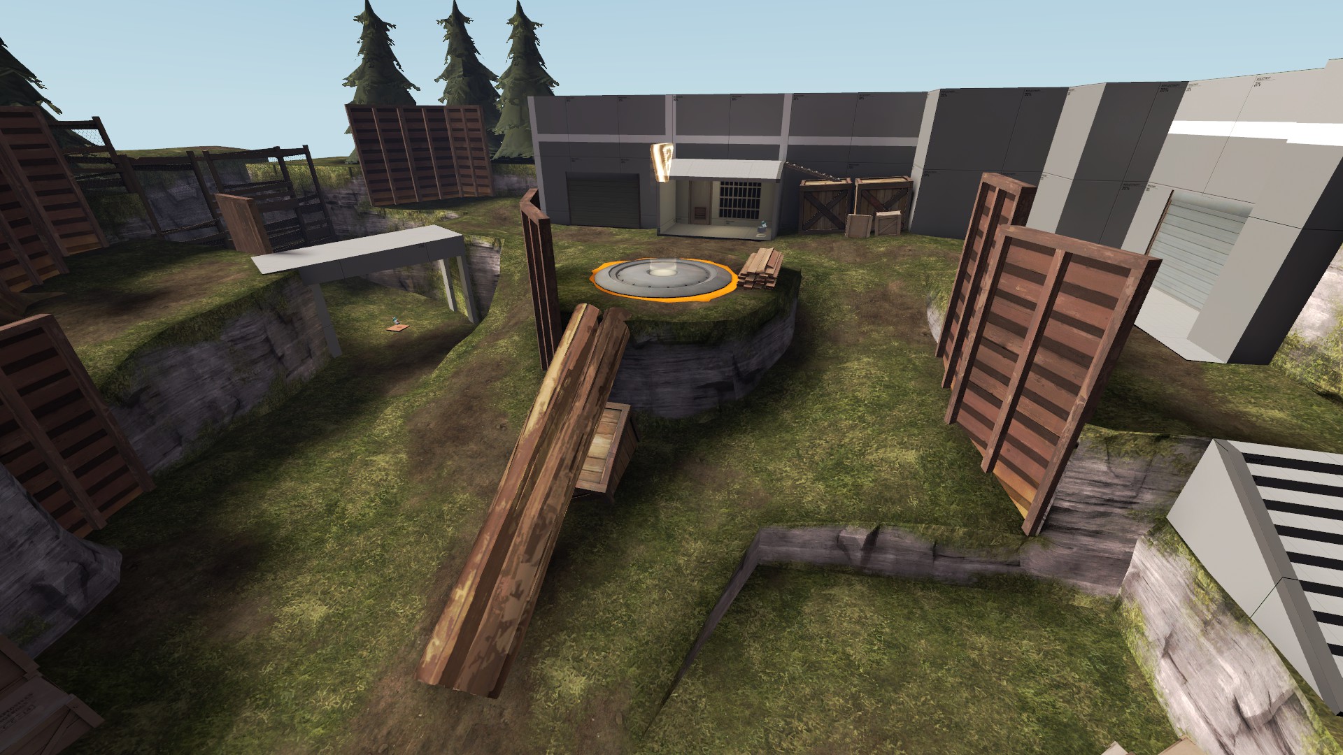
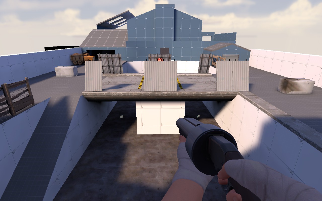
An image from the last point of Wildlife. I have a few things I want to change pertaining to spawn door direction, I'll get around to that, but for now I'm happy with it. I'm going to estimate this took me roughly 20 hours spread over about 3 days. It's pretty crazy how much displacements affect aesthetic. I still need to test the layout so I didn't want to get too crazy with any detail.
http://imgur.com/a/pXUCZ#0
Here's all 6 images. Phi should be finished connecting all of it together soon I suppose. I'm excited to see it played.
ErickShock
L1: Registered
- Aug 23, 2015
- 20
- 10


