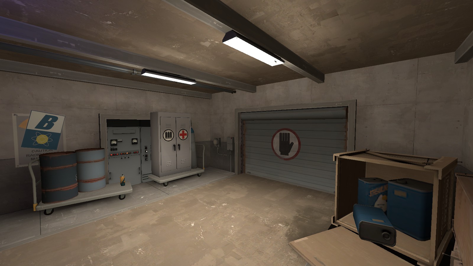
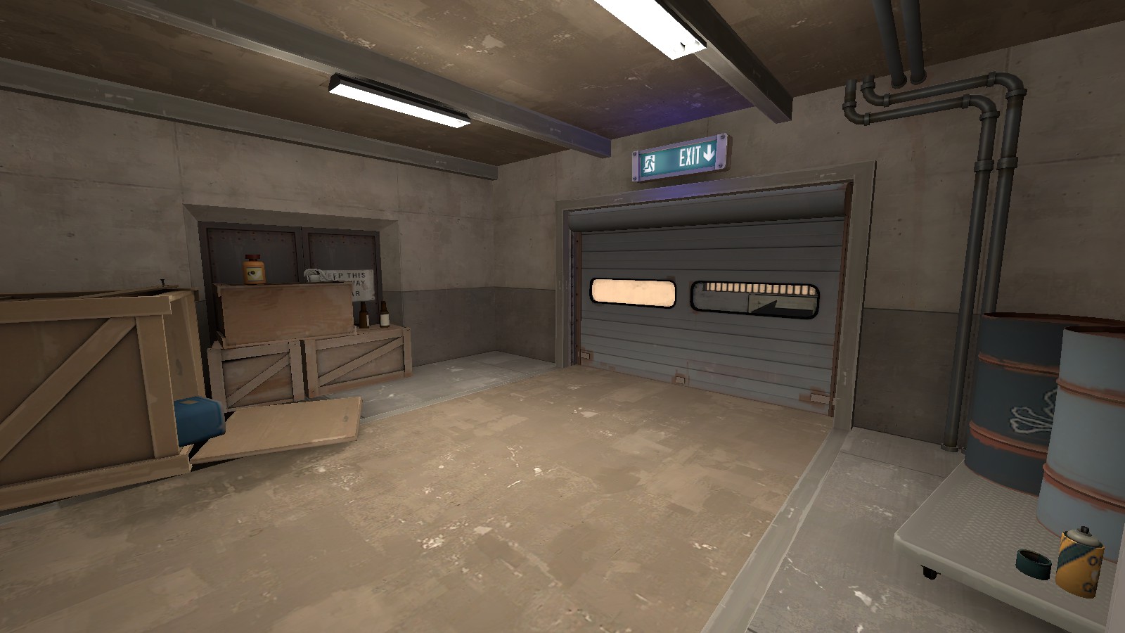
WiP in WiP, post your screenshots!
- Thread starter Arhurt
- Start date
You are using an out of date browser. It may not display this or other websites correctly.
You should upgrade or use an alternative browser.
You should upgrade or use an alternative browser.
Sawyer and Sons? I hear they're a cut above.
Sawyer and Sons, A cut above the competition - Endorsed by (the) Haunted Headless Horseman
:thumbup:
plr_mountainpass is looking more and more like a map
- snippety snap -
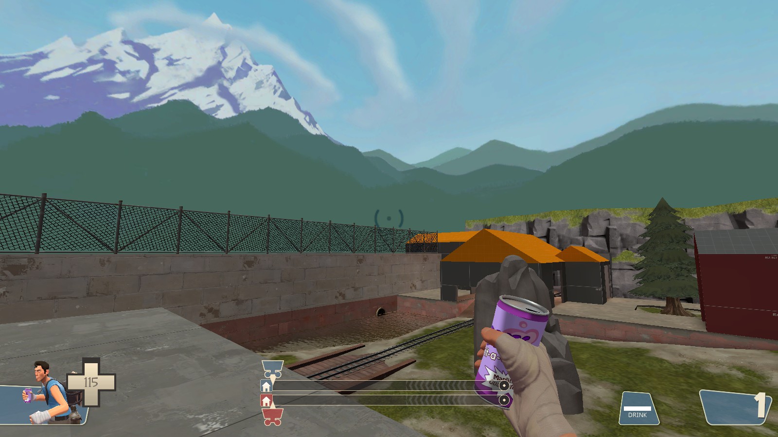
I don't think your choice of lighting colors for your environment_light fits the skybox. It looks unnatural because of it.
- Mar 6, 2013
- 1,044
- 627
I don't think your choice of lighting colors for your environment_light fits the skybox. It looks unnatural because of it.
Half-agreeing here, I like the skybox, however, I think that it doesn't really fit with the theme you're going for. The colors seem to suggest jungle or humitidty, not quite the conditions foumd of most of the world's mountains!
I do like the skybox though, it might be a nice alternative to the Borneo one for jungle maps.
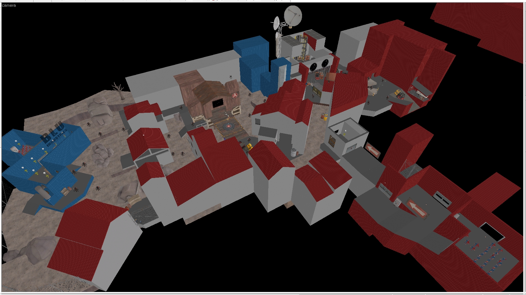
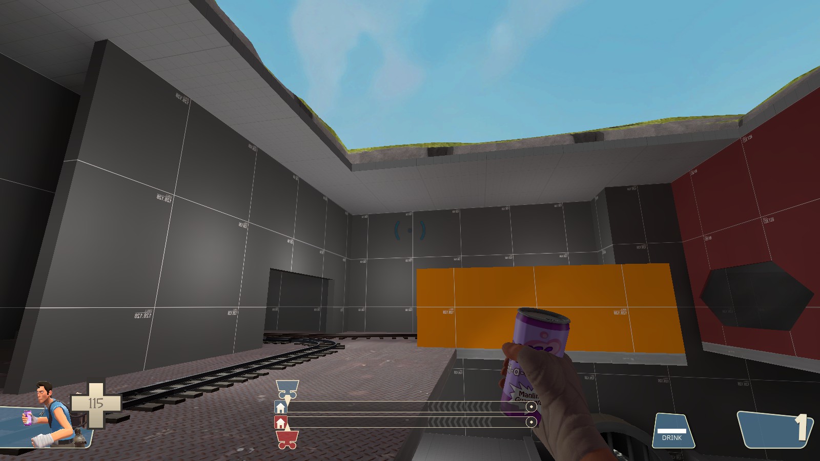
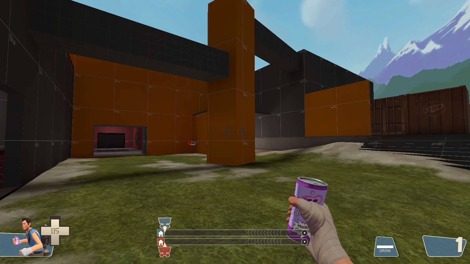
Your map also looks pretty good, first screen may be flat, but it's hard to tell from the angle. I assume you actually wanted people to comment on the map, not the lighting, right?
takabuschik
aa
- Apr 14, 2013
- 662
- 344
HQdefault, the problem w/ the skybox is that the mountain in the background is still purple while the hills are green. Re-paint the mountain and it would look much much better
The idea of blue-green hills in a skybox is sound; that's the color they get when they're far enough away to be affected by the blueness in the atmosphere but not so far away that they're totally blue. I think the issue is that they're still solid-colored, when in real life there would be plenty of definition to them at that distance.
- Aug 6, 2014
- 1,056
- 536
Half-agreeing here, I like the skybox, however, I think that it doesn't really fit with the theme you're going for. The colors seem to suggest jungle or humitidty, not quite the conditions foumd of most of the world's mountains!
I do like the skybox though, it might be a nice alternative to the Borneo one for jungle maps.
Your map also looks pretty good, first screen may be flat, but it's hard to tell from the angle. I assume you actually wanted people to comment on the map, not the lighting, right?
The idea was making the trees green would make it feel like everything's "right over there"
I'll look at some photos that resemble what I'm going for, maybe I'll find a better color.
EDIT: Already found one!
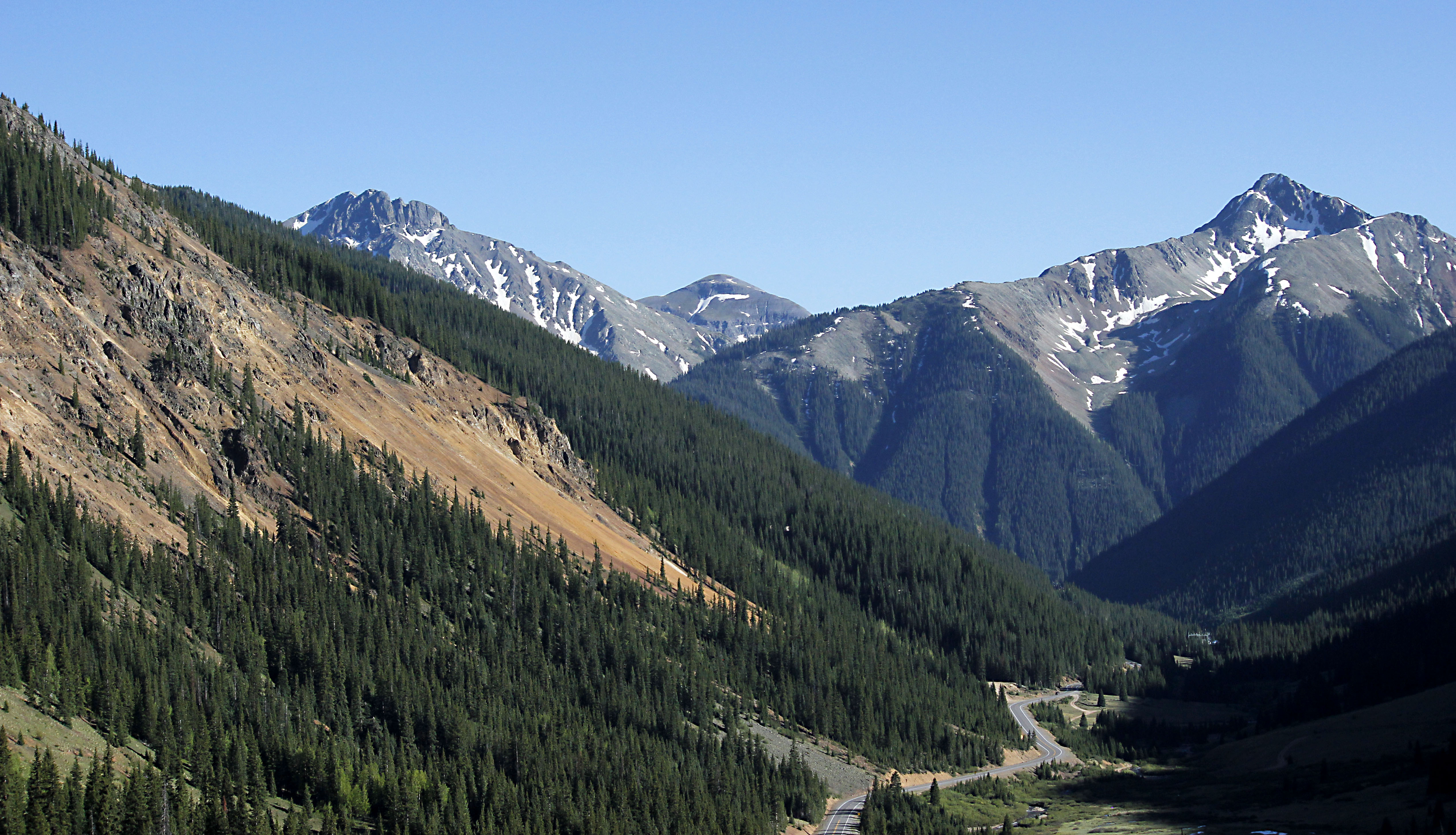
Looks like I need to make the trees a bit darker color, and maybe not so strong of a green.
I am skeptical on the mountain color, I wanted to have it be like "purple mountain majesties" like in the american national anthem, but evidently, mountains are NOT purple!
Last edited:
- Aug 6, 2014
- 1,056
- 536
Mountains look purple when you see them as every patriotic american sees their native land: through rose-tinted spectacles.
Well, to be fair,
the soldier is in the game.


