WiP in WiP, post your screenshots!
- Thread starter Arhurt
- Start date
You are using an out of date browser. It may not display this or other websites correctly.
You should upgrade or use an alternative browser.
You should upgrade or use an alternative browser.
Bull
L4: Comfortable Member
- Aug 30, 2011
- 193
- 144
Caverns, no matter how big, usually make me feel like I can't rocket jump. Its usually better to have an open ceiling to tell the player that the height boundary is higher.
Good point, I'll find another way to make the area feel more open!
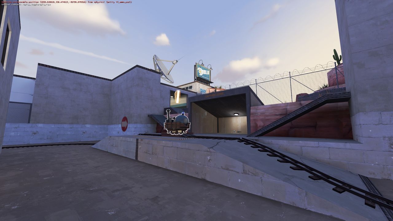
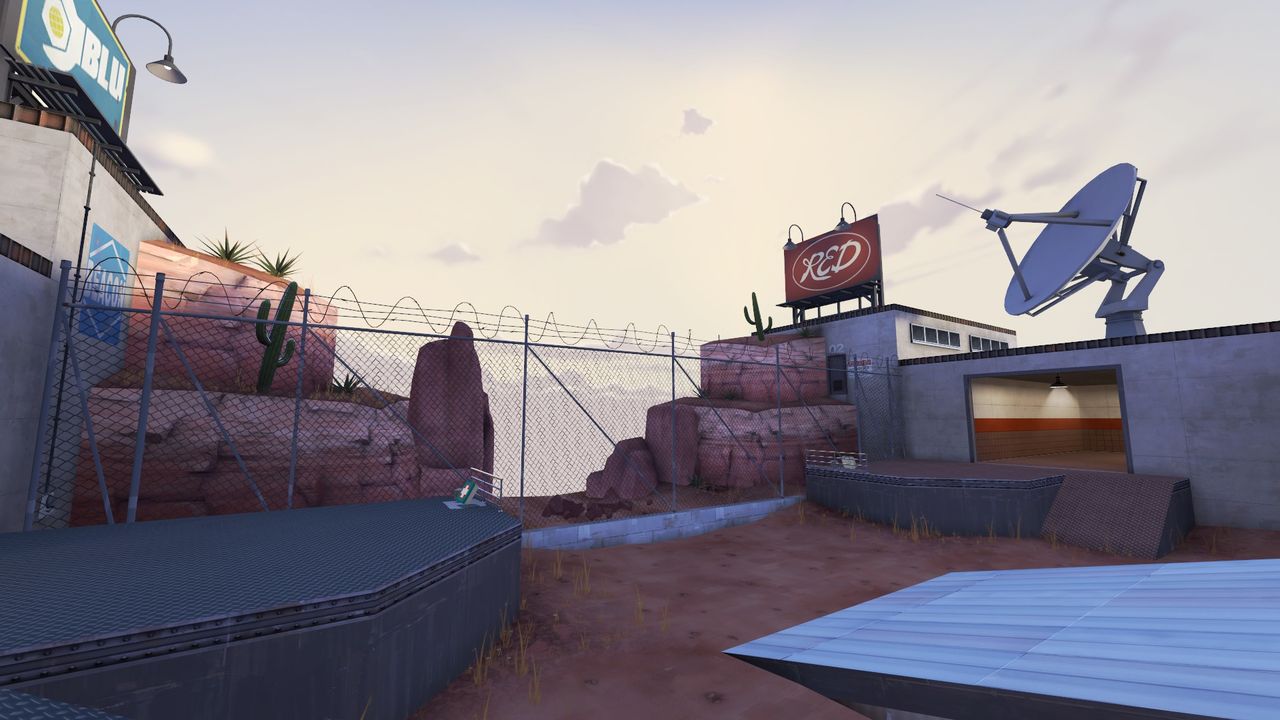
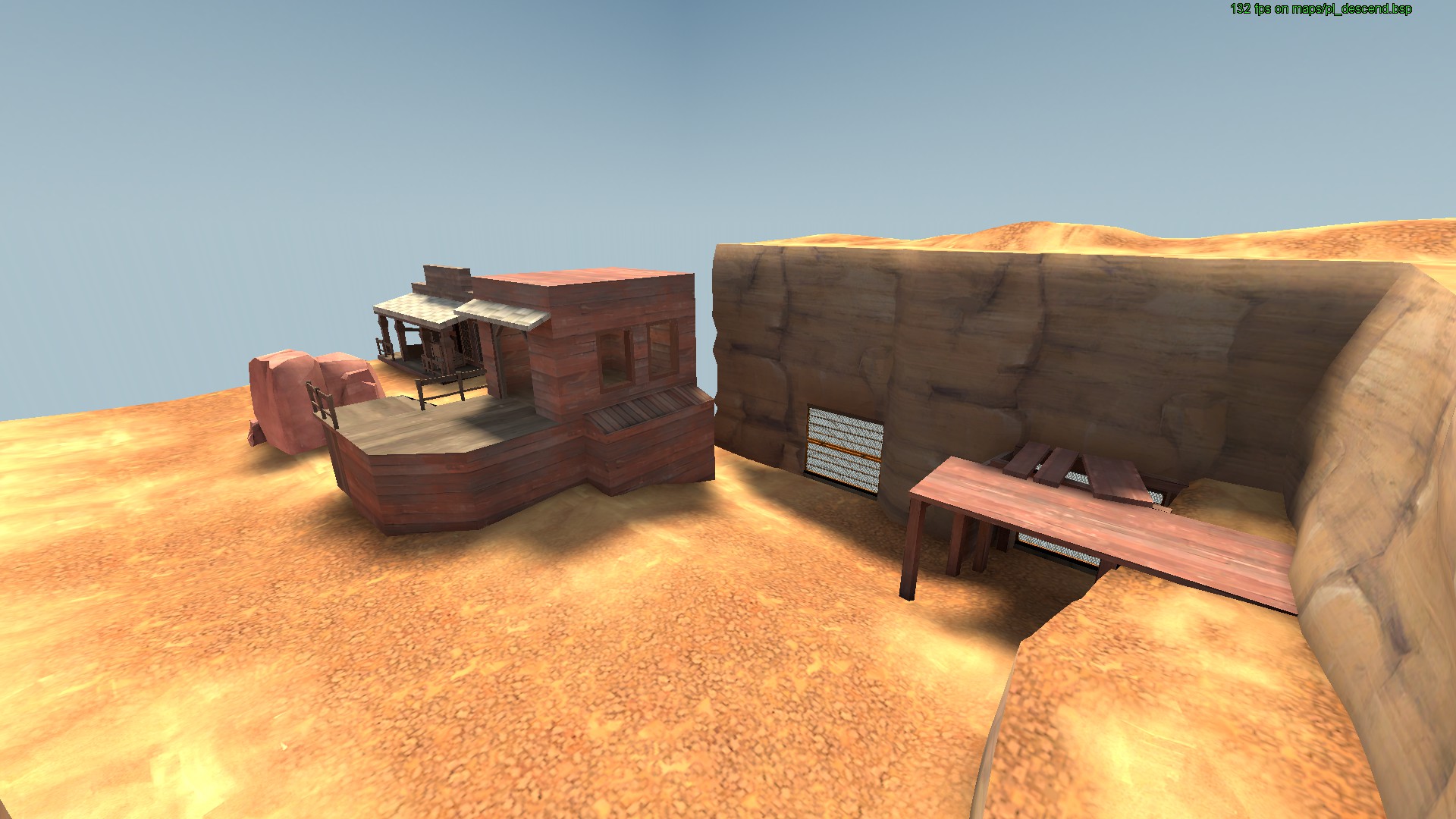
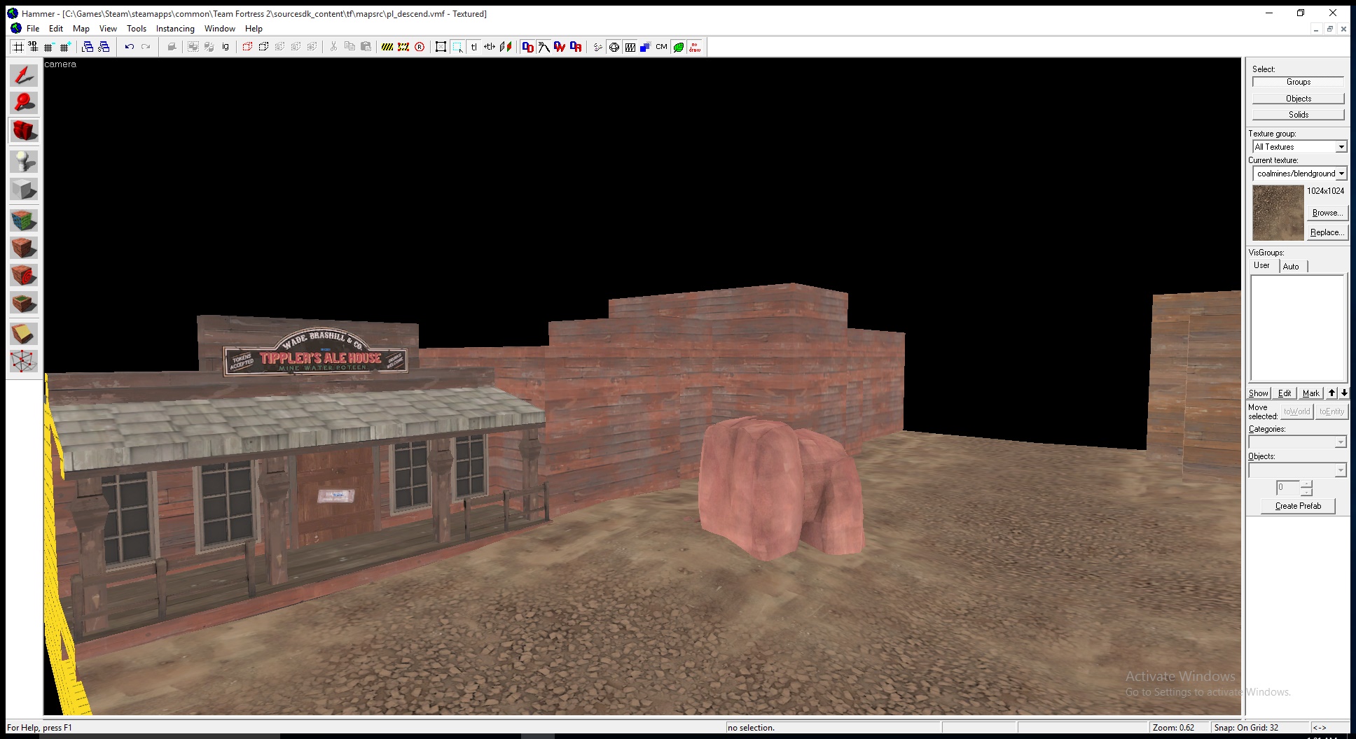
Also, on topic: rebuilding my 72-hr map as a full project, Western style!
Lampenpam
aa
- Mar 23, 2013
- 1,013
- 347
Caverns, no matter how big, usually make me feel like I can't rocket jump. Its usually better to have an open ceiling to tell the player that the height boundary is higher.
There are indoor/cave maps in which you can rocket jump easily plus you can exactly see where you would hit your head unlike when jumping under skyboxes
- Feb 15, 2011
- 333
- 344
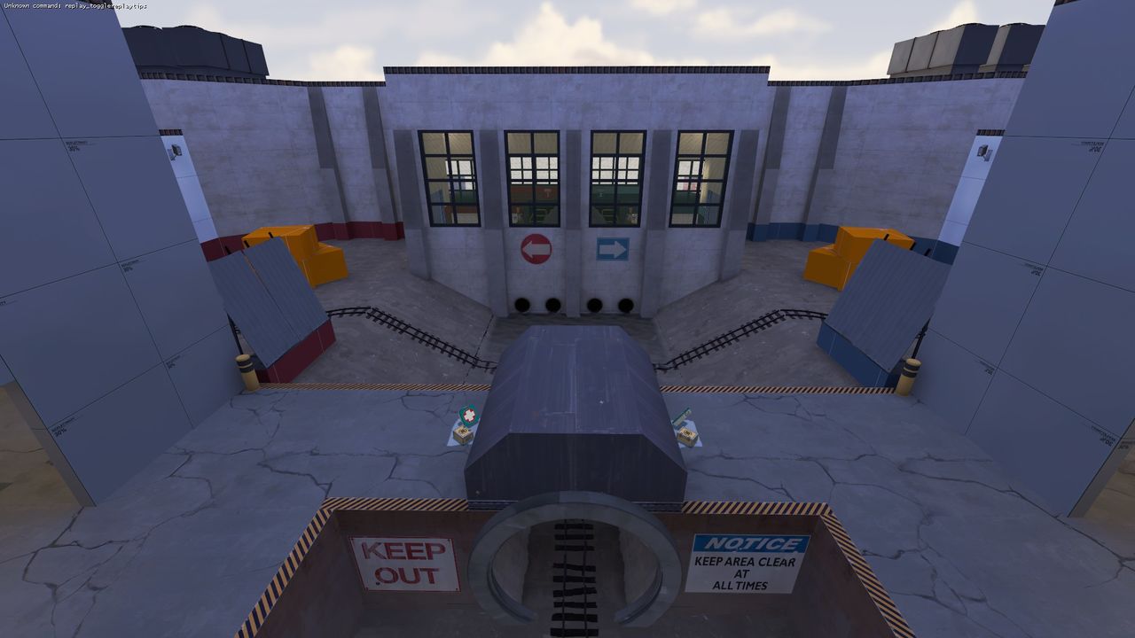
starting work on a new PLR map
The name plr_hightower is taken. Perhaps you could call it plr_manntower.
Some progress made for badmountain...
-snip-
Wow, that looks a lot different! Keep it up; I think badmountain has some interesting gameplay variety.
- Aug 6, 2014
- 1,056
- 536
The name plr_hightower is taken. Perhaps you could call it plr_manntower.

Blu decided to launch a bomb straight at a RED building. Not only does it happen quick, it's also easy, and the only person you lose was the one on the bomb cowboy style!
It was a dud.
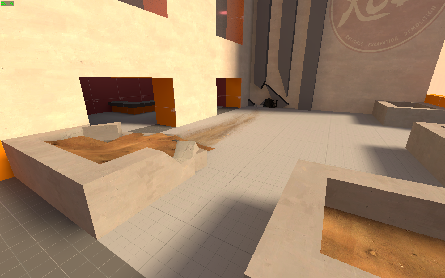
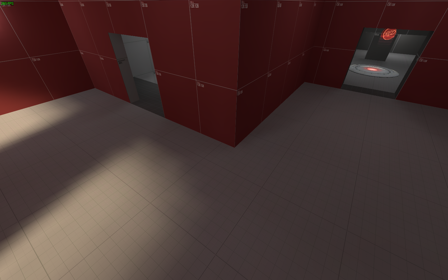
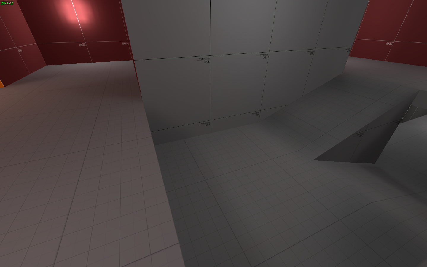
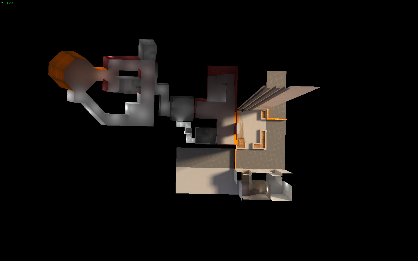
Blu now has to go set up base in a nearby building, and attack the Skyscraper, bottoms up!
One team is going up, the other one is going down. I'd say it's Hightime this battle starts.
It was a dud.


Blu now has to go set up base in a nearby building, and attack the Skyscraper, bottoms up!
One team is going up, the other one is going down. I'd say it's Hightime this battle starts.
Blu decided to launch a bomb straight at a RED building. Not only does it happen quick, it's also easy, and the only person you lose was the one on the bomb cowboy style!
-snip-
Ugh, now I've gotta watch Dr. Strangelove. :O
Looks like an interesting start, I think it's Hightime we see another map that really sells a story in its detailing, just keep it simple for a1.
- Sep 5, 2009
- 912
- 684
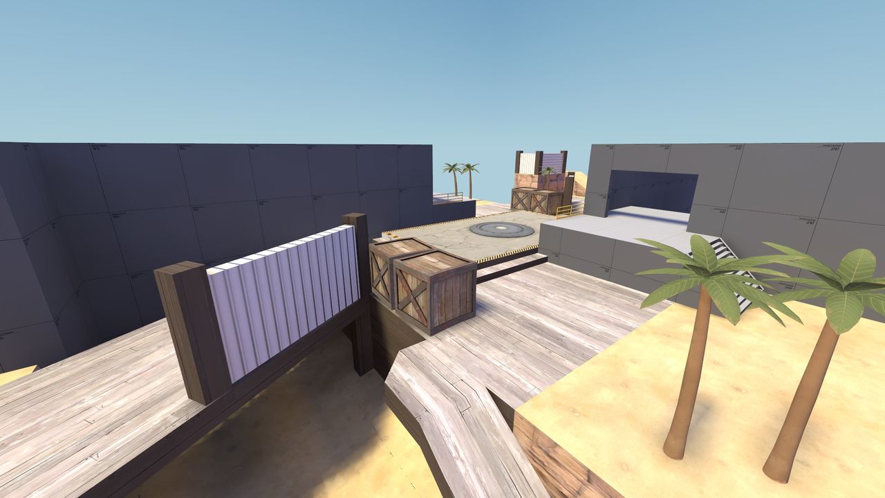
Caverns, yes / no? I was thinking of making them pretty big (enough space to rocket / sticky jump) with an open side to let light through.
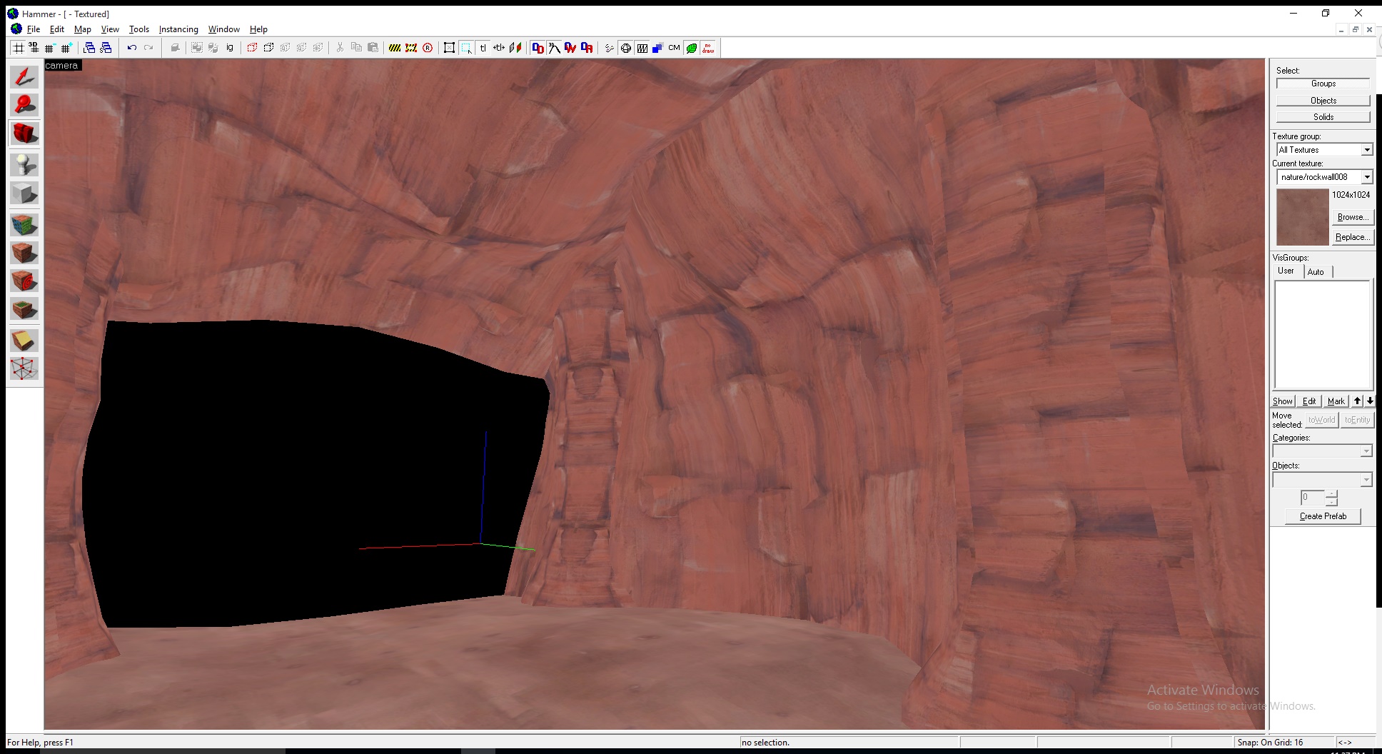
In regards to the texture you used, you accidently left
- Aug 6, 2014
- 1,056
- 536
Yes. What's with it?
(That was a rhetorical question)
It's done. I think. I'm gonna use it in a map, and if it's good, I'll put it up for download.
- Mar 6, 2013
- 1,044
- 627
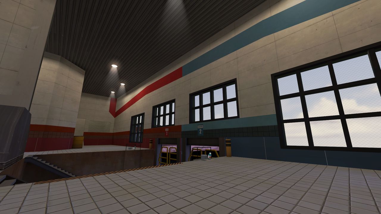
I really like the detailing so far, except for those funky stripes near the ceiling in this screenshot. I think either a straight colored band or a metal border would look better.
I really like the detailing so far, except for those funky stripes near the ceiling in this screenshot. I think either a straight colored band or a metal border would look better.
I'm thinking of adding a stripe section on the far wall from right to left, before it goes up to the ceiling. For now, it's a2, and the layout of the area might change before it's released.

