WiP in WiP, post your screenshots!

hutty

aa
Mar 30, 2014
545
445
That's also where I see the majority of my FPS impact regardless of the map. Even on the most detailed maps I'm not going under 180 unless I get a teamfight going.

Snowplow is a special case, I went onto it alone and was still having below average framerates. I popped up the budget window and it showed a rather large strain coming from particles. I popped over to cp_coldfront to see if it was a snow thing. Its not, coldfront is fine fps wise.

Either snowplow has different (more expensive) snow, or its non-snow particles (the sparks from the train?/smoke from the skybox) that slow things down.
 
T

The Asylum

also, ill just leave this here

3Kubgvc.png
 
Nov 2, 2010
355
1,048
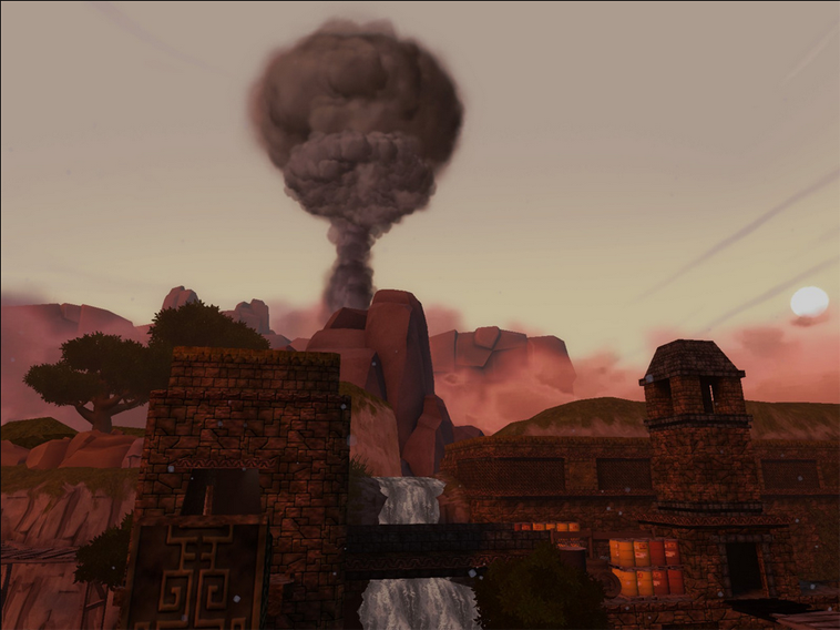
Because it's dreary and depressing.

Standin uses dark and moody colours contrasted with strong ones around the control points and you lot don't complain about that. I don't see anyone berating koth_Stark for looking dreary and depressing. It's part of its style.
 
Apr 14, 2013
663
343
Attempting to make a new TF2 theme with my non-existent art skills. Every texture in the picture was either made by me or edited from a Valve texture with the exception of the ground, the cliff and the Casali sign.

ab95768cb5.jpg


What do you guys reckon? Can you see a map looking kind of like this?

I actually like it! But as said, it could use more color. Maybe you should make the red parts more red. also, I suggest going back from the red/black hazard stripes, to the standard yellow/black ones. They look better IMO and will also add more color to your map.

And do I see my custom metal texture used? :D

EDIT: and I also want to say in response to Tyler and Berry that a new theme doesn't have to be new. It can be a different approach to an existing theme.
 
Last edited:

Vincent

&#128296 Grandmaster Lizard Wizard Jedi &#128296
aa
Sep 5, 2009
912
684
I think starting with the lighting could be a big step towards washing away the dreariness of it. Right now it's just a flat grey with grey clouds.

Change the skybox to one with more clouds / blue sky and up the environment lighting a little, see what that does.
 

Vincent

&#128296 Grandmaster Lizard Wizard Jedi &#128296
aa
Sep 5, 2009
912
684
3BwTrNA.jpg


Decided to withdraw my contest submission and work on it as a regular project. Rebuilding it from the ground up. Going to be detailing the spawns for practice.
 
Last edited:

Berry

resident homo
aa
Dec 27, 2012
1,056
1,898
Standin uses dark and moody colours contrasted with strong ones around the control points and you lot don't complain about that. I don't see anyone berating koth_Stark for looking dreary and depressing. It's part of its style.

Every single time we test either stage of Tornadoom, at least one person complains about it being "moody" or "depressing" as you say (and I quote from in-game, not just from you). I'm not sure what the problem is with maps that are intended to look like that? I did since tone the colours up a bit however (it was very dark originally)
 
Nov 2, 2010
355
1,048
Every single time we test either stage of Tornadoom, at least one person complains about it being "moody" or "depressing" as you say (and I quote from in-game, not just from you). I'm not sure what the problem is with maps that are intended to look like that? I did since tone the colours up a bit however (it was very dark originally)

I think the dark and moody look is a breath of fresh air from bright, oversaturated maps. But of course, I'm wrong about everything.
 

Muddy

Muddy
aa
Sep 5, 2014
2,578
4,596
I think the dark and moody look is a breath of fresh air from bright, oversaturated maps. But of course, I'm wrong about everything.

Bear in mind TF2's art style though. It's cartoony and exaggerated, and as a result it naturally lends itself to a more vibrant and colourful look, so a dark and gritty colour pallet just won't suit it as well.

Even maps with overcast skies have some colour in their cheeks. Look at Thunder Mountain for instance. Look at all that colour!
 
Last edited:

Zed

Certified Most Crunk™
aa
Aug 7, 2014
1,241
1,025
Nightfall and Standin have plenty of colour too.