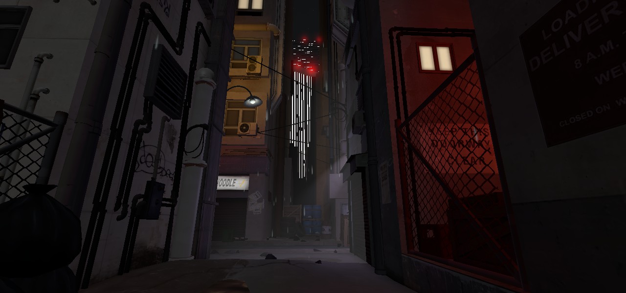
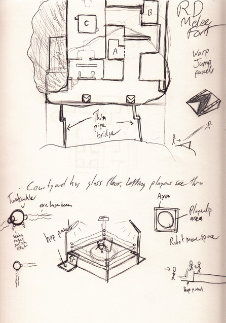
These arn't 100% yet, but i'm done for the night and its progress-share time.
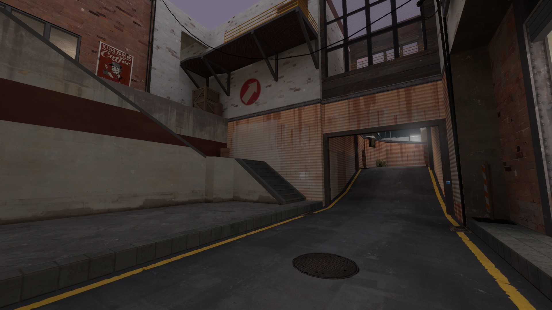
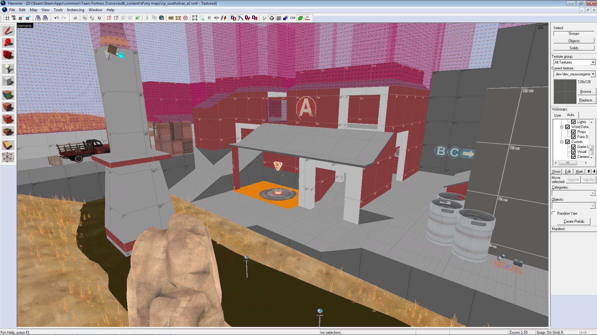
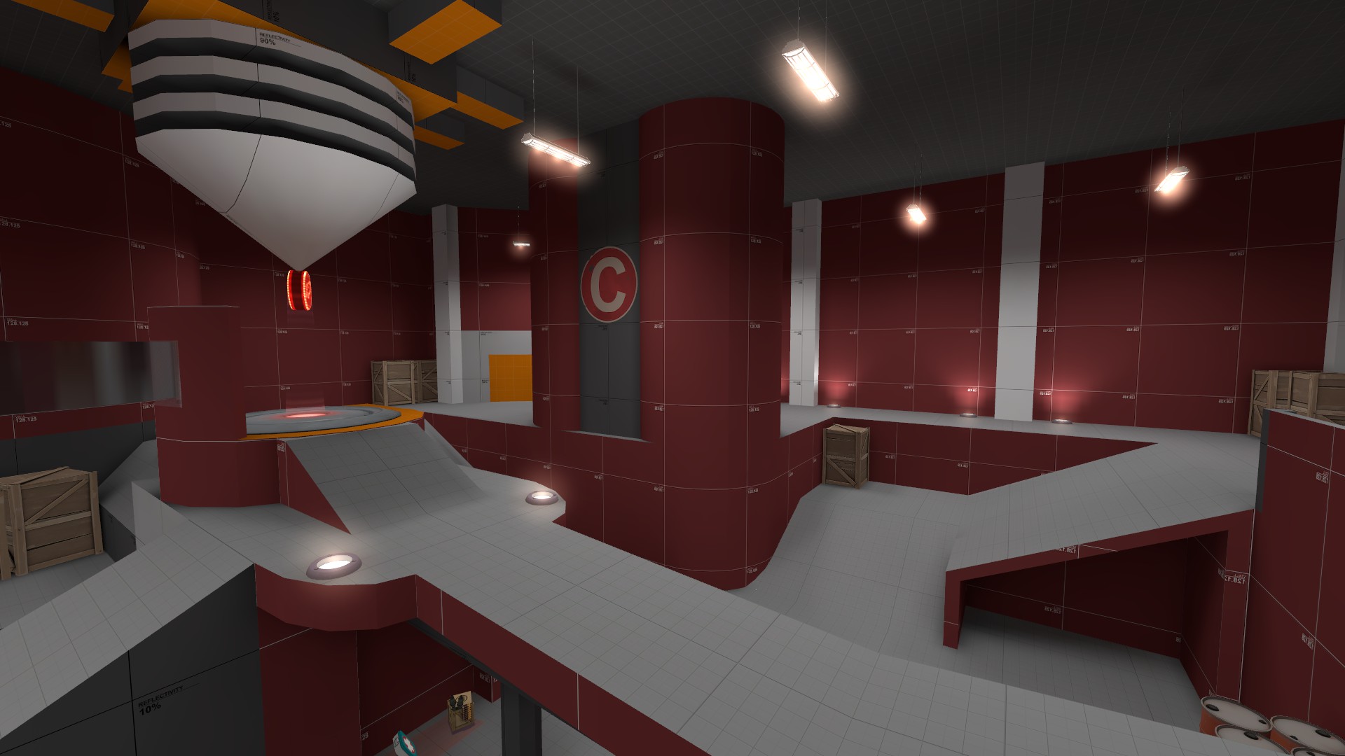
Orange metal wins the prize for texture that has the widest looks hideous in hammer to glorious in engine ratio.
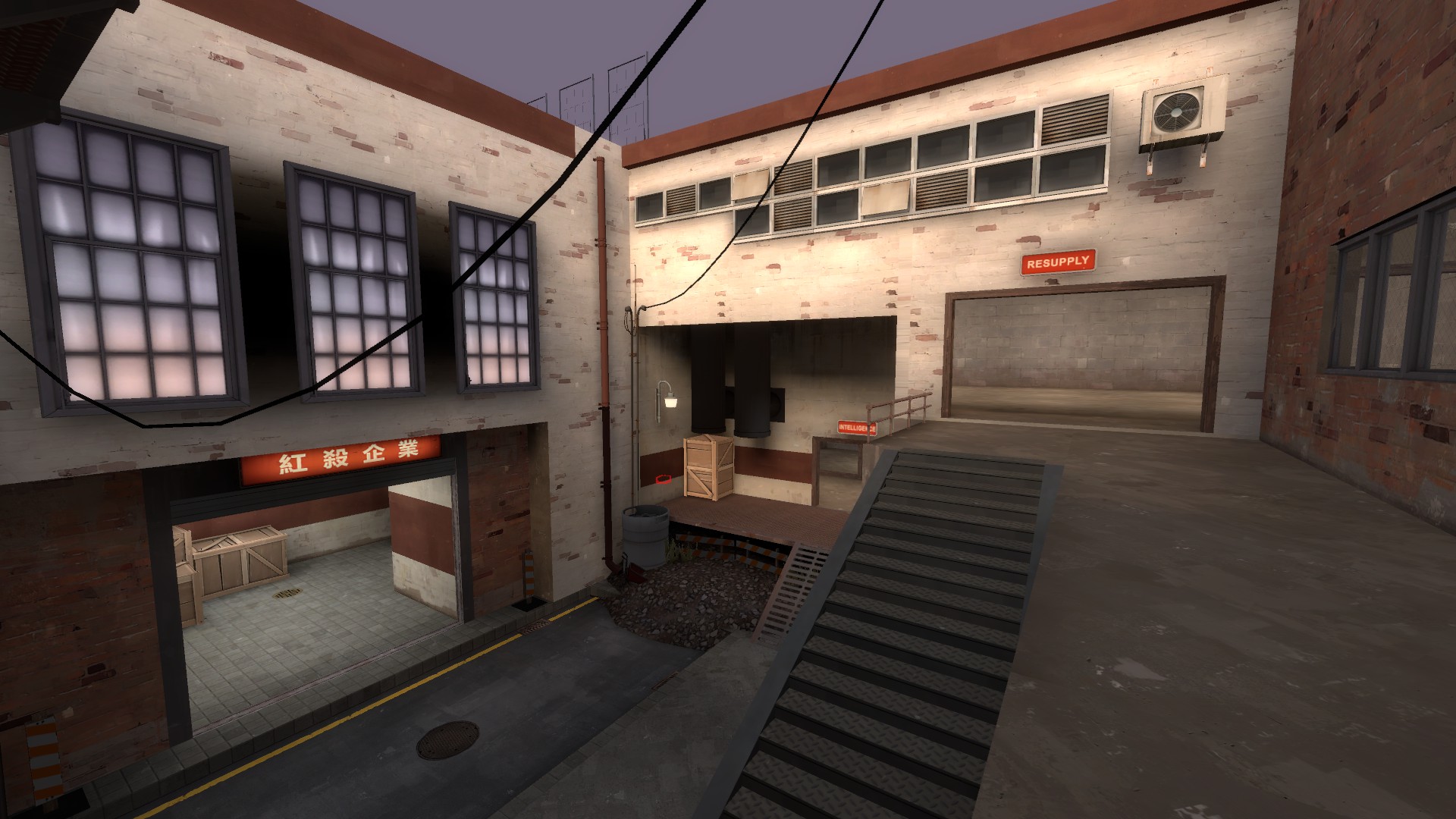
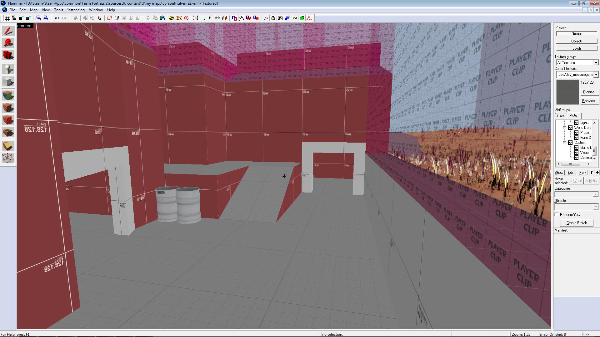
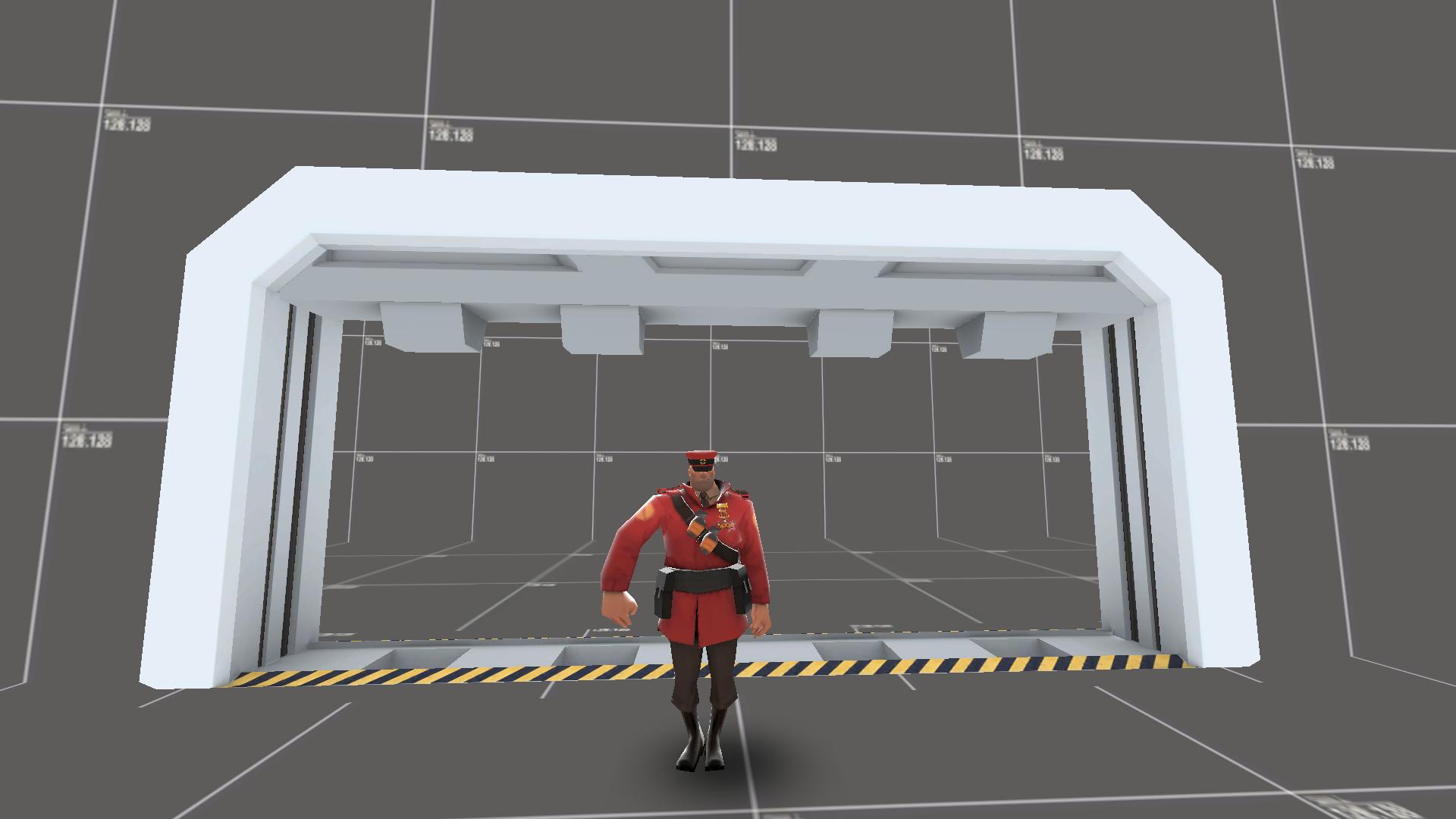
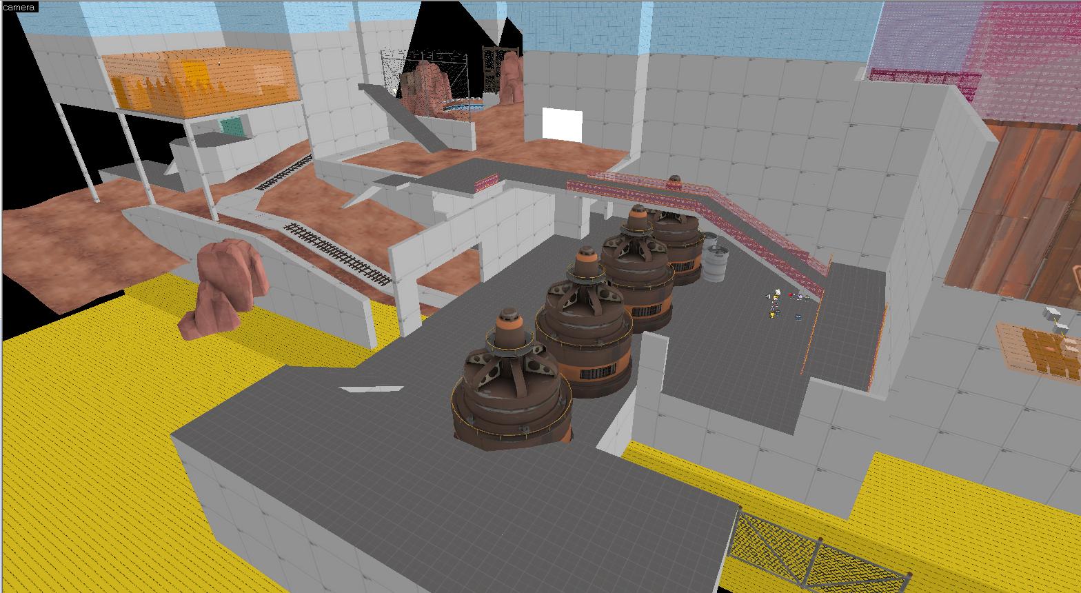
The respawn room has been relocated so players exit moving in the direction towards mid. (I still need to fix up prop shadows and general lighting in this area :/ )
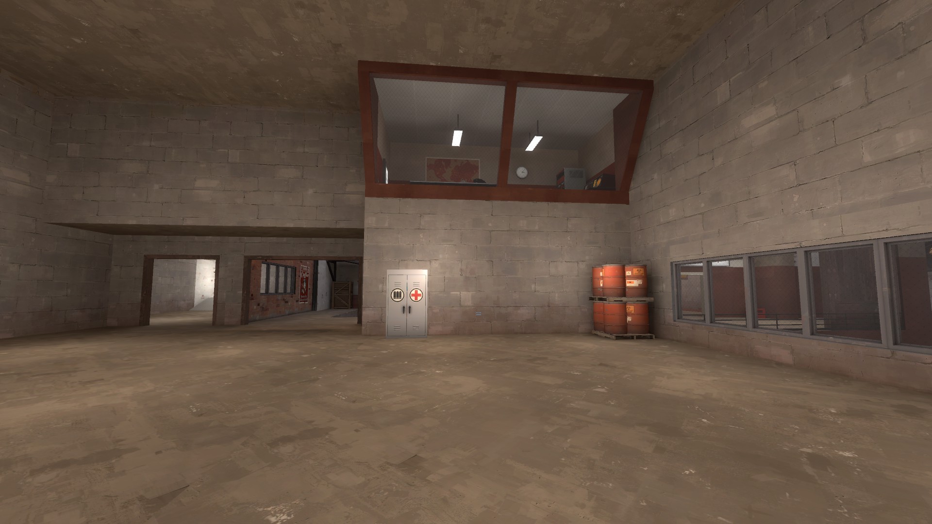
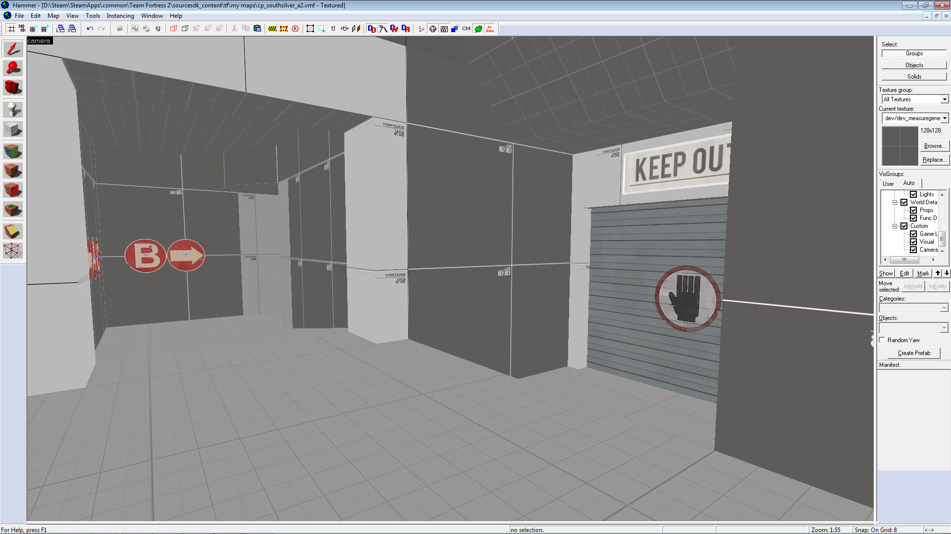
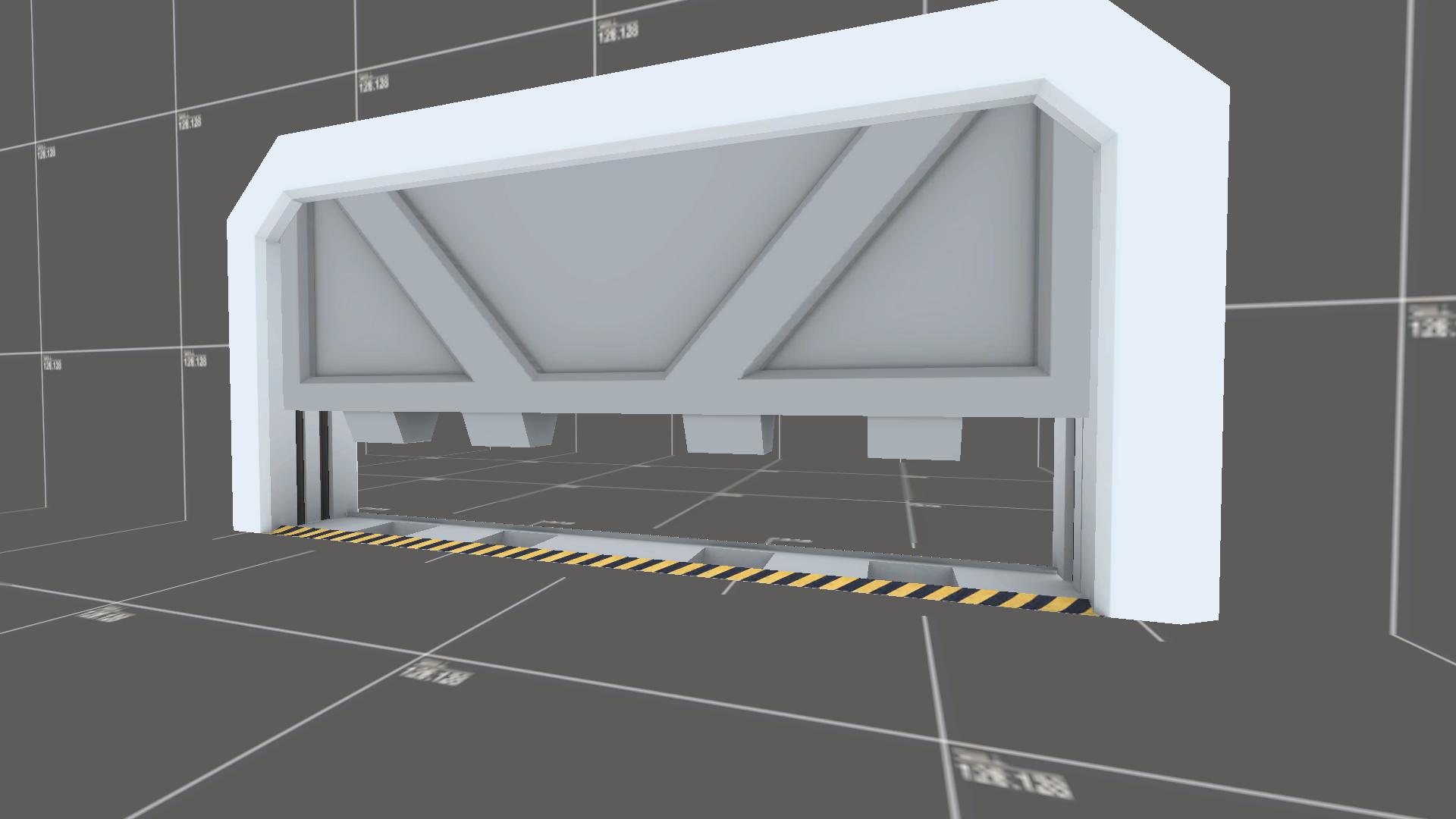
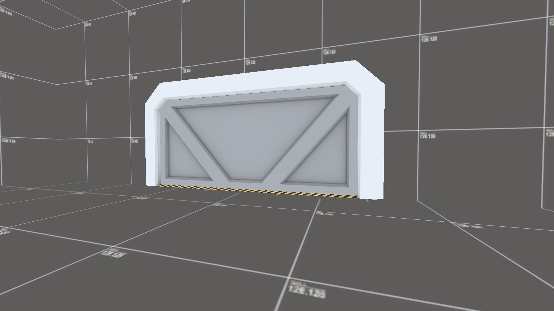
The new spawn room. A little bare for decor at the moment. The big exit will exit you facing mid, the smaller exit has not changed, but has a safety hallway leading to it. There is also now a window overlooking the intel room. (which also happened to knock off one of the manco overlays)

Orange metal wins the prize for texture that has the widest looks hideous in hammer to glorious in engine ratio.

The respawn room has been relocated so players exit moving in the direction towards mid. (I still need to fix up prop shadows and general lighting in this area :/ )

The new spawn room. A little bare for decor at the moment. The big exit will exit you facing mid, the smaller exit has not changed, but has a safety hallway leading to it. There is also now a window overlooking the intel room. (which also happened to knock off one of the manco overlays)


