WiP in WiP, post your screenshots!

Fruity Snacks

Creator of blackholes & memes. Destroyer of forums
aa
Sep 5, 2010
6,394
5,573
And again we see tf2 map veterans assuming that flat=bad. You people like to jump to conclusions a lot and are great at talking out of your ass.

Flat's bad because flat is boring. When you have a map that is literally just flat open yards, thats boring.

Granary is 'flat' but isn't bad because it actually does 'flat' well by adding minor height variations and well placed props.
 

puxorb

L69: Emoticon
aa
Dec 15, 2013
533
802
Well then look at the screenshot, I see raised gameplay areas. (or rather areas that might be raised, its hard to tell)
I think if you try hard enough you can make a flat map really interesting, like cp_granary.

But I'm sorry, I was in a terrible mood and it pissed me off.
 

Bull

L4: Comfortable Member
Aug 30, 2011
193
144
Are you talking about Mannieval? because that thing is stupendously flat as well, and anyone complaining it's too vertical is definitely trying to say something else but failing to find the right words.

I was talking about my last payload map, PL_city ;)

mannieval is bad. sorry.

Hey, that's just your opinion man. No biggie


Glad you're one of the few that seemed to like Mannieval a bit. Thanks for the feedback. :)

About the payload map: People thought I made all the battlements / snipe areas too high, and I agree. I put that map on a hold to try some stuff with new maps.

EDIT: Started with some careful height differences:

96e91f56fb.jpg
 
Last edited:
Oct 6, 2008
1,965
450
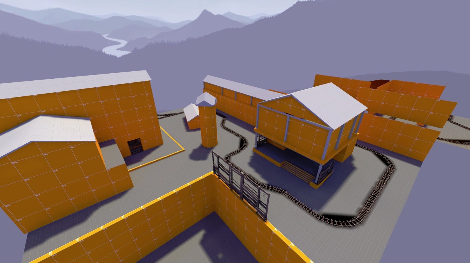
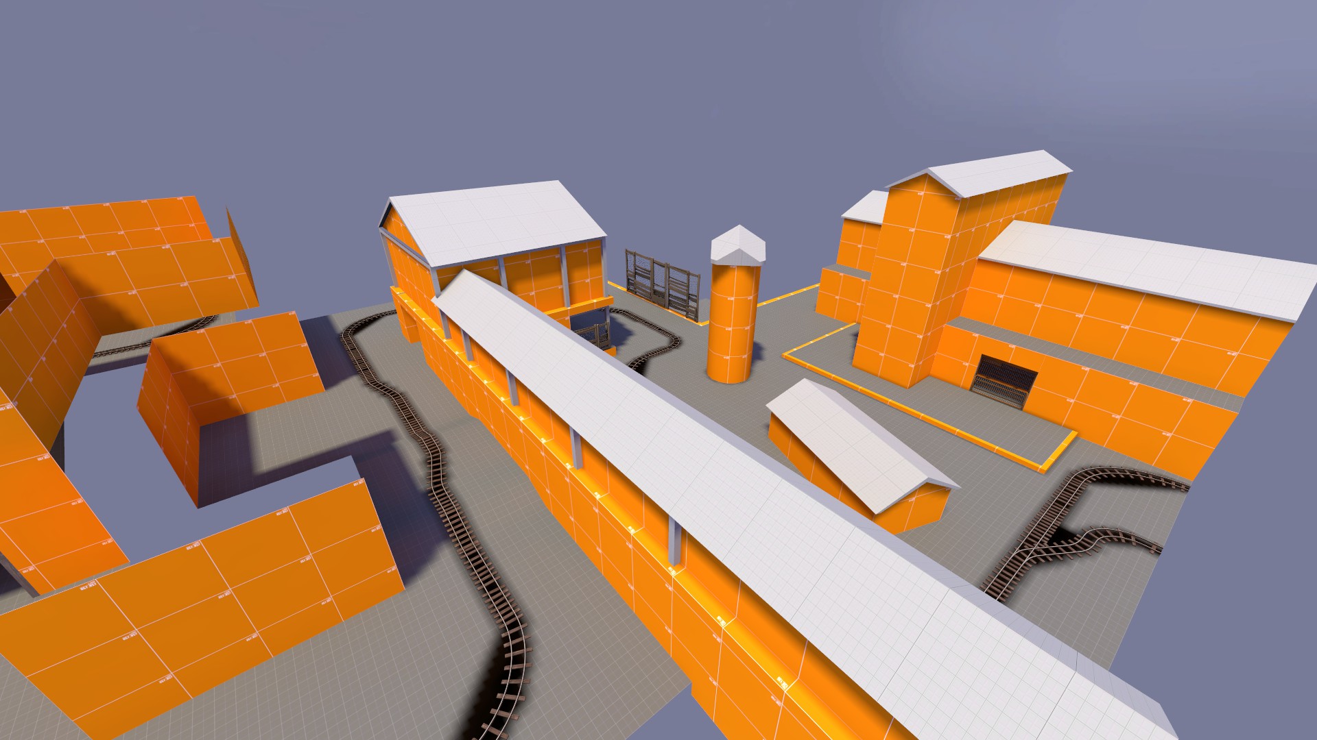
Got started on my new PL map; to the left there's the BLU base, track starts right in front

60TpsUJ.jpg


qTcZxc5.jpg


Hey - for a map that's in early development stage - I like it.
 

Fruity Snacks

Creator of blackholes & memes. Destroyer of forums
aa
Sep 5, 2010
6,394
5,573
Well then look at the screenshot, I see raised gameplay areas. (or rather areas that might be raised, its hard to tell)
I think if you try hard enough you can make a flat map really interesting, like cp_granary.

But I'm sorry, I was in a terrible mood and it pissed me off.

I did look at the screenshots, the map just looks long, flat, too open and dull gameplay wise. It's long corridors with some (but not always) stuff to block sightlines. Sure, there's a couple raised gameplay areas but they don't look like the contribute or impact gameplay that much. It's not exciting, and it's not a 'veteran' thing to complain about flat and open. Usually if someone who's been mapping for 5+ years says something, they aren't just saying it because 'they want to,' they say it because there's a reason to say it.

Yes, you can make a flat map interesting like granary, but the ones in screenshot need a lot of work to get close. It's also alpha so there is plenty of time to fix things.
 

Bull

L4: Comfortable Member
Aug 30, 2011
193
144
Hey - for a map that's in early development stage - I like it.

Thanks! Appreciate it!

Yes, you can make a flat map interesting like granary, but the ones in screenshot need a lot of work to get close. It's also alpha so there is plenty of time to fix things.

It's indeed an alpha, and I see that it needs / needed some changes. I agree there, and I'm already busy changing it all up!

However, I think a bit more carefully constructive critisism from YM might've avoided this whole discussion; saying 'flaaaaaaaaaaat' without any tips to help me doesn't really come across as friendly, although I see what he meant.

Thanks for the ideas / feedback anyhoo guys.
 
Last edited:

UKCS-Alias

Mann vs Machine... or... Mapper vs Meta?
aa
Sep 8, 2008
1,264
817
Yes, you can make a flat map interesting like granary, but the ones in screenshot need a lot of work to get close. It's also alpha so there is plenty of time to fix things.
In granary the height variety isnt there many times. but when its there it has a major influence. Thats why it works.
And note, on granary there is still 2 height levels at any combat area (the control points). Thats where it matters and thats why it is there. Well has the same system. its mostly flat.
Its also why turbine is popular. its again flat with just 2 height levels (and 3 in the middle - which granary also has there)

Flat ground in a map has a feature many forget. Flat combat removes any height benefits and allow certain classes to peak better. A heavy for example has a hard time shooting someone from above. And from above a soldier can aim more accurate. A flat ground removes that, and i think its the same reason why such maps are popular in comp. Its a static situation for combat which you can put allmost everywhere and exists in allmost every map.

Flat maps for that reason shouldnt be instantly turned down. Its a skill to master.

However, a straight sightline is often counter productive to flat maps as it boosts 1 class specificly: sniper. And since tf2 has damage falloff anything promoting a sniper is a bad thing to do. Obviously, fully stopping snipers is bad aswel, but if you force them to shoot at a vertical angle the headshots become harder to perform. Its why on 2fort most snipers ignore the bridge area, it is already too hard to perform for most snipers especialy when there is also flat ground combat between snipers.
 

wareya

L420: High Member
Jun 17, 2012
493
191
i have more fun on mostly-flat maps than maps that spam height variation with no design sensibility.
 

Fruity Snacks

Creator of blackholes & memes. Destroyer of forums
aa
Sep 5, 2010
6,394
5,573
However, I think a bit more carefully constructive critisism from YM might've avoided this whole discussion; saying 'flaaaaaaaaaaat' without any tips to help me doesn't really come across as friendly, although I see what he meant.

Oh yea, totally.
 

wareya

L420: High Member
Jun 17, 2012
493
191
i'm interested in the way the twists and turns are set up in this map, will you post a download at some point? <too lazy to check anywhere>
 

Bull

L4: Comfortable Member
Aug 30, 2011
193
144
i'm interested in the way the twists and turns are set up in this map, will you post a download at some point? <too lazy to check anywhere>

Oh thanks! I'm still working on the very first layout stuff, only started yesterday so a first download might be a couple 'o days away. I'll throw another post on this thread every once in a while with updates!
 

xzzy

aa
Jan 30, 2010
815
531
However, a straight sightline is often counter productive to flat maps as it boosts 1 class specificly: sniper. And since tf2 has damage falloff anything promoting a sniper is a bad thing to do. Obviously, fully stopping snipers is bad aswel, but if you force them to shoot at a vertical angle the headshots become harder to perform. Its why on 2fort most snipers ignore the bridge area, it is already too hard to perform for most snipers especialy when there is also flat ground combat between snipers.

Fishbus once said in a post somewhere on the internet that every TF2 map needs spots where each class can feel powerful. Not overpowered, but able to use the strengths of a class to its fullest capability.

It's a pretty good rule of thumb to keep in mind when blocking out maps.

It's also a good explanation of why 2fort is a horrible map because some classes are powerful everywhere.
 

Vel0city

func_fish
aa
Dec 6, 2014
1,947
1,589
Flat's bad?

Granary is as flat as a map can be yet it isn't at all boring. But then again it has buildings and side routes that go up on the Y-axis.
 

Moonfixer

L5: Dapper Member
Aug 23, 2014
229
81
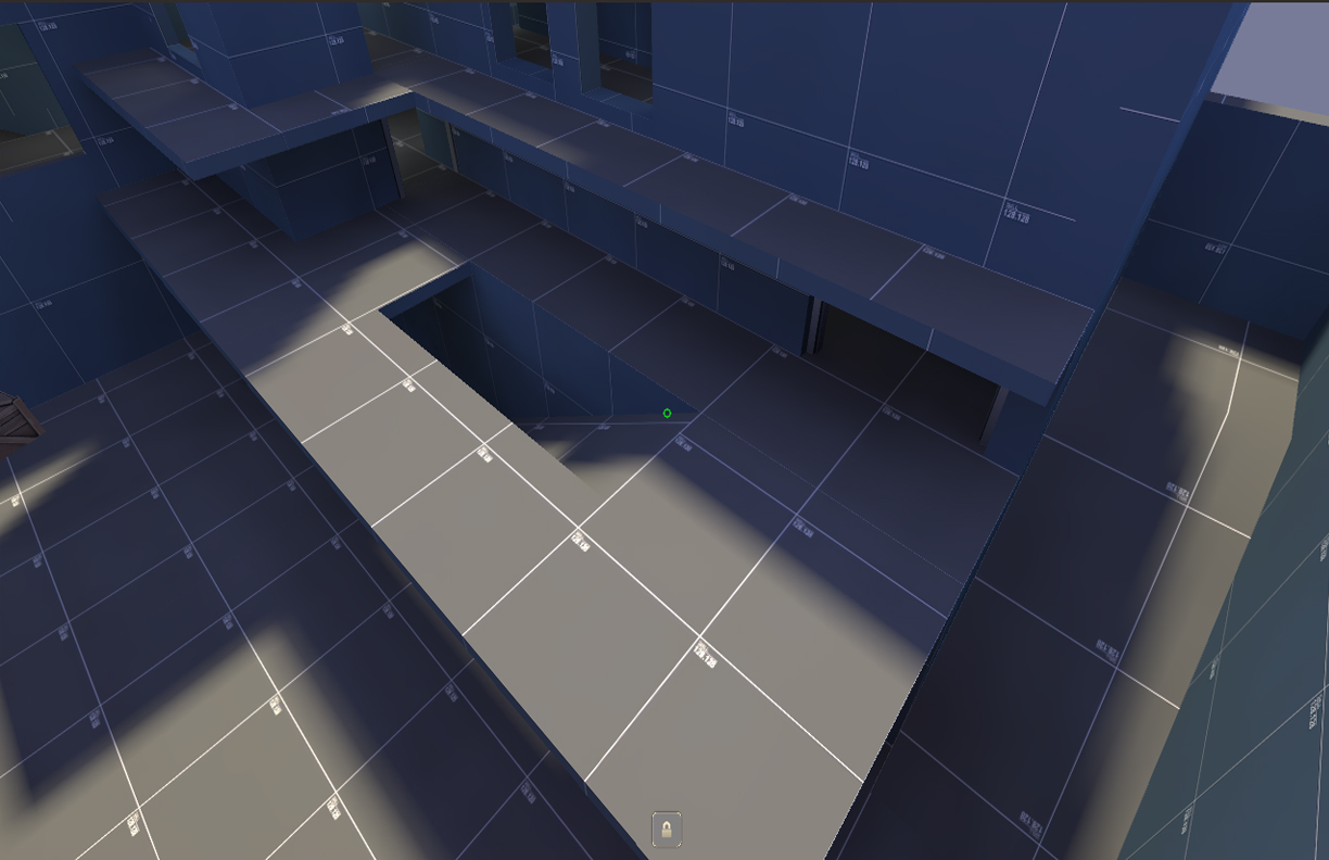
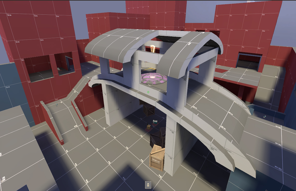
A couple screen shots of koth_outskirts's updated mid, still working on a few things though.

wR0BEjh.jpg

p4pKldf.jpg
 
Oct 6, 2008
1,965
450

xzzy

aa
Jan 30, 2010
815
531
I like how the standard of control points these days is to slap a roof on top with a couple holes in it.

I'm not saying it's a bad choice, it opens up a lot of play options and fits well in TF2. But it is turning into a bit of a cliche. :)

It'd interesting how that stuff builds up steam over time. In 2007 every CP was wide open with a few vertical components around the edges (aka granary). My in-brain timeline of maps is a bit unreliable but somewhere around the time Harvest or Coldfront hit the game, the evolution started. Now even Valve does it.
 

Moonfixer

L5: Dapper Member
Aug 23, 2014
229
81
I like how the standard of control points these days is to slap a roof on top with a couple holes in it.

I'm not saying it's a bad choice, it opens up a lot of play options and fits well in TF2. But it is turning into a bit of a cliche. :)

It'd interesting how that stuff builds up steam over time. In 2007 every CP was wide open with a few vertical components around the edges (aka granary). My in-brain timeline of maps is a bit unreliable but somewhere around the time Harvest or Coldfront hit the game, the evolution started. Now even Valve does it.

That's a fair point. That's one of the reasons I decided to make the bridge an arch to change things up a bit. I'm looking forward to seeing how this works gameplay wise.
 

wareya

L420: High Member
Jun 17, 2012
493
191
ᴄʜᴀʟʟᴇɴɢᴇ ᴛʜᴇ ᴜɴʙᴇᴀᴛᴀʙʟᴇ
ʙᴇᴄᴏᴍᴇ ᴛʜᴇ ᴜɴᴋɴᴏᴡᴀʙʟᴇ
ᴍᴀᴋᴇ ᴀ ᴍᴀᴘ ᴡɪᴛʜ ᴀɴ ᴜɴʜᴏᴜsᴇᴅ ʙʀɪᴅɢᴇ ᴄᴀᴘ ᴘᴏɪɴᴛ
 
Last edited: