WiP in WiP, post your screenshots!

SSX

aa
Feb 2, 2014
392
411
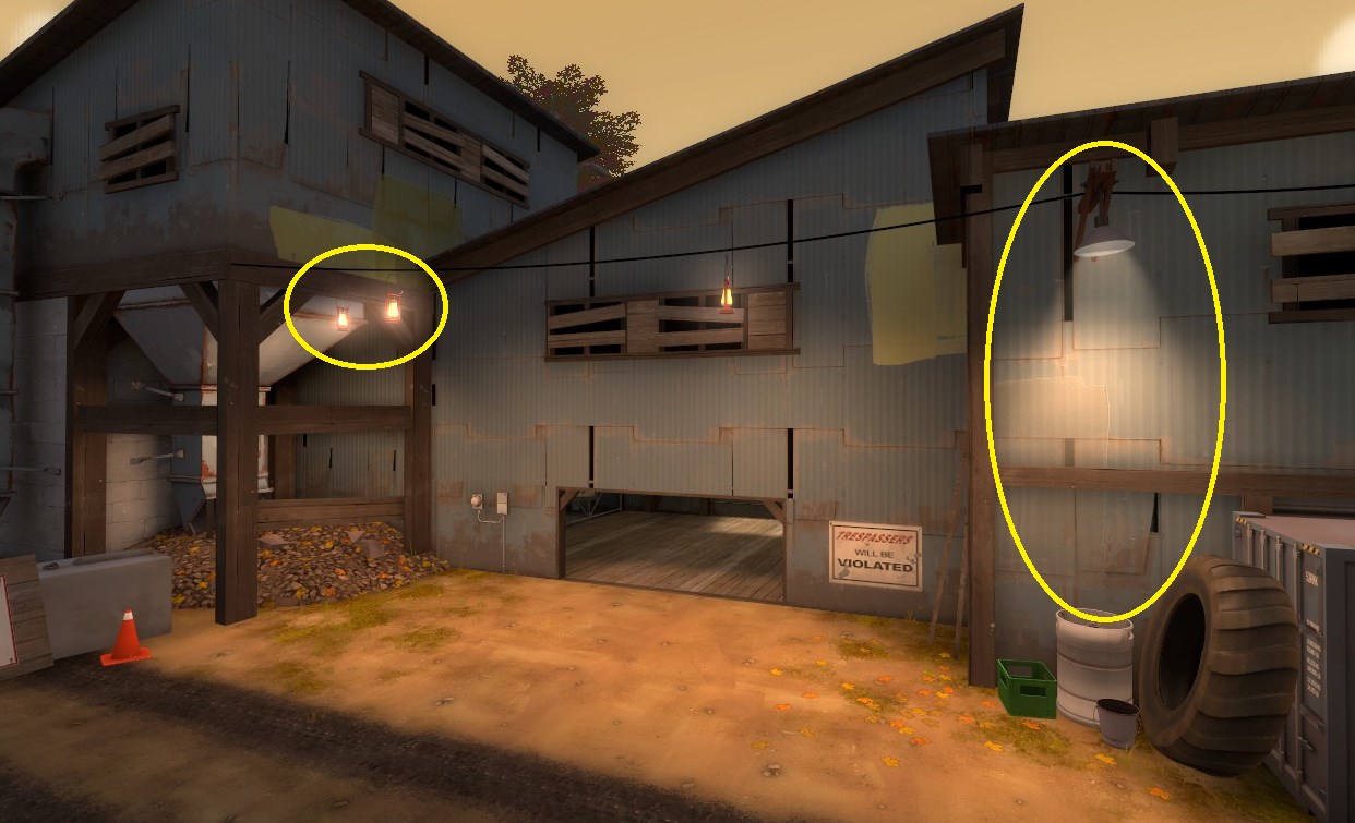
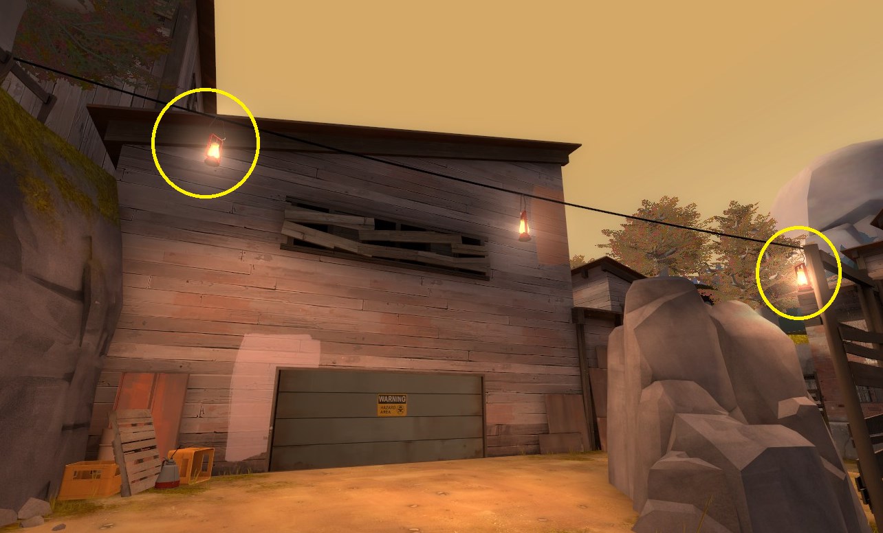
Been messing around with the lighting on Maple Ridge:

wT3BvH6.jpg

YbJx5Yr.jpg

xEvN8NH.jpg

dBtJwM7.jpg

Uuuuuugh...sorry, need to go change my pants.
 
Mar 23, 2010
1,874
1,699
thats like the grossest way to compliment a map, dude
 

SSX

aa
Feb 2, 2014
392
411
thats like the grossest way to compliment a map, dude
So we allow ReviewTechUSA to say that about Steam and Gabe, but I can't say something looks nice by exaggerating it in the same way? XD
 

Fruity Snacks

Creator of blackholes & memes. Destroyer of forums
aa
Sep 5, 2010
6,394
5,573
Might be just me, but I feel like those boards that are boarding up the windows just feel a little too forced. Basically every window is boarded up and it looks really really weird. You would think that a lot of the boards would've fallen off or have been broken.

Move some of the board down onto the ground, make it looks like they fell off. Put in some broken glass on windows that aren't boarded up. Gives some depth to the windows/walls and gives some nice aesthetics to the ground (as weird as that sounds)
 

xzzy

aa
Jan 30, 2010
815
531
The lighting does look pretty amazing.. but I have on critique in that first screenshot. To me it feels like you got too many hotspots going on, like with that line of light bulbs under the awning. Be aware that players will have their eyes drawn to those spots, so there's two points to consider: it could be visual clutter that distracts player from important information, or it can be used to help players detect areas where threats will come from.

It might be fine during play, it looks like the screenshot is taken from an angle players won't normally be using. But when you're running around the map keep it in mind.
 

Seba

DR. BIG FUCKER, PHD
aa
Jun 9, 2009
2,364
2,728
sbvuUhr.jpg

GgzLJTD.jpg

ZSTgnWW.jpg

CNjh7m5.jpg


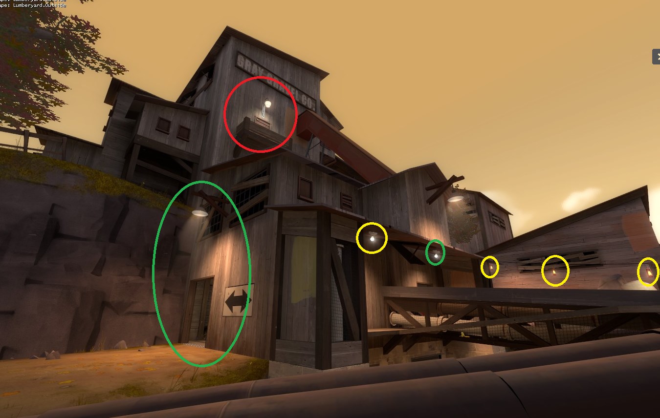
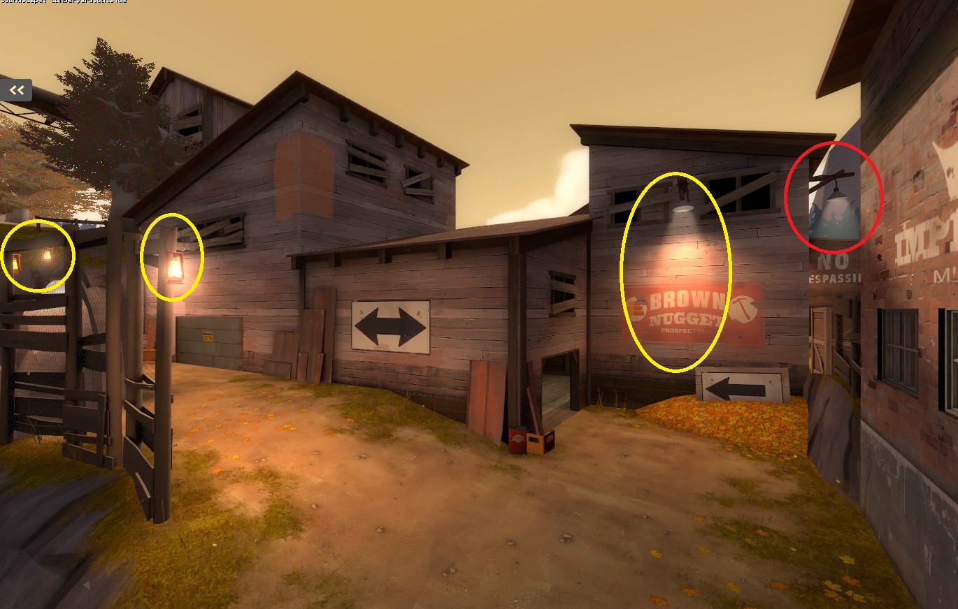
Remove the red ones, tone down the yellow ones, good job on the green ones. Basically don't use bright lights where you don't want the players to look (out of bounds areas, unimportant corners, places not where people will be coming from).

Oh, and the small green one in the first picture is supposed to be yellow.
 

Chronicius

L1: Registered
Jun 11, 2014
9
7
Quite an eyepleaser

(i have been revising my choice of tongue, as to convey myself in a manner more convenient for people of this age)
 

TheoF114

L1: Registered
Sep 10, 2013
33
234
Wow, Theo, great job detailing Maple Ridge. Been away for awhile, nice to come back to such a well done map! How long have you been mapping?

On and off for a few years but only really got into it properly when I joined the site around about the time of the detailing contest.

Thanks to everyone for the feedback as well.
 

UKCS-Alias

Mann vs Machine... or... Mapper vs Meta?
aa
Sep 8, 2008
1,264
817
Especialy on that first screen i think some arrows there are needed similar to how badlands has them on the fence. But that could just be the angle of the screenshot especialy since on screen 2 it looks already good and clear. I might be due to that door behind the rock being hidden on screen 1.

On screen 3 i see you use those lit windows. Those should be dark windows instead. Only use the lit windows for darker maps. Its how light works. If the outside is brighter than the inside then you wont see the inside area being lit from the outside. It would look darker. It also attracts too much attention to that since light is an indication of activity.

On screen 3 the roof on the left looks thin (the one with that lit window). I would make that one go a bit deeper into the background to at least make it look like that that area isnt just used for that escalator and people are actualy able to do something with it. This looks especialy odd because both sides are thin.
 

puxorb

L69: Emoticon
aa
Dec 15, 2013
533
802
Also, what is leading into that hopper? (Screenshot 3) I don't see any trapdoors, elevators, or conveyor belts that empty into the top of it. Is it there to catch rain? It would make sense if it was there to catch some sort of gravel since this is a glass factory and glass is made from certain stones and crystals melted down.
 

Fruity Snacks

Creator of blackholes & memes. Destroyer of forums
aa
Sep 5, 2010
6,394
5,573
If you were trying to suppor a giant rock ceiling, why a bucketload of tonnes, you wouldn't be putting support beams on top of buildngs. They would be vertical and anchored hard into concrete.

Angled trusses can then come out of the vertical ones. It sounds a liitle too ealistic, but you can smather in some tf2 wackiness with it.
 

Woozlez

L3: Member
Jul 28, 2010
129
287
If you were trying to suppor a giant rock ceiling, why a bucketload of tonnes, you wouldn't be putting support beams on top of buildngs. They would be vertical and anchored hard into concrete.

Angled trusses can then come out of the vertical ones. It sounds a liitle too ealistic, but you can smather in some tf2 wackiness with it.

It's only the trusses in the gameplay area that are like this on top of buildings, the rest of those that are painted in the skybox are anchored into concrete!

Although I think I'll be removing the truss on the tallest building and be adding two to the area with the two coal piles, as more of a visual landmark, and those will be anchored into concrete