WiP in WiP, post your screenshots!

Fruity Snacks

Creator of blackholes & memes. Destroyer of forums
aa
Sep 5, 2010
6,394
5,573
I'm leaving feedback based on my knowledge of the subject. If someone made a house that doesn't look like it would be structurally sound for the environment it's in, people would say something. If someone made anything that truely defied the laws of physics, people would call them out on it. It's standard practice. This is one of those instances.

I did that with your dish because it looks stupid. Scientific reasons or not, the dish is way too small and really looks silly in the map. The proportions of it actually detract from the aesthetics, in my opinion. If you took the time to make the pit that it is in, you surely could have taken the time to make the dish that entire size of the pit.

Yea, this community sometimes leaves crappy feedback, can be overly aggressive towards certain things and generally be dicks about said thing, but how much it bugs you is up to YOU, not us. If you can't handle it, it's your own fault, not the communities.


... I'm sorry for trying to provide some sort of knowledge on the subject. If you wanted to add a radio telescope to the map, you should've done better research on them.
 
Last edited:

RaVaGe

aa
Jun 23, 2010
733
1,210
I'm leaving feedback based on my knowledge of the subject. If someone made a house that doesn't look like it would be structurally sound for the environment it's in, people would say something. If someone made anything that truely defied the laws of physics, people would call them out on it. It's standard practice. This is one of those instances.

I did that with your dish because it looks stupid. Scientific reasons or not, the dish is way too small and really looks silly in the map. The proportions of it actually detract from the aesthetics, in my opinion. If you took the time to make the pit that it is in, you surely could have taken the time to make the dish that entire size of the pit.

Yea, this community sometimes leaves crappy feedback, can be overly aggressive towards certain things and generally be dicks about said thing, but how much it bugs you is up to YOU, not us. If you can't handle it, it's your own fault, not the communities.


... I'm sorry for trying to provide some sort of knowledge on the subject. If you wanted to add a radio telescope to the map, you should've done better research on them.

There's a tiny difference between a house and a radio telescope, even a dumb guy like me know that I have to put the roof on the top, and that's enough for me to say that it's a house.

The fact that something has a weird structure doesn't mean it's completly wrong, look at upward by example :

pl_upward.jpg


This structure is dumb as fuck, but nobody complain, it's just a concession between gameplay and aesthetics, the fact that you are bitching about something as nitpicking as the size of a dish is completly useless, yeah the dish is too small, yeah the mountain behind is too much near from the pit, but you know, you are in a level design forum, not at the NASA.

I said that the proportion of the map would have been screwed with a bigger dish, what don't you understand in this sentence ? Then if I listen to you, I should scrap 250 hours of works because the dish is stupid, thxbay.

We don't have the same vision of what level design is all about i'm afraid.

Also I get your point for the first time, and I took it as a good feedback and a good point of view, but the fact you are repeating yourself over and over don't make any sense to me.
 

xzzy

aa
Jan 30, 2010
815
531
The structure may be "dumb as fuck" but it fits the theme of the map. All of Upward looks like a mining operation that's about ready to fall apart and slide down the mountain. Everything in that screenshot fits in with that aesthetic.

Everything we see in TF2 is completely absurd, but for the most part the scale of things remains pretty realistic. While I'm not going to suggest that Hydro is a map that anyone should study in great detail, it is worth noting that that map does have a dish in it and it's big enough that both teams can fight inside it.

Cars are the proper scale, missiles are the proper scale, coffee brewers are the proper scale, shipping crates are the proper scale, and train cars are the proper scale. Basically you can build out any absurd scene you want in the game but if you want to do it right the scale of things should probably be appropriate.

I'm not making any commentary on your map, I haven't played on it and don't have an opinion on how you've chosen to detail it. It might be totally fine for your situation. But scale probably is something you should be thinking about and my assumption is that's why Frozen keeps bringing it up.
 

Fruity Snacks

Creator of blackholes & memes. Destroyer of forums
aa
Sep 5, 2010
6,394
5,573
I think it keeps getting repeated because of a couple things:

1) You said that having it small would keep with the proportion of the map. The issue is, it's too small and looks extremely disproportional to the rest of the map.

2) The reasons you gave for not changing it besides the proportional thing, makes you sound lazy. This bit of info is supported each time you respond back.

I'm not the only person to tell you that it looks too small, I know at least one other mentioned it in this thread, and many others would probably agree with it.

Your making a map that has a center point of a Radio Telescope, I presume based around the Arecebo Telescope in Puerto Rico. Sure, we're level designers. It's an art that will have different opinions. Unfortunately for you, I have completed courses on telescope construction, radio astronomy and radio observation, ontop of all the other astronomy courses I've taken. You can take that info as you wish.

Now, as for your example of weird architecture, that specific building is actually structurally sound. Yea, it looks silly, but it's not breaking any laws of engineering or science, that is a plausible structure. I'll stop giving you a hard time about the dish, when you give me a damn good reason besides "it screws with proportions" and you being lazy.
 

RaVaGe

aa
Jun 23, 2010
733
1,210
I think it keeps getting repeated because of a couple things:

1) You said that having it small would keep with the proportion of the map. The issue is, it's too small and looks extremely disproportional to the rest of the map.

2) The reasons you gave for not changing it besides the proportional thing, makes you sound lazy. This bit of info is supported each time you respond back.

I'm not the only person to tell you that it looks too small, I know at least one other mentioned it in this thread, and many others would probably agree with it.

Your making a map that has a center point of a Radio Telescope, I presume based around the Arecebo Telescope in Puerto Rico. Sure, we're level designers. It's an art that will have different opinions. Unfortunately for you, I have completed courses on telescope construction, radio astronomy and radio observation, ontop of all the other astronomy courses I've taken. You can take that info as you wish.

Now, as for your example of weird architecture, that specific building is actually structurally sound. Yea, it looks silly, but it's not breaking any laws of engineering or science, that is a plausible structure. I'll stop giving you a hard time about the dish, when you give me a damn good reason besides "it screws with proportions" and you being lazy.

Actually, i'm sorry, but in my eyes it's not a plausible structure, i'm sorry for you but I have completed courses on architecture, carpentry, and I know how to cut wood, A-M-A-Z-I-N-G.

I've made a lot of brush testing before asking heyo for the props, and maybe it looks weird on the screenshots, but in game, the proportion was the best in this state, so yeah I'm kinda lazy for asking him to change the props, and yeah i'm terribly lazy about changing all the cliff part behind the map.

But, the thing you don't seem to understand is if I make that dish too much large, it will simply looks bad, I tryed, it wasn't good. Like I said, it's a problem of proportion to the whole map, not only the dish part.

Anyway, I asked heyo to modify the scale of that dish, and we'll see how it looks.

Also for those who wonder, here's the first tests of that pit part, it has been extremely hard to have a bearable result :

2013-11-17_00001.jpg

2013-11-17_00003.jpg


2014-03-17_00009.jpg
 
Last edited:

Fruity Snacks

Creator of blackholes & memes. Destroyer of forums
aa
Sep 5, 2010
6,394
5,573
Actually, i'm sorry, but in my eyes it's not a plausible structure, i'm sorry for you but I have completed courses on architecture, carpentry, and I know how to cut wood, A-M-A-Z-I-N-G.

Dads an architect. When I had to go to work with him, I read his architecture books. This carried through and I still have an interest in architecture. I continue to look into it and studied it from afar. Carpentry, just experience I have with my dad when we were updating a home we moved into a while ago. I can actually cut wood too. (I made a small trebuchet as a kid).

I'd like to see how it gets scaled up and fits in with the map. While it might look weird for you, when you get a bunch of people saying that the scaling is off (which, since we've had this arguement initially, people have said that the scaling is too small, here and in chat), you need to reconsider.

EDIT: You've since posted new images of the bigger dish. It does look 100% better.
 

Spipper

Former cheese man Gorgonzola
aa
Feb 18, 2012
246
407
ZZYALPP.jpg


Also, I'm predicting we're getting alot of different versions of a very certain map:
TOjFrDR.jpg
 

Trotim

aa
Jul 14, 2009
1,195
1,045
Incompetent structures and impractical facades are fine, but things out of scale just look wrong. It's because we have lots of the former in real life too.

I agree the bigger dish looks better. That you spent a bunch of time on the displacements is your fault, you'll have to swallow it was a waste. (Copying pl_frontier's final point doesn't work in this case - there it's not a dish, it's hiding a big laser weapon)

To make it a bit more interesting or sell the incompetence part further you could put leaves or some puddle of rain on the bottom part of the dish. Then not only Frozen can laugh at how it wouldn't actually work
 

SSX

aa
Feb 2, 2014
392
411
cAVriHO.png


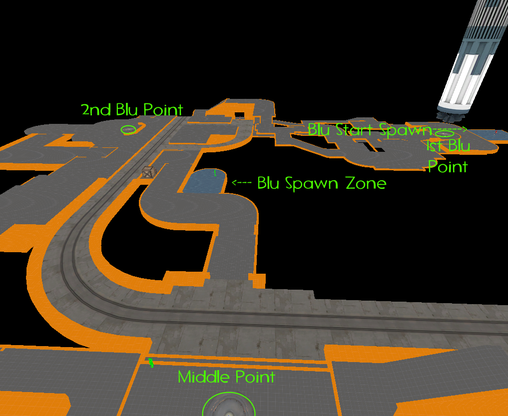
Super complex looking level layout go!

It's the same layout for the RED side as well.
 

Yacan1

D I G I T A L I N F L U E N C E R
aa
Nov 7, 2010
411
793
ZZYALPP.jpg


Also, I'm predicting we're getting alot of different versions of a very certain map

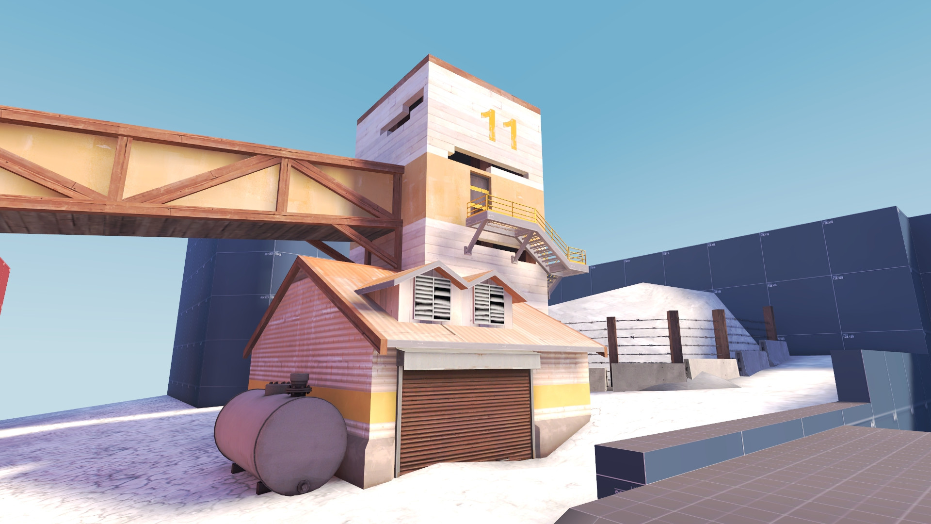
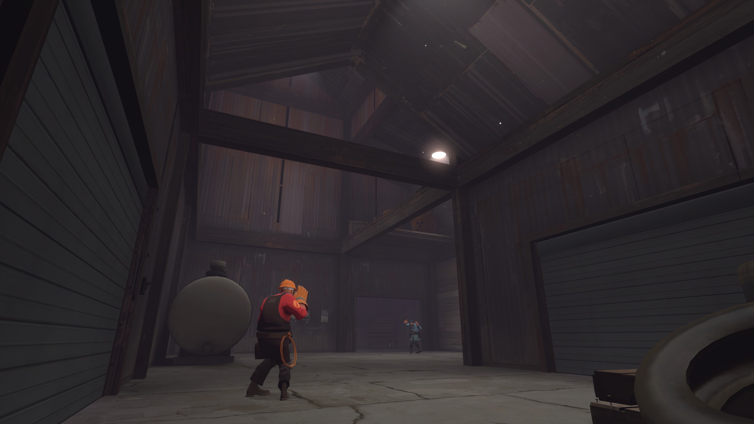
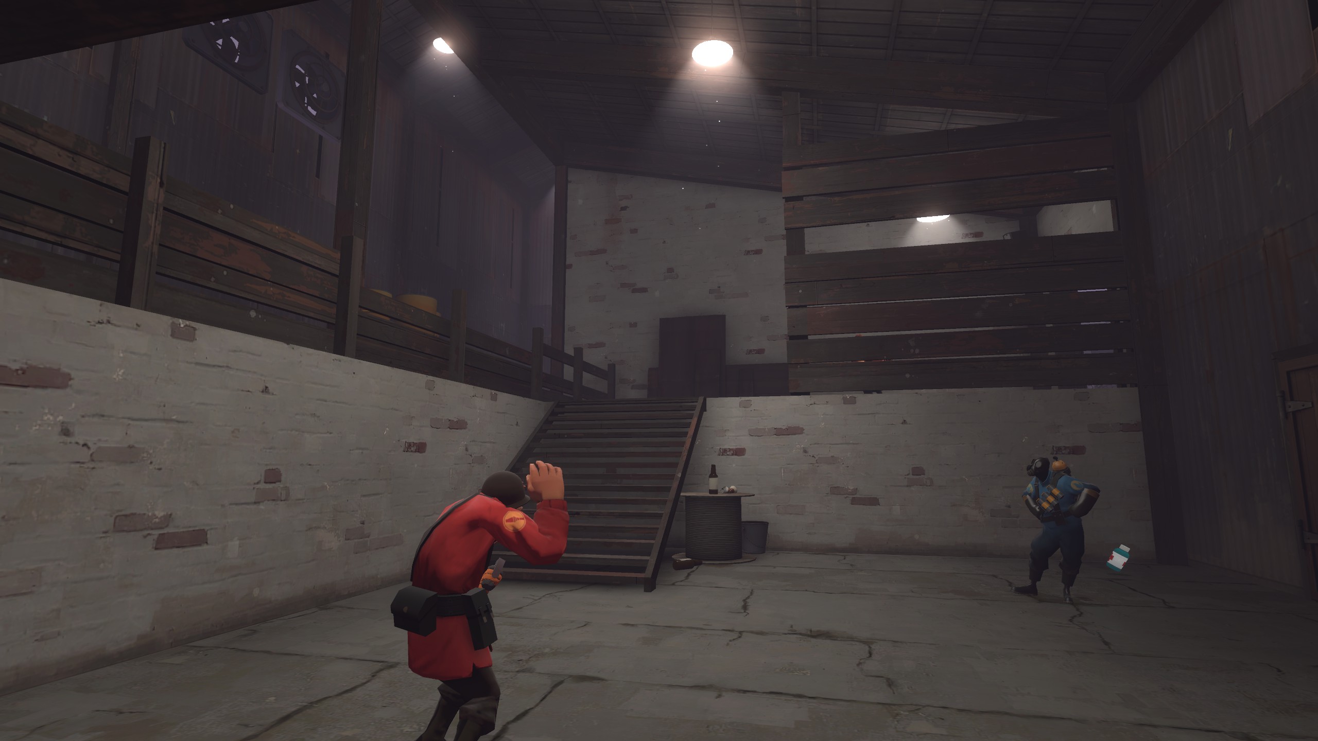
oh man I really like the color palette of the first image, the white and tan is pretty rad. The smaller building is a bit wonky but def. keep the tower structure, the vertical-ness of it is nice.
 

Seba

DR. BIG FUCKER, PHD
aa
Jun 9, 2009
2,364
2,728
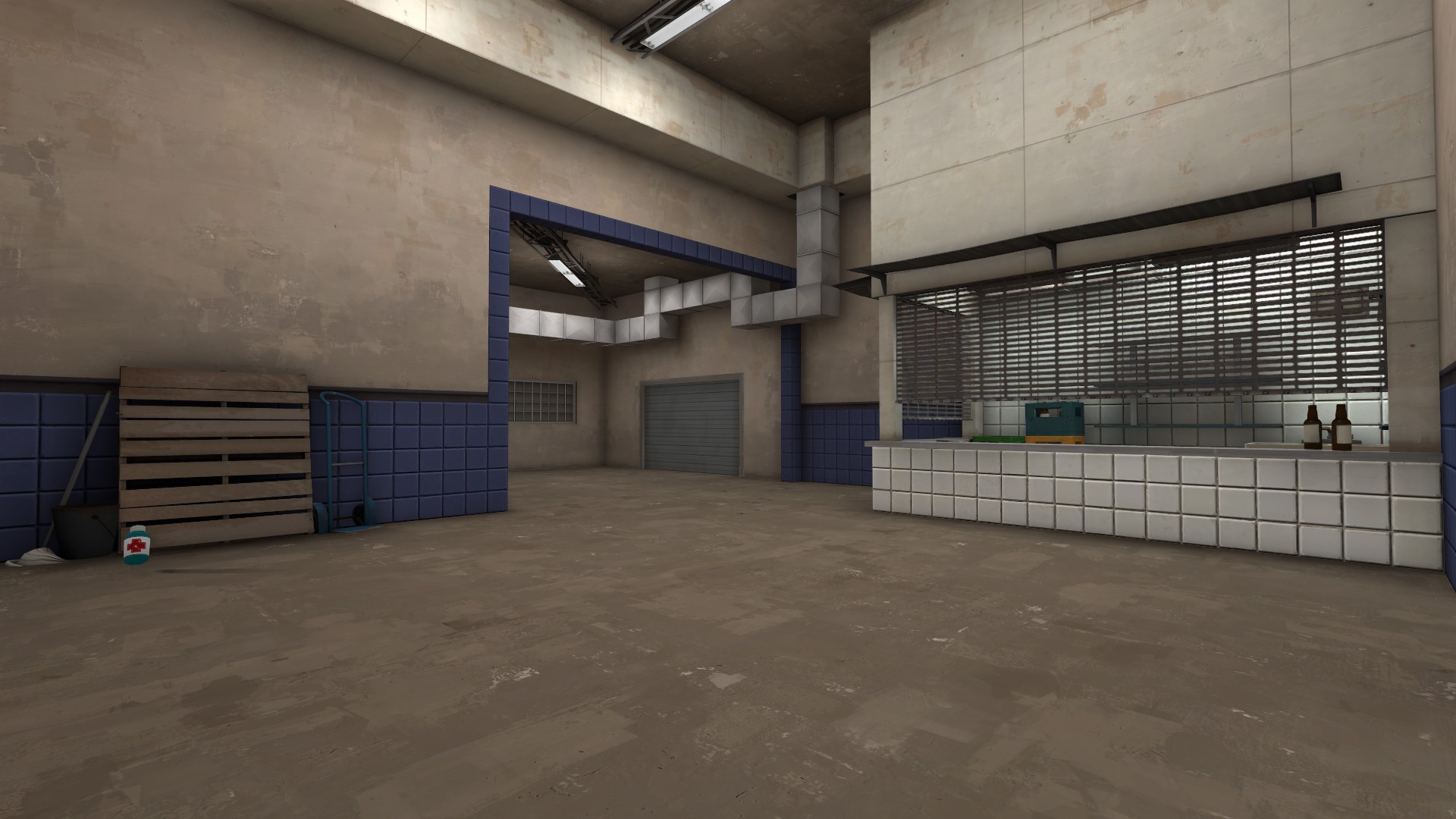
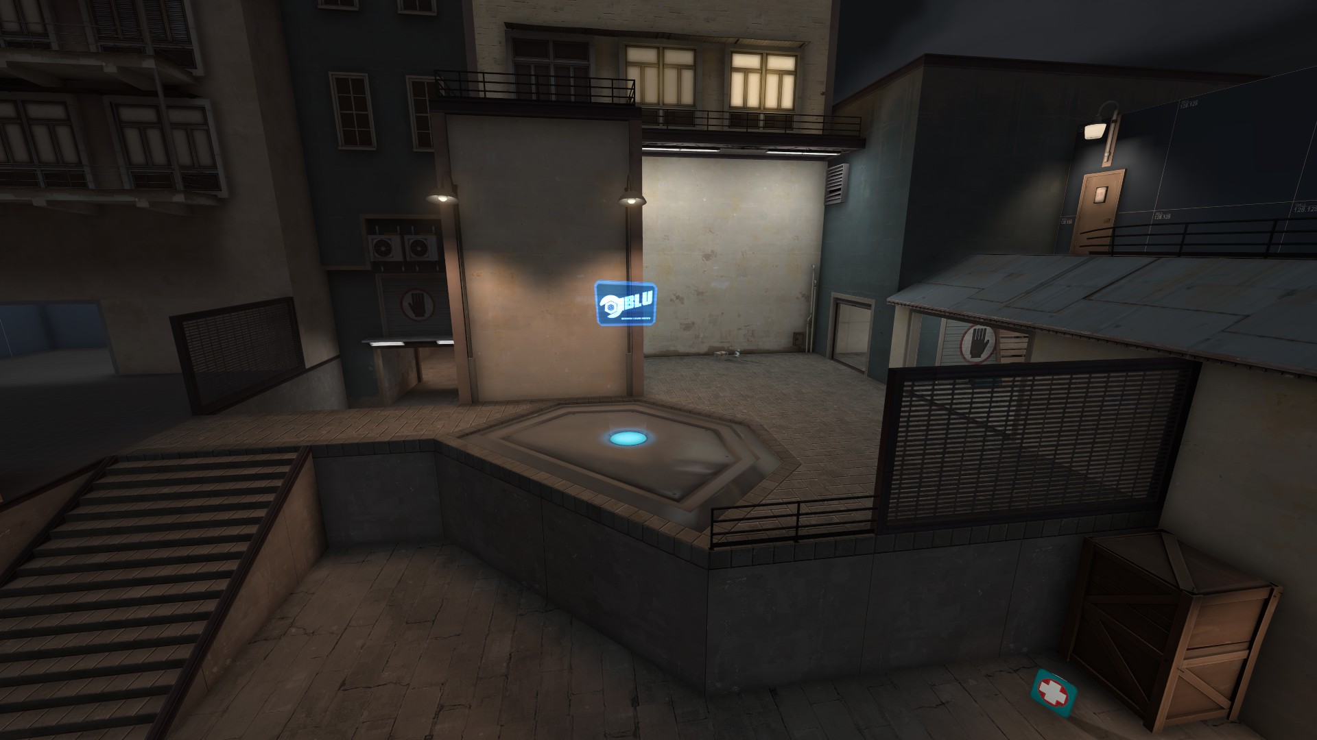
The blue tiles are way too strong, turn down the saturation or something. Everything else looks great though, especially that cappoint base - it's magnificent.
 

xzzy

aa
Jan 30, 2010
815
531
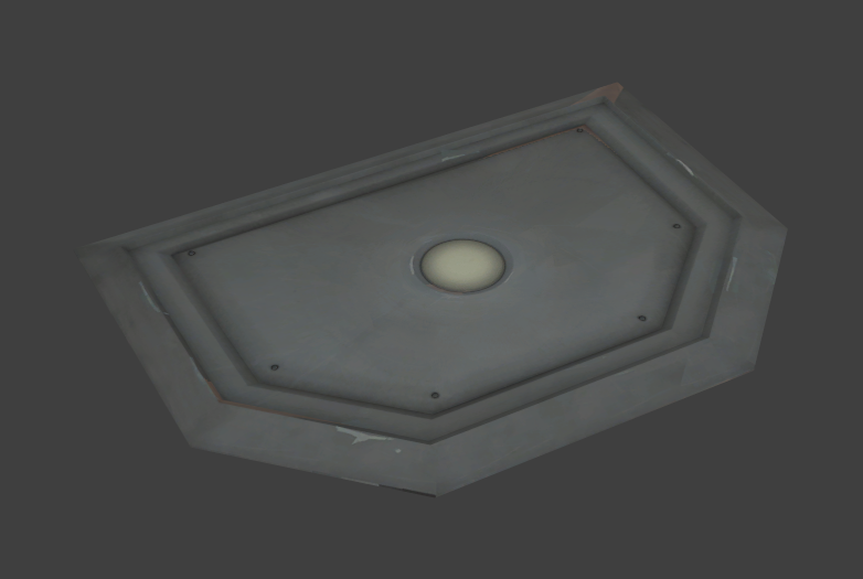
Only issue I see with the new (awesome) cap point is you've got a dent in it.

Which might actually be a good thing, battle worn props are always handy, but I can't tell if it's intentional or not.


I guarantee players will complain about the light levels in the outdoor area too. :)
 

xzzy

aa
Jan 30, 2010
815
531
Yeah, I was referring to the reflection. Either the specular map has a "dent" in it or it's the cubemap itself. Given the way TF2 does reflections it's hard to tell from a single angle.