WiP in WiP, post your screenshots!
- Thread starter Arhurt
- Start date
You are using an out of date browser. It may not display this or other websites correctly.
You should upgrade or use an alternative browser.
You should upgrade or use an alternative browser.
nightwatch
aa
- Sep 7, 2012
- 638
- 501
You should definitely reuse the texture space as much as possible. Especially for things like the webbing, the railing, and the masts.
Oh definitely, but I'm not looking forward to unwrapping things like the sails and the ropes, both of which I haven't added yet out of dread
you know that just gave me an idea
what if instead of a generic sci fi shooter you do a medieval magician shooter
like instead of guns itd be like magic scrolls or some shit
fuck its not even 8 and im already overflowing with horrible ideas
Medieval elephant magician shooter. like instead of guns itd be like magic scrolls or some shit, and like instead of people, giant-ear people, green people, or other people, itd be elephants using their trunks to cast stuff!!!
evanonline
L420: High Member
- Mar 15, 2009
- 485
- 273
It's coming along great!
If all the parts aren't seperate models, you might want to consider compiling them that way. It'd help with resolving any ingame lighting issues, plus if you need to adjust things a little for playability (like moving a mast one direction or the other, etc), it'd obviously be easier.
If all the parts aren't seperate models, you might want to consider compiling them that way. It'd help with resolving any ingame lighting issues, plus if you need to adjust things a little for playability (like moving a mast one direction or the other, etc), it'd obviously be easier.
Garuda112
L1: Registered
- Sep 4, 2013
- 38
- 36
If anything, I think the wood on the deck should have a slight contrast with the exterior hull. My personal recommendation would be to make the hull the darker wood.
I personally don't think the ropes need to sway, given that they look like they need to be taut. If anything, I would think the flag and sails should sway/billow, but that might either be too technical or resource heavy. I haven't done much in the way of animation, so I might not know what I'm talking about. Just suggestions.
Nevertheless, I think that ship looks gorgeous. Great work, Aly! (Also, the playtest a week or so back was fun, and I loved the brush work on the wood posts).
For the record, I caught that same bug in a stock map the next day, so I'm pretty sure the issue was either on my end or something wrong with the game in general that they secretly patched out.Nah, they look better this way and I've had too much trouble with in-engine ropes breaking 90% of the time and casuing about 20 feedback annotations about it.
I feel like there has to be some drawback to using a model for something this big in the Source engine; there must be. But all that comes to mind is that the shadows would be wonky if there were anything tall enough and close enough to actually cast shadows onto it, which there isn't since the light is coming from the side opposite the buildings.
Garuda112
L1: Registered
- Sep 4, 2013
- 38
- 36
This was what I will officially call an "art test". I have a King of the Hill map planned and I wanted to make sure I had a viable theme to work with. This design came up with after tinkering with some ideas for a day or two:
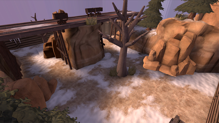
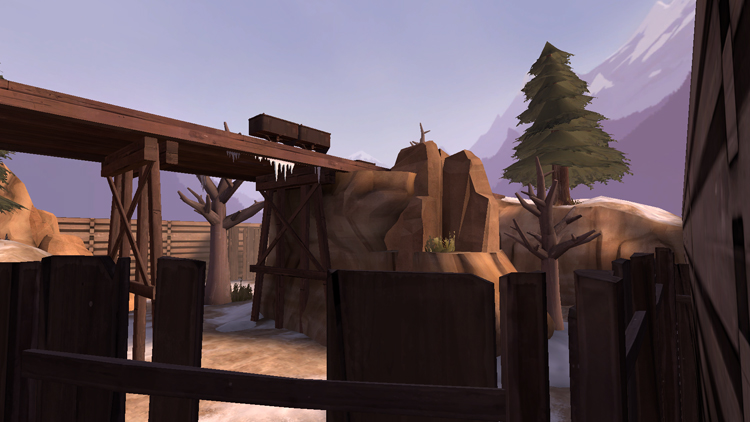
I was thinking of making a mining themed map; the environment I wasn't sure about. I knew I wanted something winter themed, but first designs (and few snow texture options) made it look too close to Viaduct. Then these textures came and I stuck with the idea. Originally I was just going to have dead trees, but that was too plain, and so I added evergreens for a great boost to visual contrast (in turn, I was inspired by Bryce Canyon). The end result I feel pretty satisfied with. It doesn't feel like its been used before, at least to me.
Its hard to say when the map itself will be built, but I'm looking forward to using this theme.
Last edited:
Fredrik
L6: Sharp Member
- Aug 15, 2009
- 376
- 219
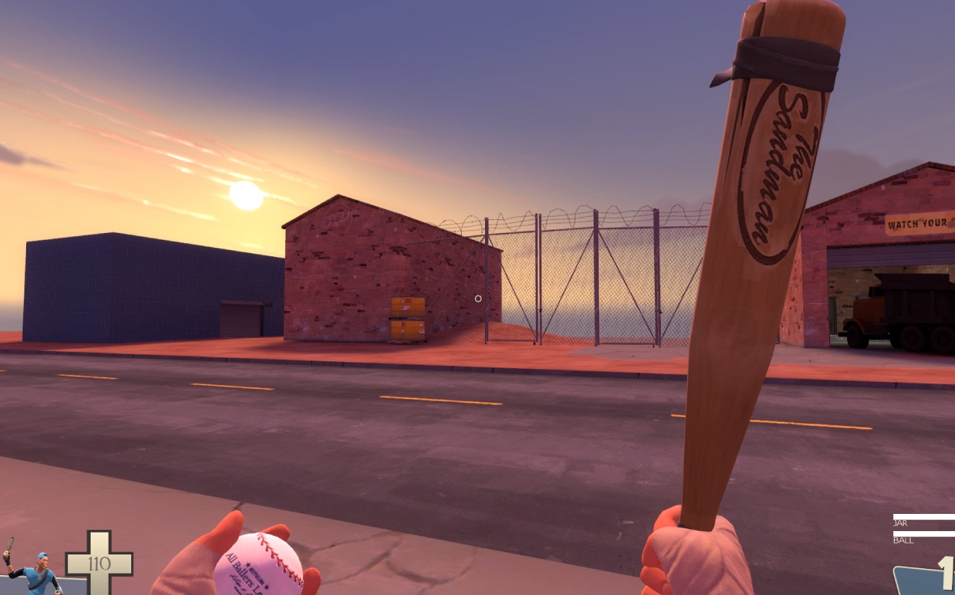
Concept map for a light test, i've modified a bit cp_well's base light settings, with an overall stronger orange and a bit of pink
I like it! :thumbup:
- Jul 31, 2011
- 872
- 1,021
i think i remember a snowy desert map discussion that was very very old
iirc it ended with the conclusion that snowy desert is a real thing, but people don't like to accept it and generally complain when its used in maps.


