Fredrik
L6: Sharp Member
- Aug 15, 2009
- 376
- 219
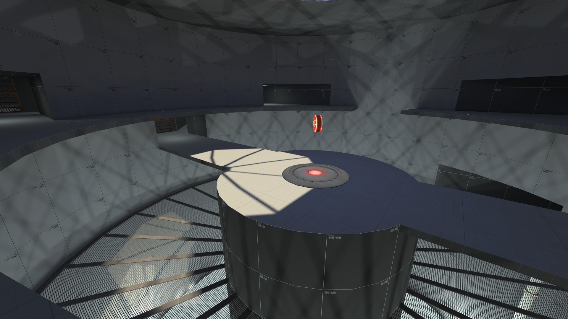
Concept map for a light test, i've modified a bit cp_well's base light settings, with an overall stronger orange and a bit of pink
I like it! :thumbup:
Concept map for a light test, i've modified a bit cp_well's base light settings, with an overall stronger orange and a bit of pink
i think i remember a snowy desert map discussion that was very very old
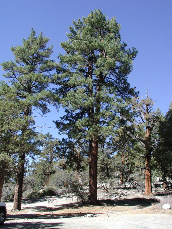
I think the mountain throws it a bit. I usually think of high deserts as being the snowy ones, which are bordered by low dry mountains and rock formations. That mountain's massive, pointy and is covered in trees. Other than that it looks like a pretty viable theme.
It is within my ken, yah.KEN YA TIL WHAT IT EES YETT?
Using a deep blue for the outdoor shadows (which would be fitting, given how deep blue that side of the skybox is) should help as well. Bonus points if the façade of BLU's base is facing away from the sun and thus ends up having a very blue tint to it.red light + blue coloured players = a potential identification problem. Adding strong-but-not-blinding white spot/lights in the playable areas will help to reduce the issue.
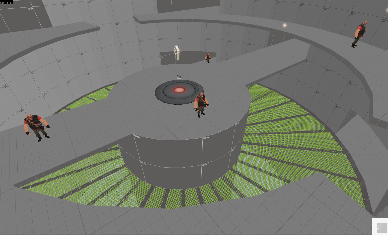
VRAD crashed before he was able to compile HDR. And I haven't added a shadow to the metalgrate texture yet !