WiP in WiP, post your screenshots!

Burnout6010

L5: Dapper Member
Oct 14, 2012
207
67
DA863D81F783C7ADBE117AA70DDB55D5F4C797B2


1278533FA9A44E24B600CADC344FEF92C719BD76


3937867636706A95D34CF7AC8E654663C4DE00DA


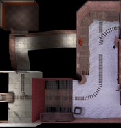
Tell me whenever you think something looks bad and where I can fix some things up.
FYI, that third screenshot shows areas I haven't finished at ALL, so don't judge me on that 3rd screenshot :p

Thanks
 

tyler

aa
Sep 11, 2013
5,100
4,621
I'm seeing one major right to that point, and it's very short, with a tight elbow bend for a flank. That worries me. You may want to look at payloads like Barnblitz or Boundary to see how multiple paths in tightly packed areas can work.
 

Burnout6010

L5: Dapper Member
Oct 14, 2012
207
67
I'm seeing one major right to that point, and it's very short, with a tight elbow bend for a flank. That worries me. You may want to look at payloads like Barnblitz or Boundary to see how multiple paths in tightly packed areas can work.

Boundary ? I'll download that one and look at Barnblitz with more care. I didn't understand which area you meant thought : the tunnel from mid to B or the tiny dev textured platform which leads to the back of the map ?
 

tyler

aa
Sep 11, 2013
5,100
4,621
I specifically mean this

1gaFF


Nowhere do I see any other entrances or places to be other than this one tunnely area. Look at how Gold Rush stage 3 is a hallway of spam, then look at your map. You've got less places for players to be. How do you think it will turn out?

The dev textured platform is a start, but you need to turn the elbow into an area, not a hallway, and maybe look at other ways to work in flanks and side routes.

It's possible I don't fully understand the area, but take it in mind anyway.
 
Last edited by a moderator:

Burnout6010

L5: Dapper Member
Oct 14, 2012
207
67
I specifically mean this

1gaFF


Nowhere do I see any other entrances or places to be other than this one tunnely area. Look at how Gold Rush stage 3 is a hallway of spam, then look at your map. You've got less places for players to be. How do you think it will turn out?

The dev textured platform is a start, but you need to turn the elbow into an area, not a hallway, and maybe look at other ways to work in flanks and side routes.

It's possible I don't fully understand the area, but take it in mind anyway.

So maybe turn the upper tunnel (with the spawn) into an area with stairs arranged into corners (like in GoldRush, red spawn in Stage 3 final cap, the stairs that lead to the sniper deck) and eventually add more cover in the South "tunnel" (with the stairs and the track) ?

I might need to post the map to the forums in the Workshop so you can check it out for yourself, top view only is hard to understand, I agree

EDIT : Did I forget to say it's a Tug O War pl map ? So mirrored map because both teams can push :)
 
Last edited:

Pocket

Half a Lambert is better than one.
aa
Nov 14, 2009
4,701
2,583
If you put the gutter directly under the roof overhang, I bet you'd have room for another length of downspout and not have to hang the bottom bendy part that far above the ground. And once you start displacing said ground, you could use a blendtexture to have a spot right under there where the water has melted the snow.
 

MiiMii1205

L1: Registered
Sep 27, 2012
4
3
So this is my third map so far...

It's almost finished, but I think it's missing something.
I can't quite put my fingers on it... :confused:

2012-10-21_00001.jpg


2012-10-21_00002.jpg


2012-10-21_00003.jpg


2012-10-21_00004.jpg


2012-10-21_00005.jpg


2012-10-21_00006.jpg


2012-10-21_00007.jpg


2012-10-21_00008.jpg


If you have any ideas, let me know...
 
Sep 19, 2010
476
500
So this is my third map so far...

It's almost finished, but I think it's missing something.
I can't quite put my fingers on it... :confused:

-snip-

If you have any ideas, let me know...
It looks to me like your map is a bit over scaled and pretty wide open. And what is going on with that glow on the control points?
 

MiiMii1205

L1: Registered
Sep 27, 2012
4
3
It looks to me like your map is a bit over scaled and pretty wide open. And what is going on with that glow on the control points?

Well, first, the map is designed that way ( Attack - Defense ) and the glowing control points are stylized in a future / high-tech style. The glow actually changes color depending who's owning the point.

( or it's the FOV that's way up )
 
Sep 19, 2010
476
500
Well, first, the map is designed that way ( Attack - Defense ) and the glowing control points are stylized in a future / high-tech style. The glow actually changes color depending who's owning the point.

( or it's the FOV that's way up )
I guess what I'm trying to say is it looks like there is a lot of unused space. Now I'm not saying you need to fill it in (you don't want your map to be too cluttered), I'm just suggesting you scale down a bit. That's only one opinion though. In the end it's your map, so you should do what you want to do.
 

soylent robot

L420: High Member
May 26, 2009
499
394
given the height of those platforms combined with railings, it looks like that it would be pretty difficult to rocket jump up there for the average player, even tho the layout looks to be encouraging that approach.
 

MiiMii1205

L1: Registered
Sep 27, 2012
4
3
given the height of those platforms combined with railings, it looks like that it would be pretty difficult to rocket jump up there for the average player, even tho the layout looks to be encouraging that approach.

Funny you said that, because I've just test the map, and tried to rocket jump...

It's very close, but a well calculated rocket jump can be use to get to the higher platforms.

however, it's got to be perfect. :p