WiP in WiP, post your screenshots!
- Thread starter Arhurt
- Start date
You are using an out of date browser. It may not display this or other websites correctly.
You should upgrade or use an alternative browser.
You should upgrade or use an alternative browser.
- Jul 31, 2011
- 872
- 1,021
Explain pls
(I think I will probably take out those buildings btw)
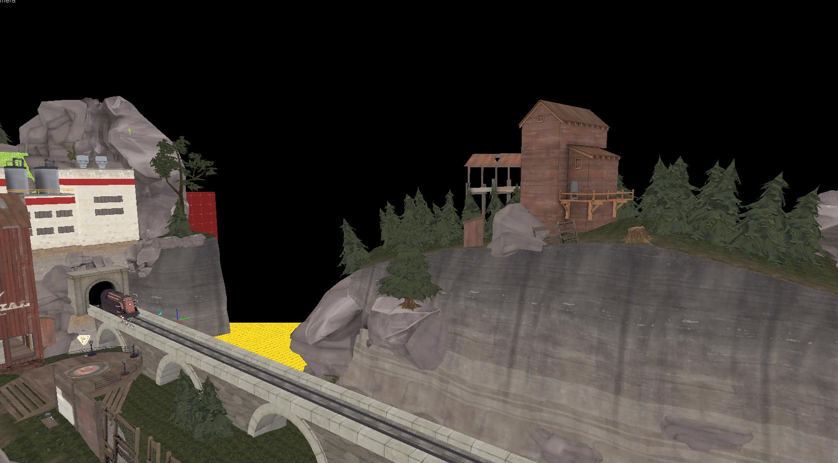
I think the stone bridge looks out of place.
A) It looks like an aqueduct, but its a rail bridge
B) Rail bridges usually aren't made from stone, especially not when they're that long.
C) You don't see giant stone rail bridges in mountainous areas surrounded by trees and wooden buildings.
- May 21, 2009
- 2,039
- 1,484
Explain pls
(I think I will probably take out those buildings btw)
It's like, temperate forest but also a lot of metal buildings (they will rust) and also somehow pristine concrete (gorge) and also a lot of decrepit wooden buildings (sawmill)
Fredrik
L6: Sharp Member
- Aug 15, 2009
- 376
- 219
It is like someone combine Gullywash mid and yard between Croissant's mid and 2nd.
And Konkreet. It basically looks like you really love Arnold's maps. Try to work Bazillion in, too.
Is it just because of the curved routes it looks like his maps?
I'm going to change the actual point because it is basically stolen :blushing: . I bet I can come up with something good myself.
P.S. I have to admit that I really like his brushwork.

A stone bridge that low doesn't make much sense. Either it'd be raised with something cheap like a load of gravel or the tunnel would have been cut at ground level in the valley. At best, it may be made out of wood because it's cheap and quick to erect (see lumberyard for reference), but i'm not sure how much work you wanna do on it at this point in the art pass. Wood would look really neat but it'd be fiddly and probably take you a while (not to mention be a lot of detail to render in an open space).
I saw like 20 in Oregon ahjhdfsghdfgC) You don't see giant stone rail bridges in mountainous areas surrounded by trees and wooden buildings.
I hate falling into the "just because it is real doesn't mean it is believable" trap
None of the buildings are really decrepit except the one with a hole in the side. Otherwise I don't think I've warped a single roof. There are some stains but that's normal even in nice places! I think the lighting needs adjustment honestly. Thanks though, you're not the only one thinking this, I'm sure.It's like, temperate forest but also a lot of metal buildings (they will rust) and also somehow pristine concrete (gorge) and also a lot of decrepit wooden buildings (sawmill)
Bermuda Cake
L9: Fashionable Member
- Feb 20, 2009
- 679
- 480
Should I make an independent thread for this?
It's probably better off to wait for a working first version of the map. Independent threads are good for organising feedback that's focused on one map, and providing the download link for the map, organising gamedays. It's definitely tempting to create a thread, it makes it feel very official and feels like work, but it's a better use of your time to work on the map itself.
As for the map, it looks cool, although the snow texture looks a bit strange - have a look at the one koth_viaduct uses, maybe experiment with alpha textures to add some variation in the form of grass. Also, the inside of the buildings looks very dark, too dark for players to tell what is going on. There seems to be a strip of nodraw on the front of the middle building, and there's something strange going on with the lighting on your train carts. Keep at it!
Spacek531
L4: Comfortable Member
- Jan 28, 2012
- 165
- 94
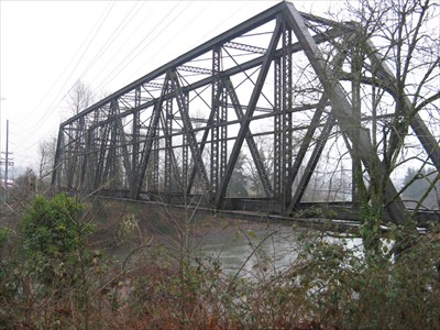
The only place I've seen the type of stone arch bridge like the one in the screenshot is across rivers in the east. Oregon has many types of bridges but the most common in northwest Oregon is the overhead truss bridge.

Second most common railroad bridge is the metal beam bridge.

EDIT: this isn't to say the stone arch bridge is wrong, simply trying to bring forwards what may be thematically similar to the real world.

Second most common railroad bridge is the metal beam bridge.

EDIT: this isn't to say the stone arch bridge is wrong, simply trying to bring forwards what may be thematically similar to the real world.
Last edited:
Godling
L2: Junior Member
- Oct 26, 2007
- 55
- 14
It's all about audience/player conditioning and expectation. Make whatever you want of coarse... just don't be surprised if it doesn't quite work out when you place your own personal beliefs before basic human psychology.I hate falling into the "just because it is real doesn't mean it is believable" trap
LMFAO
Banned
- Jun 14, 2012
- 131
- 60
It's probably better off to wait for a working first version of the map. Independent threads are good for organising feedback that's focused on one map, and providing the download link for the map, organising gamedays. It's definitely tempting to create a thread, it makes it feel very official and feels like work, but it's a better use of your time to work on the map itself.
As for the map, it looks cool, although the snow texture looks a bit strange - have a look at the one koth_viaduct uses, maybe experiment with alpha textures to add some variation in the form of grass. Also, the inside of the buildings looks very dark, too dark for players to tell what is going on. There seems to be a strip of nodraw on the front of the middle building, and there's something strange going on with the lighting on your train carts. Keep at it!
Thanks for the convincing feedback. If you type snow, you'd select the snow003a texture. That's what I used.
I've noticed it. I probably have remove it already because I replaced every nodraw on a displacement surface with a cliff texture.
I do plan on making feedbacks for the map, though.
SOON

(the weird-looking cliffs to the right will be changed, and the gray cliffs on the right will be recolored, don't worry; and keep in mind this is a6 and detailing is subject to change...)
(...also, what happened to koth_montane the past gameday? Was it broken? I can't find any game data/feedback for it even though theharribokid said they'd play it.)
LMFAO
Banned
- Jun 14, 2012
- 131
- 60
http://www.youtube.com/watch?v=tWgmok0xVWs
In stunning 720p
I can tell you've been carving. repent now!
- Jul 31, 2011
- 872
- 1,021


