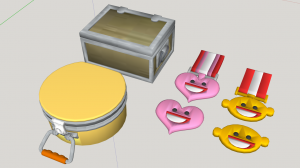
TF2Maps Presents: The Summer 2017 72 Hour TF2 Jam!
- Thread starter Void
- Start date
-
- Tags
- 72hr summer 2017 tf2jam
You are using an out of date browser. It may not display this or other websites correctly.
You should upgrade or use an alternative browser.
You should upgrade or use an alternative browser.
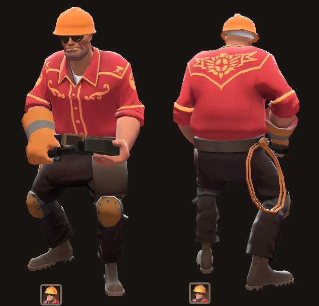
not to have buttons painted onHaven't done anything related to TF2 in a while, thought I'd get my hands dirty again. Here's what I have so far. Feedback hugely appreciated!
- Oct 11, 2013
- 273
- 413
Looks good! Although a bit plain. Maybe you could draw a thin outline around some of the yellow lines, or make the top part of the shirt a bit darker? If you want more feedback you could make a separate thread for itHaven't done anything related to TF2 in a while, thought I'd get my hands dirty again. Here's what I have so far. Feedback hugely appreciated!

Haven't done anything related to TF2 in a while, thought I'd get my hands dirty again. Here's what I have so far. Feedback hugely appreciated!
I agree with the others. Great idea, but it needs some highlights & shadows so it looks more like embroidery rather than a pattern painted on to a shirt.
Fantastic feedback, thank you for everyone's input thus far!
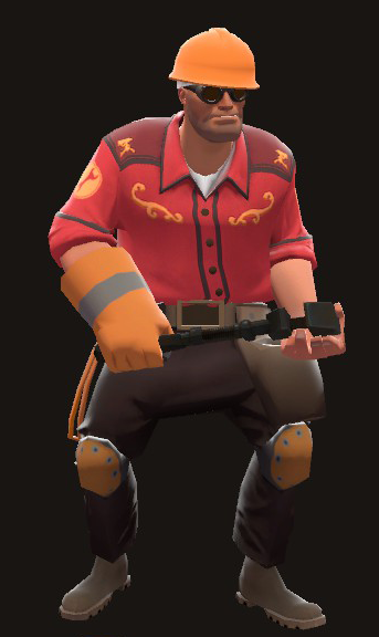
I've modeled in buttons, darkened the top part, added a bit of detail to some of the edge lines, and tossed in a subtle normal map. I also adjusted the edge line color to match the cosmetic a little bit closer to the engineer's color palette.
I don't want to hijack the thread, but if there are any additional recommendations you have, I can certainly entertain accommodating them.

Finished my SFM poster for the 72 hour jam! https://tf2maps.net/downloads/snipers-treasure-hunt.4735/
Greemu
L1: Registered
- Jul 25, 2017
- 7
- 2
God damnDecompiling was the easy part. Took much longer than expected to bend these tracks the right way. More variations and compiling tomorrow.
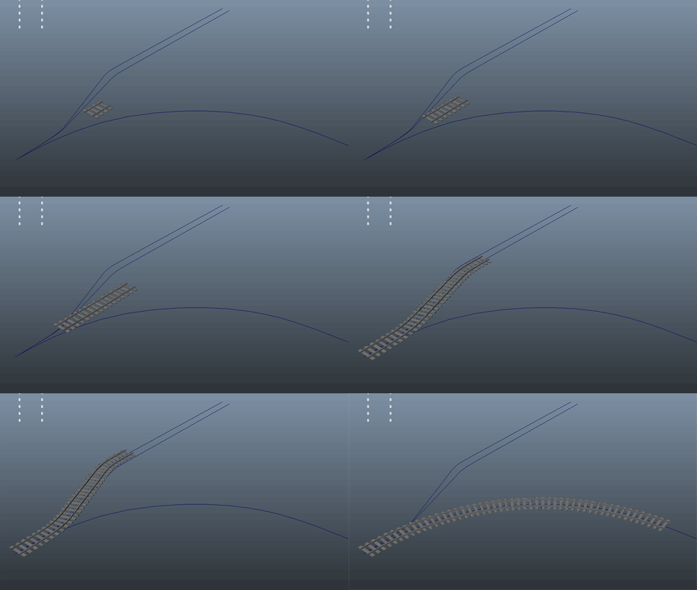
Well this is my first time doing this and I lost the first day due to family stuff and I'll miss most of the third day due to work. And I've already missed most of the second day due to delaying.
I can't do much, but I'm trying my hand at fanfiction, it won't be anything fantastic but it will be a thing.
(I probably should get back to working on it.)
I can't do much, but I'm trying my hand at fanfiction, it won't be anything fantastic but it will be a thing.
(I probably should get back to working on it.)
Fantastic feedback, thank you for everyone's input thus far!
I've modeled in buttons, darkened the top part, added a bit of detail to some of the edge lines, and tossed in a subtle normal map. I also adjusted the edge line color to match the cosmetic a little bit closer to the engineer's color palette.
I don't want to hijack the thread, but if there are any additional recommendations you have, I can certainly entertain accommodating them.

It would be really cool if there was some sort of incorporation of white accents in the shirt, to pair nicely with the golden motifs. This picture popped into my head when I saw this:
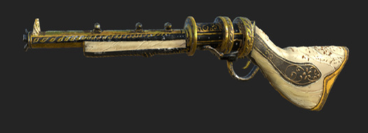
It's a skin for rust that has a similar theme. I was thinking that maybe make the inside of the shirt unbuttoned and loose, so you could see the white undershirt beneath it. While you are at it, have the coat progressively get darker as it goes down, similar to the cute suit, but maybe not as drastic. I think it would work really nicely with the yellow and white!
EDIT:
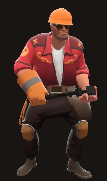
I quickly sketched a mockup of what I had envisioned in my head. I think it would look amazing actually modeled!
Last edited:
gOOD ^It would be really cool if there was some sort of incorporation of white accents in the shirt, to pair nicely with the golden motifs. This picture popped into my head when I saw this:

It's a skin for rust that has a similar theme. I was thinking that maybe make the inside of the shirt unbuttoned and loose, so you could see the white undershirt beneath it. While you are at it, have the coat progressively get darker as it goes down, similar to the cute suit, but maybe not as drastic. I think it would work really nicely with the yellow and white!Really good work so far.
EDIT:
I quickly sketched a mockup of what I had envisioned in my head. I think it would look amazing actually modeled!

Greemu
L1: Registered
- Jul 25, 2017
- 7
- 2
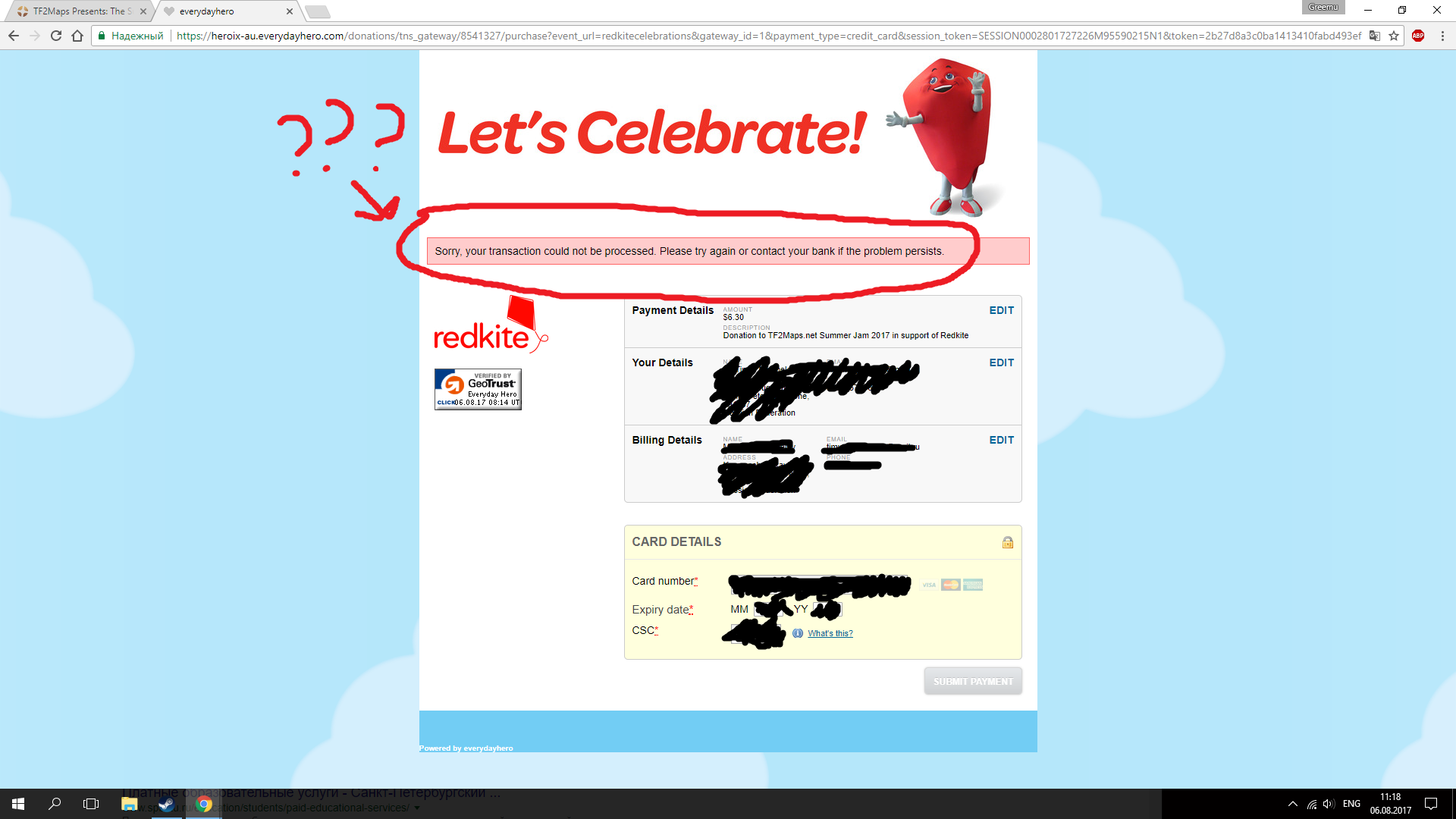
Hi, I am a bit curious how many time takes to receive a medal? I posted a drawing yesterday and I followed the rules but I haven't received anything yet. Is not the big deal, I liked the idea of participite but still it would be nice to have the medal.
By the way, I love the full concept of see the community creating new stuff for tf2, thanks to everyone for your work.
By the way, I love the full concept of see the community creating new stuff for tf2, thanks to everyone for your work.


