TF2Maps.net New Site Information Mega Thread
- Thread starter Fruity Snacks
- Start date
You are using an out of date browser. It may not display this or other websites correctly.
You should upgrade or use an alternative browser.
You should upgrade or use an alternative browser.
Did this ever happen? This would be expected behavior to me.
Yes, this was how I used to go back to check posts I'd just made. Always happened that way. With the new forum, it stopped.
Actually maybe I always used "Today's Posts" instead... there is no option for that on the new forums. Out of habit, I always went to the last thing on the forum list, which used to be "Today's Posts" and now is "New Posts."
Also, quoting the part of my post that was more important IMO for the new page
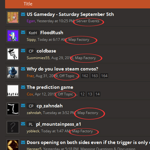
I guess since I never heard a response, that moving the subforum names to the right to make them more visible isn't an option.

Can we get these outlined, or in a different colour, or at least bold? I have tremendous difficulty reading these (mild dyslexia), whereas I didn't on the old forums because they weren't in tiny letters bunched up with the author, date, etc info.
If you press New Posts, on the right there's a "Recent Threads" button that will show new posts you've made too.
I'm working on the forum list thing
EDIT: Done, lemme know what you think.
OMG, thank you so much. Much better!
This is great, If it's possible, put a "Forum" header in the orange bar that says Title/Views/etcI'm working on the forum list thing
EDIT: Done, lemme know what you think.
Why do I have to click so many buttons to get to a map's screenshots in the map factory?
It's one button press extra if you want to see screenshots, and even then only if the thread is still in its first page. Anyway, I've updated it so the content of the first post for all new download postings is a direct copy of the overview, with the exception of the uninserted attachments box. You'll have to live with the extra click for the old threads unless their authors update them though.
Last edited:
OK, just so we're on the same page: I'm talking about mousing over the alerts when I'm on a thread page — thus popping up a box with the most recent activity and clearing the number — and then mousing over it again from a cached page where it still has the number. If you do this, does it (A) still have the number when you go back, and if so, (B) pop up the box and clear the number a second time as one would expect?I use Firefox - the alerts bar works fine after a normal page back event. :S
Just looked over the OP again to find out about importing my maps, and uh
...And what? If you have an existing map thread in the workshop subforum and here's a million dollars? If you have an existing map thread in the workshop subforum and here's your own spaceship? There's clearly a decent amount of information that's missing here.IF YOU HAVE AN EXISTING MAP THREAD IN THE WORKSHOP SUBFORUM AND .
Just looked over the OP again to find out about importing my maps, and uh
...And what? If you have an existing map thread in the workshop subforum and here's a million dollars? If you have an existing map thread in the workshop subforum and here's your own spaceship? There's clearly a decent amount of information that's missing here.
It's supposed to say, if your map already has a thread, upload it into the Import Queue category (which suppresses the automatic creation of a new thread).
I wrote a more detailed guide for importing over here - it's meant for importing other peoples' things, so feel free to do whatever you want for the tagline/description/etc. for your own stuff.


