TF2Maps.net is getting a new look and new software!

Kube

Not the correct way to make lasagna
aa
Aug 31, 2014
1,342
1,849
I forgot to import thanks when I dumped the forums, it's on my to-do list for the actual port.

Your user title changed to New Member because I was messing with it, it's fixed now, though I've decided utf8mb4 will probably be impossible - I'm not even sure how the current forums are coping with that, they really shouldn't.

Emoticons also haven't been imported as they have to be "stitched" together into one huge image. I'll do that later on.

EDIT: AAAHHH CLEVER GIRL - The current forums convert invalid UTF code points into html entities, which is a far nicer solution.

Cool, thanks for the update.
 

Geit

💜 I probably broke it 💜
aa
May 28, 2009
598
1,161
Worth noting that if you can't do some thing you think you should be able to in the testbed, the permissions are probably janky - which will be fixed when the real thing goes live.
 

Kraken

Few more zeros and ones for the site to proccess
Dec 21, 2014
430
121
I don't know if it's worth mentioning. This thread doesn't appear in the new post section even with new posts.
 

Idolon

they/them
aa
Feb 7, 2008
2,107
6,116
I don't know if it's worth mentioning. This thread doesn't appear in the new post section even with new posts.

The testbed is running off of its own set of data, copied from here. Updates don't transfer.
 

Kube

Not the correct way to make lasagna
aa
Aug 31, 2014
1,342
1,849
Woo, the crowns appear in my nametag again!

Whatever you did, Geit, it worked. Thank you!
 

tyler

aa
Sep 11, 2013
5,102
4,621
Is there a mobile app or site for the new forum by the way? I've been using Tapatalk to read the forum on my phone for years now, hopefully there's an equivalent for Xenforo stuff?
 

killohurtz

Distinction in Applied Carving
aa
Feb 22, 2014
1,016
1,277
The testbed does actually have a mobile layout right now, but it's a little rough in places. I can start listing some of the problems I've found if it's going to be developed along with the desktop site.

EDIT: I put things in an imgur album
 
Last edited:

Geit

💜 I probably broke it 💜
aa
May 28, 2009
598
1,161
The testbed does actually have a mobile layout right now, but it's a little rough in places. I can start listing some of the problems I've found if it's going to be developed along with the desktop site.
The "mobile" version of the site is simply responsive design, please do report any issues you find and I'll try get them fixed before next week.

Is there a mobile app or site for the new forum by the way? I've been using Tapatalk to read the forum on my phone for years now, hopefully there's an equivalent for Xenforo stuff?

There is indeed a tapatalk addon! I've installed it on the testbed now if you want to give it a go.

Woo, the crowns appear in my nametag again!

Whatever you did, Geit, it worked. Thank you!

The world's dirtiest hack: http://geit.uk/uploads/6rZhFA.png

(It converts UTF8 text into an HTML entity instead of letting the database save it)
 
Last edited:

ExtraCheesyPie

L420: High Member
Jan 29, 2015
484
151
Moderately excited!
 

spudboy

L1: Registered
Feb 8, 2015
37
6
I'm looking through the testbed site and I have some concerns.

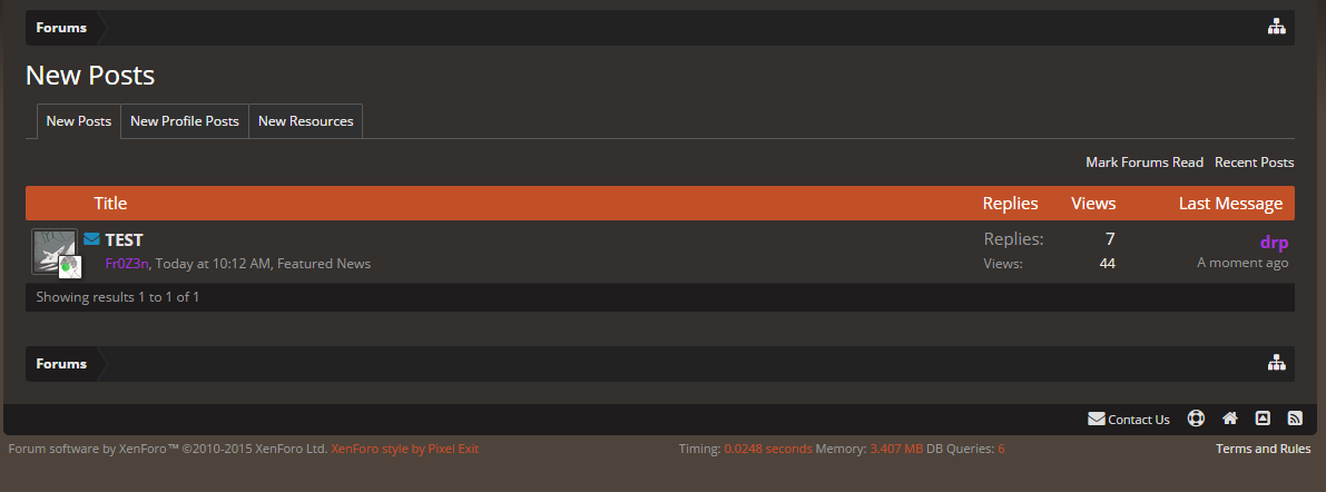
The thing that I use the most on this site by far is the "recent threads" section. I don't tend to find myself looking at specific sections of the forums. I like to pop in and quickly be able to see what people have been talking about since I was last here. The current site design does this pretty well, and puts the new posts front and center.

062718e1fd.png


However, on the new site, this is relegated to a side bar, and only shows 5 entries as opposed to the current 8, as well as giving me far less information about the thread itself.

334cce6338.png


Also when I 
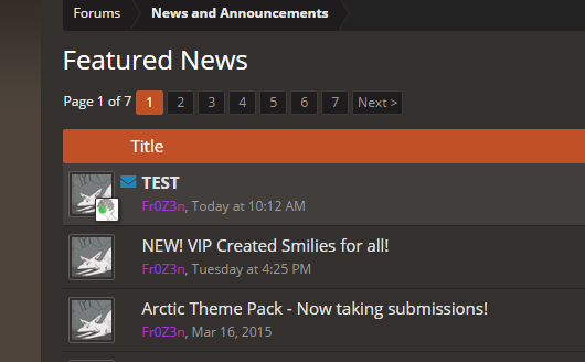
am just browsing through forums, the new site also seems to give me less information.

4a95cece71.png


There's no actual indication on what threads have posts I haven't read yet, where on the current site we have this handy little icon.
98a12efd90.png


There's also no sign of the "Latest Maps" bar, which I also liked.
fdcd43e3f0.jpg


From what I've seen this new site is a definite downgrade from what we have now, and I don't really get why everyone seems to be so excited about it.

PS: I think having "thanks" over "likes" makes more sense with the learning-oriented community we have around here. Kind of a nitpick but just more negatives to add onto the pile.
 

tyler

aa
Sep 11, 2013
5,102
4,621
There is a new posts page, spud.

Rd4Hhzx.png


PzknV8S.png


In the forum view:

oiHyIEG.png


Clicking the blue envelope takes you to the new post like the little thing we have now.

The site just thinks you've already read everything because it's not live, it's using an old copy where you had read everything. Or read/unread data wasn't copied.

I agree that we need a latest maps/latest showcase maps bar also, though. I don't use the front page ever, it's totally useless to me, but it's a good front for new people and visitors.
 

Tumby

aa
May 12, 2013
1,085
1,194
So basicaly, tf2maps.net gets replaced with forums.tf2maps.net? I don't like navigating forum stuff at all, which is why I always use the front page. I'm just gonna list the things that I fear will suddenly be gone:

What's the newest stuff atm? Click "Recent Threads" text.
Need to get to, lets say, the "Arctic Theme Pack" thread? Click the image thing.
Want to join US/ES Server before everyone else? Click the button in the image on the side because In-Game server browser's favorite feature never works anyways.
 

spudboy

L1: Registered
Feb 8, 2015
37
6
There may be a new posts page, but I feel like I shouldn't have to click down another level to get there.

tyler said:
I don't use the front page ever, it's totally useless to me, but it's a good front for new people and visitors.

Well that's kind of the difference here. I use the front page for 90% of things I want to do on the site, and a lot of that is taken away or downgraded on the new site.

Tumbolisu seems to have pretty much the same problems. I didn't even think about it but when I join the steam chat I usually do it by clicking the steam chat button on the front page, as navigating through some of the Steam stuff is a pain.

I'm not necessarily saying that you can't get to stuff on the new site, but a good website is as convenient as possible for users and should take as few clicks as possible to get where you want to be. From what I'm seeing, the new homepage fails at this.
 

tyler

aa
Sep 11, 2013
5,102
4,621
Guys, the front page stuff isn't being removed necessarily, it just isn't in place yet. Links to Steam Chat can be added again no problem, it's just a single link. Also the new posts link isn't buried under additional clicks and once the front page is I doubt it will be far from that either. No reason to not keep it in the header.

It's good to raise these points but you don't need to freak out! It says in the OP things are missing or will be missing for a bit!
 
Last edited:

spudboy

L1: Registered
Feb 8, 2015
37
6
So we'll be switching to the new site in about a week right? If that's the case I'm just kind of worried because I feel like a good front page is very important, and I'm not sure that the people working on this will go from nothing (that I've seen at least) to a great homepage in that time.

Additional nitpick: currently on the testbed you have to be logged in to download files. Even worse, you even have to be logged in to go through a download link to an external site.

These things may fall under "stuff we're gonna do" or "janky permissions" but I'd rather voice this now and make sure everything is fine than switch to a sub-par site.
 

tyler

aa
Sep 11, 2013
5,102
4,621
I believe you already need to be logged in to download files. I think that's why we have thousands of users with no posts. I agree it should be changed, or thought about.
 

Geit

💜 I probably broke it 💜
aa
May 28, 2009
598
1,161
So we'll be switching to the new site in about a week right? If that's the case I'm just kind of worried because I feel like a good front page is very important, and I'm not sure that the people working on this will go from nothing (that I've seen at least) to a great homepage in that time.

Additional nitpick: currently on the testbed you have to be logged in to download files. Even worse, you even have to be logged in to go through a download link to an external site.

These things may fall under "stuff we're gonna do" or "janky permissions" but I'd rather voice this now and make sure everything is fine than switch to a sub-par site.

If I feel that in a week the site is in a state where not all functionality is adequately replicated, defunct or replaced then I will delay it, getting a functionally equivalent front page will take about 5~10 hours of work, but we haven't decided what we want yet.

Also fixed the downloads thing, as you said - a trivial permission issue.
 

Kube

Not the correct way to make lasagna
aa
Aug 31, 2014
1,342
1,849
One quick (fickle) complaint-

There isn't much contrast between the non-linked and linked text in the green announcement bar. A deeper gray would do a lot of good.

temp.png


Edit: Also, under the profile images to the side of each post, I like the current format of "Posts; Thanks given; and Thanks received" rather than "Joined; Messages; Like Received", even though I could get used to the removal of "Thanks given" (983 thanks given! Man, I'm a kissup). Again, I'm fickle.
 
Last edited:

tyler

aa
Sep 11, 2013
5,102
4,621
Starting my list of tiny inconsequential changes I'd like to see happen:

Can we change the text on the Add Resource page to say a1 instead of 1.0?
0j3P1Od.png